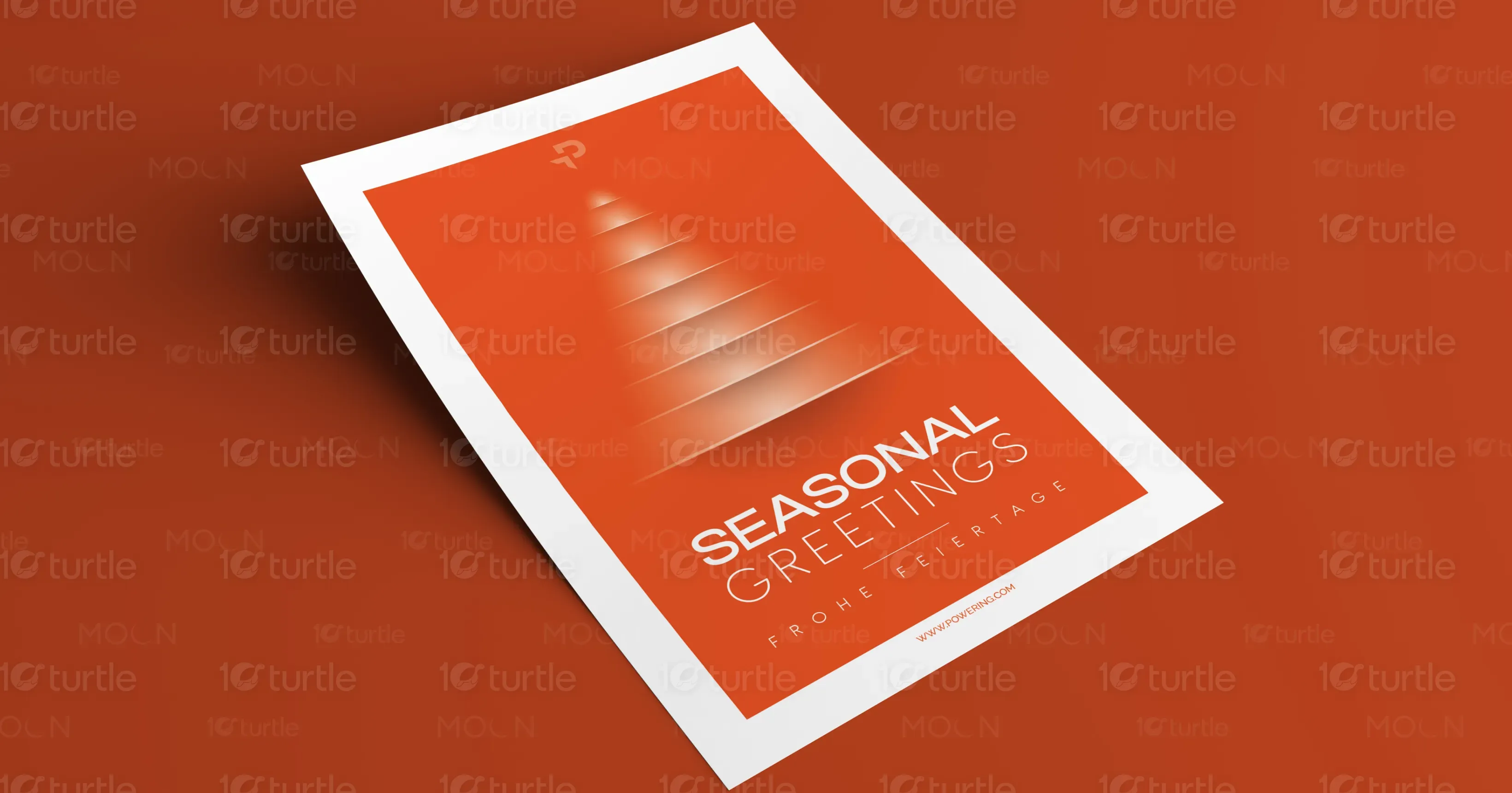
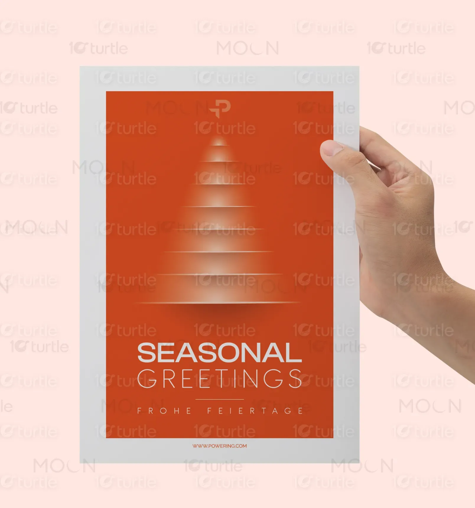
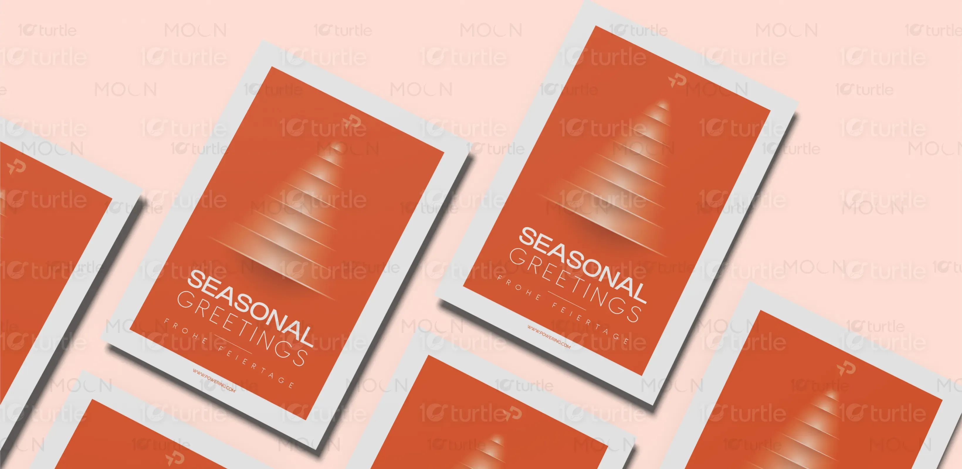
The design utilizes a minimalistic and modern aesthetic, focusing on a subtle yet striking representation of a Christmas tree formed by soft gradients and geometric shapes. The clean typography complements the elegant, calming vibe of the design. The use of an orange hue as the dominant color evokes warmth and cheerfulness, making the card feel inviting while maintaining a sophisticated look. The geometric tree and simple typography reinforce the balance of creativity and professionalism, appealing to modern sensibilities.
Graphic Design
Greeting Card Design
Industry
Arts, Culture & Entertainment
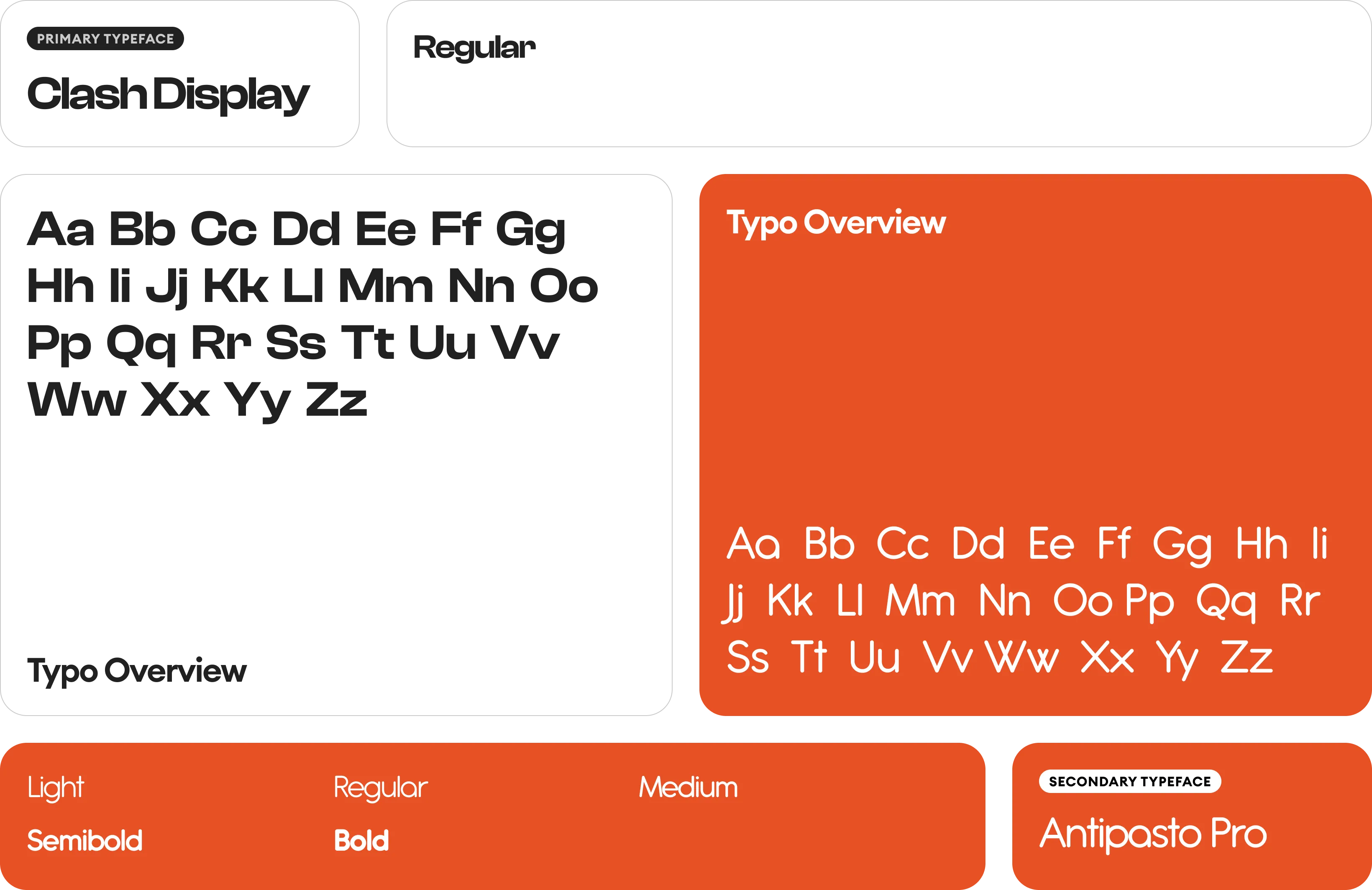
Tools we used


Project Completion
2025
Key Market
Global
This greeting card blends modern design with seasonal warmth. A minimalistic interpretation of a holiday tree, created with smooth gradients and geometric forms, is complemented by clear, crisp text. The card’s purpose is to deliver a holiday greeting in an elegant, contemporary manner. Its unique selling points include its balance of simplicity and creativity, offering a fresh take on traditional seasonal greetings. The use of bold color and refined design ensures it stands out in a crowded market of generic holiday cards.

Industry
Arts, Culture & EntertainmentWhat we did
Graphic DesignGreeting Card DesignPlatform
-Many seasonal greeting cards are overly festive and filled with cluttered imagery, making them feel impersonal or too generic. In a market dominated by these conventional designs, there is a gap for modern, stylish cards that offer an emotional connection without overwhelming visuals. Consumers often seek a refined aesthetic to send season’s greetings in a way that feels personal and high-end.
This design addresses the market gap by creating a sophisticated yet simple card, using modern design techniques to communicate warmth and festive spirit. The subtlety of the geometric tree and clean text makes the card feel timeless and elegant, appealing to individuals looking for something different from the usual holiday card. The overall simplicity and clarity of the design allow the message to shine, offering a personalized touch in a minimalist package.
The long-term goal for this design is to redefine the way seasonal greetings are communicated. By embracing minimalism, the design aims to create a lasting impact on the greeting card industry, encouraging others to adopt more thoughtful and visually refined styles. The vision is for this design to resonate with consumers who seek to send greetings that reflect personal taste and modern aesthetics, setting new standards in the market for elegant, contemporary seasonal cards.

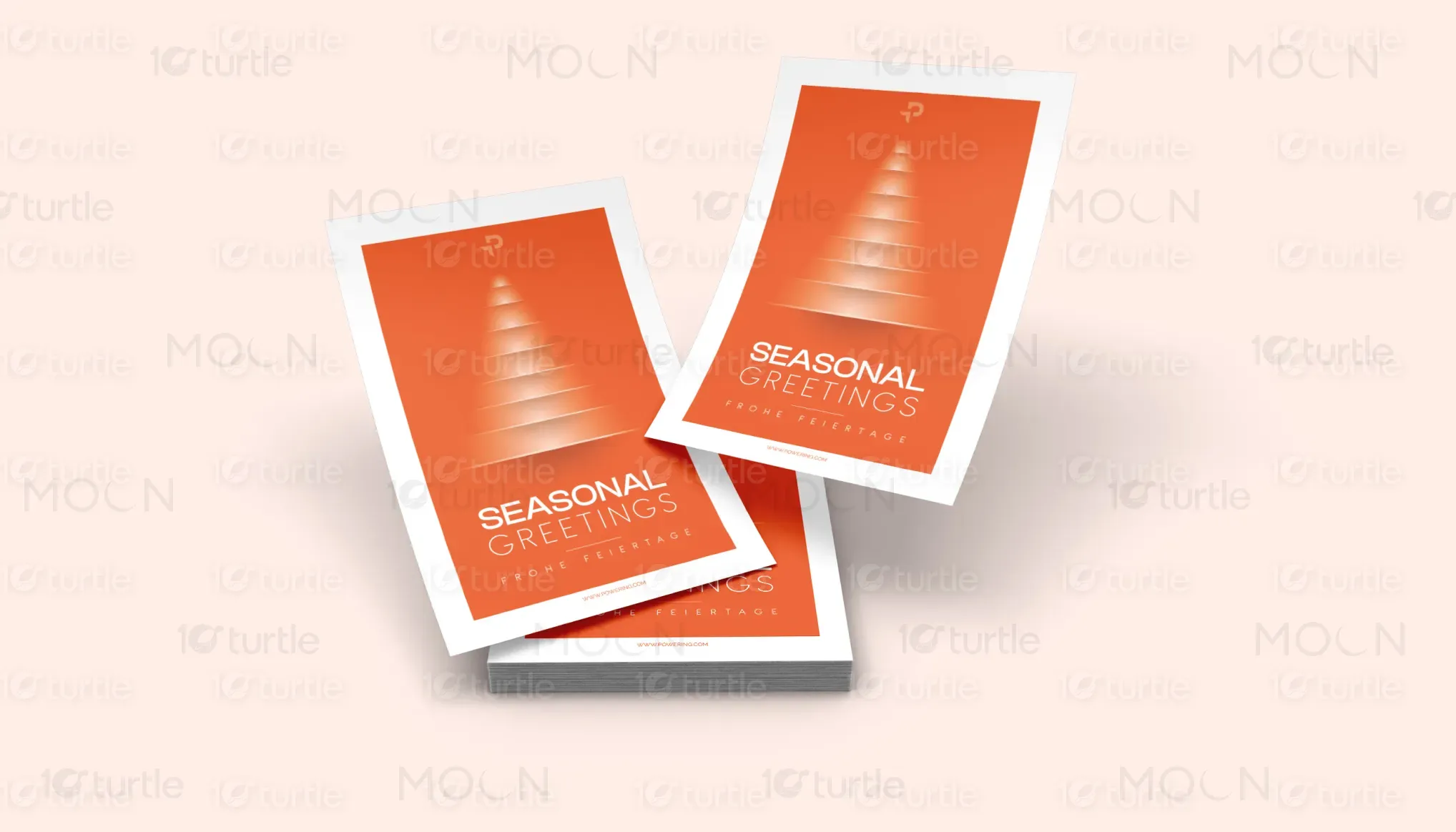

The chosen color palette centers around a vibrant orange, which conveys warmth, optimism, and festive cheer. This color works harmoniously with the minimalist approach, adding a dynamic and energetic vibe to the design while remaining subtle and sophisticated. The palette aligns with the brand’s identity of modernity and simplicity, evoking positive emotions and creating a welcoming atmosphere. The use of orange contrasts beautifully with the white background, ensuring the design feels fresh yet timeless.