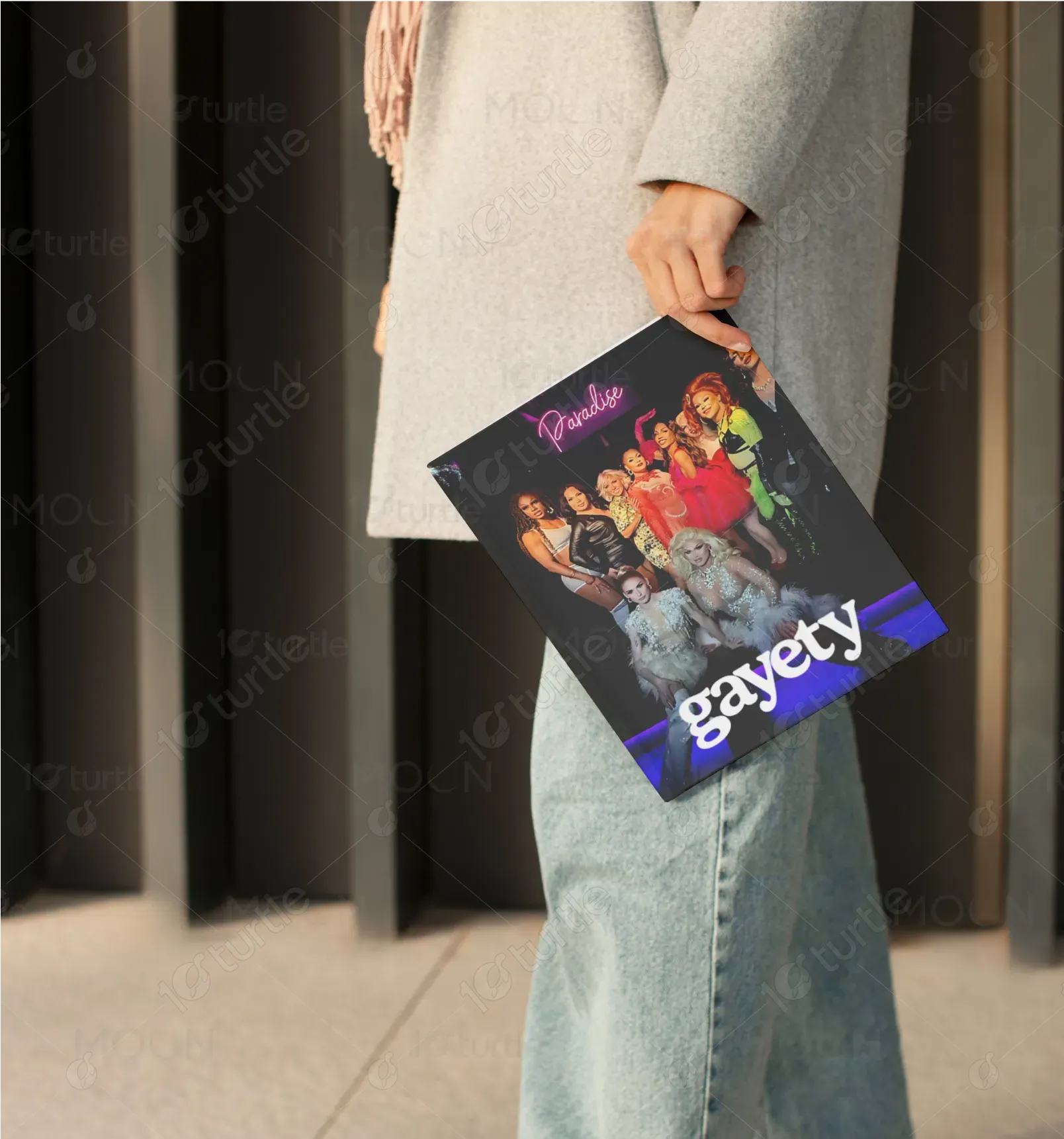
The design bursts with bold vibrance, featuring drag artists clad in dazzling costumes under glowing neon lighting. The title “Paradise” written in a cursive neon script, sets the tone of glamour and freedom. The cover layout is dynamic, with a diverse cast positioned centrally to highlight inclusivity. The magazine title "Gayety" in a bold, white font with a soft blue glow anchors the composition, creating a high-contrast, theatrical aesthetic that captures the spirit of performance and queer celebration.
Magazine Covers Design
Graphic Design

Industry
Arts, Culture & Entertainment
Tools we used


Project Completion
2025
Key Market
Global
Gayety is a lifestyle and entertainment magazine focused on LGBTQ+ culture, spotlighting drag artistry, queer fashion, and nightlife. Its market niche lies in providing authentic, celebratory content that empowers marginalized voices. With vivid visuals and contemporary themes, Gayety offers a fresh, unapologetic tone for a modern, inclusive audience. The magazine bridges glam with realness, delivering news, features, and event coverage that reflect the vibrancy of queer experiences.
Industry
Arts, Culture & EntertainmentWhat we did
Magazine Covers DesignGraphic DesignPlatform
-LGBTQ+ media often struggles with limited visibility in mainstream publication spaces. Many magazine covers lack representation of queer joy and authenticity, especially outside urban niches. The challenge is to stand out while remaining true to community roots, avoiding tokenism or commercial dilution.
Gayety leverages authentic imagery, vibrant palette, and inclusive storytelling. The cover’s visual energy and real drag performers highlight lived experiences rather than stylized stereotypes. The layout is inclusive yet elevated—blending editorial polish with grassroots flair, ensuring cultural respect and visual impact.
To become the definitive global voice of LGBTQ+ entertainment and lifestyle—Gayety aims to expand its reach across events, digital content, and merchandise. The brand seeks to empower future creators, amplify queer joy, and redefine representation through bold, community-first media.

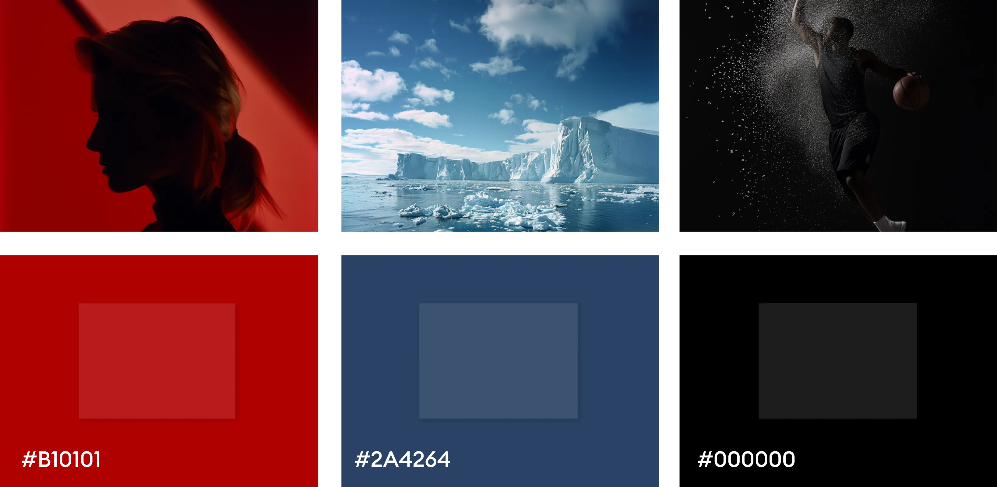
The color palette for Happy Vibes for Minis blends warmth, nature, and elegance to create an emotionally resonant and visually appealing identity. The earthy green symbolizes growth, health, and natural living—perfectly aligning with a child-focused, conscious brand. The soft copper beige adds a gentle touch of sophistication and warmth, making the brand feel both premium and nurturing. When paired with a matte black background, these colors offer strong contrast, enhancing clarity and giving the logo a timeless, versatile presence across packaging, digital, and print media.