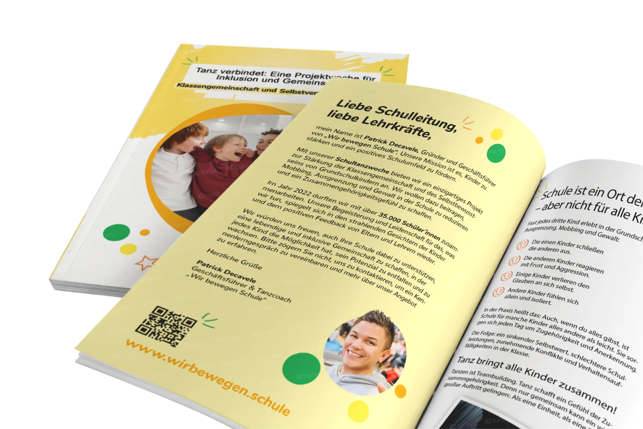
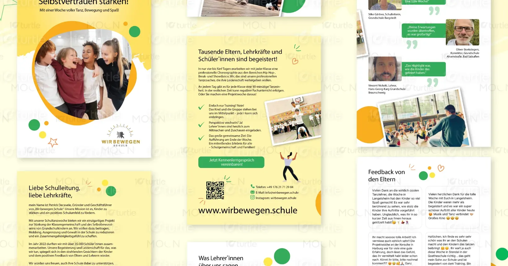
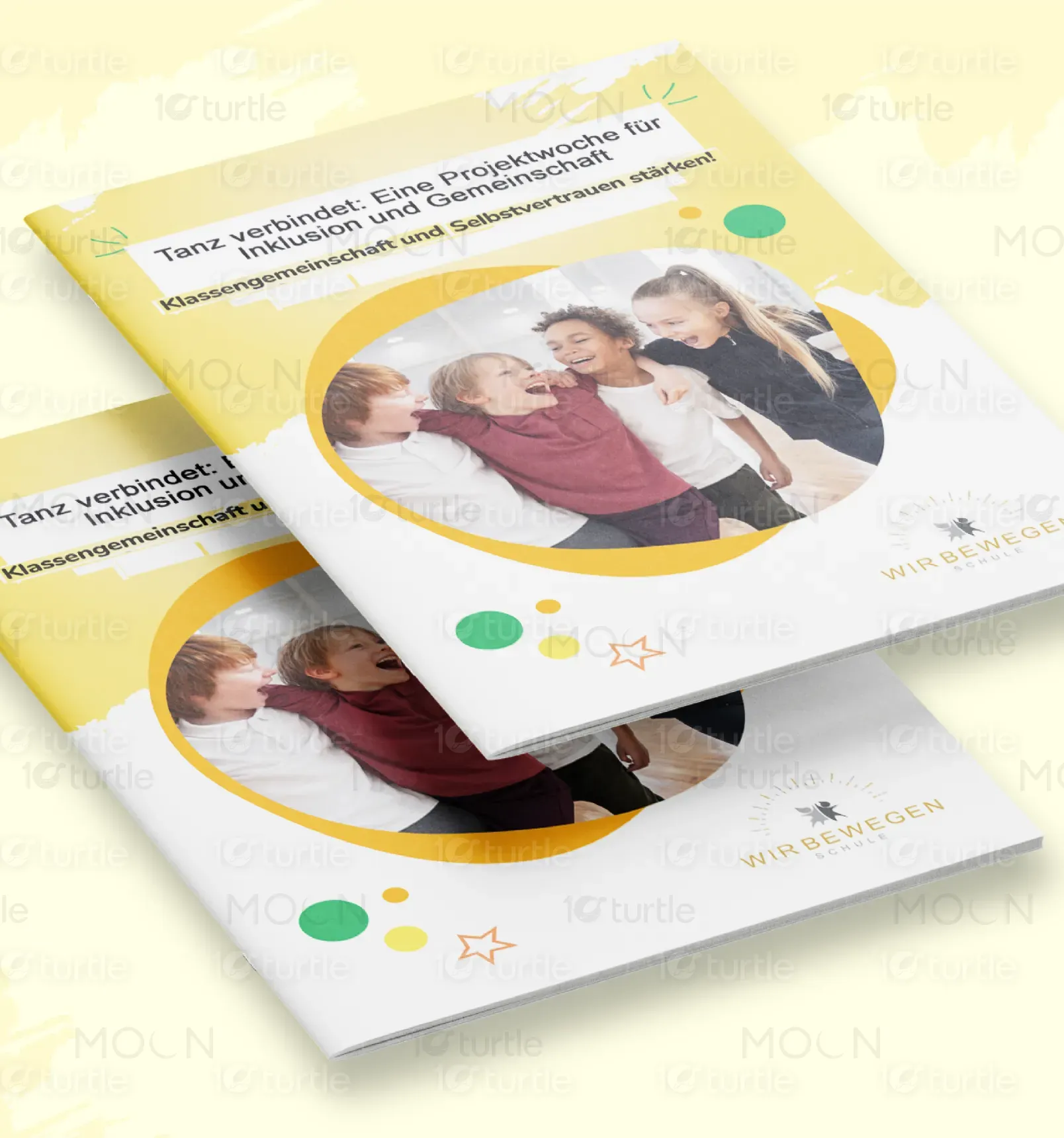
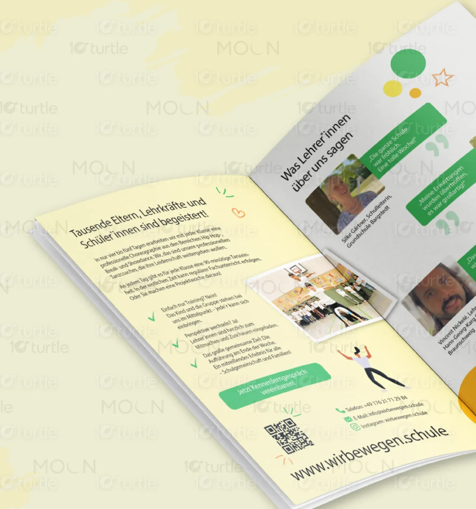
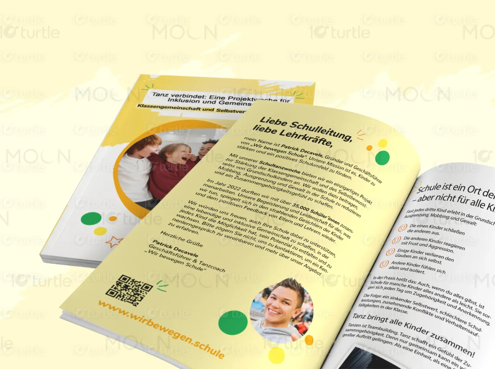
The brochure design effectively communicate the project’s themes of inclusion, teamwork, and self-expression. It should feature a visually engaging layout, combining vibrant colors, playful graphic elements, and high-quality imagery. The design should maintain a clean structure for readability while incorporating interactive features like QR codes to encourage deeper engagement. Every element should work together to inspire educators and students, fostering a sense of unity and joy.
Brochure Design
Graphic Design
Industry
Healthcare & Wellness
Tools we used



Project Completion
2024
Key Market
Global
The Tanz verbindet brochure is a carefully curated design piece that highlights the themes of unity, self-expression, and inclusion. It serves as an inspiring and engaging resource tailored for schools and educators, aiming to foster a sense of community and promote teamwork among participants. The design reflects energy and positivity through its visual elements, aligning perfectly with the core mission of the project.
Industry
Healthcare & WellnessWhat we did
Brochure DesignGraphics DesignPlatform
-The primary challenge was to create a brochure that not only communicates the essence of inclusion and teamwork but also captures attention in a visually compelling manner. It needed to stand out while remaining approachable, professional, and easily comprehensible. Additionally, balancing vibrancy with clarity was crucial to ensure the brochure appeals to both educators and students.
To address these challenges, a dynamic layout was created, integrating vibrant visual elements and high-quality imagery. A cheerful yellow background paired with playful dots and shapes evokes movement and positivity. The brochure includes well-structured sections and interactive components, such as a QR code, encouraging further engagement. This approach ensured the balance of warmth, professionalism, and creativity while delivering a message that resonates deeply with the audience.
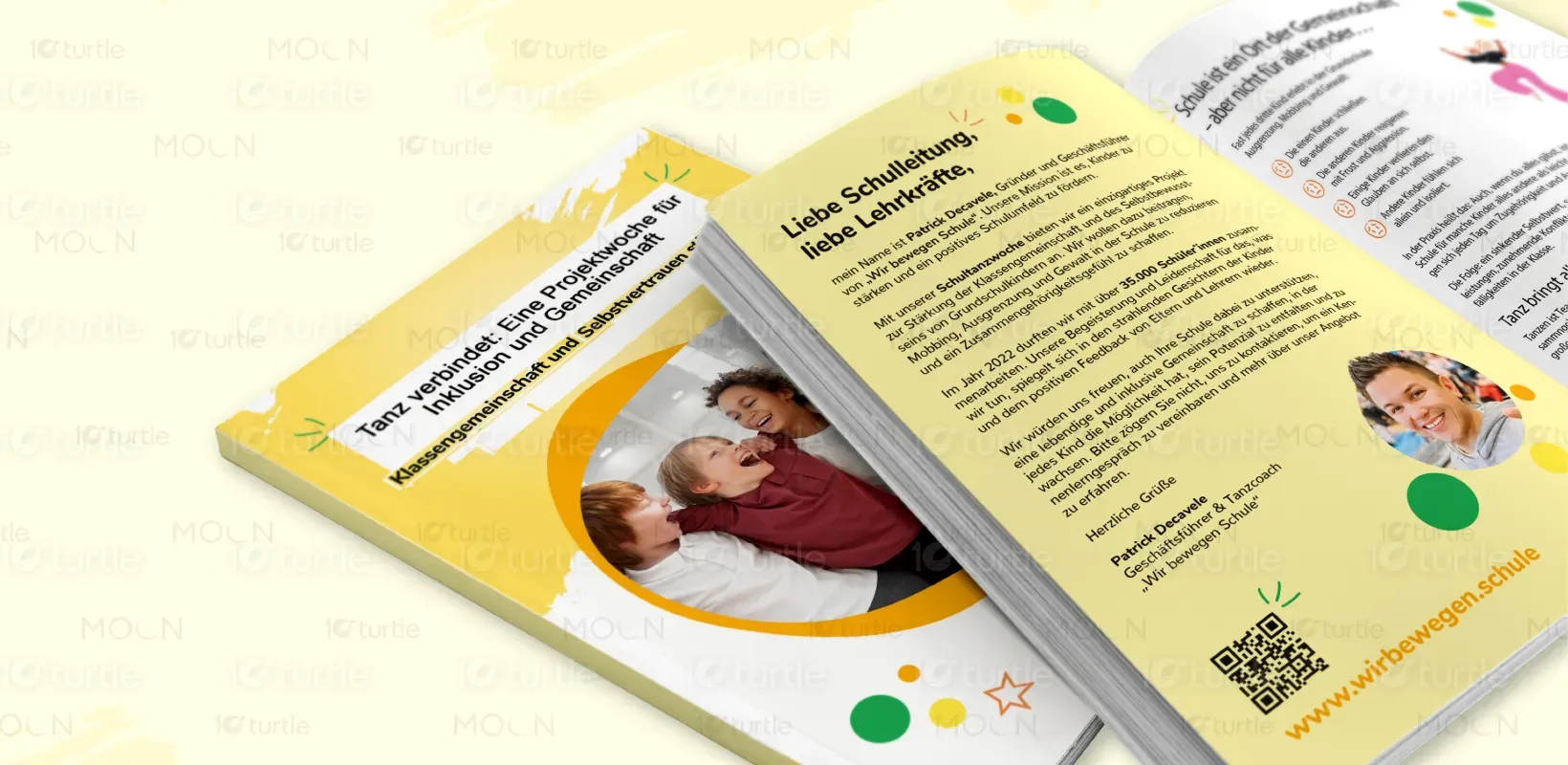
Our vision is to design a brand identity that fosters connections and celebrates diversity. The goal is to inspire educators and students alike through visually engaging materials that emphasize teamwork, self-expression, and the joy of movement. Every design element should contribute to building a positive, inclusive community.
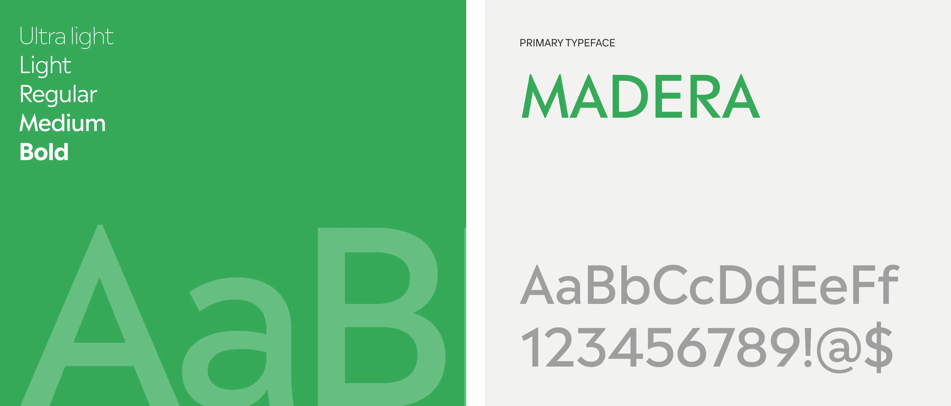
The logo should reflect the themes of connection, positivity, and creativity. Using dynamic typography with soft, rounded edges, it will convey approachability and energy. Incorporating playful shapes or abstract patterns could further enhance the sense of movement and inclusivity.
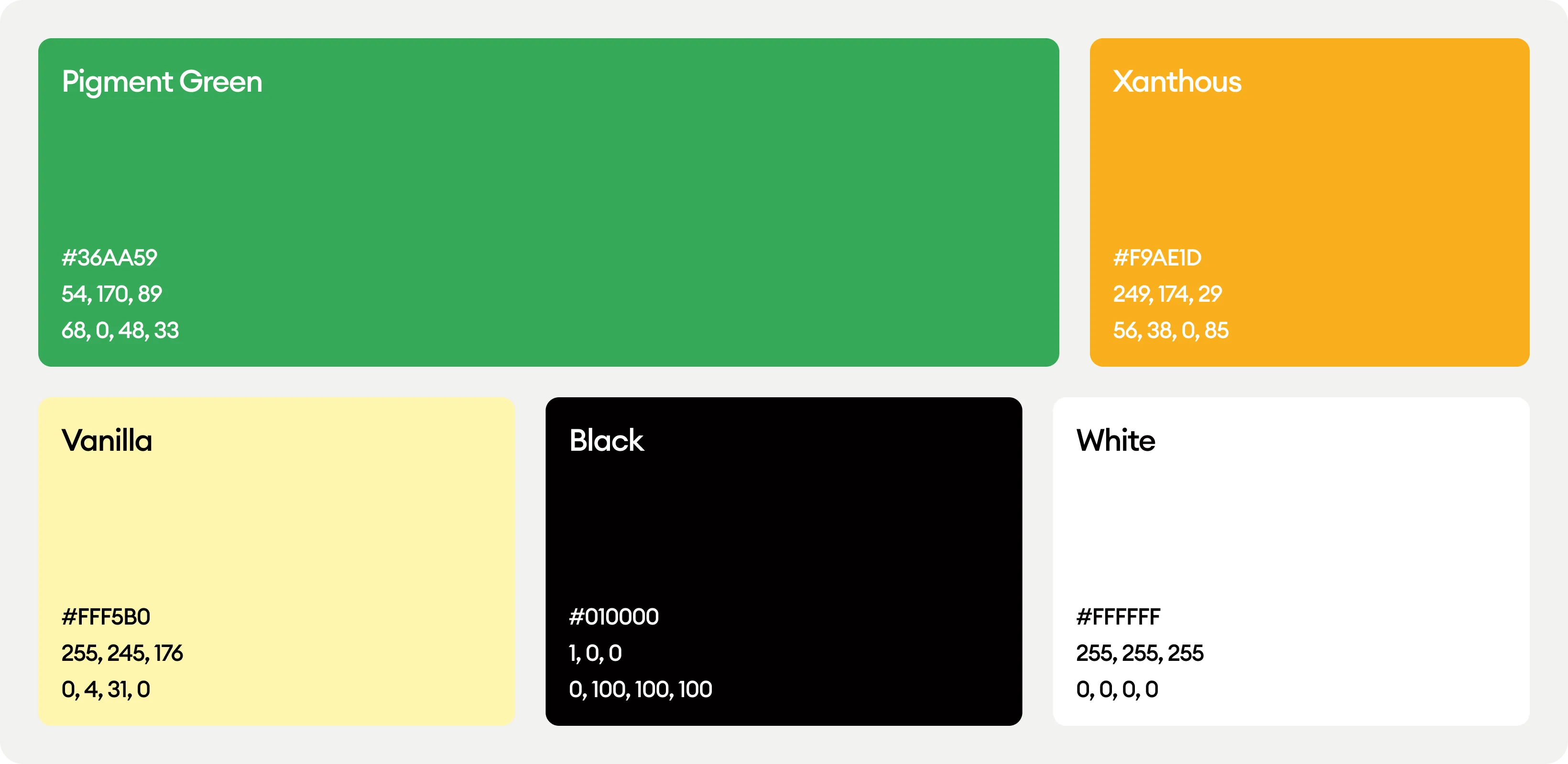
The color palette will revolve around cheerful and vibrant tones, with yellow as the dominant color to evoke positivity and energy. Complementary hues, such as blues and greens, can be used for contrast and balance. These colors will work together to convey optimism and inclusivity.
