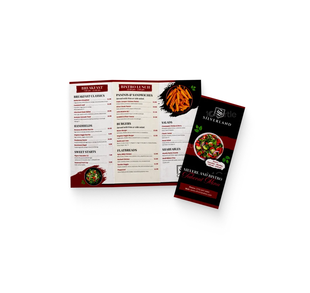
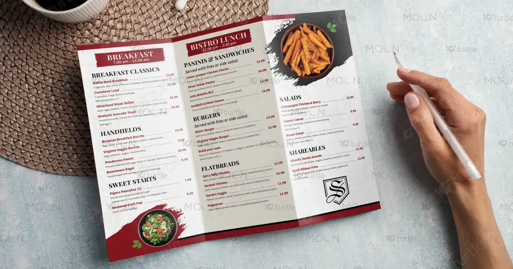
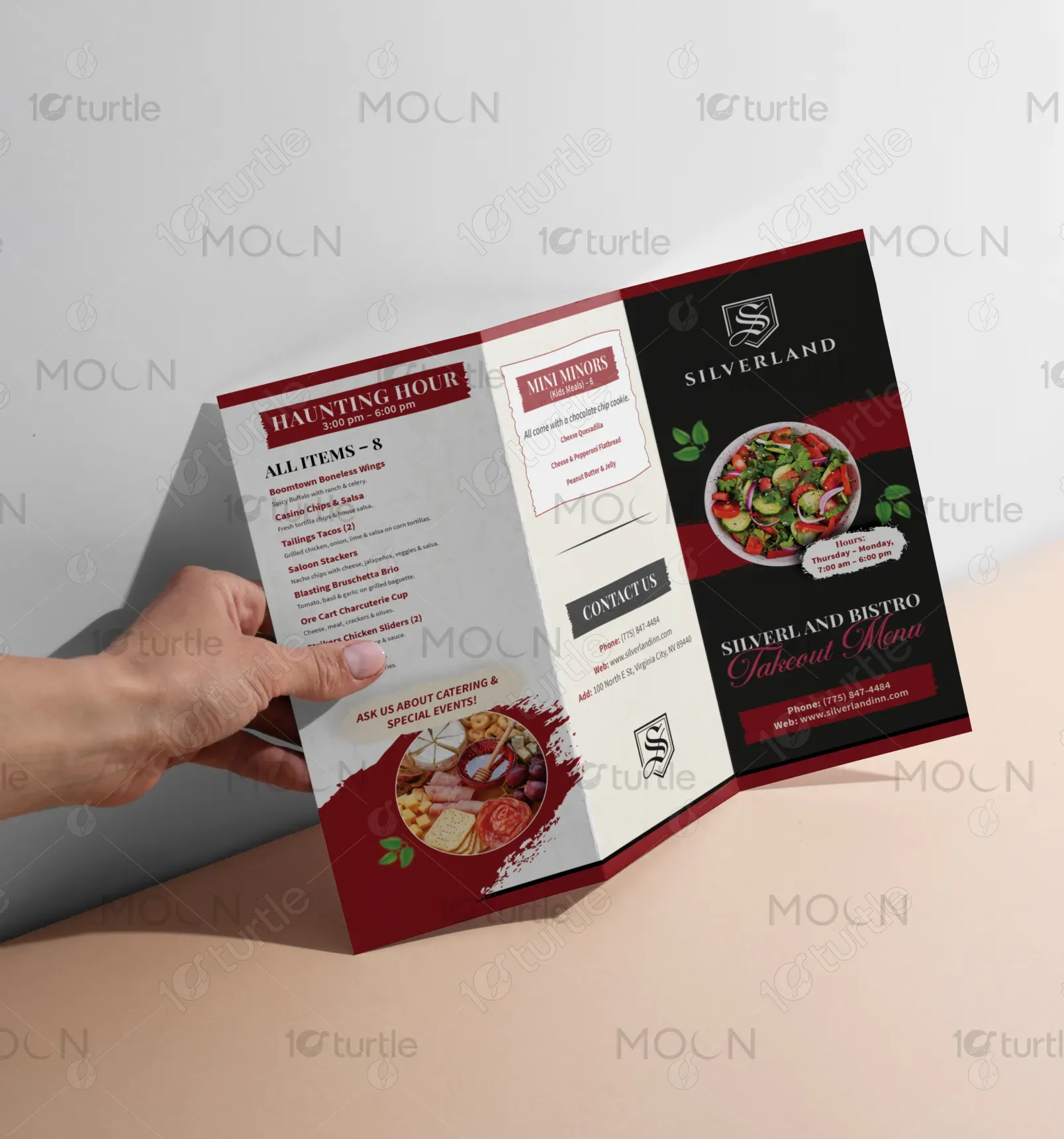
The Silverland Bistro trifold menu design embraces a rustic yet modern western aesthetic, combining earthy tones and vintage-inspired typography to evoke the historic charm of Virginia City. Carefully segmented sections with clear headers ensure ease of navigation through breakfast, lunch, and kids’ offerings. Iconic names like “Boomtown Bagel” and “Battle Born Breakfast” add local flavor and personality. The layout is both functional and stylish, delivering an immersive brand experience while keeping the focus on variety, quality, and warm hospitality.
Tri Fold Design
Graphic Design
Industry
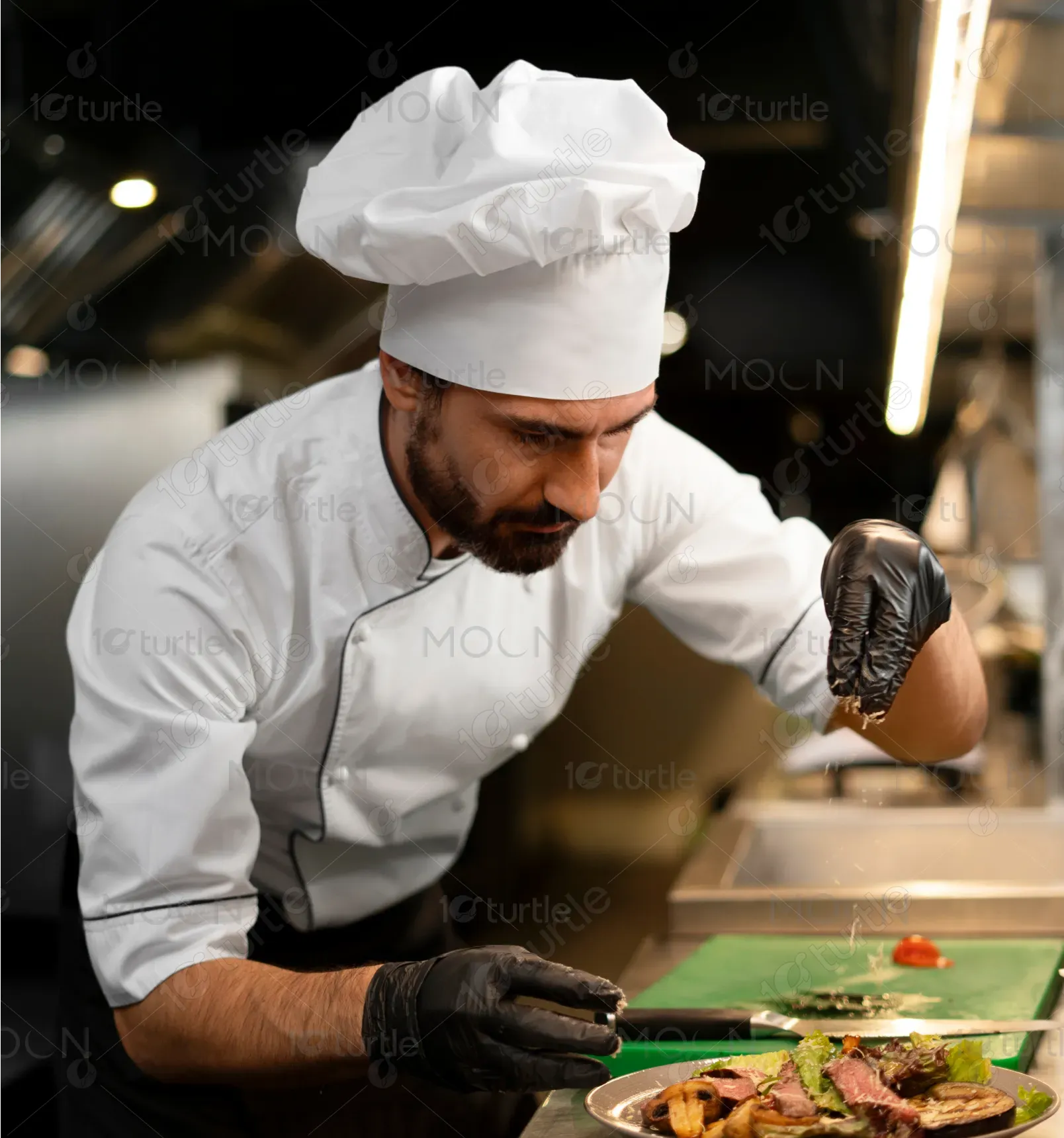
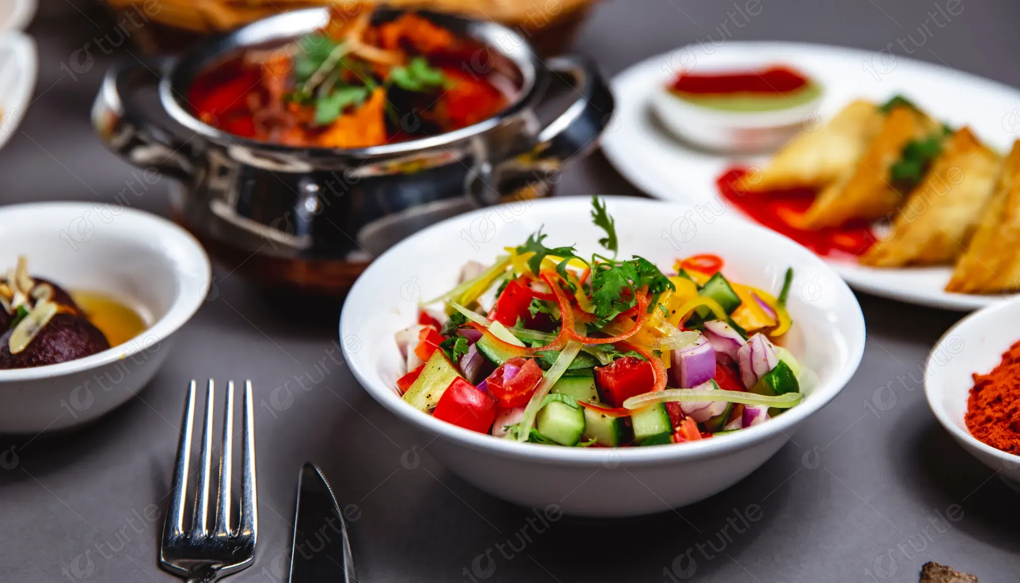
Food, Beverage & Hospitality
Tools we used


Project Completion
2025
Key Market
Global
The Silverland Bistro menu is a thoughtfully curated trifold takeout design catering to breakfast, lunch, and shareable delights, aimed at tourists and locals seeking hearty, home-style meals with a nostalgic Nevada twist. Featuring playful dish names, diverse meal options, and a section for kids, it stands out through its regional storytelling. The aesthetic blends rustic charm with clarity, reflecting the venue’s welcoming atmosphere and commitment to delicious comfort food with a local spirit.
Industry
Food, Beverage & HospitalityWhat we did
Tri Fold DesignGraphic DesignPlatform
-Menus in historic tourist locations often lack coherence, visual appeal, or user-friendliness—making it hard for visitors to quickly decide or connect with the brand. In such settings, generic menus fall short of enhancing the dining experience. Moreover, unclear categorization and cluttered layouts frequently frustrate users, especially during peak hours when time is short. A lack of personality also means missed branding opportunities in a competitive, tourism-heavy market.
The Silverland Bistro menu solves these challenges with a clean, intuitive trifold design that’s easy to read at a glance. It uses engaging section titles, concise descriptions, and appealing dish imagery (if added) to guide the reader. The design integrates playful and local-themed dish names to build emotional connection and brand memory. Clear categorization—Breakfast, Lunch, Kids, Shareables—enhances usability, while the balanced layout ensures the aesthetic aligns with both tradition and modern expectations.
Silverland Bistro aims to become a culinary landmark in Virginia City, known not only for its satisfying fare but also for capturing the essence of Old West charm. Long-term, the brand seeks to expand its presence through catering, themed events, and possibly franchise opportunities in other heritage towns. With storytelling-driven branding and consistent quality, Silverland Bistro envisions building a loyal customer base that values warmth, authenticity, and a taste of Nevada’s history on every plate.
-1766567489452.webp)
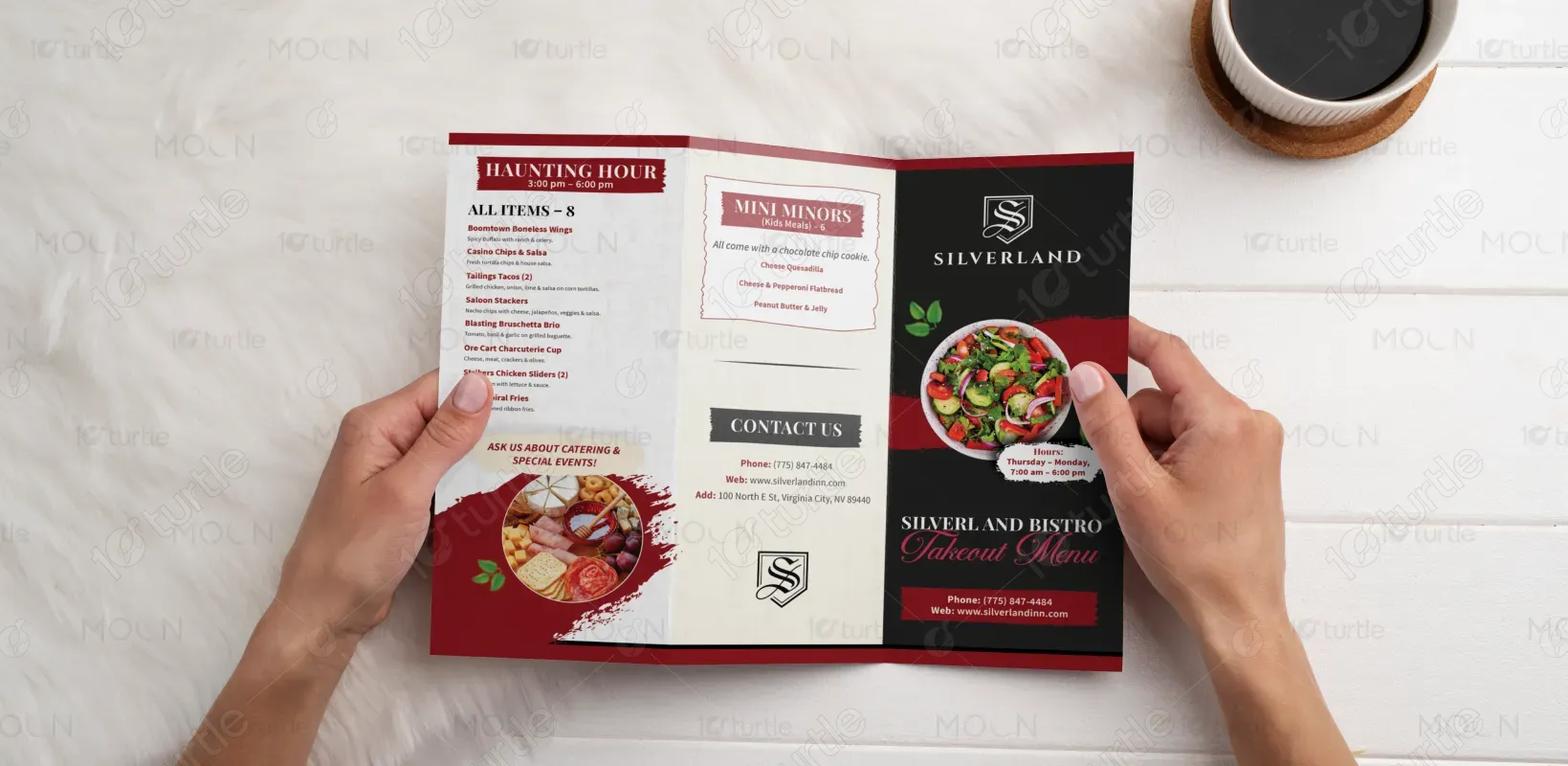
The menu’s color palette features warm, inviting tones—rich browns, muted golds, and rustic beige—echoing the woodgrain textures and vintage tones of the Old West. These hues enhance readability while reinforcing the brand’s western heritage. Accents of deep red or copper may be used to draw attention to key sections like “Haunting Hour” or “Mini Minors.” The palette not only supports visual clarity but also evokes feelings of comfort, tradition, and down-home hospitality.