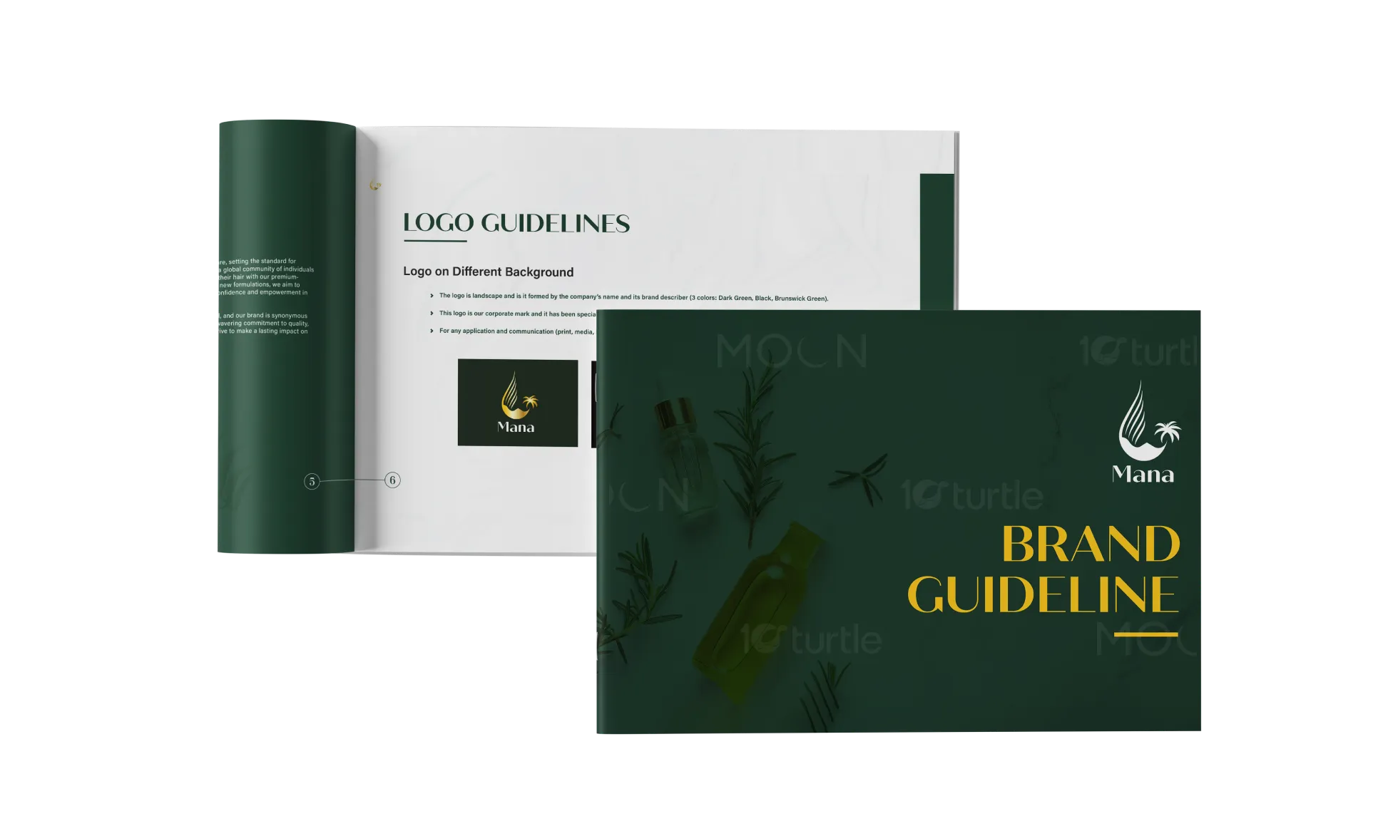
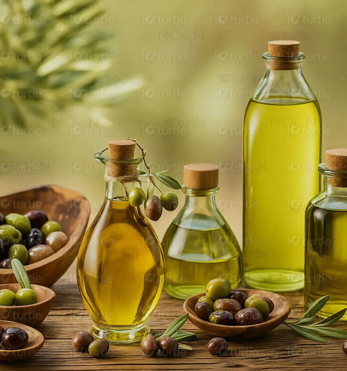
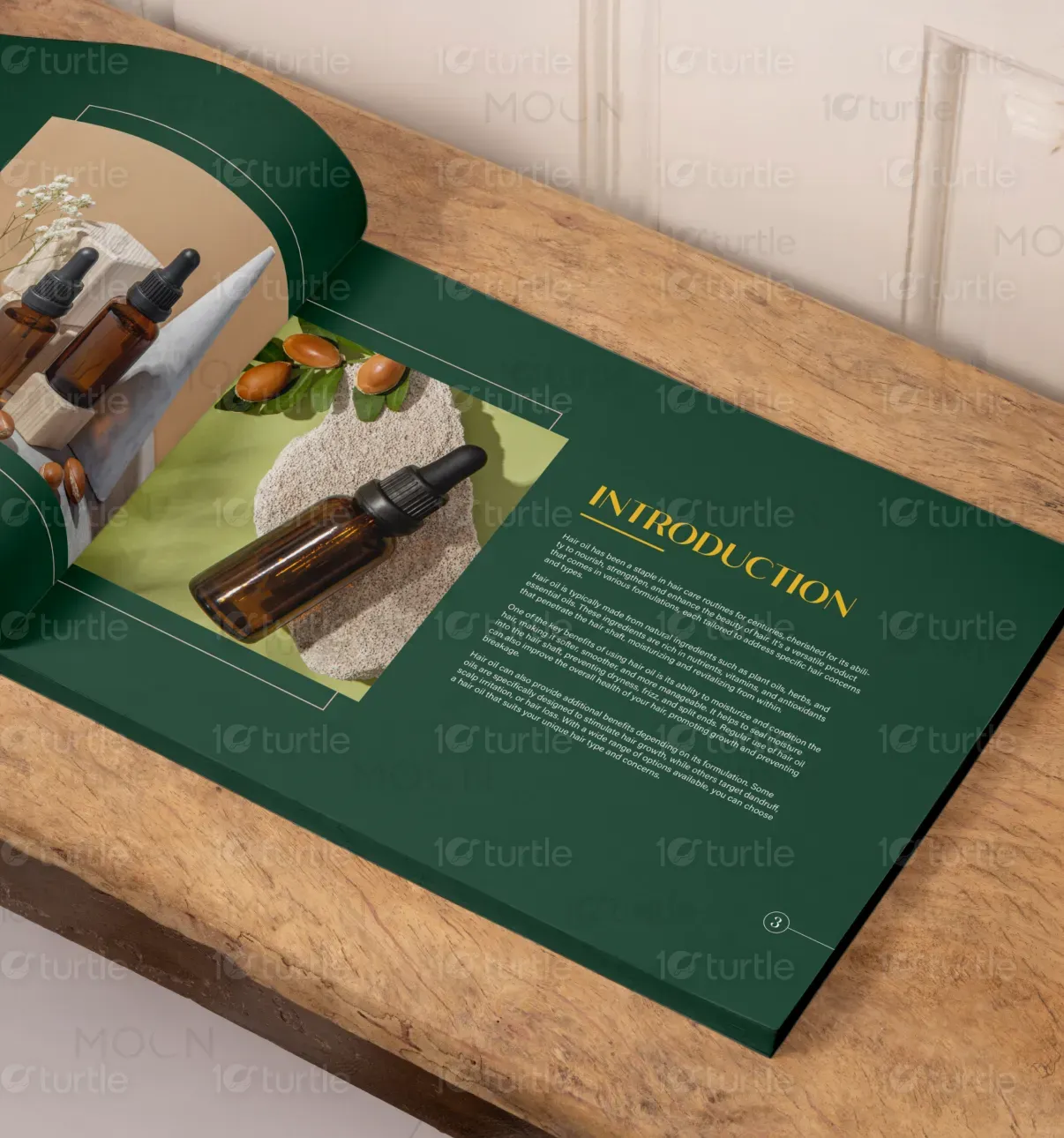
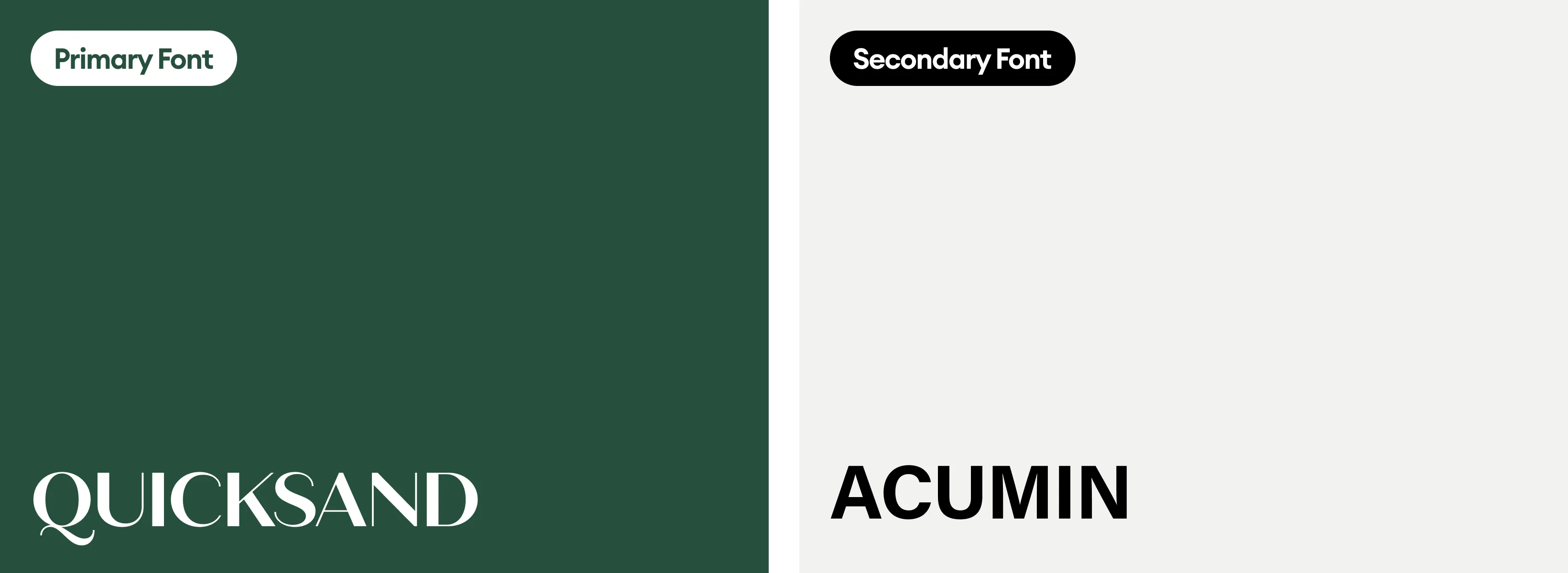
The Mana Brand Guideline employs a refined and cohesive aesthetic that reflects the brand’s natural and premium ethos. Using a balanced blend of deep greens and gold accents, the design evokes a sense of luxury, trust, and organic purity. Clean typography paired with high-quality imagery of botanical ingredients enhances clarity and engagement. The layout follows a structured grid, providing clear sections for logo usage, color palette, and typography, ensuring brand consistency across all media and touchpoints.
Graphic Design
Brand Guide Design
Industry
Healthcare & Wellness
Tools we used


Project Completion
2025
Key Market
Global
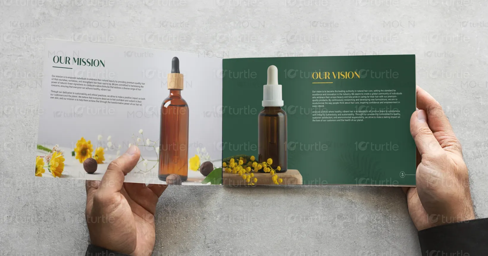
The Mana Brand Guideline serves as the foundational document to maintain brand identity coherence. It details the logo applications, color schemes, typography choices, and visual style to ensure all communications reflect the brand’s core values of natural beauty and hair care excellence. The guideline helps internal teams and external partners create consistent branding materials that resonate with the target audience seeking high-quality, natural hair care products.
Industry
Healthcare & WellnessWhat we did
Graphic DesignBrand Guide DesignPlatform
-One key challenge is preventing inconsistent brand representation, which can dilute Mana’s market presence and confuse consumers. Many emerging natural beauty brands struggle with vague or incomplete brand guidelines, leading to misaligned marketing efforts. Additionally, balancing the natural, organic feel with a luxurious appeal can be difficult, especially when the brand must appear approachable yet premium across digital and physical formats.
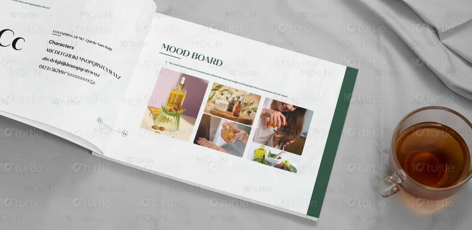
The guideline addresses these issues by establishing clear, precise rules for logo use, color variations, and typography. It uses detailed “do’s and don’ts” to guide proper logo placement and avoid common mistakes. The palette is carefully curated for versatility across mediums. This structured approach allows consistent brand portrayal, elevating consumer trust and recognition. High-quality imagery and mood boards provide inspiration for maintaining the brand’s natural yet sophisticated personality.
Mana’s brand guideline aims to evolve as the brand expands its product range and markets. The vision is to create a recognizable and trusted identity that customers associate with efficacy and natural care. Over time, these guidelines will support brand growth, enabling seamless adaptation across new campaigns, packaging, and digital platforms while preserving the brand’s authentic voice and visual harmony.

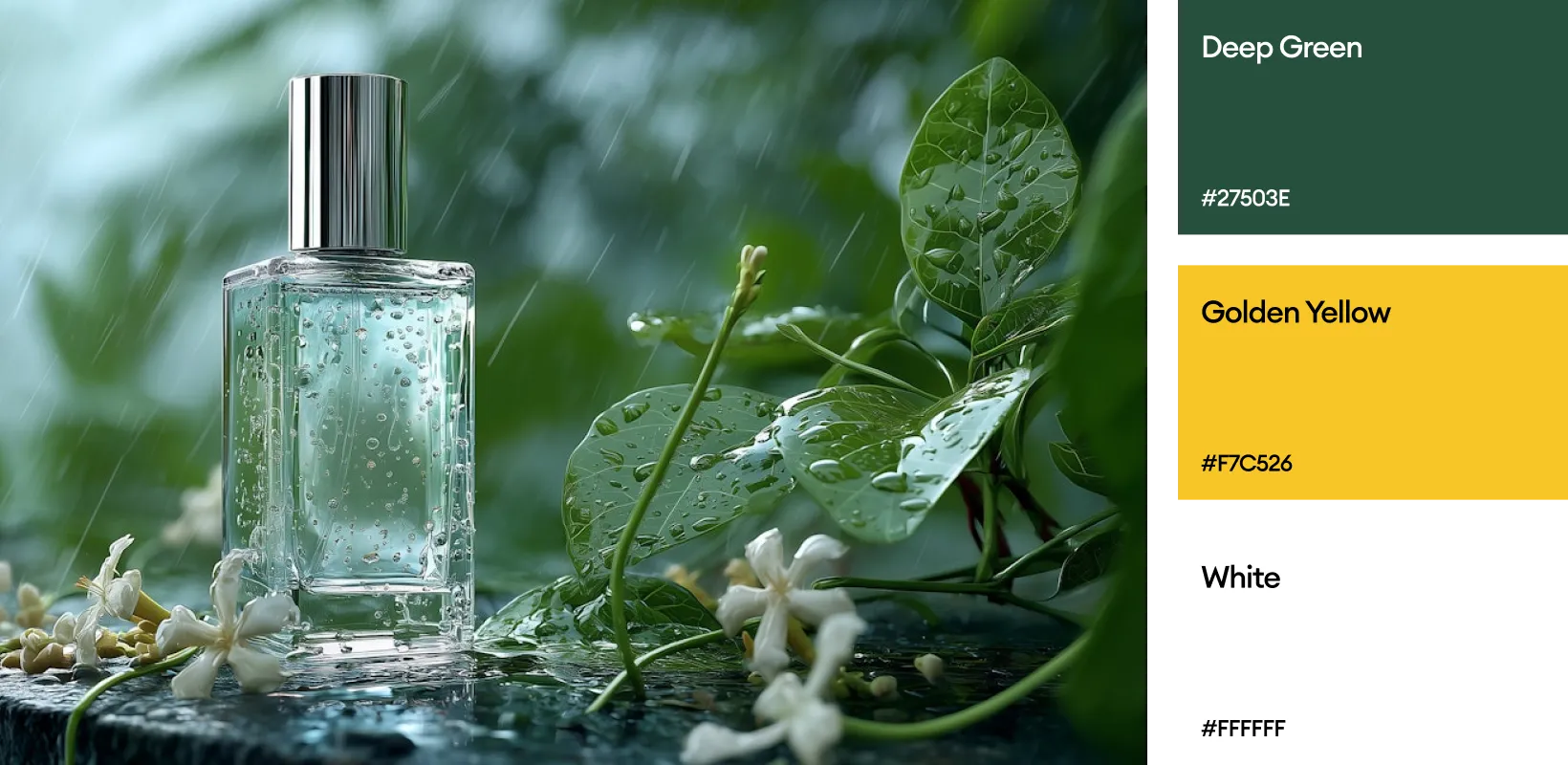
The palette features a dominant deep green (#27503e), symbolizing growth, nature, and vitality, paired with warm gold tones that evoke luxury and excellence. Complementary soft beige and off-white shades balance the vibrancy with calmness and simplicity, reinforcing the brand’s organic roots. These colors work harmoniously to convey trustworthiness, sophistication, and an eco-conscious spirit throughout the brand’s visual communications.