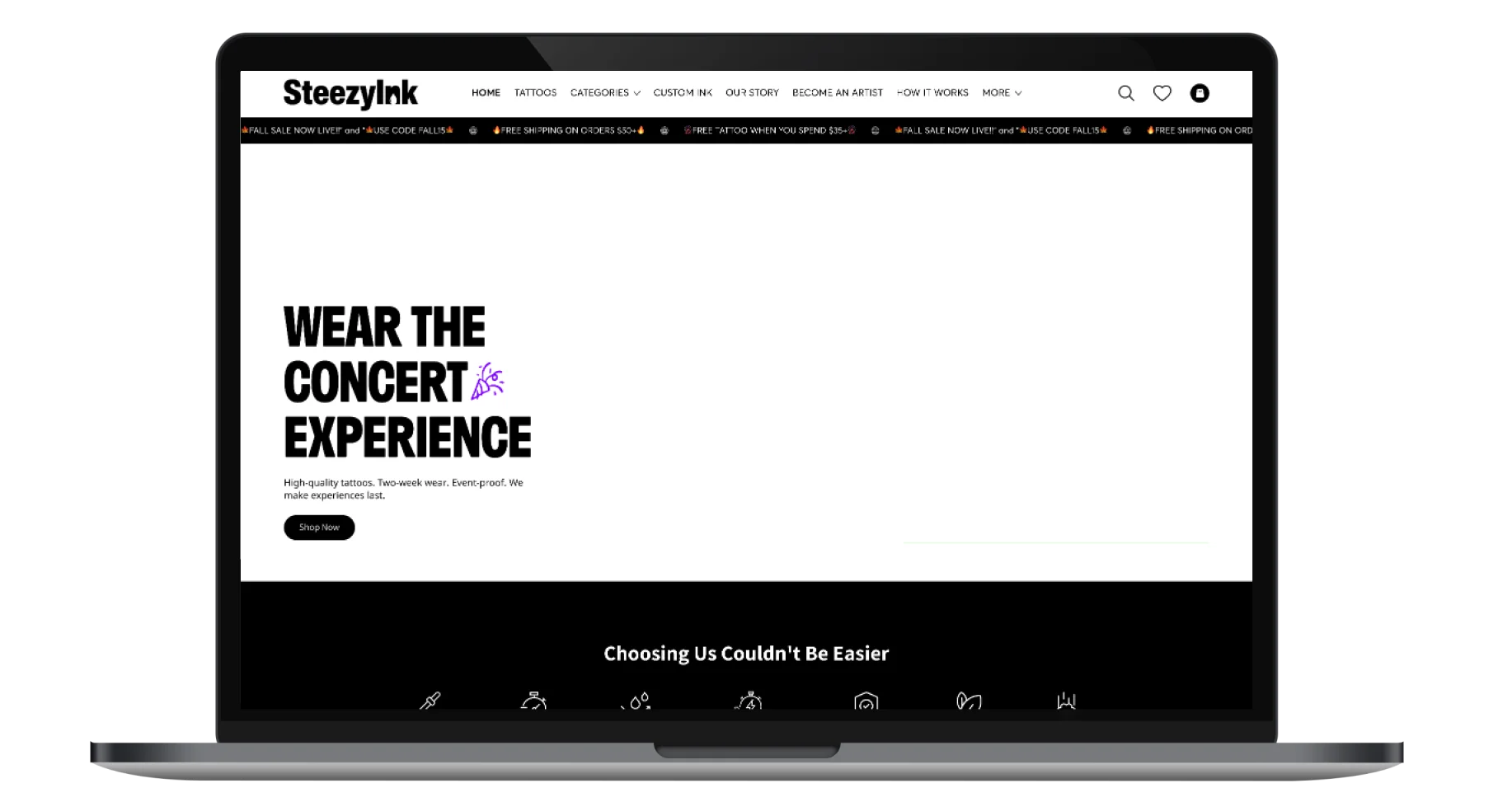
This case study details the design process behind SteezyInk, an e-commerce platform dedicated to high-quality, semi-permanent temporary tattoos. The project aimed to create a user-friendly and visually appealing experience that reflects the brand's commitment to art, self-expression, and quality. The result is a website that offers a seamless journey from discovery to application, while emphasizing the unique aspects of SteezyInk's product offering.
UX Design
UI Design
Research
Website Design
Industry
E-Commerce Website
Tools we used

Project Completion
2024
SteezyInk is an online store specializing in semi-permanent temporary tattoos designed to last up to two weeks. The brand focuses on providing high-quality, skin-safe, and aesthetically pleasing tattoos, bridging the gap between short-lived novelty tattoos and long-term permanent ones. The website serves as the primary platform for browsing, selecting, and purchasing tattoos, while also communicating the brand's values and unique selling propositions. The project aims to cater to a target audience that appreciates art, self-expression, and the temporary nature of fashion and trends.
Industry
E-Commerce WebsiteWhat we did
User ResearchUI UX DesigningProduct Experience StrategyPlatform
E-CommerceExisting temporary tattoo options often lack quality and aesthetic appeal. There's a need for a platform showcasing diverse, high-quality, safe temporary tattoo designs, combined with a trustworthy e-commerce experience. The primary challenge was creating a site that communicates SteezyInk’s quality, safety, and ease-of-use.
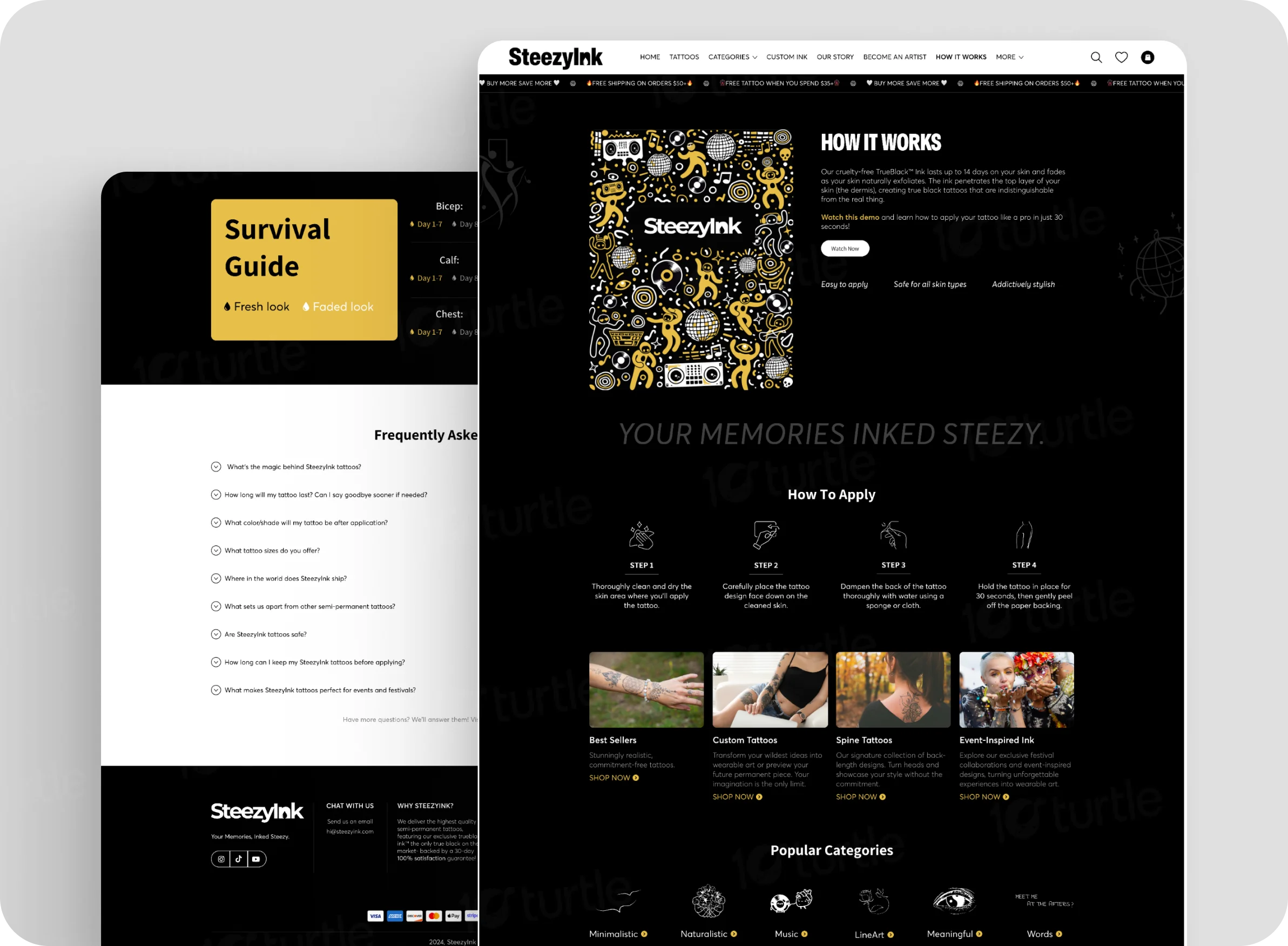
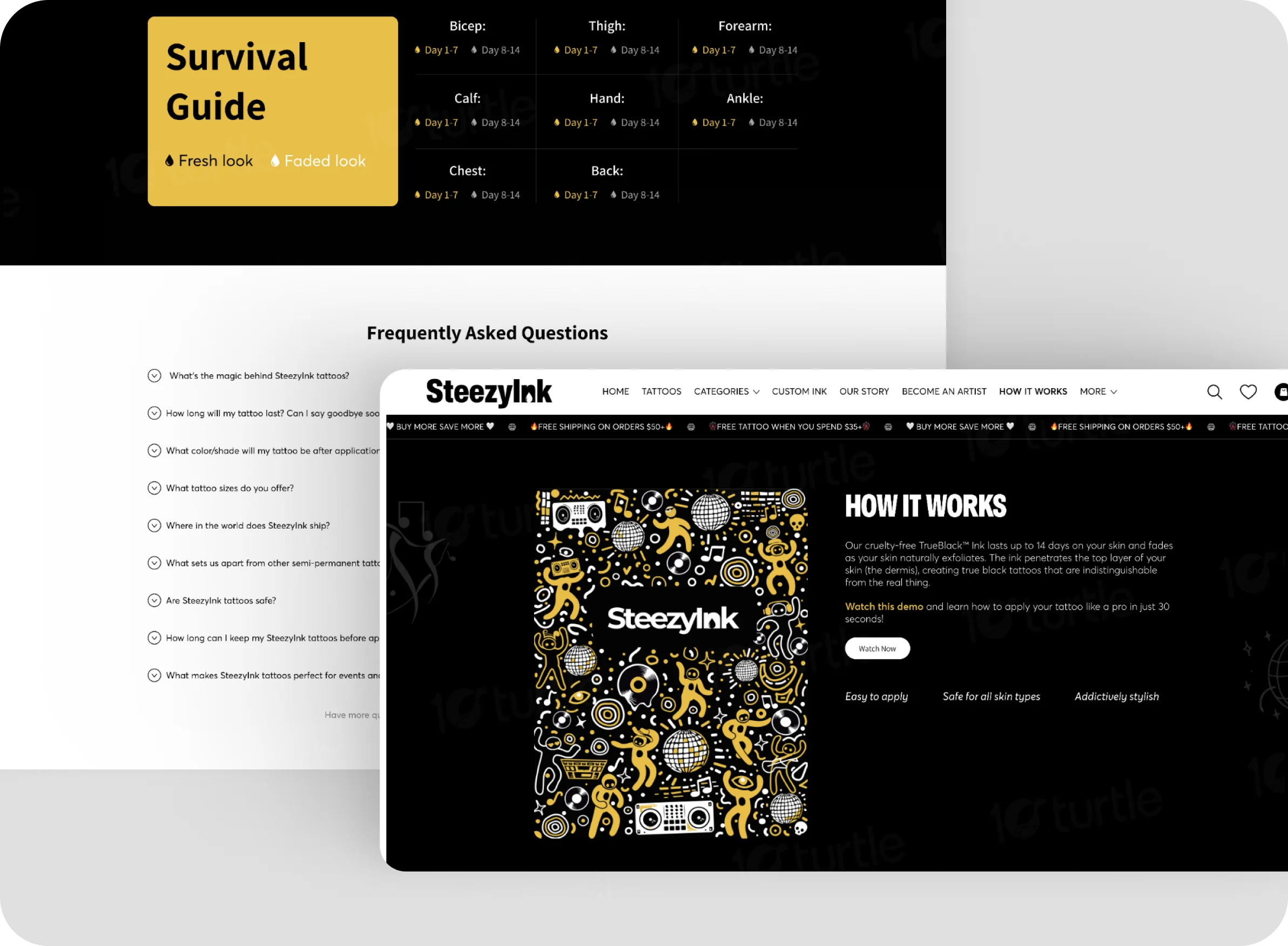
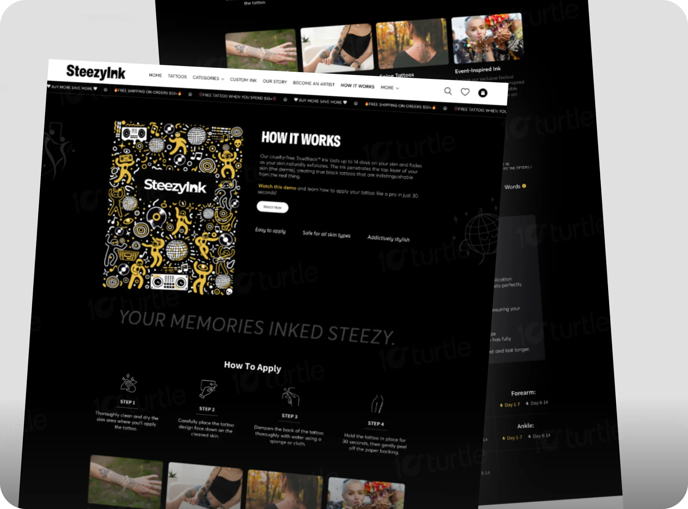
The solution was a visually engaging, robust e-commerce website. It features clear navigation, rich imagery, and informative content. It highlights SteezyInk’s unique, plant-based ink, and provides a smooth path to purchase. The site offers application instructions and an FAQ section, ensuring a positive customer journey.
The client sought a modern, bold, and edgy brand that appealed to a creative audience. The site needed to reflect the tattoos’ vibrant art and convey professionalism. The aesthetic leaned toward clean, minimalist design. The goal was a balance between sleek interface and an engaging user experience.
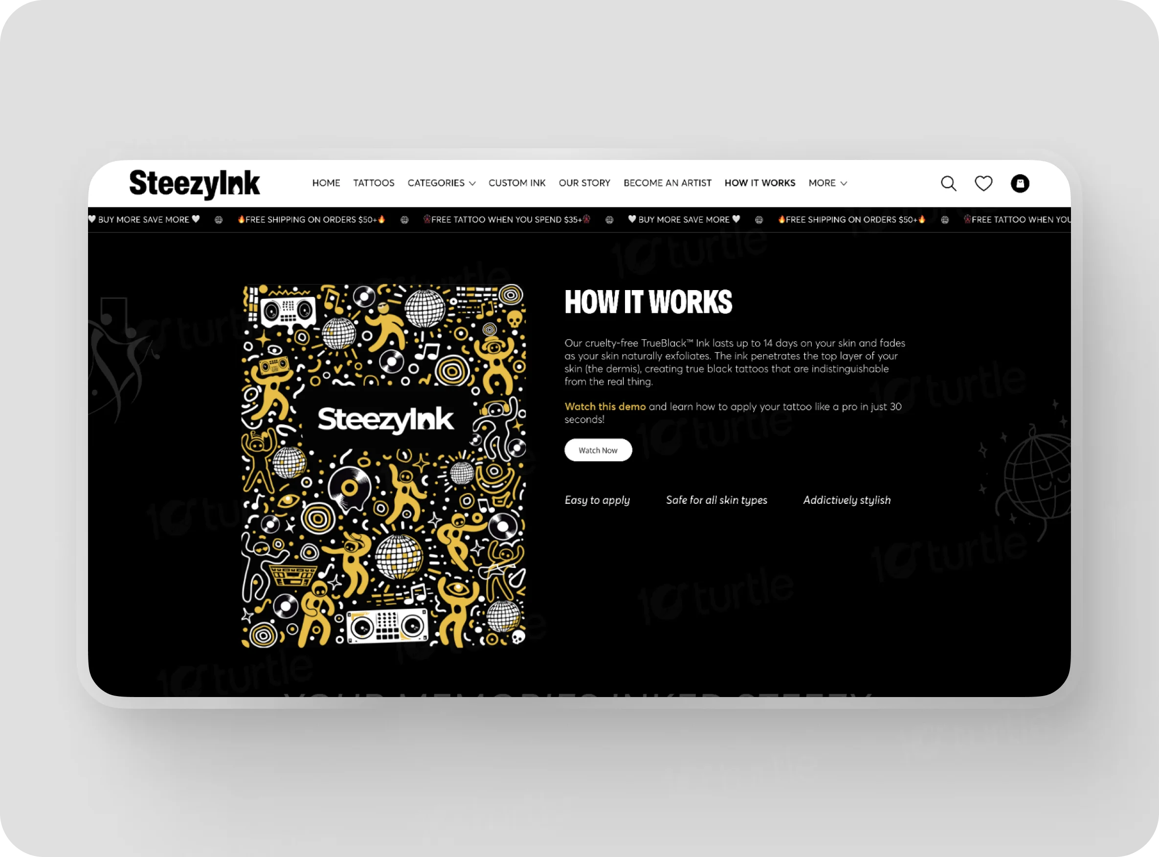
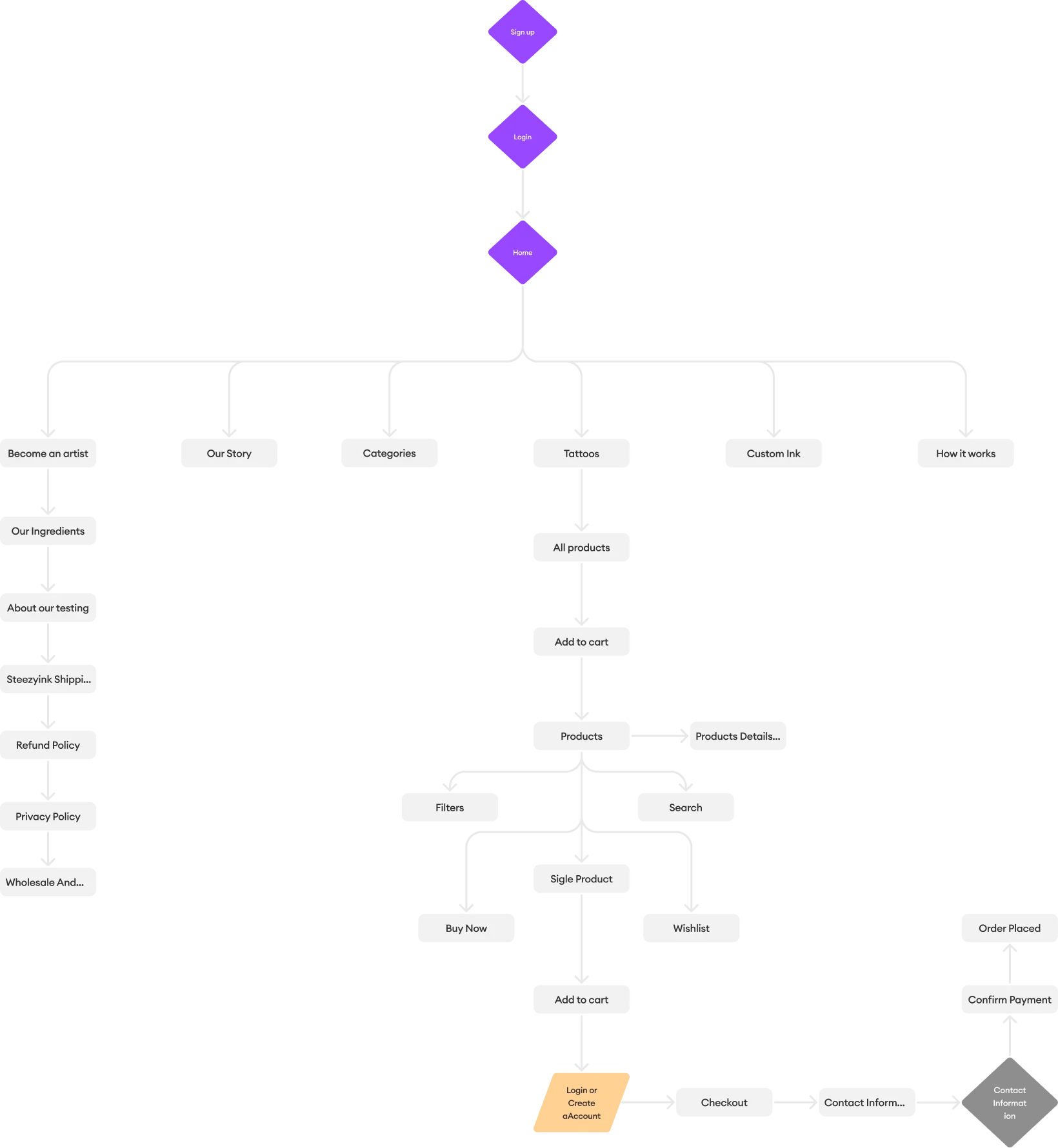
The user flow is intuitive. Users land on the homepage and can browse categories or collections. Product pages show details and purchase options. The cart and checkout are simple. Informational pages (FAQ, About Us) are accessible.
The SteezyInk logo is a clean, modern wordmark featuring the brand name in a bold, sans-serif typeface. The design is simple yet impactful, intended to be versatile and memorable, and is easily recognizable on various platforms. A unique element is the small droplet within the 'i' which suggests the ink used in their tattoos.
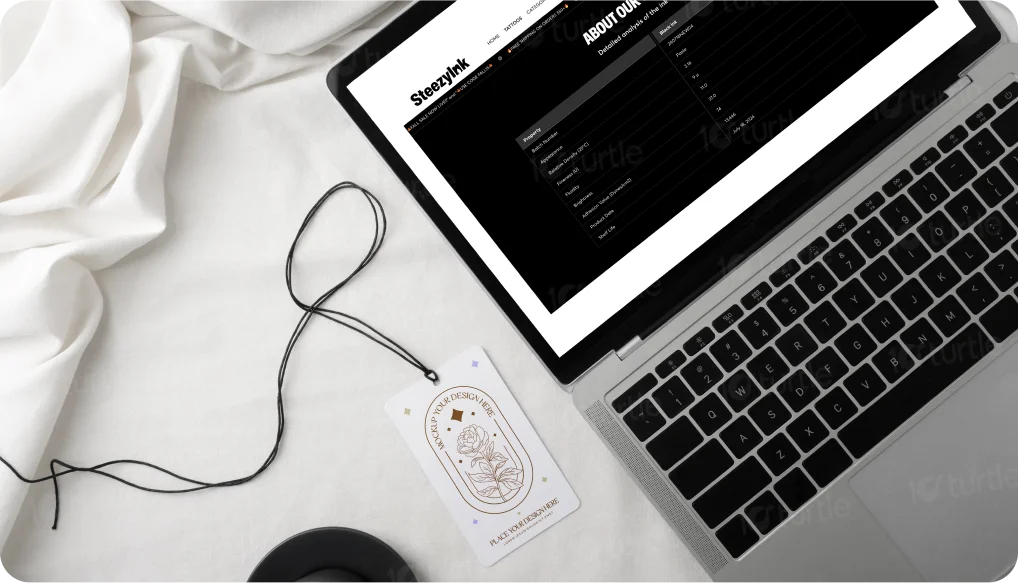
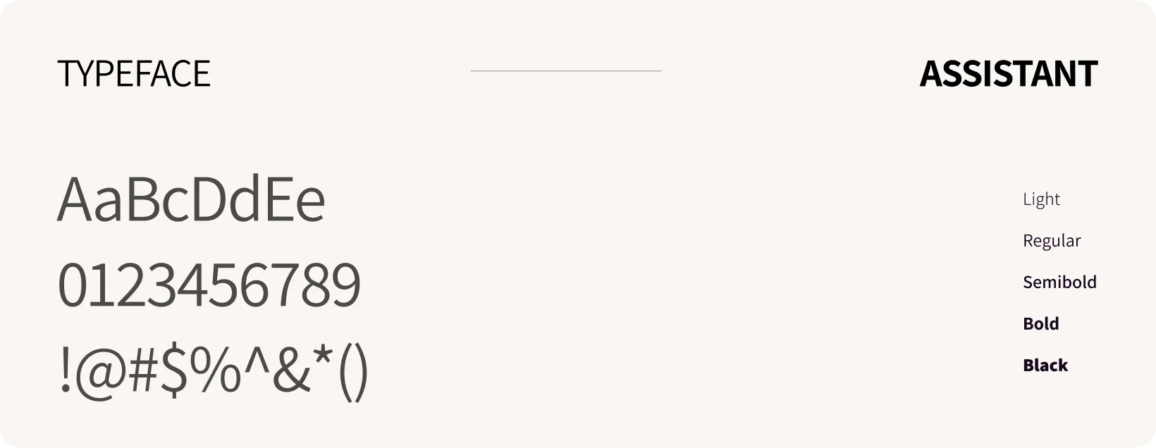
The website uses Assistant, a clean and modern sans-serif font designed for optimal readability and functionality. Its minimalist letterforms provide a fresh and approachable look, making it ideal for both headings and body text. The font's versatile weights allow for clear emphasis on key elements while maintaining a consistent and professional tone throughout the site. This choice ensures a seamless reading experience, aligning perfectly with the website's user-friendly and contemporary design.
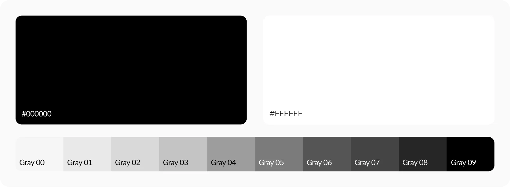
The SteezyInk color palette combines vibrant and artistic tones to create a bold and expressive aesthetic. The lively green (#B5CD49) symbolizes growth and creativity, reflecting the spirit of self-expression. The bright yellow (#F7D70C) introduces energy and vibrancy, highlighting innovation and playfulness. The deep purple (#652F85) adds a touch of sophistication and artistic flair, aligning with the brand's commitment to quality. The sleek black (#000000) provides a strong foundation, ensuring clarity and focus, while the clean white (#FFFFFF) balances the design with a modern and user-friendly feel. Together, these colors deliver a visually engaging experience that celebrates individuality and artistic freedom.
The wireframe was designed with a mobile-first approach, prioritizing a responsive design that adapts to various screen sizes. The structure of the wireframe focuses on a clear hierarchy, with navigation menus at the top, content blocks divided into logical sections, and product listings prominently displayed.
