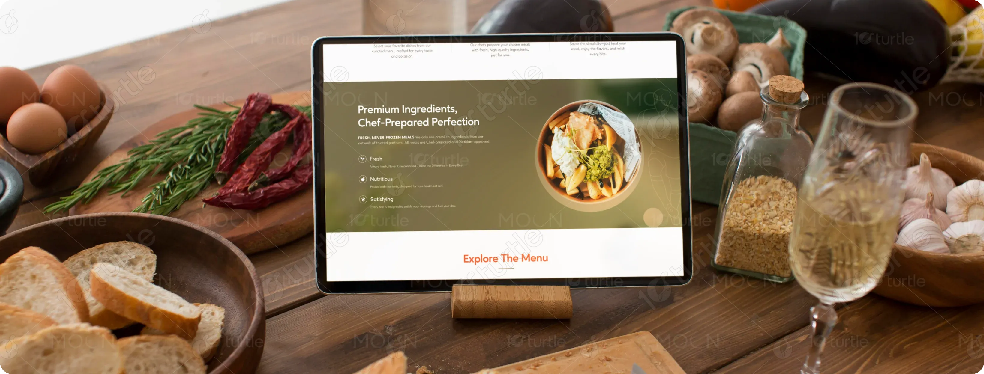
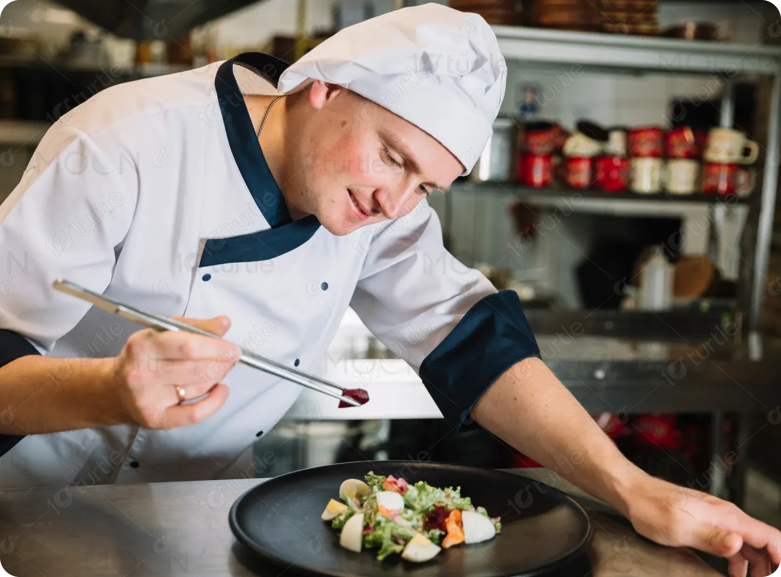
Football Kitchen offers fresh, never-frozen meals crafted by expert chefs. Designed for convenience without compromising taste, the service provides restaurant-quality dishes delivered straight to customers' homes.
UX Design
UI Design
Websites Design
Industry
Food, Beverage & Hospitality
Tools we used

Project Completion
2024
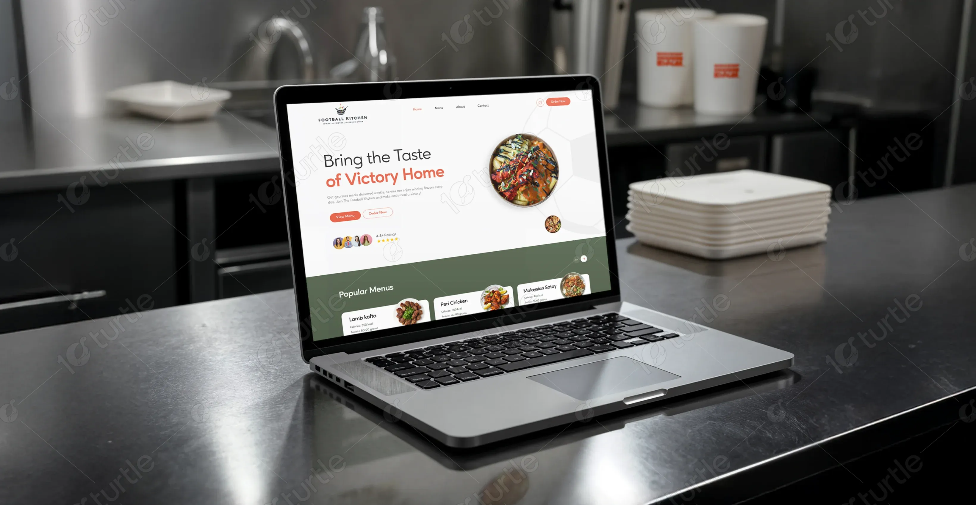
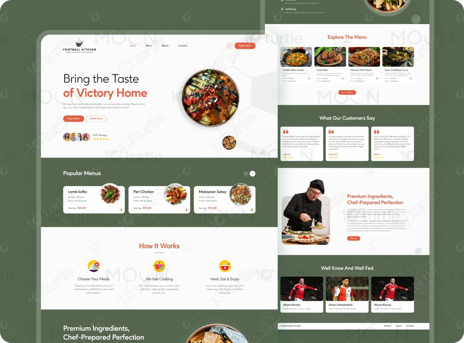
The project aimed to create an engaging website that reflects the fusion of football culture and gourmet cuisine. The main focus was to provide a seamless user experience for browsing and ordering meals while effectively communicating the freshness and quality of ingredients. A major challenge was balancing a sporty and gourmet aesthetic within the UI while ensuring a smooth ordering process that encourages engagement. Differentiating the brand from other meal delivery services was another key factor in the design approach.

Industry
Food, Beverage & HospitalityWhat we did
User ResearchUI UX DesigningPlatform
-Football Kitchen needed a website that effectively showcased its unique identity—blending the energy of football with the sophistication of fine dining. The challenge was to design an interface that was both visually appealing and highly functional for browsing menus and placing orders.
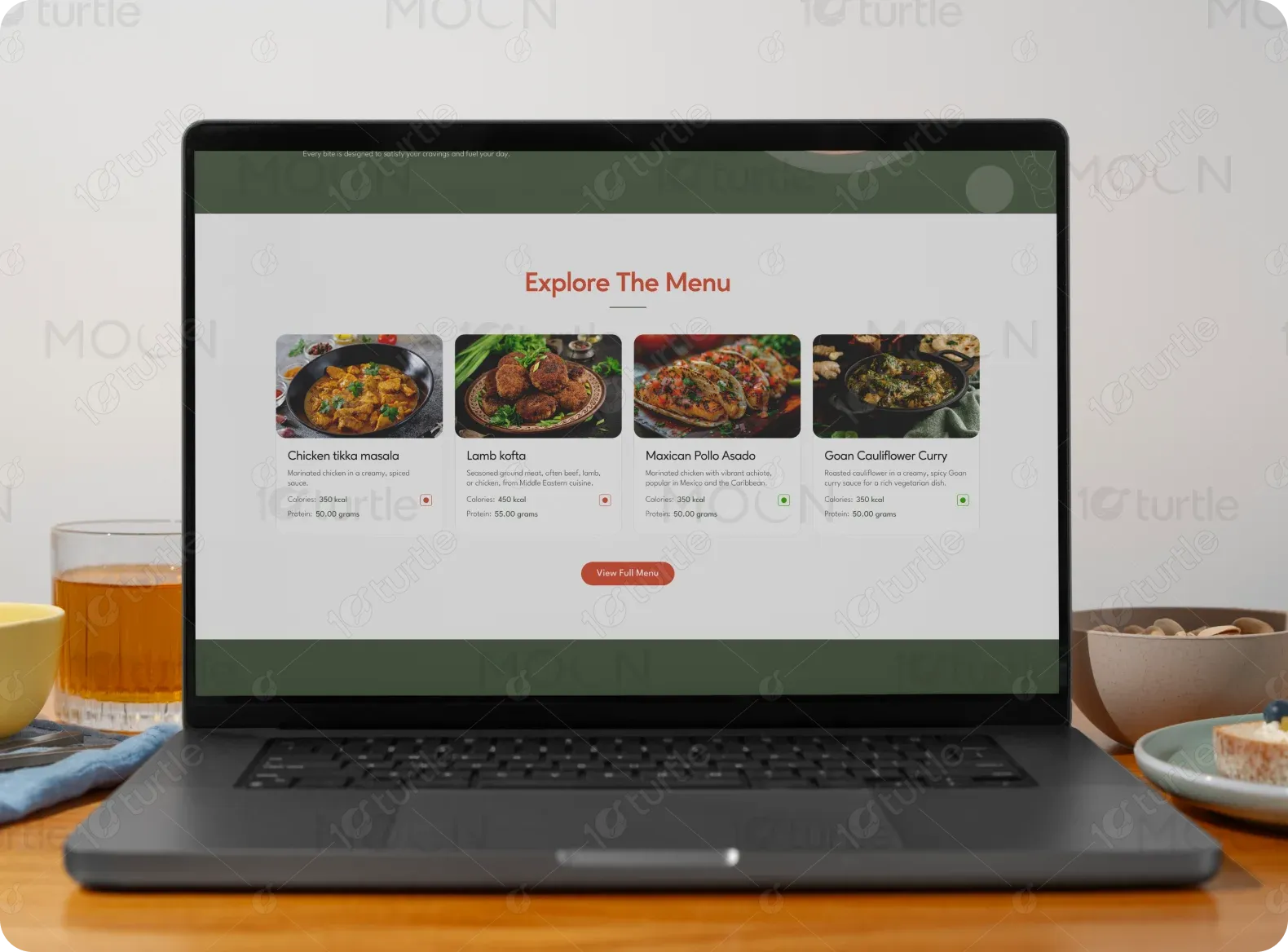
A bold, modern design was implemented to combine sports-inspired elements with elegant typography and visuals. The structured meal display made it easy to explore popular dishes. A streamlined ordering system ensured a smooth checkout experience, while engaging sections like customer testimonials and chef insights helped build credibility.
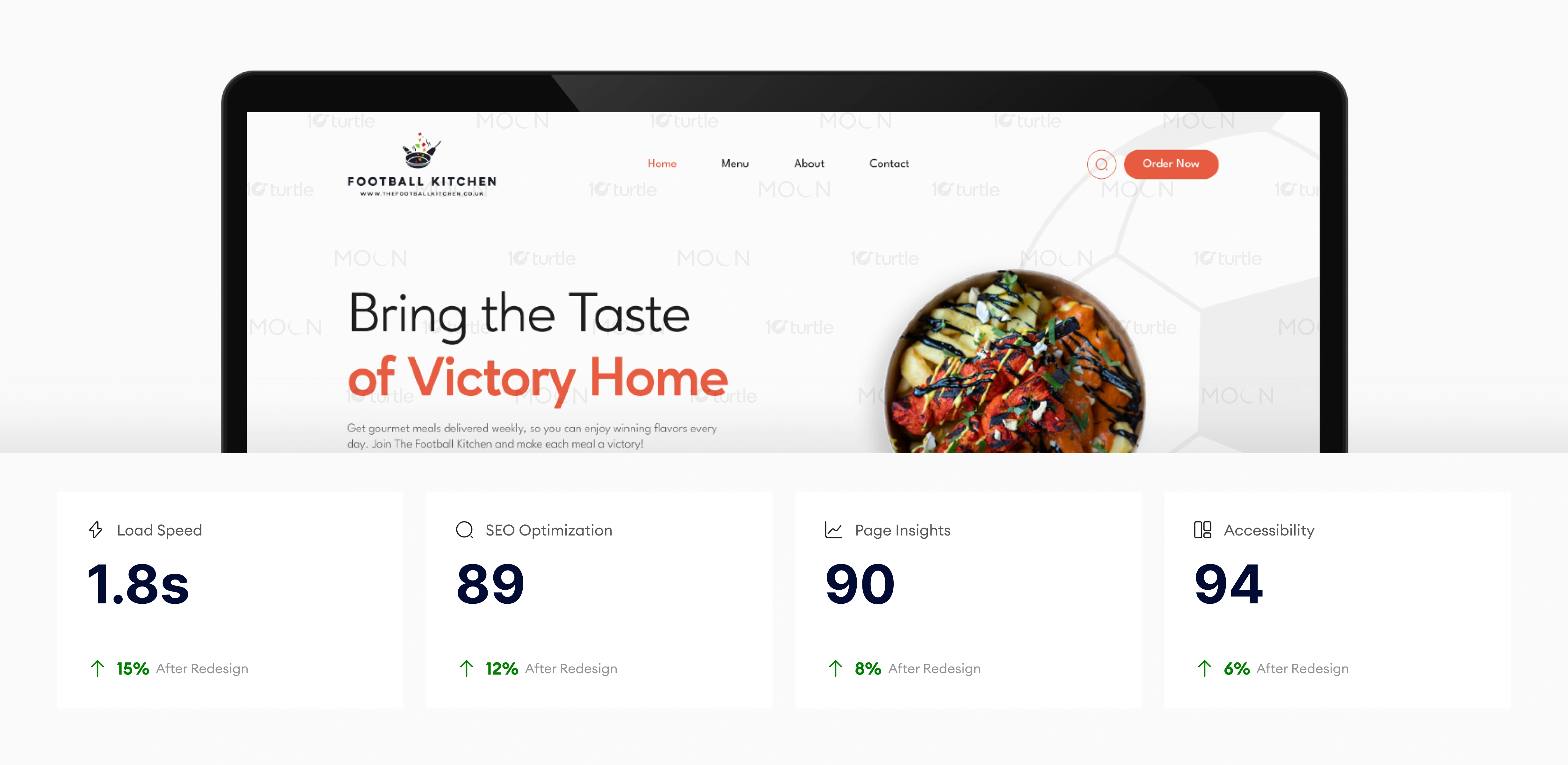
The design’s optimizations in load speed, SEO, and accessibility provide a faster, more engaging user experience. The higher page insights score reflects positive user engagement, while accessibility improvements ensure a smoother experience for all users. These factors together enhance the site’s overall effectiveness and user interaction, leading to higher conversions.
The client wanted a dynamic, sports-inspired yet premium aesthetic that would appeal to both food lovers and football fans. Vibrant imagery of high-quality meals, minimal yet bold typography, and a green and orange color palette symbolizing freshness and energy were key design elements. A clean, intuitive layout enhanced usability and made navigation effortless.
The Football Kitchen logo integrates a chef’s hat with a football, symbolizing the blend of sports and gourmet dining. It reinforces the brand’s identity and creates a strong visual association.
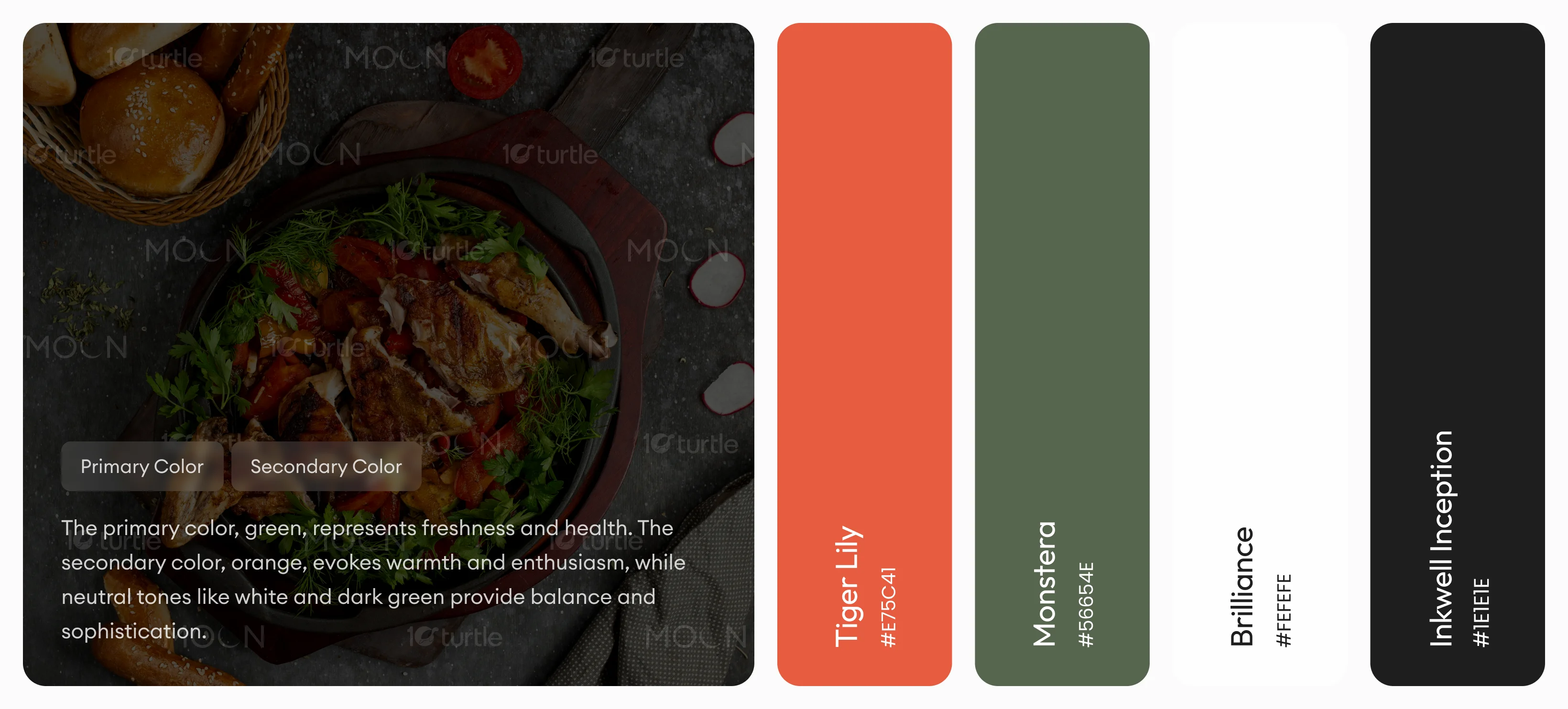
The brand’s color scheme is carefully chosen to reflect sophistication, modernity, and trust. Primary Color – #E75C41: Represents trust, reliability, and professionalism, reinforcing the brand’s credibility. Secondary Color – #56654E: Ensures a clean and minimal aesthetic, creating contrast for readability and elegance. Accent Color – #1E1E1E (Deep Black): Adds a premium and bold touch, enhancing the luxury feel of the brand.
Initial wireframes focused on a clear hierarchy of content and intuitive navigation. The layout highlights meals effectively, ensures mobile responsiveness, and maintains a smooth flow from product discovery to checkout.