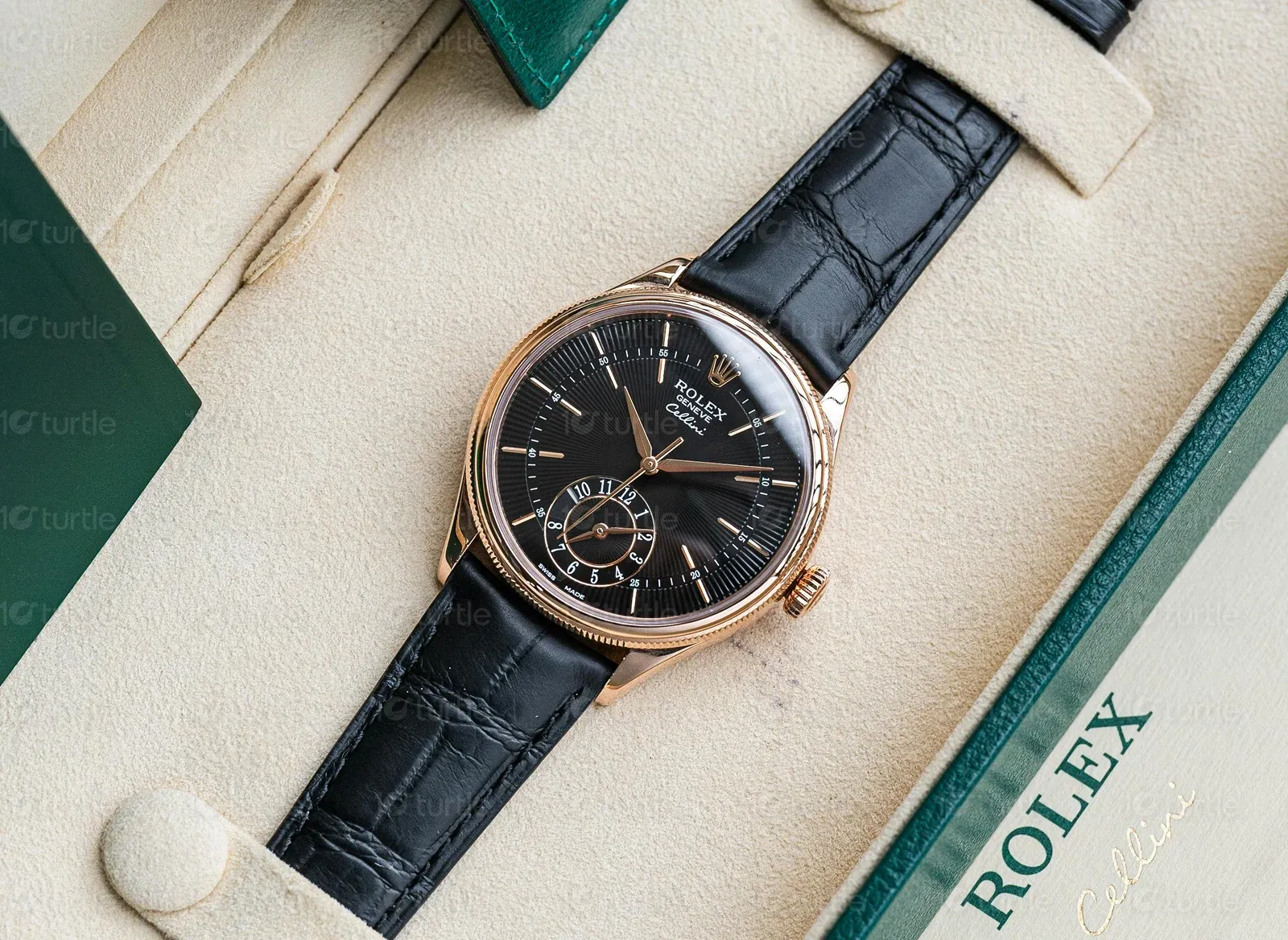
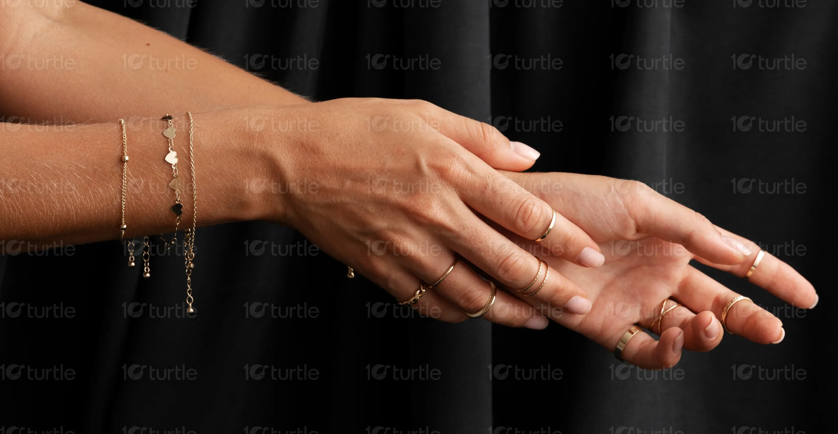
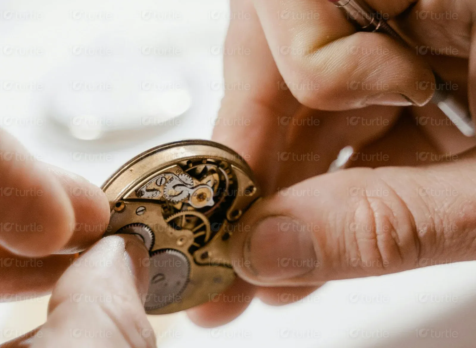
Statement Watches and Jewelry is a premium retailer specializing in luxury watches and fine jewelry, with a strong focus on preowned Rolex pieces. The brand is grounded in quality, heritage, and personalized service, offering everything from consultations to repair and resale.
UX Design
UI Design
Research
Websites Design

Industry
E-Commerce
Tools we used


Project Completion
2024
The project aimed to establish a professional, elegant digital presence that mirrors the brand’s luxury offerings. The client needed a holding page that would later evolve into a full-fledged eCommerce platform.

Industry
E-CommerceWhat we did
User ResearchUI UX DesigningPlatform
-The brand had no existing online footprint, which posed challenges in reaching new audiences and validating their premium positioning. Additionally, given the competitive nature of the luxury resale market, a distinctive and credible digital experience was essential from the start.
We designed a visually compelling and structurally sound landing page focused on building trust, highlighting key services, and offering a teaser into the product range. Key features included:
The client wanted a luxurious, minimalist design inspired by premium watch and jewelry brands, with a focus on high-quality visuals, a neutral color palette, and a layout that feels like a boutique showroom — elegant, professional, and product-driven.


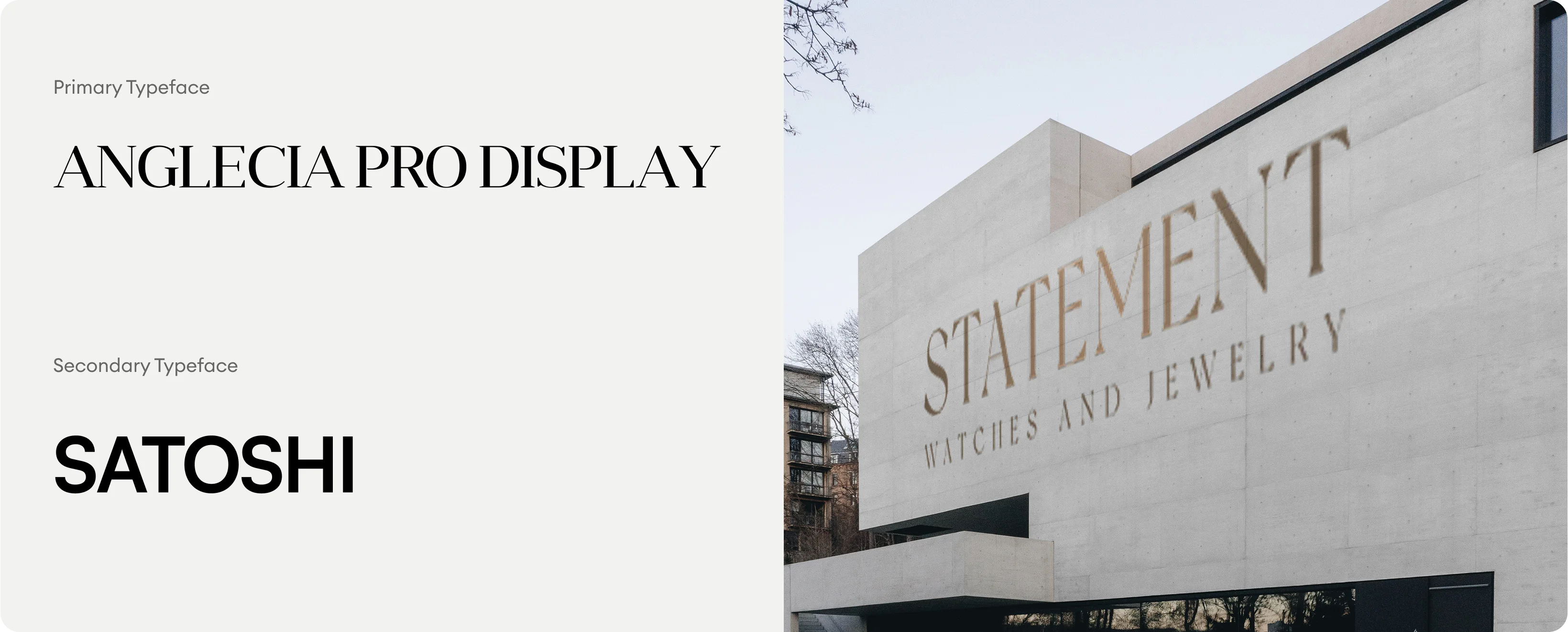
The logo for Statement Watches and Jewelry features a serif typeface with capitalized spacing, combining modernity with traditional prestige. The word “STATEMENT” stands tall, while the subtitle “WATCHES AND JEWELRY” provides a grounded, clear category descriptor. The color is a muted gold — evoking value and legacy.
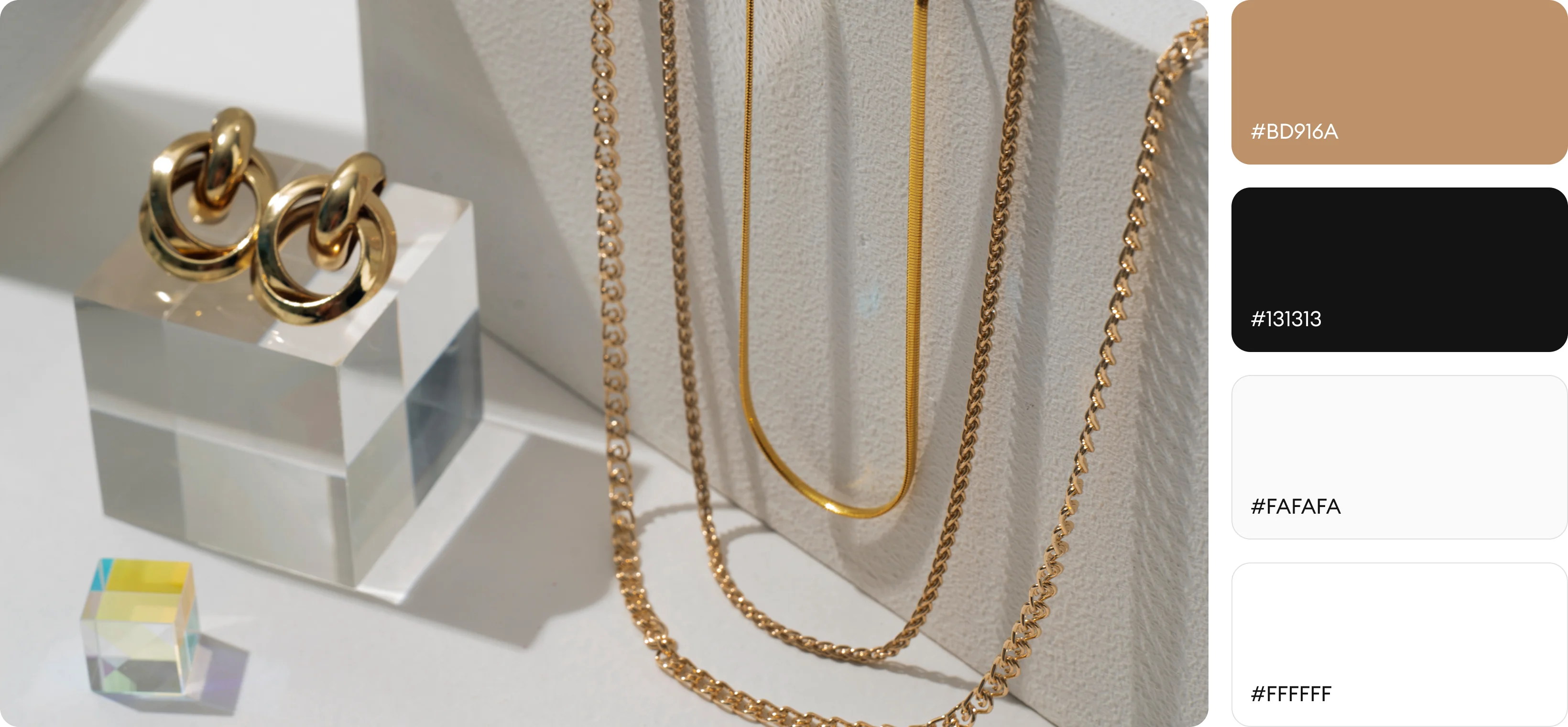
The color palette for Statement Watches and Jewelry was carefully chosen to evoke a sense of luxury, sophistication, and trust. The primary colors, Deep Black (#1D1D1D) and Soft Gold (#C1A26F), establish an elegant and timeless visual identity — with black symbolizing exclusivity and depth, while gold conveys refinement and prestige. Complementing these are the secondary colors, White (#FFFFFF) and Warm Taupe (#E5D8C6), which bring balance, warmth, and an inviting feel to the design.
The initial wireframe was designed with a single-page layout that emphasized clarity, visual hierarchy, and user flow. It featured a top navigation bar with essential links for ease of access, followed by a bold hero section with a clear call-to-action to immediately engage visitors.