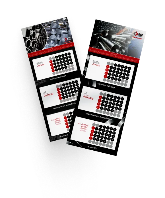
This calendar combines industrial precision with clean, modern aesthetics to reflect the essence of ETF Aluminium GmbH. A minimalist grid layout ensures easy readability, while a trilingual format (German, English, French, Dutch) enhances global accessibility. The sleek typeface, functional layout, and the incorporation of aluminum product categories subtly reinforce brand identity. Both versions—red and white slogan designs—offer distinct visual impact, providing clients with an annual tool that is both practical and stylish, showcasing the brand’s commitment to clarity and quality.
Calendar Design
Graphic Design

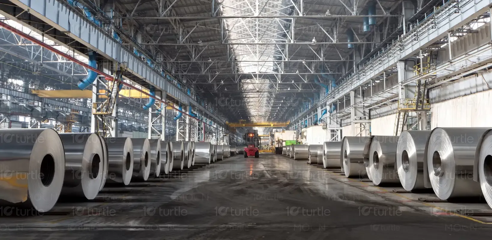
Industry
Education & Training
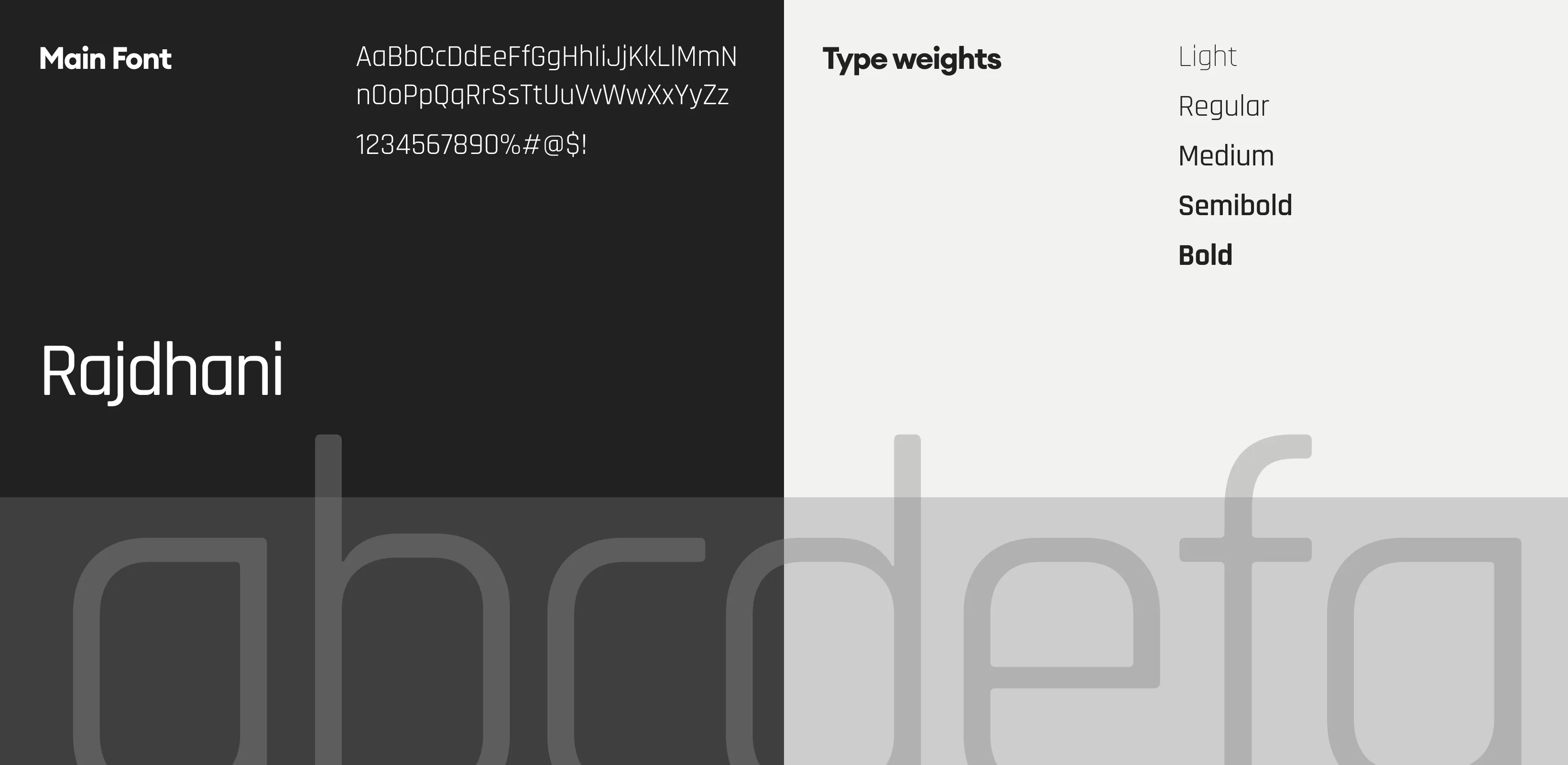
Tools we used
Project Completion
2025
Key Market
Global
This calendar serves as both a promotional and practical tool for ETF Aluminium GmbH. It highlights the company's core offerings—aluminum semi-finished products—while offering a year-long planner for clients and partners. With trilingual month and date formats, it targets a wide European market. Its unique value lies in blending corporate identity with everyday utility, ensuring ETF’s presence on desks and walls throughout the year. Its clean design and brand integration distinguish it from generic promotional calendars.


Industry
Education & TrainingWhat we did
Calendar DesignGraphic DesignPlatform
-Many B2B calendars lack design relevance or fail to reinforce brand identity. Generic visuals and cluttered formats often diminish usability and impact, especially in industrial sectors like aluminum manufacturing. Additionally, reaching a multilingual audience without overwhelming the visual clarity poses a common design hurdle. The need was for a calendar that not only serves a practical purpose but also subtly communicates professionalism, global presence, and product focus—qualities central to ETF Aluminium’s brand.
This calendar design resolves the above issues with a clean, modular layout that’s universally legible. Its bilingual/trilingual headers cater to international users without overcrowding the design. The use of minimal colors, high-contrast typography, and subtle branding ensures clear visual hierarchy and corporate recall. Featuring product categories prominently without disrupting functionality bridges promotional and practical roles. The slogan “our aluminium for your business” reinforces brand positioning while offering daily value.
The vision behind this design is to establish ETF Aluminium’s calendar as an annual brand touchpoint that’s both useful and visually aligned with the company’s identity. Future iterations may include QR codes linking to digital catalogs or production schedules, customizable layouts for client sectors, and sustainable print options. The aim is to evolve this tool into a hybrid physical-digital asset that strengthens customer engagement year after year.


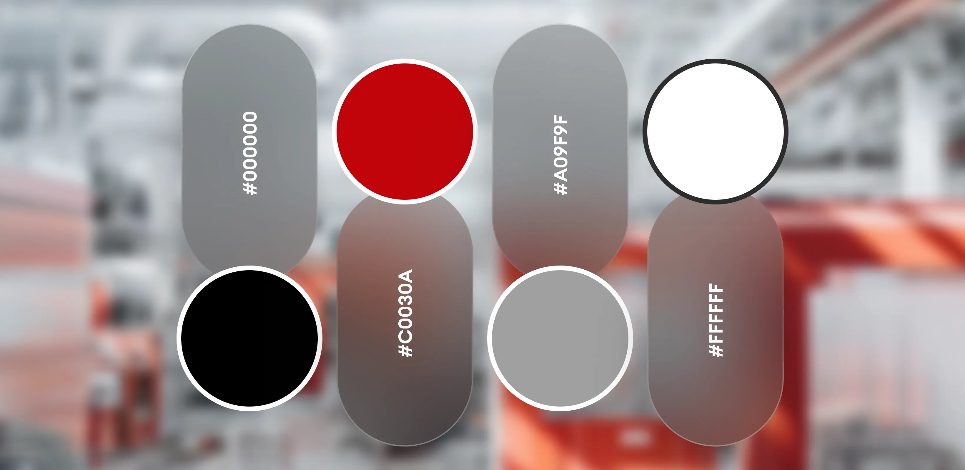
The two versions present distinct color strategies. The Red Slogan version uses bold red to emphasize energy, strength, and industrial precision—values aligned with aluminum manufacturing. The White Slogan version conveys neutrality, clarity, and versatility, appealing to a broader, more minimalist aesthetic. Both designs maintain a consistent gray-black base for professionalism, with accent tones used sparingly to highlight brand elements and guide the viewer’s focus across the calendar layout.