Experience tailored financial advice and asset planning, built on years of trust in the sports industry. now expanding beyond sports, the firm delivers trusted financial solutions to individuals and businesses alike. their services focus on high-impact advisory and alternative asset strategies built for long-term success.
UI/UX Design
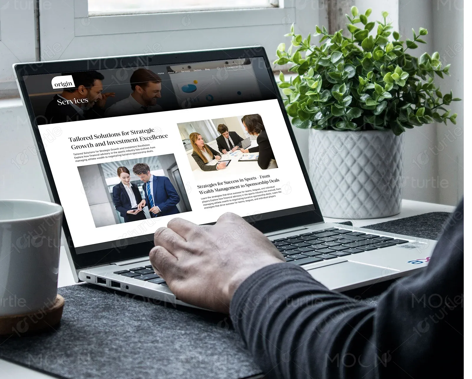
Financial Services
Advisory Services
Investment Advisory
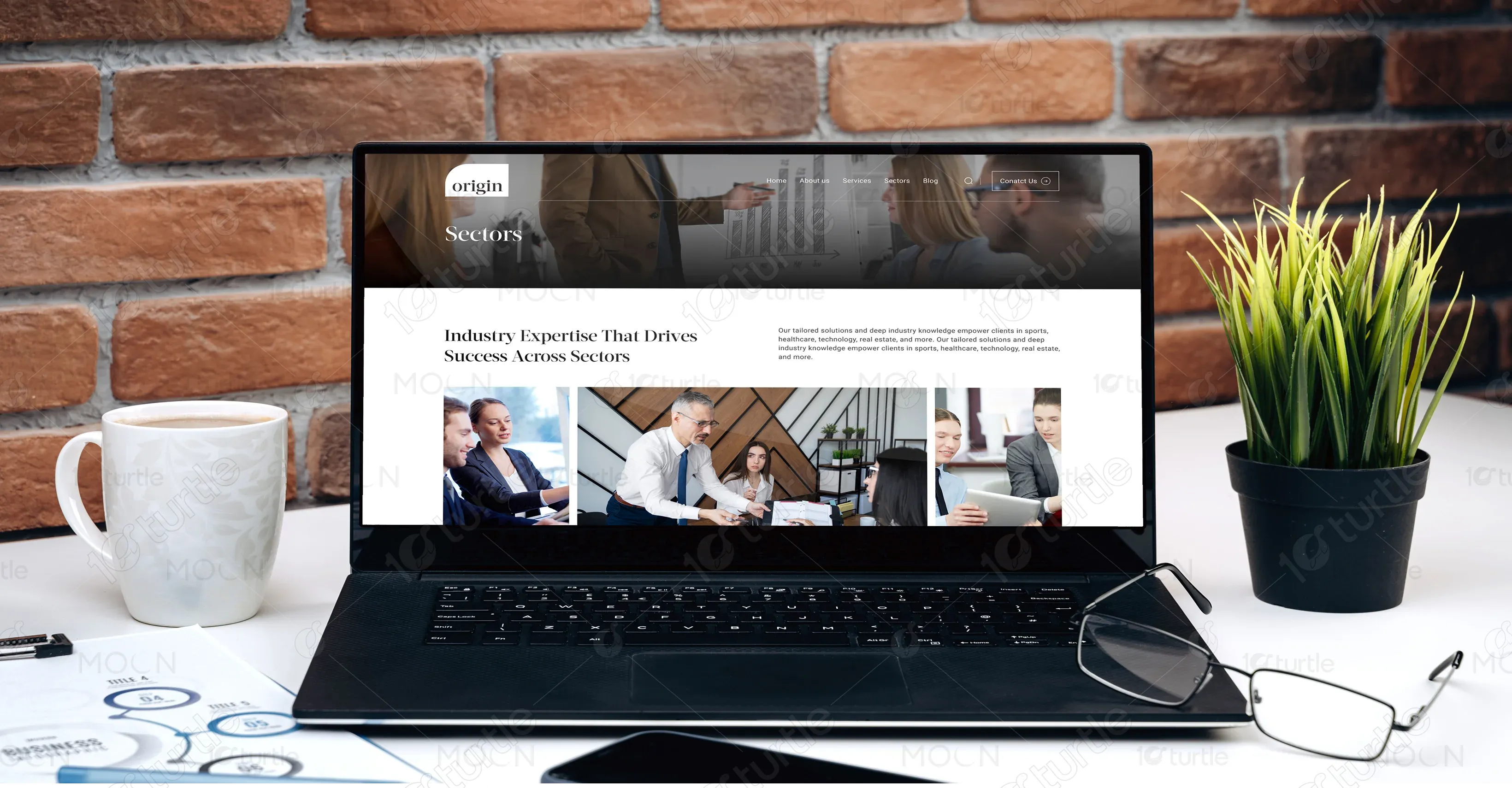
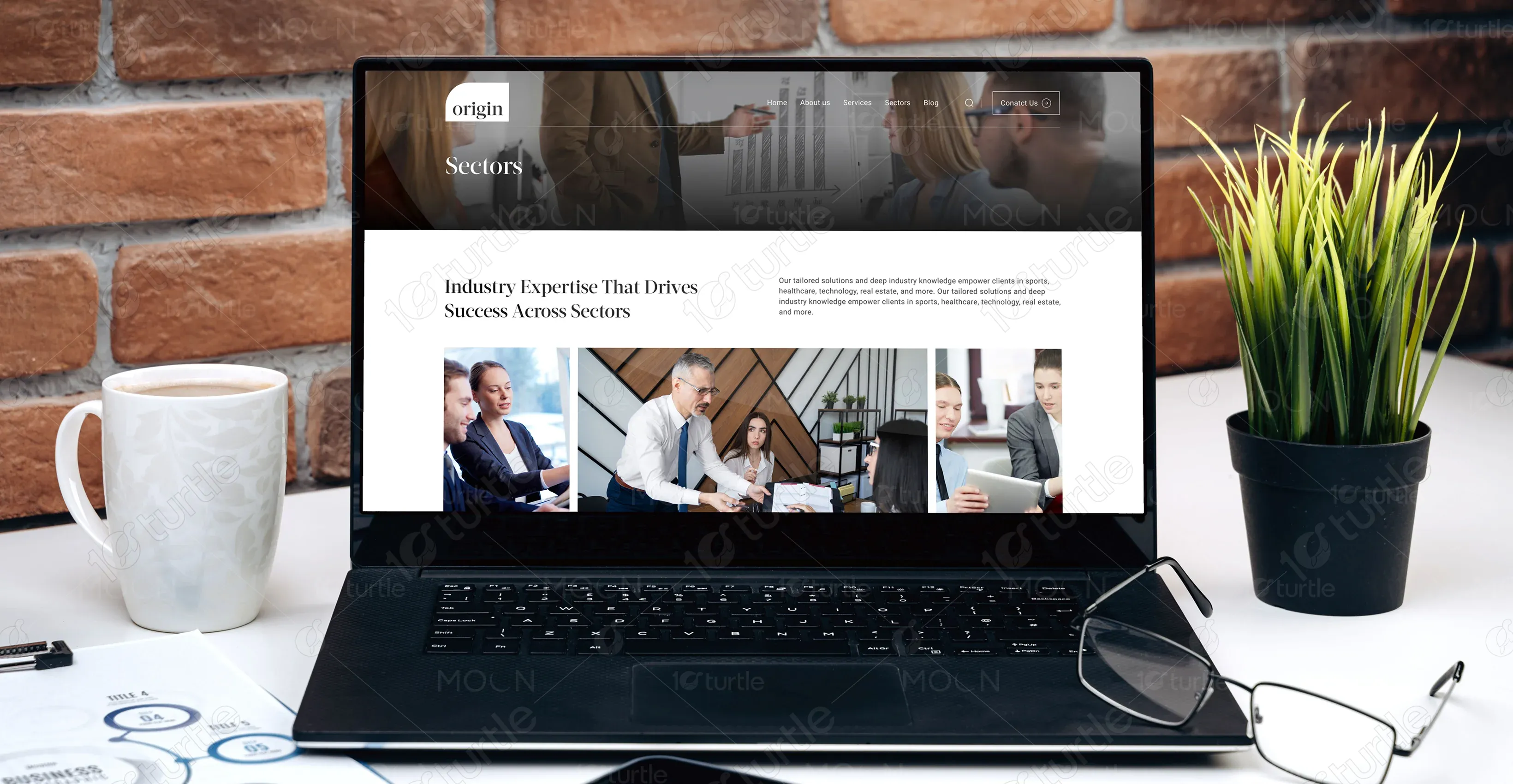
Industry
Finance, Legal & Insurance
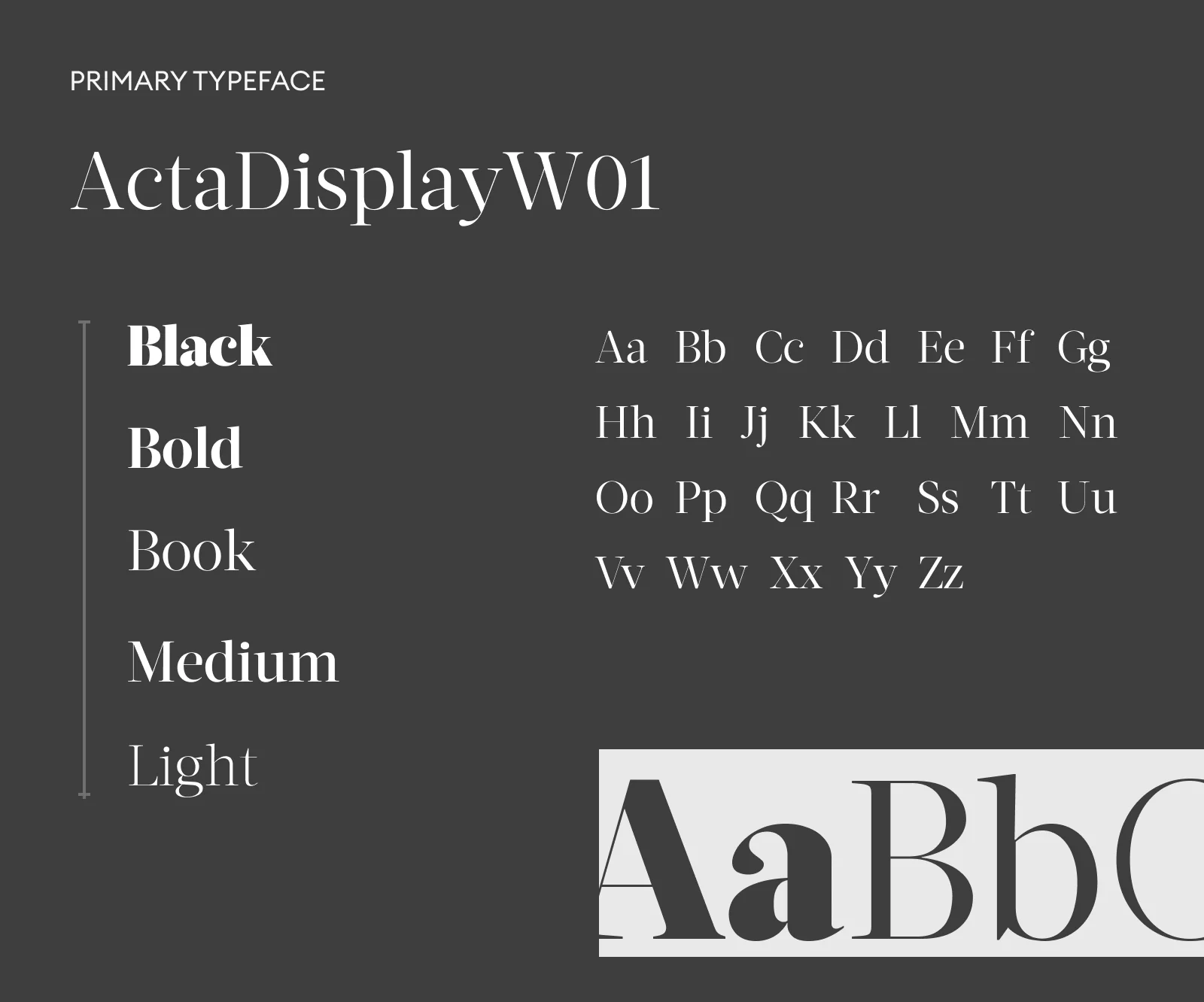
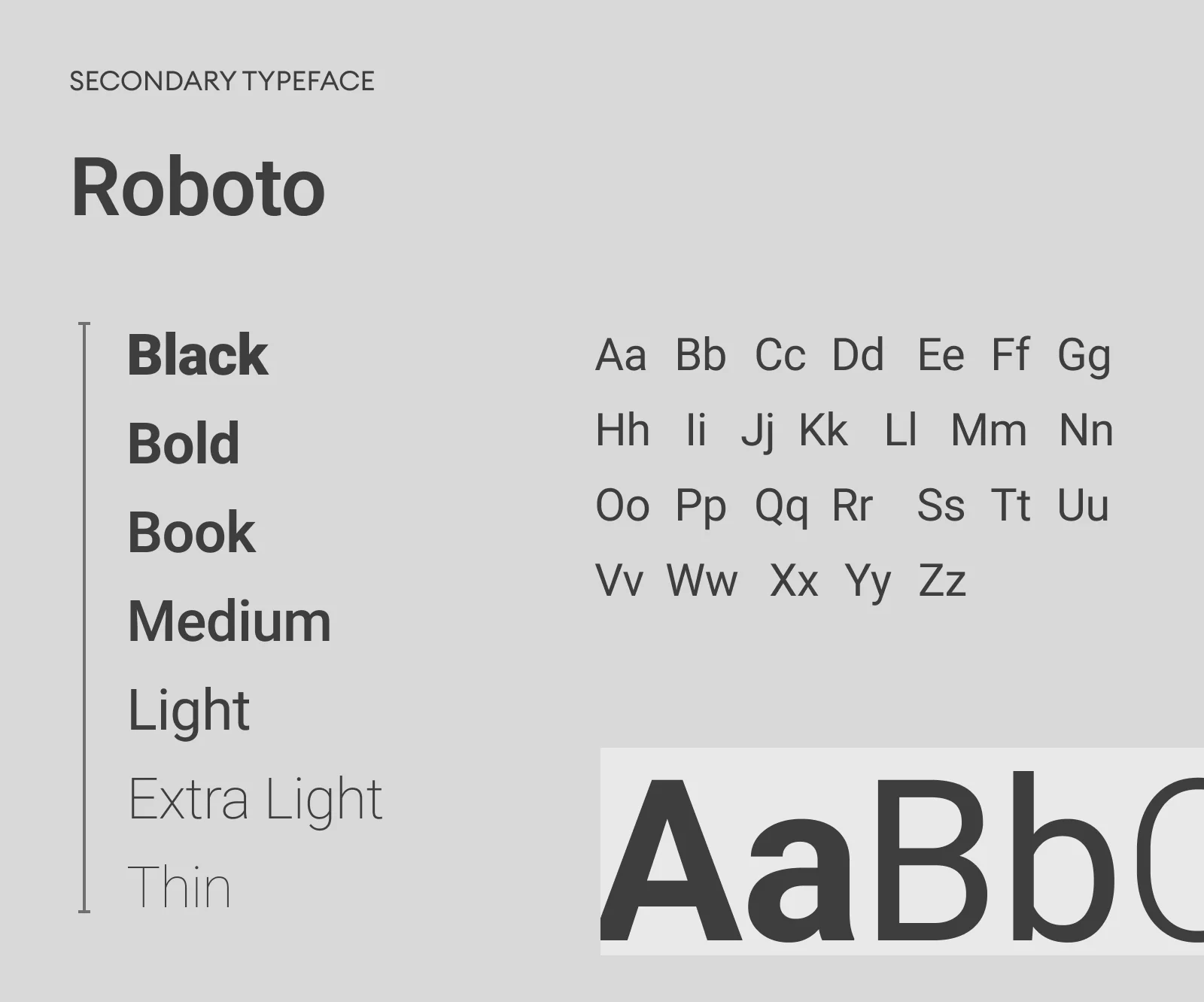
Tools we used


Project Completion
2024
Live Url
https://originadvisers.com/
Colin Chisholm Financial has built a strong reputation by offering strategic financial guidance to professional sports firms. With a legacy of deep insight in the sports world, the brand is now transitioning to serve a broader client base—offering focused services in Advisory and Alternative Assets, backed by proven expertise and a forward-thinking approach.
Industry
Finance, Legal & InsuranceWhat we did
User ResearchDesigning the SolutionStrategic ActionsPlatform
-Many sports professionals and firms face challenges managing complex wealth structures, uncertain income cycles, and limited access to diversified investment options. Traditional financial services often overlook the unique needs of this sector.
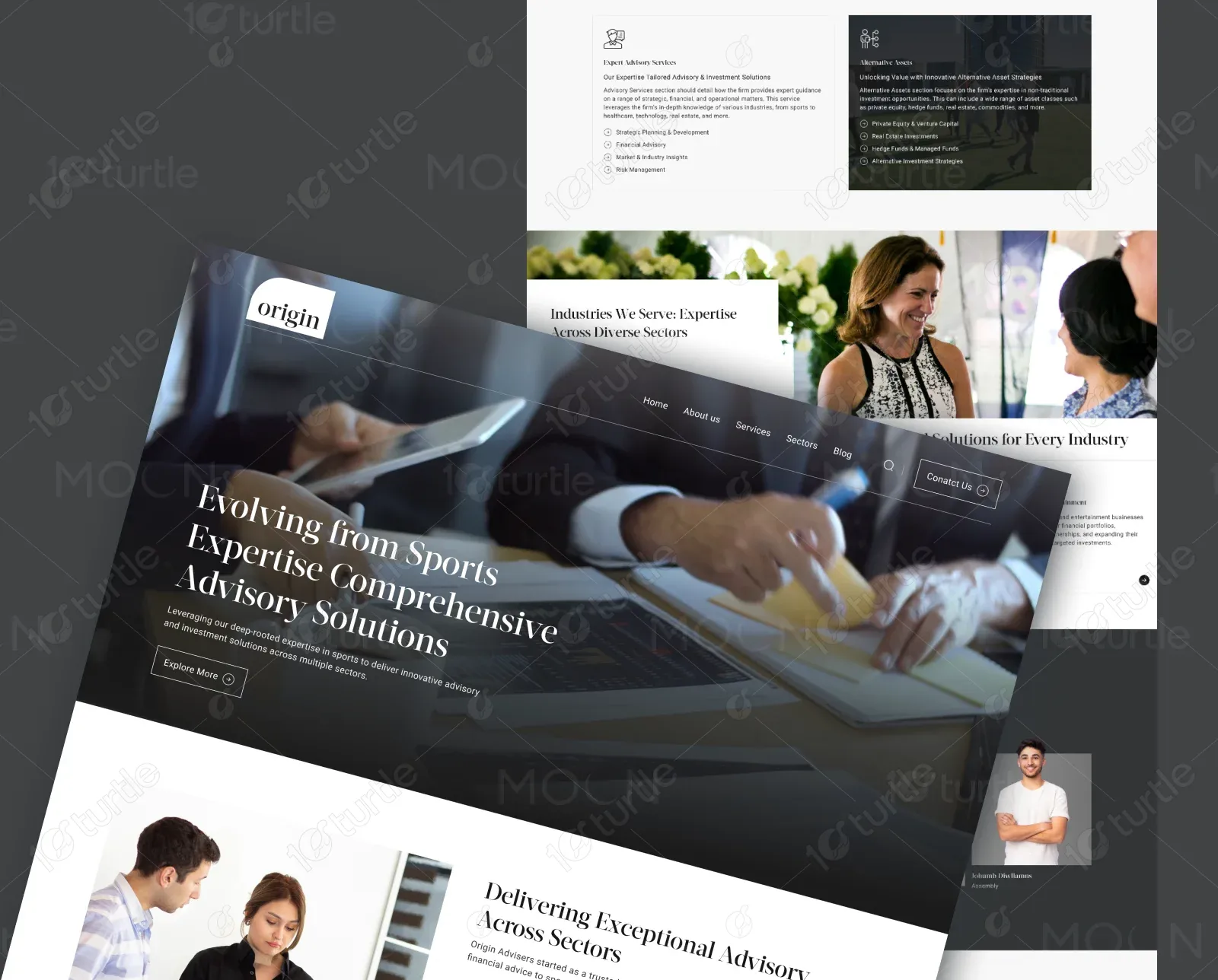
We designed a sleek, professional web experience that clearly highlights the two primary services—Advisory and Alternative Assets—while reinforcing the client’s credibility in the sports advisory space. The design reflects both tradition and ambition, supporting Colin Chisholm Financial’s brand growth.
The client wanted a clean, premium look that reflects growth beyond the sports industry. The design needed to feel trustworthy, modern, and sector-neutral—without losing the credibility built through years of sports advisory experience.


The logo was designed using refined typography to convey trust, stability, and expertise. Its minimalist structure ensures it feels timeless and adaptable across industries. The mark reflects the firm’s transition from niche sports advisory to broader financial leadership—maintaining professionalism while signaling growth.
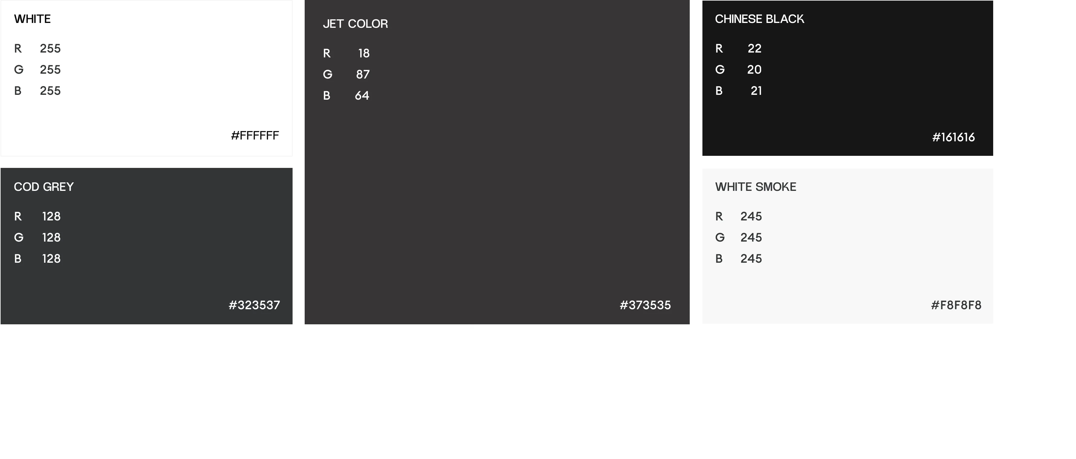
The color palette uses deep neutrals like #161616 and #373535 to convey strength, professionalism, and trust. Light tones like #F8F8F8 and #FFFFFF bring clarity and balance, ensuring a clean and modern user experience. These colors work together to support a premium, approachable brand presence.
The wireframe was designed to create a clear and structured user journey, starting with a strong brand statement and service highlights. It includes key sections like Hero, About, Services, Testimonials, and Contact. The layout ensures easy navigation and keeps the focus on credibility, clarity, and conversion.