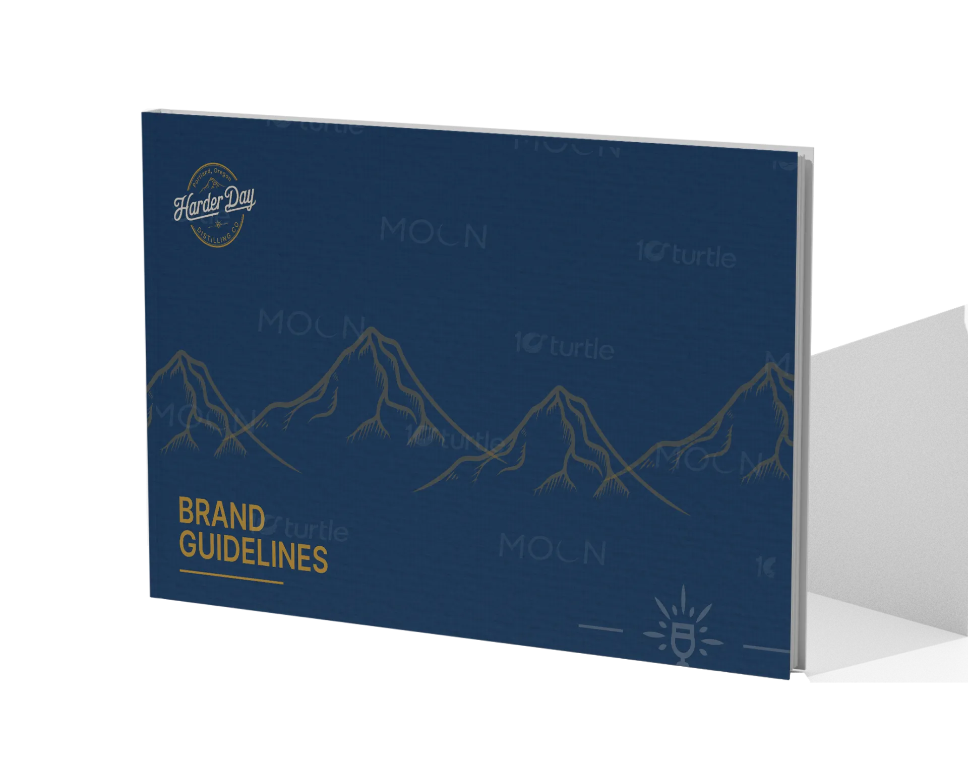
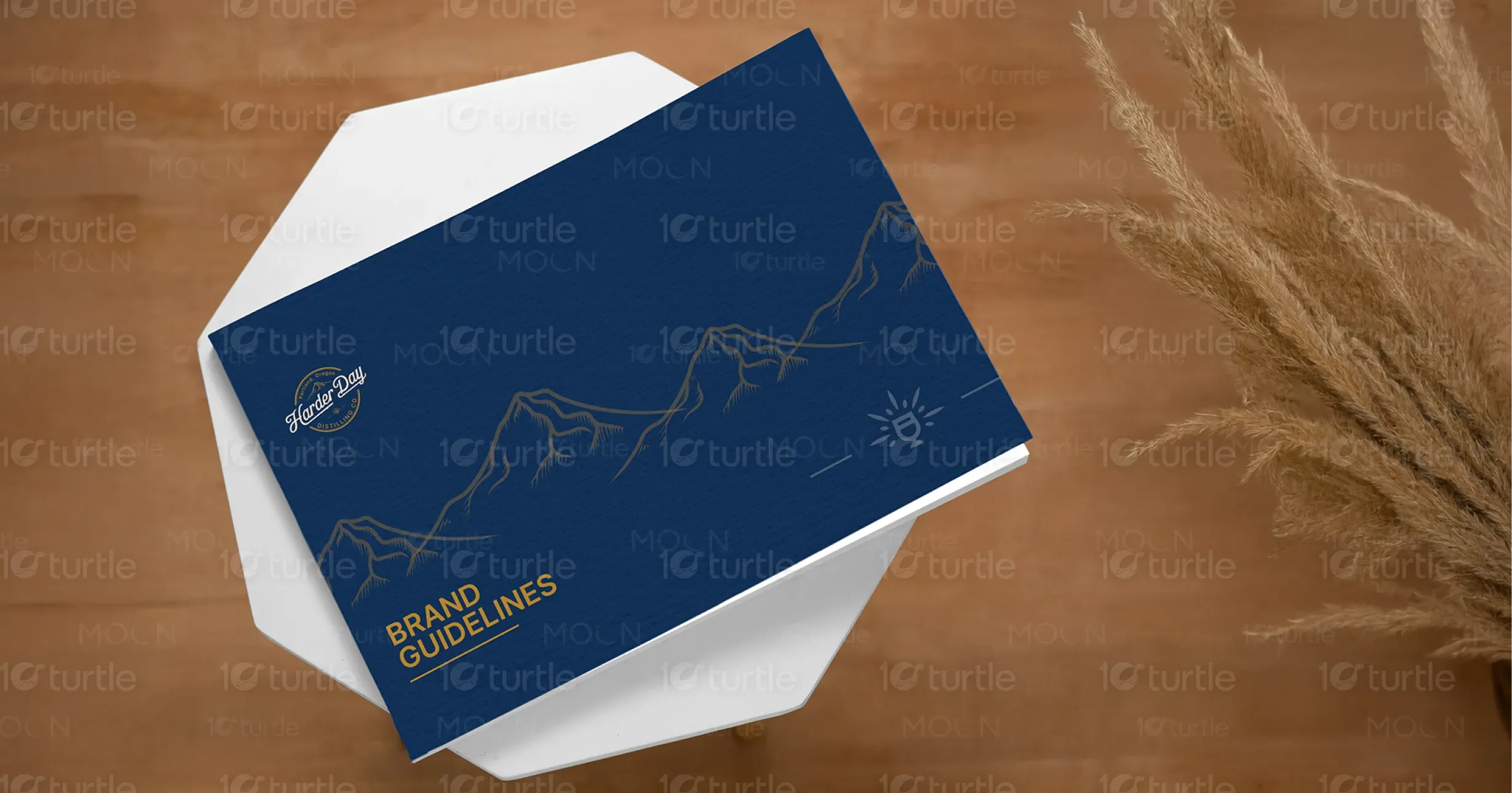
The design captures a blend of heritage and modern professionalism. Featuring a structured layout, the brand guide uses bold navy blue, rich mustard, and cream tones to express depth, trust, and tradition. The typography is clean and legible, complemented by a sophisticated serif logotype that mirrors the artisanal essence of the brand. Subtle mountain illustrations add a rugged charm that reinforces the spirit of exploration and craftsmanship, while the overall layout maintains clarity, consistency, and visual hierarchy.
Brand Guide Book Design
Graphic Design
Industry
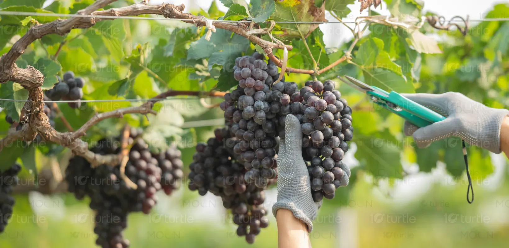
Food, Beverage & Hospitality
Tools we used


Project Completion
2025
Key Market
Global
This brand guideline document was developed for Harder Day Distilling Co., a premium craft spirits brand rooted in authenticity and bold character. The guide defines the brand’s visual identity, including logo use, color palette, and typography standards. It is a crucial tool to ensure brand consistency across packaging, marketing, and merchandise. With a rugged yet refined aesthetic, the design aligns with the brand's story—balancing raw tradition with modern polish, giving it an edge in the growing artisanal beverage market.
Industry
Food, Beverage & HospitalityWhat we did
Brand Guide Book DesignGraphic DesignPlatform
-Many emerging craft distilleries struggle with fragmented branding, leading to inconsistencies in packaging, marketing, and retail presence. This results in lost brand recognition and diluted storytelling. For example, smaller distilleries often rely on makeshift brand assets without a unified design system, making it hard to compete against established players who project professionalism and heritage through cohesive branding.
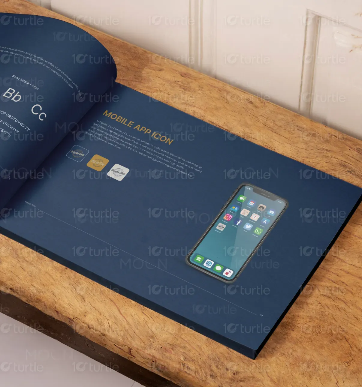
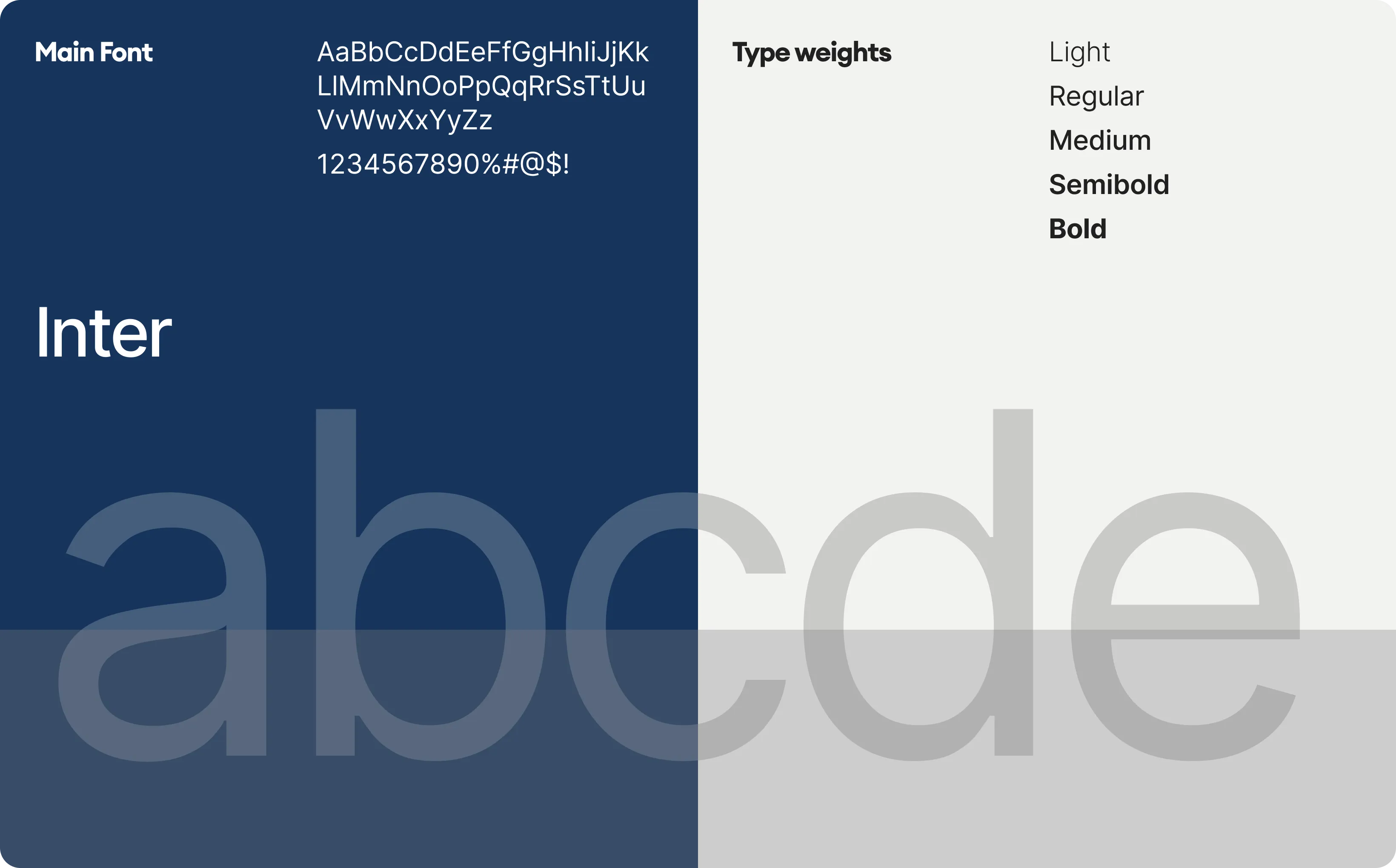
The Harder Day brand guide addresses this issue by establishing a clear, adaptable visual framework. It outlines logo treatments, approved color schemes, and font usage, ensuring a unified presentation across touchpoints. The use of timeless, bold colors and a clean modern typeface (Inter) offers readability and brand recall. The mountain motif subtly reinforces the brand’s rugged, outdoor-inspired roots, and the manual empowers designers, marketers, and partners to uphold brand integrity effortlessly.
Harder Day Distilling Co. envisions becoming a hallmark of authentic American craft spirits—where every bottle reflects passion, heritage, and artistry. The long-term goal is to grow from a regional name into a nationally recognized brand while preserving its small-batch soul. The brand’s visual identity aims to stay relevant yet grounded, supporting expansion into experiential marketing, product lines, and collaborations that further solidify its cultural footprint.
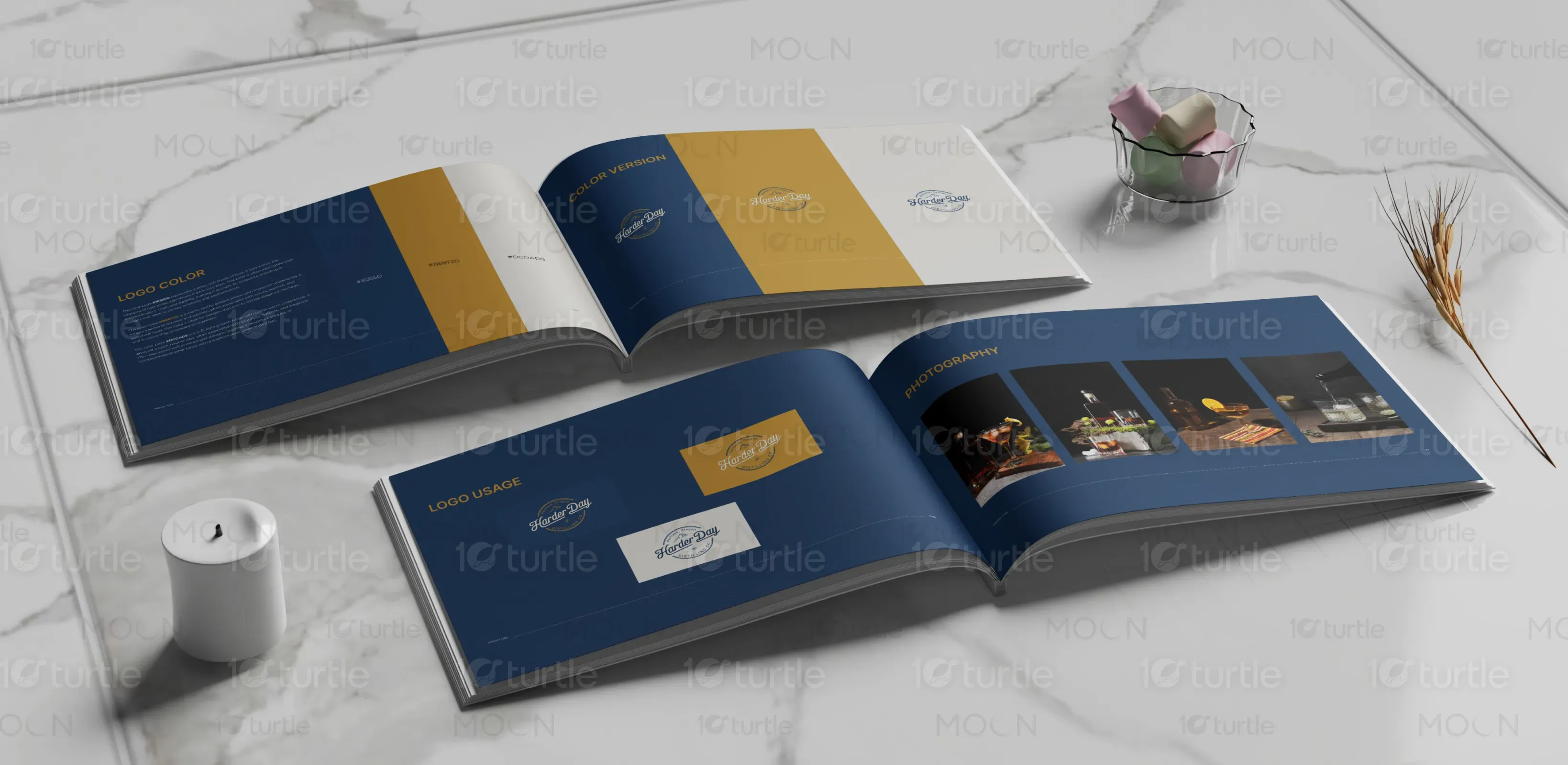
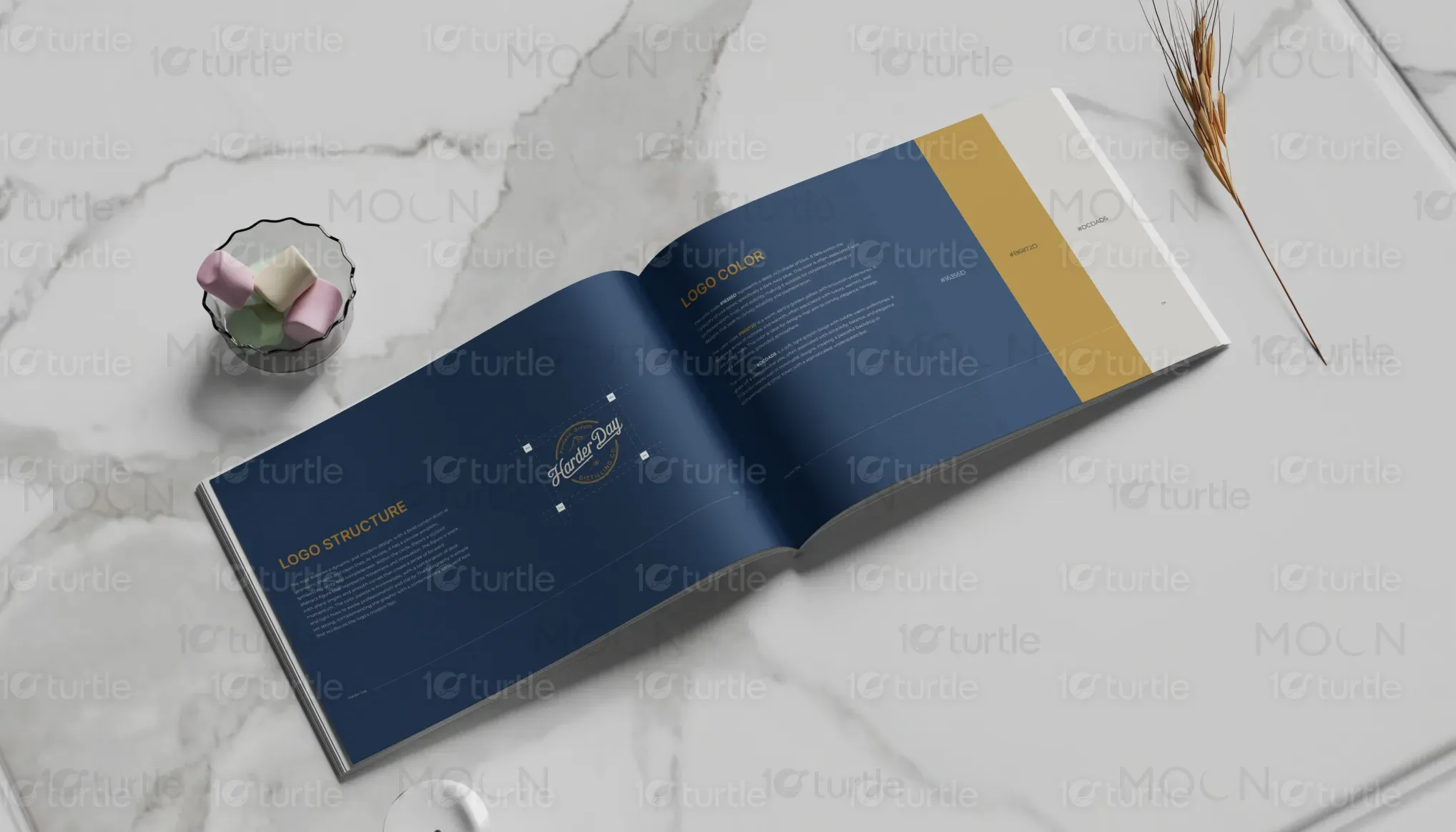
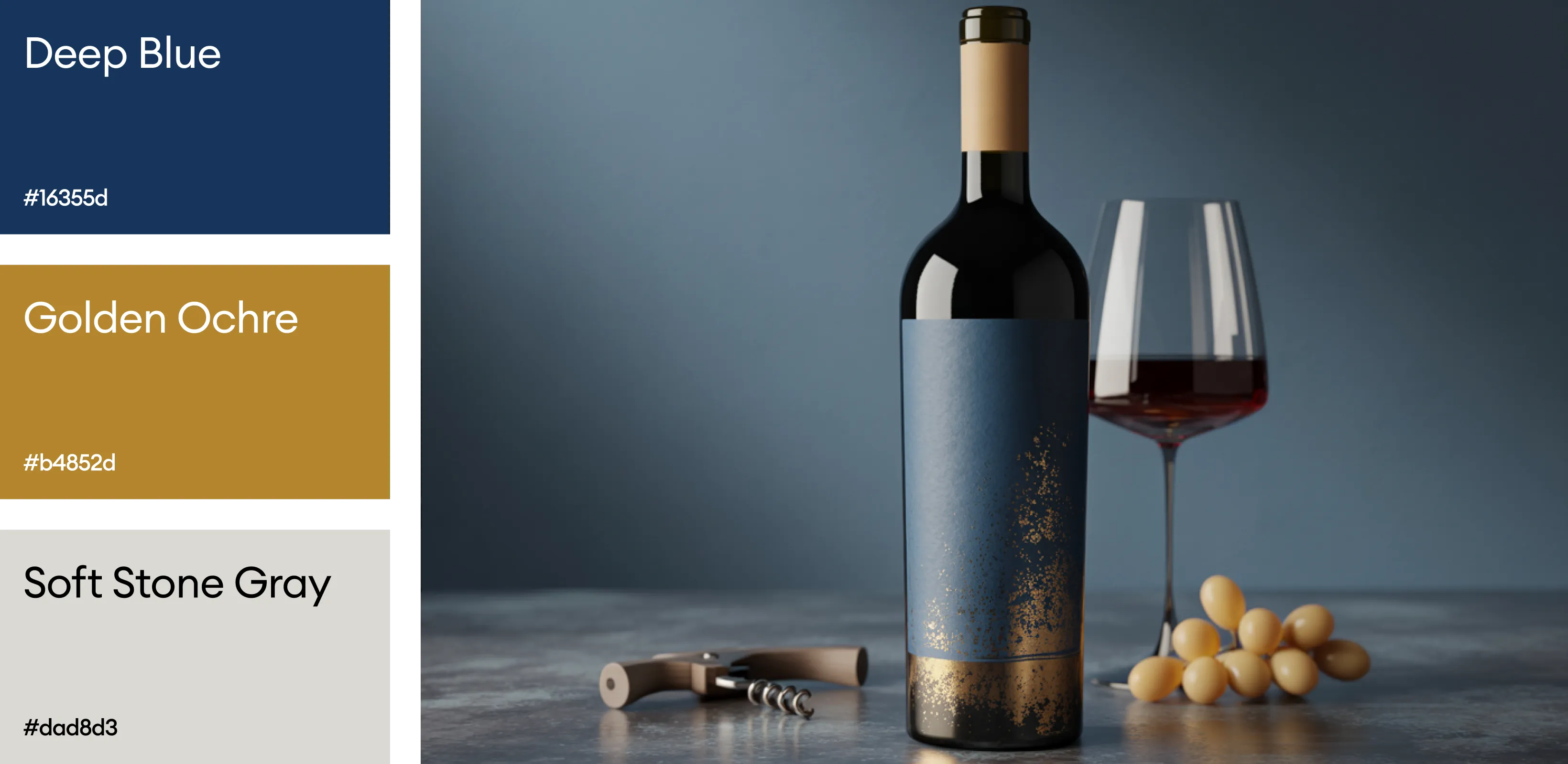
The primary color palette consists of Navy Blue, Rich Mustard, and Cream White. Navy Blue conveys trust, depth, and heritage—ideal for a legacy-driven distilling brand. Rich Mustard brings warmth and uniqueness, evoking vintage appeal and rustic charm. Cream White balances the palette with sophistication and readability.