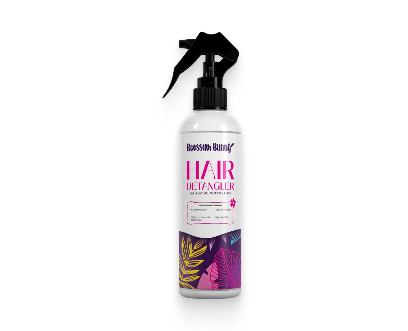
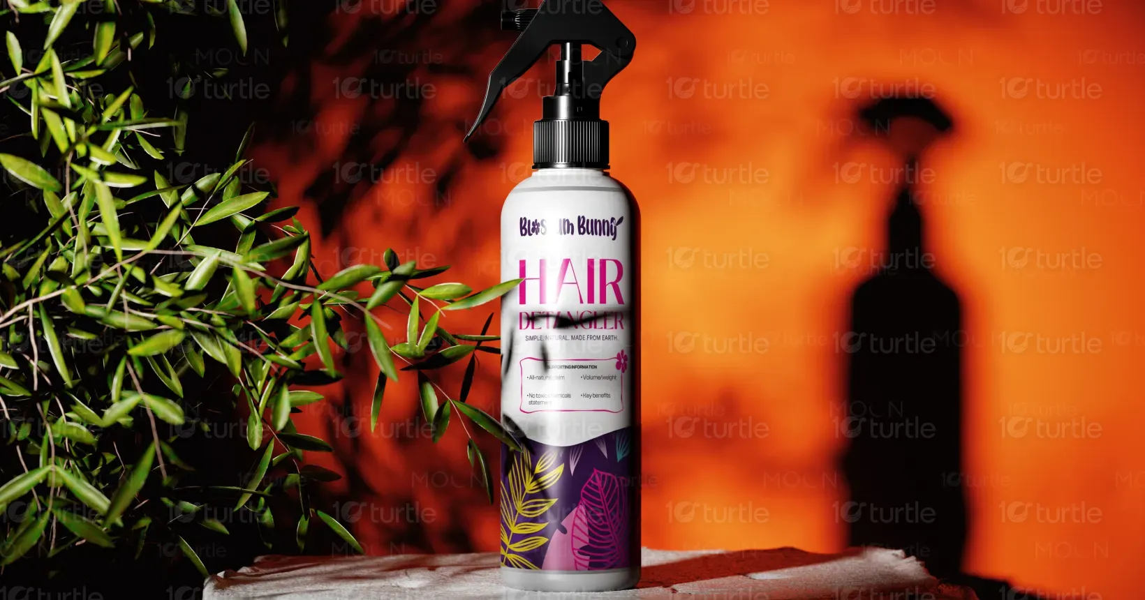
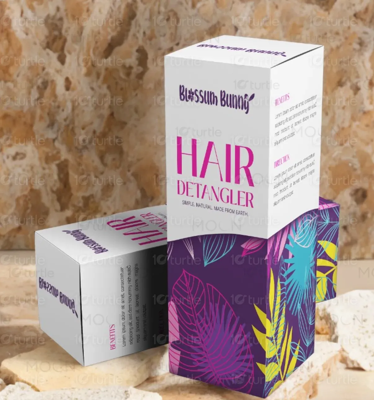
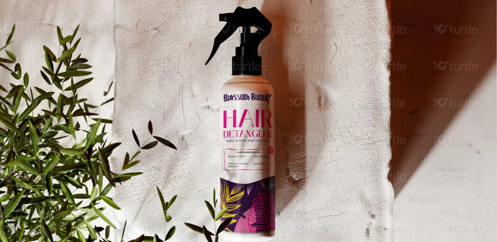
The design embraces a minimalistic, natural aesthetic, combining earthy tones and clean lines to communicate simplicity and purity. By using a sleek, modern font and a subtle yet impactful color palette, the design emphasizes the all-natural, toxin-free nature of the product. The layout ensures ease of readability, with clear visual hierarchy to highlight the product benefits and key details. This approach creates an inviting and premium feel, perfectly aligned with the brand’s ethos of nature-made beauty.
Label Design
Graphic Design
Industry
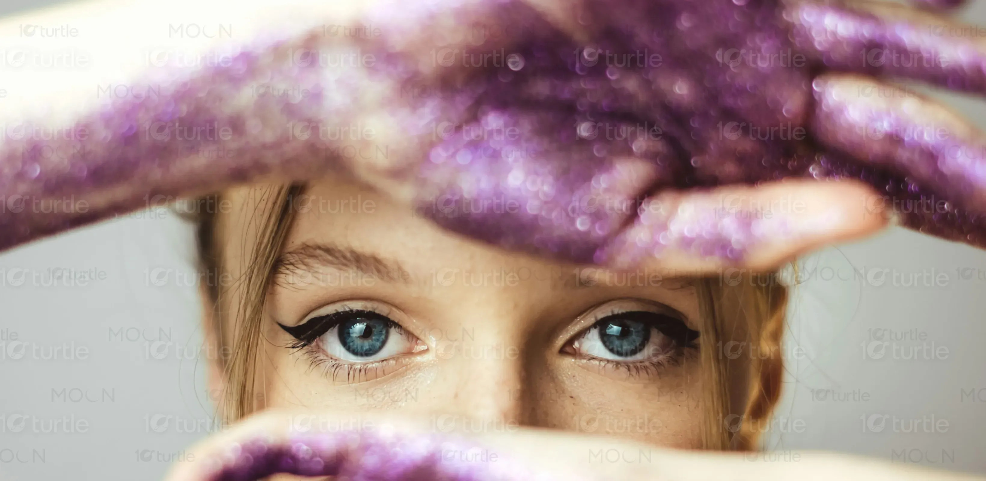
Fashion, Beauty & Lifestyle
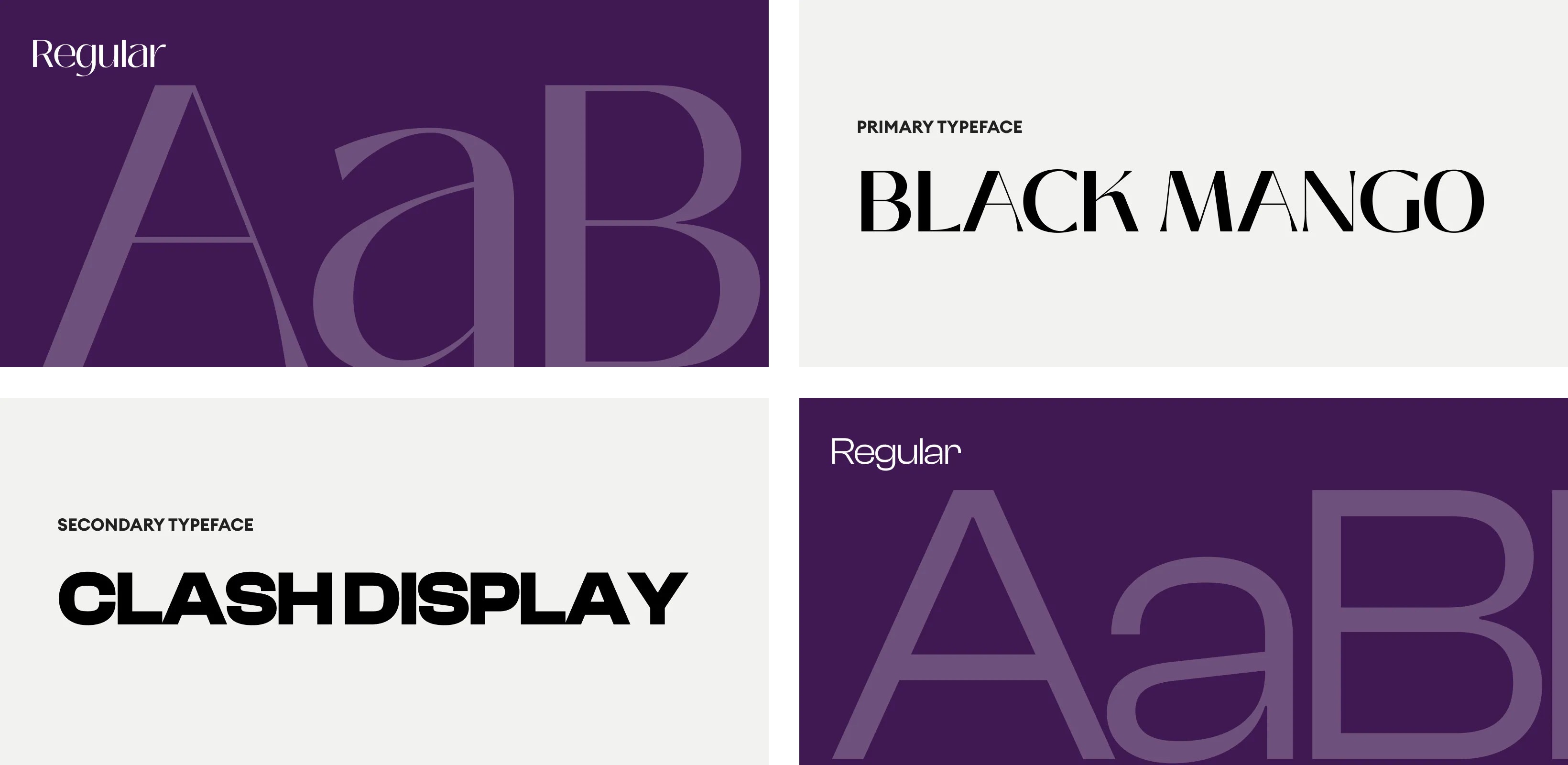
Tools we used


Project Completion
2025
Key Market
Global
The product, a hair detangler, aims to provide an all-natural solution to tangled and unruly hair. The packaging reflects the brand’s commitment to purity and sustainability, free from harmful chemicals. Its clean and straightforward design is a testament to its functional yet luxurious appeal. The product stands out in the market for its chemical-free composition, making it an attractive option for conscious consumers who prioritize health and the environment.
Industry
Fashion, Beauty & LifestyleWhat we did
Label DesignGraphic DesignPlatform
-The challenge lies in creating a product that stands out in a highly competitive beauty market. Consumers are increasingly aware of harmful chemicals in hair products, yet many brands offer either ineffective or overly synthetic alternatives. This has created a gap for products that are both effective and all-natural but are packaged in a way that communicates premium quality without being overly complicated.
This design resolves the problem by focusing on transparency and simplicity. The packaging clearly communicates the product’s natural, chemical-free ingredients through the use of minimalistic design elements and easily accessible information. The simple yet premium look resonates with the target audience, providing a trustworthy, effective solution for hair care that aligns with both their health-conscious and aesthetic preferences.
The long-term vision for this design is to solidify the brand as a leader in natural, sustainable beauty products. The clean, timeless aesthetic aims to evolve into a symbol of quality and reliability in the industry. Over time, the brand seeks to expand its product range while maintaining the minimalist yet elegant design approach, ensuring that the products continue to resonate with an environmentally conscious audience.
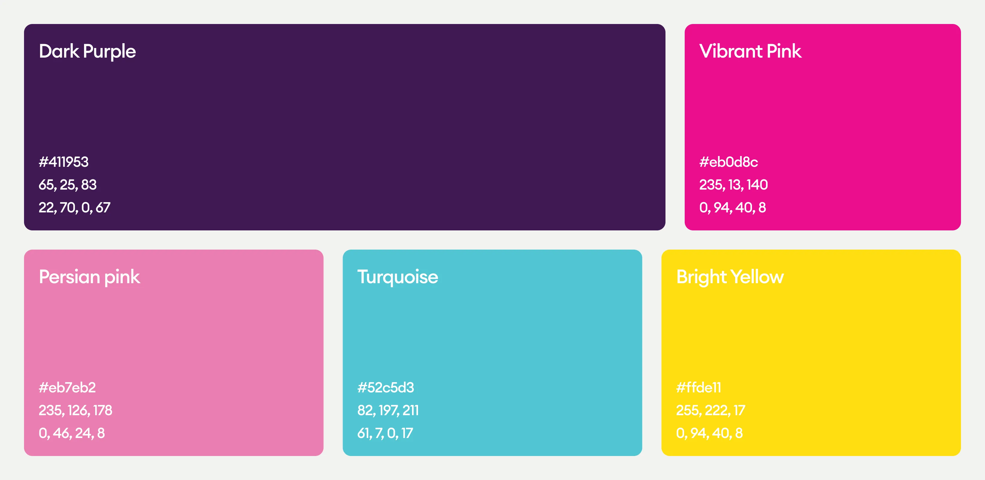
The color palette features soft, earthy tones that evoke a sense of calm, purity, and trust. Greens and browns symbolize nature and sustainability, while subtle accents of gold or metallic hues add a touch of luxury and sophistication. These colors align with the brand’s natural identity and appeal to consumers seeking both functional and elegant beauty solutions.