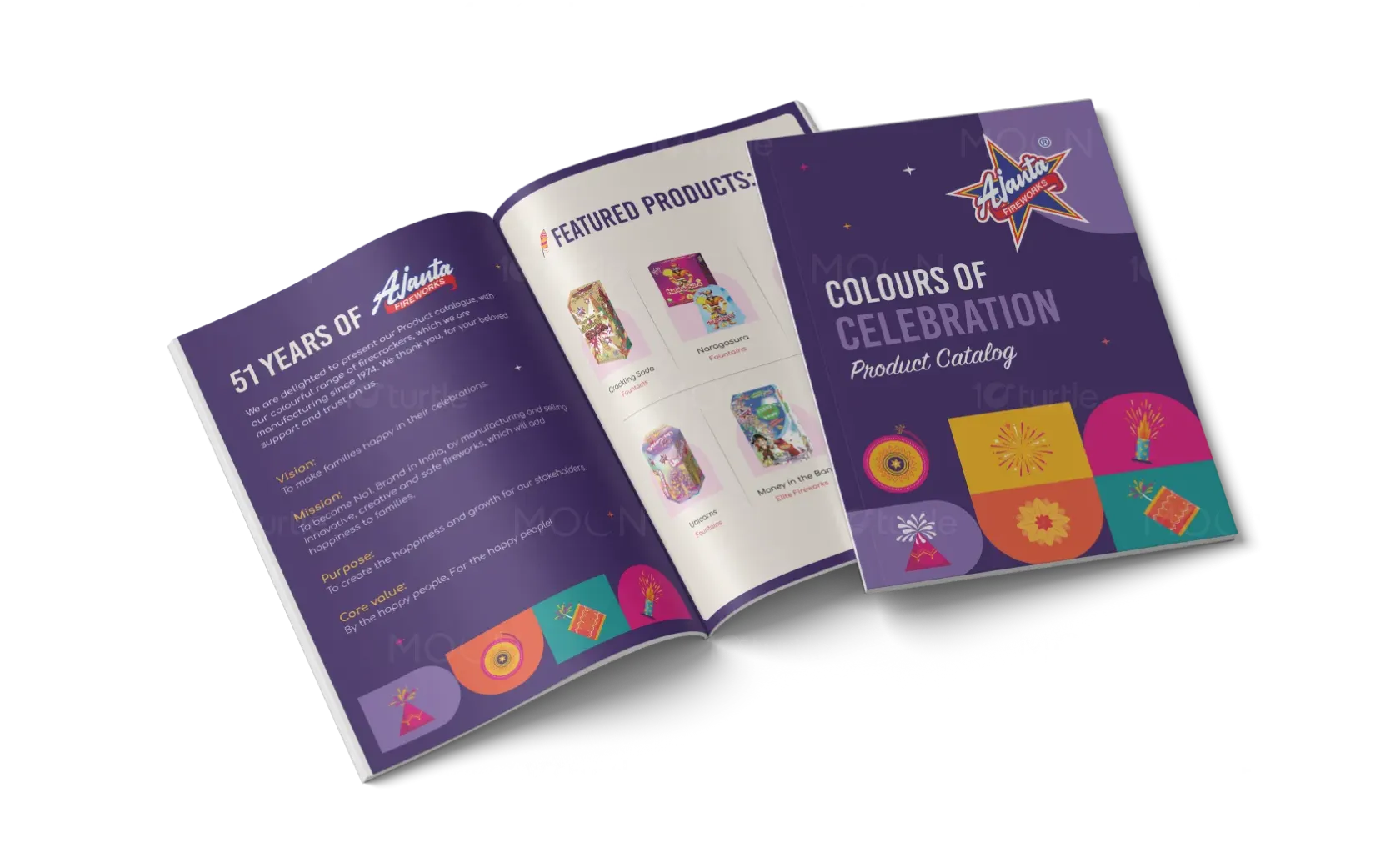
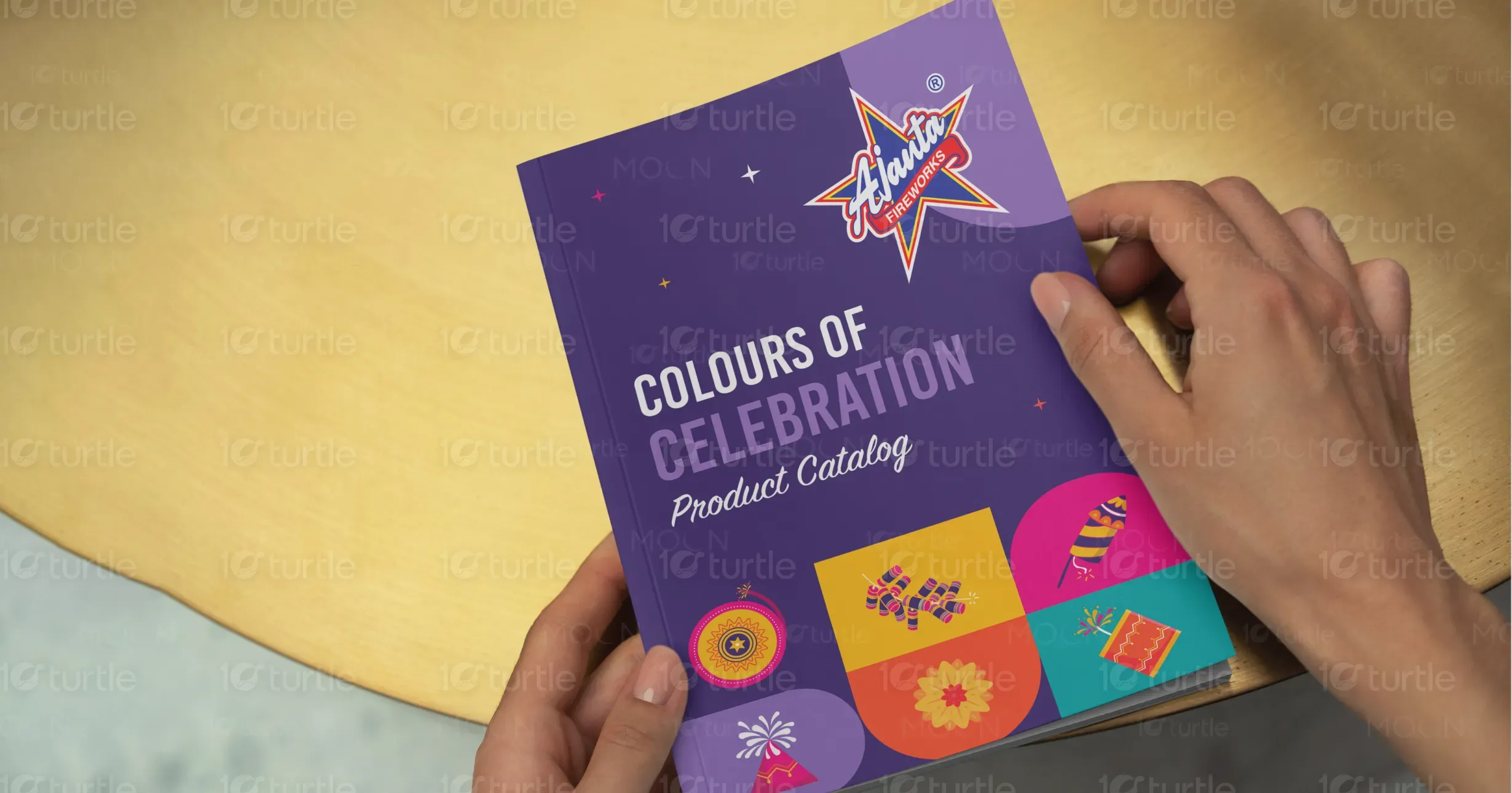
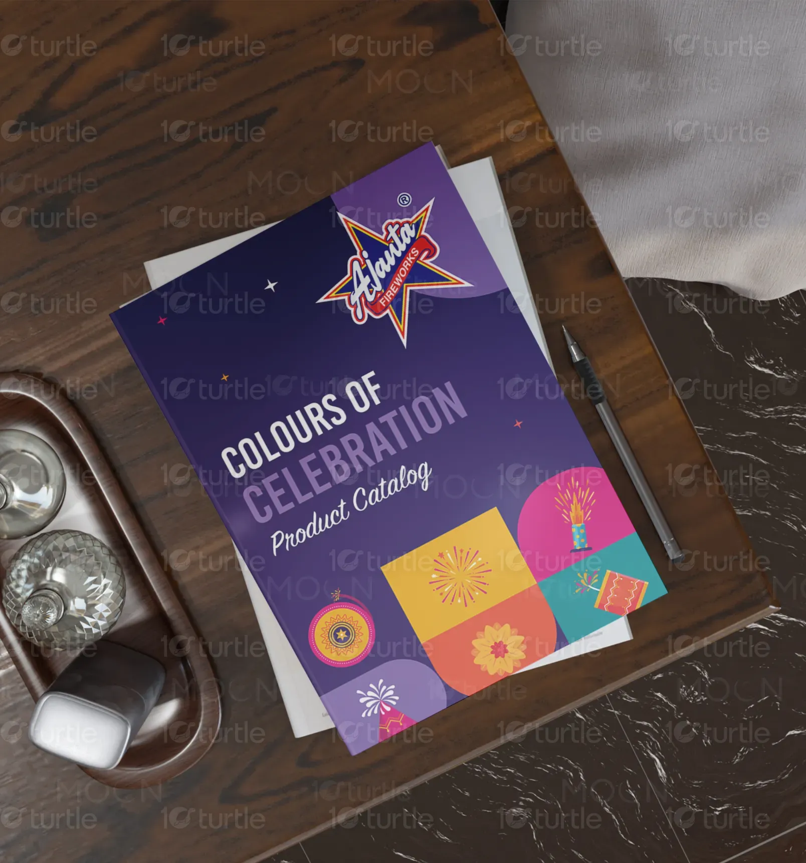
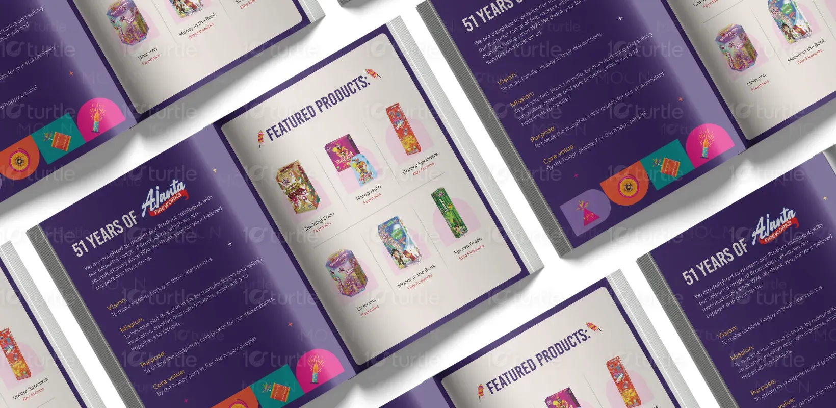
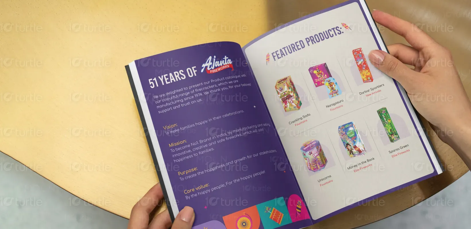
The design concept embodies joy and festivity through vibrant colors and bold, celebratory typography. The layout is clean yet playful, allowing the colorful product visuals to take center stage. A balance of traditional charm and modern aesthetics was achieved to reflect both the legacy and innovation of the brand. Emphasizing user engagement, the catalog is visually rich, easy to navigate, and emotionally resonant, celebrating 51 years of happiness through safe, creative, and high-quality firecrackers.
Catalog Design
Graphic Design
Industry
Consumer Goods & Retail
Tools we used


Project Completion
2025
Key Market
Global
This catalog showcases a diverse range of premium fireworks under the banner "Colours of Celebration." Aimed at family celebrations and festive events, the collection includes fountains, sparklers, and elite fireworks such as "Unicorns" and "Money in the Bank." The brand—active since 1974—emphasizes joy, safety, and innovation. With vibrant packaging and unique product names, it distinguishes itself in the competitive market of celebratory pyrotechnics. The catalog reflects a commitment to making every celebration memorable, colorful, and safe.

Industry
Consumer Goods & RetailWhat we did
Catalog DesignGraphic DesignPlatform
-A major challenge was designing a catalog that appeals to both traditional buyers and modern audiences, especially in a competitive market with visual saturation. The design needed to convey heritage and trust while still being exciting and trendy to younger generations. Additionally, fireworks packaging often faces cultural sensitivities and safety concerns, which required careful messaging and visual alignment. The task was to visually differentiate each product while maintaining brand consistency and clarity.
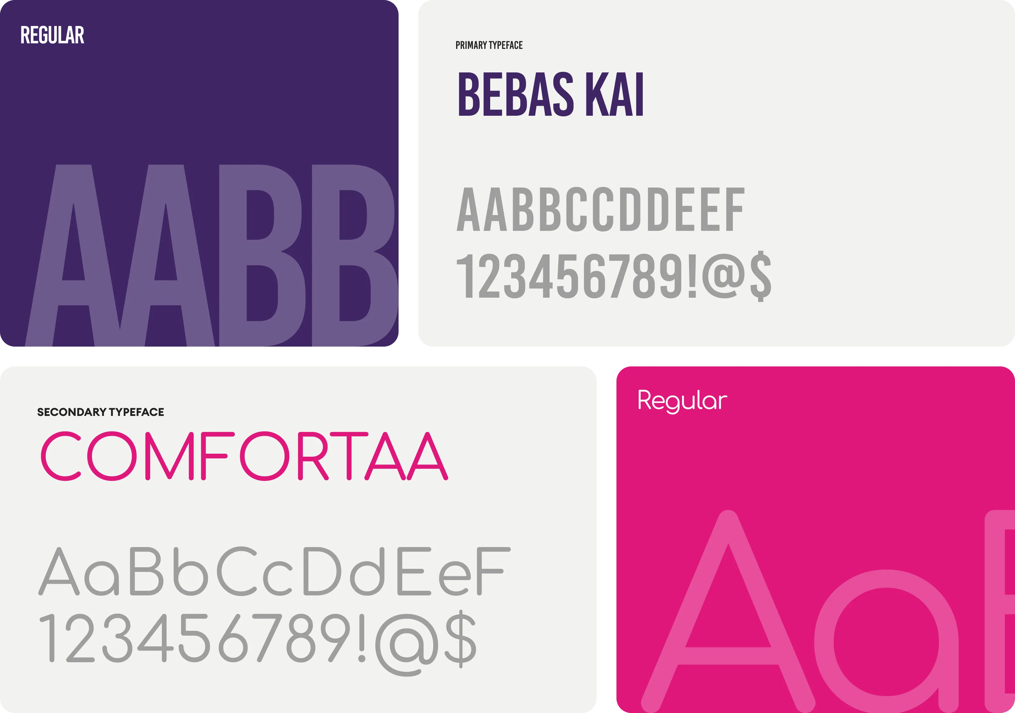
The catalog solves these challenges through a vibrant and structured visual language that merges tradition with modern aesthetics. Products are categorized clearly, using consistent yet flexible design modules. Vibrant imagery highlights the joyful nature of each item, and a heritage-inspired typeface enhances brand trust. Safety and creativity are subtly reinforced through the presentation and language. The narrative of “51 years of happiness” ties legacy and innovation together, ensuring the catalog connects with both long-time loyalists and new customers.
The long-term vision is to establish this catalog as a cornerstone of the brand's annual identity, evolving with each edition to reflect product innovation and cultural relevance. As the brand aims to become the No. 1 in India, the catalog will serve not just as a product showcase but as an emotional connector with families. Future editions may integrate augmented reality for product demos or interactive digital versions to further enhance consumer engagement and brand recall.
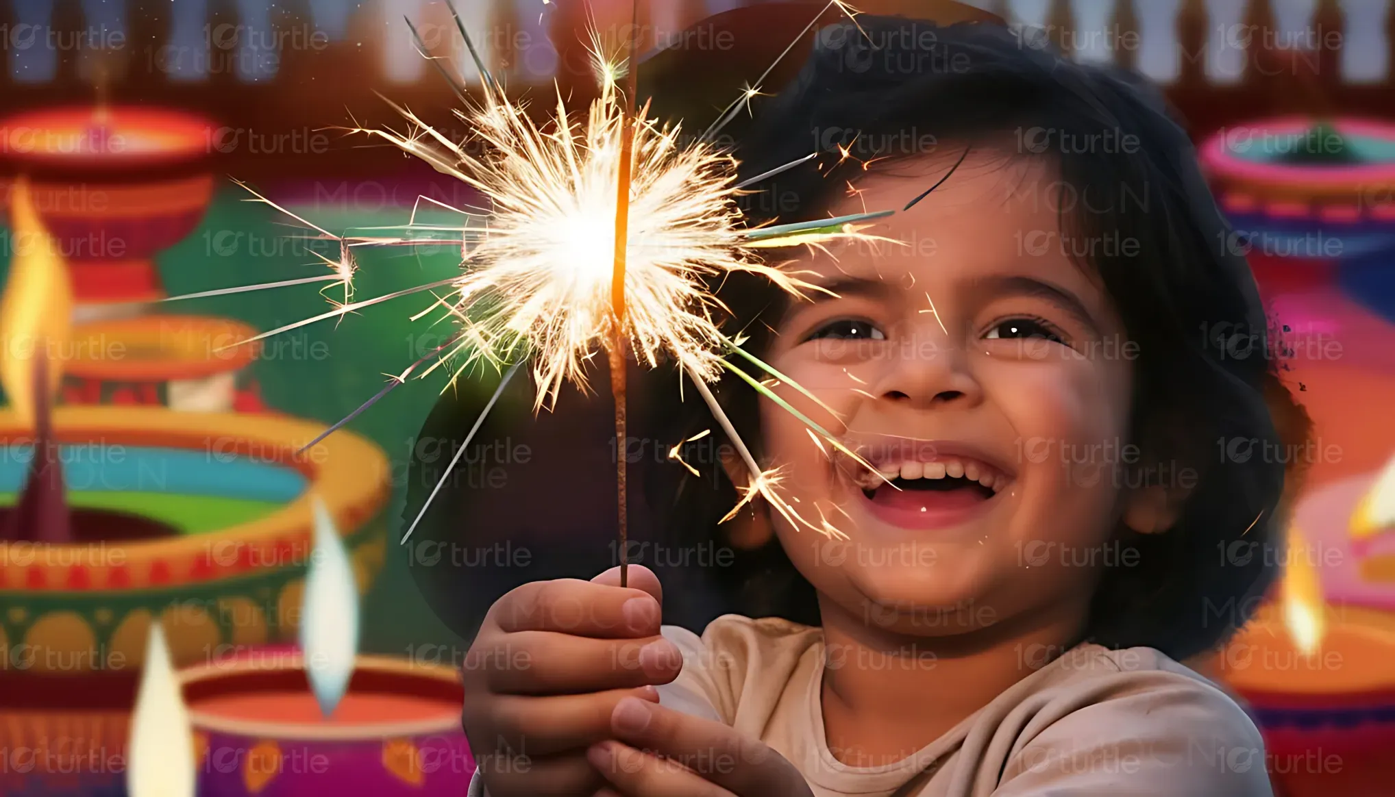
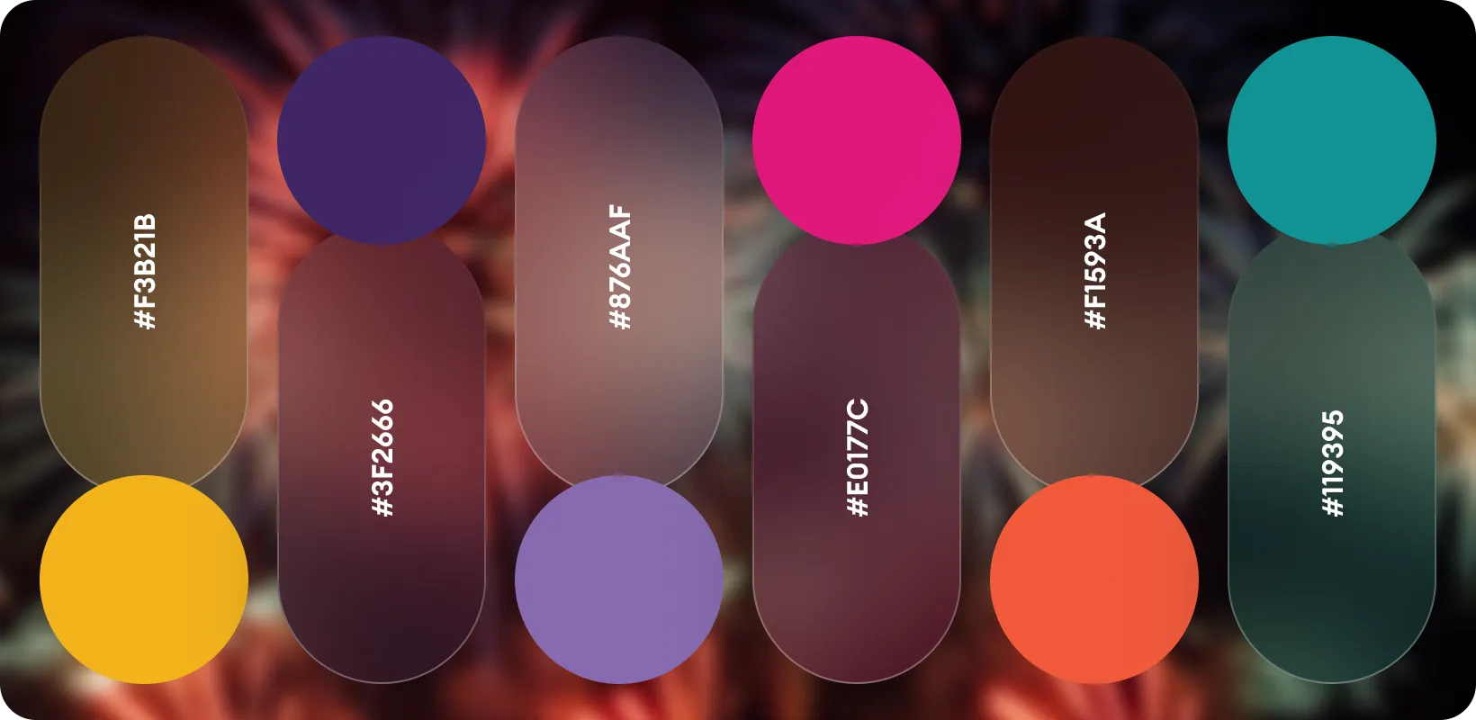
The color palette draws from vibrant, festive tones—bright reds, greens, purples, and golds—that reflect the spirit of Indian celebrations. These colors are emotionally uplifting and culturally resonant, symbolizing prosperity, joy, and energy. The consistent use of bold and contrasting hues enhances visual hierarchy and product differentiation while aligning with the brand’s message of “happiness through celebration.” The palette contributes significantly to the catalog’s festive and approachable aesthetic, making each page a visual delight.
