Promille transforms ambition into action. It provides users with the tools and mindset needed to master their life goals—whether personal, physical, or professional—via structured systems and daily practices. The brand’s method blends self-discipline, strategy, and community inspiration.
UX Design
UI Design
Websites Design
Industry
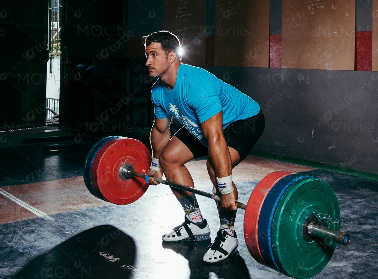
Health & Wellness
Tools we used


Project Completion
2024
The project aimed to build a bold and motivating digital presence, communicate core brand values like growth, discipline, and confidence, and promote the Promille system while inspiring conversions. The scope included designing a motivational homepage with clear structure, showcasing key system pillars, success stories, and community inspiration, and integrating FAQs, product previews, and contact links.
Industry
Health & WellnessWhat we did
User ResearchUI UX DesigningPlatform
-Promille lacked a platform that visualized its method and impact. Without a central hub, users couldn’t explore the brand’s system, core benefits, or credibility. A website was needed to articulate Promille's message and drive engagement.
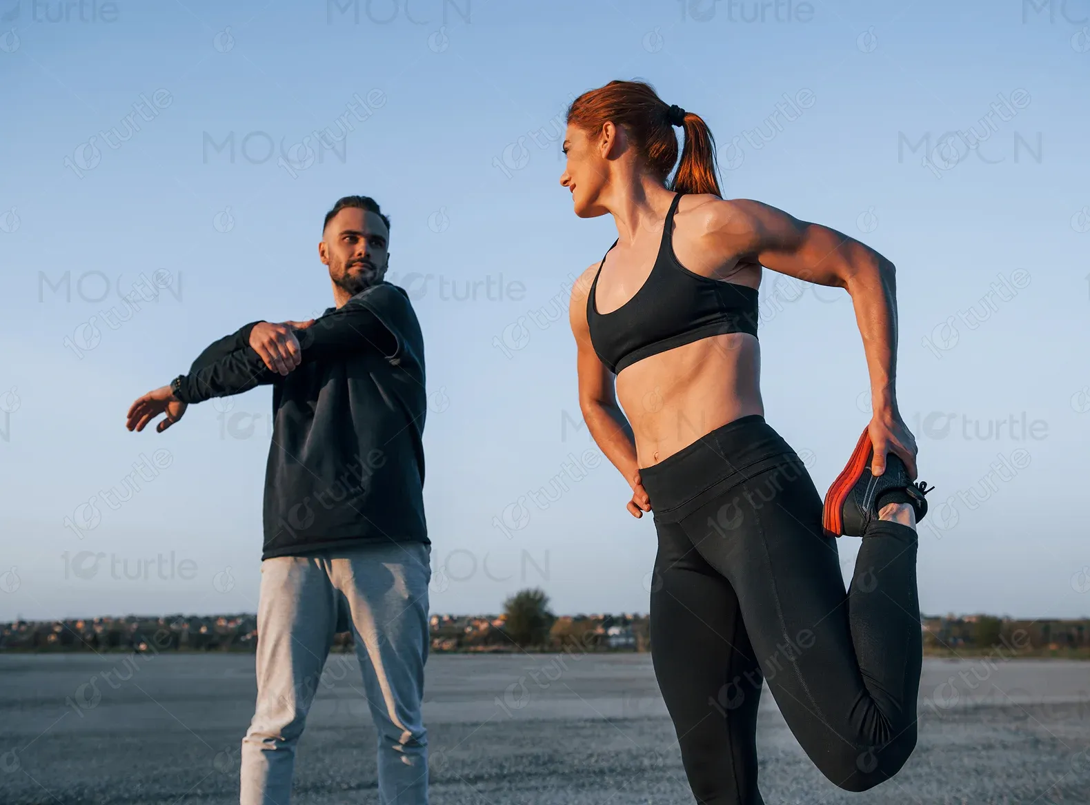
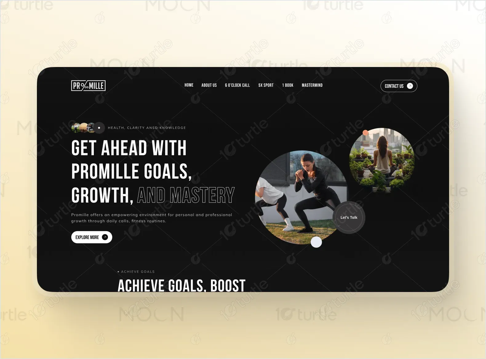
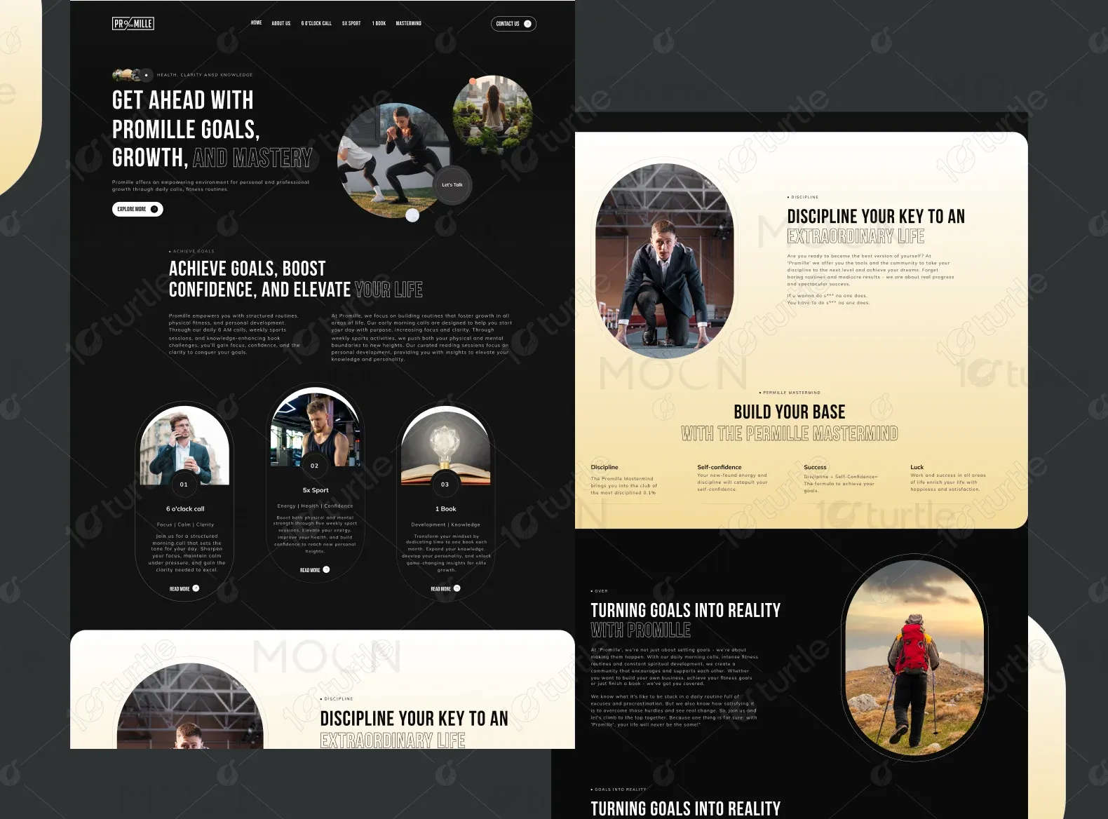
We designed a bold, high-contrast homepage emphasizing strength and clarity. The layout integrated structured content to highlight the Promille system and its benefits. Motivational stories, visual elements, and quotes were included to inspire users, while strategically placed CTAs encouraged deeper exploration and connection.
The client envisioned a bold, energetic, and structured design. Inspiration came from performance coaching brands, fitness influencers, and personal development authors. The layout needed to feel premium, organized, and highly motivational.
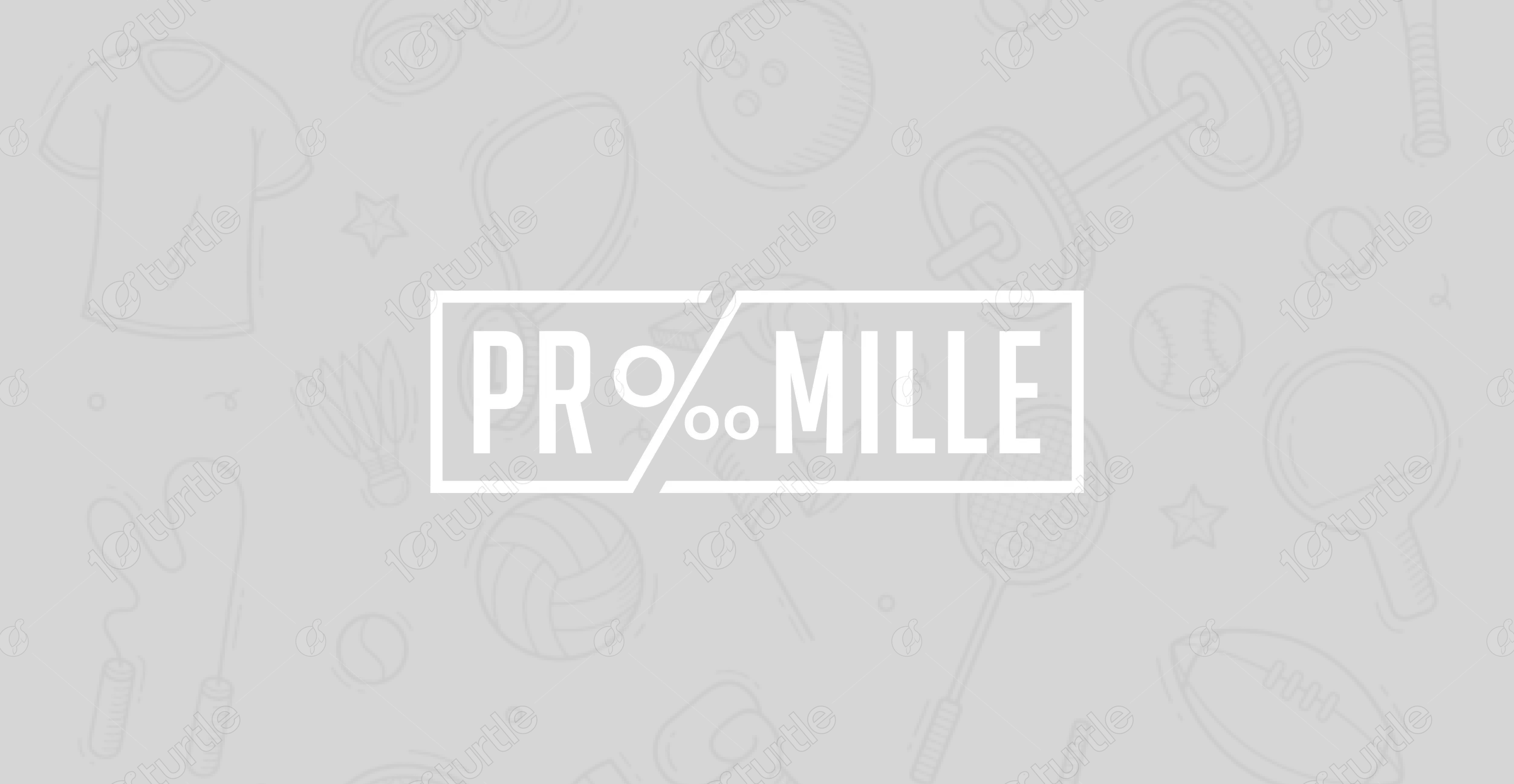
The Promille logo is compact and monochrome, projecting strength, structure, and clarity. Its modern serif feel adds professionalism while remaining assertive.
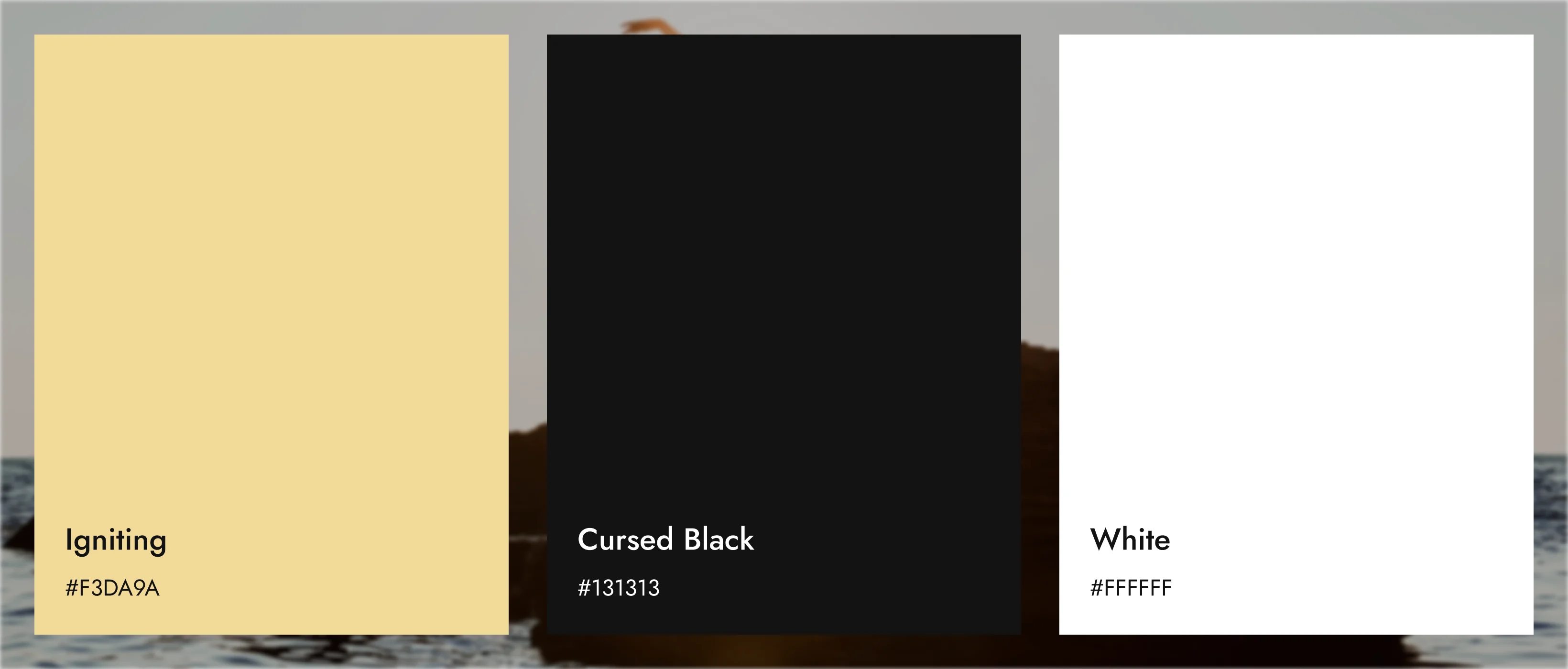
Jet Black (#000000) represents authority, power, and clarity. Soft White (#FFFFFF) brings simplicity and purity through contrast. Warm Gold Gradient (#FFF3E0 – #FFE0B2) evokes encouragement, aspiration, and progress. Together, these tones convey a sense of focus, transformation, and premium quality.
Initial wireframes prioritized vertical flow, balancing content with whitespace and spotlighting each section’s purpose. The structure mirrored the Promille mindset—clear, focused, and goal-driven.