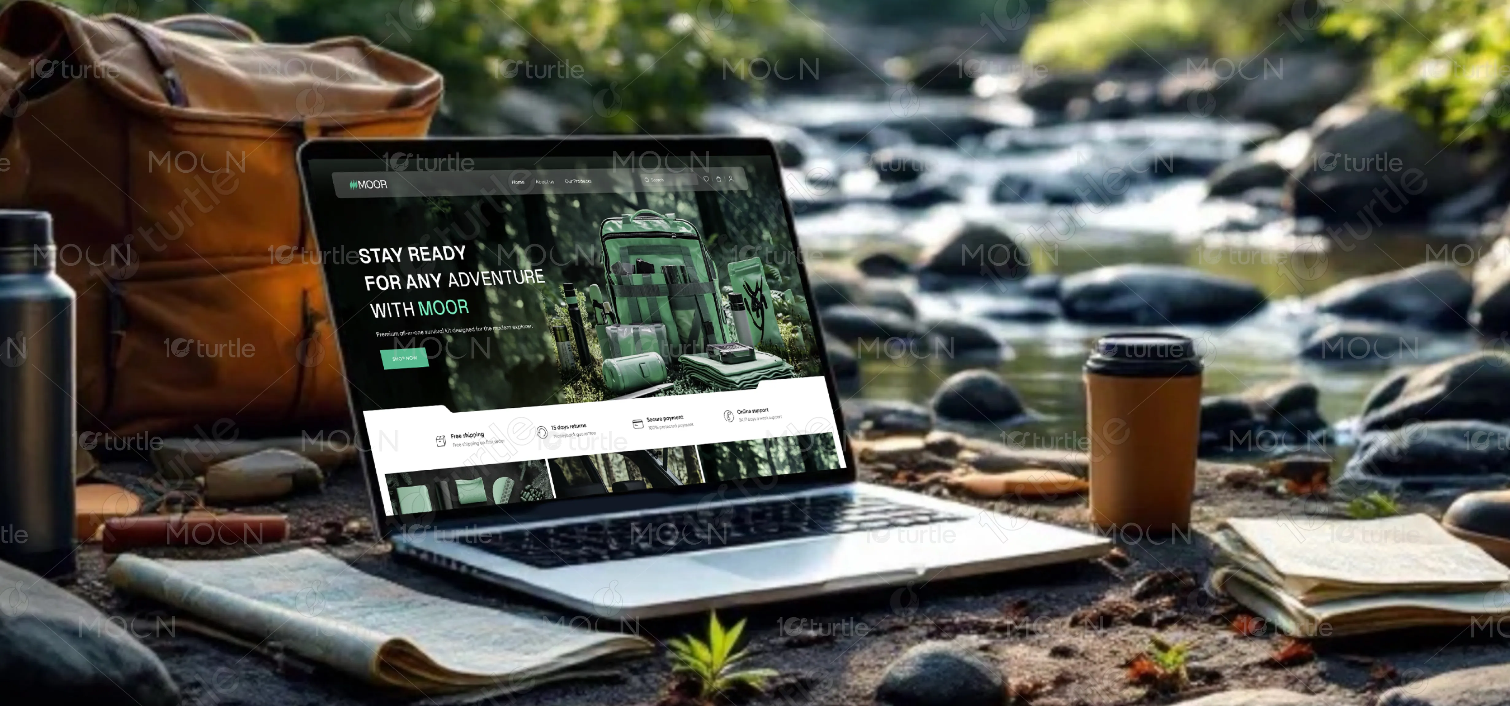
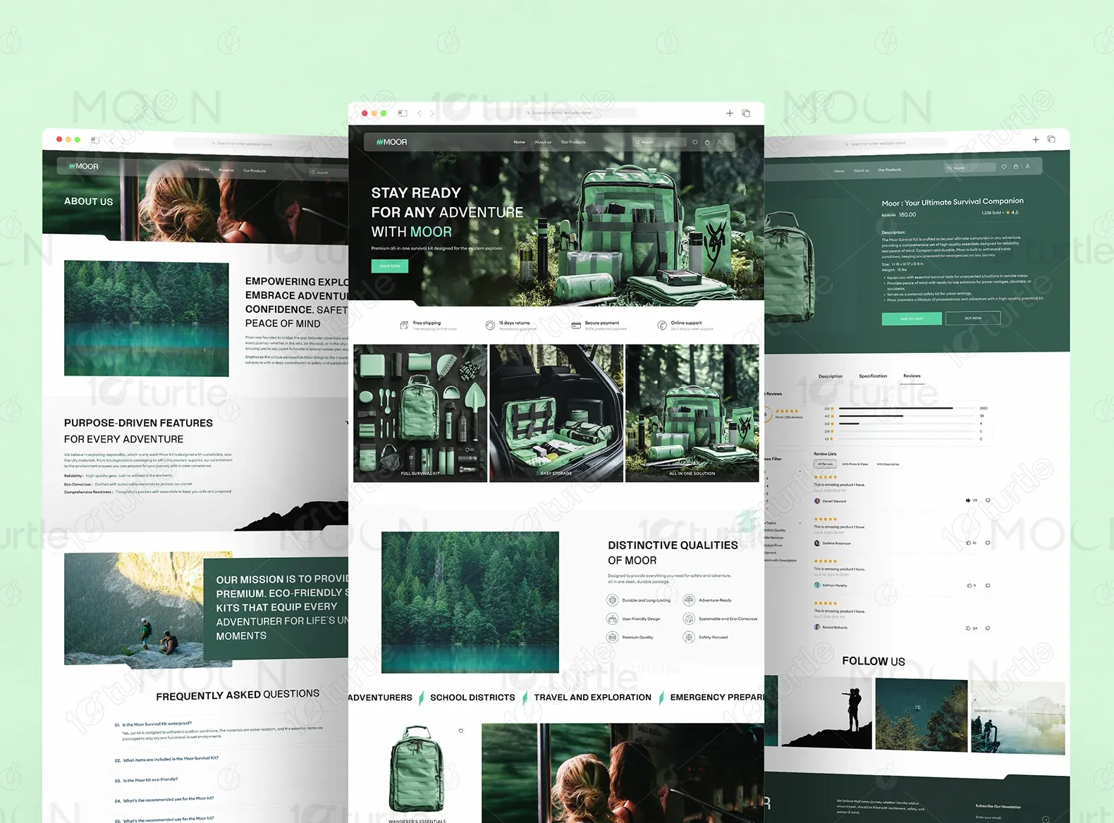
MOOR is a premium survival gear brand with compact kits for outdoor activities. Focusing on durability and functionality, MOOR equips adventurers with reliable survival tools.
UX Design
UI Design
Research
Industry
Travel, Tourism & Experiences
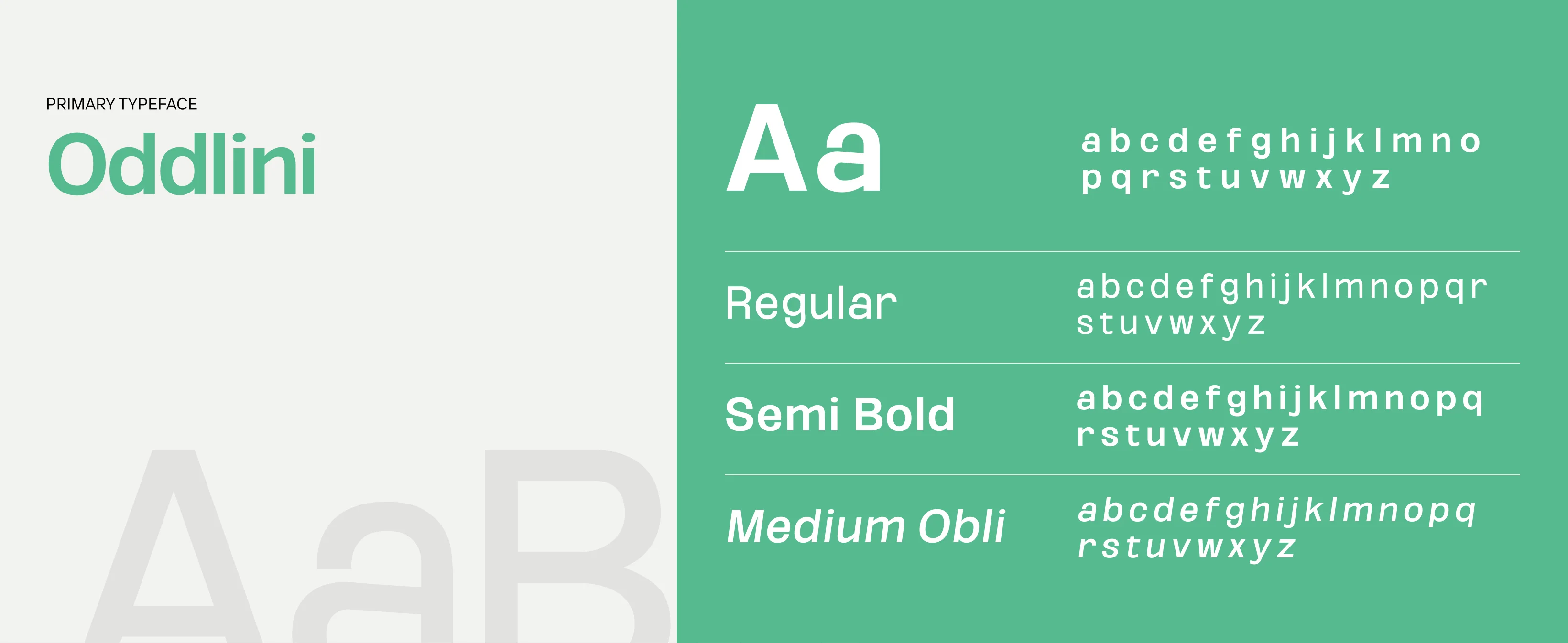
Tools we used

Project Completion
2024
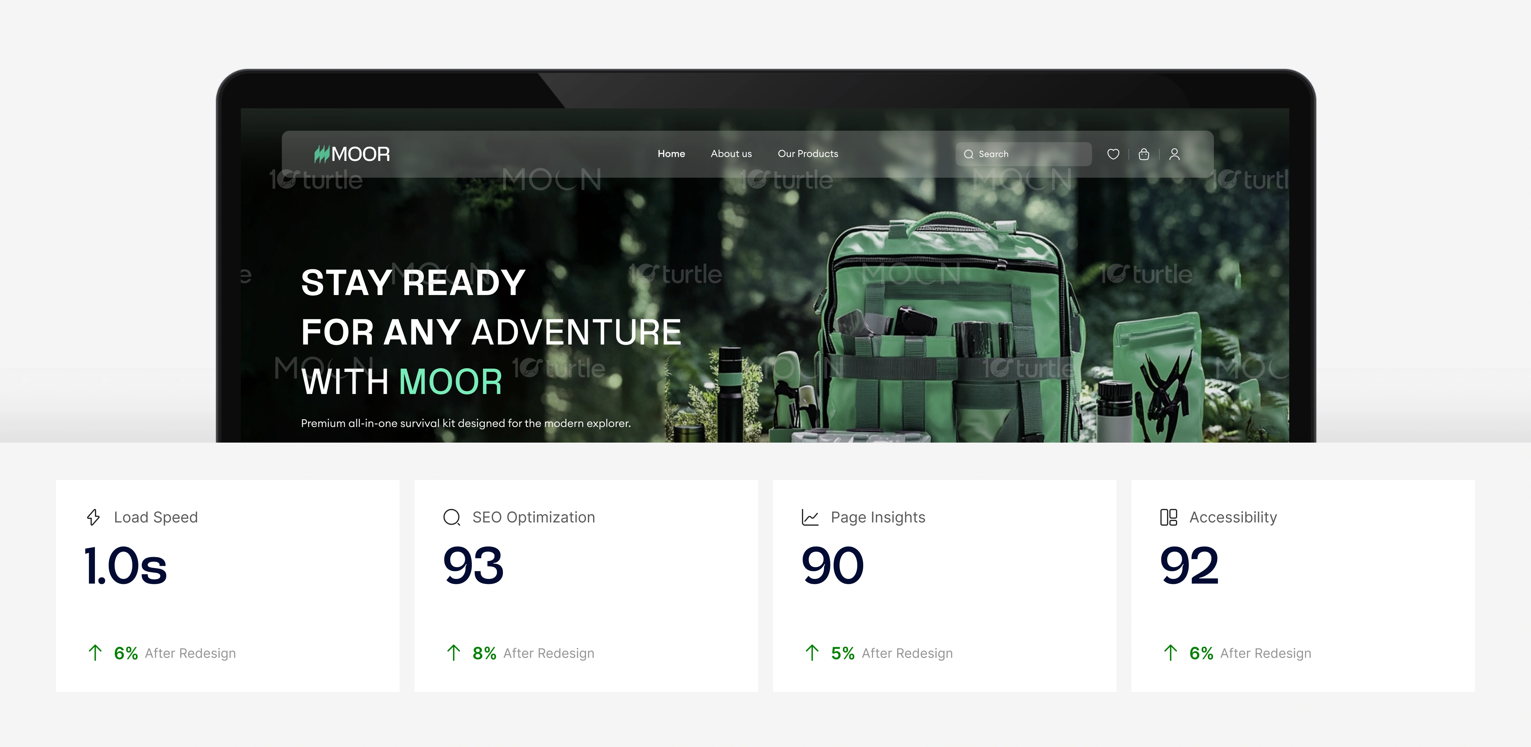
The primary goal of this project was to develop a modern, visually engaging e-commerce website that effectively showcases MOOR’s survival kits while improving user engagement and conversion rates. The client sought a design that would seamlessly balance rugged adventure aesthetics with a premium shopping experience. The main challenges included communicating the product’s unique value in a competitive market, creating an intuitive design that aligns with the brand’s adventurous spirit, and optimizing the website for a smooth e-commerce experience across all devices.
Industry
Travel, Tourism & ExperiencesWhat we did
User ResearchUI UX DesigningPlatform
-MOOR needed a compelling online presence that accurately represented its premium survival kits. The previous design lacked the necessary visual appeal, clear navigation, and structured product showcase required to engage potential customers. The challenge was to design a platform that not only captured MOOR’s essence but also provided an efficient shopping experience. Without a strong digital presence, the brand risked losing potential customers to competitors with more refined online stores.
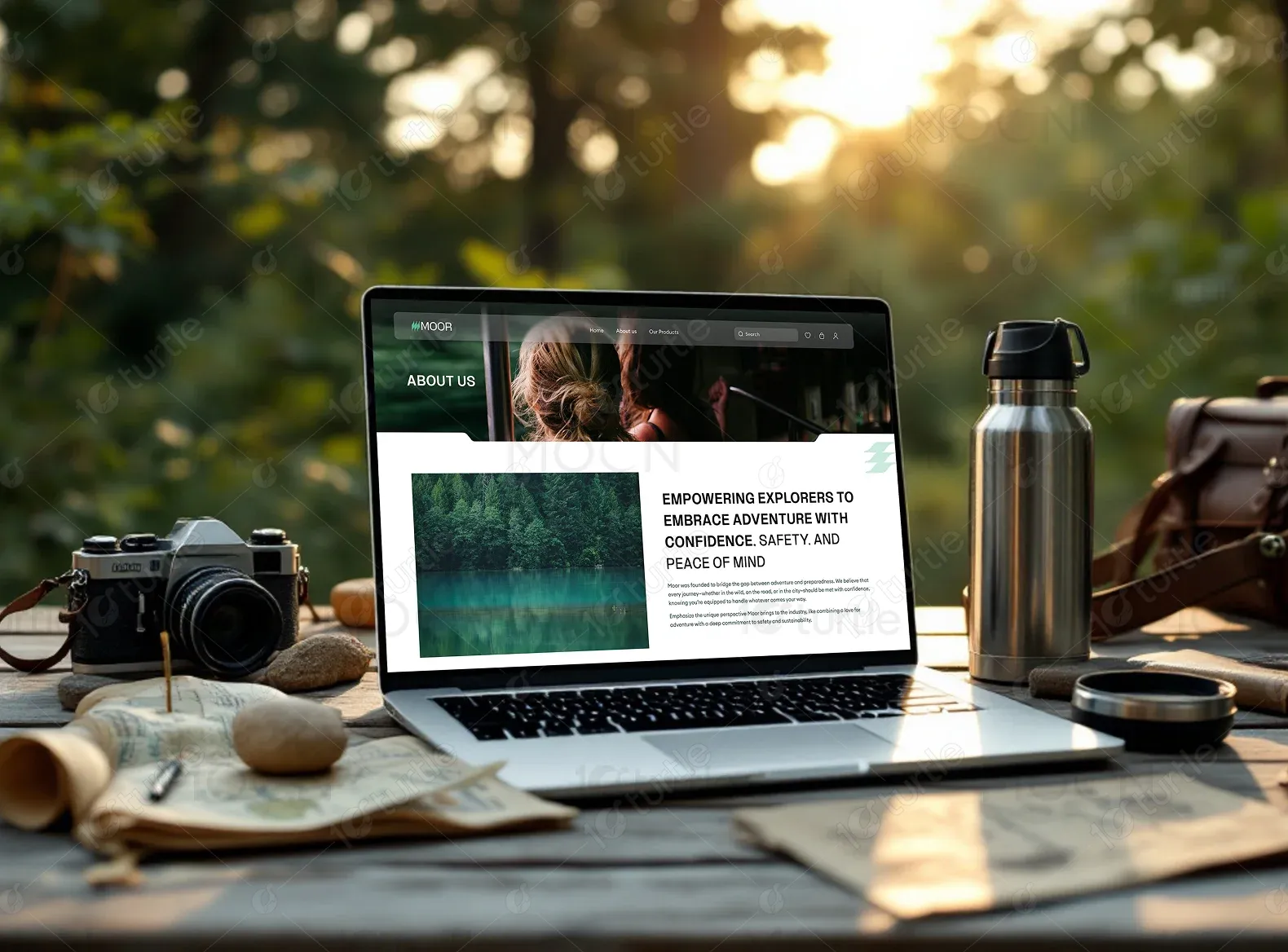
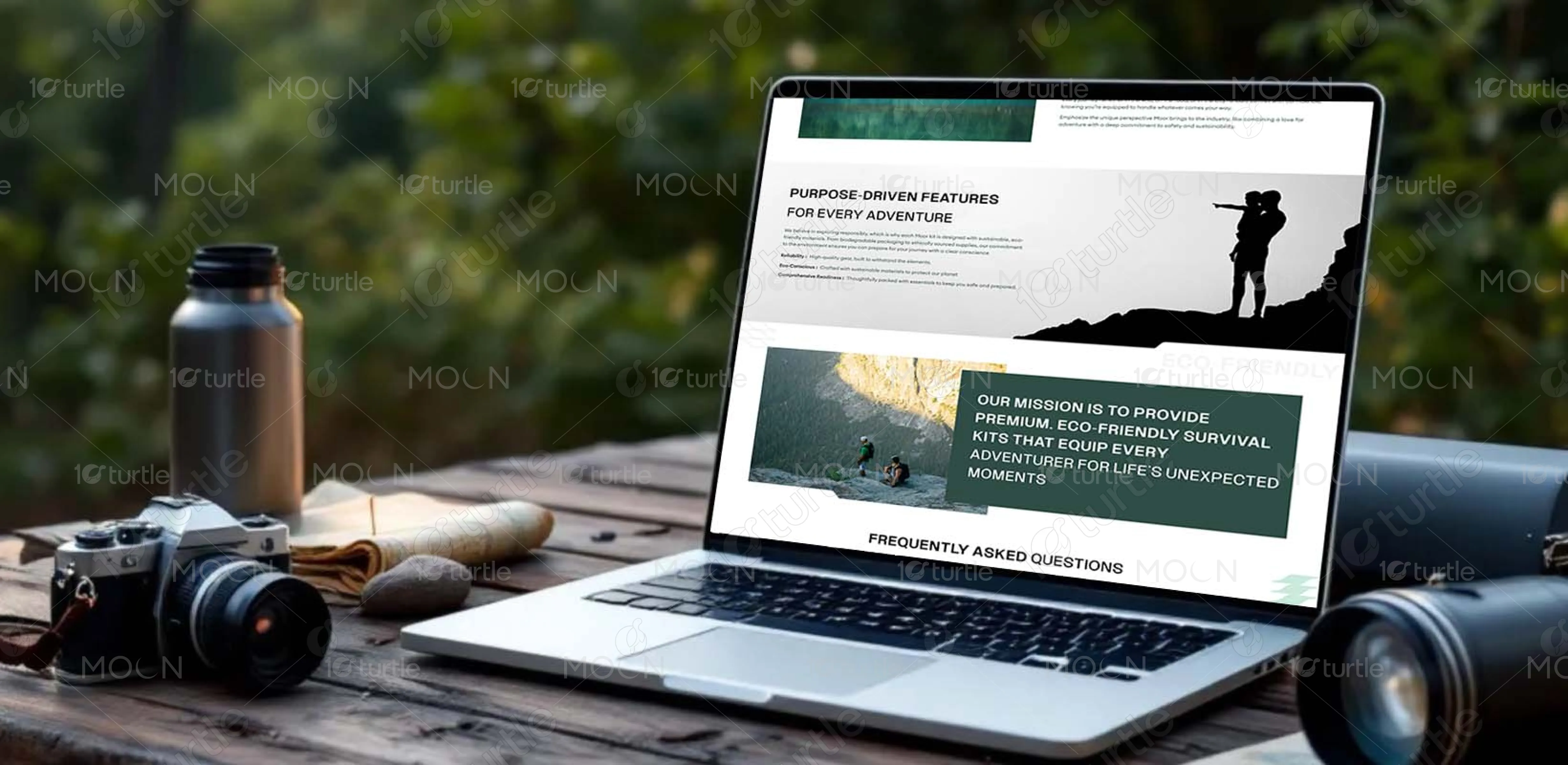
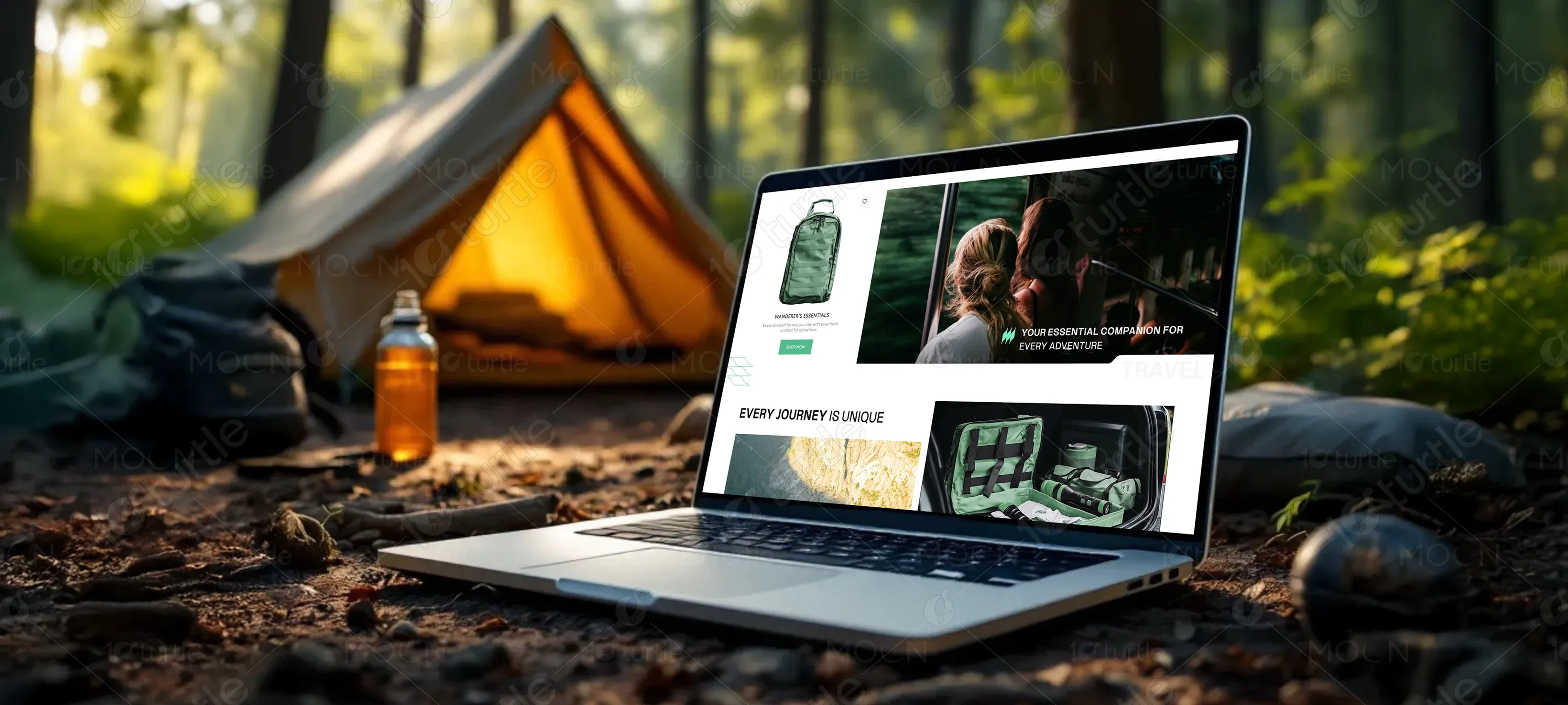
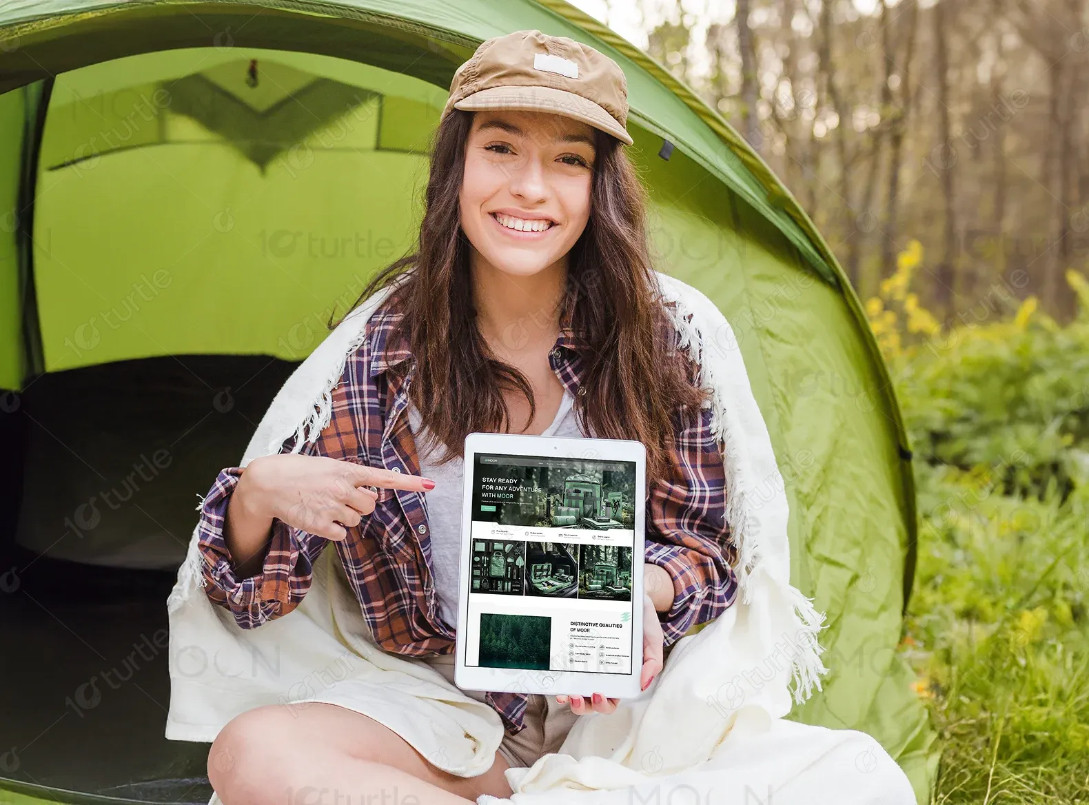
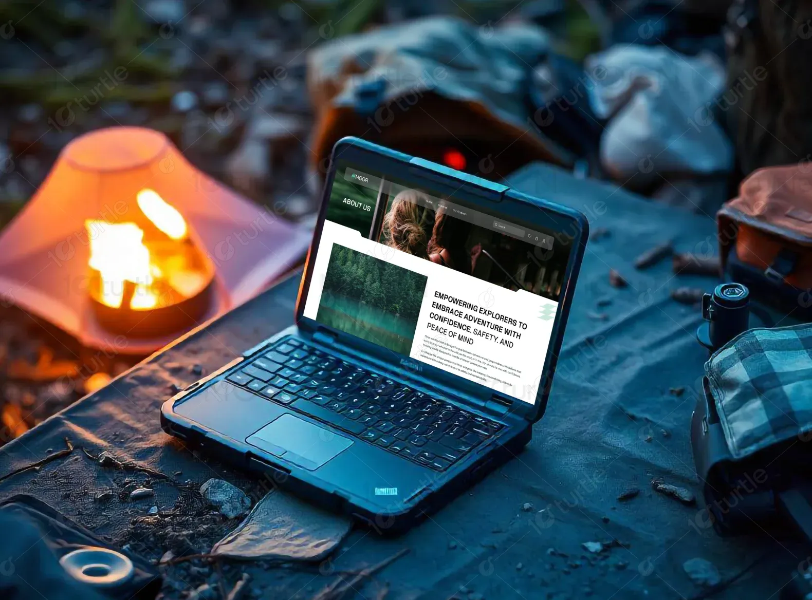
The approach focused on developing a sleek and modern UI that encapsulates the adventurous yet premium nature of MOOR’s brand. The website was structured to create a highly immersive experience through high-quality imagery, interactive product displays, and a seamless navigation system. A visually rich layout was implemented to highlight key product features and benefits. Thoughtfully designed call-to-action elements ensured a smooth customer journey, from product discovery to checkout. Additionally, a fully responsive and mobile-friendly interface was developed to guarantee optimal usability across all devices.
The website's fast load time, optimized SEO, high page insights, and improved accessibility contribute to an enhanced user experience. These factors ensure that users are engaged quickly, with minimal friction, while the design’s clear structure and responsiveness lead to better interaction and conversion rates, reflecting an overall effective user experience.
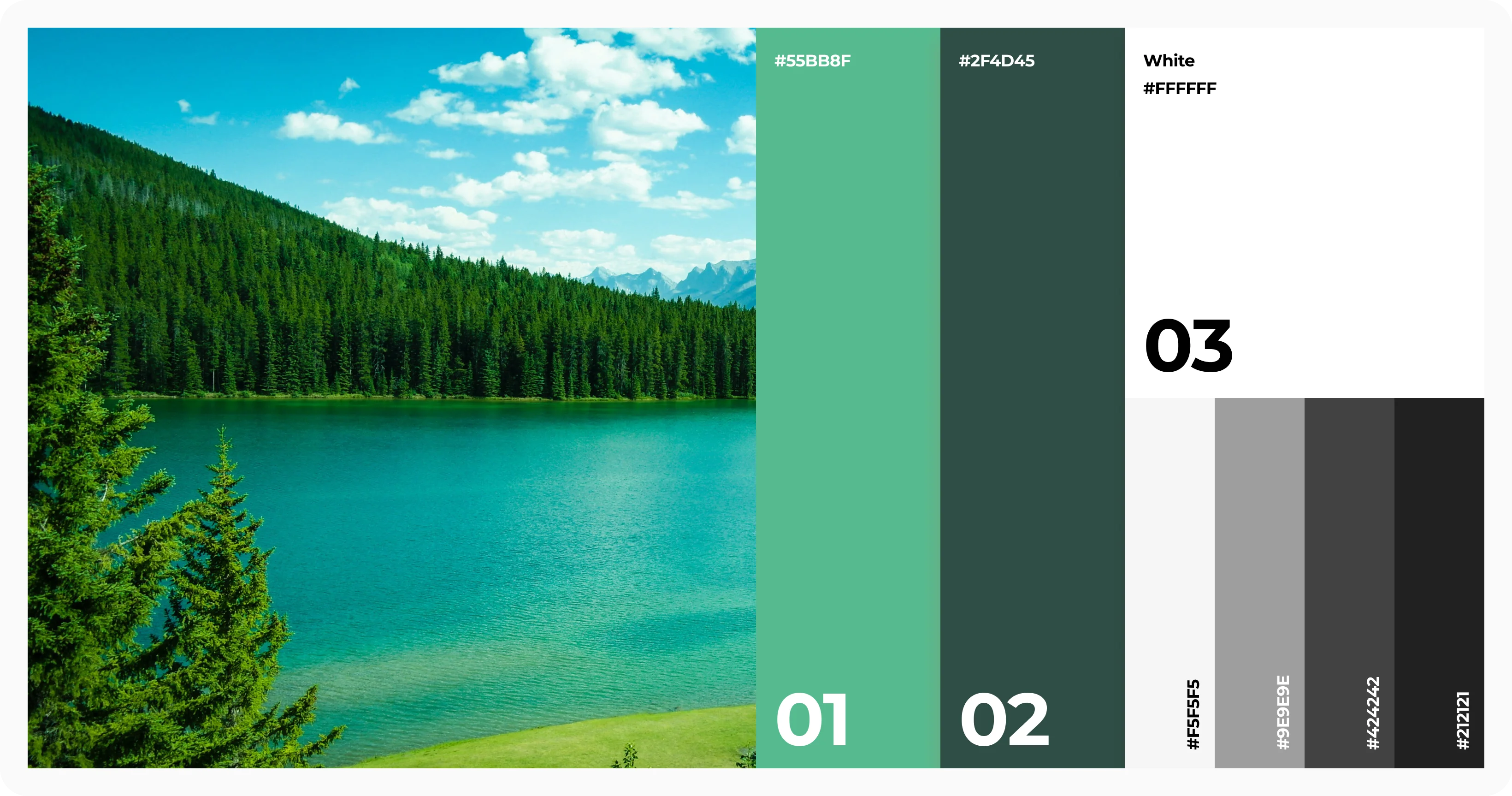
The client envisioned a website that felt premium, adventurous, and immersive while maintaining ease of use. They emphasized a nature-inspired aesthetic with deep greens, rugged textures, and bold typography that aligned with the brand’s essence. Drawing inspiration from brands like Patagonia and The North Face, the design needed to reflect the thrill of exploration while maintaining an intuitive e-commerce flow.
MOOR’s logo embodies resilience and preparedness. Designed with a rugged yet minimalistic approach, the logo features strong typography combined with a dynamic icon that represents durability and adventure. The color palette of the logo further reinforces the brand’s connection to nature and exploration.
The brand’s primary color is Forest Green (#2C5E3E), symbolizing nature, resilience, and reliability. Black (#000000) is used for contrast and sophistication, while White (#FFFFFF) maintains a clean and minimal aesthetic. Earthy Beige (#D9C2A3) adds warmth to the design, reinforcing the connection to outdoor exploration and adventure.
The initial wireframes were meticulously crafted to establish a strong visual hierarchy and intuitive navigation. The layout focused on presenting product features in a structured manner while maintaining a compelling storytelling approach. Key wireframe elements included a bold hero section, immersive product showcases, and a streamlined checkout process.