
Annual Report Design • Corporate Report Design • Brochure Design • Digital Report Design
Overview
Vantage Dynamics Inc.’s annual report design presents company results, leadership, services, and value creation in a polished corporate format. Built for both tablet viewing and print-ready reporting, the layout uses restrained olive, beige, white, and black tones, modular pages, statistics panels, table of contents, board profiles, and service sections to make stakeholder communication feel clear and premium.
The Challenge

Corporate annual reports often contain dense information that can feel difficult to scan, especially when financial, leadership, and strategic content compete for attention. Poor report design can make a capable company look unclear, outdated, or less credible to stakeholders. In consulting and technology-led industries, audiences expect information to feel structured, confident, and easy to review across print and digital formats. The challenge was to turn formal business content into a readable, modern report without losing authority.
The Solution
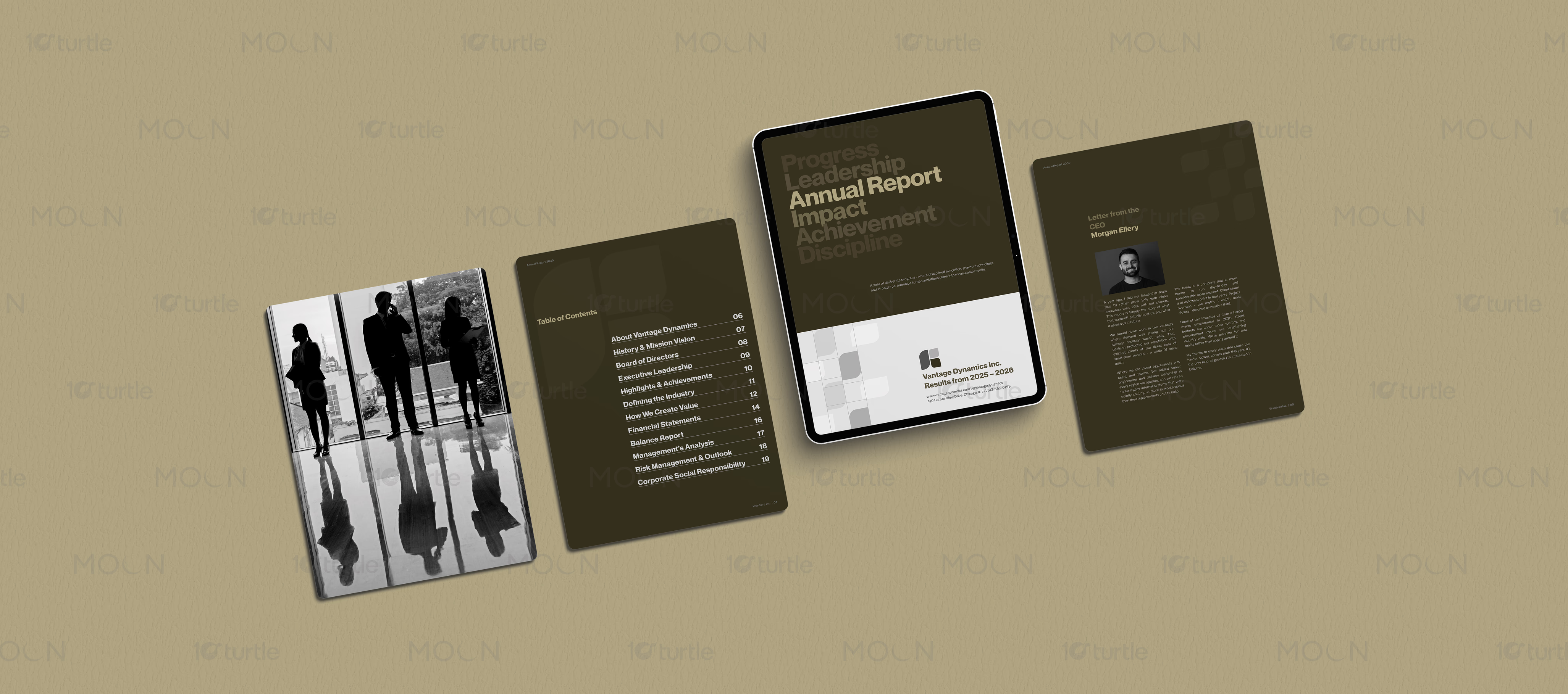
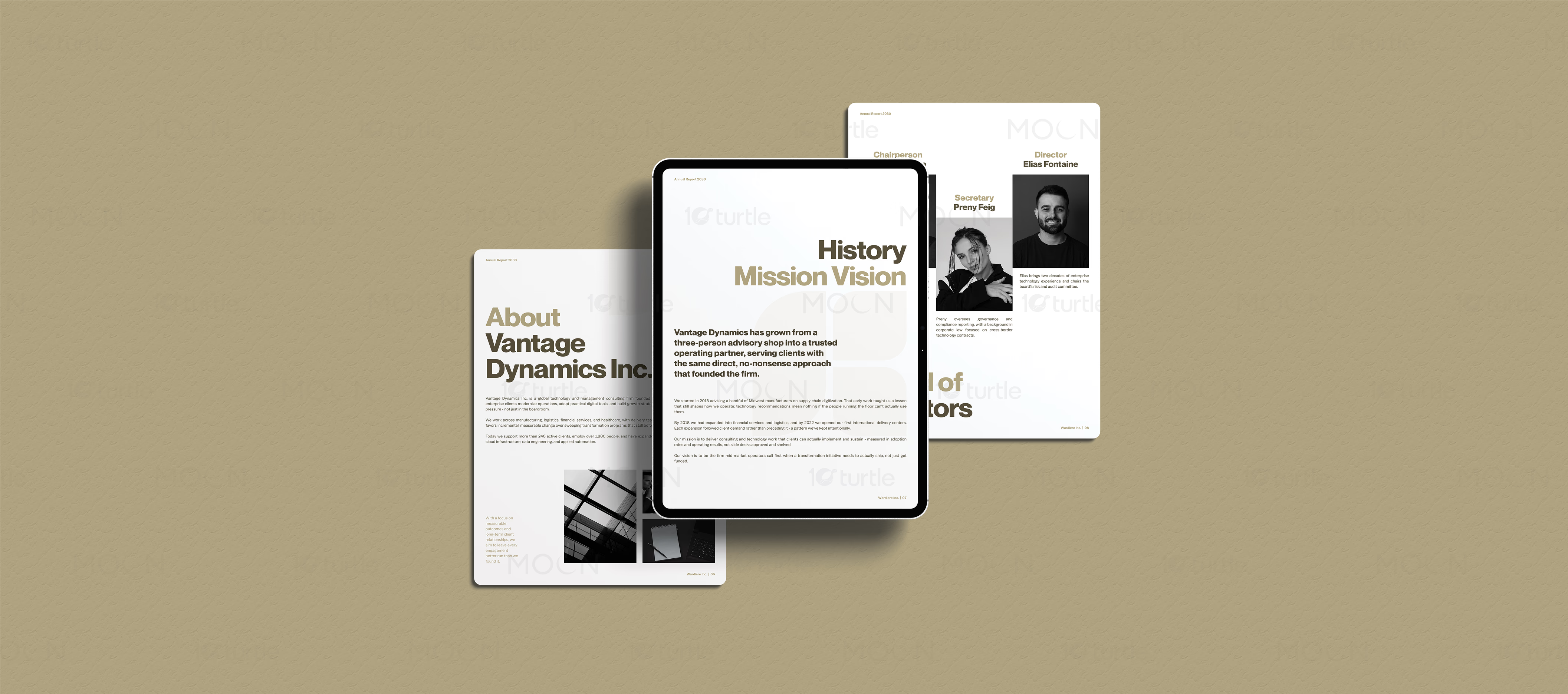
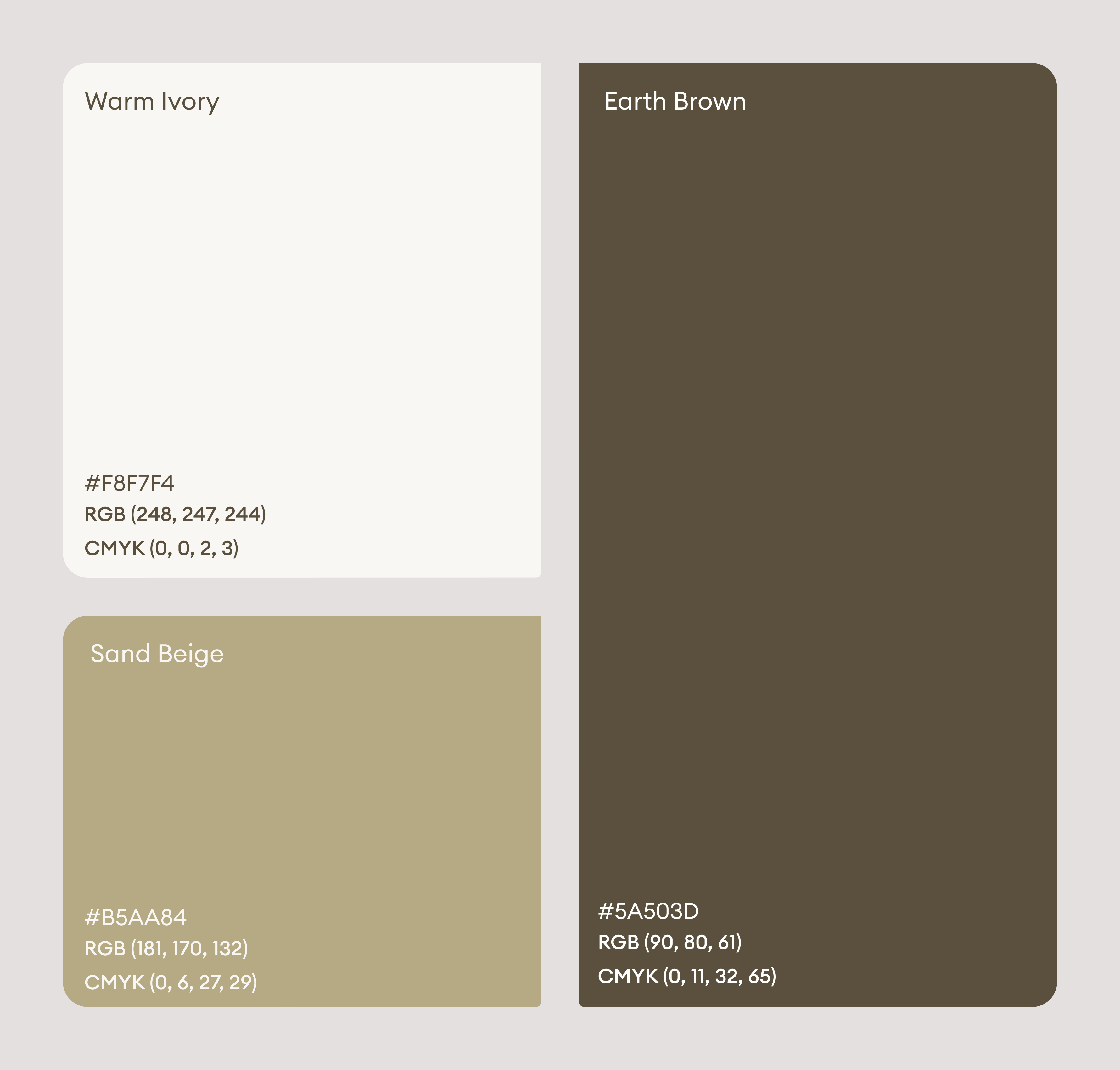
The design uses a refined olive, beige, black, and white color system to create a professional corporate tone. Large typographic pages highlight themes such as progress, leadership, impact, achievement, and discipline, while clean editorial spreads organize sections like history, mission, board of directors, statistics, management analysis, and services. Tablet mockups show the report as a digital-ready document, while print pages demonstrate brochure-style usability. Black-and-white photography, grid-based layouts, and clear content blocks help the report feel premium and easy to navigate.
The Impact
The annual report strengthens Vantage Dynamics Inc.’s professional image by making company performance and leadership communication visually credible. Its print and tablet-ready format supports investor sharing, internal presentations, stakeholder meetings, and digital distribution. The structured layout makes key achievements easier to understand and remember. Long term, this report system can improve brand trust, corporate transparency, and consistency across future business communications.



Annual report design plays a major role in how a company communicates performance, leadership, and future direction. For a corporate brand like Vantage Dynamics Inc., the report needs to do more than present information. It must help stakeholders understand progress, trust the organization, and move through dense business content without friction. This project approaches the annual report as both a formal corporate document and a modern brand communication asset.
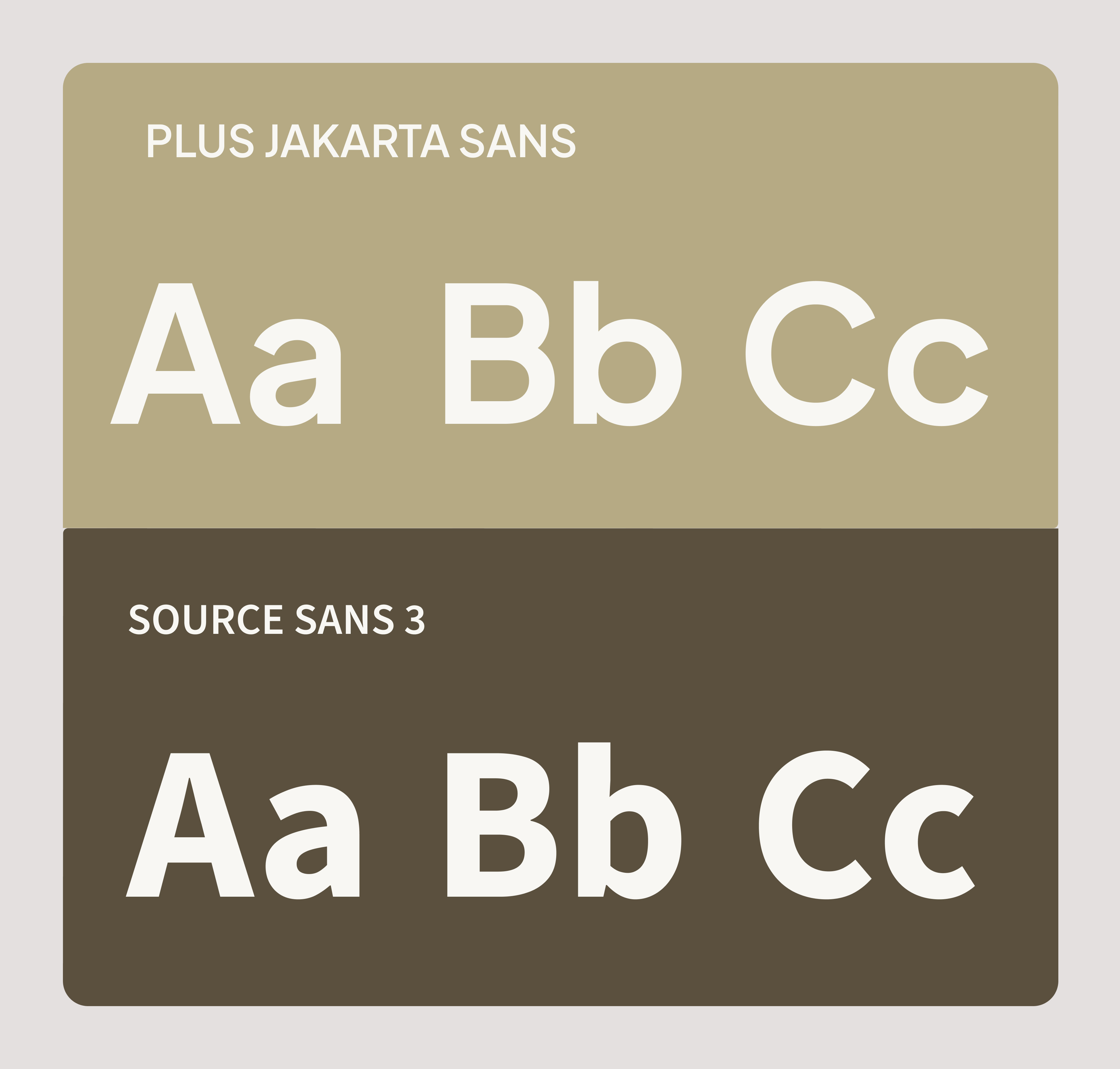
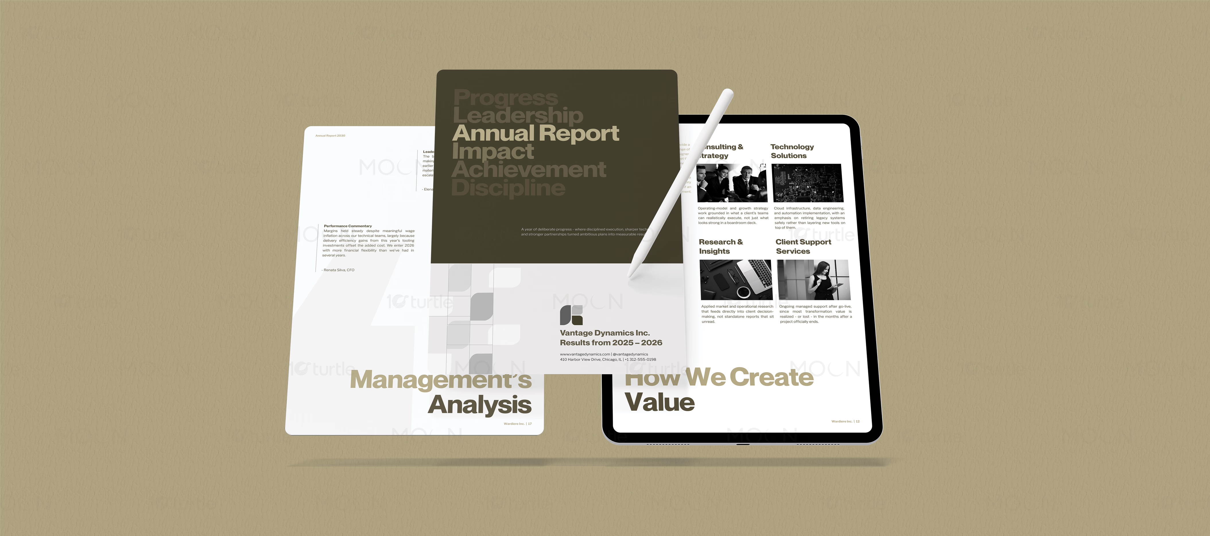
The visual direction is clean, restrained, and professional. The report uses an olive-black cover style, warm beige presentation backgrounds, white interior pages, and strong black-and-white photography. These choices create a serious corporate tone without making the layouts feel heavy. Large sans-serif typography is used to highlight key themes such as progress, leadership, annual report, impact, achievement, and discipline. This gives the report a strong opening impression while keeping the brand language direct and confident.
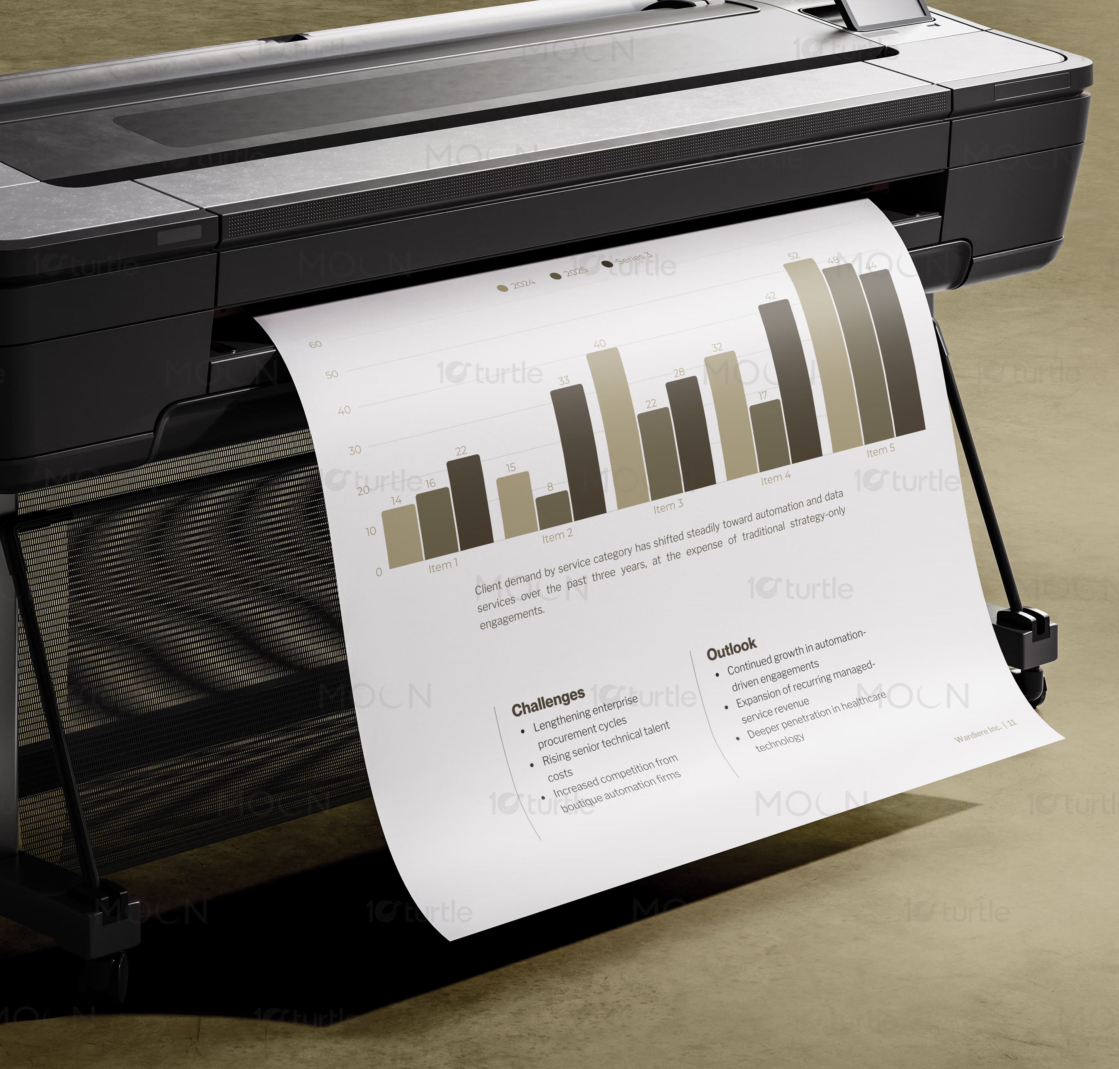
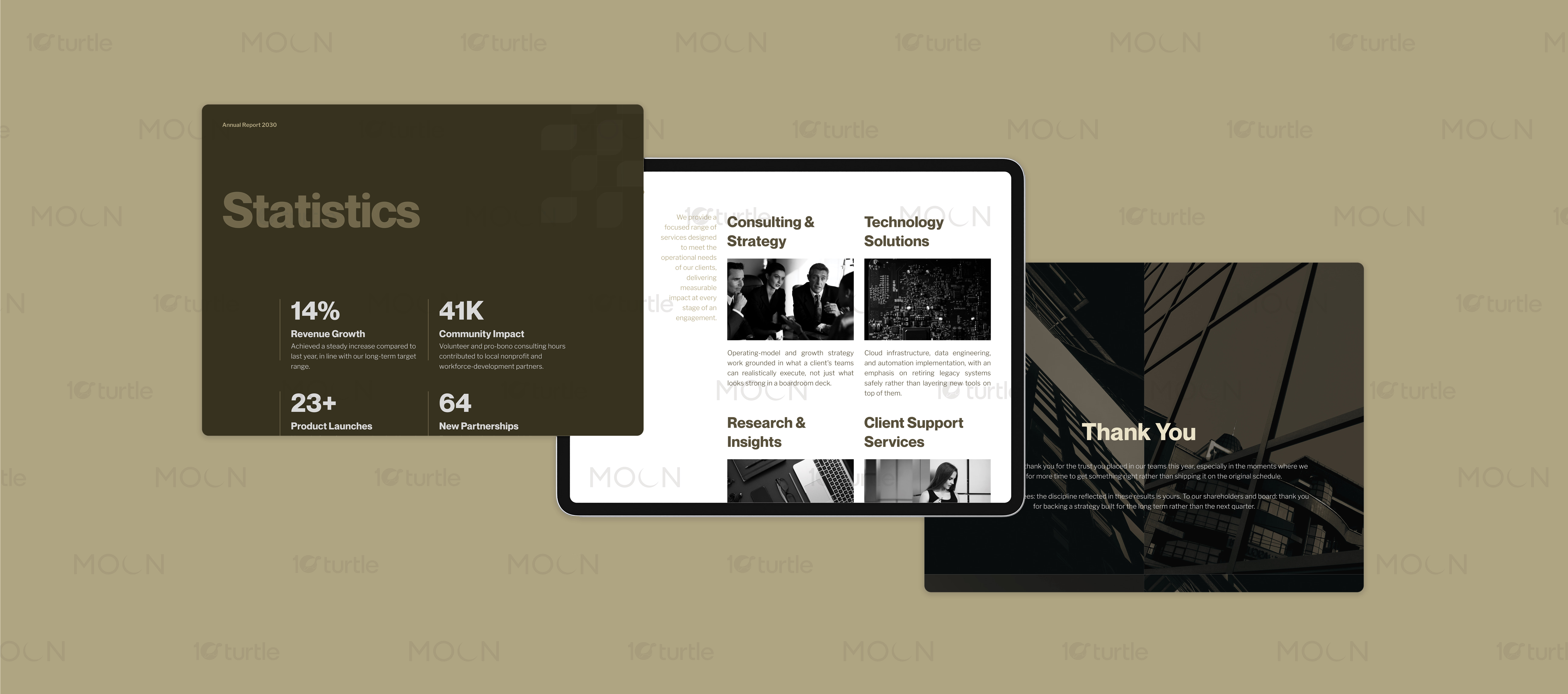
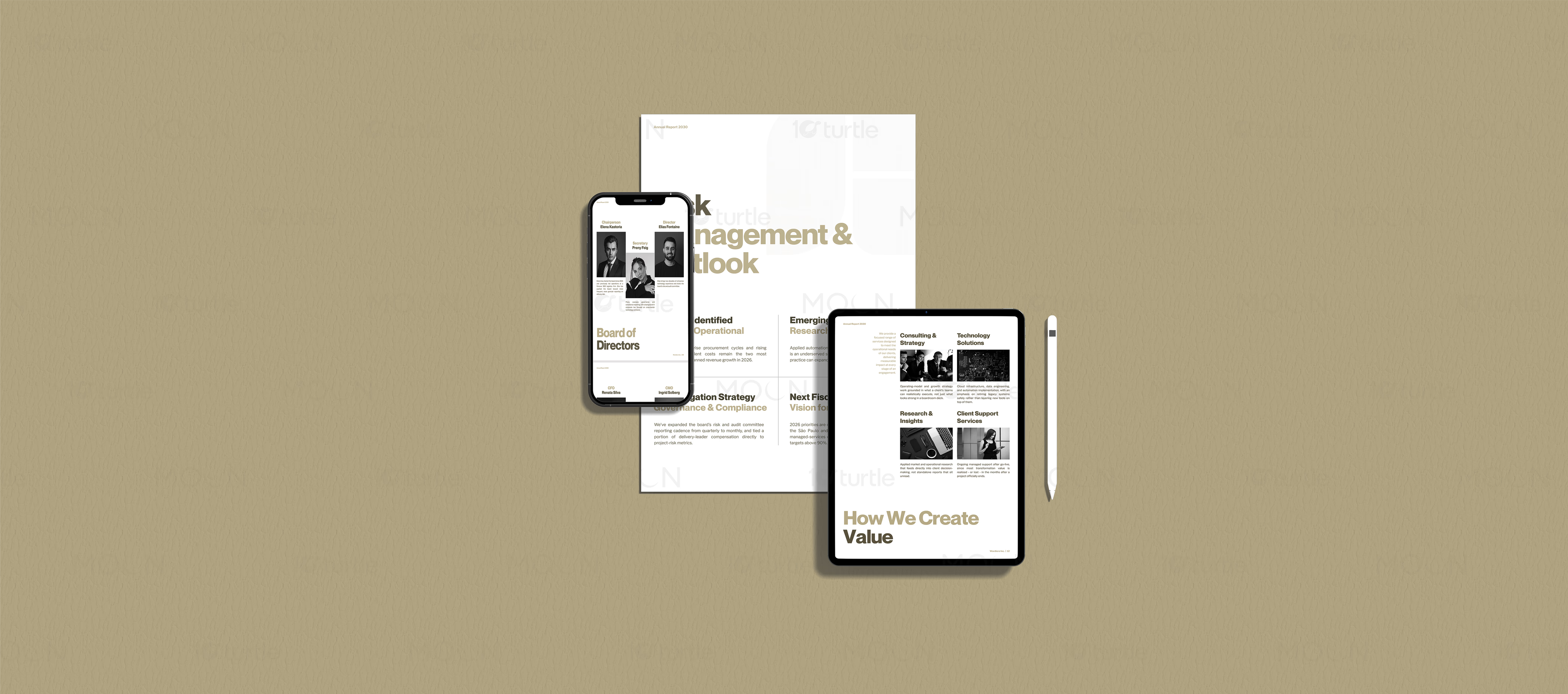
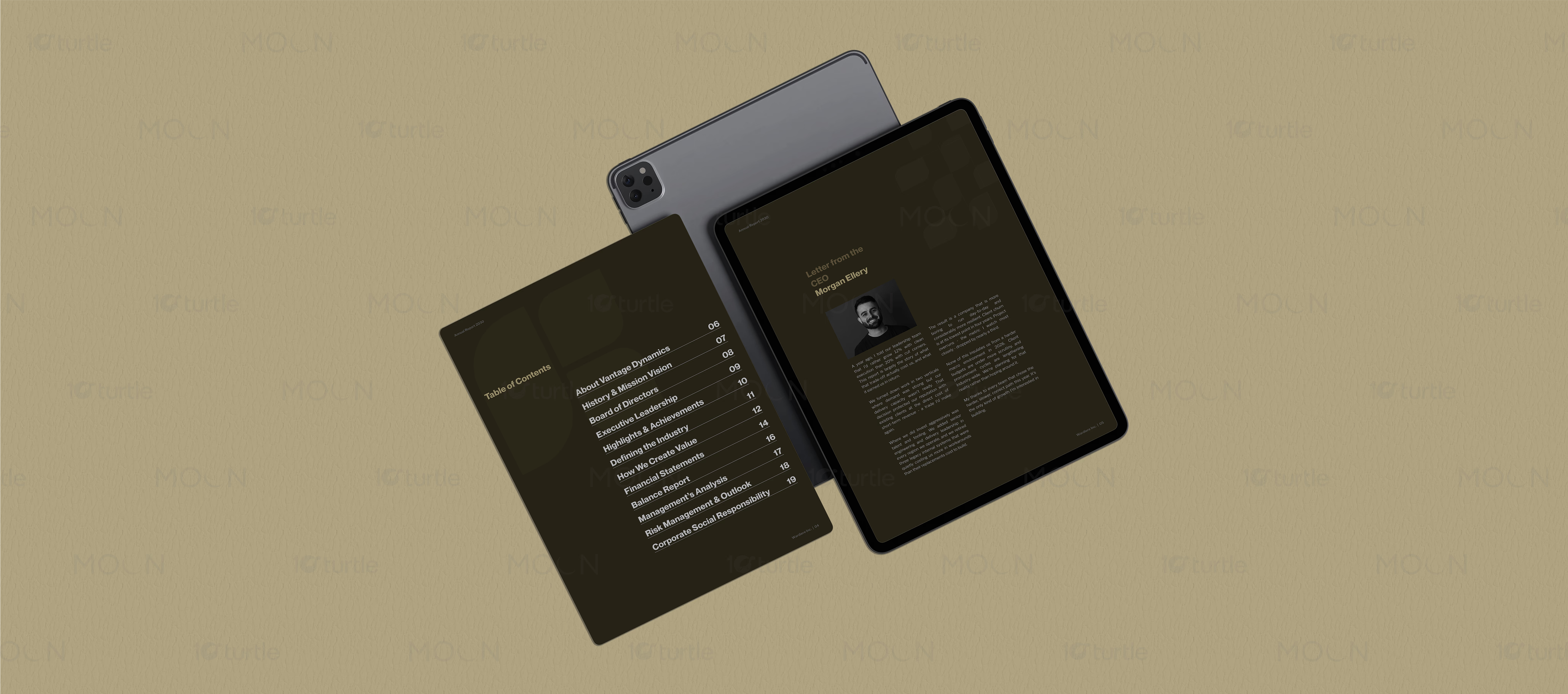
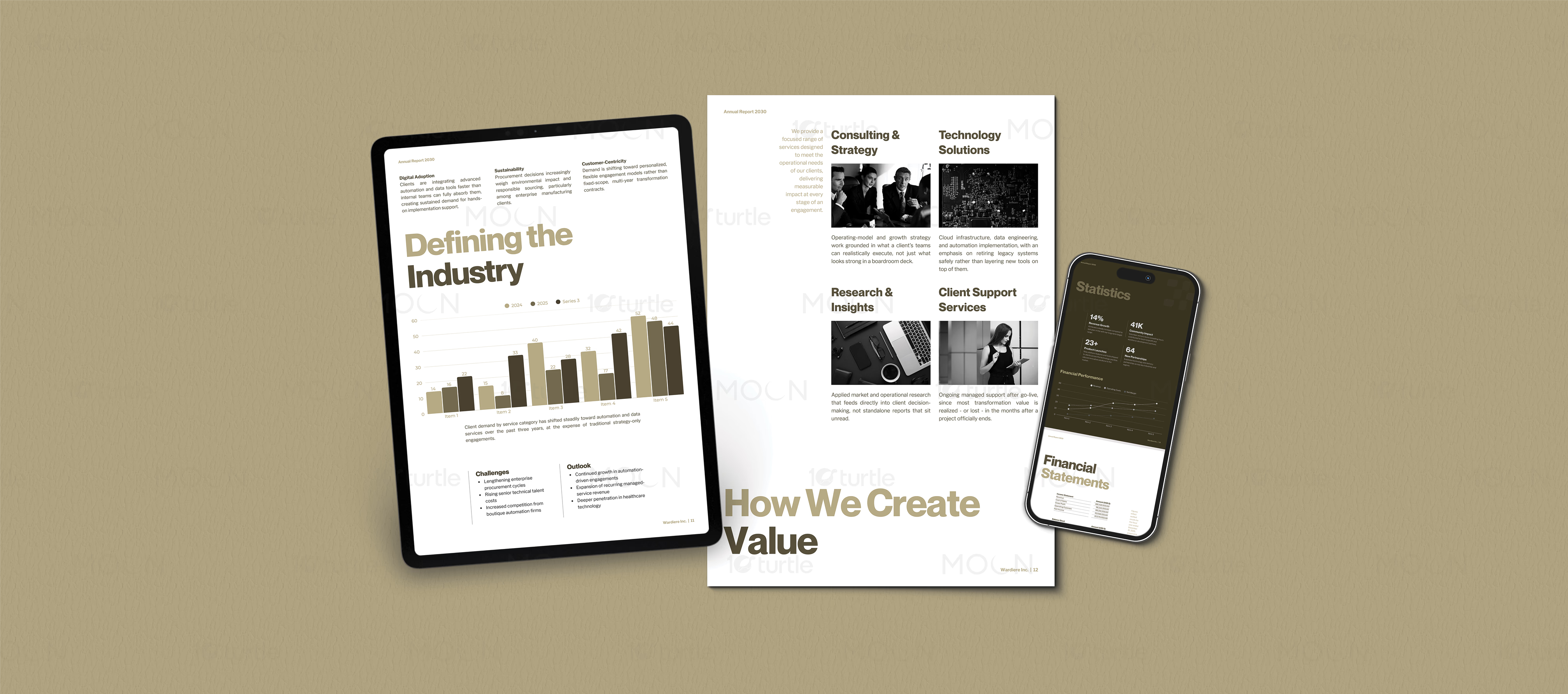
The interior structure focuses on clarity. Pages such as the table of contents, history, mission vision, board of directors, statistics, consulting and strategy, technology solutions, research and insights, client support services, management analysis, and thank-you page are shown through modular editorial layouts. Each spread uses clear hierarchy, readable text blocks, image placement, and generous spacing. The statistics page uses large figures such as 14%, 41K, 23+, and 64 to make business highlights instantly visible. These details help transform complex corporate information into content that feels organized and easy to review.
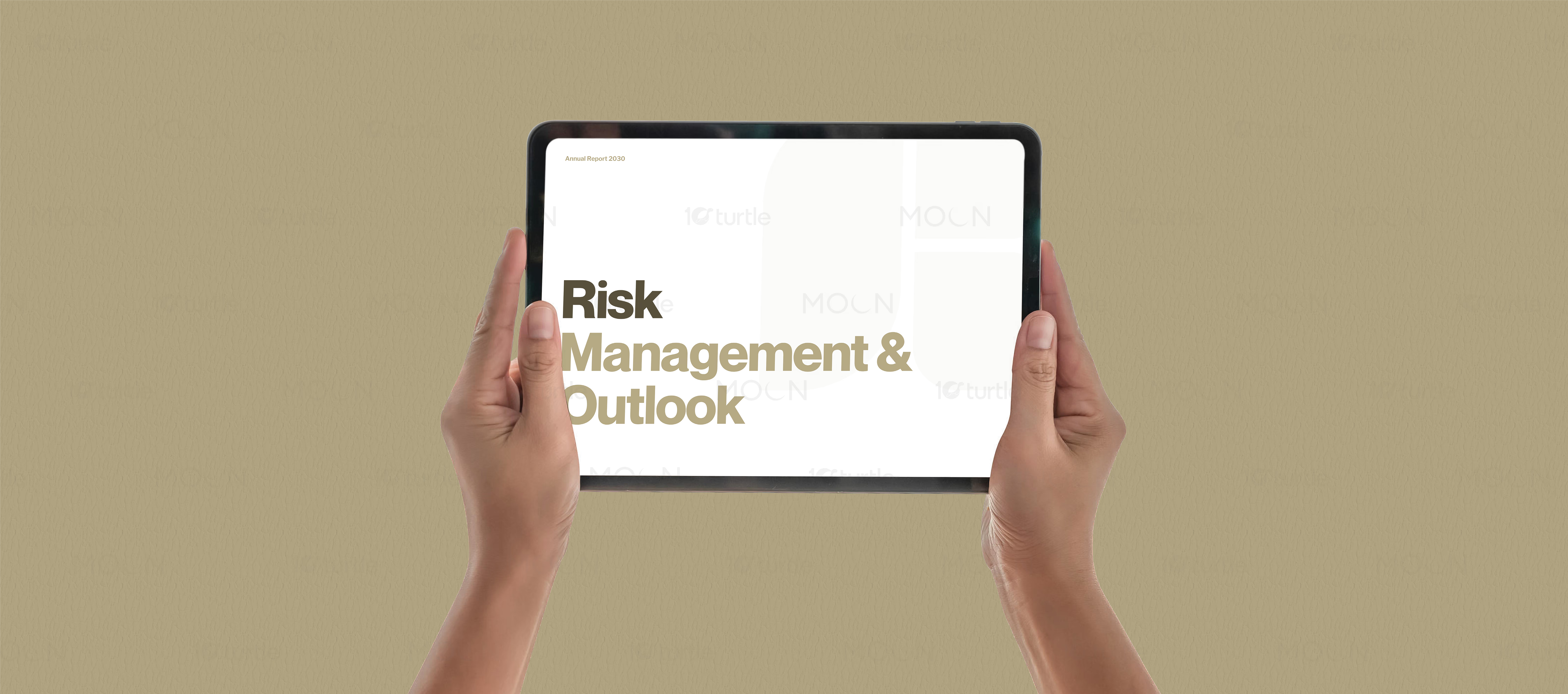
A key strength of this corporate report design is its multi-format presentation. The visuals show the report across printed pages, tablet screens, and mobile-style views, making it suitable for stakeholder meetings, digital sharing, investor communication, and brochure-style presentation. This matters because annual reports are no longer viewed only as printed documents. They are often shared as PDFs, viewed on tablets, used in presentations, and repurposed across corporate communication channels.
The result is a polished annual report design that supports both credibility and usability. The restrained color palette builds authority, while the grid-based structure keeps the report practical. The tablet mockups make the project feel current, and the print-ready layouts show that the report can function as a professional physical document. For corporate and consulting brands, this kind of business report design can improve trust, strengthen presentation quality, and create a consistent foundation for future reporting.
#annualreportdesign
#corporatereport
#businessreport
#reportdesign
#editorialdesign
#brochuredesign
#printreadyreport
#digitalreport