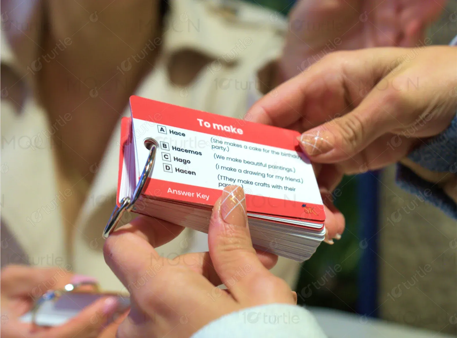
Study Key helps users conquer language barriers through vibrant, thoughtfully designed flashcards. With categories like essential verbs and travel phrases, the brand focuses on learning through play, cultural insight, and compact design.
UX Design
UI Design
Websites Design
Industry
Education
Tools we used

Project Completion
2024
The goal was to create a playful, educational, and accessible digital presence that promotes product discovery and future launches, while reinforcing the brand’s mission to make language learning approachable. The scope included designing a homepage that showcases products, highlights key features, and provides a contact form—all while aligning with the colorful, youth-friendly, and educational brand identity.
Industry
EducationWhat we did
User ResearchUI UX DesigningPlatform
-Study Key lacked a digital storefront and engaging platform to introduce its unique flashcard products and attract early users. A clean, friendly, and intuitive website was essential to reflect its core educational values.
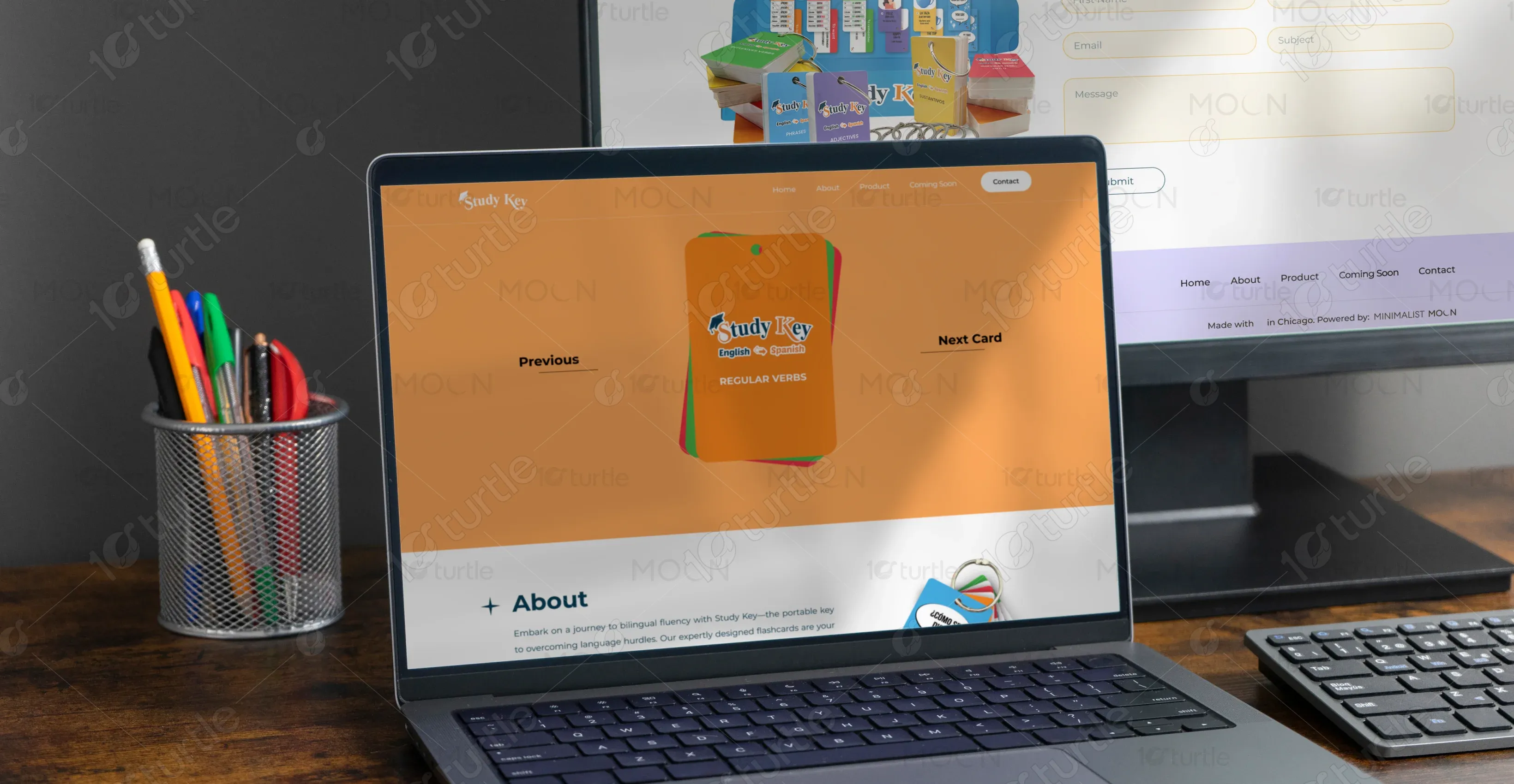
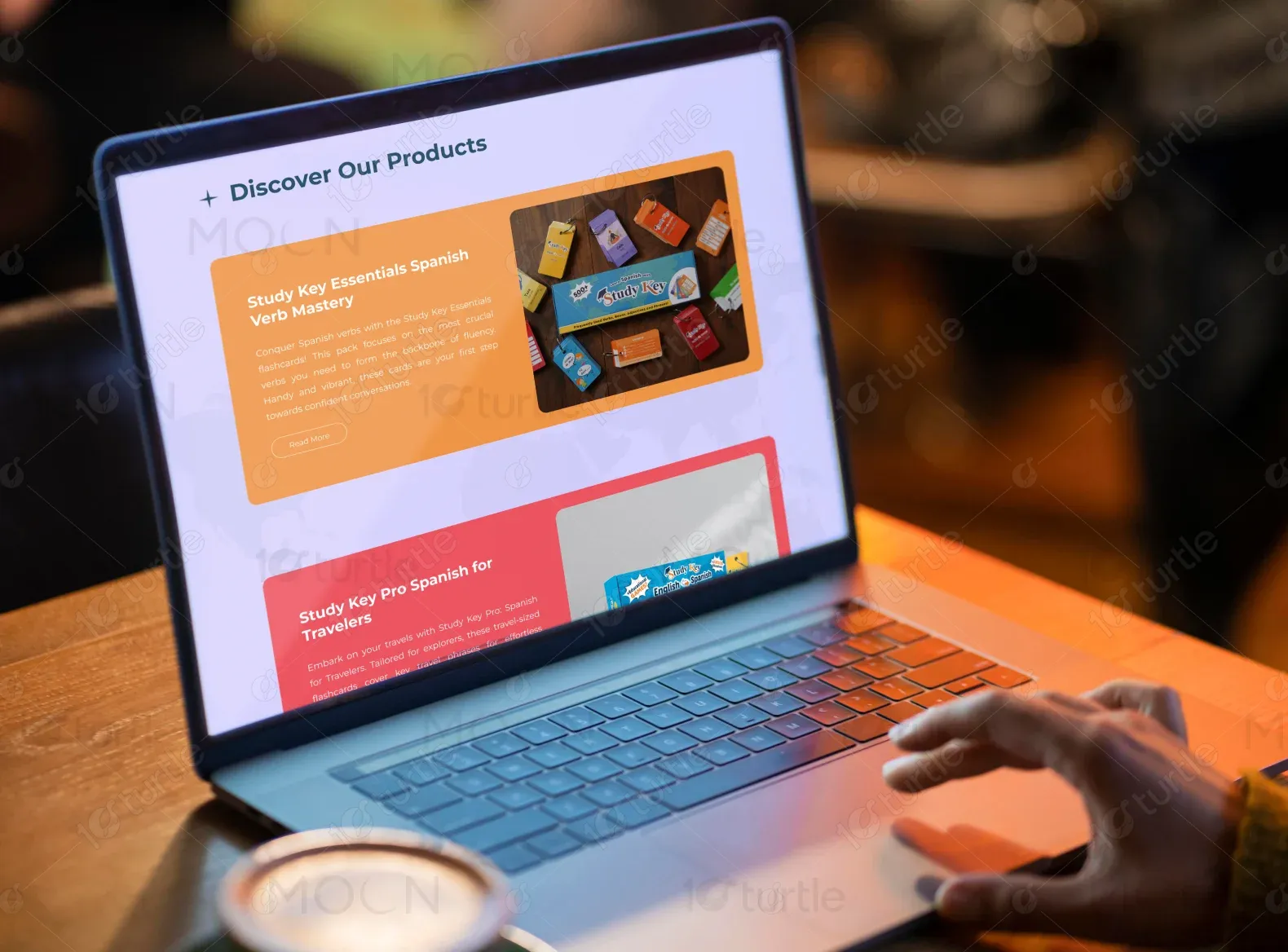
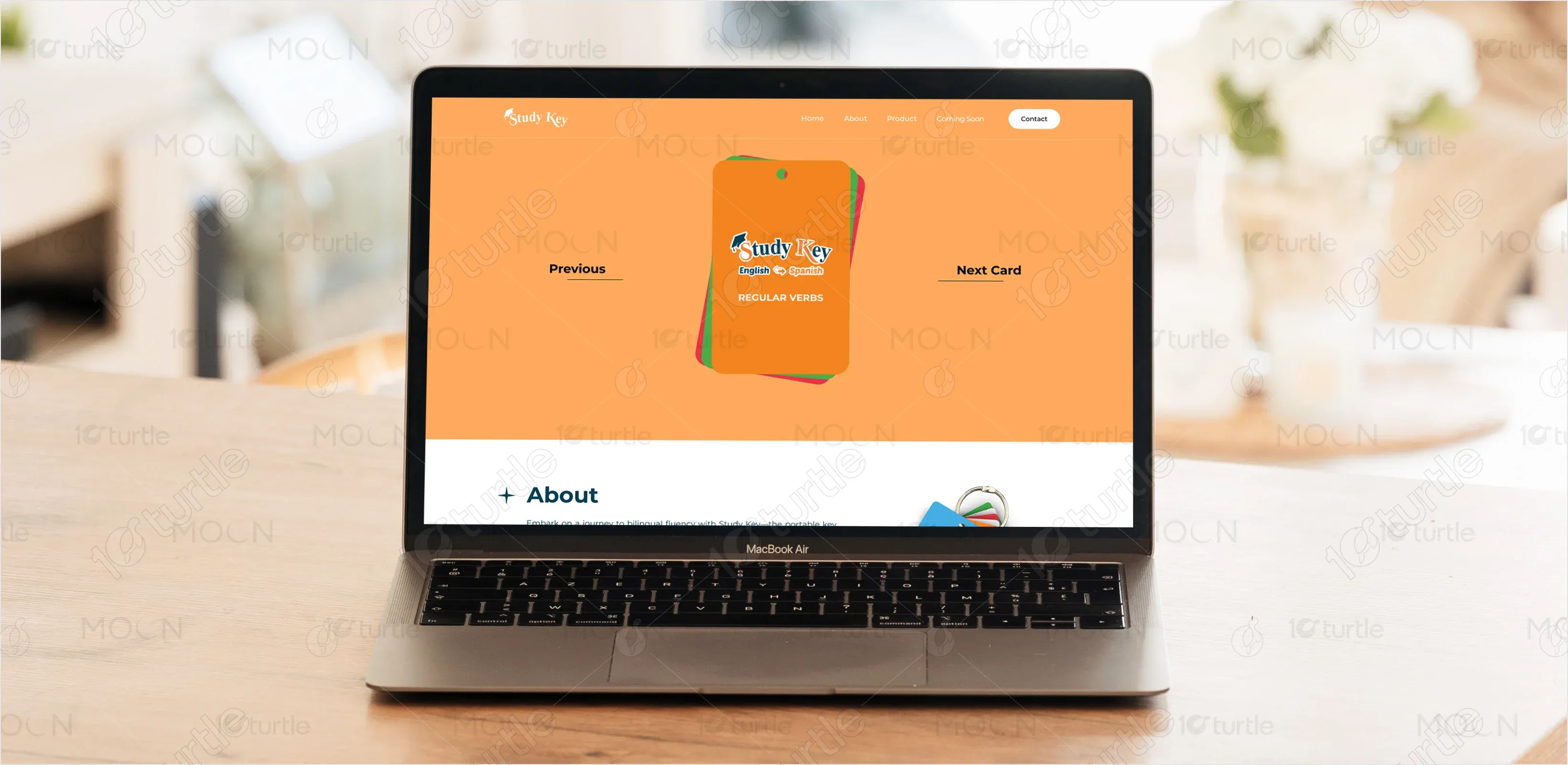
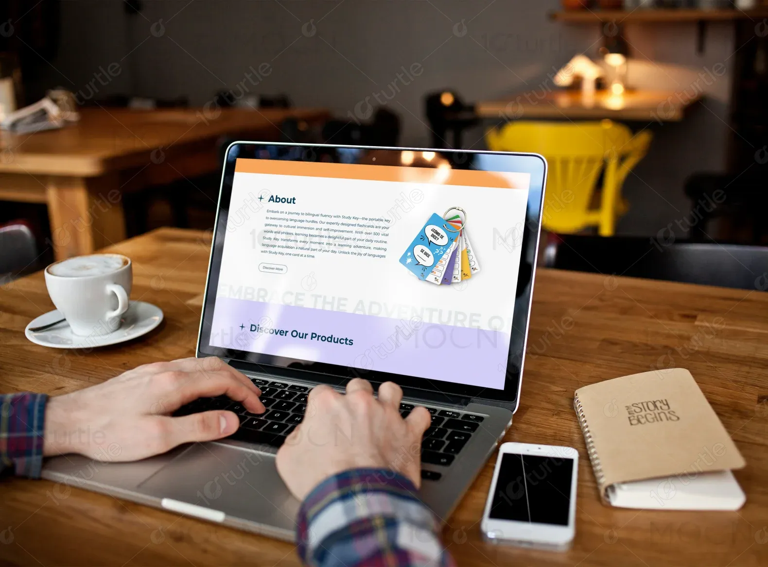
We built a visually engaging one-page website featuring a hero section that showcases the product in action, informative “About” and “Product Discovery” sections, interactive product previews with launch announcements, and an easy-to-access contact form to encourage communication.
The client wanted a design that felt fun, portable, and educational. Inspiration was drawn from playful product packaging and interactive learning tools. The site needed to appeal to learners, parents, and educators alike—balancing usability with creativity.
The Study Key logo features a playful serif font with a combination of orange and blue tones, incorporating a key icon to symbolize unlocking language skills. It effectively conveys learning with charm and warmth.
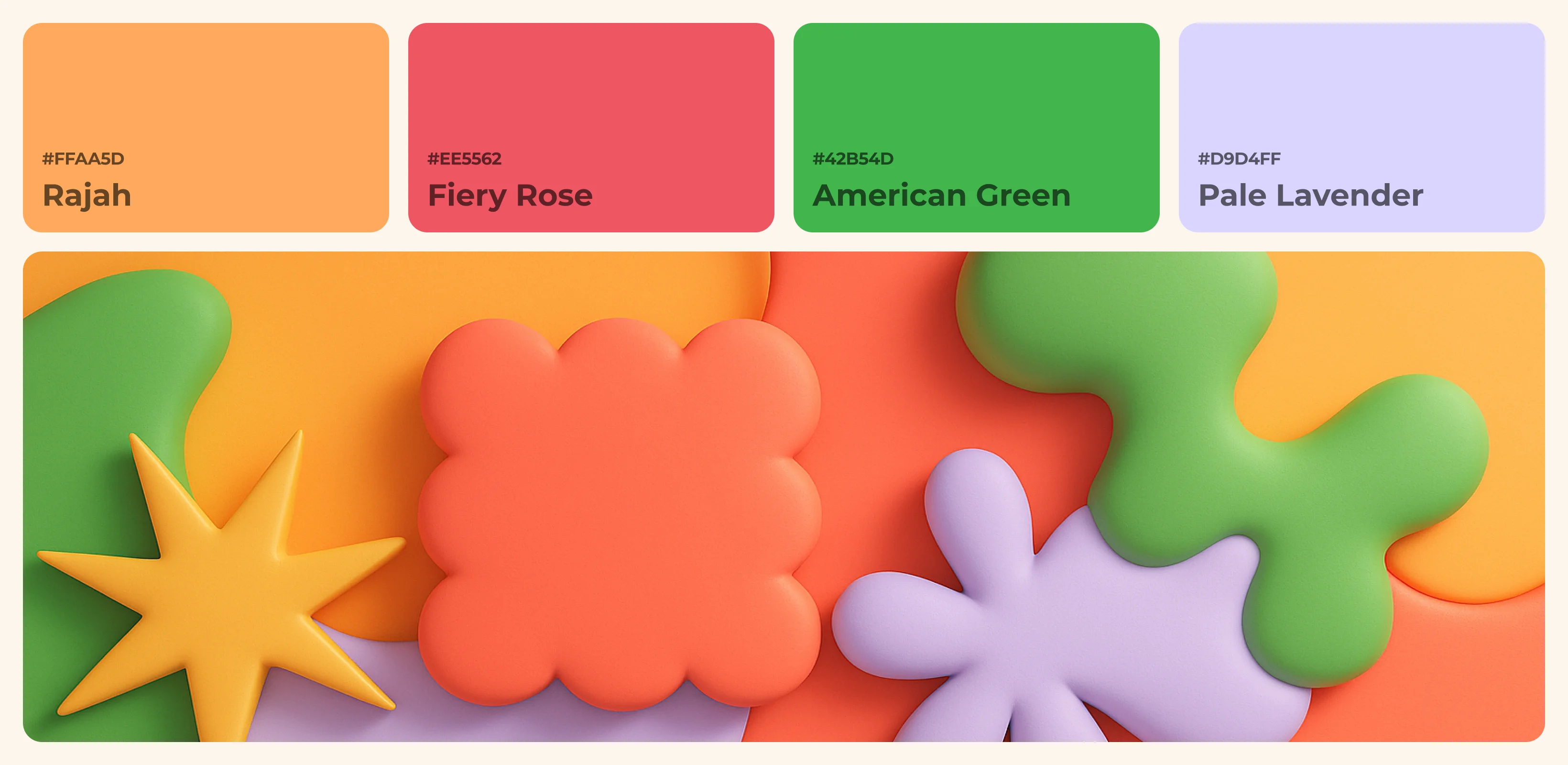
The Study Key color palette blends Rajah Orange (#FFAA5D), Fiery Rose (#EE5562), American Green(#42B54D), and Pale Lavender (#D9D4FF) to create a vibrant, educational, and approachable feel. These hues evoke curiosity, clarity, and warmth—perfectly reflecting the brand’s playful and learning-driven essence.
Early wireframes explored a modular layout designed to highlight flashcards, use space efficiently, and draw attention to product images and benefits. Each section was structured to support a linear learning journey.