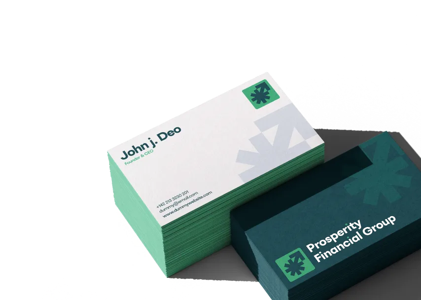
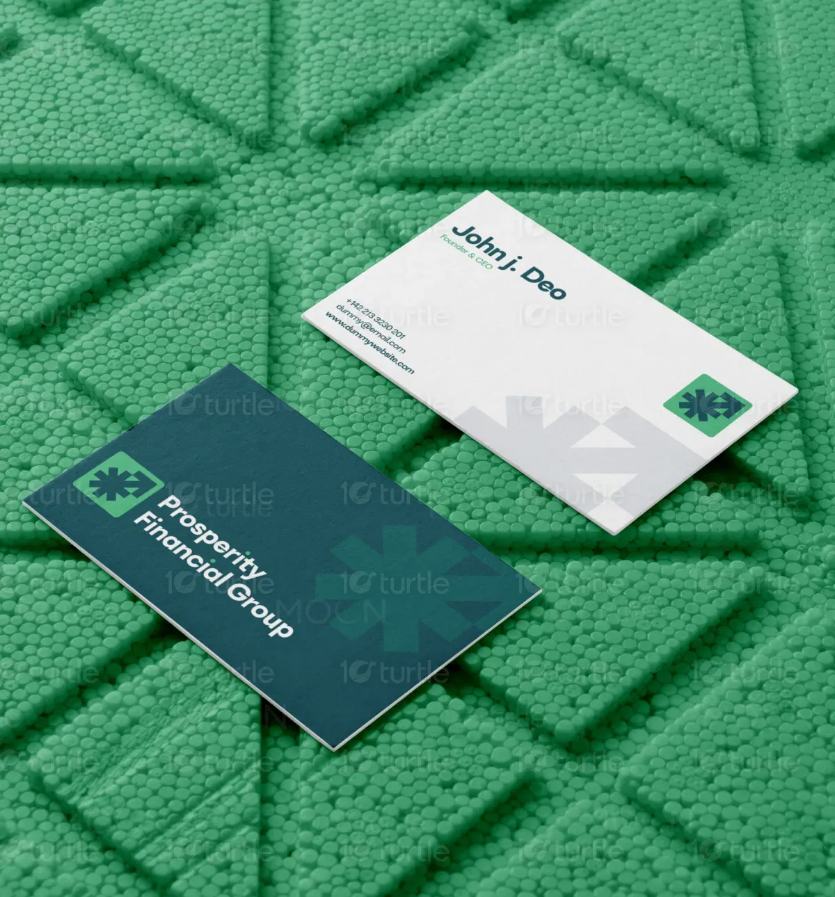
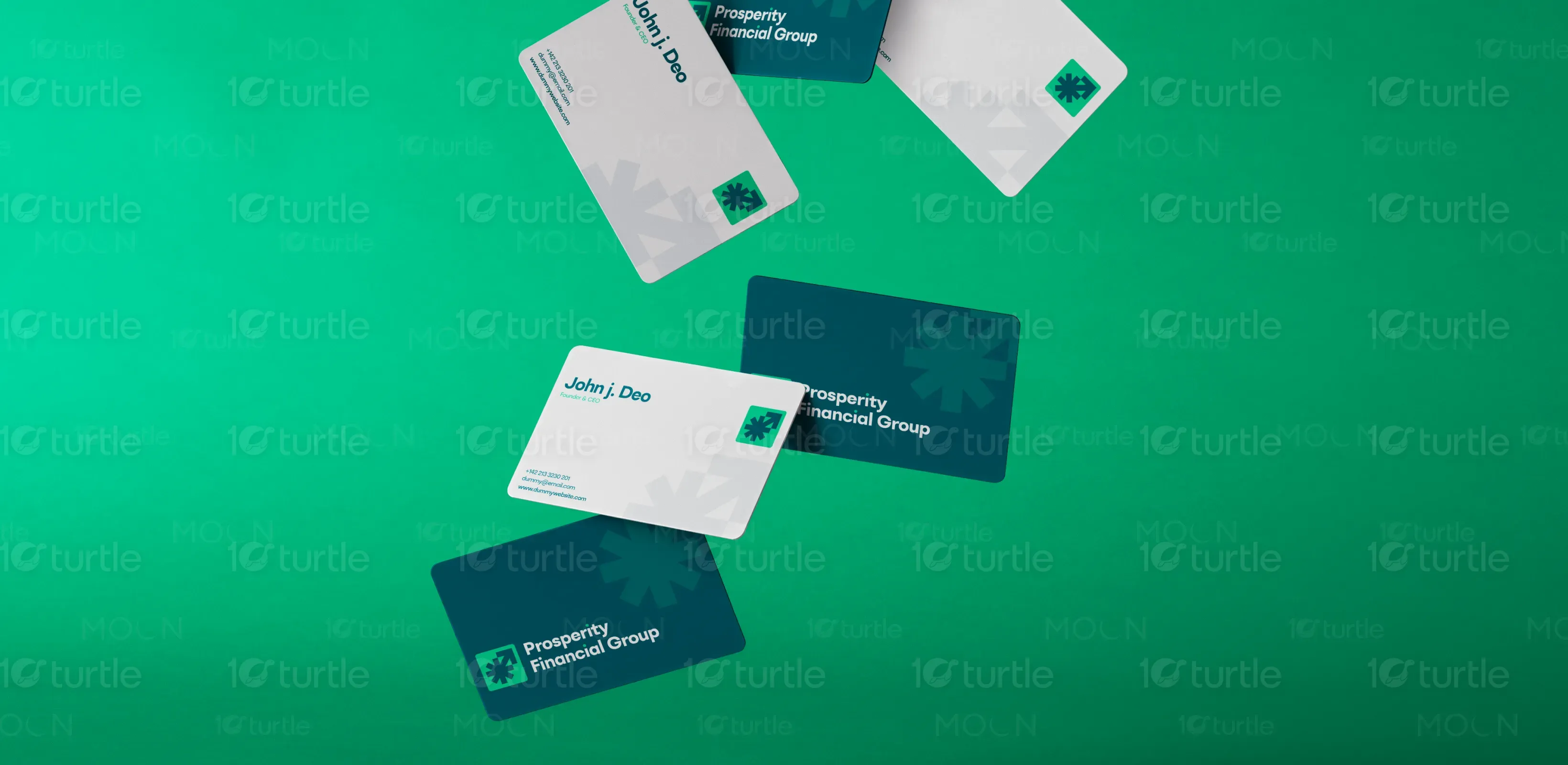
This business card design embodies a modern, minimalistic aesthetic that emphasizes clarity and professionalism. With a clean white canvas on the front and a bold, rich teal background on the back, the design balances simplicity with visual impact. The sharp geometric arrow symbol signifies growth and direction, subtly reinforcing the brand's financial focus. Carefully chosen typography and layout create a structured and elegant visual experience that reflects credibility, leadership, and a future-forward approach.
Branding
Brand Identity Design
Graphic Design
Motion Graphics

Industry
Finance, Legal & Insurance
Tools we used


Project Completion
2025
Key Market
Global
The business card was designed for Prosperity Financial Group, a forward-thinking financial services provider. It serves as a sleek branding tool to convey the company’s professionalism, modern outlook, and commitment to client success. Its minimalist yet bold aesthetic helps it stand out in a competitive industry. The arrow-themed visual language symbolizes upward growth, reflecting the brand’s mission to elevate clients' financial futures. The dual-sided layout smartly distinguishes contact info from brand identity.

Industry
Finance, Legal & InsuranceWhat we did
BrandingBrand Identity DesignGraphic DesignMotion GraphicsPlatform
-In the financial industry, many business cards tend to follow outdated or overly conservative designs that blend into a sea of sameness. This creates a challenge in leaving a lasting impression, especially during networking events or client meetings. Traditional layouts also struggle to visually communicate modernity or innovation—qualities increasingly expected by younger, tech-savvy clients. The gap was in designing a card that feels both trustworthy and contemporary without overwhelming or alienating the audience.
The design solves this by marrying clean minimalism with bold symbolism. The upward arrow icon communicates growth and financial ascension, resonating with both traditional and modern clients. The green accent symbolizes prosperity, while the deep teal conveys trust. Strategic whitespace ensures clarity and focus, especially for the contact section. The use of modern fonts and strong visual hierarchy enhances readability while reinforcing the brand’s sophistication. This balance ensures memorability and trust at first glance.
The long-term vision is to use this identity as the foundation for a cohesive brand system—extending into digital platforms, presentations, and client materials. As the company scales, this visual identity will support strong brand recall and foster trust in both individual and institutional clients. The bold-yet-professional design aims to redefine expectations in financial branding, positioning Prosperity Financial Group as a visionary leader in a competitive space.

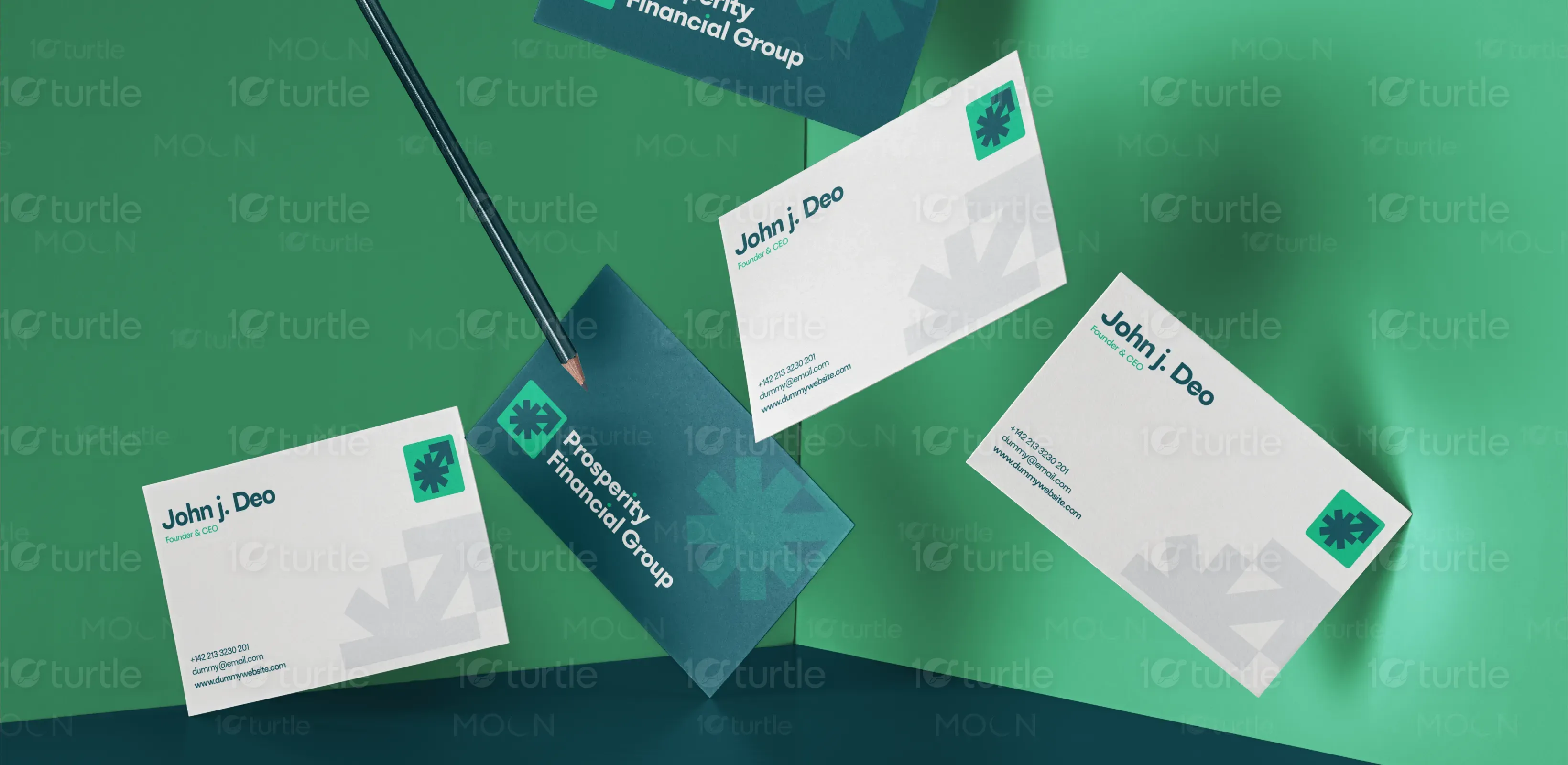

The colors of PFD Business card Symbolizes trust, intelligence, and financial stability—ideal for a financial brand, Represents prosperity, success, and growth. Used to highlight the arrow icon, reinforcing upward momentum, Offers clarity, openness, and breathing room, enhancing overall legibility and modernity. Used subtly for geometric background elements, they reinforce depth and professionalism without cluttering the design.