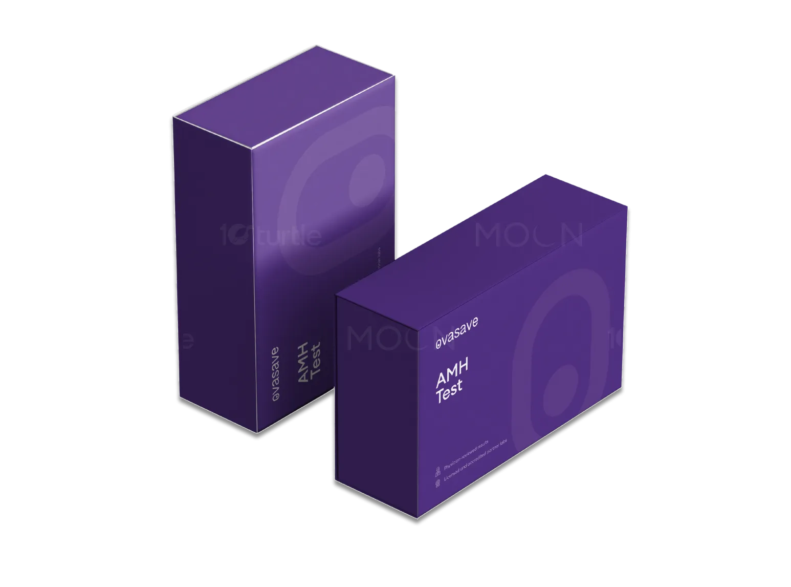
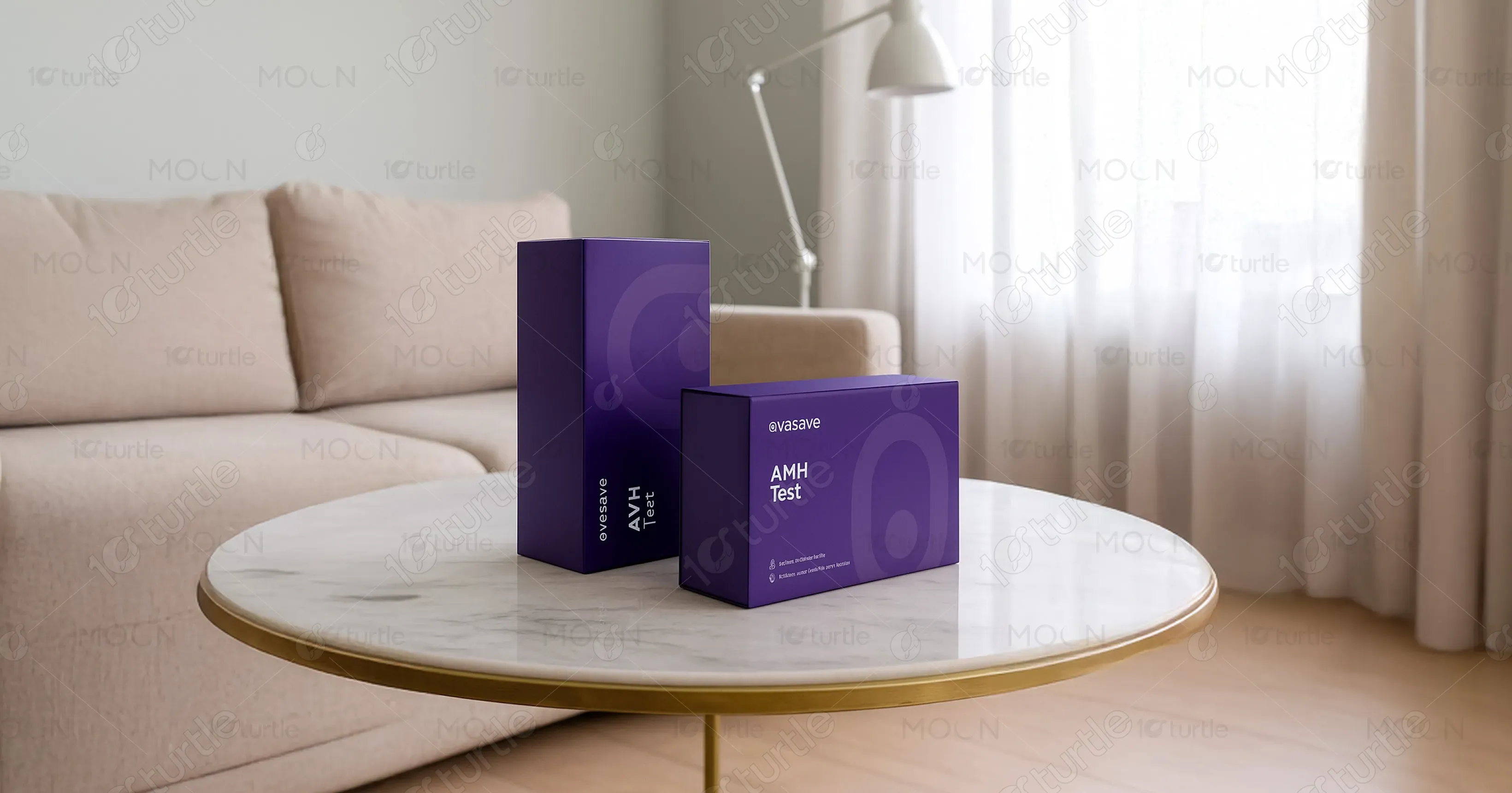
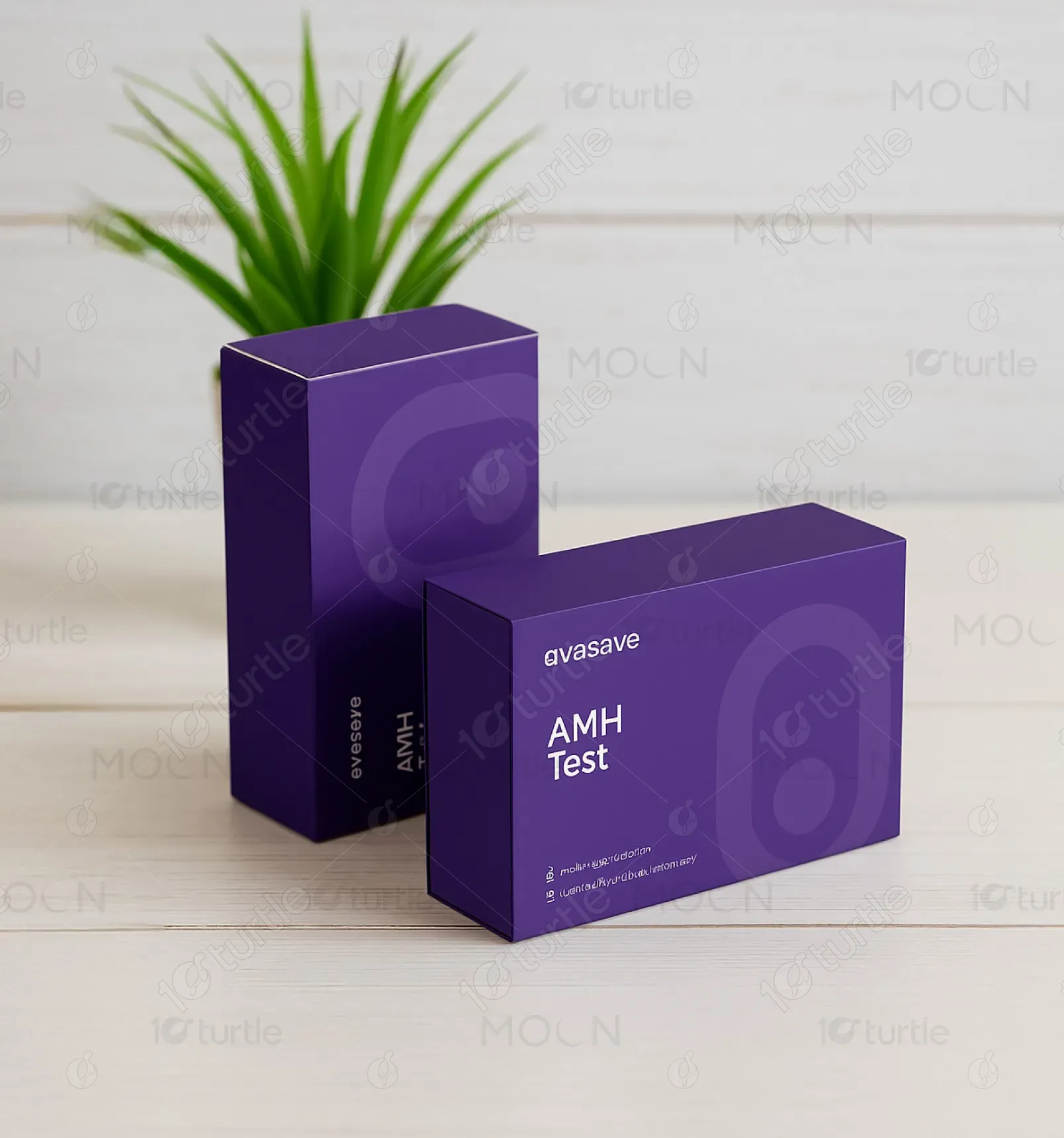
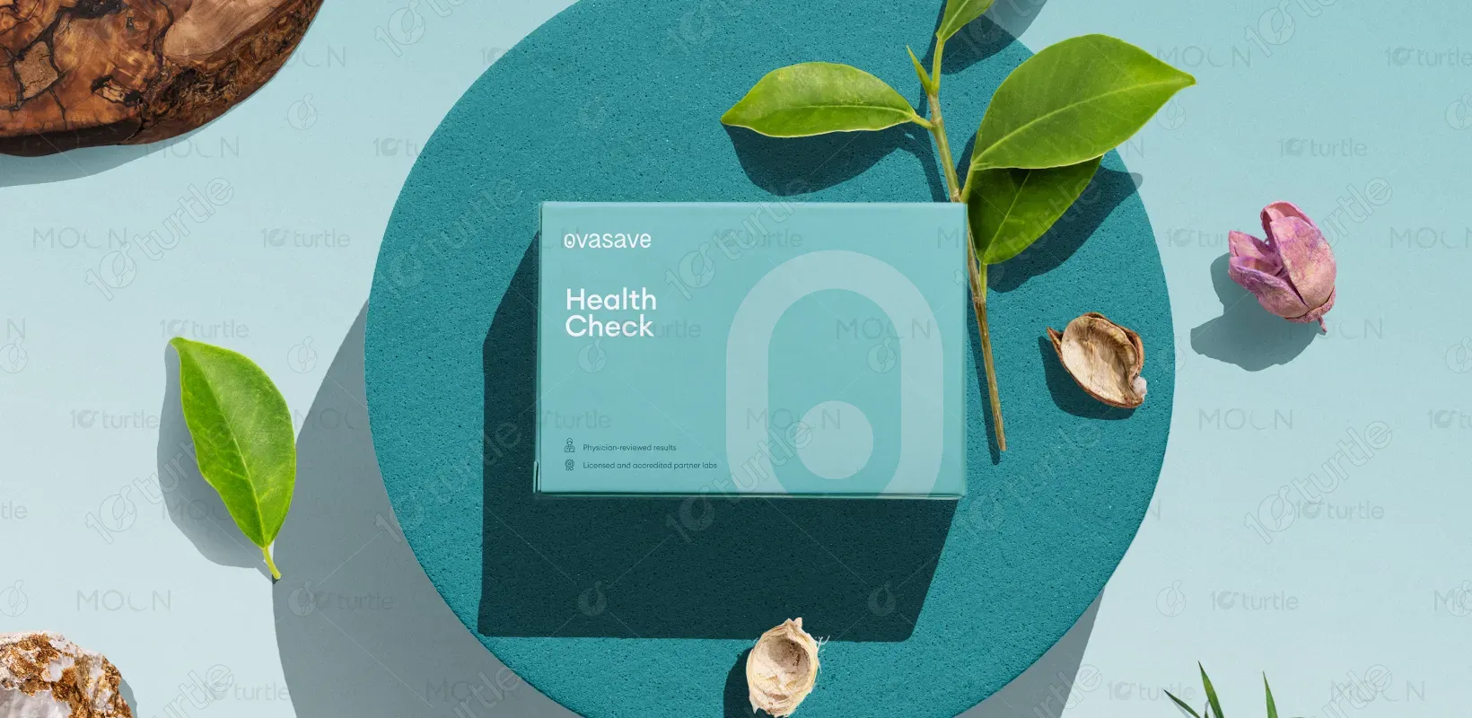
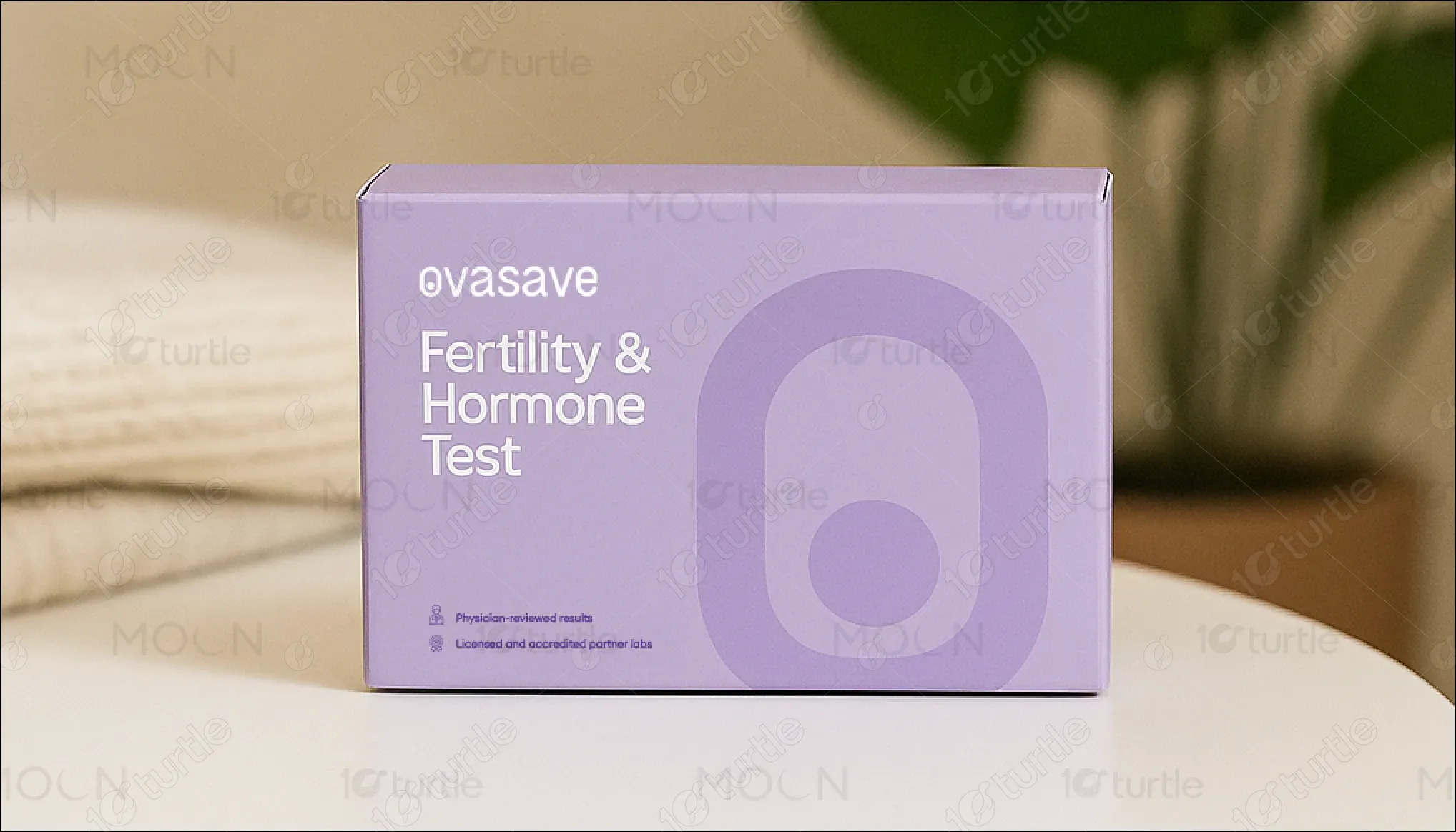
The packaging design reflects a clean, minimalistic aesthetic with soft geometric elements and pastel tones that project calmness and trust. The typography is modern and clear, ensuring instant readability, while the iconic symbol subtly reinforces the brand identity. The layout avoids clutter, emphasizing accessibility and comfort. The visual language speaks to the modern, health-conscious individual seeking medical insights from the convenience of home. The design balances clinical reliability with a consumer-friendly look that’s approachable and reassuring.
Packaging design
Graphic Design
Industry
Healthcare & Wellness
Tools we used

Project Completion
2025
Key Market
Global
Ovasave’s Health Check kit offers a convenient, discreet, and professional-grade at-home testing solution. Designed for individuals proactively managing their wellness, it provides physician-reviewed results and lab-grade accuracy. The test covers essential hormonal and fertility markers, empowering users to make informed decisions about their health. Unlike traditional clinical visits, this solution blends simplicity, privacy, and science. The premium packaging reinforces trust while aligning with modern consumer aesthetics—positioning the product as both practical and aspirational in the growing wellness market.

Industry
Healthcare & WellnessWhat we did
Packaging designGraphic DesignPlatform
-Traditional healthcare testing often involves clinical environments that can feel intimidating, time-consuming, and inaccessible for many. Additionally, most diagnostic packaging appears sterile or overly medical, failing to engage modern users—especially women—who seek both comfort and empowerment in their health journey. The gap lies in delivering trust-based functionality with emotional appeal, particularly for sensitive topics like fertility or hormone balance.
Ovasave bridges this gap through empathetic, user-focused design. The approachable color palette and soft visual forms ease anxiety, while the premium unboxing experience feels personal and empowering. By blending clinical credibility with aesthetic sensitivity, the design elevates trust and engagement. Easy-to-understand instructions, clean labeling, and professional assurance make the kit an ideal choice for modern users seeking health insights without the stress of traditional healthcare systems.
Ovasave envisions becoming a leading player in at-home healthcare, democratizing access to diagnostics through trust, transparency, and design excellence. The brand aims to continually expand its product line—covering broader wellness areas—while staying grounded in empathy and user empowerment. By fostering proactive health ownership, Ovasave aspires to shift perceptions of diagnostics from reactive necessity to everyday wellness rituals.

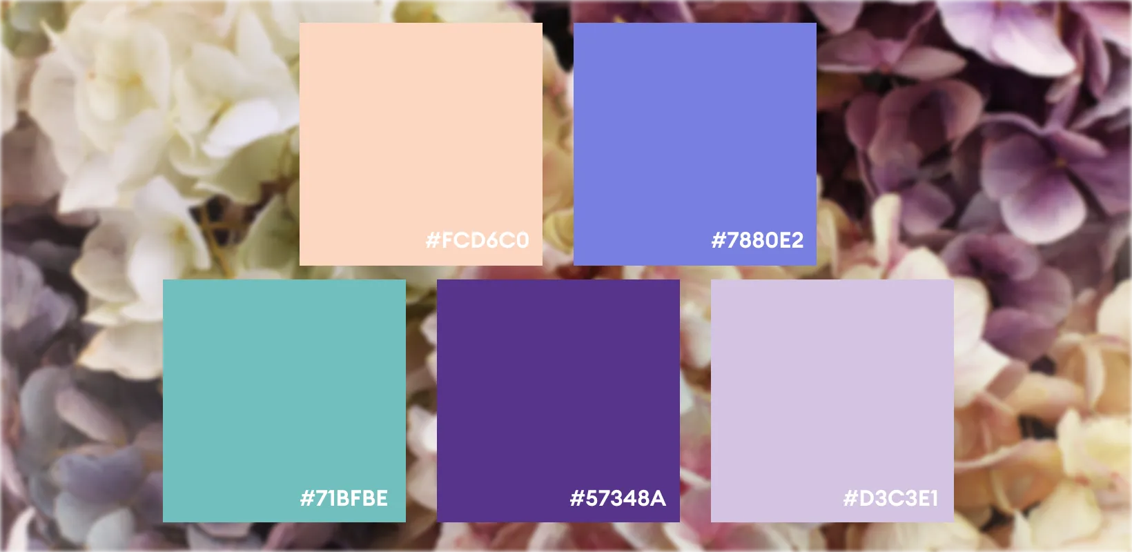
The packaging employs a muted aqua-teal base with soft gradients, symbolizing cleanliness, calmness, and clinical trust. This is paired with minimal white text and icons, ensuring legibility and contrast. The harmonious tone soothes the viewer, making the brand feel safe and supportive. The color scheme appeals to health-conscious, design-aware consumers, reinforcing wellness, approachability, and modernity—all without compromising professionalism.