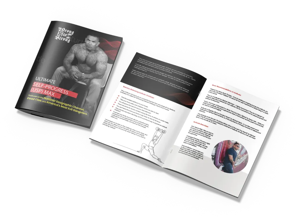
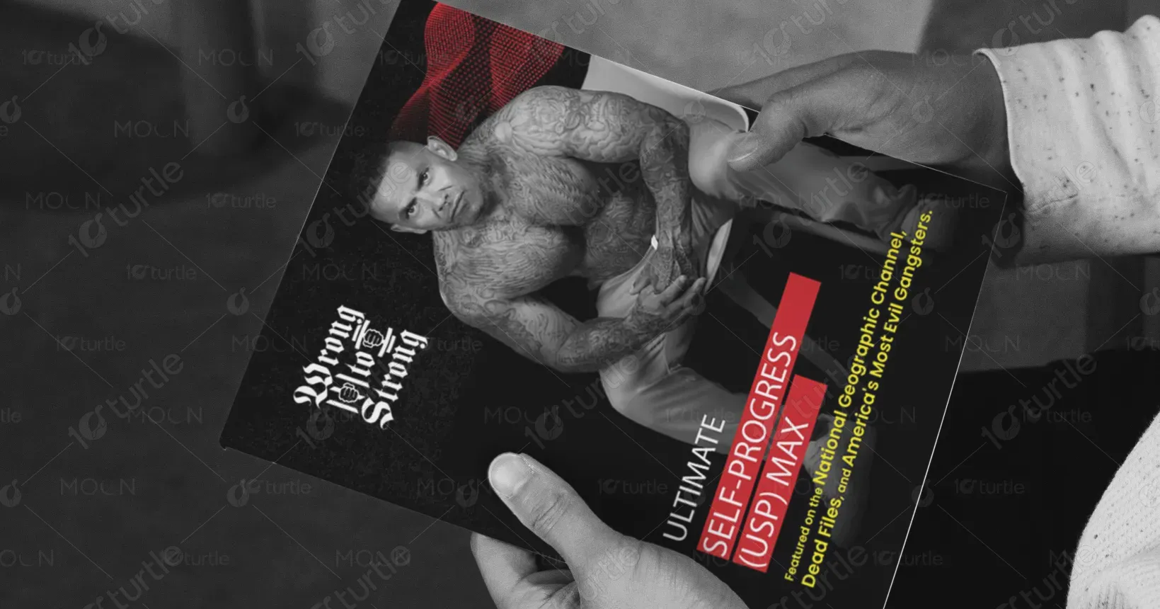
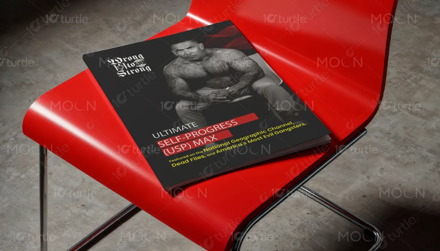
This design follows a raw, powerful aesthetic inspired by the brand’s core message of personal transformation. The layout uses bold typography, clean lines, and vibrant colors to evoke energy, strength, and resilience. The design is intentionally minimalist, allowing the content to take center stage and engage users in a journey of personal growth. Imagery is symbolic, reflecting both the struggle and the success of breaking through limitations.
Book Design
Graphic Design
Industry
Healthcare & Wellness
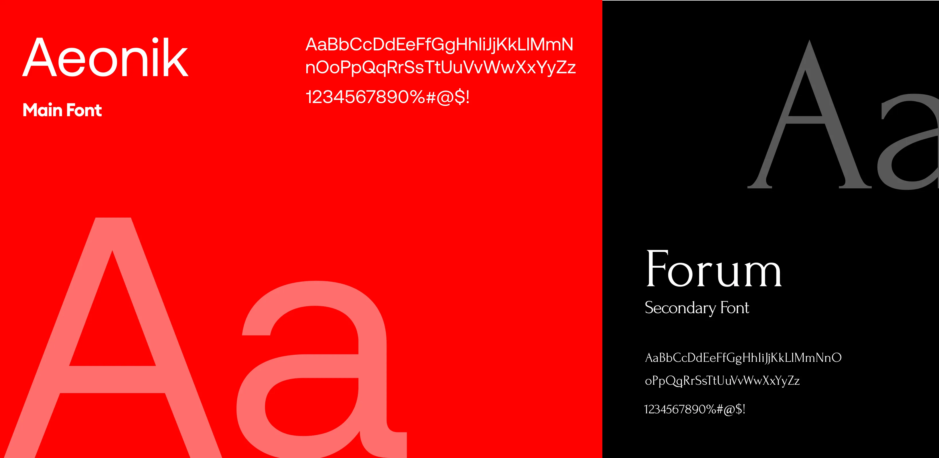
Tools we used


Project Completion
2025
Key Market
Global
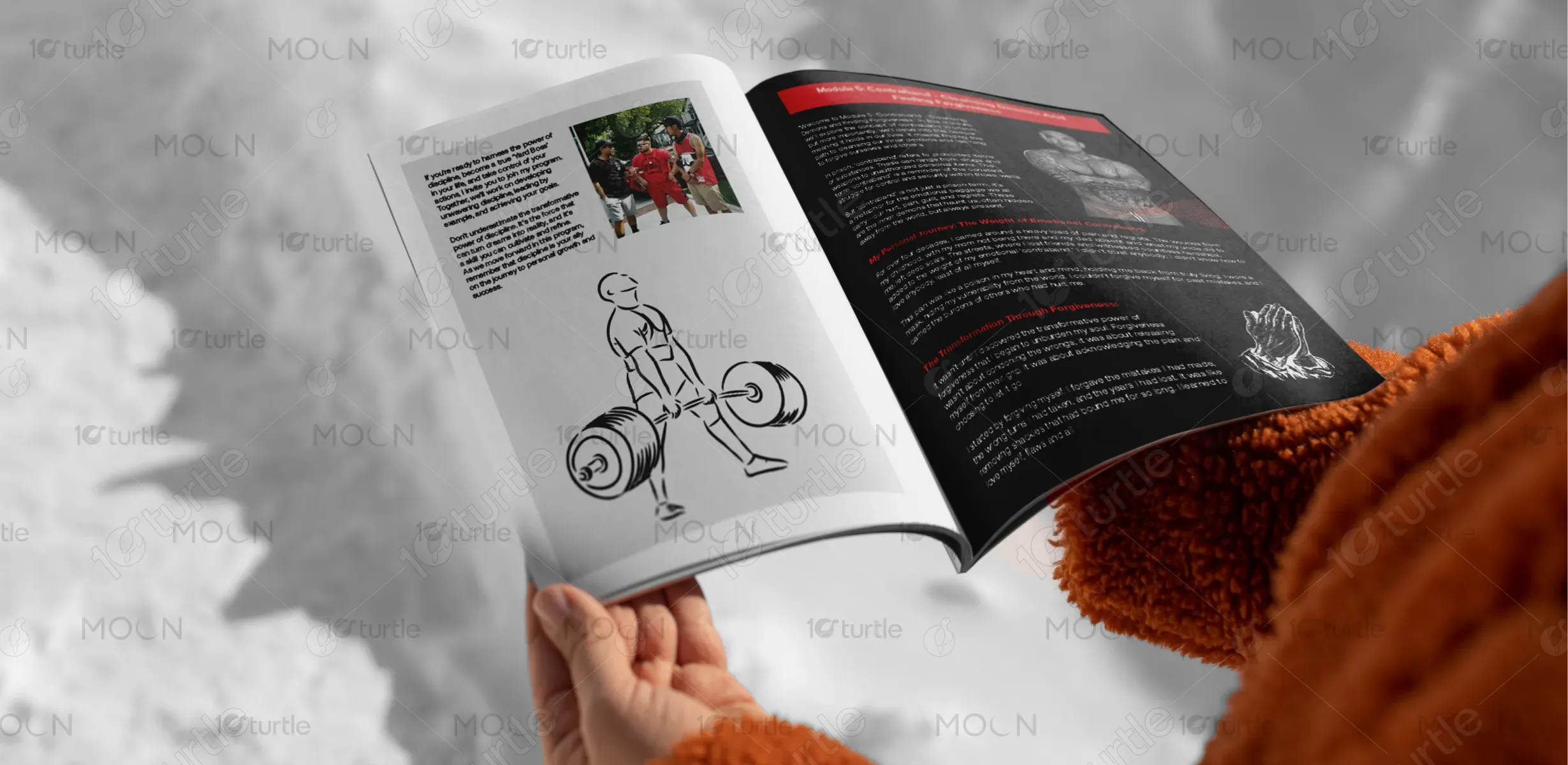
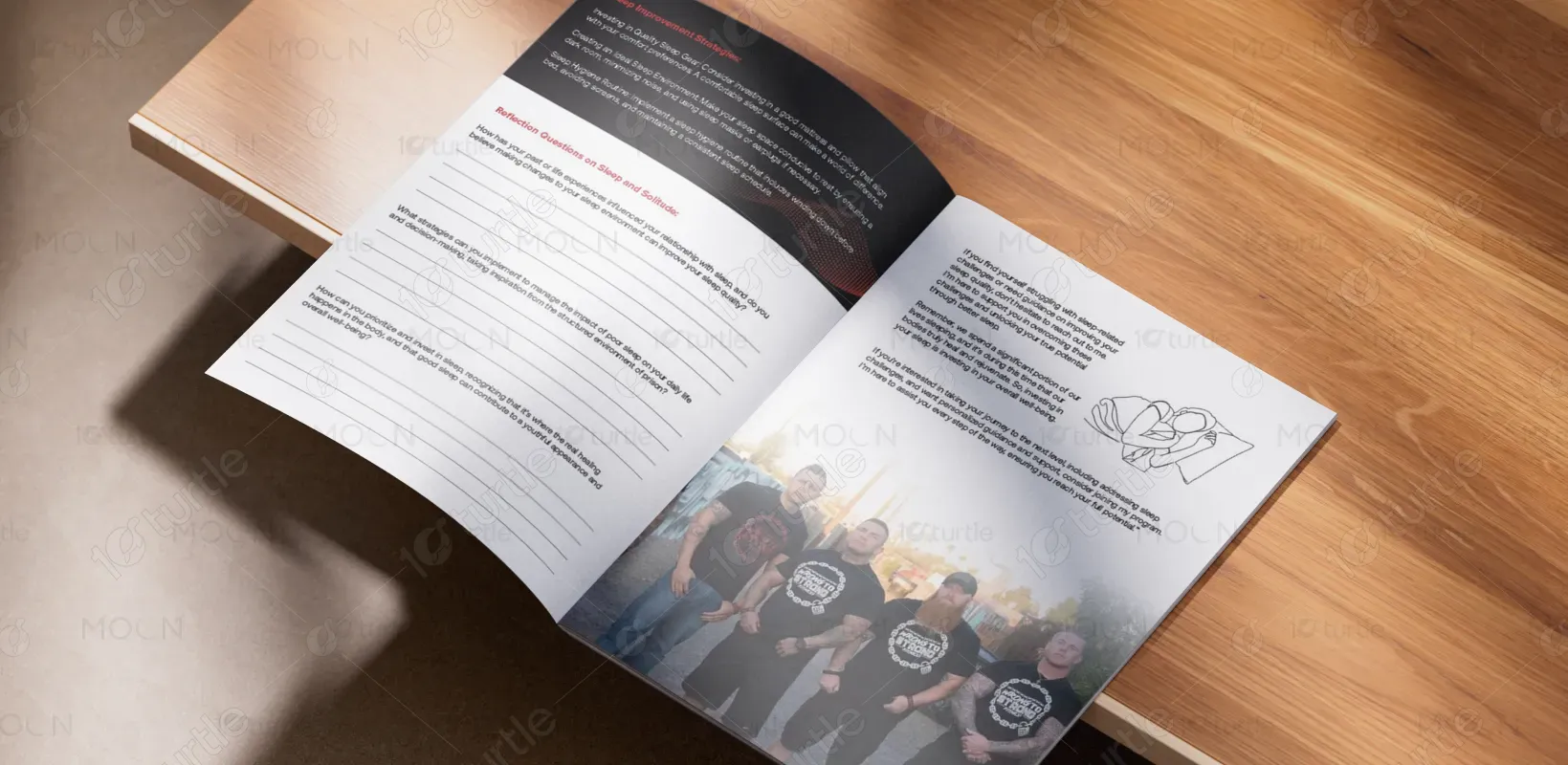
"From Wrong to Strong" is a transformative program that blends mentorship, fitness, and personal development, aimed at individuals who want to rewrite their story. The design of the planner reflects the essence of this journey, empowering users to embrace change and embrace a new chapter in life. It integrates modules on mental strength, physical wellness, and emotional healing, while offering actionable steps to achieve personal goals. Its unique selling point lies in the holistic approach to transformation, combining mental, physical, and spiritual growth.


Industry
Healthcare & WellnessWhat we did
Book DesignGraphic DesignPlatform
-Many individuals struggle with finding holistic transformation programs that address not only physical fitness but also mental and emotional wellness. Existing fitness programs often overlook the emotional aspect, leaving people without the necessary tools for true self-discovery and growth. The market lacks designs that reflect the gritty, real-life struggles individuals face, and the need for empowerment and actionable steps in overcoming those challenges.
The planner offers a comprehensive approach, providing both structured guidance and flexibility. It tackles the problem by combining fitness routines with emotional and mental health exercises, thus addressing a person’s full spectrum of needs. Through powerful, motivating content and realistic challenges, the design facilitates a seamless, transformative experience. The program emphasizes accountability, mentorship, and tangible results, empowering individuals to break through barriers and unlock their potential.

The long-term vision for the "From Wrong to Strong" planner is to become a symbol of empowerment and personal revolution. It aims to inspire individuals to not just change their physical appearance but to revolutionize their way of thinking, behaving, and approaching life. Through its modules, it is designed to foster a community of like-minded individuals striving for positive change, ultimately becoming a movement for personal empowerment and societal reintegration.
The color palette is carefully chosen to reflect strength, transformation, and hope. Strong, earthy tones like deep blues, grays, and browns evoke resilience and stability, while pops of bright yellow and red represent energy, passion, and the drive to overcome obstacles. The colors are intended to stimulate action and focus, making the user feel empowered every time they engage with the content. Each hue plays a crucial role in evoking the emotional depth of the program’s journey.