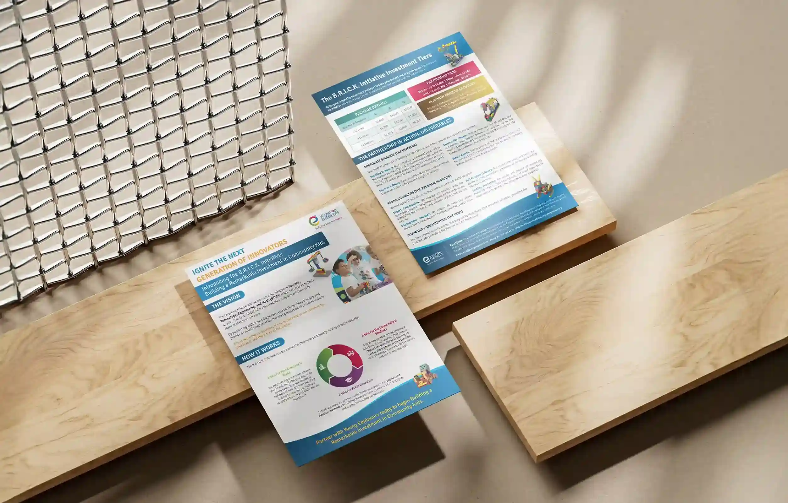
Package Design
Visual Identity
Overview
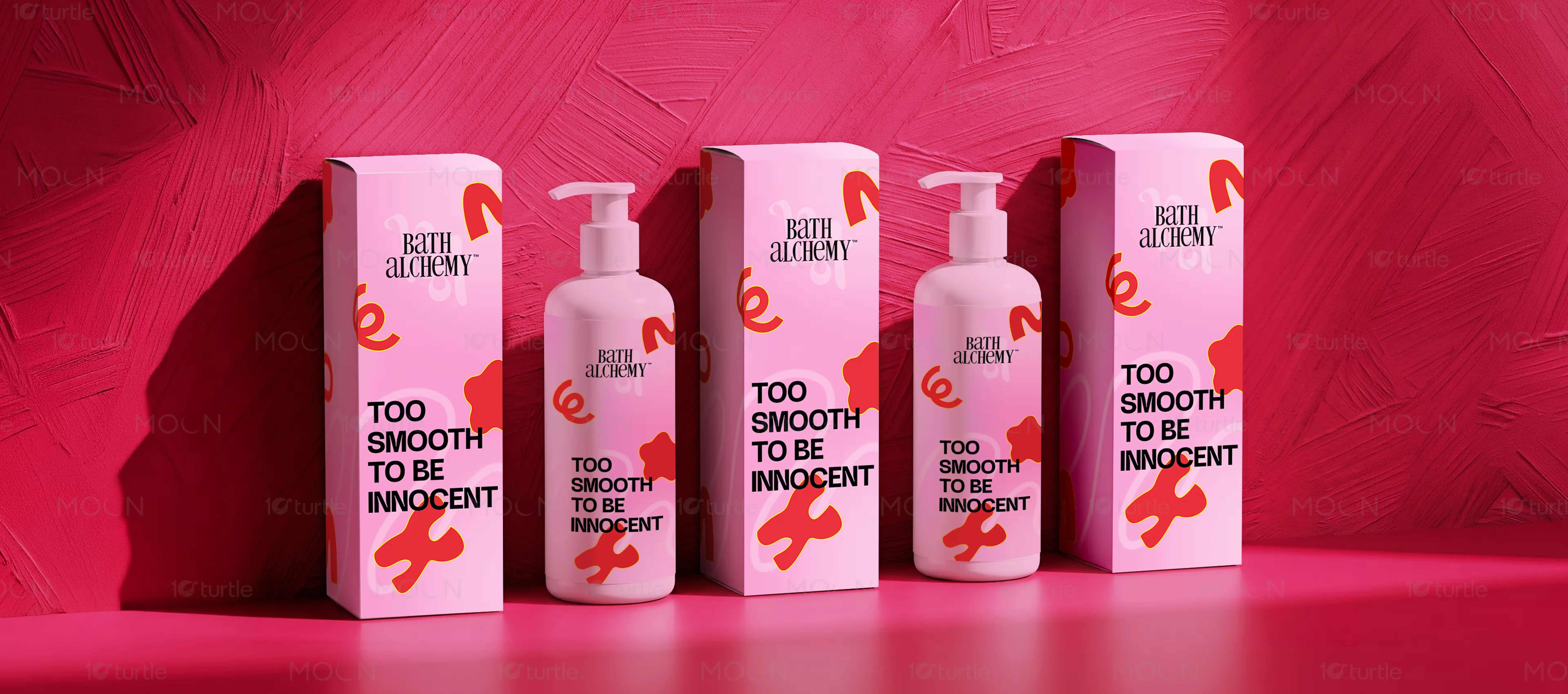
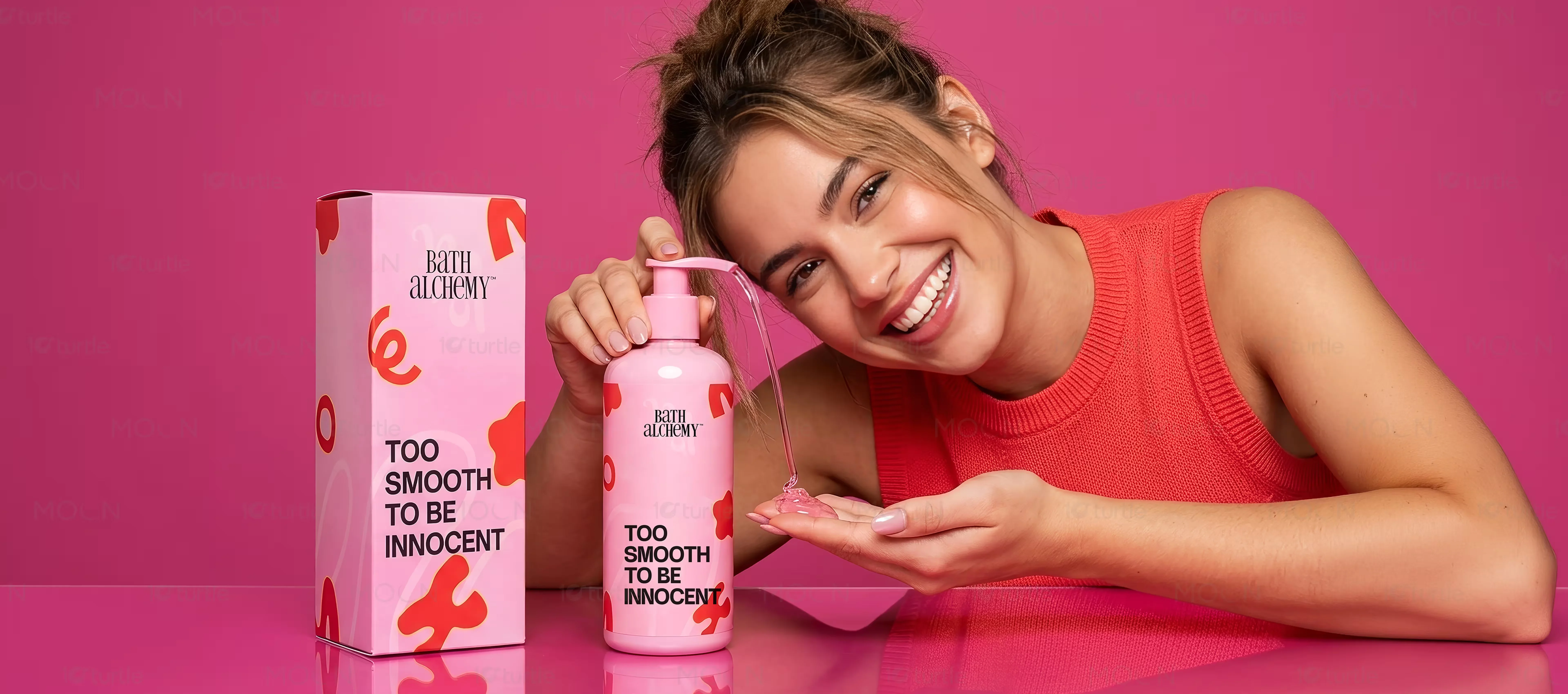
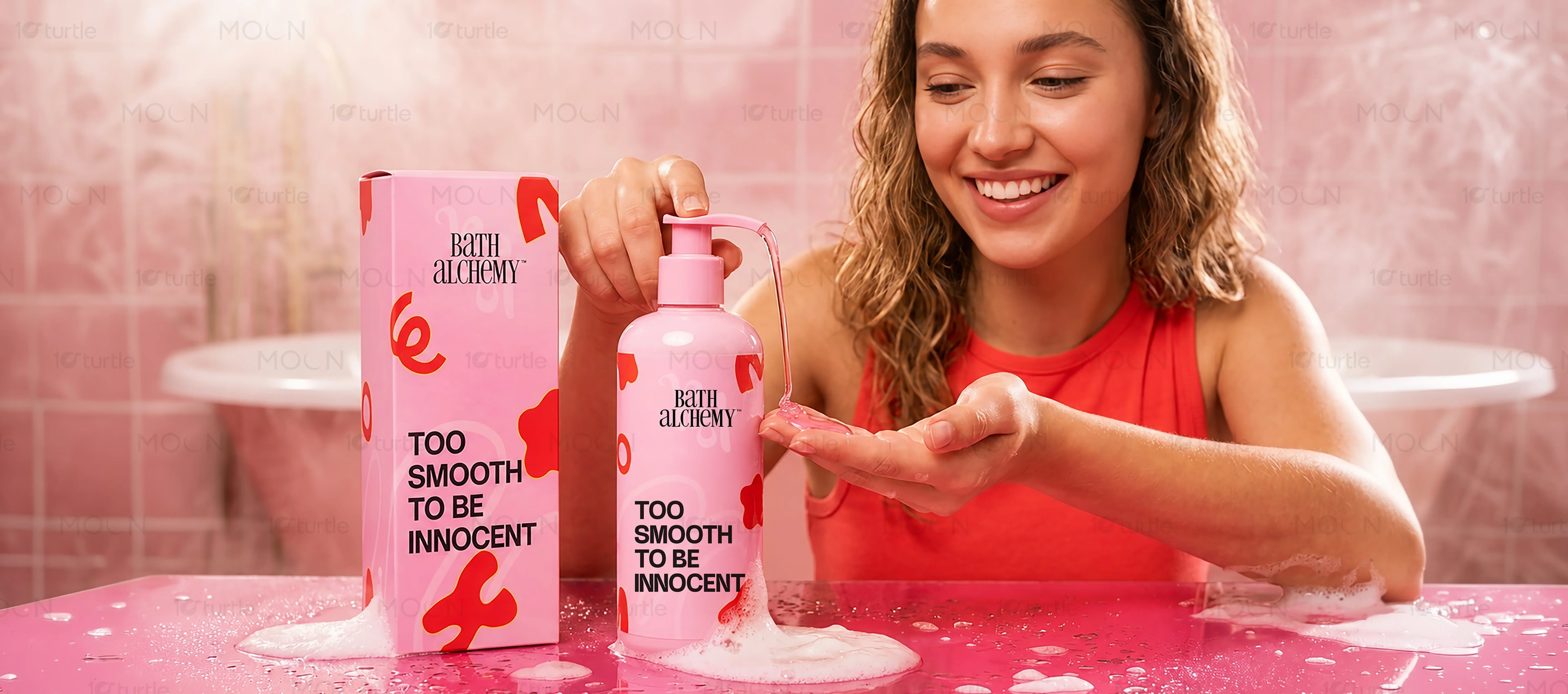
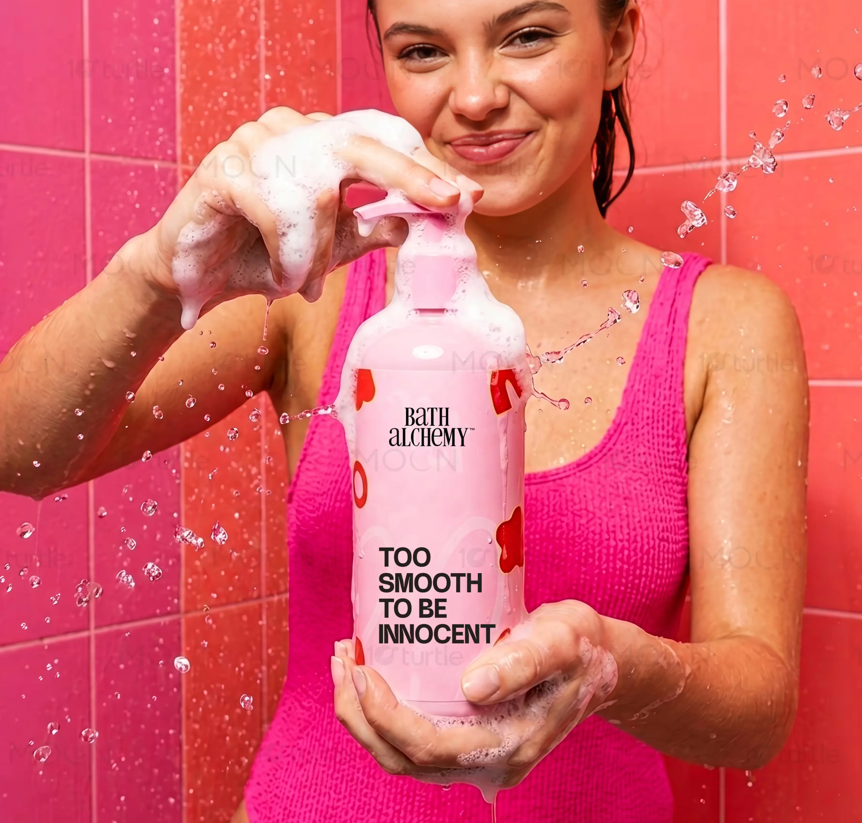
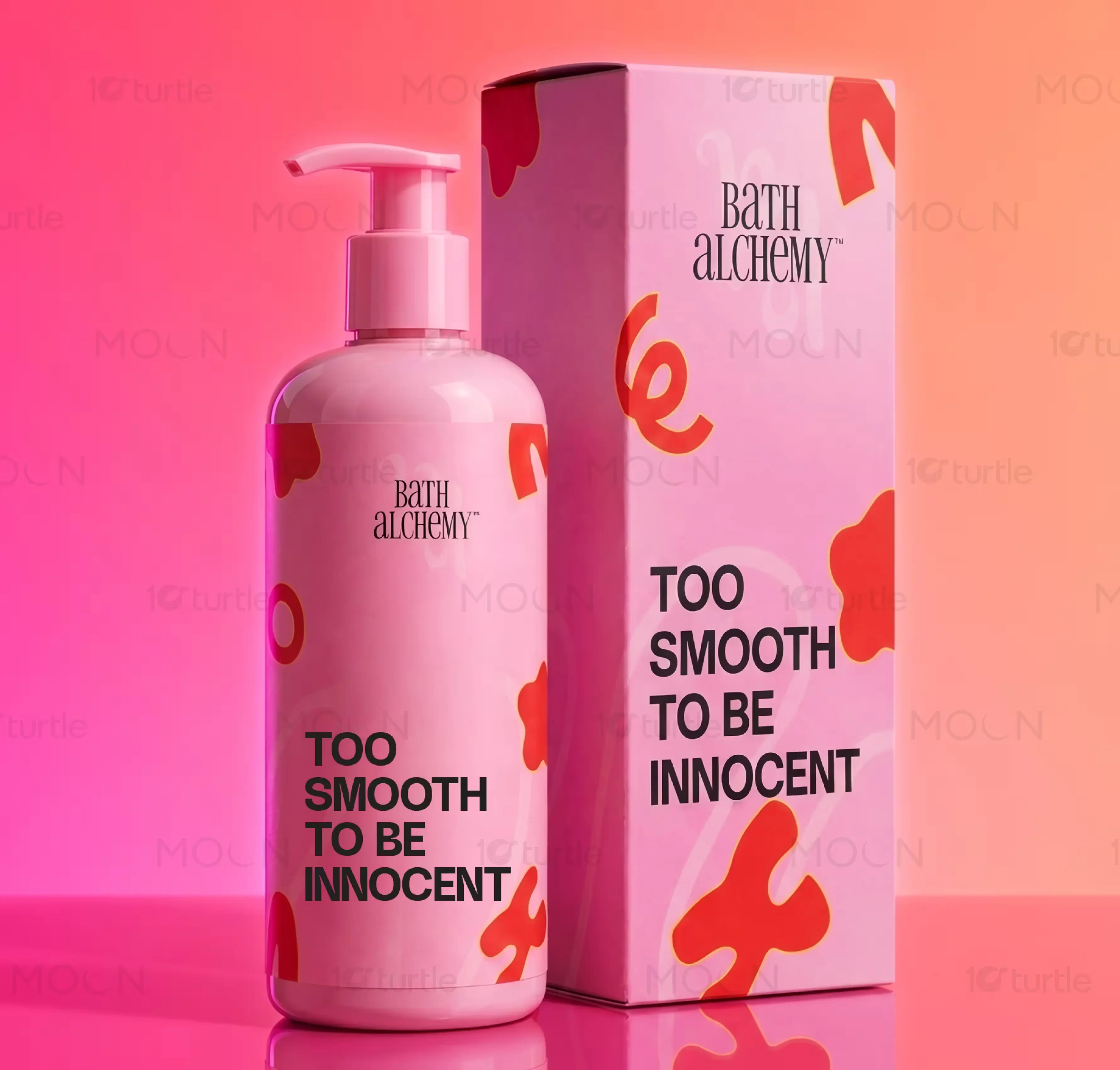
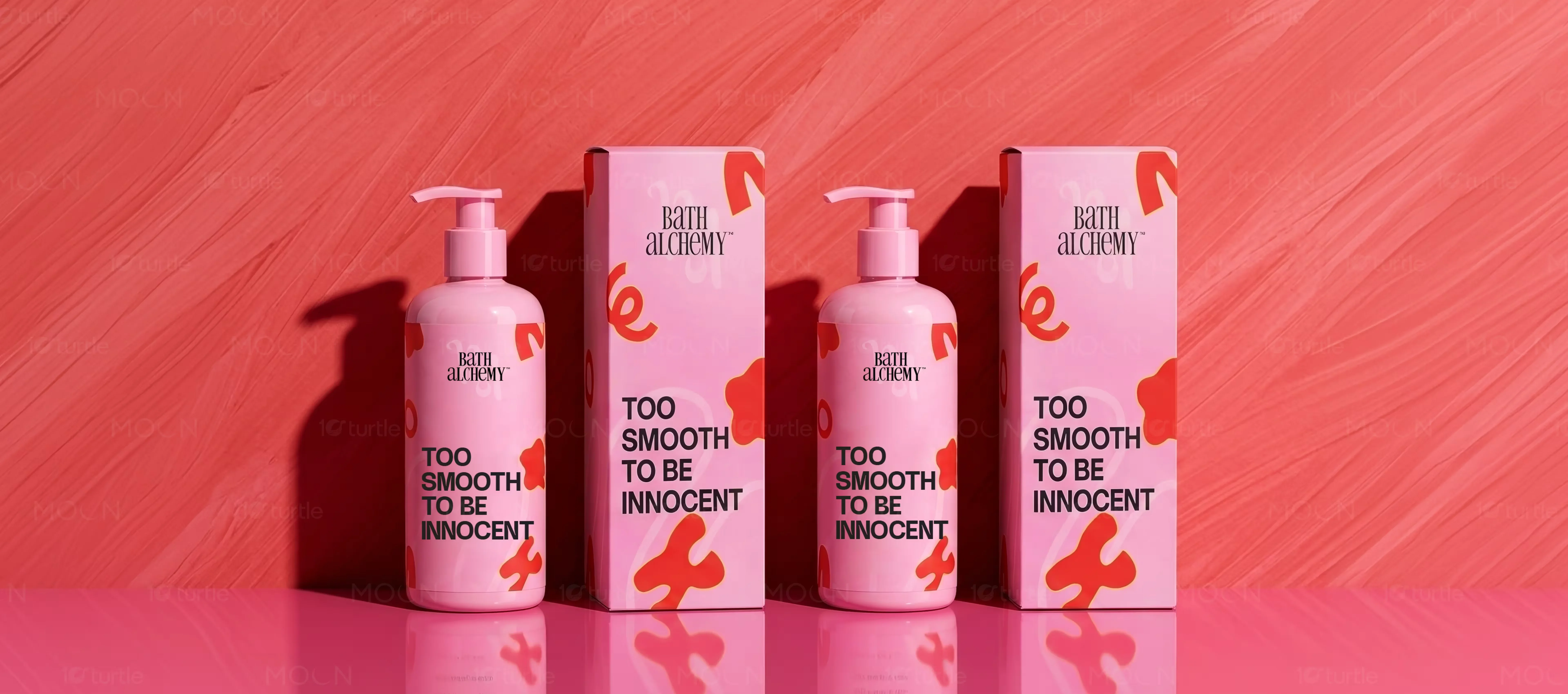
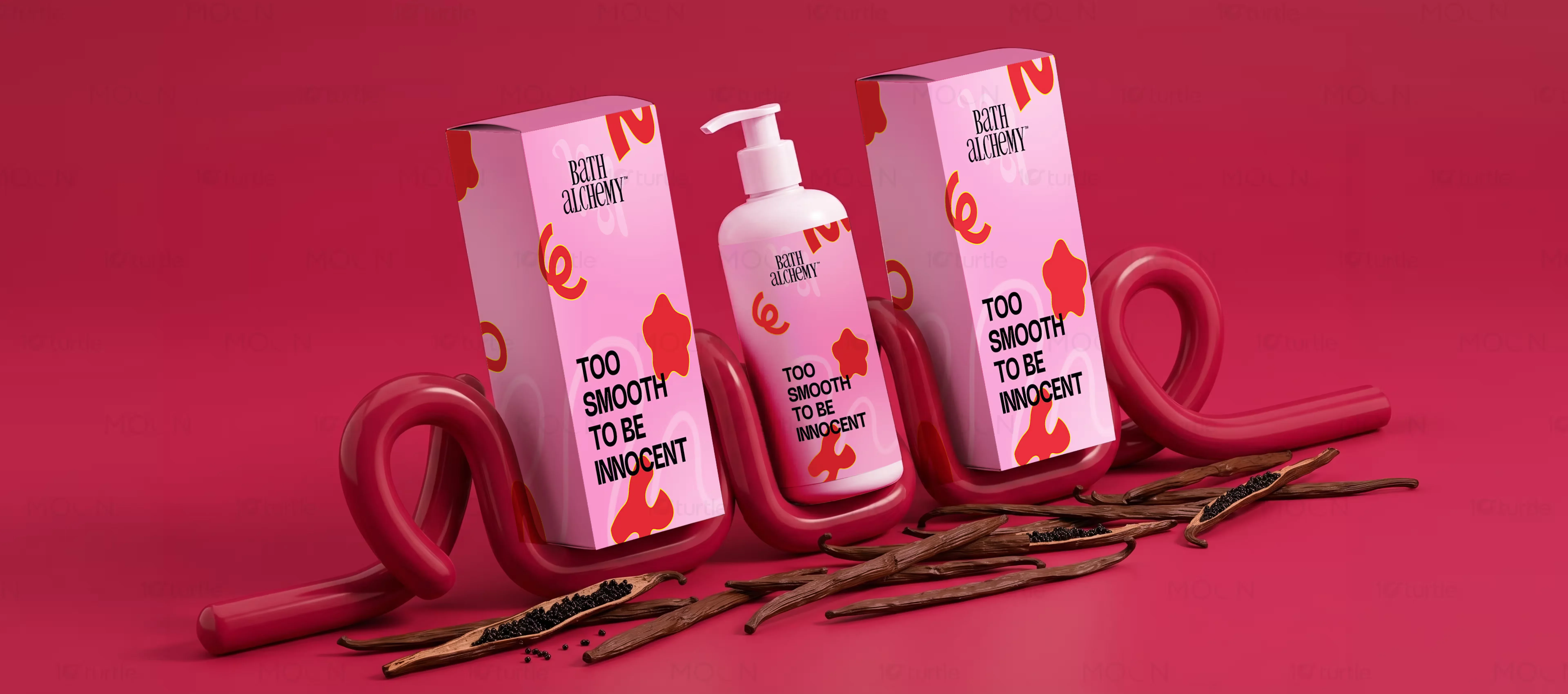
A playful yet premium packaging design system created for Bath Alchemy, an organic skincare brand. Utilizing a vibrant pink color palette and custom organic shapes, we built bottle and box mockups that redefine retail shelf presence in the modern cosmetics industry.
The Challenge

The challenge was creating a visual packaging layout that could balance playful, artistic elements with premium lifestyle positioning. The existing cosmetics market was flooded with sterile clinical designs, meaning we had to stand out without losing professional authority. We needed to solve the problem of visual friction where modern consumers want energetic and trustworthy brand signals at a single glance.
The Solution
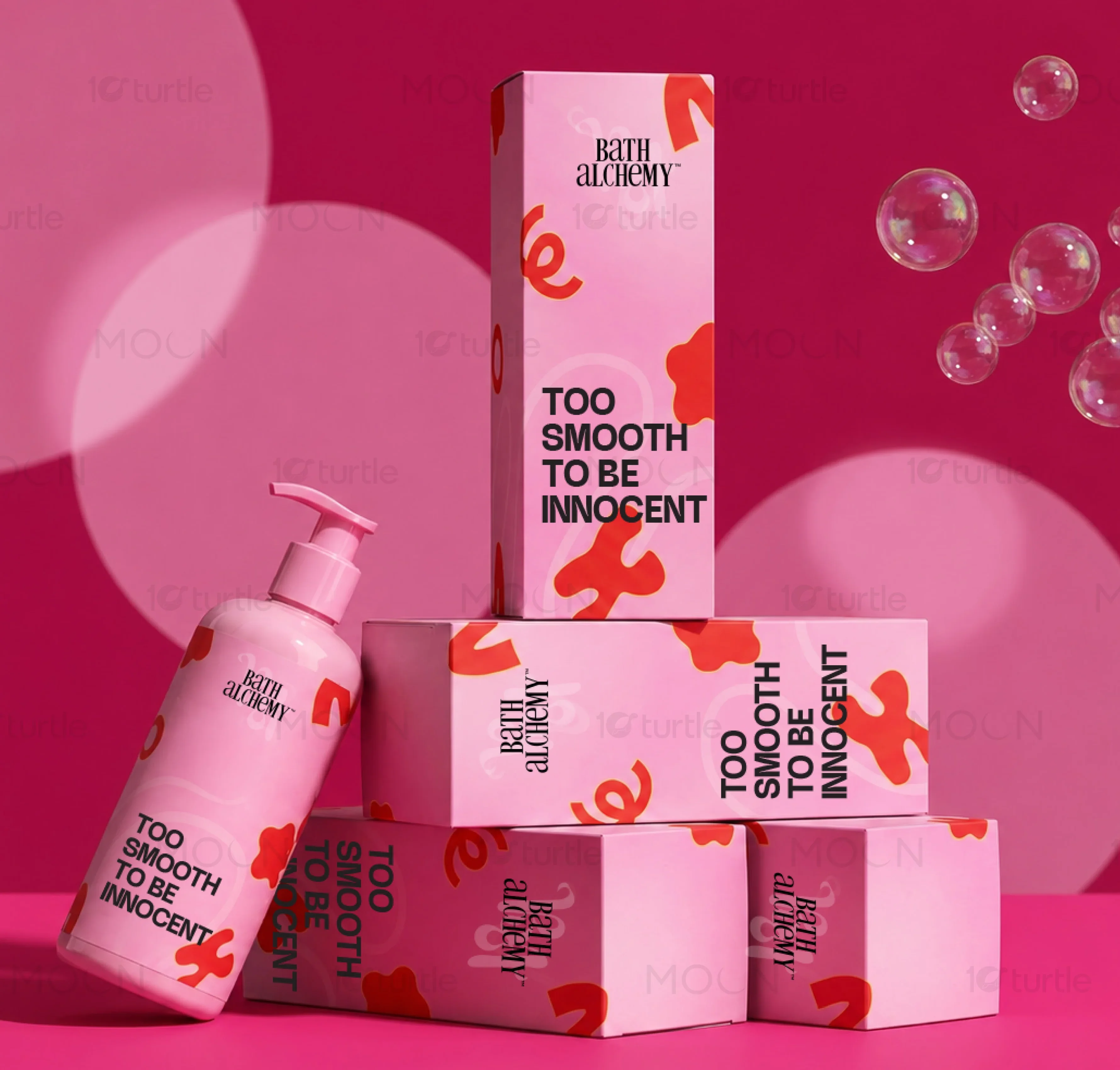
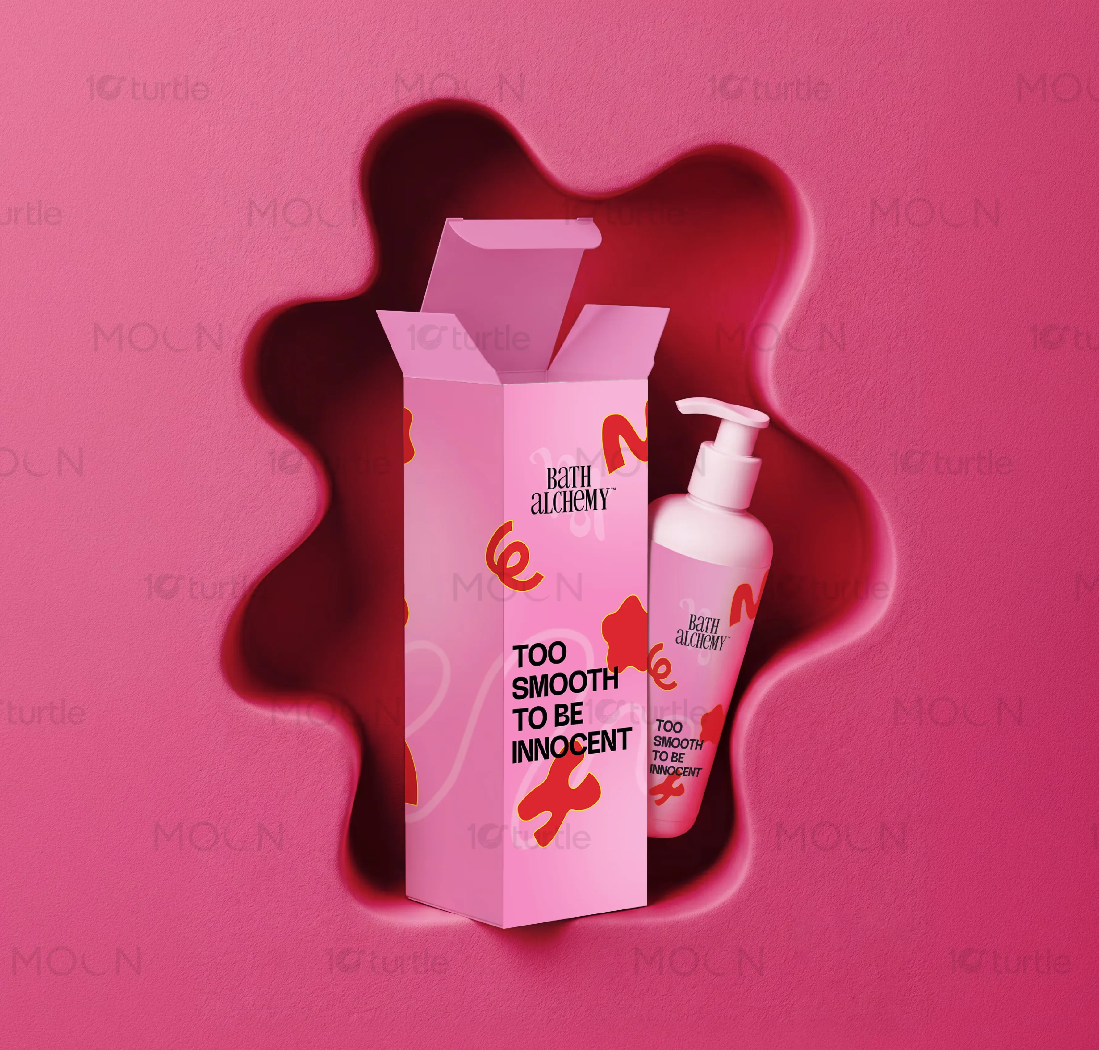
We developed a cohesive skincare packaging design using a vibrant pink color system and custom organic shape illustrations. By pairing playful typography with an ultra-clean layout grid, we designed bottle and box mockups that communicate luxury. The resulting material specs, like matte-finished stock and spot UV highlights, ensure a highly premium, tactile physical presence.
The Impact
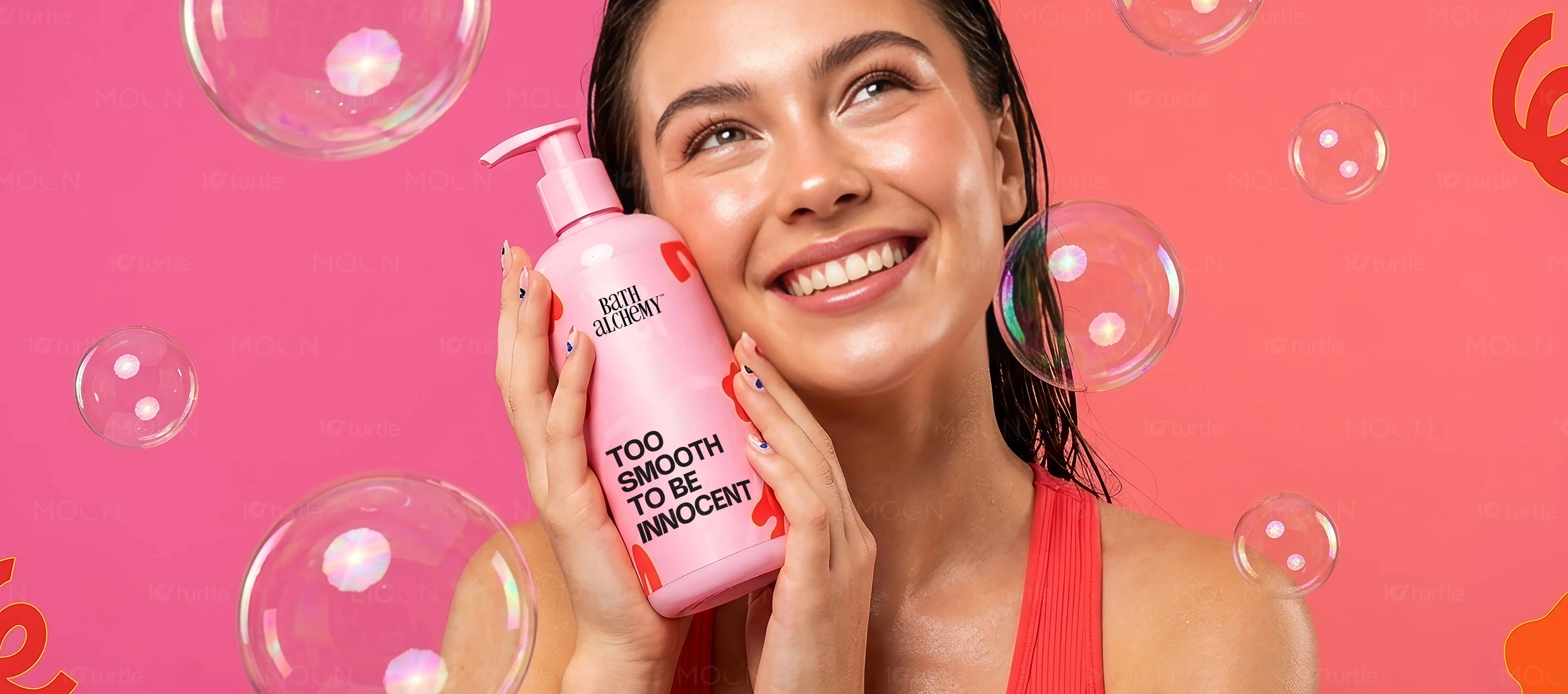
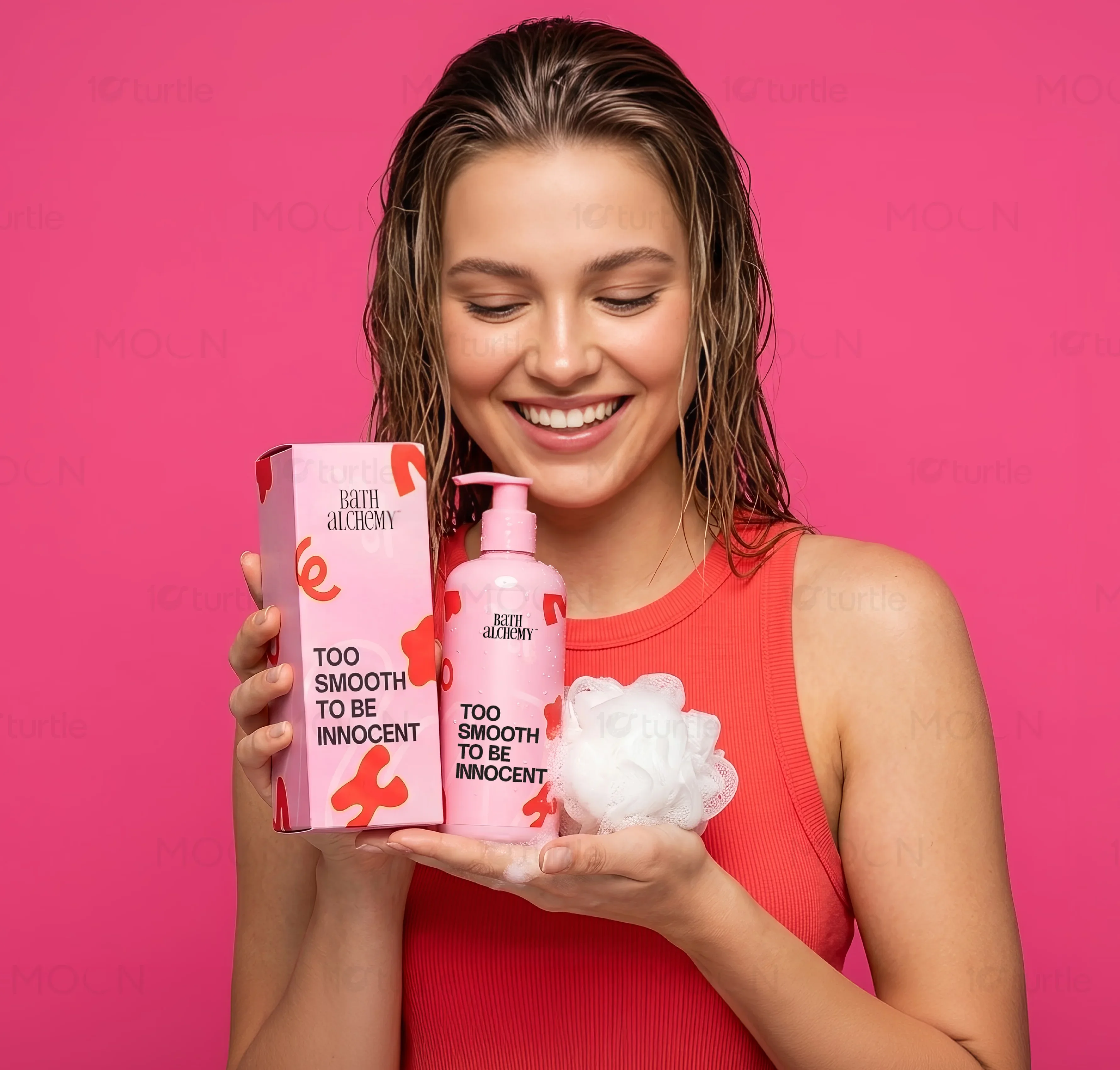
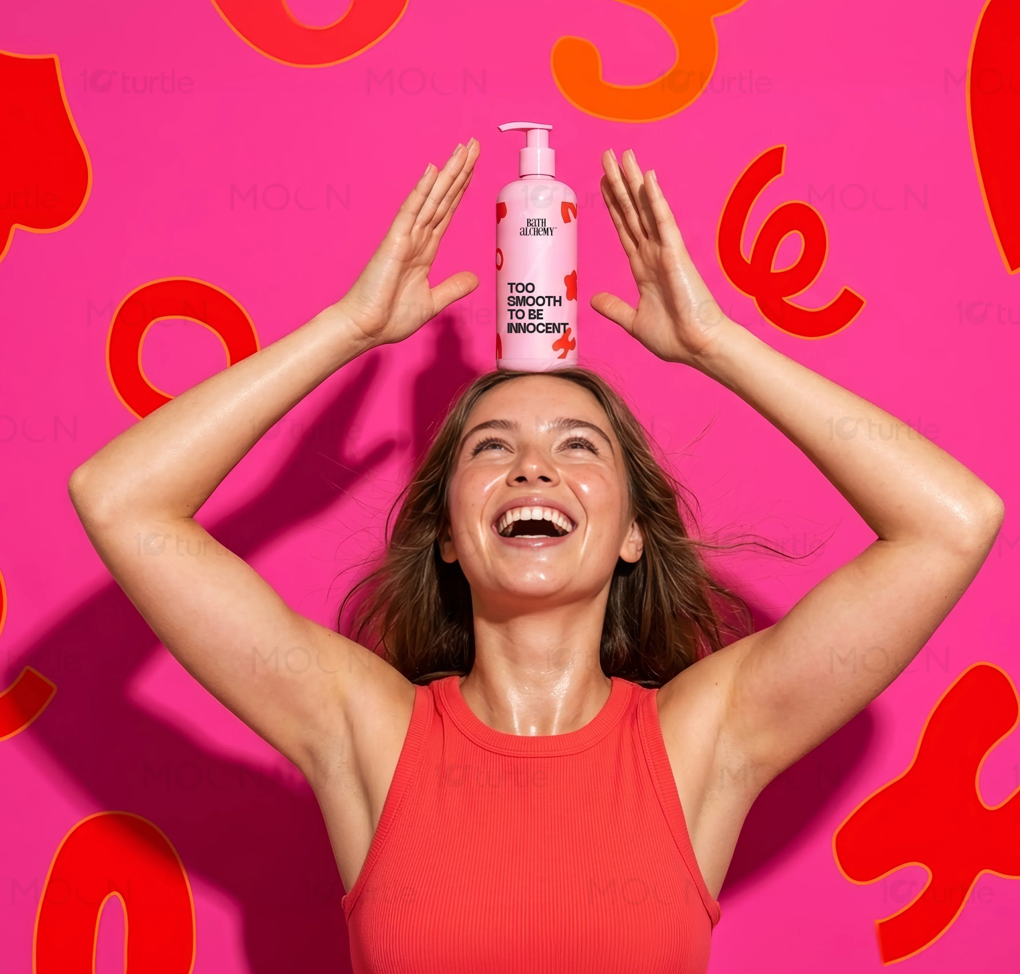
The strategic package design established a strong visual presence that immediately elevated the brand inside premium beauty retail spaces. With highly distinct amber glass bottle mockups and organic pink shapes, the layout increased shelf visibility and generated widespread unboxing shares on social media. This comprehensive packaging design acts as a scalable blueprint for the brand's future product expansions.
Beauty packaging design is not merely a protective shell for a product, it is the most critical physical vehicle for a skincare brand's storytelling on the retail shelf. When consumers stand before rows of competitive products, the visual hierarchy, tactile finish, and immediate personality of the box or bottle mockup determine if they will reach out and touch it. In this particular beauty design case study, the strategic challenge was to balance a premium lifestyle aesthetic with a playful, modern soul. Every surface of the packaging was mapped to establish an energetic yet refined voice, speaking to a discerning demographic that values both clean organic skincare and playful lifestyle design. By placing the packaging structure at the core of the brand system, we crafted an instantly recognizable silhouette that transitions seamlessly from digital marketing touchpoints to physical bathroom counters.
The foundation of the layout is built on a precise grid system that allows expressive graphic elements to float dynamically without disrupting the essential product information. For a beauty line with multiple product variants, maintaining visual legibility is paramount. We designated specific zones for technical details such as volumes, ingredients, and key benefits, freeing up the primary display panels to showcase striking custom typography and organic shapes. This layout logic ensures that as the skincare range expands, new bottles and box mockups can be introduced under a unified framework. Rather than relying on a static, rigid grid, our layout system uses fluid white space to let each design element breathe, ensuring the overall look remains uncluttered, professional, and sophisticated.
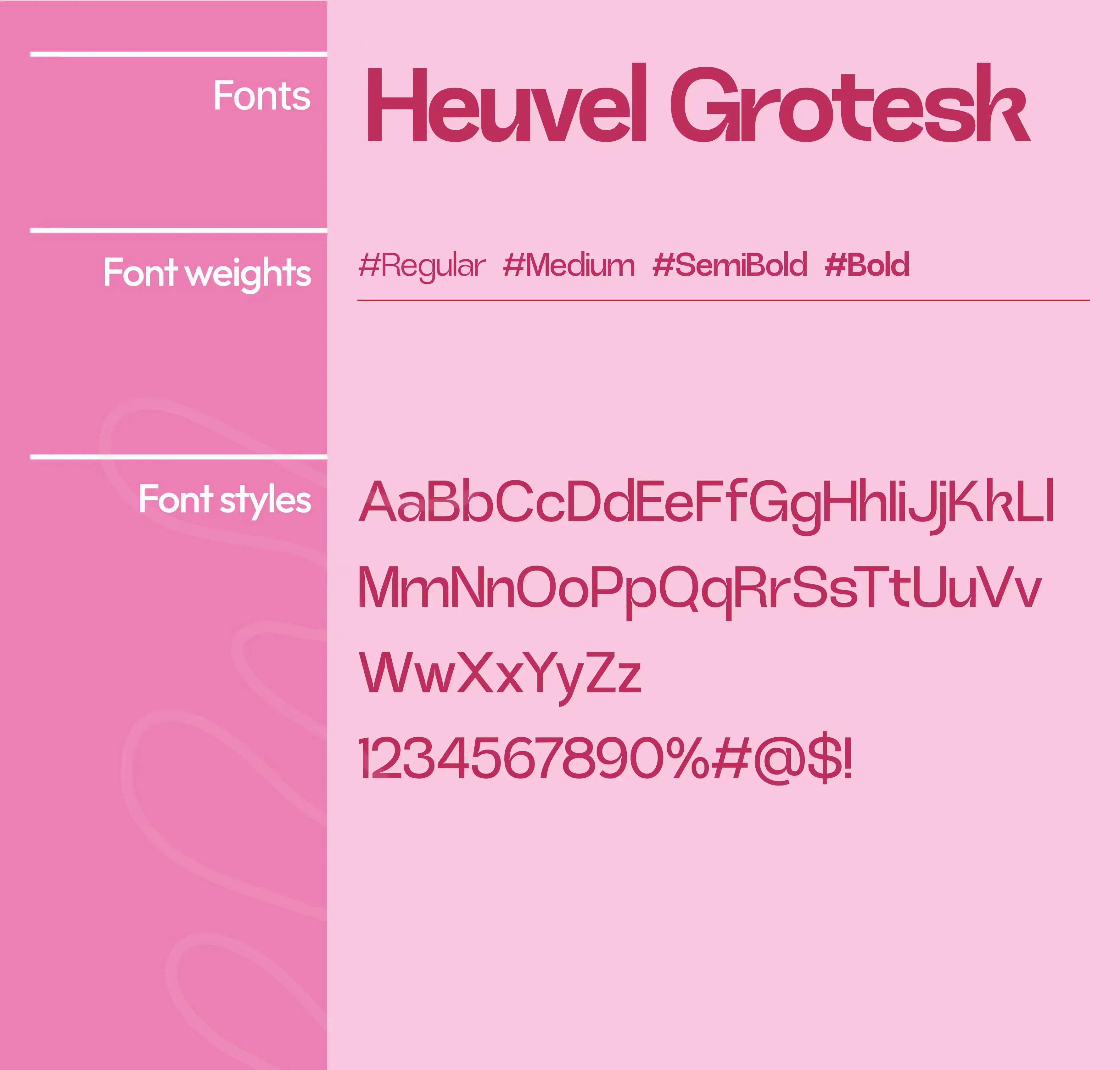
Typography acts as the emotional anchor of this packaging design. To express a playful yet premium personality, we paired an expressive custom headline typeface with a ultra-clean, functional secondary sans-serif. The headline font features subtle organic curves and balanced weights that mirror the natural ingredients within the formula, while the secondary typeface provides crisp, high-contrast legibility for usage instructions and ingredient lists. This typographical tension between playful personality and editorial precision is what elevates the product from a basic cosmetic item to a high-end lifestyle artifact. By carefully adjusting letter-spacing and line heights, the typography remains readable even at small print scales, preserving the premium quality on small dropper bottles and compact boxes alike.
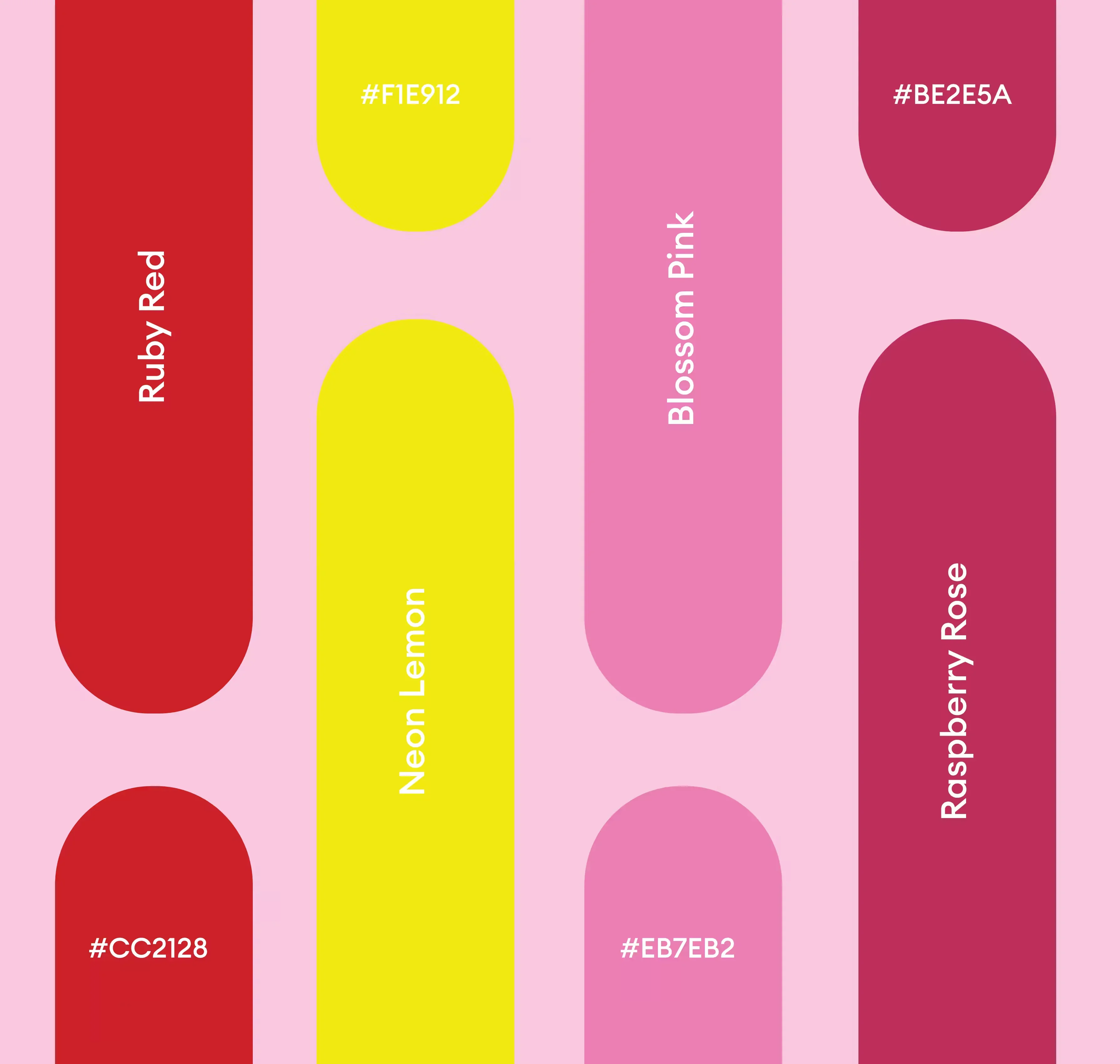
Color strategy plays an indispensable role in defining the shelf presence of the beauty line. We opted for a vibrant yet sophisticated pink color palette, avoiding generic pastel pinks in favor of a richer, more nuanced tone that communicates both youthful energy and mature luxury. This primary pink is paired with contrasting supportive tones to delineate different product variants within the skincare line. By utilizing color blocking and soft organic illustrations, each product family carries its own unique personality while remaining clearly part of the overall brand collection. This deliberate color pairing ensures that the cosmetics packaging stands out dramatically in crowded retail environments, catching ambient light beautifully on shelf displays.
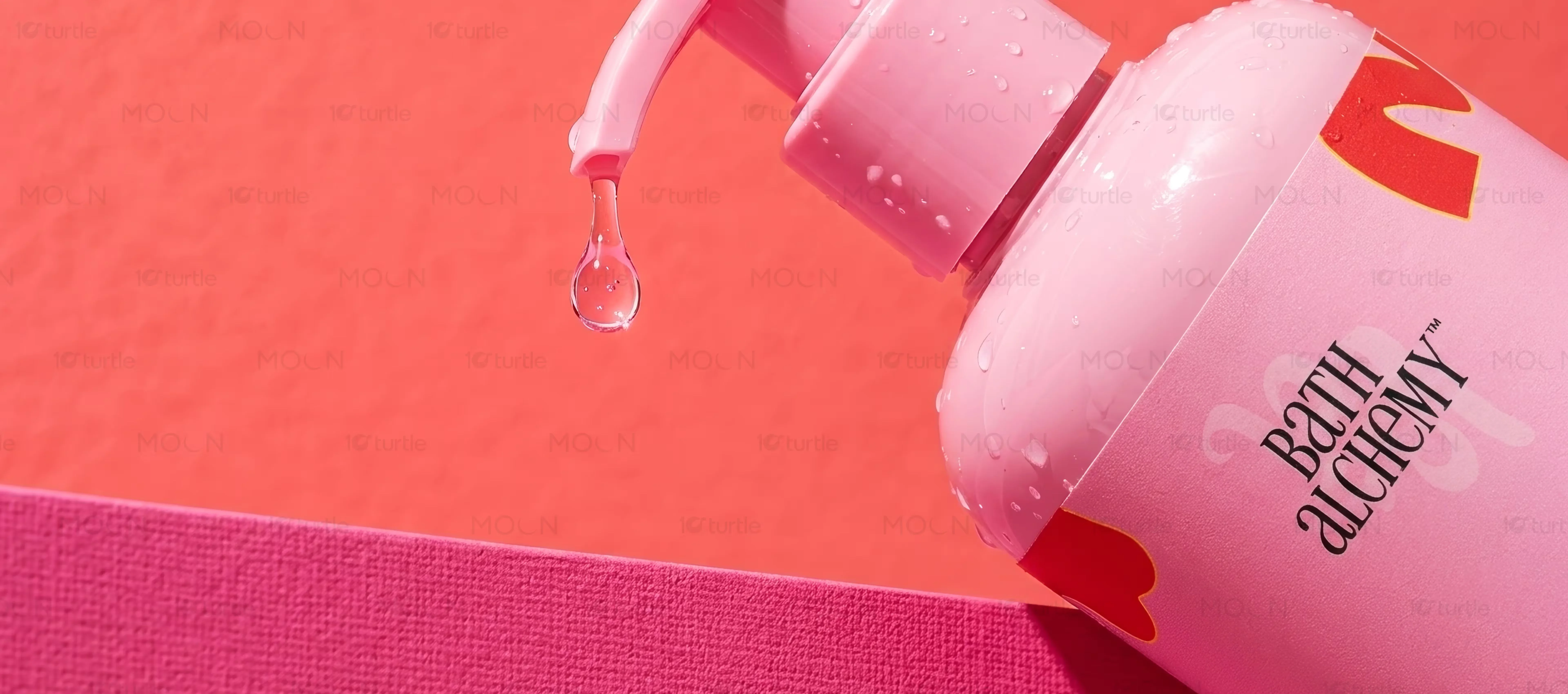
Physical touch is the ultimate converter in product packaging. The mockups were styled to reflect high-quality production specifications, indicating matte-finish soft-touch paper stock for the outer boxes and frosted amber glass for the inner bottles. The contrast between the organic pink graphic shapes and the rich warm amber glass creates a beautiful layered depth when displayed side-by-side. Additionally, we planned for spot UV varnish on the organic shapes of the box mockup, introducing a tactile contrast that rewards the consumer once they hold the package in their hands. This multi-sensory approach transforms unboxing into a memorable event, driving repeat purchases and generating organic social media advocacy from consumers who love showcasing their skincare routines online.
Creating scalable beauty packaging design requires anticipating how light and shadow interact with different materials. Our design team produced meticulous three-dimensional bottle mockups and box mockups to test how the playful typography wrapped around curved surfaces. We evaluated how the organic pink shapes aligned when multiple boxes were stacked together on a shelf, creating continuous visual patterns that catch the shopper's eye from a distance. This continuous shelf layout is a classic strategy used by elite global brands to command more visual space without increasing advertising spend. The result is an adaptable, premium packaging collection that defines the brand's physical presence, establishing them as a forward-thinking leader in the modern organic cosmetics space.
Ultimately, the success of this cosmetic packaging project lies in its ability to combine visual art with commercial strategy. By designing a flexible visual system rather than a series of isolated labels, we provided the beauty start-up with a powerful toolkit for future growth. The design establishes a strong emotional connection with the customer before they ever open the bottle, building trust and excitement through thoughtful details, balanced spacing, and deliberate material choices. This strategic package design elevates the ritual of skincare, converting a daily routine into a highly aesthetic, premium self-care experience that feels both indulgent and remarkably approachable.
Every visual decision made on this cosmetics project speaks to the intricate craft of modern packaging layout. By carefully testing color contrast ratios under standard retail store LED lighting, we guaranteed that the pink hues hold their vibrant, premium depth without washed-out reflections. The seamless alignment of the organic shapes wrapping from the front face to the side panels of the outer cardboard box required micro-millimeter alignment accuracy in the final print templates. This absolute devotion to physical print finish and tactile detail ensures that the final product sits on boutique shelves as a masterpiece of functional commercial design, directly translating our artistic efforts into measurable retail metrics for the brand.
skincare packaging design
beauty product packaging
cosmetics bottle mockup
premium box design
organic shape packaging
playful branding typography