Digital Design
Art Direction
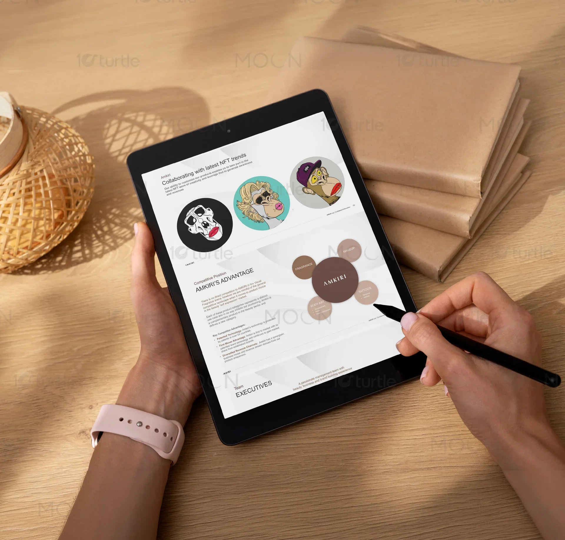
Overview
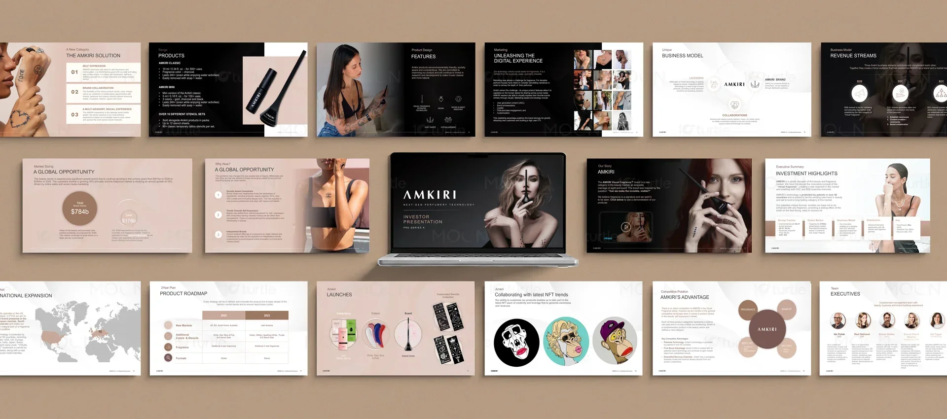
To support a high-stakes fundraising initiative in the premium cosmetics market, we developed a bespoke investor presentation design for an innovative beauty brand. The visual system marries editorial elegance with scientific credibility, transforming dense proprietary data into a captivating visual narrative. By leveraging an asymmetric layout grid and high-contrast typography, we built a digital experience that mirrors the luxury of physical beauty packaging.
The Challenge

The brand needed to convey both high-concept scientific cosmetics technology and emotional luxury appeal to sophisticated institutional investors. Traditional presentation templates felt cold and corporate, completely disconnected from the tactile, high-fashion world of luxury beauty. The core challenge was designing a digital slide deck that maintains rigorous data clarity while evoking the sensory romance of premium cosmetics packaging.
The Solution
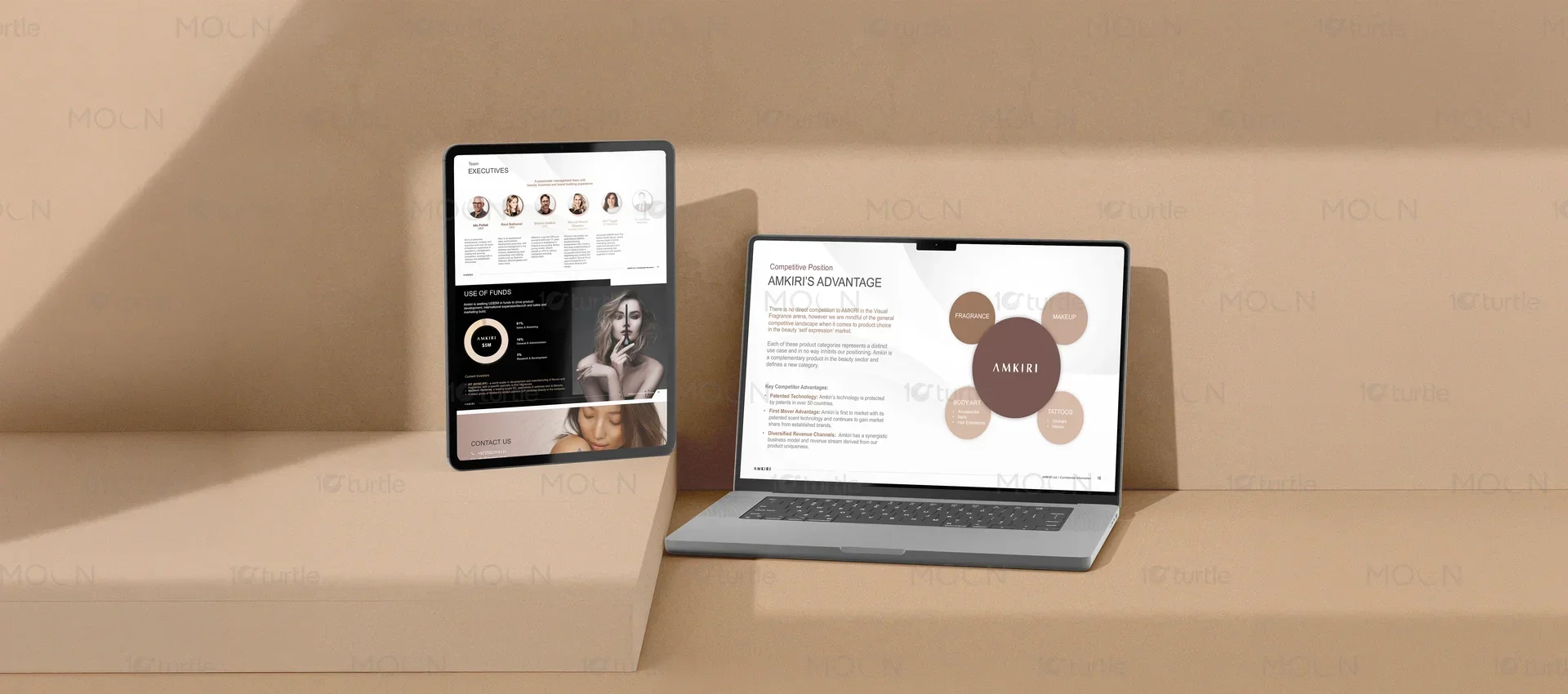
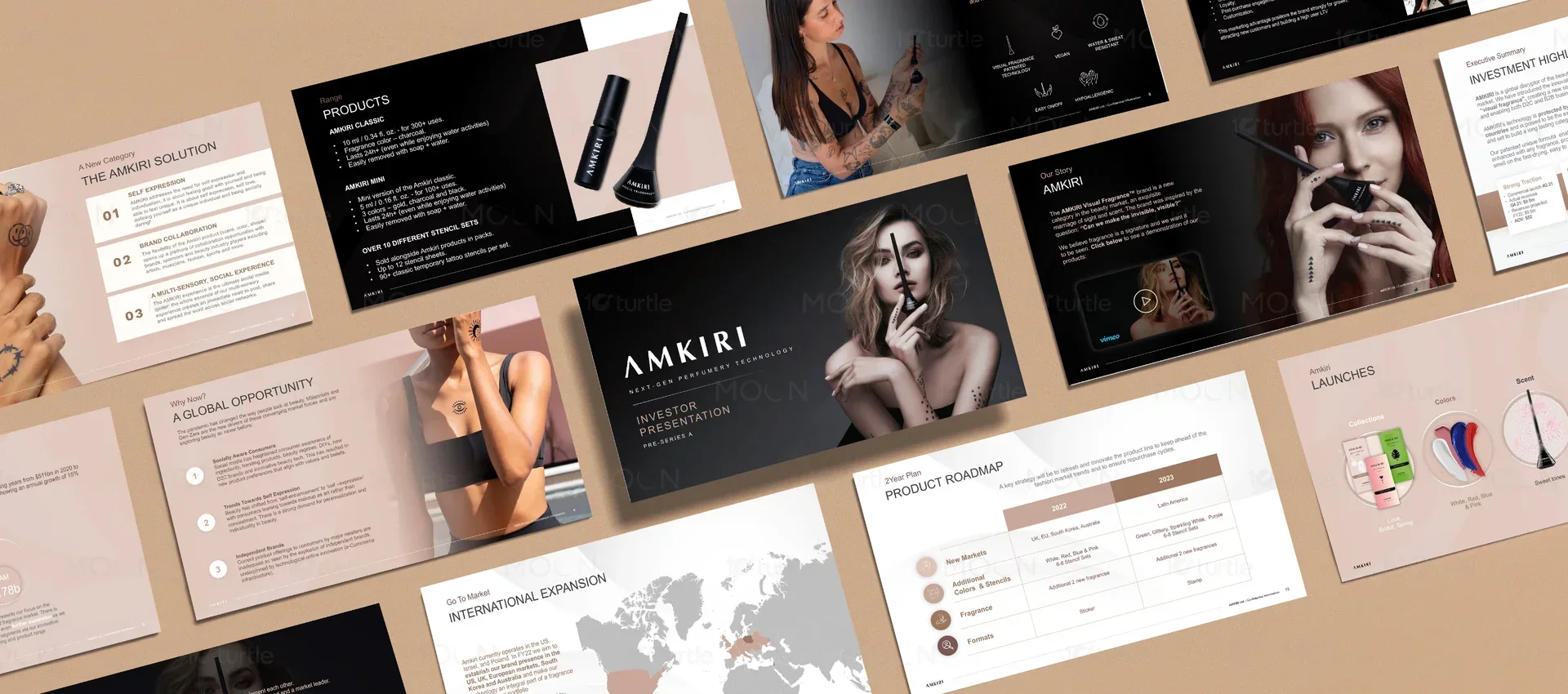
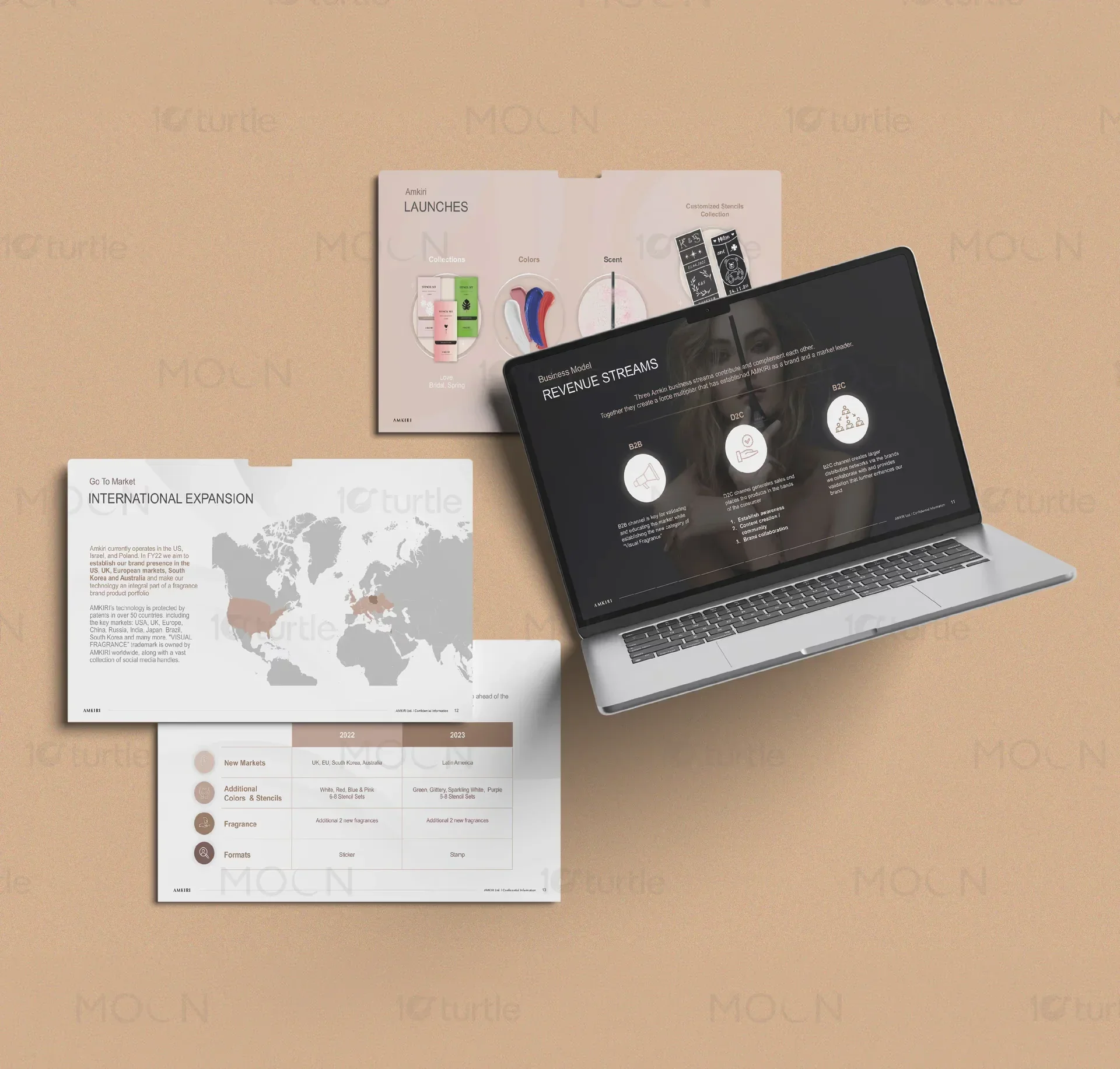
We engineered an editorial-grade slide layout system anchored by a sophisticated typographic hierarchy, combining refined serif headlines with a clean, tech-focused geometric sans-serif. Every key data visualization, timeline, and market chart was custom-drawn in warm champagne and deep charcoal tones to match the luxury aesthetic. The resulting pitch deck design seamlessly presents scientific breakthroughs alongside high-contrast product photography, establishing immediate authority and desire.
The Impact
The highly targeted investor presentation design completely elevated the brand's fundraising communications, establishing a commanding presence in competitive venture capital rounds. By organizing scientific cosmetics data into logical, beautifully spaced editorial chapters, the deck significantly reduced investor friction and accelerated high-value discussions. The client now possesses a timeless, modular slide system that perfectly matches the prestige of their revolutionary physical products.
The art of presentation design within the luxury beauty sector demands a delicate equilibrium between operational mechanics and emotional sensory storytelling. For a modern cosmetics brand seeking venture capital, a slide deck is not merely a collection of data points but an immersive portal into the brand's aesthetic soul and intellectual property. The layout of every slide must speak the language of prestige, utilizing architectural margins, controlled typographic scales, and meticulous asset placement to reassure sophisticated partners of the enterprise's long-term commercial value.
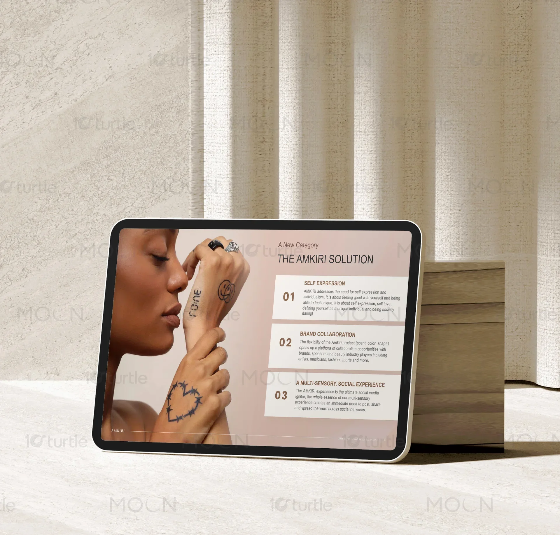
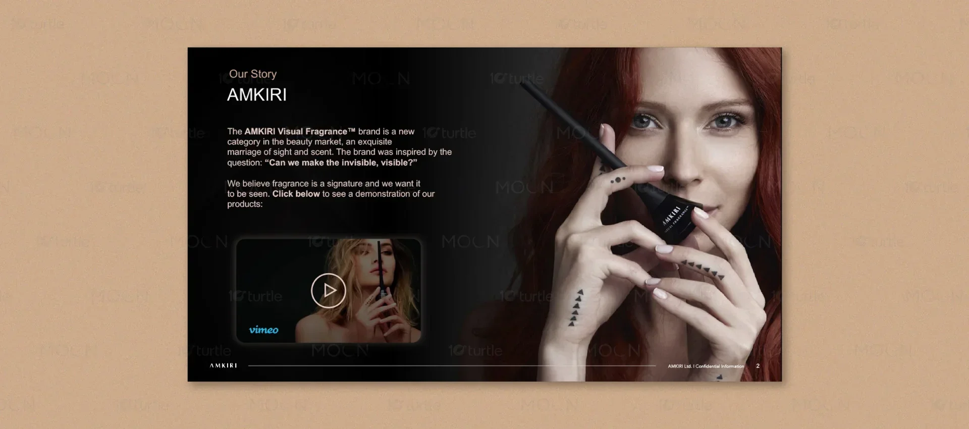
When designing high-stakes presentation assets for the cosmetics space, a standard corporate slide template fails entirely. Luxury cosmetics rely on tactile romance and visual prestige, qualities that must survive translation into flat, screen-based formats. To achieve this, our design strategy prioritized asymmetric editorial grids that evoke the layout logic of high-end beauty periodicals. Rather than cramming slides with standard bullet points, we utilized expansive whitespace to give key statements and product silhouettes breathing room, creating an atmosphere of exclusivity and confidence.
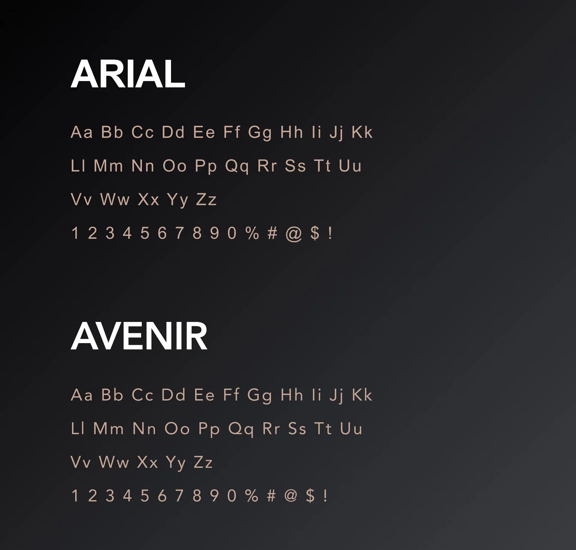
Our choice of typography on this presentation project was deliberately split to convey both artistic heritage and scientific precision. For the primary slide titles and overarching thematic headings, we implemented a high-contrast serif typeface that mirrors the classic letterforms found in premium fashion publications. This choice communicates immediate luxury and heritage, setting an elevated tone from the first glance. To balance this editorial elegance, we styled all analytical data, market projections, and technical notes in a clean, high-legibility geometric sans-serif typeface. This typographic friction ensures that while the viewer is swept up in the sensory story of the brand, the hard data remains undeniably clear, professional, and readable on low-resolution projectors.
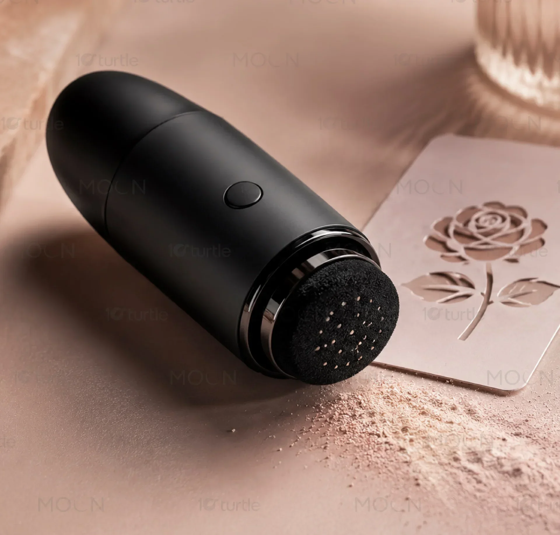
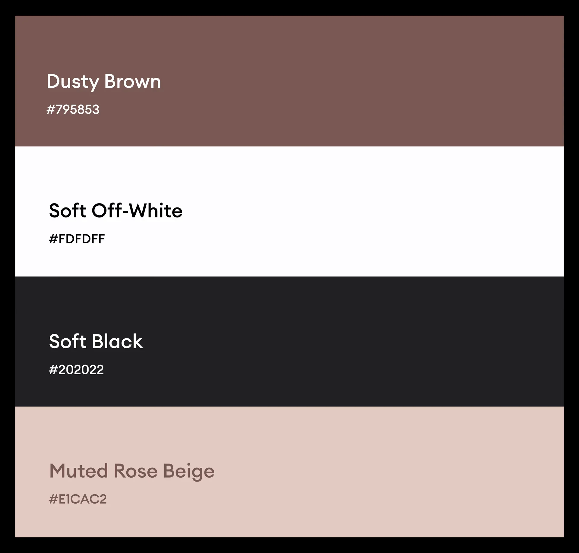
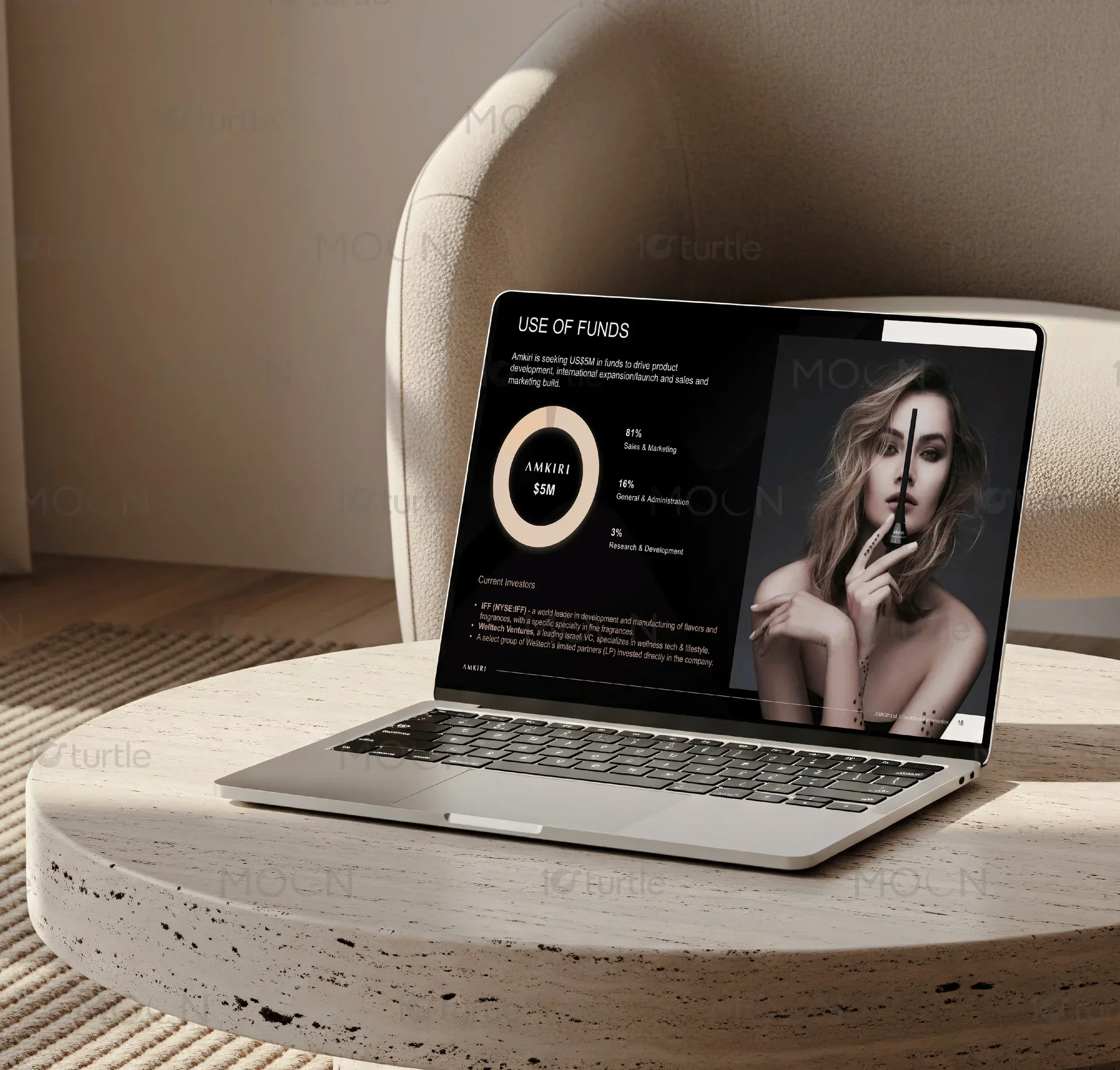
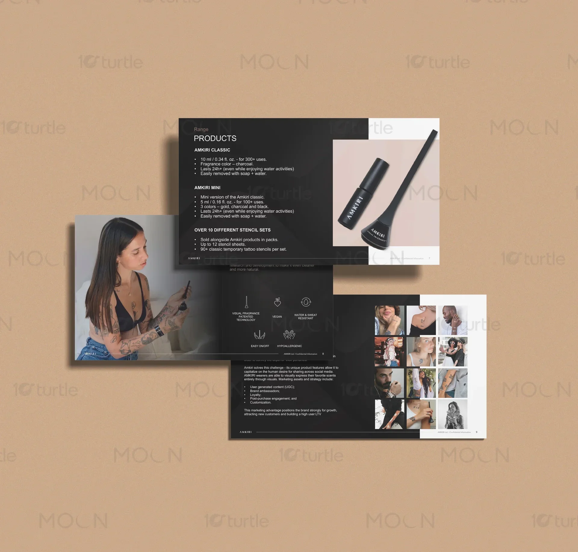
The chromatic strategy of the slide deck was curated to emphasize premium materiality without relying on loud, distracting colors. We established a foundational palette dominated by stark charcoal, soft ivory, and warm champagne undertones, allowing the product packaging and visual cosmetics assets to serve as the primary sources of color. By anchoring the deck in these neutral, luxury-adjacent tones, the presentation feels cohesive, mature, and structured. This intentional restraint ensures that when highly detailed visual brand assets or packaging close-ups are introduced, they hold maximum visual impact against the minimalist backdrops, driving investor focus directly to the product innovation.
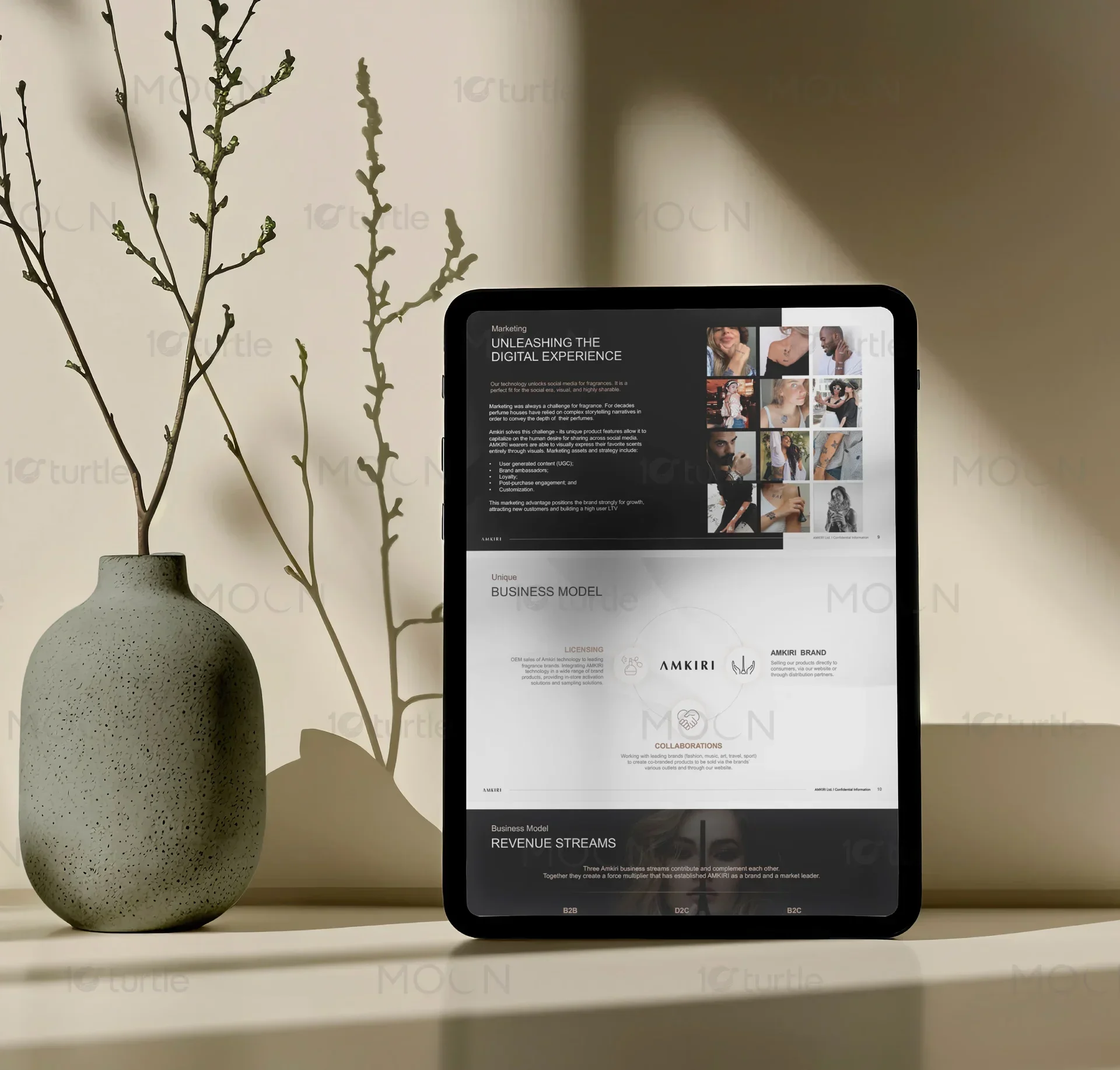
To sustain momentum across a multi-slide narrative, we structured the deck's layout system around rhythmic pacing. Much like a physical editorial publication, a successful digital presentation must alternate between quiet, image-driven moments and dense, information-rich slides. We developed custom layout grids for market opportunity slides, consumer behavior graphics, and financial projection tables, translating dry metrics into custom infographics. Rather than using generic, auto-generated charts, every bar graph, timeline, and data visualization was custom-drawn to match the exact stroke weight and typographic rules of the broader brand guidelines.
For a luxury beauty brand introducing a highly novel product format to the market, a slide deck must solve a unique cognitive hurdle. It must explain how a highly physical, sensory, and tactile cosmetic product functions while preserving an aura of mystery and prestige. We addressed this by integrating architectural line drawings and pristine product photography within minimalist layouts, clearly separating technical application graphics from high-impact brand statements. By organizing the slides into thematic chapters marked by dramatic, full-bleed transition slides, we allowed the presenter to pause and build anticipation, turning a standard pitch session into a cinematic brand experience.
Ultimately, the strength of bespoke presentation design lies in its ability to build narrative equity. When every visual asset, from the alignment of a footnote to the custom layout of an investment table, is designed with meticulous attention to detail, it signals to potential investors that the brand approaches its product development with the same uncompromising standards. By treating the digital deck as a premium, tactile extension of the physical brand, we gave our client a robust, strategic narrative tool that bridges the gap between scientific innovation and raw emotional luxury. This comprehensive approach to the visual slide system successfully repositioned the brand's pioneering narrative, transforming a high-concept business model into a clear, visually compelling, and investment-ready commercial vision.
The technical execution of the slide deck required rigorous asset optimization to ensure flawless rendering across diverse viewing environments. Presentation files frequently suffer from degraded image quality or unexpected typography shifts when shared between different devices and display software. To mitigate these risks, we crafted bespoke, high-resolution vector assets for all diagrams, iconography, and frameworks, ensuring razor-sharp rendering on both massive conference screens and personal tablet displays. Every photographic asset was individually color-graded and compressed to balance extreme fidelity with rapid loading times, preventing lag during critical pitch moments and maintaining an uninterrupted flow.
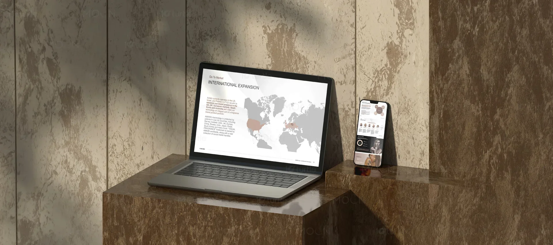
Furthermore, the design system established for this presentation was architected with long-term flexibility in mind. A luxury brand's financial models and strategic goals are fluid, requiring frequent updates as market conditions evolve and fundraising rounds progress. Rather than creating static, rigid slides, we built a comprehensive library of custom, modular slide templates that the internal team could easily edit and restructure. This system included custom layout grids for team profiles, global market expansion maps, and retail distribution timelines, ensuring that any future additions or adjustments would naturally adhere to the strict typographic scale, color logic, and structural elegance of the original creative direction. By pairing high-stakes aesthetic design with functional, user-friendly utility, we ensured the brand could maintain its premium positioning across all future communications.
beauty presentation design
cosmetics pitch deck design
investor presentation layout
luxury slide deck design
presentation design services
pitch deck design for beauty brands