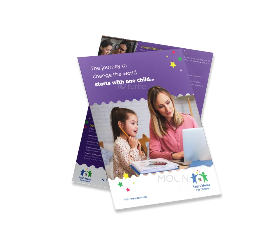
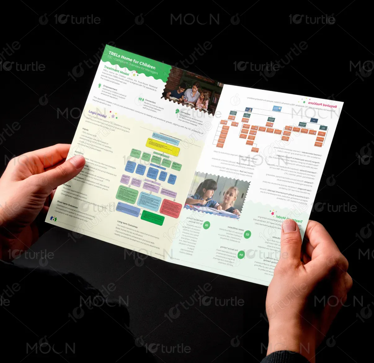
The design takes a minimalistic yet impactful approach, focusing on clear, structured communication of TRELs Home for Children’s trauma-informed care model. The layout uses soft colors and clean lines to represent the calming and supportive environment the organization fosters. Icons and simple typography enhance readability, while sections are organized to flow logically, ensuring an engaging experience. Visuals reflect the core values of trust, connection, and empowerment, maintaining a professional yet compassionate tone.
Bi-Fold Design
Graphic Design

Industry
Civic, Government & Nonprofits
Tools we used


Project Completion
2025
Key Market
Global
TRELs Home for Children is a trauma-sensitive care facility, utilizing the Trust-Based Relational Intervention (TBRI) model to support children’s emotional and physical well-being. The brochure highlights their comprehensive care approach, integrating connection, correction, and empowerment into daily practices. With trauma-informed staff and a structured environment, TRELs works toward stabilizing behaviors and supporting long-term emotional growth. The design emphasizes the home’s healing mission and the importance of holistic, individualized care plans that promote growth and stability in a secure setting.
Industry
Civic, Government & NonprofitsWhat we did
Bi-Fold DesignGraphic DesignPlatform
-The challenge in designing this brochure was to present complex, trauma-sensitive concepts in a clear, digestible format. The care model includes a variety of therapeutic services and behavioral strategies, which could overwhelm the reader. Additionally, it was crucial to convey the delicate nature of the service without sacrificing professionalism, while also ensuring that the brochure was accessible and engaging for a broad audience, including parents, caregivers, and professionals.
The design effectively simplifies the complex information by using clear headers, sections, and visual cues. Each service is broken down into easy-to-understand categories, such as connection, correction, and empowerment. The color scheme and typography contribute to a calming and welcoming aesthetic, while icons and charts visually support key concepts. The logical flow of the content ensures that the audience understands the TBRI model, its benefits, and how TRELs implements these principles in everyday care.
The vision for this design is to create a lasting impression of TRELs as a compassionate, trauma-informed home for children. It aims to evoke trust and empathy, encouraging families and partners to support TRELs' mission. Long-term, the design is intended to be adaptable, evolving with the organization’s growth and the expanding awareness of trauma-informed care. The goal is to position TRELs as a leader in trauma-sensitive care, helping to change the way children in need are supported and nurtured.
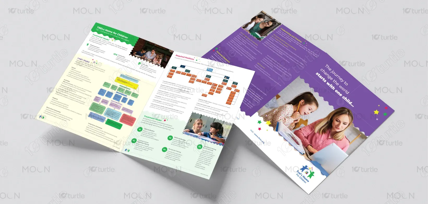

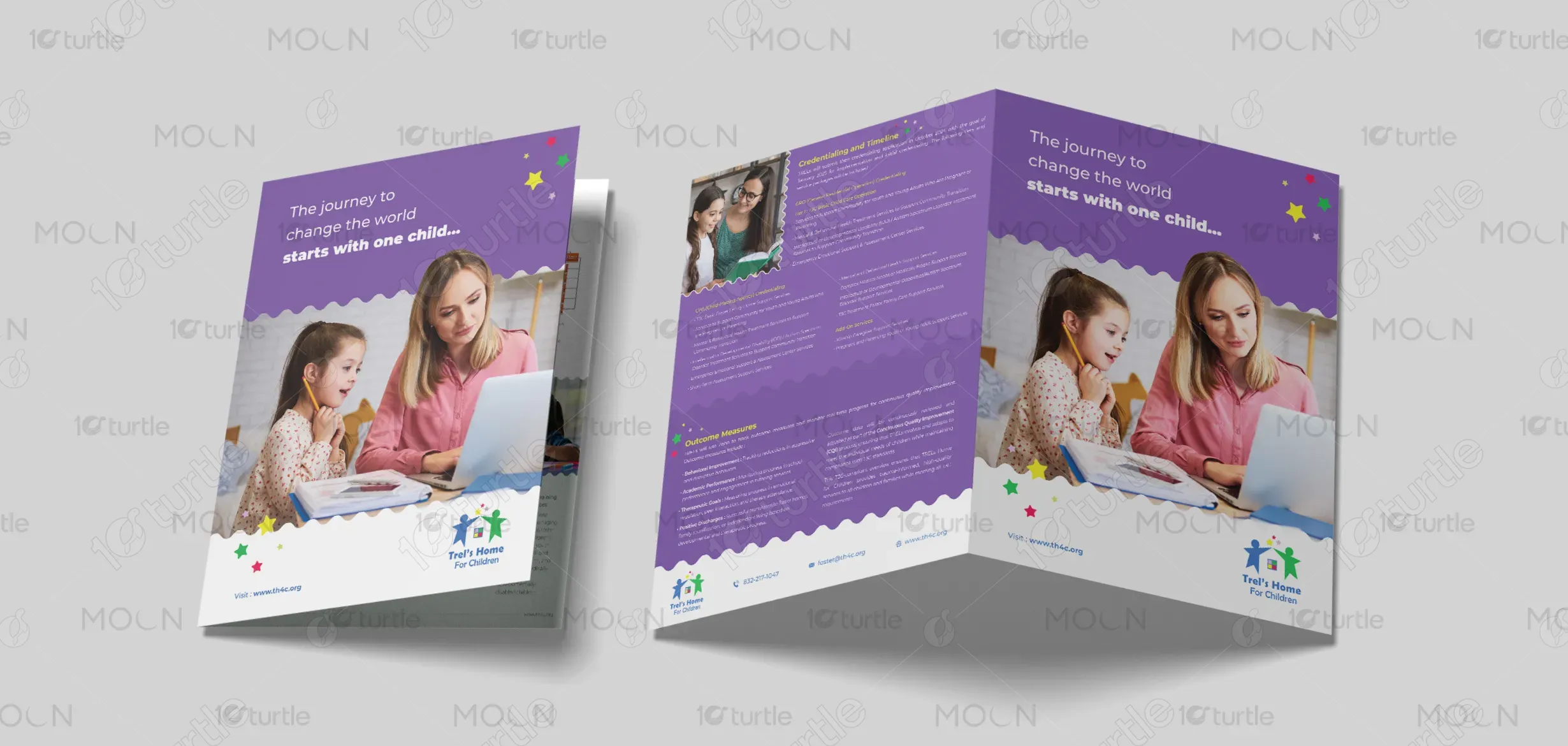
The color palette includes soft, muted tones such as pastel blues, greens, and purples, which evoke calmness, stability, and healing. These colors align with the mission of providing a safe, welcoming, and peaceful environment. They also support emotional regulation and reflect the emotional support offered at TRELs. The colors are chosen to create a sense of trust and warmth, reinforcing the home’s trauma-sensitive philosophy and creating a reassuring and approachable look for the brochure.