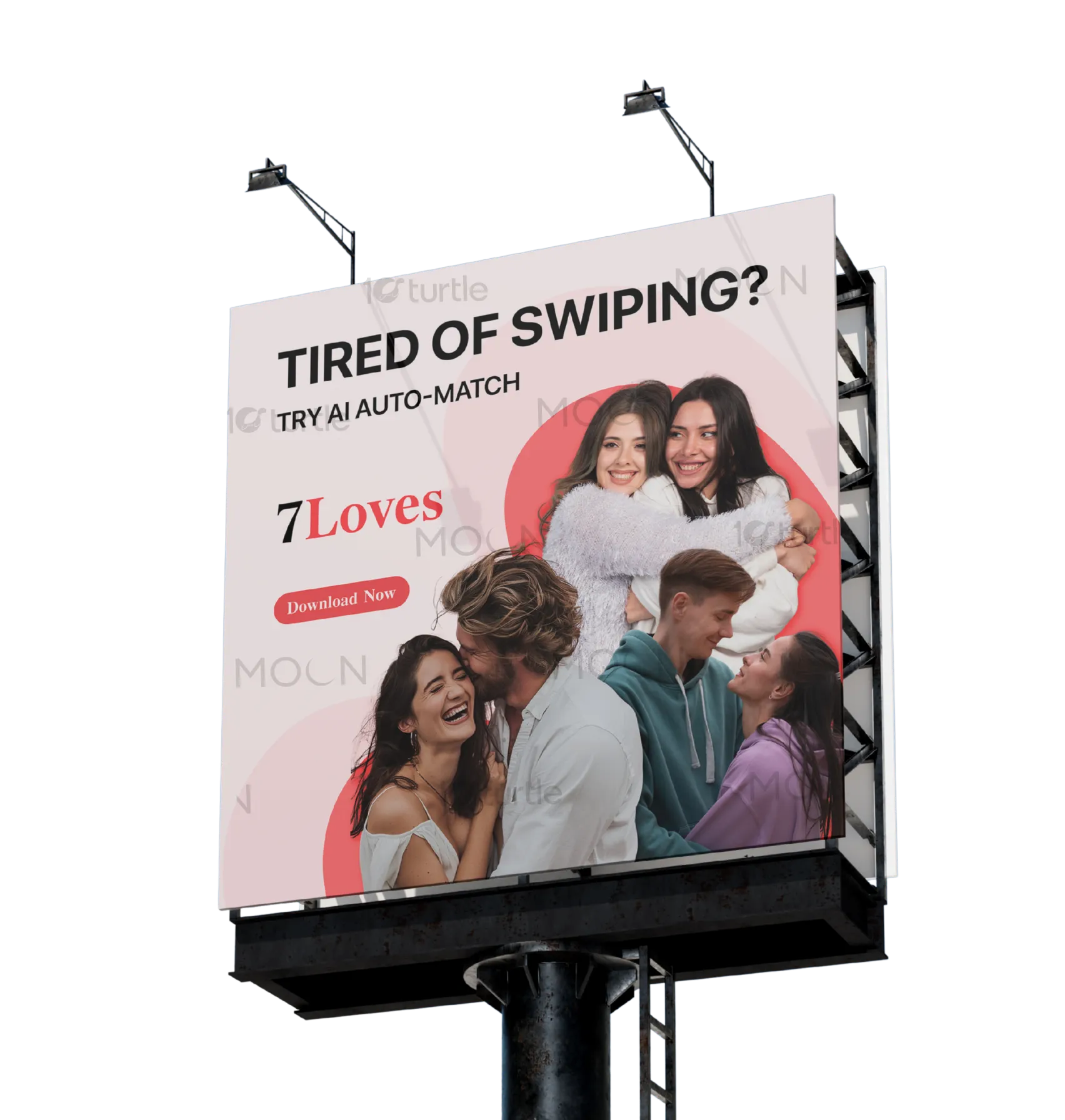
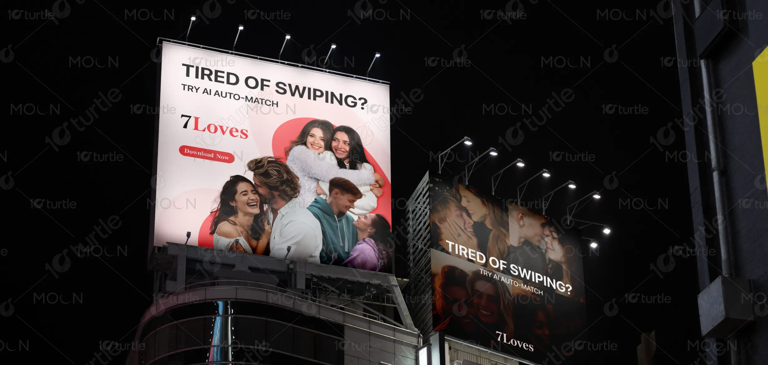
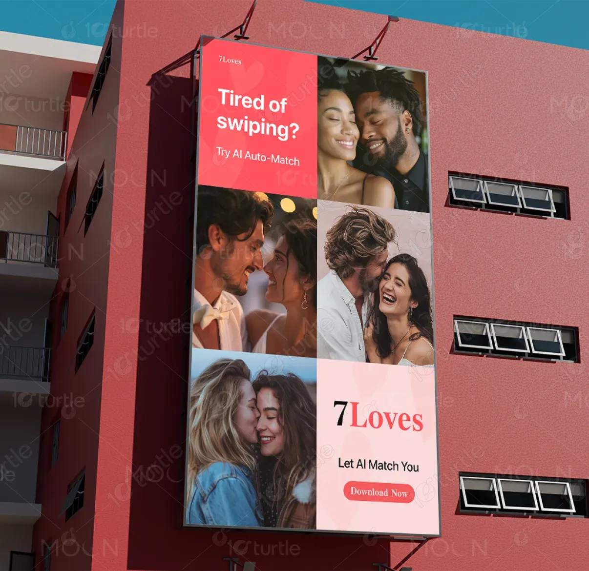
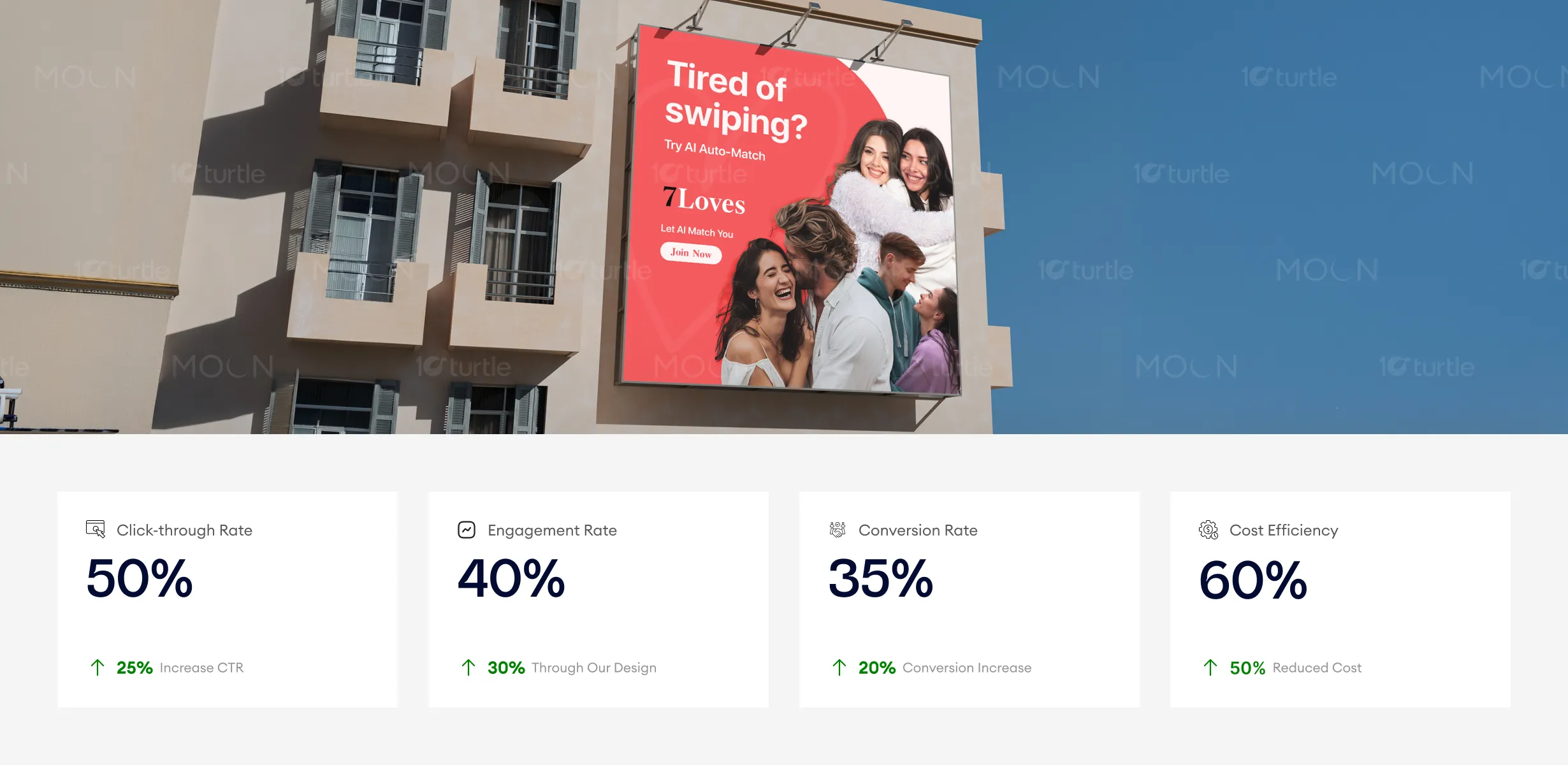
The design follows a clean, modern, and emotionally engaging approach, combining bold typography with lifestyle imagery to create instant relatability. The large headline “Tired of Swiping?” captures attention immediately, while the supporting line introduces the AI-driven solution. The layout is structured with a strong visual hierarchy—headline at top, brand in the middle, and CTA below—ensuring readability even from a distance. The use of real, happy couples builds trust and emotional appeal, while the soft red accents create warmth and highlight key elements without overwhelming the composition.
Billboard Design
Social Media Post Design
Graphic Design
Industry
Technology, SaaS & Startups
Tools we used


Project Completion
2026
Key Market
Global
This design represents a modern dating platform, 7Loves, focused on simplifying the online dating experience through AI-powered matching. The primary goal is to attract users who are fatigued by traditional swipe-based apps and offer them a smarter, faster alternative. Positioned within the competitive dating app market, the design communicates ease, authenticity, and efficiency while maintaining a premium yet approachable visual identity across billboards and social media formats.

Industry
Technology, SaaS & StartupsWhat we did
Billboard DesignSocial Media Post DesignGraphic DesignPlatform
-Modern dating apps often rely heavily on endless swiping, leading to user fatigue, low-quality matches, and reduced engagement. Many users struggle with decision overload, lack of meaningful connections, and time inefficiency. Additionally, crowded digital platforms make it difficult for brands to stand out with clear messaging. This results in low conversion rates and weak emotional connection between users and the product.
The design addresses these challenges through a direct, user-focused message and simplified visual communication. The bold question-based headline immediately resonates with the audience’s frustration, while the AI-driven solution is presented as a clear alternative. A strong visual hierarchy ensures quick comprehension across large-scale formats like billboards. The use of authentic human imagery builds emotional trust, while the clean layout and minimal text improve clarity and engagement. The scalable design system ensures consistency across digital and outdoor media.

The design proves effective in attracting attention through a well-balanced composition that’s emotionally engaging and visually striking. The combination of bold, relatable messaging with vibrant imagery enhances engagement and trust, ultimately driving both conversions and cost efficiency. The strong call-to-action and emotional connection through real couples facilitate better audience retention and increased interaction with the platform.
The long-term vision for 7Loves is to position itself as a smart, reliable, and emotionally intelligent dating platform that prioritizes meaningful connections over volume. The design system is built to evolve across future campaigns while maintaining a consistent brand identity. By focusing on clarity, trust, and innovation, the brand aims to become a recognizable leader in AI-driven matchmaking, adaptable across global markets and multiple communication channels.
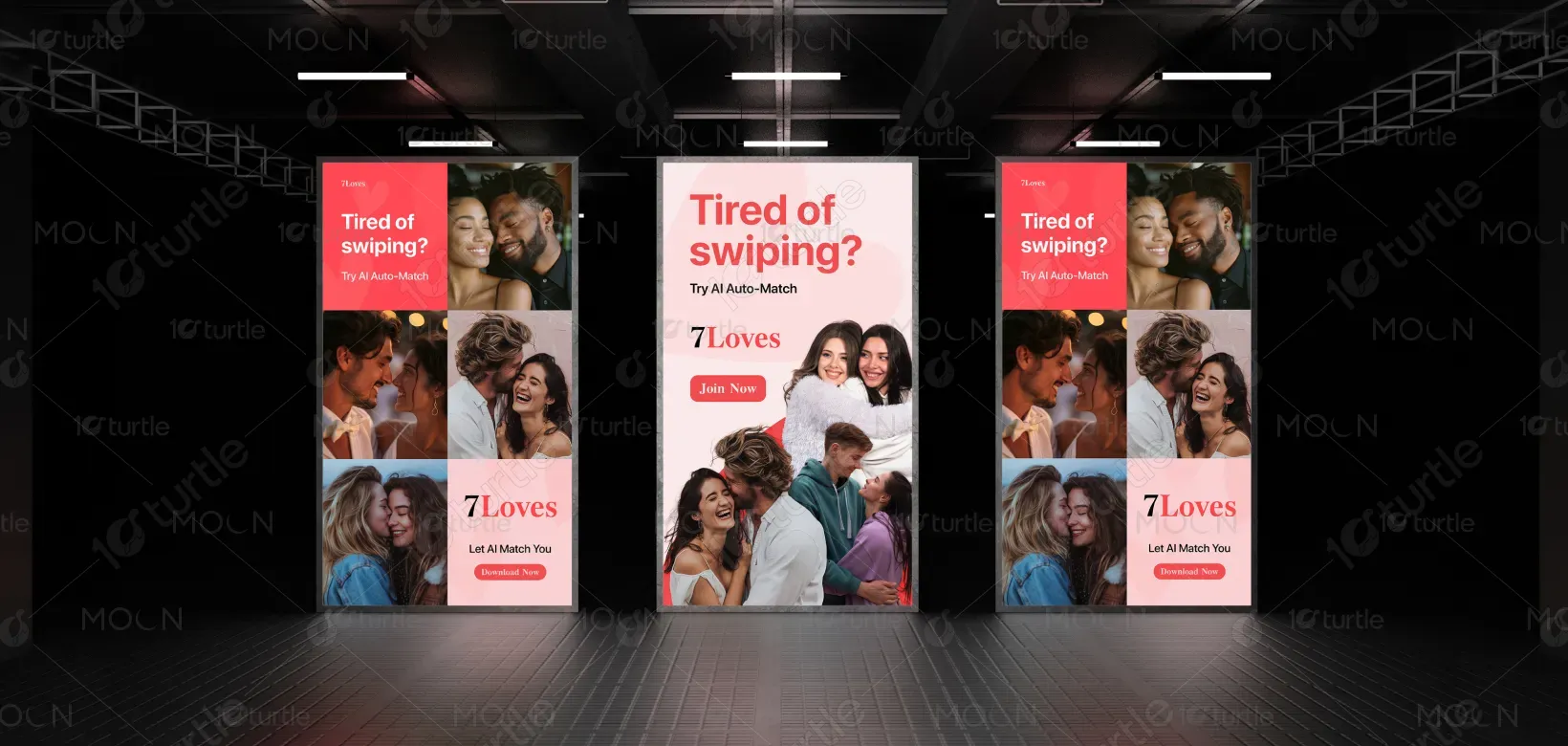
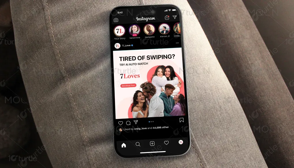
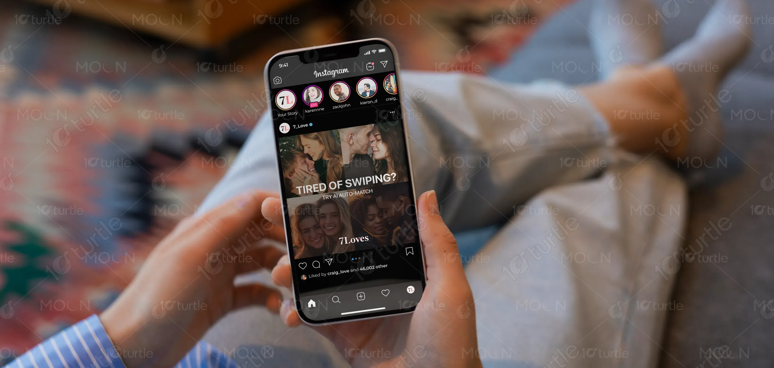
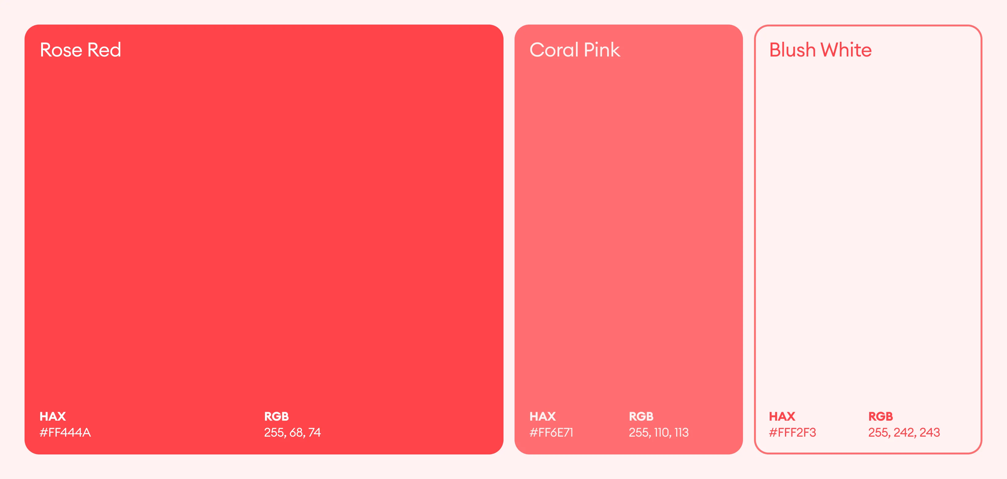
The design uses a soft red and white color palette, supported by neutral tones and natural imagery. Red acts as a focal color, symbolizing love, energy, and action, while also drawing attention to key elements like the brand name and CTA. The white background ensures clarity, readability, and a premium feel, especially in outdoor environments. The overall visual language is minimal, modern, and human-centric, using rounded shapes and soft gradients to create warmth and approachability while maintaining a clean and scalable design system.