
Book Cover Design • Paperback Cover Design • Audiobook Cover Design • Publishing Design
Overview
This book cover design collection includes three paperback-focused concepts created for publishing and self-publishing use. The set covers business/AI transformation, dramatic fiction, and personal growth storytelling. Each cover uses strong title hierarchy, immersive visual scenes, high-contrast compositions, and polished mockups to support bookstore presentation, audiobook promotion, digital listings, and print-ready author marketing.
The Challenge

Books compete in crowded online marketplaces where readers judge credibility within seconds. Poor cover design can make strong content look unfinished, generic, or unsuitable for its category. Authors also need covers that work across paperback, ebook previews, audiobook thumbnails, and promotional mockups. Without clear typography, genre cues, and platform-ready formatting, the book can lose visibility and reader trust.
The Solution
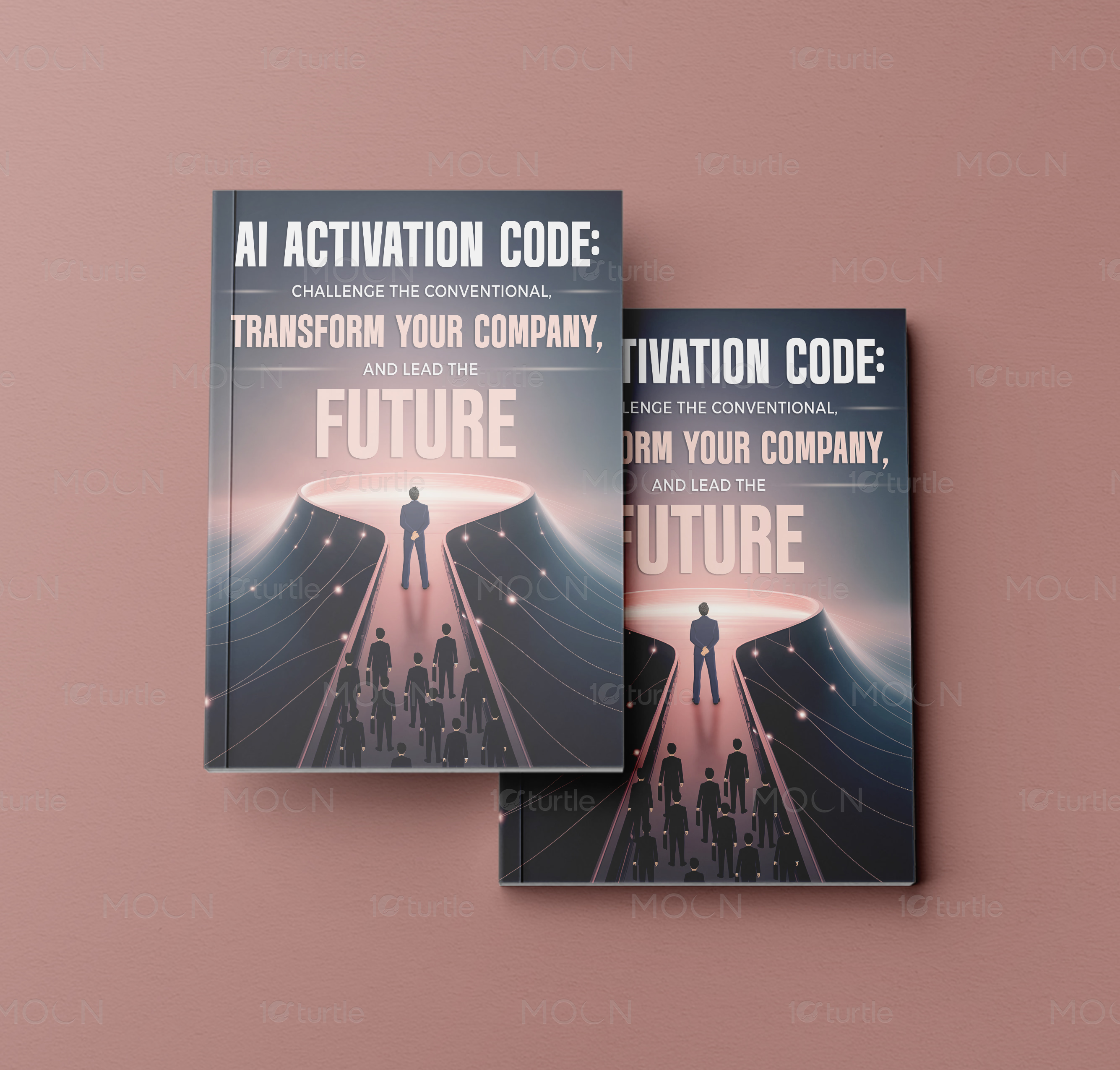
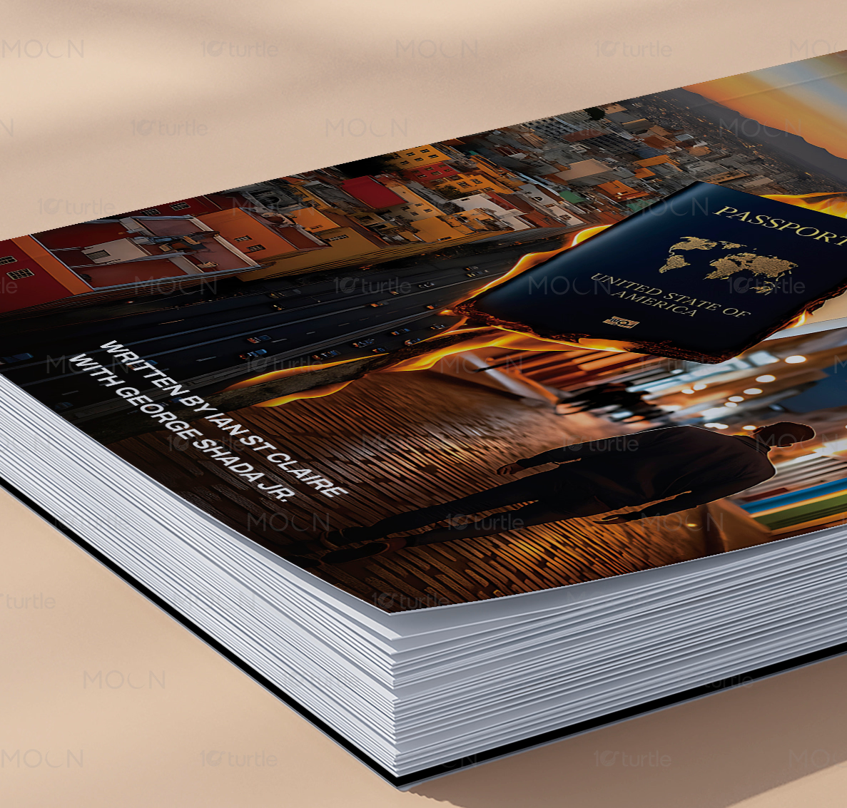
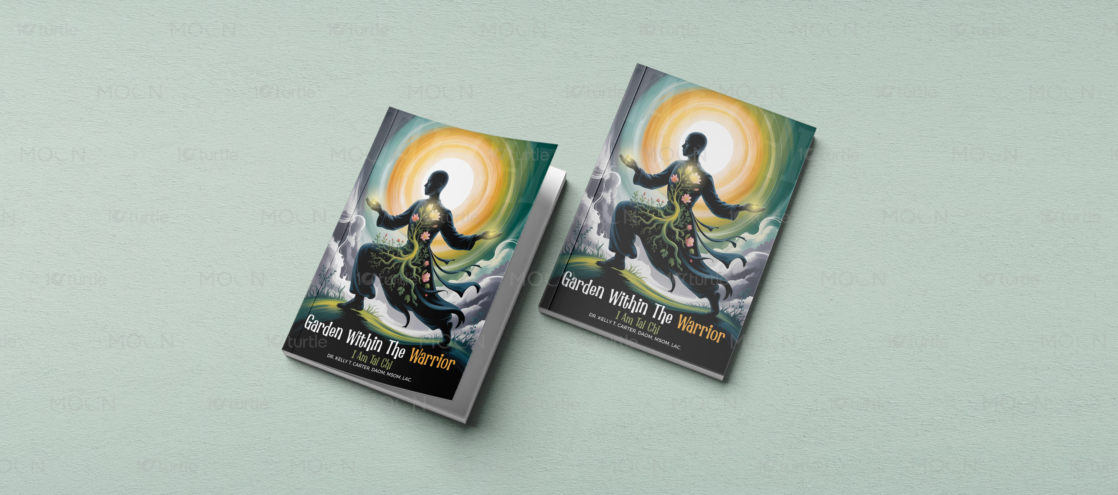
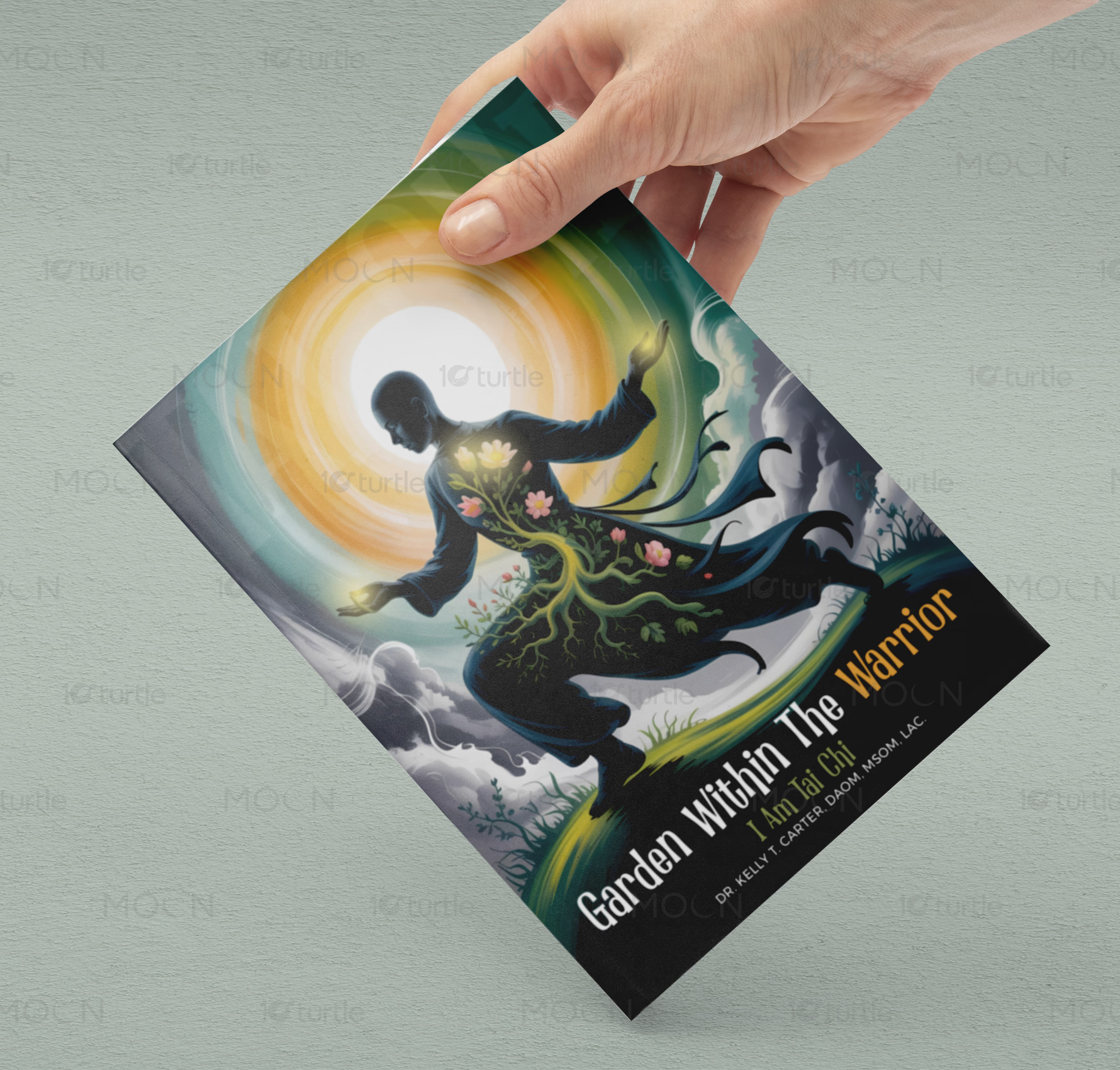
This collection solves that through bold, genre-specific visual storytelling while keeping the set professionally publication-ready. The AI business cover uses futuristic pathways, glowing lights, leadership silhouettes, and condensed uppercase typography to create a transformation-driven corporate tone. The fiction cover uses fire, passport imagery, city streets, gold serif lettering, and device mockups to support both print and audiobook promotion. The self-growth cover uses a warrior silhouette, glowing sun, botanical body illustration, and dark-to-green contrast to create an emotional, symbolic reading experience.
The Impact
The cover collection gives authors a stronger visual presence across print, audiobook, and digital channels. Each design creates instant category recognition while still feeling distinctive and memorable. The print-ready paperback presentation supports professional publishing workflows and marketplace confidence. Long term, these covers help books appear more credible, increase click-through interest, and strengthen author-brand perception.










In modern publishing, book cover design has to work harder than ever. A cover is no longer only a printed front page on a shelf; it must perform across Amazon listings, author websites, audiobook platforms, social media posts, digital ads, and printed paperback copies. This case study brings together three book cover concepts as one unified publishing design project, showing how different genres can share the same professional standard while still keeping their own visual identity.
The collection includes a futuristic business-style cover, a dramatic fiction cover, and a symbolic self-growth cover. Each design uses a different visual language to speak to its intended reader. The AI-focused cover uses a dark atmospheric setting, glowing pathways, leadership silhouettes, and bold condensed uppercase typography. The layout immediately suggests transformation, innovation, strategy, and future-facing business thinking. Its strong type hierarchy makes the message readable even from a distance, which is important for online thumbnails and promotional graphics.
The fiction direction uses cinematic contrast, golden serif typography, fire, smoke, a passport, city scenery, and a lone figure walking through an illuminated street. This creates a dramatic travel-inspired story world with tension and movement. The same cover is also shown across an audiobook-style device presentation, proving that the artwork can extend beyond paperback into digital listening platforms and launch promotions. This flexibility is important for authors who want one visual identity across multiple publishing formats.
The self-growth cover takes a more symbolic and illustrative approach. A warrior figure is shown with glowing light, floral growth, roots, storm clouds, and circular motion around the body. The design uses teal, yellow, black, green, and soft grey tones to suggest resilience, inner transformation, and emotional strength. The typography sits along the lower cover area, allowing the illustration to become the main storytelling element.
Across the full collection, the creative strategy is consistent: strong title visibility, genre-specific imagery, polished mockup presentation, and print-ready thinking. The covers are designed to support paperback cover design, audiobook cover design, ebook promotion, and author branding. Instead of creating decorative visuals only, the work focuses on helping books look credible, market-aware, and ready for publishing.
For authors and publishers, this kind of publishing design creates long-term value. A professional cover can improve first impressions, support sales pages, strengthen reader trust, and make the book easier to promote. Whether the final file is prepared for print, KDP, IngramSpark, audiobook platforms, or digital campaigns, the design gives each book a clear visual identity built for visibility and reader connection.
#bookcoverdesign
#paperbackcover
#audiobookcover
#selfpublishing
#publishingdesign
#authorbranding
#printreadybook
#ebookcover
#fictioncover
#bookmockup
#kdpcover
#ingramspark