
Overview
This hardcover book cover design collection brings together three complete publishing concepts with front, back, and spine presentations. The set supports religious puzzle books, literary fiction, and health transformation titles through genre-aware visuals, readable typography, strong back-cover messaging, and premium mockups that help authors appear credible across print, retail, and self-publishing channels.
The Challenge

Hardcover books need to feel valuable before a reader opens them, especially when they appear beside paperback and digital editions. Poor cover design can weaken trust, hide the genre, or make the book look unfinished in online previews and physical displays. Authors also need the spine and back cover to work as functional selling spaces, not afterthoughts. Without clear hierarchy, barcode planning, and readable back-cover content, a hardcover loses both shelf impact and publishing polish.
The Solution
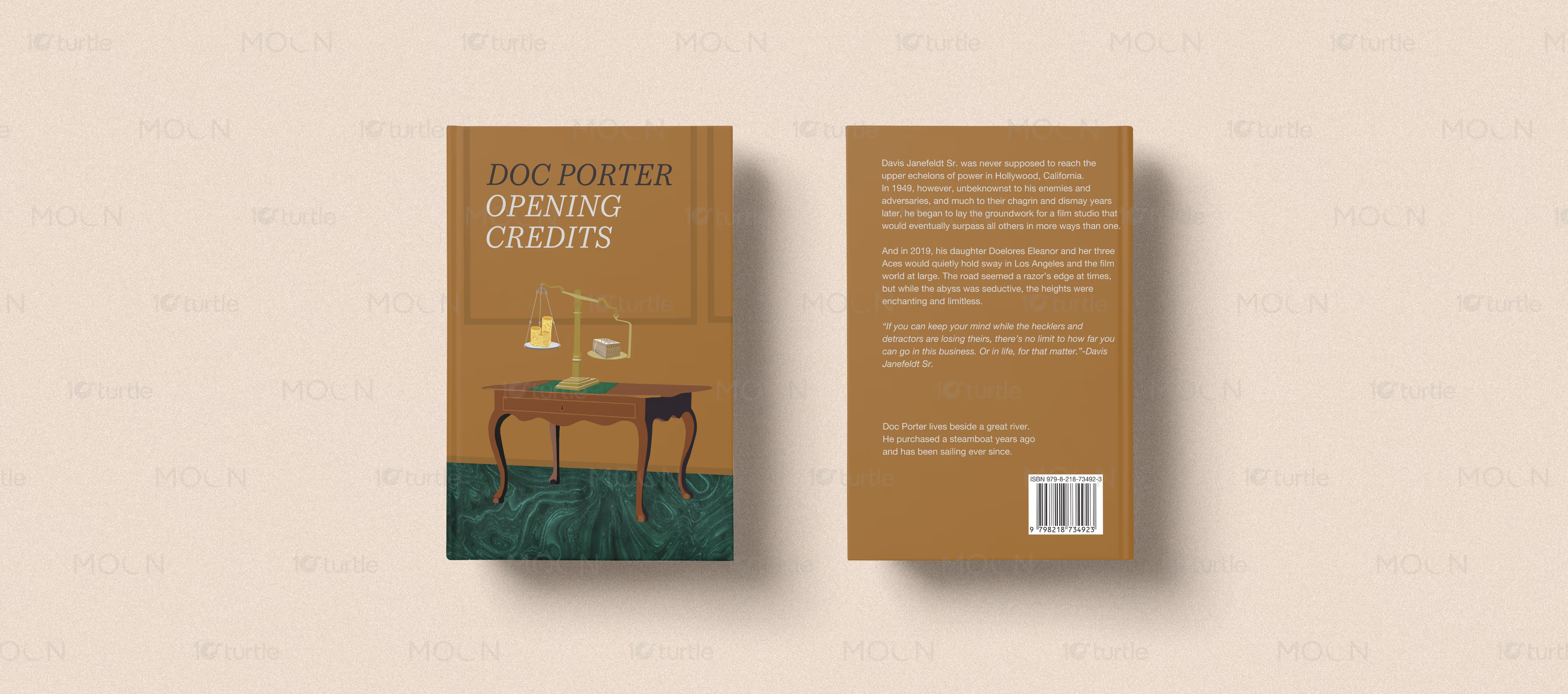
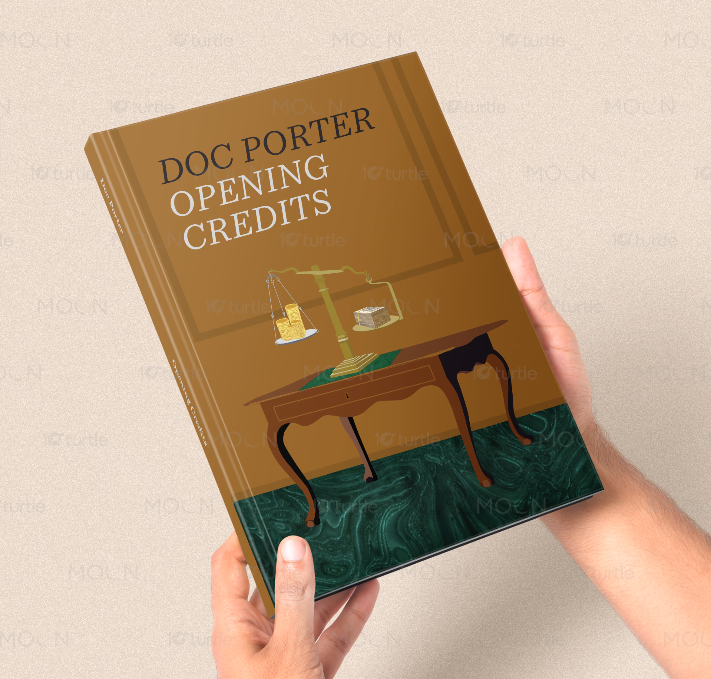
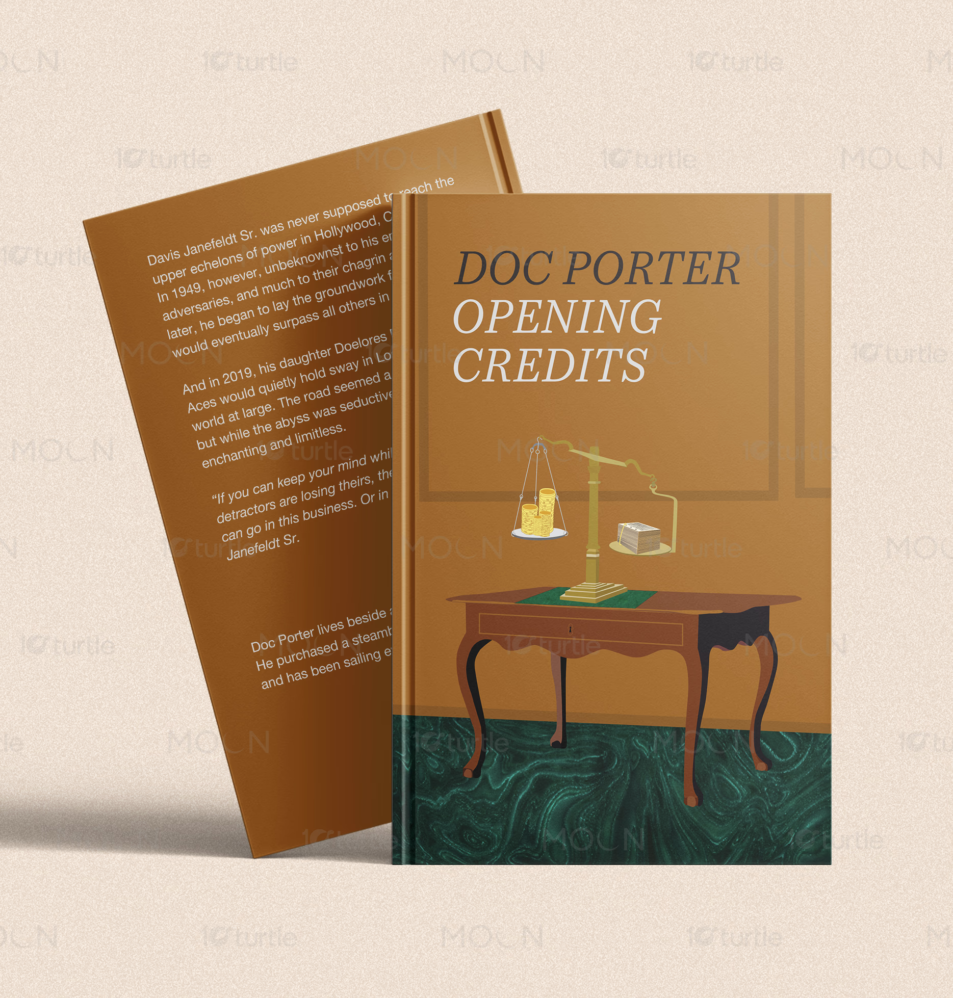
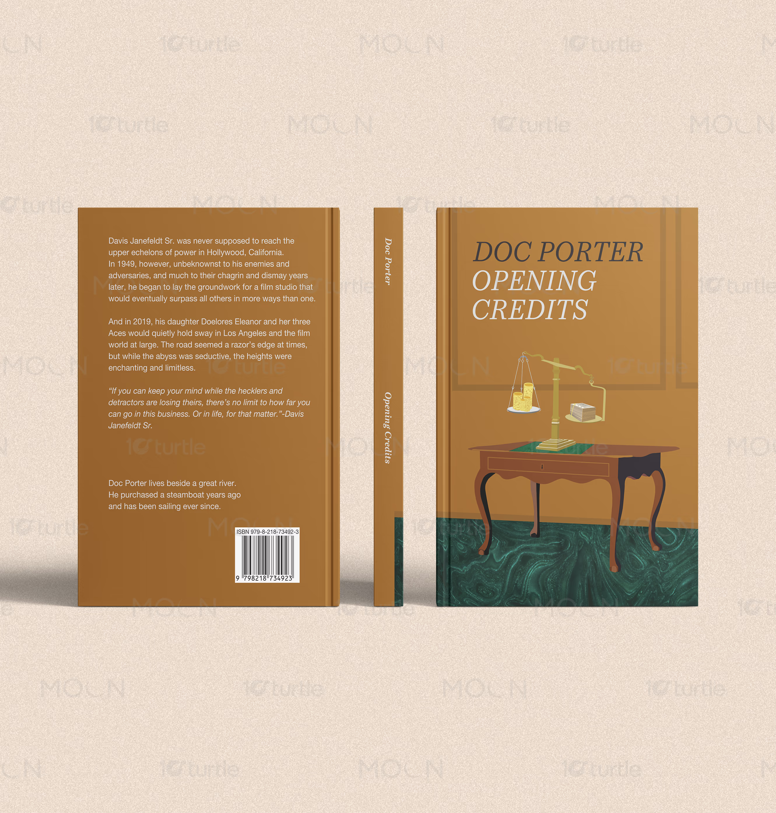
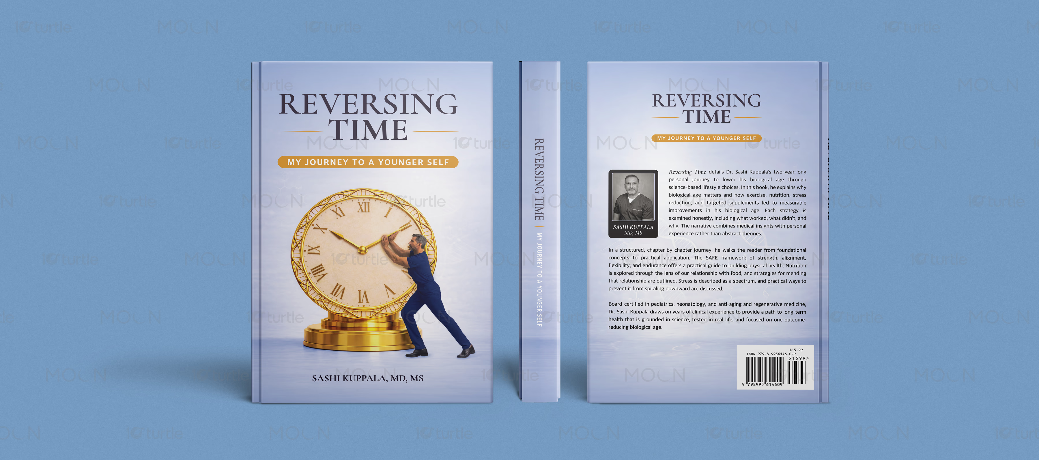
This collection builds each hardcover as a complete object, not just a front cover. The devotional puzzle cover uses cream tones, large serif typography, scripture-inspired imagery, a dove, and word-search visuals to communicate calm, faith, and accessibility. The fiction cover uses warm brown, teal flooring, illustrated scales, money, and desk symbolism to suggest power, judgment, and story tension. The health-focused cover uses a pale blue palette, a golden clock, author portrait, barcode placement, and structured back-cover copy to create credibility and premium nonfiction appeal.
The Impact
The collection helps authors present their books with stronger authority across bookstores, online listings, and publisher portfolios. Full front, spine, and back-cover systems make each title feel complete, collectible, and professionally produced. The genre-specific visuals improve reader recognition while the polished mockups support marketing and launch campaigns. Long term, this design approach strengthens author branding, improves marketplace trust, and supports smoother publishing presentation.



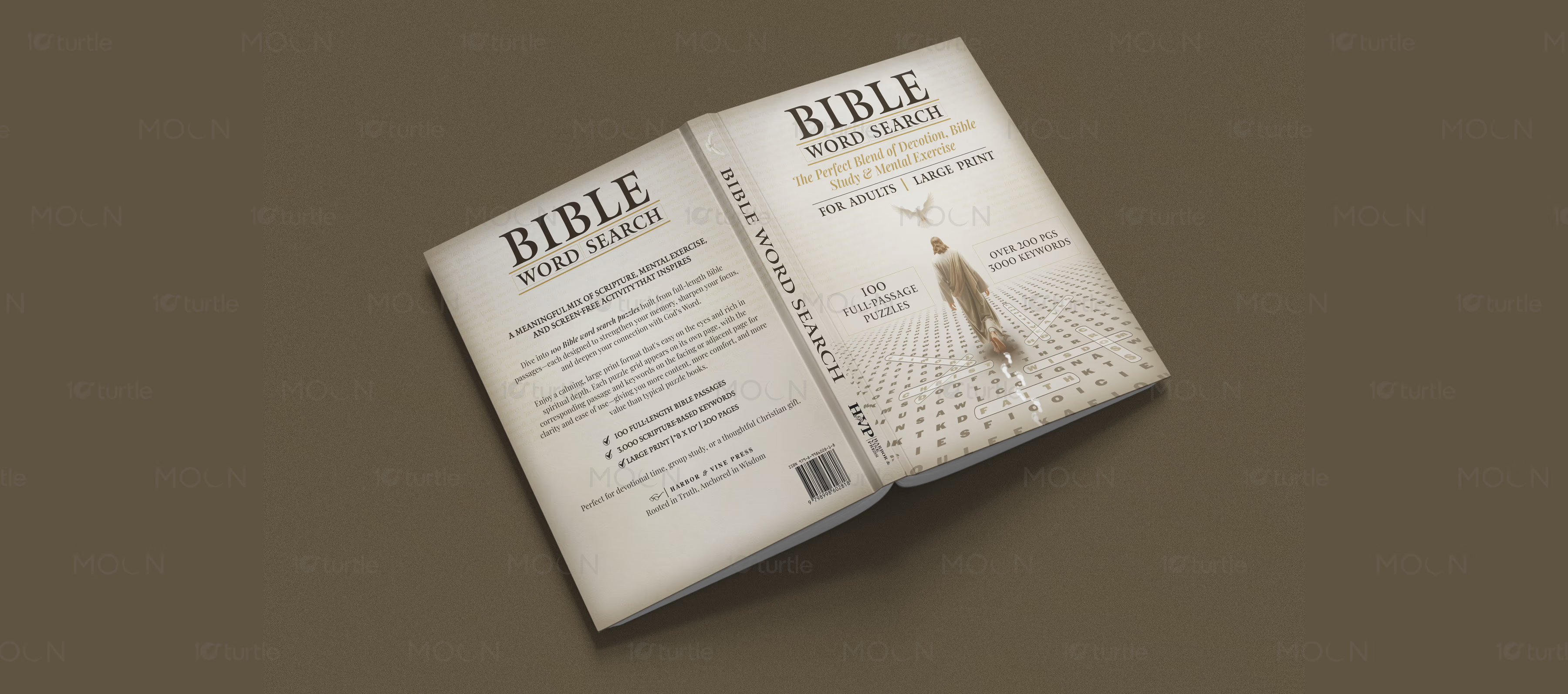

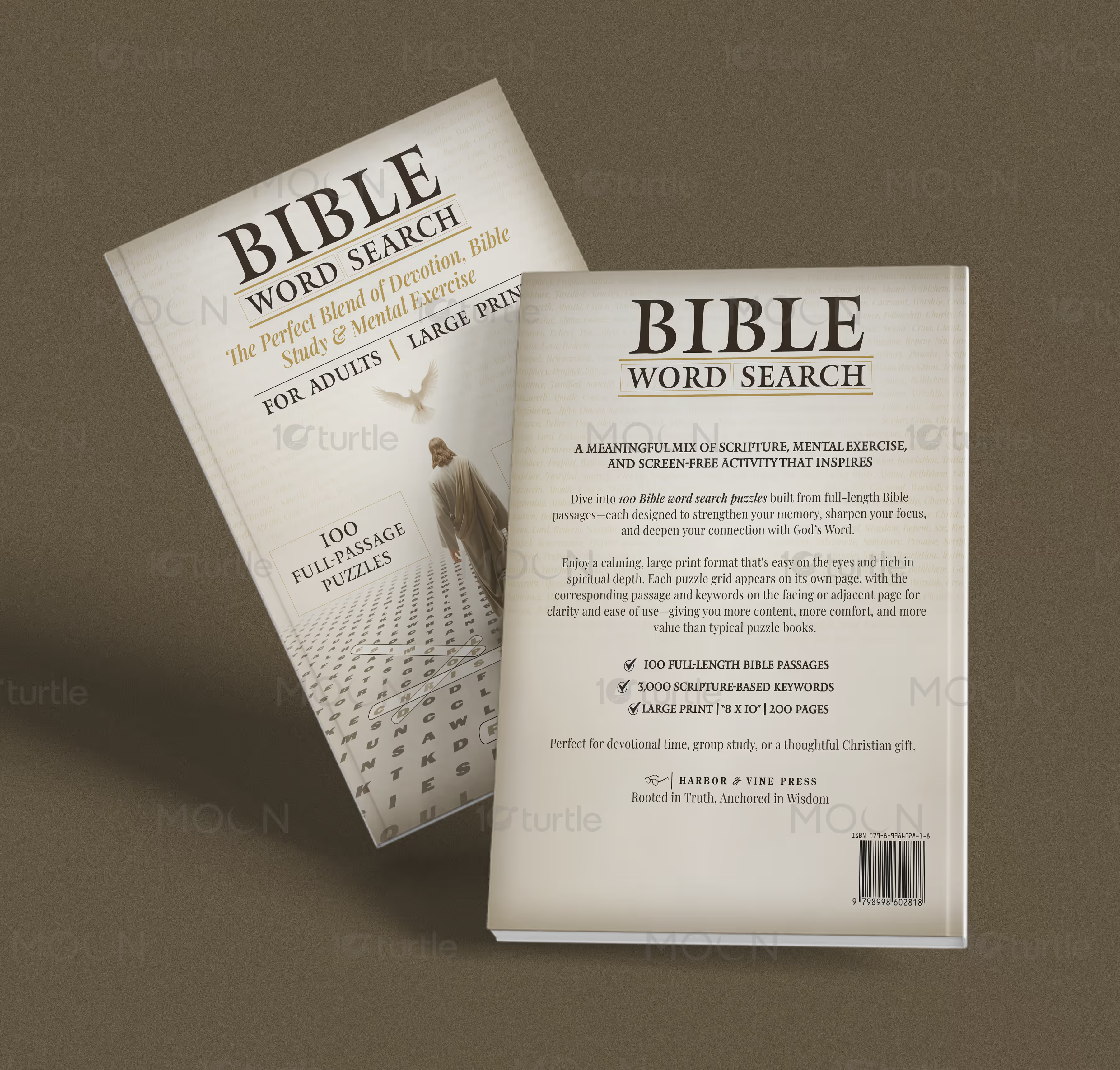
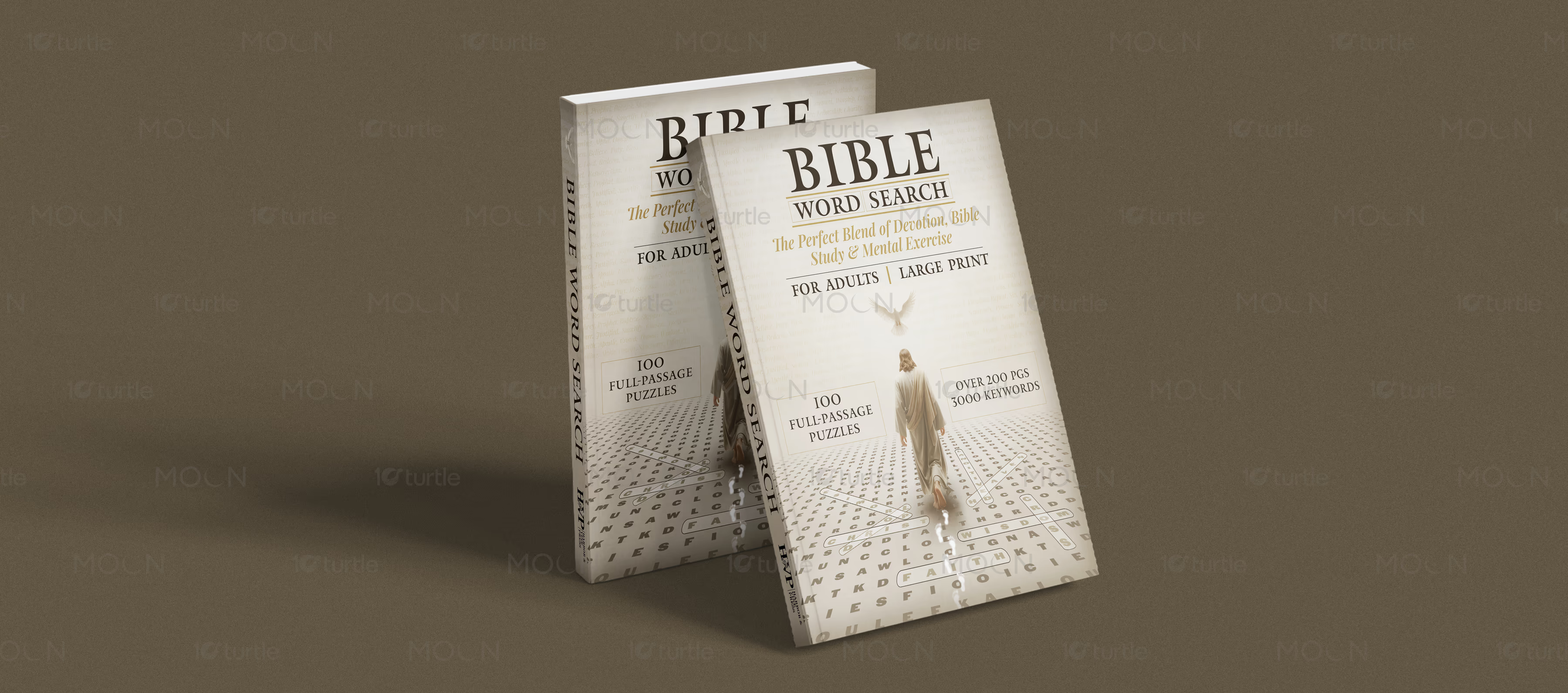
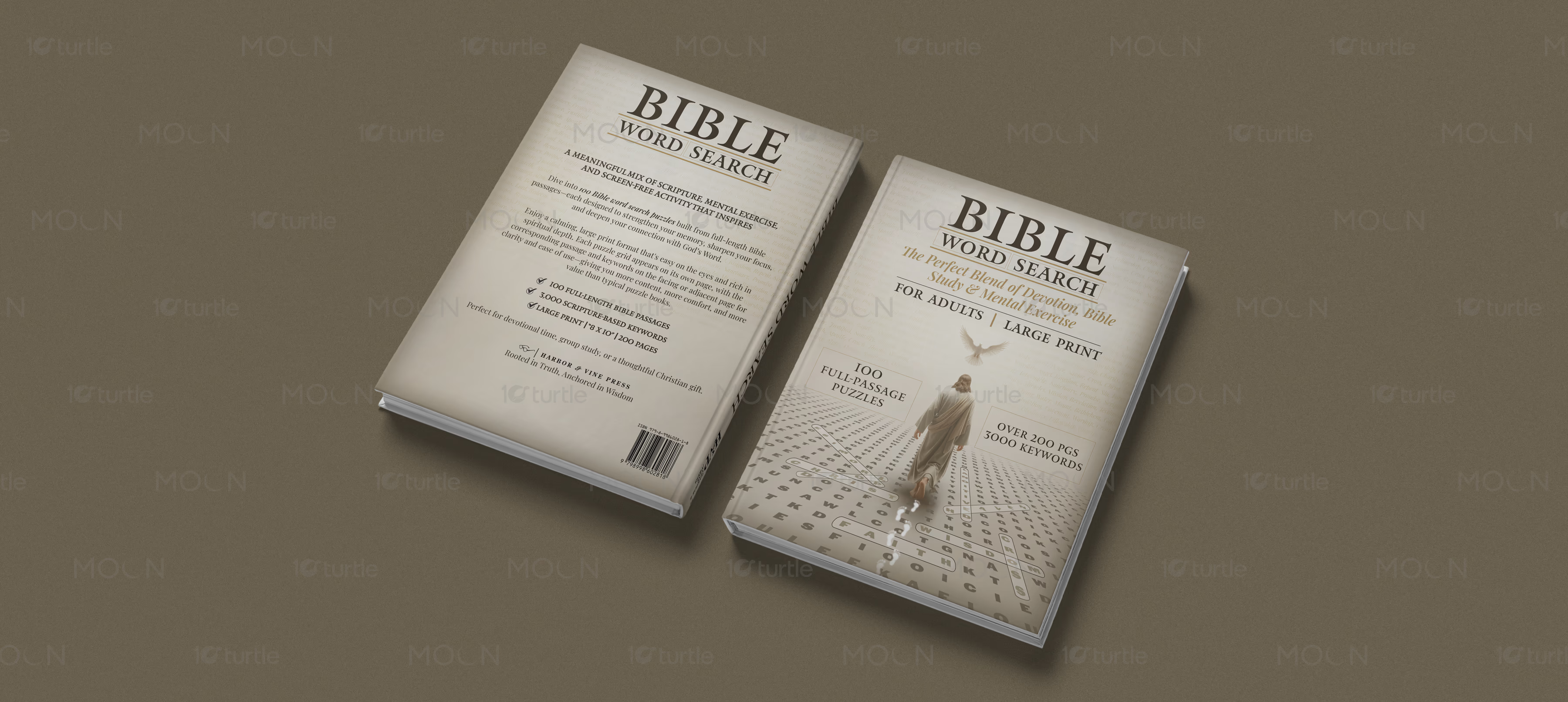
Hardcover book cover design carries a different responsibility from a standard paperback or ebook cover. It needs to feel substantial, giftable, credible, and ready for long-term shelf presence. This collection brings together three hardcover publishing designs created as complete cover systems, including front cover, spine, back cover, barcode placement, and polished presentation mockups. The goal is not only to make each book attractive, but to make each title feel professionally prepared for readers, retailers, and self-publishing platforms.
The challenge in publishing design is that every genre needs a different visual promise. A devotional puzzle book must feel peaceful, readable, and trustworthy. A fiction title needs atmosphere, story tension, and emotional curiosity. A health or personal transformation book must communicate credibility, clarity, and author authority. If these genre signals are unclear, readers may scroll past the book or misunderstand what it offers. Strong book cover design helps solve that by making the message visible immediately.
The devotional hardcover uses a soft cream palette, elegant serif typography, pale gold accents, a dove, a walking figure, and a word-search floor pattern. These elements connect Bible study, mental exercise, and spiritual calm in one refined composition. The front cover highlights key selling points such as full-passage puzzles, large print, and keyword volume, while the back cover uses structured copy and icon-style checkmarks to explain the book’s value clearly.
The fiction hardcover uses warm brown tones, a vintage desk illustration, weighing scales, coins, cash, and teal marble flooring. The serif title treatment and symbolic composition create a dramatic literary mood, suggesting power, value, judgment, and hidden consequences. The full back cover layout includes a readable blurb, quotation treatment, spine typography, and barcode placement, making the cover feel complete as a physical product.
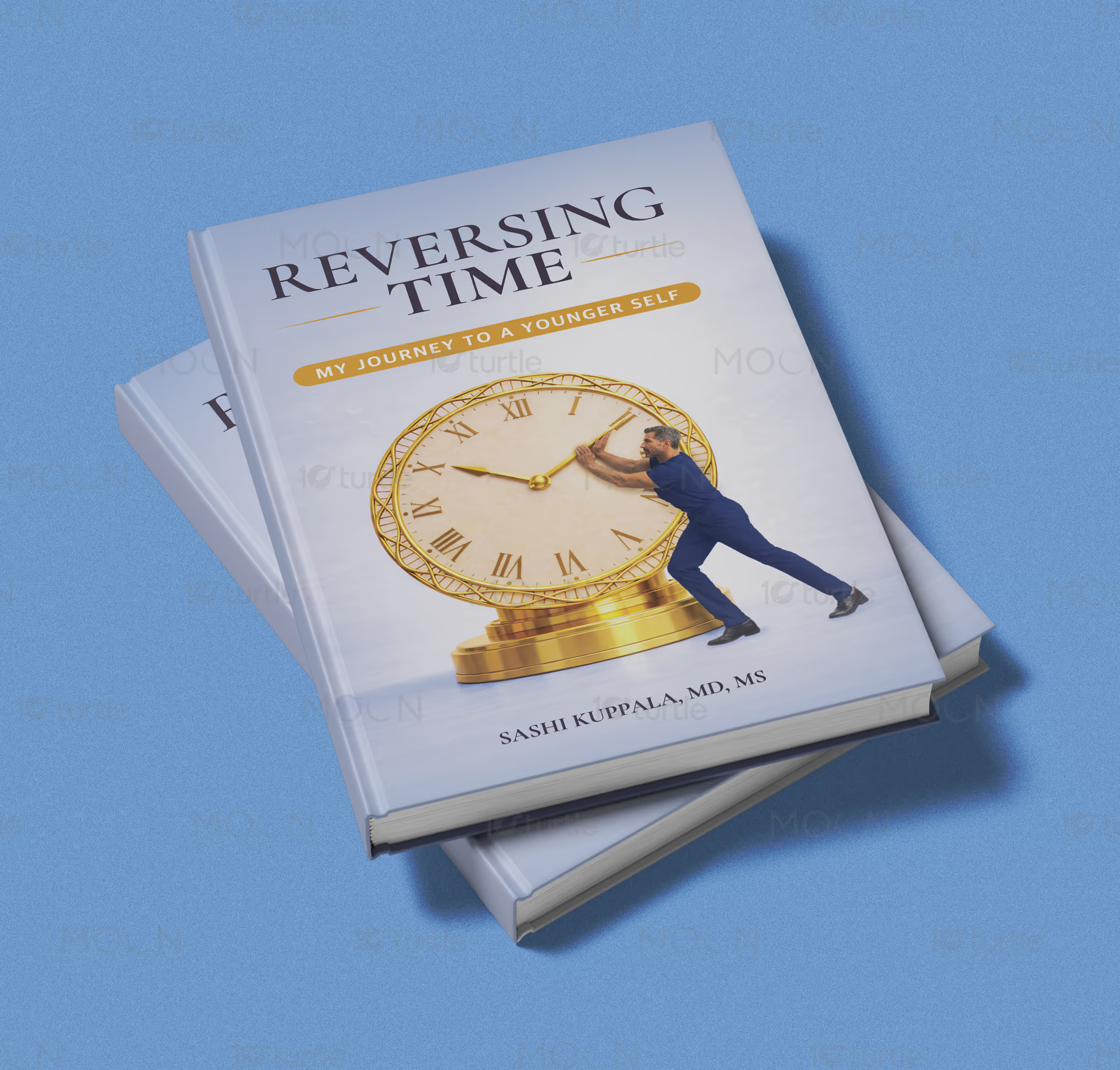
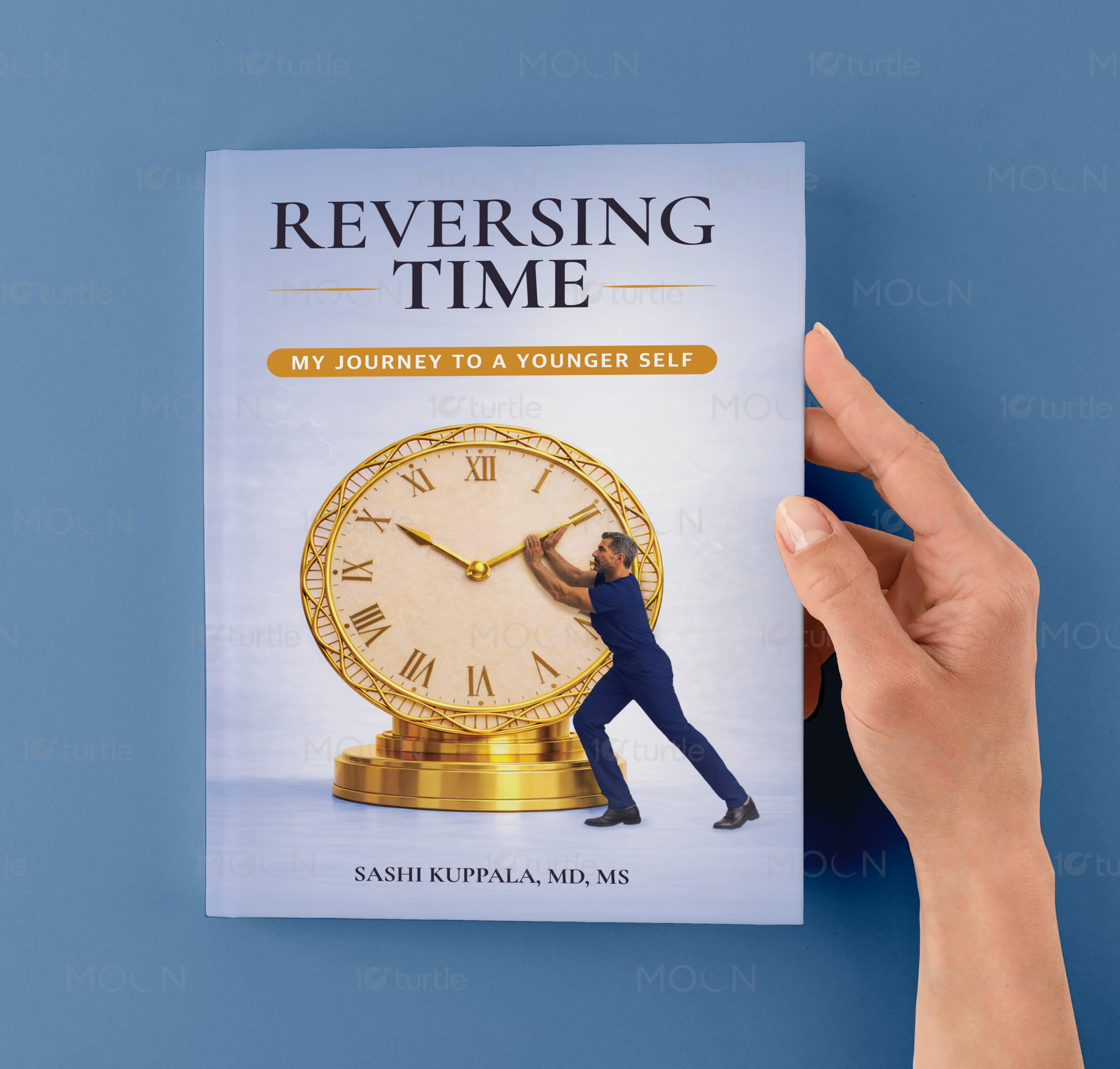
The nonfiction health cover takes a cleaner, more clinical-premium direction. Pale blue backgrounds, a large golden clock, a figure pushing time backward, author credentials, portrait placement, and a structured back-cover summary create trust and clarity. This approach supports nonfiction cover design by giving the reader a clear subject, professional tone, and polished shelf presence.
Across the full collection, the shared strength is production-aware design. Each hardcover is built with attention to spine hierarchy, back-cover readability, barcode space, and premium mockup presentation. For authors and publishers, this creates stronger author branding, better print-ready cover presentation, and a more confident path from design to marketplace visibility.
#hardcoverdesign
#bookcoverdesign
#publishingdesign
#selfpublishing
#printreadycover
#bookspinedesign
#backcoverdesign
#authorbranding
#fictioncover
#nonfictioncover
#religiousbook
#bookmockup