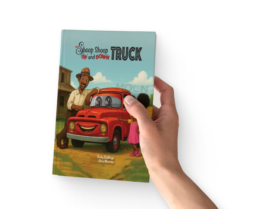
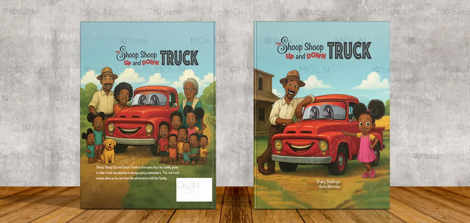
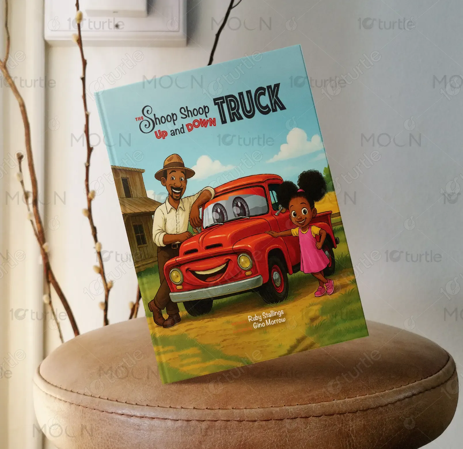
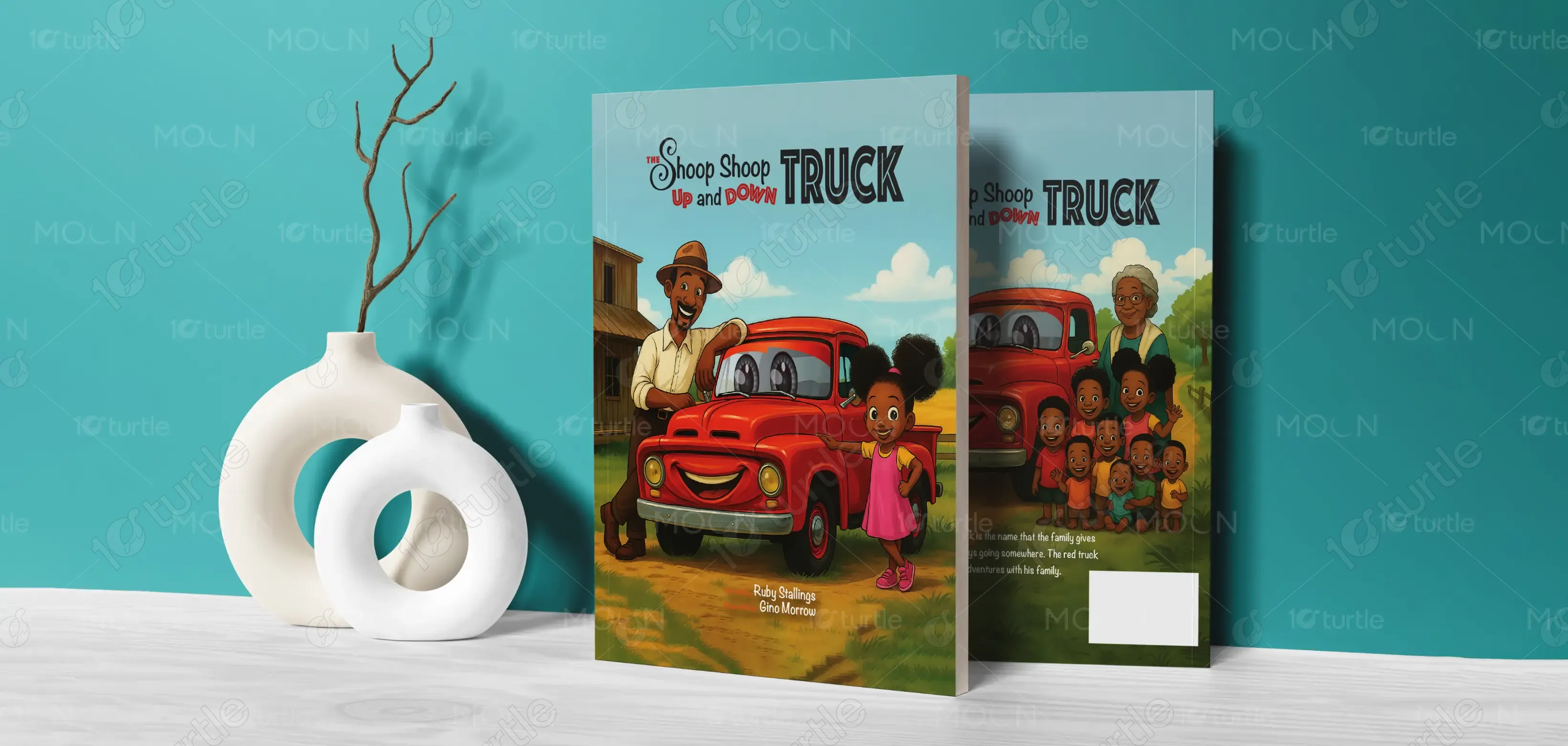
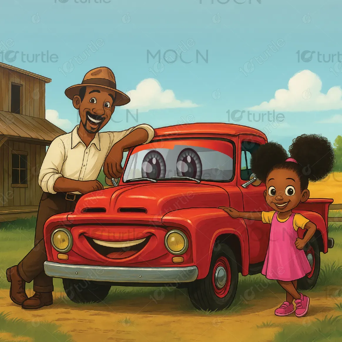
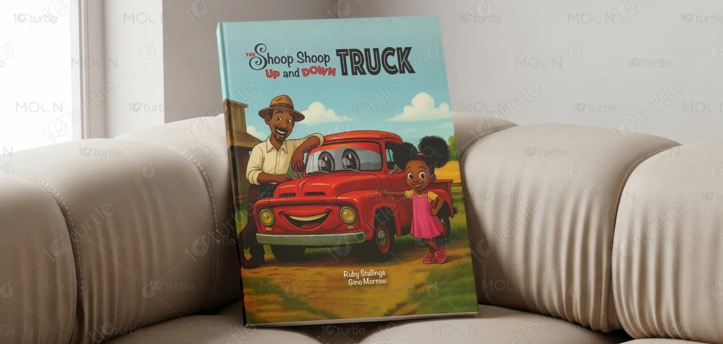
The design embraces a warm, story-driven illustration style that instantly connects with children and parents. A vibrant red truck with expressive features becomes the central visual anchor, supported by friendly characters that evoke emotion and curiosity. The layout is clean and balanced, with the title placed prominently at the top to ensure readability and strong shelf presence. Typography blends playful script with bold display fonts, creating contrast while maintaining harmony. The soft sky-blue background and earthy tones enhance depth, making the composition feel lively yet approachable.
Book Cover Design
Graphic Design
Industry
Arts, Culture & Entertainment
Tools we used


Project Completion
2025
Key Market
Global
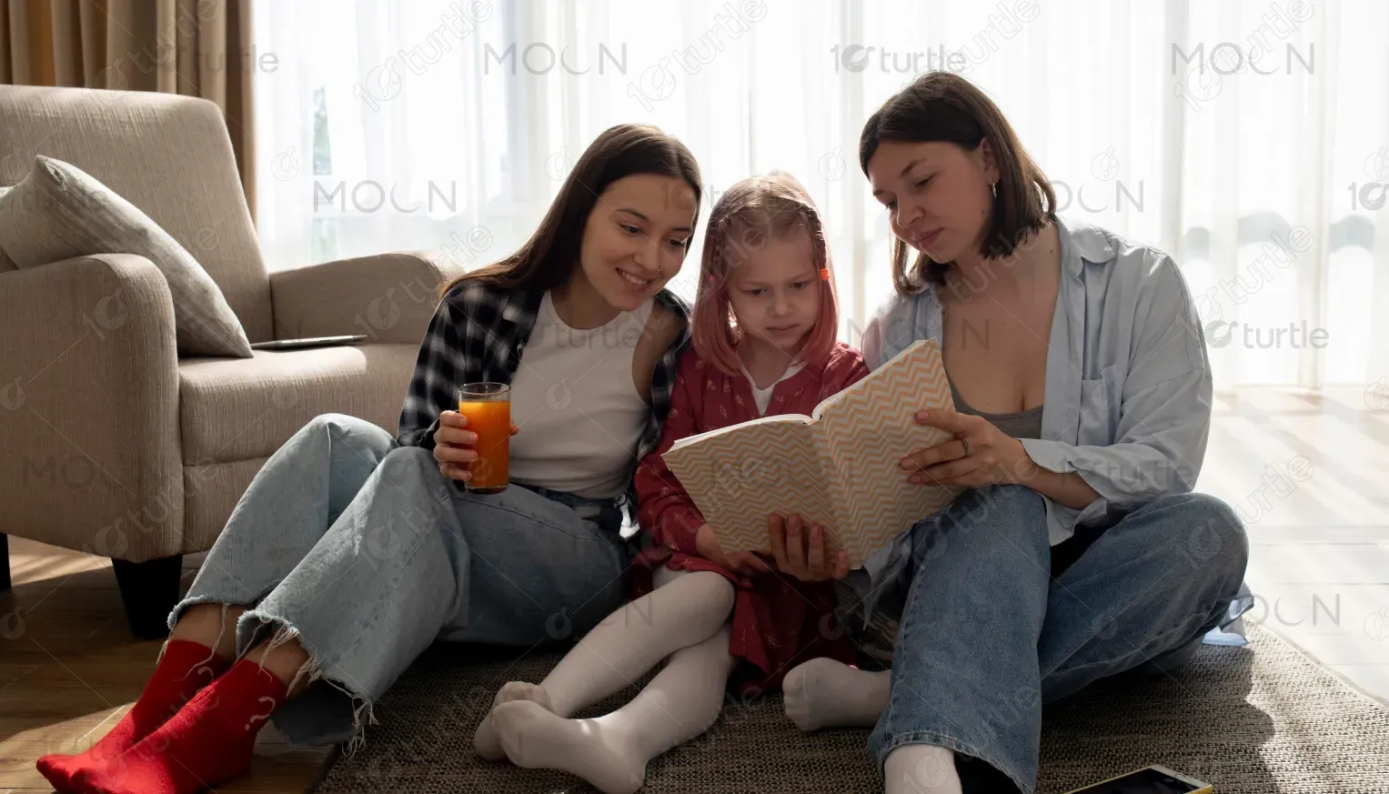
This book cover represents a children’s storytelling experience centered around adventure, family, and imagination. It is designed to attract young readers while also appealing to parents seeking meaningful and engaging content. The cover acts as both a visual hook and a narrative preview, communicating warmth, fun, and emotional connection. Within the children’s book market, it positions itself as a heartwarming and visually engaging storybook that encourages exploration and bonding.

Industry
Arts, Culture & EntertainmentWhat we did
Book Cover DesignGraphic DesignPlatform
-In the children’s book industry, many covers struggle to create an immediate impact due to either overly complex visuals or lack of emotional depth. Designs often fail to capture a child’s attention within seconds, leading to reduced engagement both on shelves and in digital marketplaces. Additionally, unclear hierarchy and weak character presence can make it difficult for the audience to understand the story’s tone or connect with it. This results in poor differentiation in a crowded market and limits the book’s ability to build trust and interest among both children and parents.
The design addresses these challenges by focusing on clarity, emotional storytelling, and strong visual hierarchy. The use of expressive, character-driven illustration ensures instant relatability and engagement, while the clean and structured layout avoids clutter and enhances readability. Strategic typography placement makes the title easy to identify even at smaller sizes, ensuring effectiveness across both print and digital formats. The vibrant yet controlled color palette draws attention without overwhelming the viewer, and the overall composition guides the eye naturally from the title to the characters and scene. This approach creates a seamless balance between visual appeal and functional clarity.
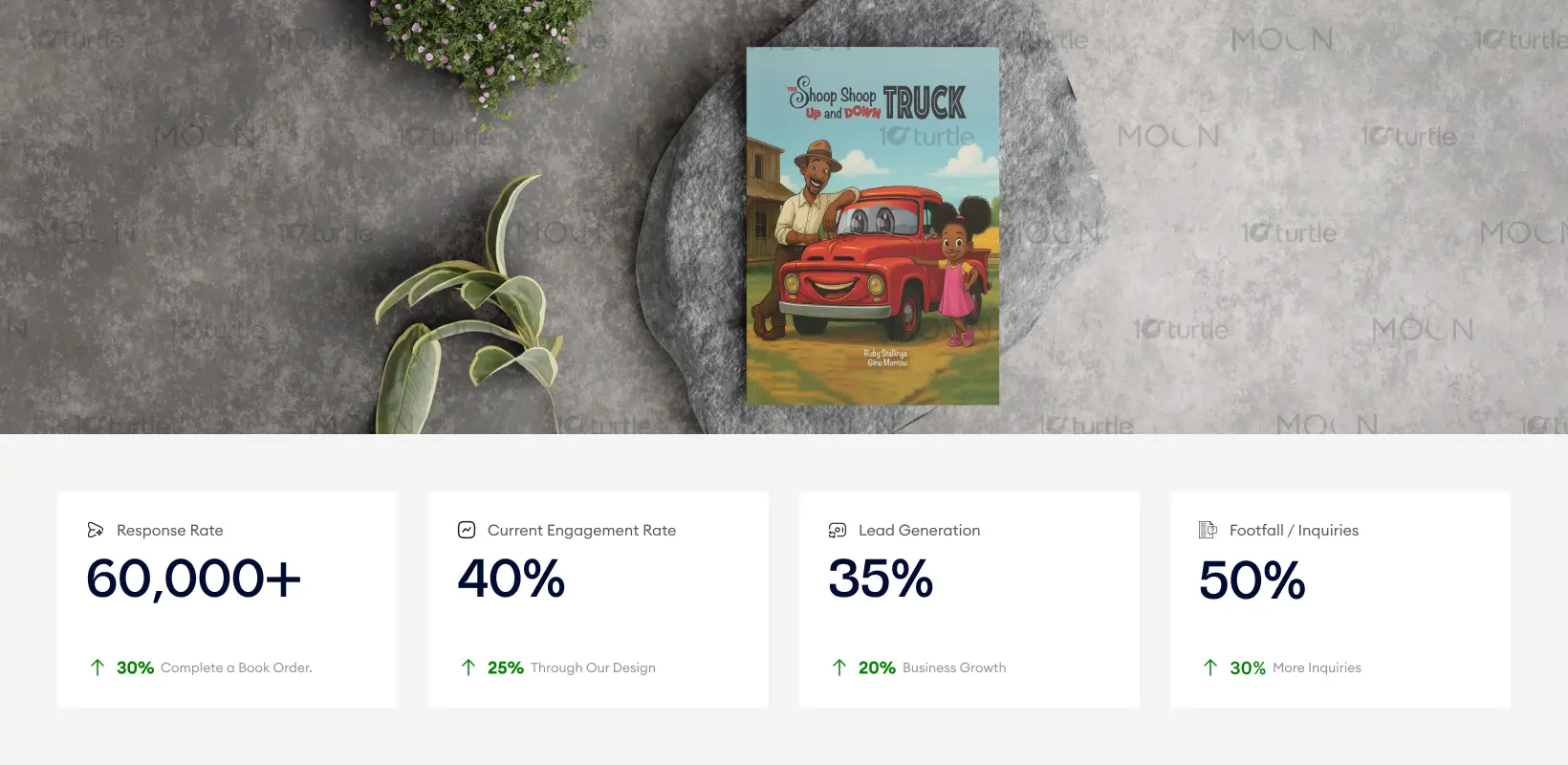
The book cover design is highly effective in capturing the attention of both children and parents, using vibrant colors and relatable characters to draw in potential readers. The balance between playful typography and clean layout encourages engagement and leads to increased inquiries. To further enhance these metrics, optimizing online and in-store visibility, as well as incorporating interactive elements (e.g., sneak peeks or samples), could significantly boost sales and engagement.
The long-term vision is to establish this as a recognizable children’s book series or brand that consistently delivers joyful, meaningful stories. The design system allows scalability for future editions by maintaining consistent typography, illustration style, and layout structure. It aims to build a lasting emotional connection with young readers, encouraging repeat engagement and brand loyalty over time.
The color palette is centered around bold, modern colors that evoke energy and excitement—specifically red, black, and white. Red accentuates key interaction points, drawing attention to important elements like the video player interface, while black and white provide a strong contrast, ensuring readability and visual clarity. The design incorporates clean lines and minimalistic elements, maintaining a professional, yet dynamic tone that reflects the brand’s commitment to quality and innovation in wheel rim manufacturing.