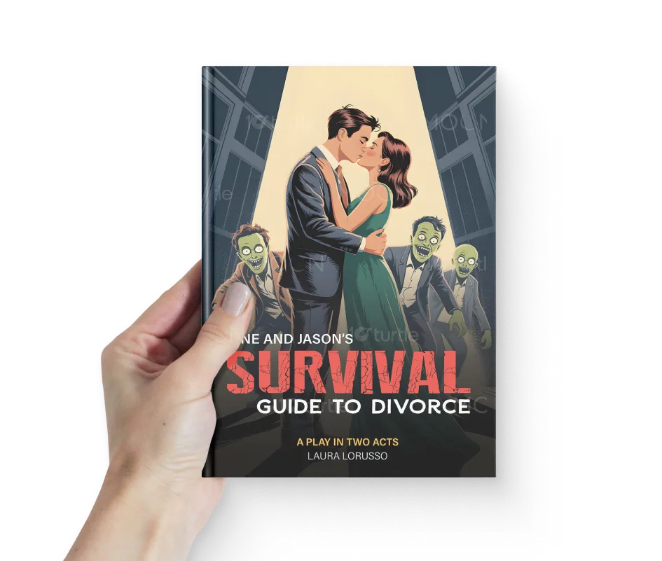
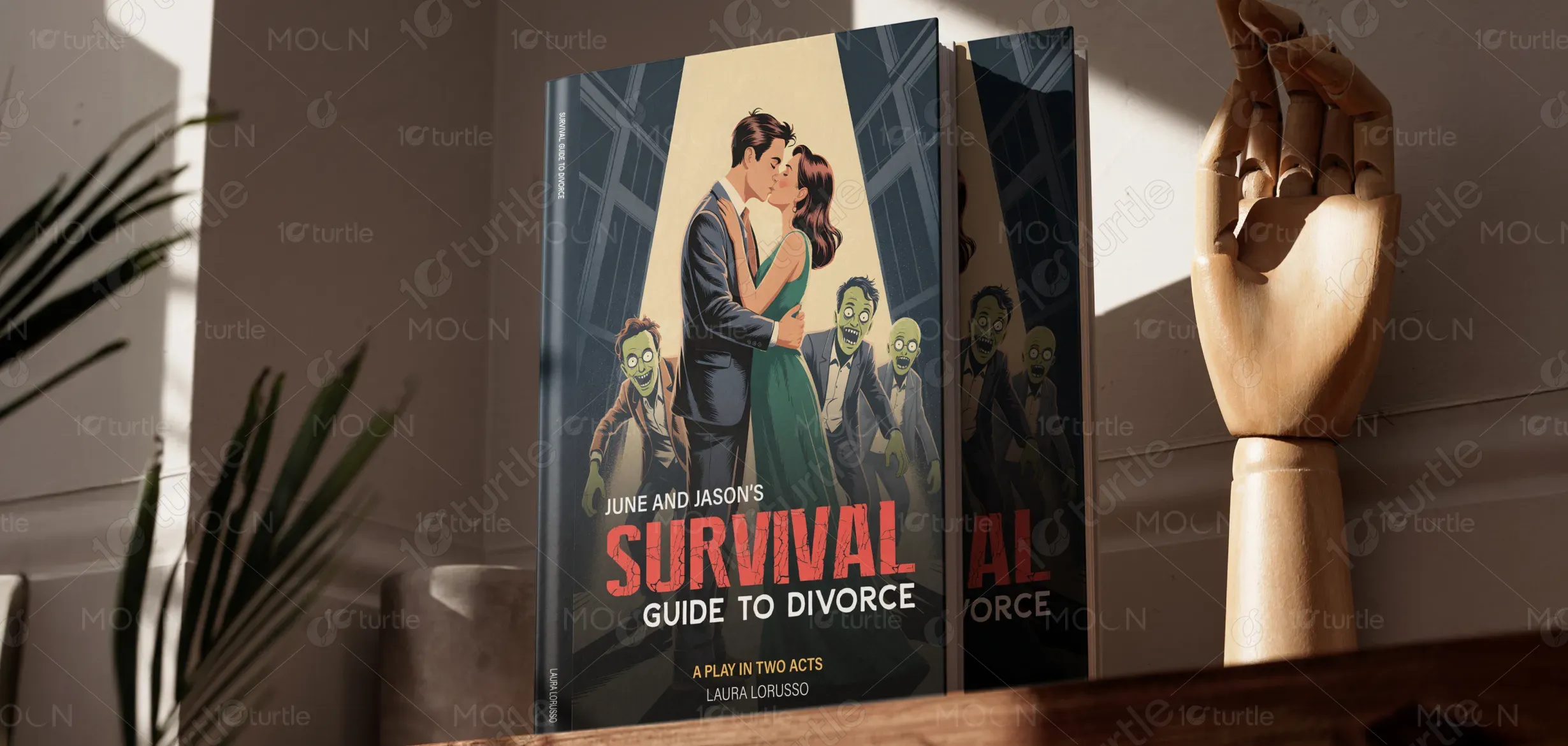
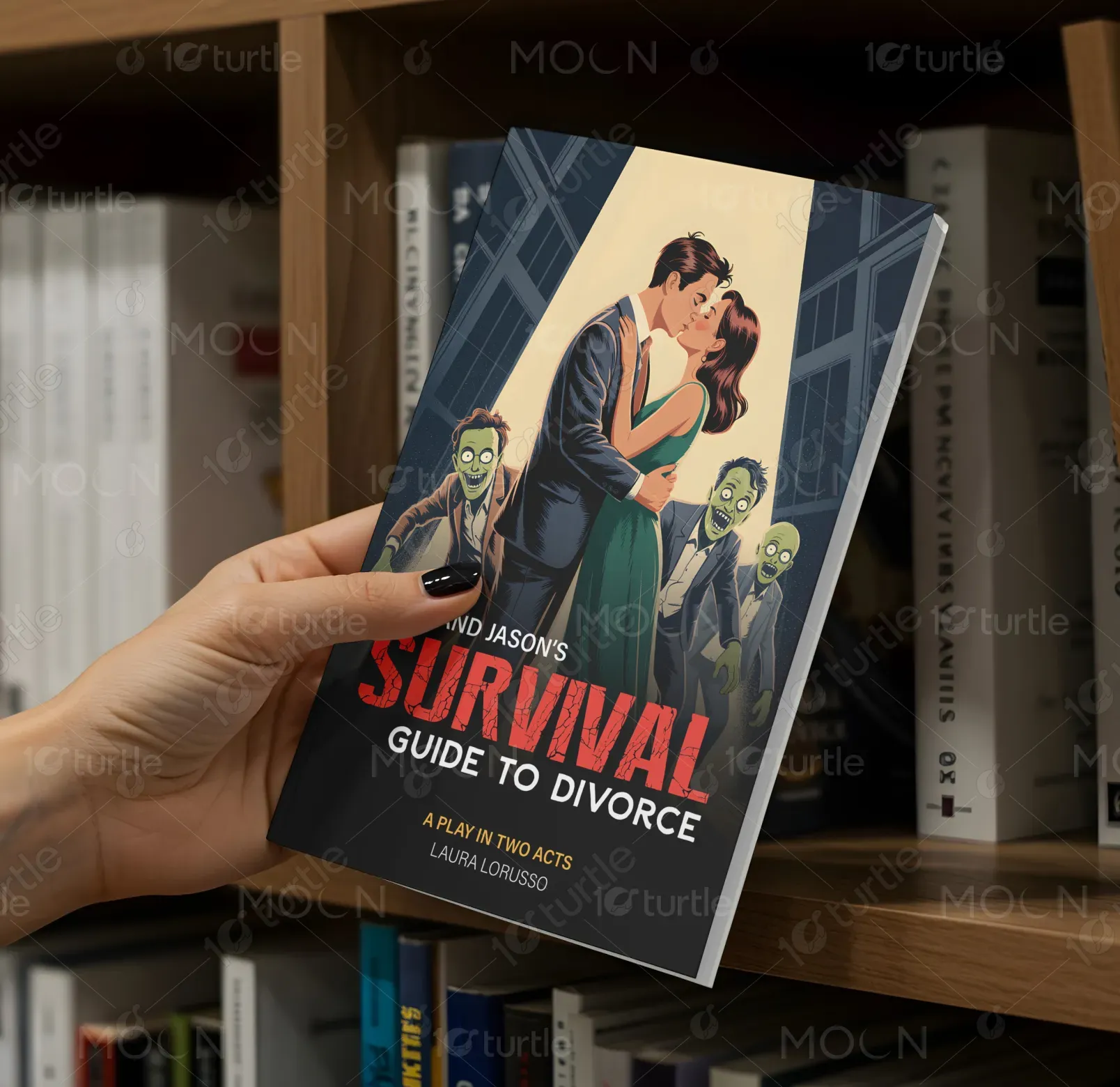
The design features a playful yet dramatic blend of romance and surreal humor. A kiss between June and Jason symbolizes the personal story at the core of the book, while the eerie presence of zombies in the background adds a comedic twist, reflecting the unexpected and sometimes absurd challenges of navigating a divorce. The contrast between a warm, intimate moment and the looming horror elements (zombies) creates a unique visual appeal. Typography is bold and modern, with the title “Survival Guide” standing out in a striking red to convey urgency and drama. The clean layout and high-contrast imagery balance the playful tone with seriousness.
Book Cover Design
Graphic Design
Industry
Arts, Culture & Entertainment
Tools we used


Project Completion
2025
Key Market
Global
This book, June and Jason's Survival Guide to Divorce, is a lighthearted yet insightful play that combines humor and emotional depth. Written by Laura Lorusso, it aims to guide readers through the emotional rollercoaster of divorce with a touch of humor and a hint of the absurd. The design reflects this approach with engaging visuals that make the topic of divorce seem less daunting and more approachable, helping the book stand out in a crowded genre of self-help and relationship guides.
Industry
Arts, Culture & EntertainmentWhat we did
Book Cover DesignGraphic DesignPlatform
-Divorce can be an overwhelming and emotionally charged process, often accompanied by feelings of isolation, fear, and stress. Traditional divorce guides tend to be too serious or dry, making it difficult for readers to engage. Many people avoid self-help books on sensitive topics, fearing more distress rather than comfort. The challenge here is to design a visual identity that draws attention, makes the subject more approachable, and speaks directly to readers who might need both emotional support and a sense of humor.
The design takes a creative approach by juxtaposing humor with an unconventional topic. The use of zombies as a visual metaphor for the "deadly" aspects of a divorce adds an element of fun and engagement. By pairing this with a loving image of the couple, the design creates a relatable narrative. The bold typography enhances the book's message of survival and resilience, while the contrasting colors evoke a sense of urgency. This approach keeps the content engaging, reduces the intimidation factor, and invites readers to dive into a conversation about divorce with an open, light-hearted attitude.
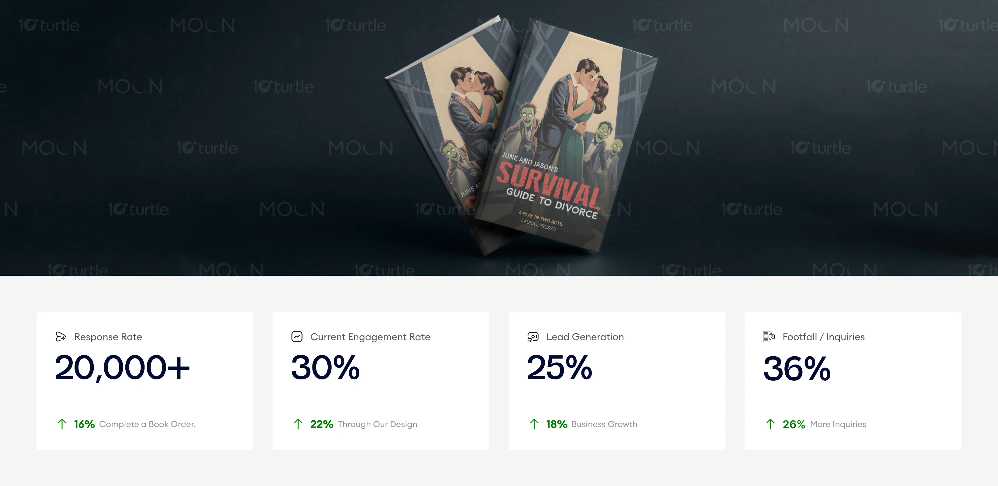
The cover's playful yet dramatic design successfully engages readers, capturing attention and driving interest in the book. By mixing humor with a serious theme, the design encourages greater interaction and curiosity, leading to higher response rates and lead generation. The striking visual balance between warmth and surprise ensures strong brand appeal and increased inquiries from potential customers.
The vision for Survival Guide to Divorce is to create a brand that not only provides practical advice but does so in a way that feels refreshing, humorous, and accessible. The design supports this vision by positioning the book as an approachable and fun resource for those navigating difficult personal transitions. Over time, the brand could expand to include other resources for personal growth, humor-driven self-help, and engaging content on life’s big challenges.
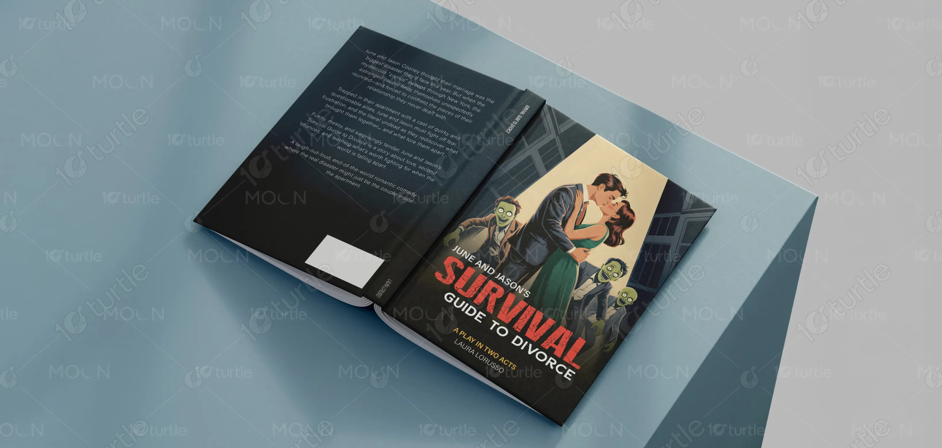
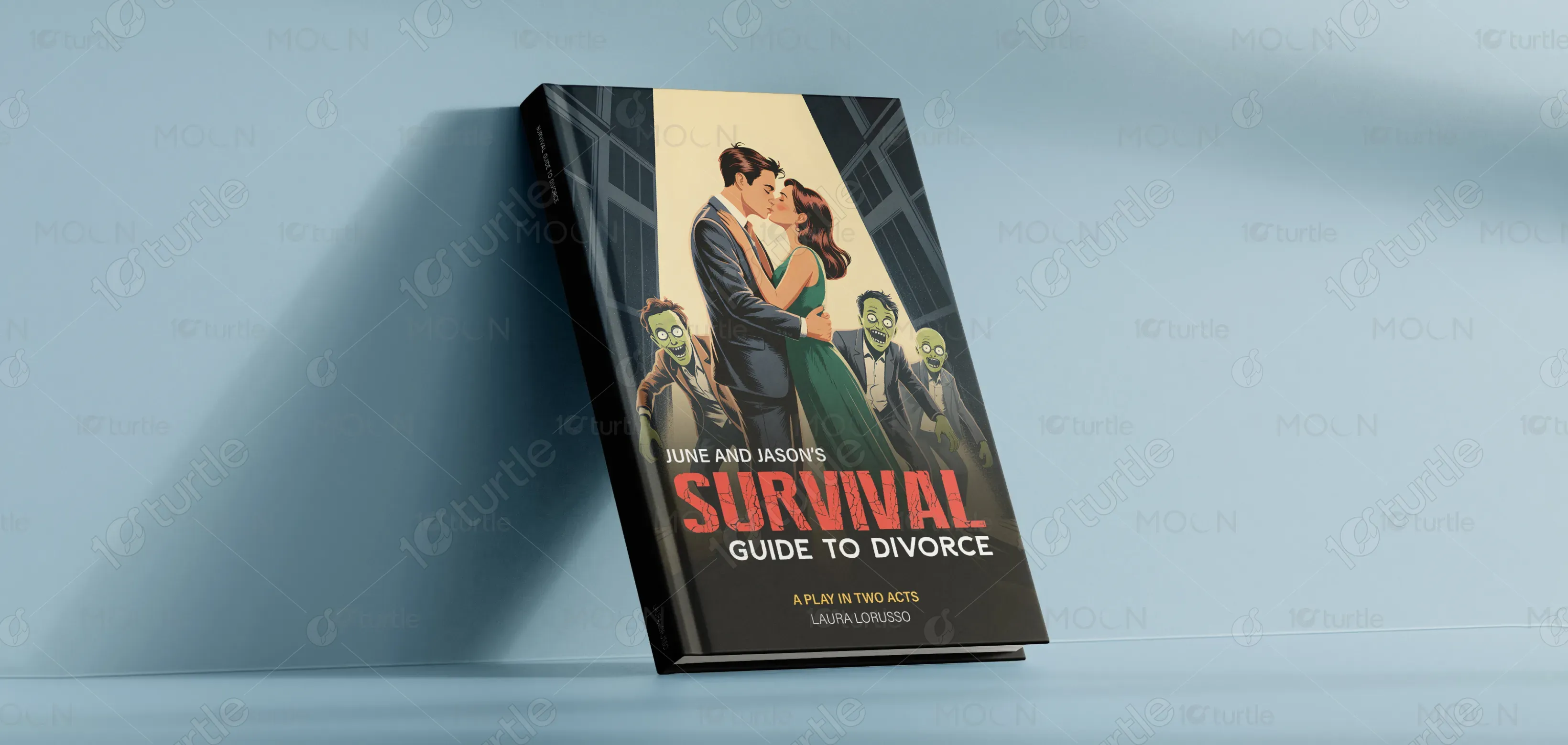
The color palette is bold and striking, using red to convey urgency and drama, while soft beige and green tones create a more inviting, grounded feeling. The red color in the title immediately grabs attention, while the muted colors of the zombies help them blend into the background without overpowering the central image of the couple. The overall visual language combines elements of traditional romance with playful, unexpected humor, creating an engaging and unique experience for the audience.