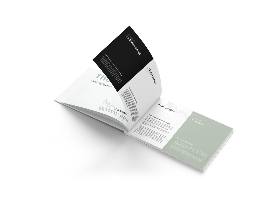
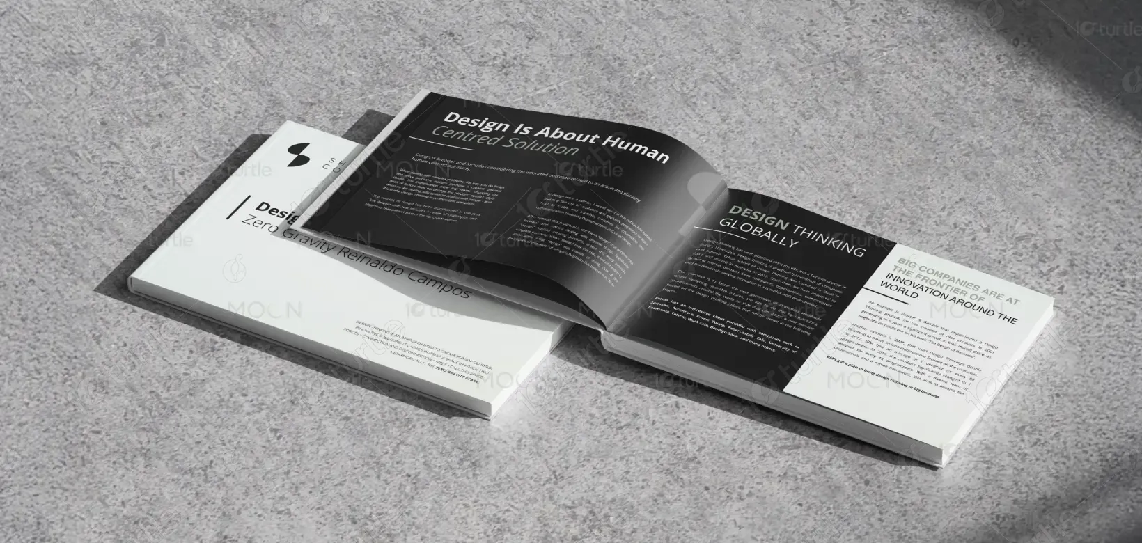
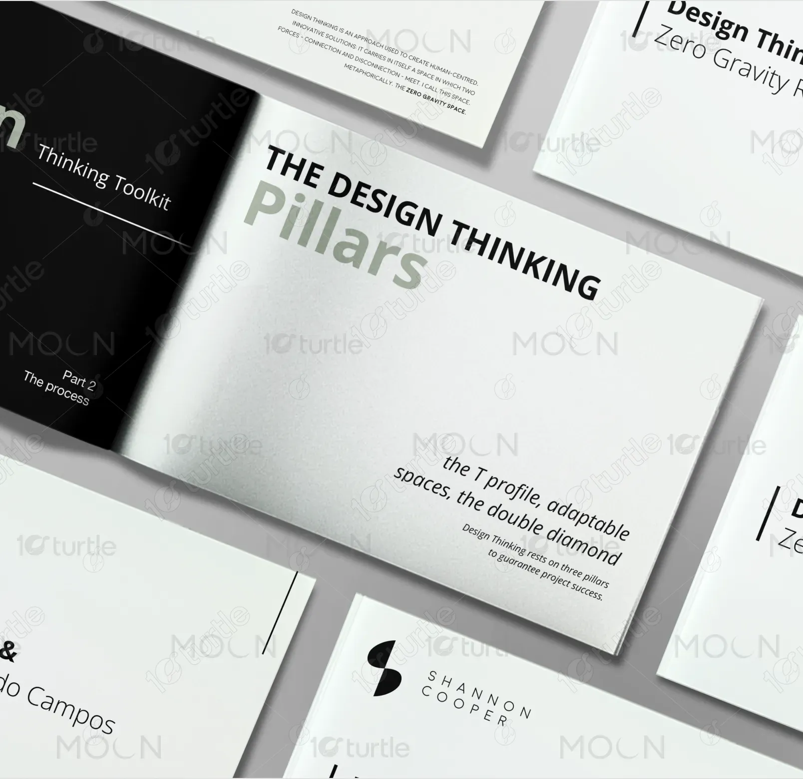
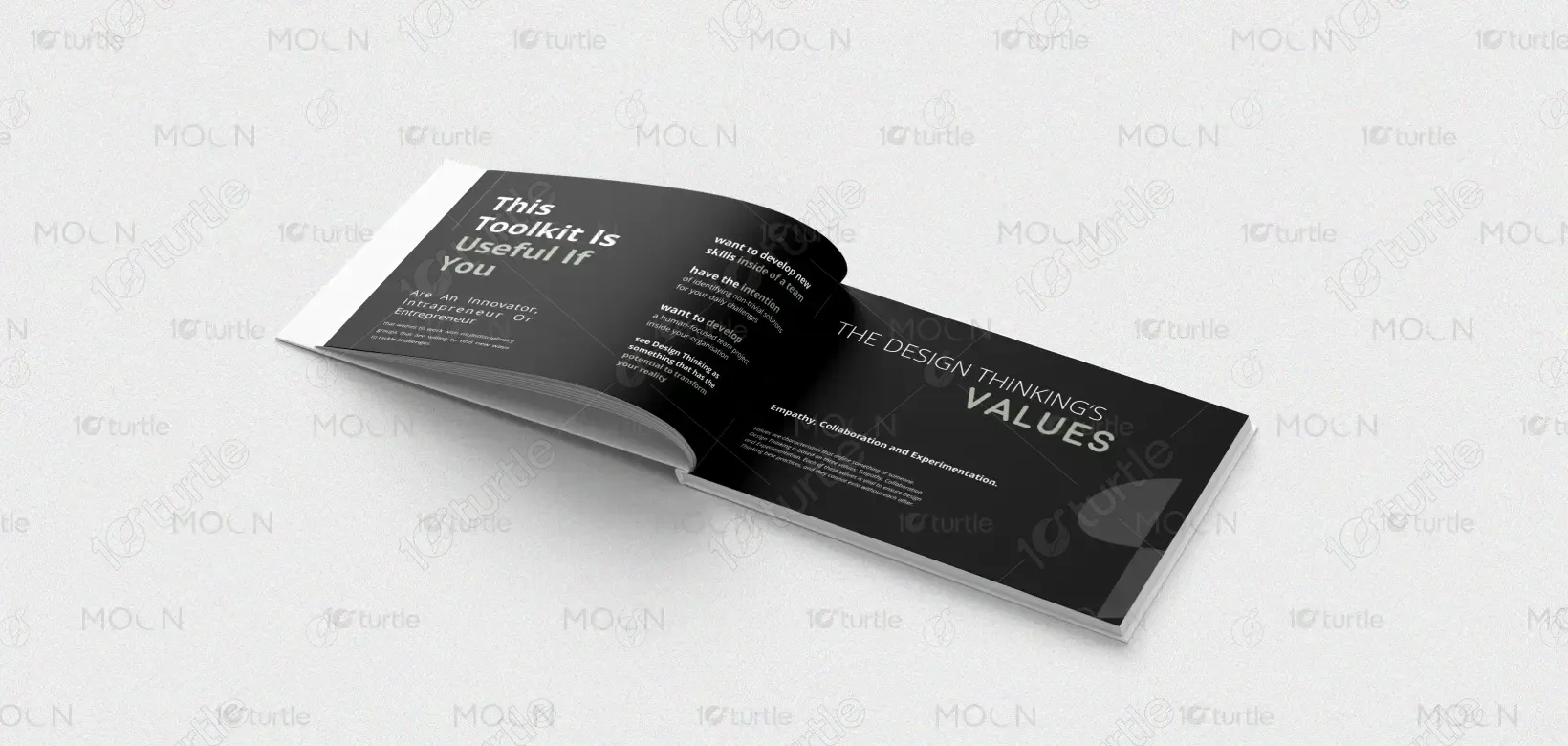
The book follows a minimalist, high-contrast design approach that reflects clarity and structured thinking. A refined black-and-white color palette establishes sophistication and authority, while subtle neutral tones soften the composition to maintain balance. Strong typographic hierarchy—bold headlines paired with clean sans-serif body text—ensures readability and focus. The layout uses intentional spacing, grid alignment, and sectional contrasts to guide the reader seamlessly through content. Dark spreads emphasize key themes, while light pages provide breathing space for reflection. This interplay enhances visual rhythm and reinforces the intellectual and strategic nature of the subject matter.
Book Design
Graphic Design
Industry
Education & Training
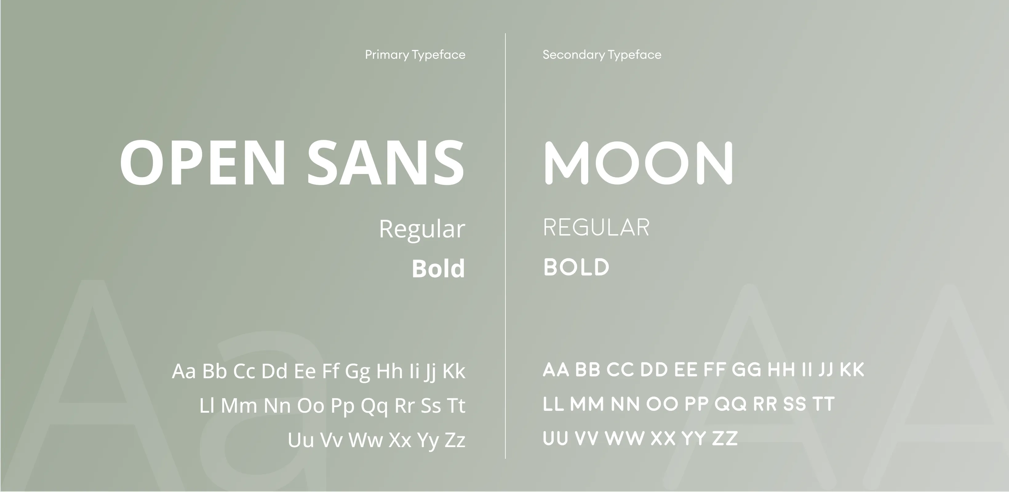
Tools we used


Project Completion
2025
Key Market
Global
This book represents a comprehensive exploration of design thinking and human-centered problem-solving. It serves as both an educational resource and a strategic toolkit for leaders, designers, and innovators seeking structured approaches to creativity and decision-making. Positioned within the professional and academic design industry, the publication bridges theory and practice. It highlights core principles such as empathy, collaboration, experimentation, and iteration—framing design not only as aesthetics, but as a strategic business driver.

Industry
Education & TrainingWhat we did
Book DesignGraphic DesignPlatform
-In many industries, design is often misunderstood as purely visual decoration rather than a strategic process. This leads to unclear messaging, inconsistent branding, fragmented user experiences, and reduced audience engagement. Organizations struggle with information overload, poor content hierarchy, and lack of differentiation in competitive markets. Without a clear framework, innovation becomes reactive rather than intentional, limiting growth and weakening brand credibility.
The design addresses these challenges through structured clarity and purposeful storytelling. A clear typographic hierarchy ensures information is digestible and logically organized. Strategic use of contrast enhances emphasis and improves navigation across sections. User-centric layouts prioritize readability and flow, making complex ideas accessible. Consistent grid systems and scalable design elements allow adaptability across print and digital formats. The visual discipline reflects the core message of design thinking—intentional, empathetic, and systematic.

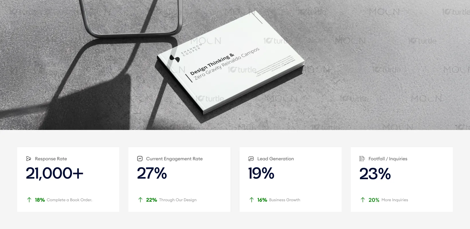
The minimalist, high-contrast editorial design improves readability and reinforces the authority of the content, making the book easier to scan and absorb. Clear typographic hierarchy and intentional spacing enhance reader engagement and retention. This structured presentation supports stronger reader interaction, driving more inquiries, speaking opportunities, and professional engagement around the subject matter.
The long-term vision is to position this publication as a foundational reference in design thinking and innovation strategy. The clean and timeless visual identity ensures adaptability across future editions, digital platforms, workshops, and educational materials. By maintaining consistency and intellectual authority, the design supports brand expansion into courses, toolkits, and thought leadership initiatives. It reinforces credibility while remaining flexible enough to evolve with emerging design methodologies.
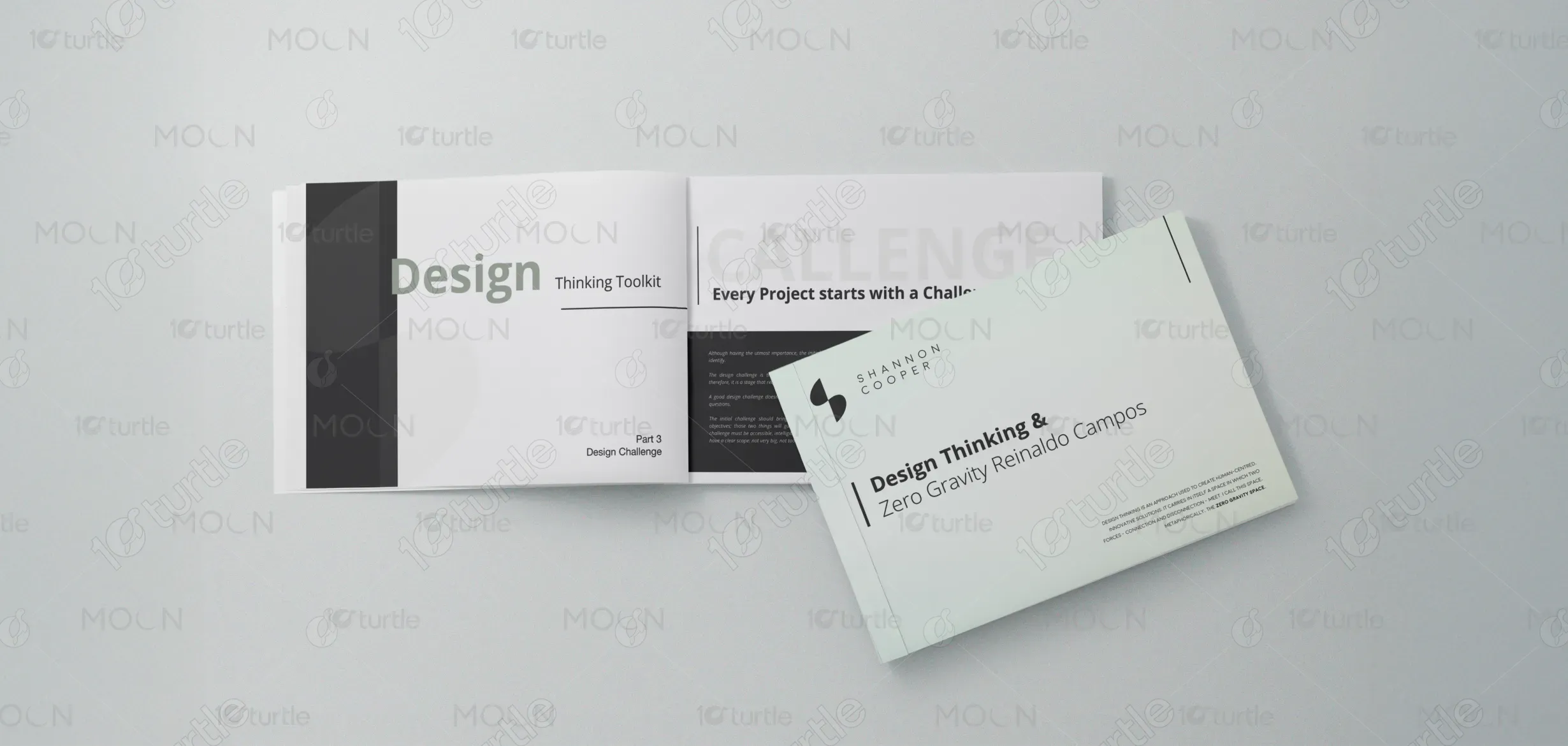
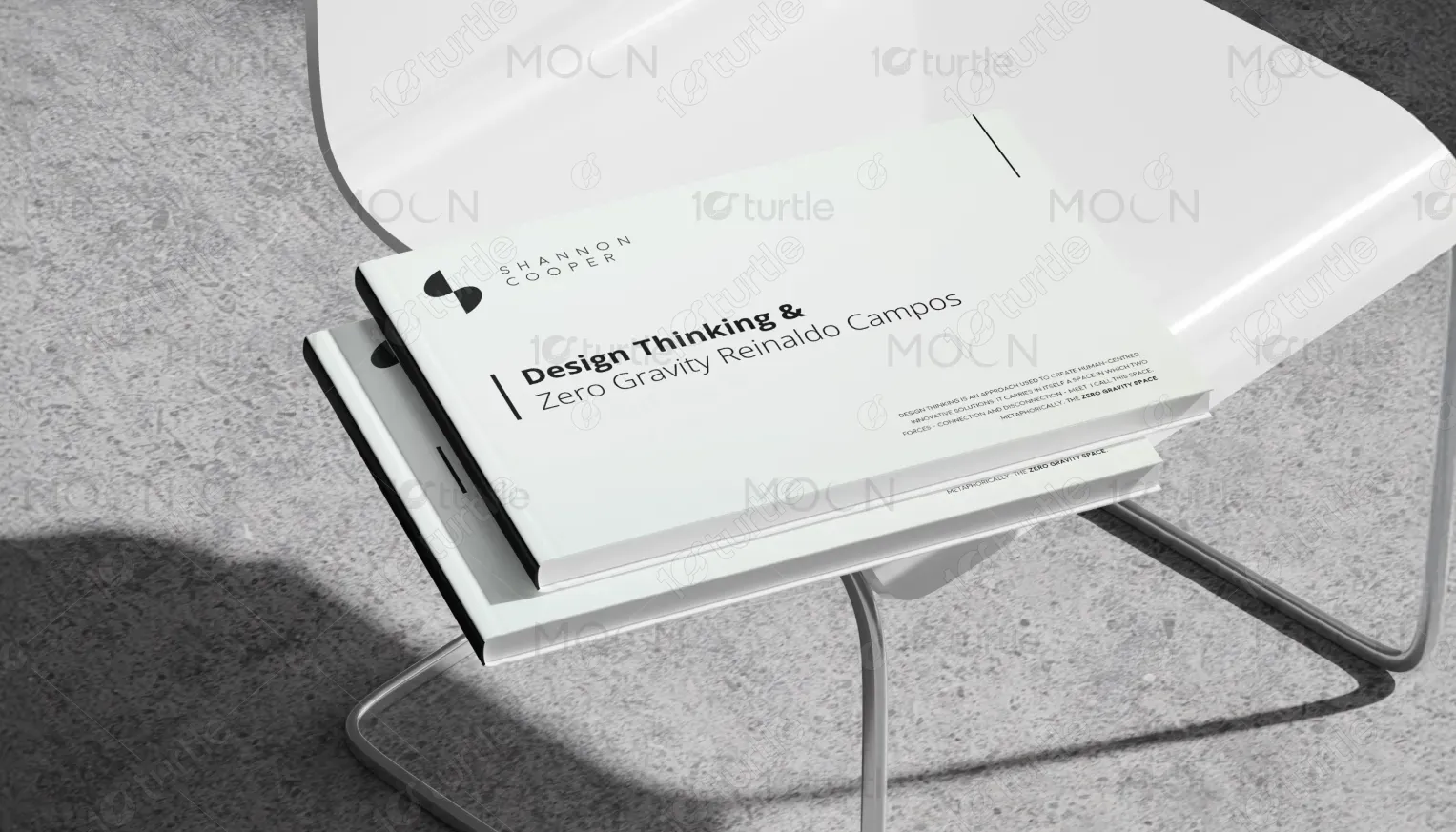
The primary color palette consists of deep black, soft white, and muted grey tones. This monochromatic scheme communicates authority, intelligence, and modernity while ensuring maximum readability. Subtle gradients and abstract shapes add depth without distracting from the content. The restrained visual language reflects professionalism and strategic focus. The minimal aesthetic enhances clarity, ensuring consistent recognition across print spreads, presentations, and digital adaptations.