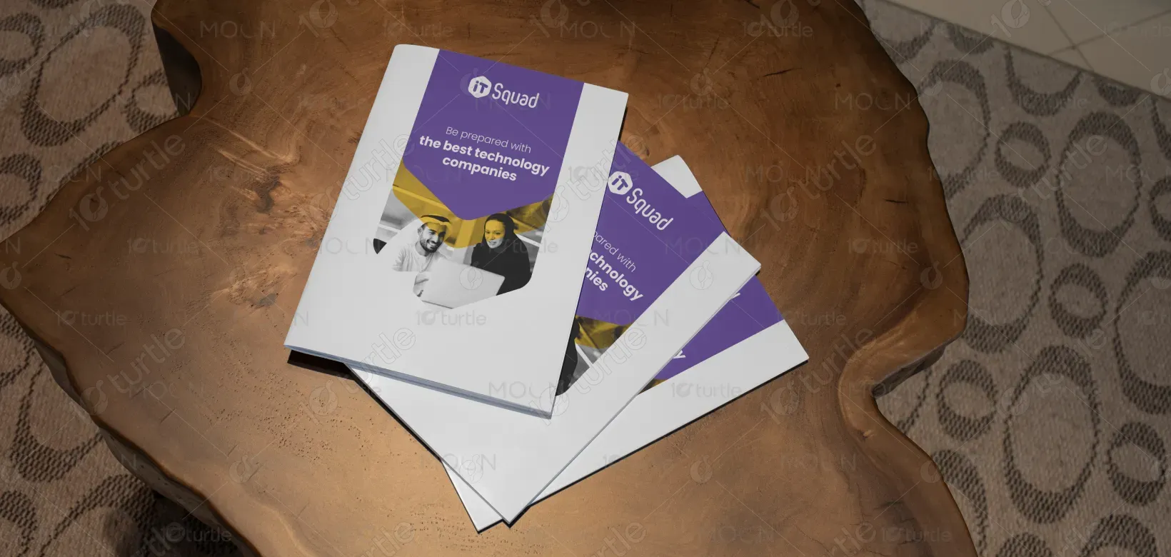
The book design follows a clean, modern, and visually balanced approach that combines readability with aesthetic elegance. The cover integrates bold typography with thoughtful spacing, ensuring strong visibility and instant recognition. Minimalist illustrations and refined graphic elements create a professional yet approachable tone. The layout inside emphasizes clarity, with structured hierarchies, consistent alignment, and engaging visuals that enhance storytelling. The overall creative direction is aimed at blending functionality with style, ensuring the design resonates with the target audience while reinforcing the book’s message.
Book Design
Graphic Design
Industry
Technology, SaaS & Startups
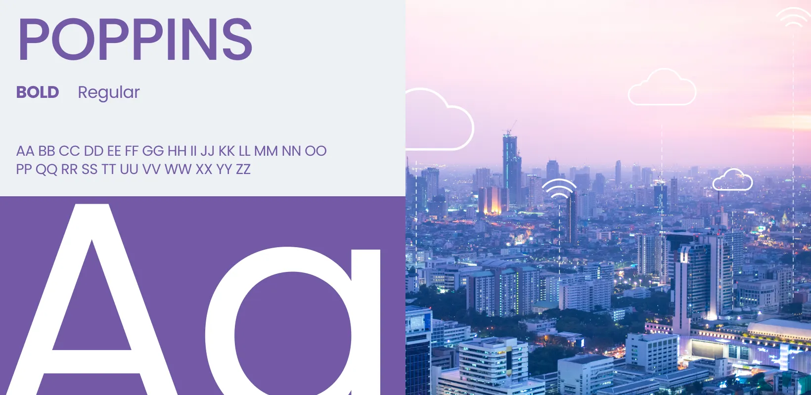
Tools we used


Project Completion
2025
Key Market
Global
This book design is crafted to be more than just a container of content—it is an experience. The design elevates the reader’s journey through thoughtful use of typography, imagery, and layout consistency. It highlights the book’s purpose by making the subject matter accessible, visually appealing, and memorable. In a competitive market, where readers often judge by the cover, this design positions the product as professional, trustworthy, and engaging. The unique selling points lie in its seamless blend of clarity, brand alignment, and strong visual storytelling.

Industry
Technology, SaaS & StartupsWhat we did
Book DesignGraphic DesignPlatform
-A major challenge in book design is striking the balance between aesthetics and usability. Many books either overwhelm readers with overly decorative designs or lean too much on plain formatting that lacks visual appeal. This gap often results in books being overlooked, even if the content is strong. For example, in today’s digital-first world, printed or eBook designs that fail to stand out visually struggle to gain traction. The problem lies in capturing attention quickly while still ensuring readability and functionality across formats.
This design solves the issue by merging visual elegance with reader-centric functionality. The cover is bold and eye-catching, ensuring it stands out on shelves and online listings. Inside, the structured typography, whitespace, and visual elements create an intuitive reading flow that reduces strain and enhances comprehension. The design also integrates flexible layouts that adapt well to both print and digital platforms. By combining modern aesthetics with practical design solutions, the book appeals to both casual readers and professionals seeking quality presentation.

The long-term vision for this book design is to create a standard of timeless aesthetics and functionality that can influence future editorial design practices. It aspires to set benchmarks in how content presentation shapes audience engagement, building lasting recognition for the author or brand. Beyond being visually attractive, the design aims to cultivate a strong identity, enabling the book to be remembered as both informative and beautiful. Ultimately, it strives to make reading an inspiring and enduring experience in a crowded marketplace.

The chosen color palette blends modern sophistication with emotional resonance. A combination of neutral base tones (white, grey, or black) ensures clarity and professionalism, while accent colors—such as bold yellow, calming blue, or vibrant red—are strategically applied to highlight key elements. This balance enhances hierarchy, guides reader attention, and reflects the book’s theme. The palette aligns with brand identity by evoking trust, energy, and creativity, while maintaining harmony across cover and interior layouts. This ensures both aesthetic appeal and psychological impact on readers.