
Professional Brochure Design Case Study
Professional Brochure Design Case Studyarrow

Structured brochures for beauty training and healthcare planning.

Brochure Design • Training Manual Design • Healthcare Guide Design • Guide Design

Overview

This brochure design case study combines two professional education booklets: a keratin lash lift and tint training manual, and a healthcare private practice planning guide. Both layouts organize detailed information into readable sections using refined typography, soft imagery, structured tables, numbered procedures, and clear visual hierarchy for training, consultation, compliance, and business planning.

The Challenge

down-right

Professional brochures often carry dense instructional or compliance-heavy content that can become overwhelming if the layout is not structured carefully. Beauty training manuals need to make procedures, tools, aftercare, and product steps easy to follow. Healthcare business guides must present checklists, timelines, regulations, and planning tasks without feeling intimidating. Poor brochure design can reduce comprehension, weaken trust, and make important training material harder to apply.

The Solution

down-right

This collection solves the challenge through calm, organized editorial systems tailored to each subject. The lash training brochure uses close-up eye photography, sage green panels, numbered lash procedure steps, product visuals, and client-care sections to guide beauty professionals through a technical service. The healthcare brochure uses blue-grey tones, geometric cover styling, table-based checklists, medical imagery, and structured planning pages to support private practice setup. Both designs use clean spacing and hierarchy to turn complex information into usable learning material.

The Impact

down-right

The brochures help each brand appear credible, polished, and education-focused. Clear layouts support better learning, smoother training sessions, and easier reference after the first read. The designs also strengthen the perceived value of the information by making it feel professionally packaged. Long term, this approach can improve client trust, training consistency, and brand authority across beauty and healthcare education.

2.avif3.avif
4.avif
5.avif
6.avif7.avif
8.avif
9.avif10.avif
11.avif
12.avif13.avif
14.avif
Custom Brochure Design with Premium Print Quality

Professional brochure design has to do more than look clean. It must help readers absorb detailed information, follow steps, and return to the material as a practical reference. This case study brings together two educational brochure systems: a keratin lash lift and tint training manual for beauty professionals, and a healthcare private practice guide for medical professionals preparing to launch or organize their business. Although the subjects are different, both designs solve the same communication problem: turning complex content into structured, useful, and visually credible learning material.

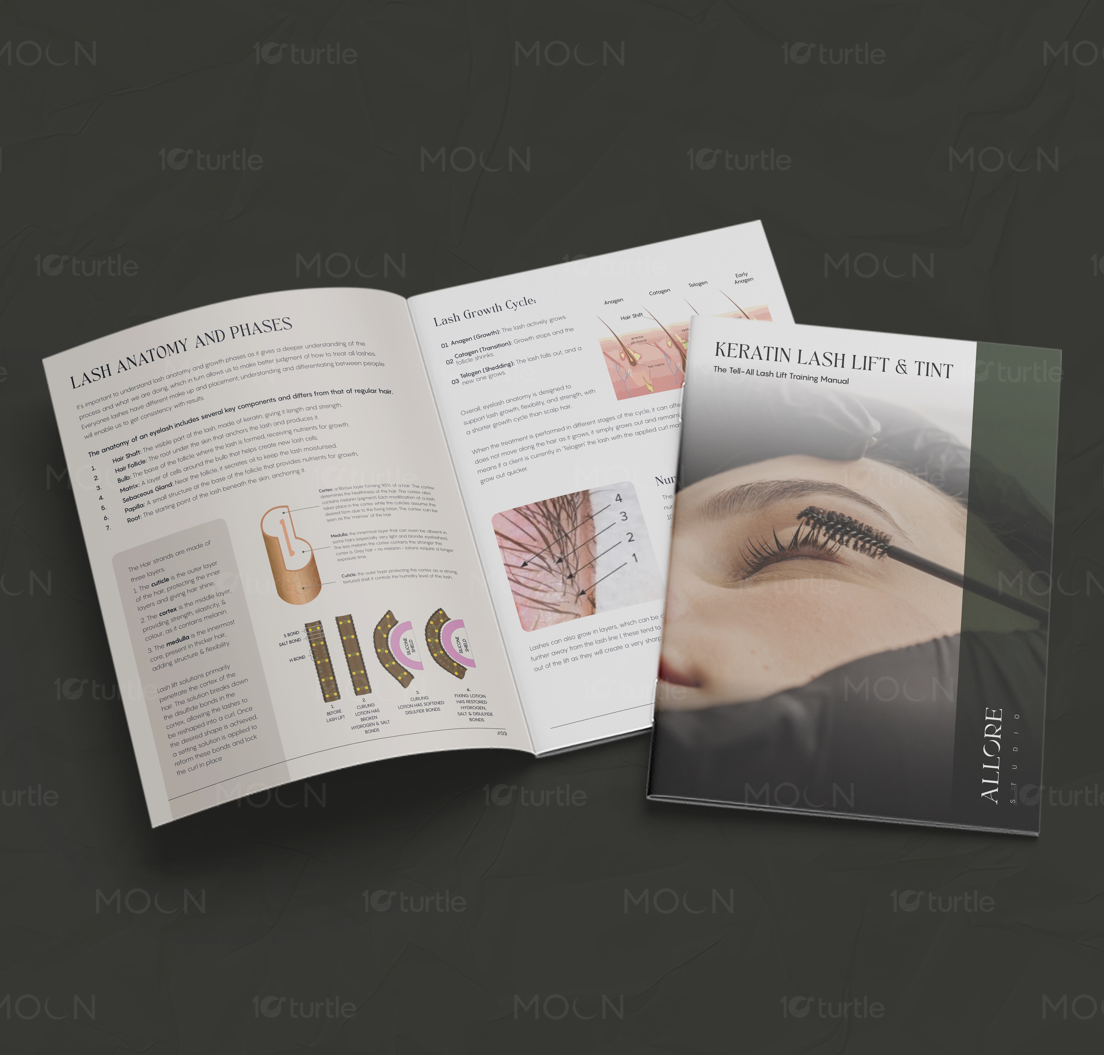
The lash training brochure focuses on beauty education and hands-on service instruction. The visual direction uses dark sage green, soft beige, white space, close-up lash photography, and refined serif headings to create a calm studio-led tone. Pages such as “The Guided Procedure,” “Client Consultation,” “Pre and Post Care for Client,” and “Lash Placement” use numbered steps, bullet points, image callouts, and supporting diagrams. These choices make the training manual layout easy to follow during learning, practice, and review. The photography also gives the guide a real salon context, helping the content feel practical rather than abstract.

The healthcare guide takes a more structured and administrative direction. The cover for “Building Your Dream Practice” uses a soft cream base, blue typography, geometric tile shapes, and a clean professional layout. Inside, the pages include disclaimer content, introduction sections, compliance timelines, credential checklists, deadline tables, and medical workplace imagery. This healthcare brochure design uses tables and clear columns to make regulatory, operational, and planning information easier to manage. The muted blue-grey palette supports trust and professionalism while keeping the guide approachable.

Across both brochures, the creative approach relies on hierarchy and rhythm. Large headings introduce key sections, while smaller text blocks, tables, checklists, and images break the material into manageable parts. This is essential for professional guide design because readers are not only browsing; they are learning, planning, and applying the information. The designs also show strong print brochure design thinking through spread layouts, page numbers, consistent margins, and booklet-style mockups.

The result is a brochure design collection that supports education, trust, and usability. For beauty brands, this kind of booklet can improve training consistency and client-care standards. For healthcare professionals, a clear guide can reduce confusion around planning, licensing, compliance, and practice setup. Together, the two brochures show how editorial brochure design can make specialized information feel organized, premium, and easier to act on.

#brochuredesign

#bookletdesign

#trainingmanual

#healthcarebrochure

#beautybrochure

#printdesign

#editorialdesign

#professionalguide

#manualdesign

#healthcaredesign

#beautytraining

#brandcollateral

Next Project

arrow

AMSINFORM

PPT DESIGN • GRAPHICS DESIGN

AMSINFORM