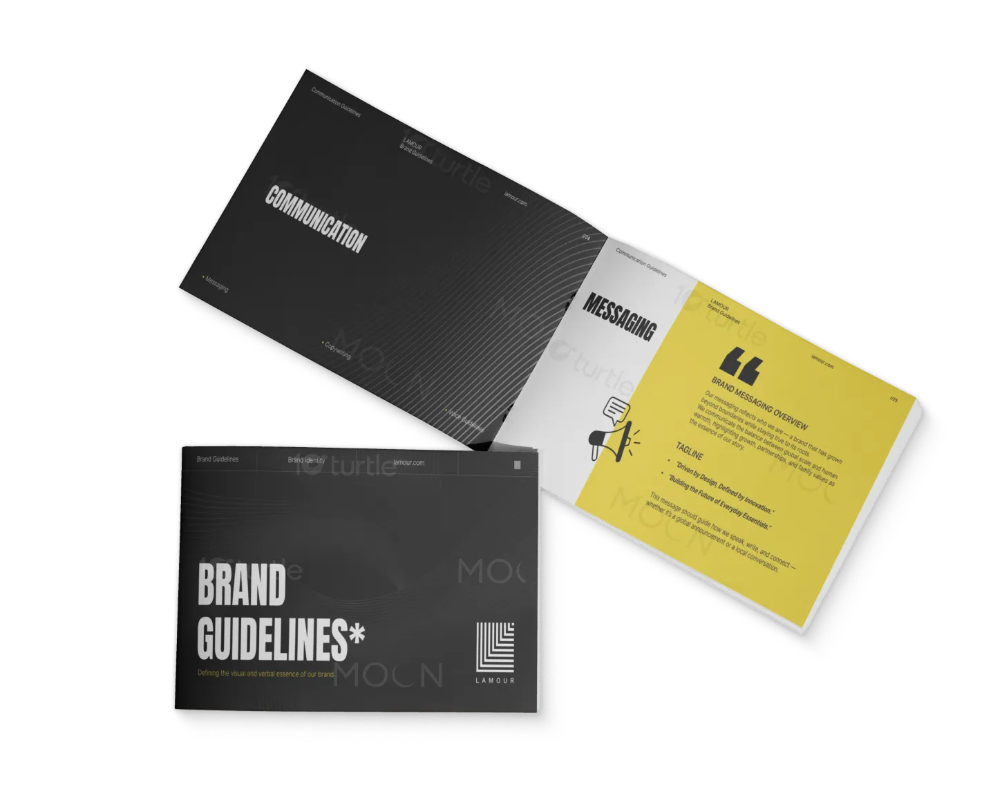
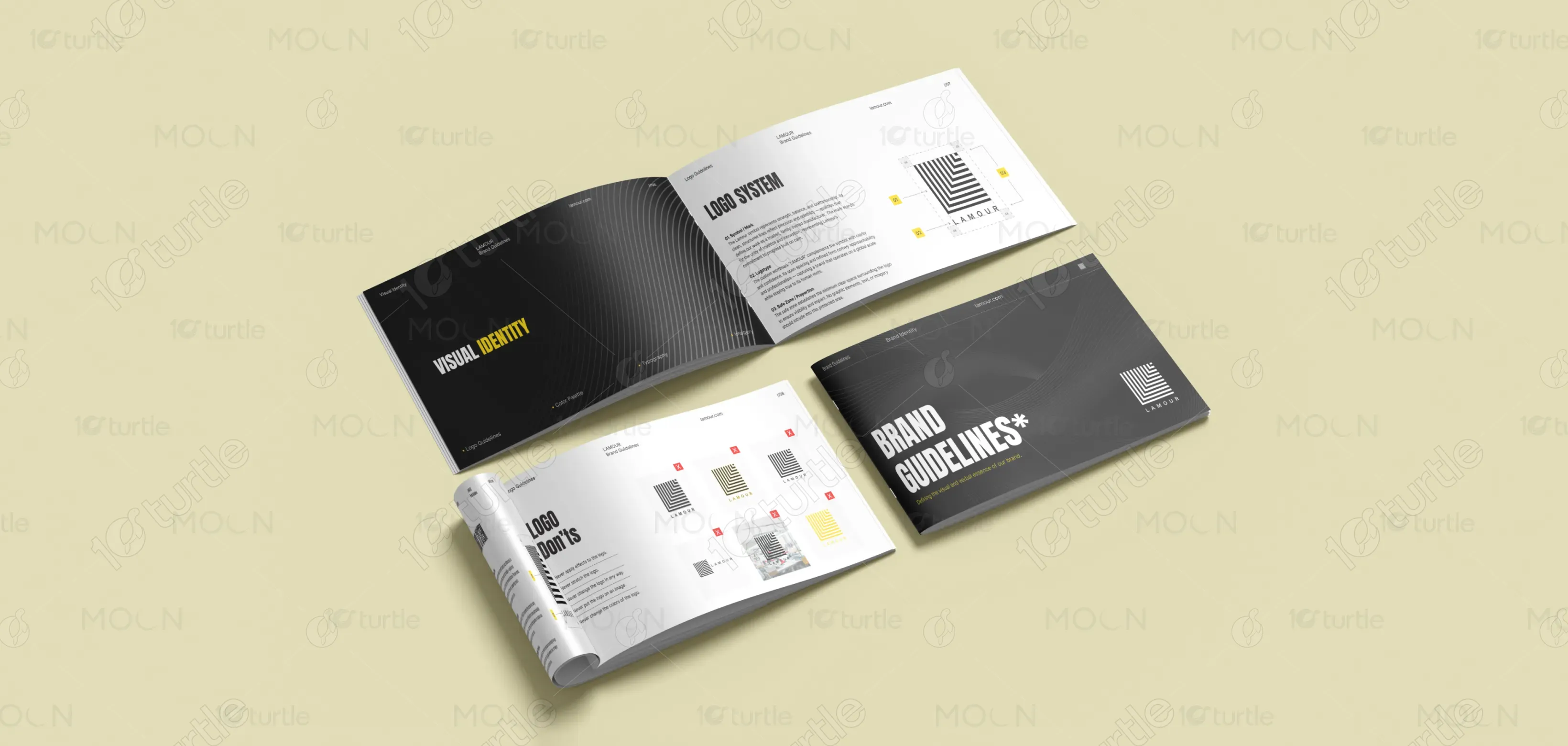
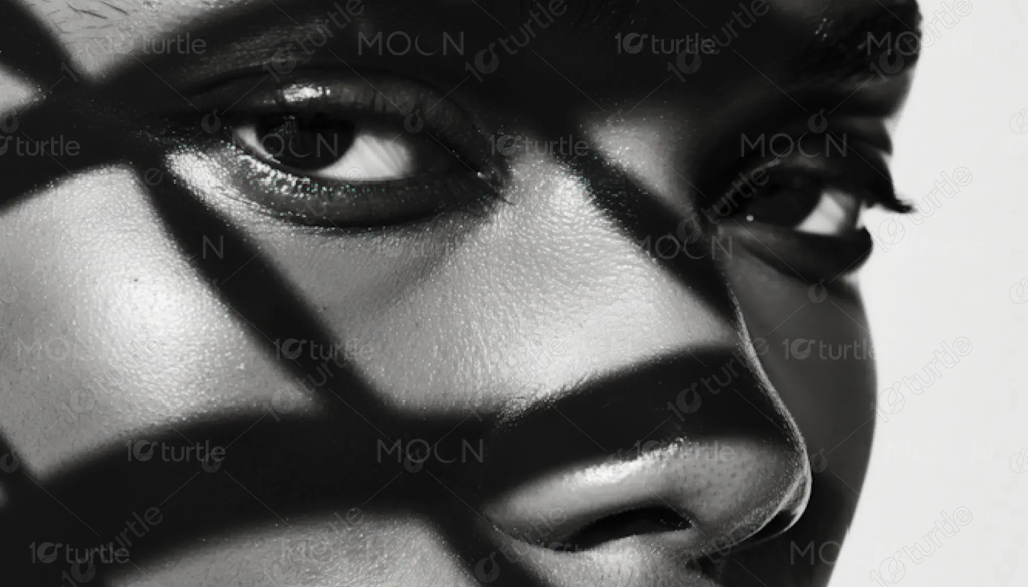
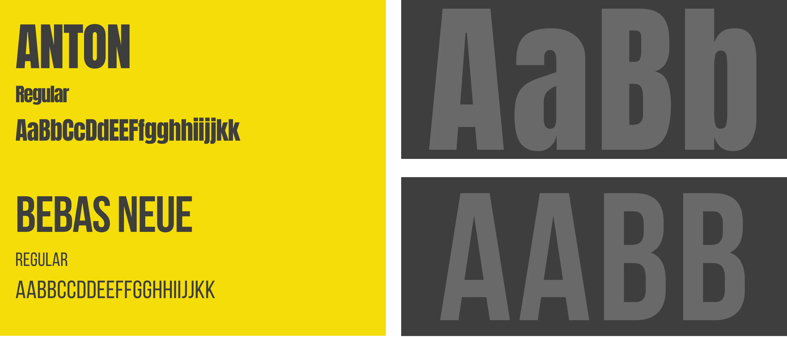
The design approach for Lamour blends simplicity with sophistication, reflecting the brand’s global scale and human-centered values. With a focus on bold, structured lines and minimalistic design elements, the visual identity emphasizes professionalism and approachability. The black and yellow color palette enhances clarity and energy, while the modern typography ensures readability. The overall aesthetic merges traditional craftsmanship with innovative forward-thinking, capturing Lamour's commitment to quality and collaboration.
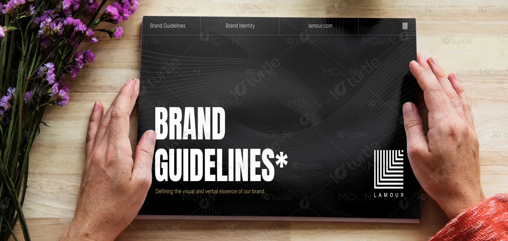
Brand Guide Design
Graphic Design
Industry
Fashion, Beauty & Lifestyle
Tools we used


Project Completion
2025
Key Market
Global
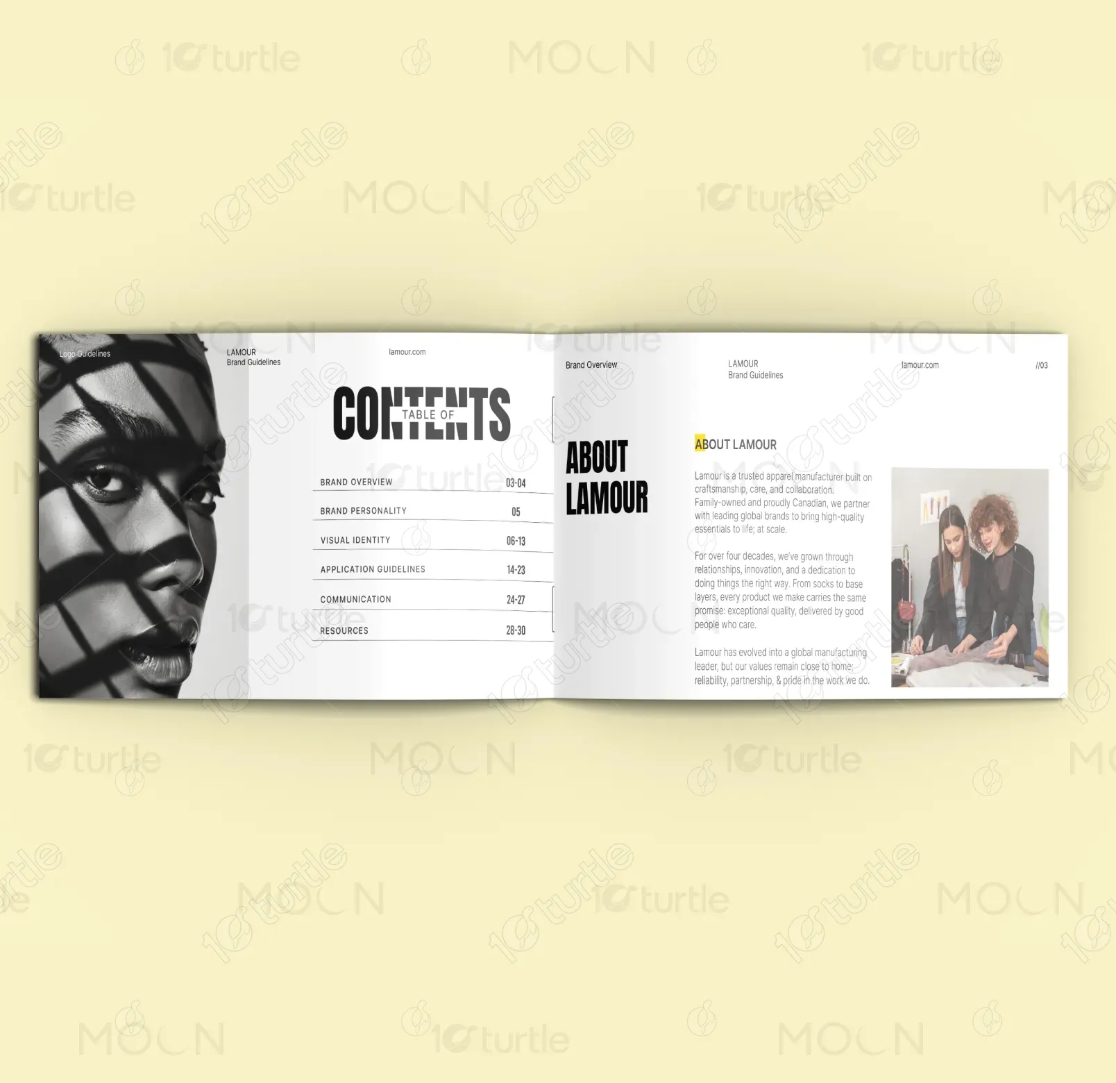
Lamour is a trusted Canadian apparel manufacturer that prides itself on craftsmanship, reliability, and collaboration. The brand focuses on providing high-quality essentials at scale for global partners, offering a wide range of products from socks to base layers. Lamour’s distinct visual identity — clean lines, bold typography, and a black-and-yellow color scheme — reflects its global presence while maintaining a human, approachable touch. The brand’s unique selling point lies in its unwavering dedication to quality and ethical manufacturing practices.

Industry
Fashion, Beauty & LifestyleWhat we did
Brand Guide DesignGraphic DesignPlatform
-A key challenge in the apparel manufacturing industry is balancing high-volume production with exceptional quality. Many manufacturers struggle with maintaining consistent craftsmanship while scaling their operations. This gap affects both the brand’s reputation and the consumer’s trust. Lamour aims to solve this problem by integrating innovation with craftsmanship to produce essentials that not only meet the needs of global brands but also exceed expectations in terms of quality and dependability.
Lamour addresses the industry’s challenges by focusing on innovative processes and maintaining a strict commitment to quality. By combining modern manufacturing techniques with attention to detail, the brand ensures high-quality production at scale. The use of a clear, structured design identity — including a well-defined logo and cohesive color palette — reinforces the brand's promise of quality and dependability, while the approachability of the design aligns with its people-first philosophy.
The design’s clean, sophisticated aesthetic reflects professionalism and builds trust with both customers and investors. The bold use of black and yellow, combined with modern typography, enhances readability and engages users effectively, leading to a higher brand recall and conversion rate. This refined approach positions the brand as a strong contender in its market, driving long-term customer loyalty and repeat business.
The long-term goal for Lamour’s design is to evolve as a symbol of high-quality, responsible manufacturing that maintains a strong connection to its roots. The design will continue to reflect Lamour’s growth and its ability to adapt, innovate, and build lasting relationships with global brands. Over time, the visual identity will further solidify Lamour’s place as a trusted global partner, bridging the gap between function and fashion, while remaining approachable and human-centered in its communication.
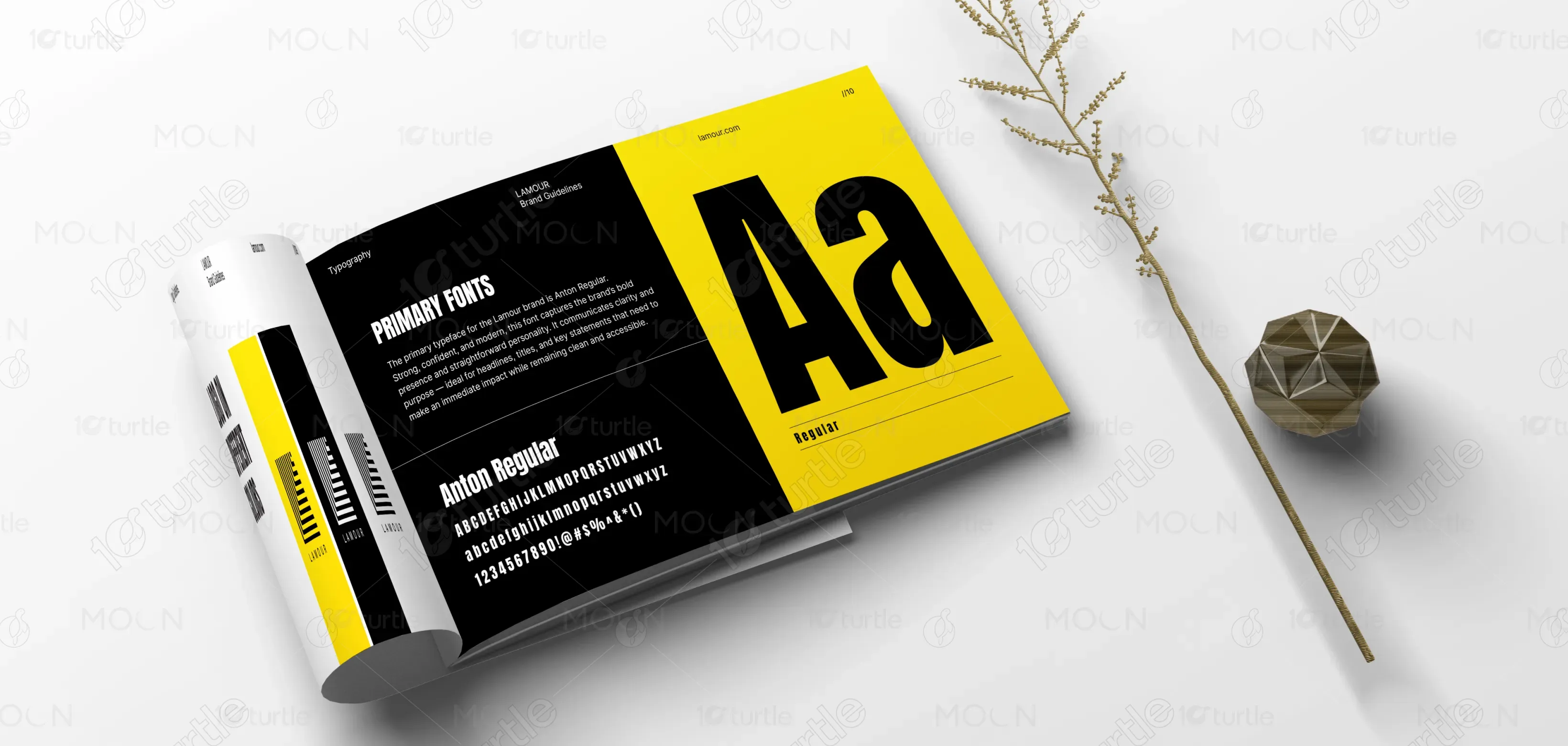
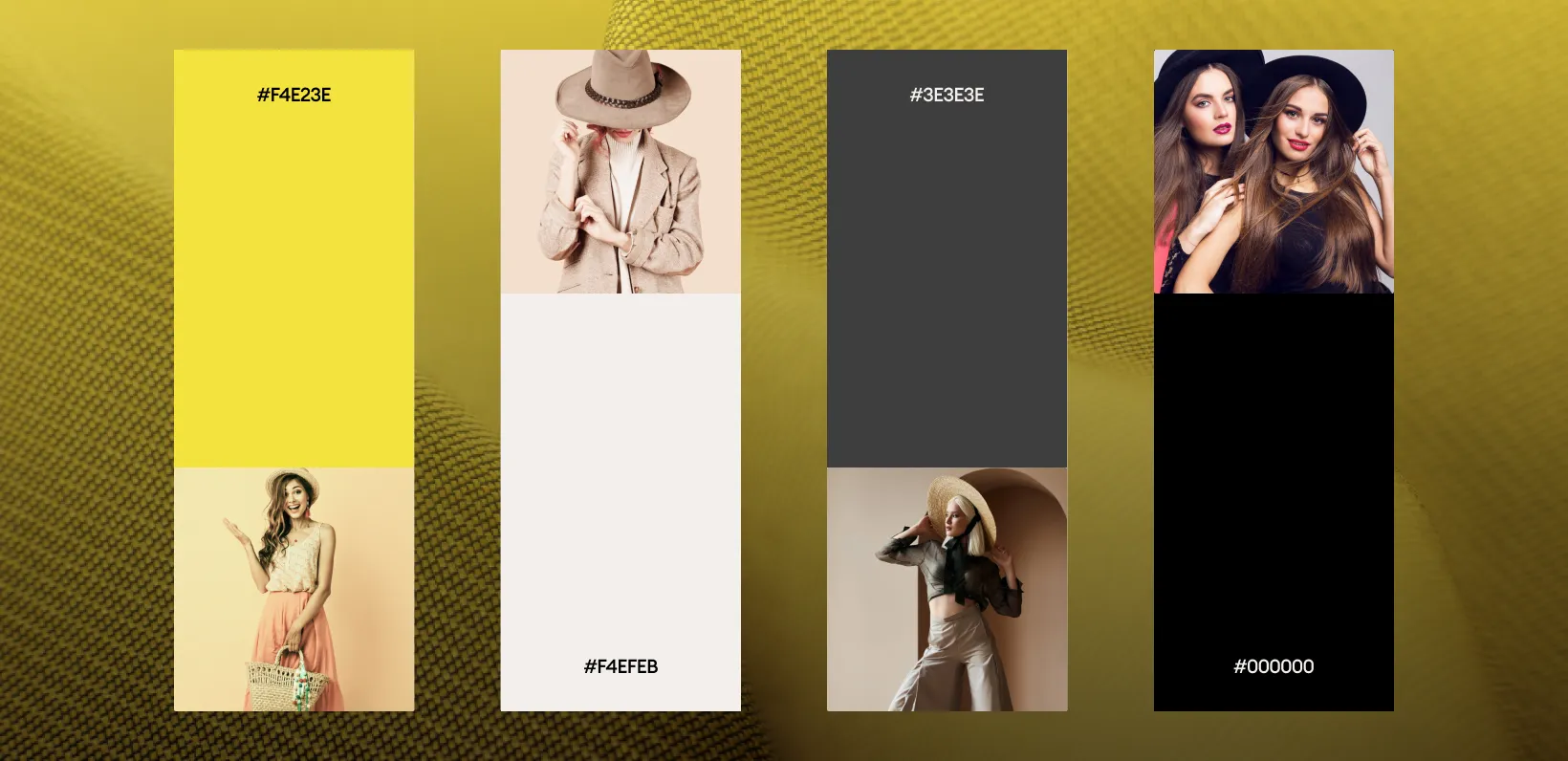
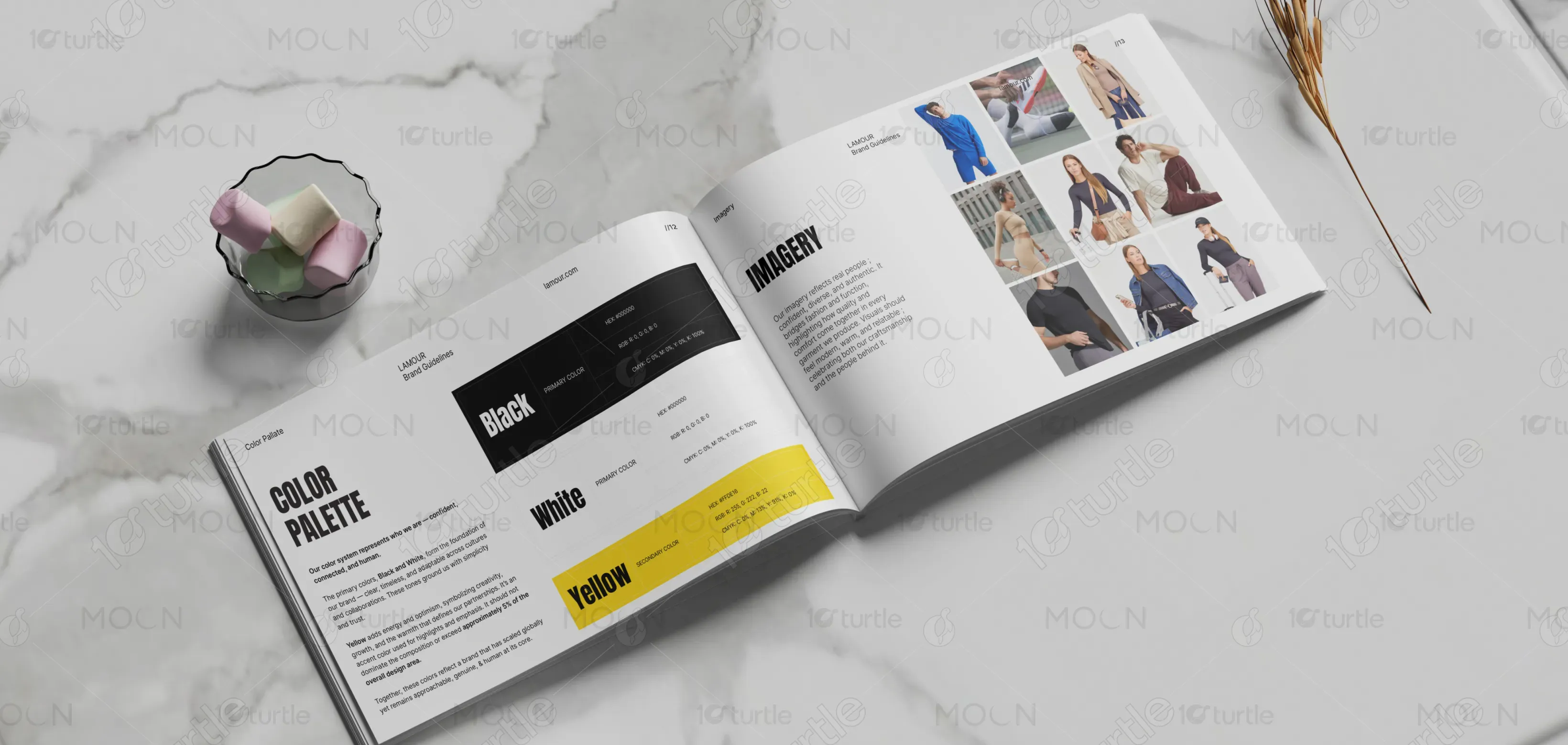
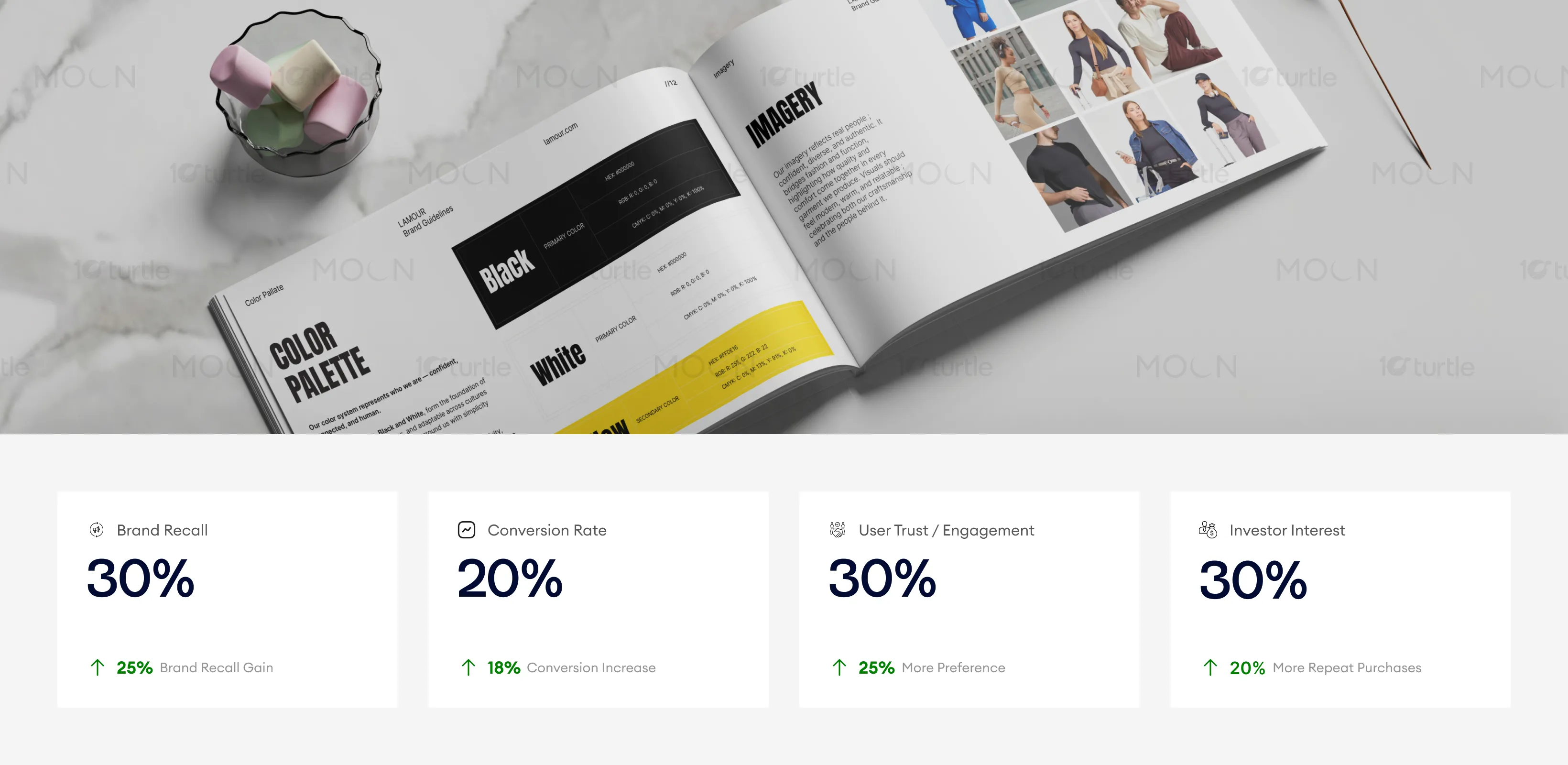
The color palette of Lamour is built around simplicity and clarity. Black and white form the foundation, conveying professionalism, timelessness, and trust. Yellow serves as an accent color, adding energy, optimism, and creativity to the brand. This dynamic palette highlights Lamour's commitment to innovation and growth, while ensuring that the brand remains grounded and approachable. The colors are adaptable, suitable for both global and local markets, and ensure strong visibility across various applications.