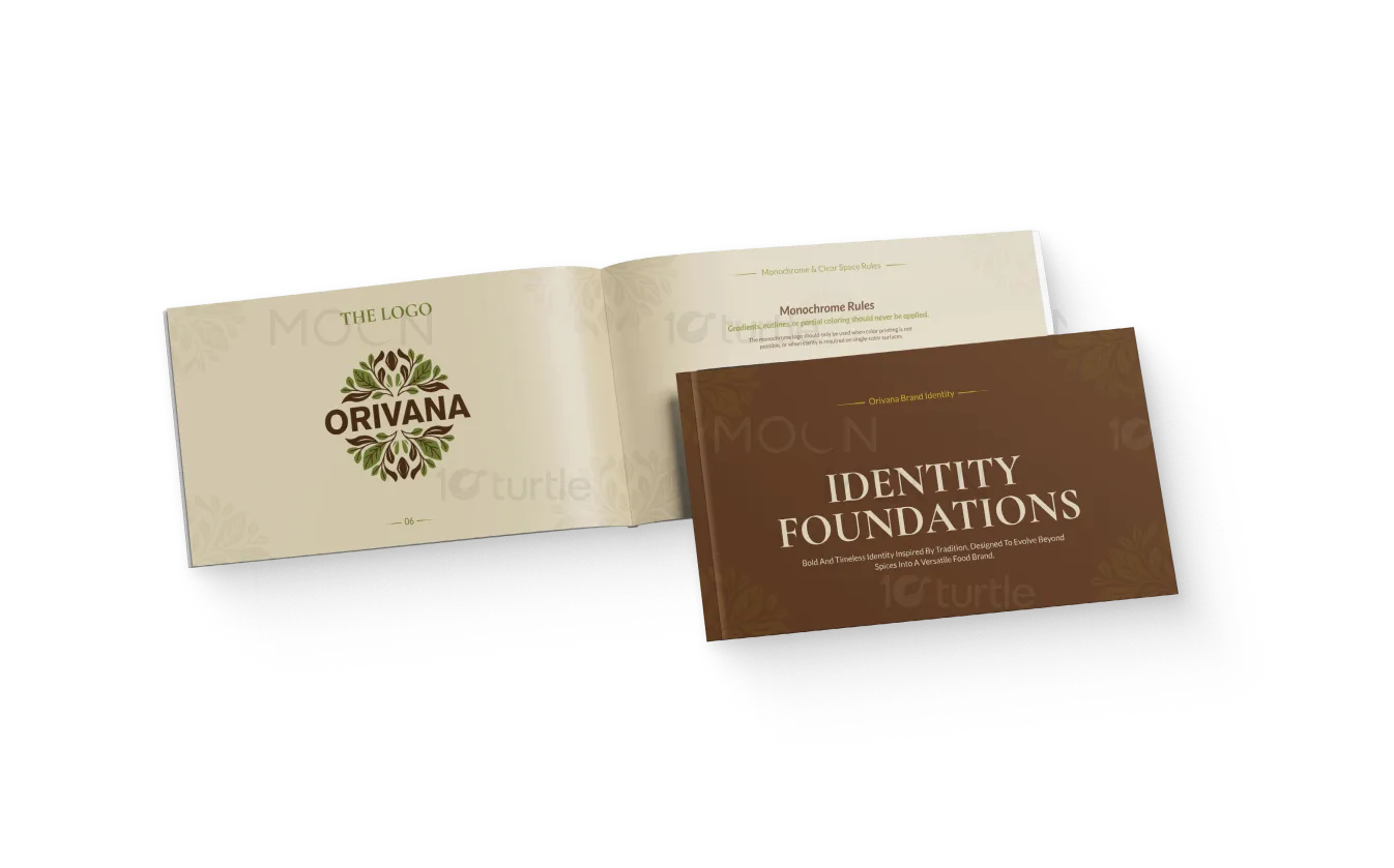
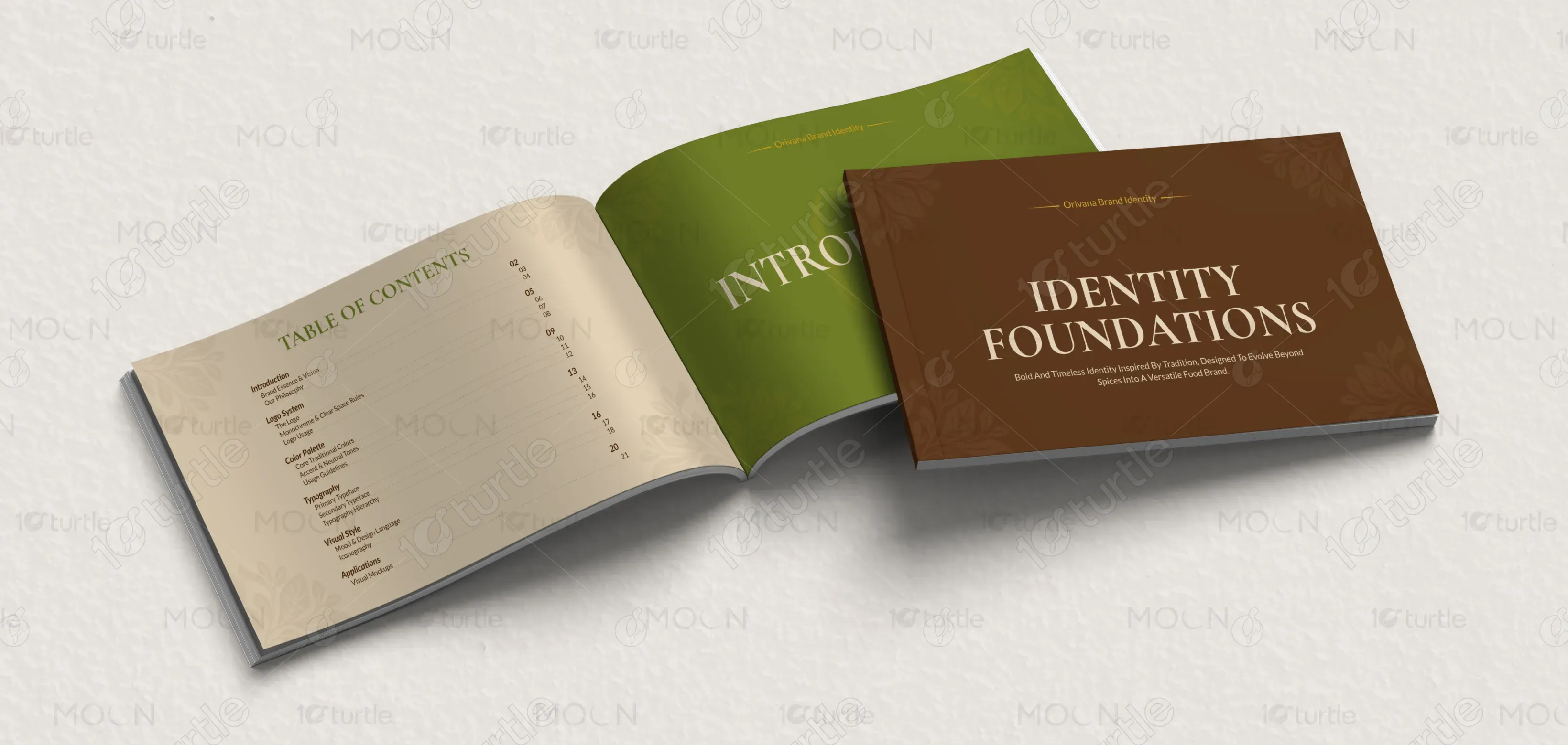
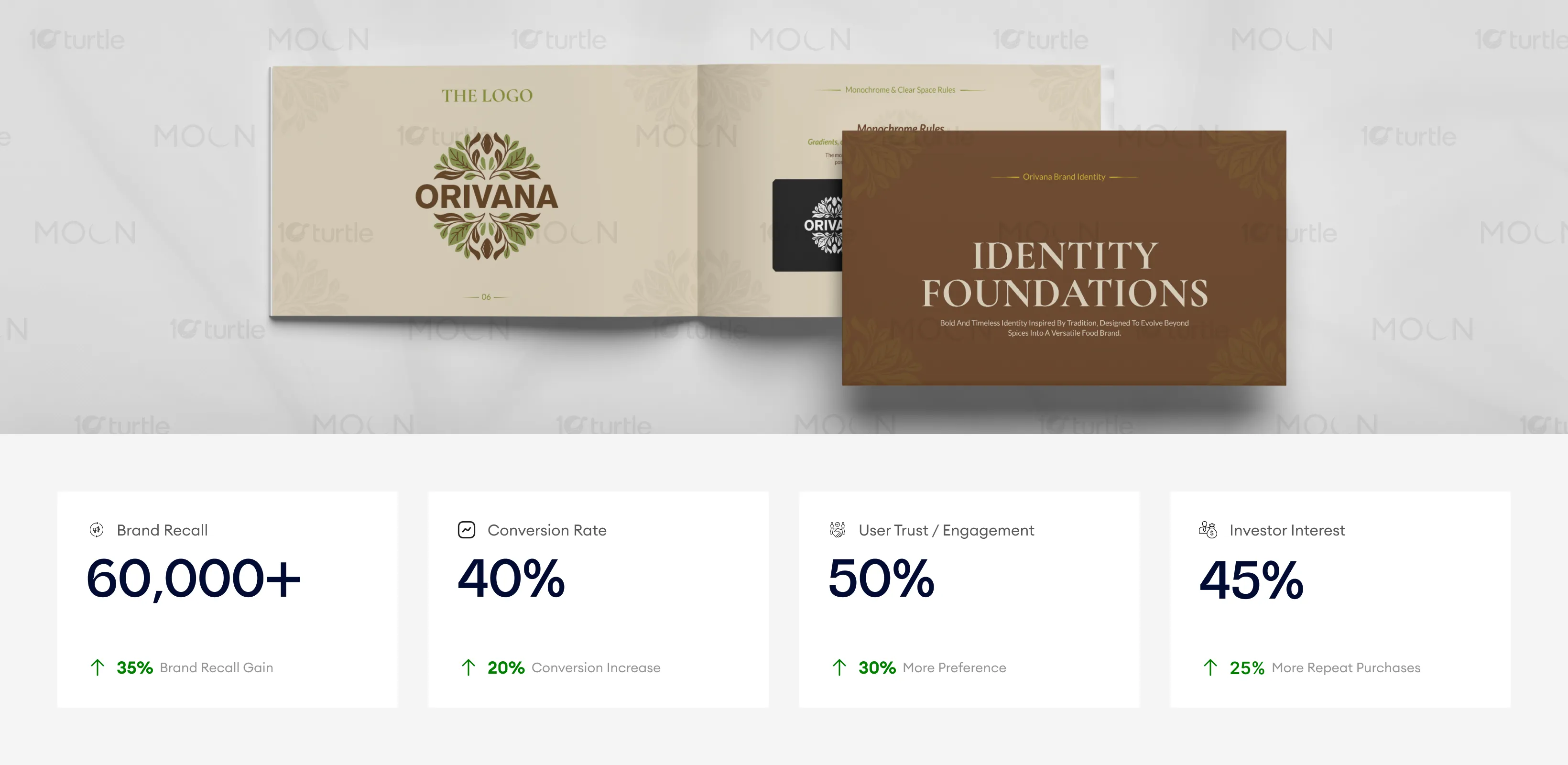
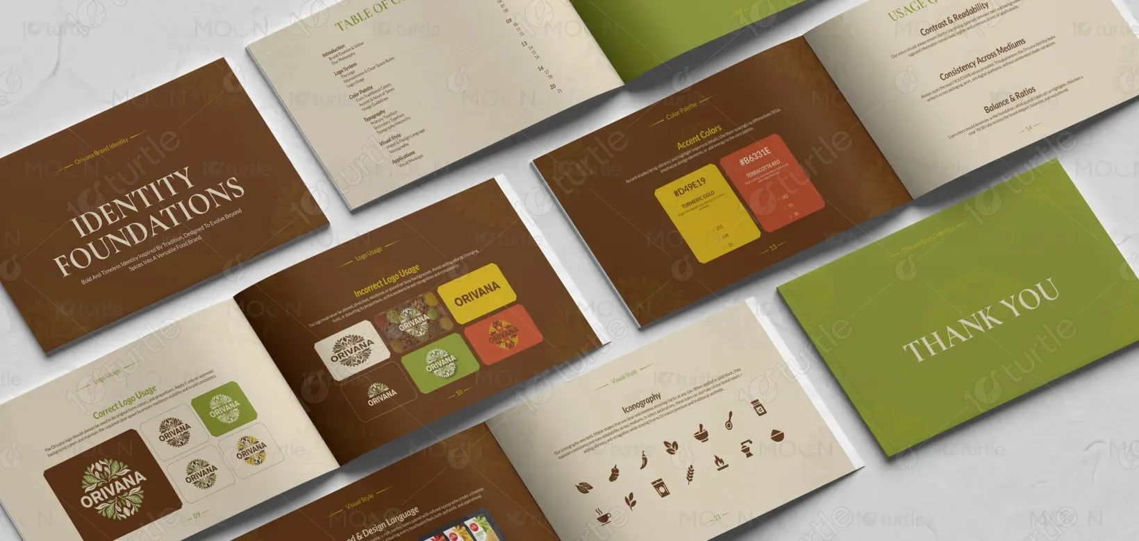
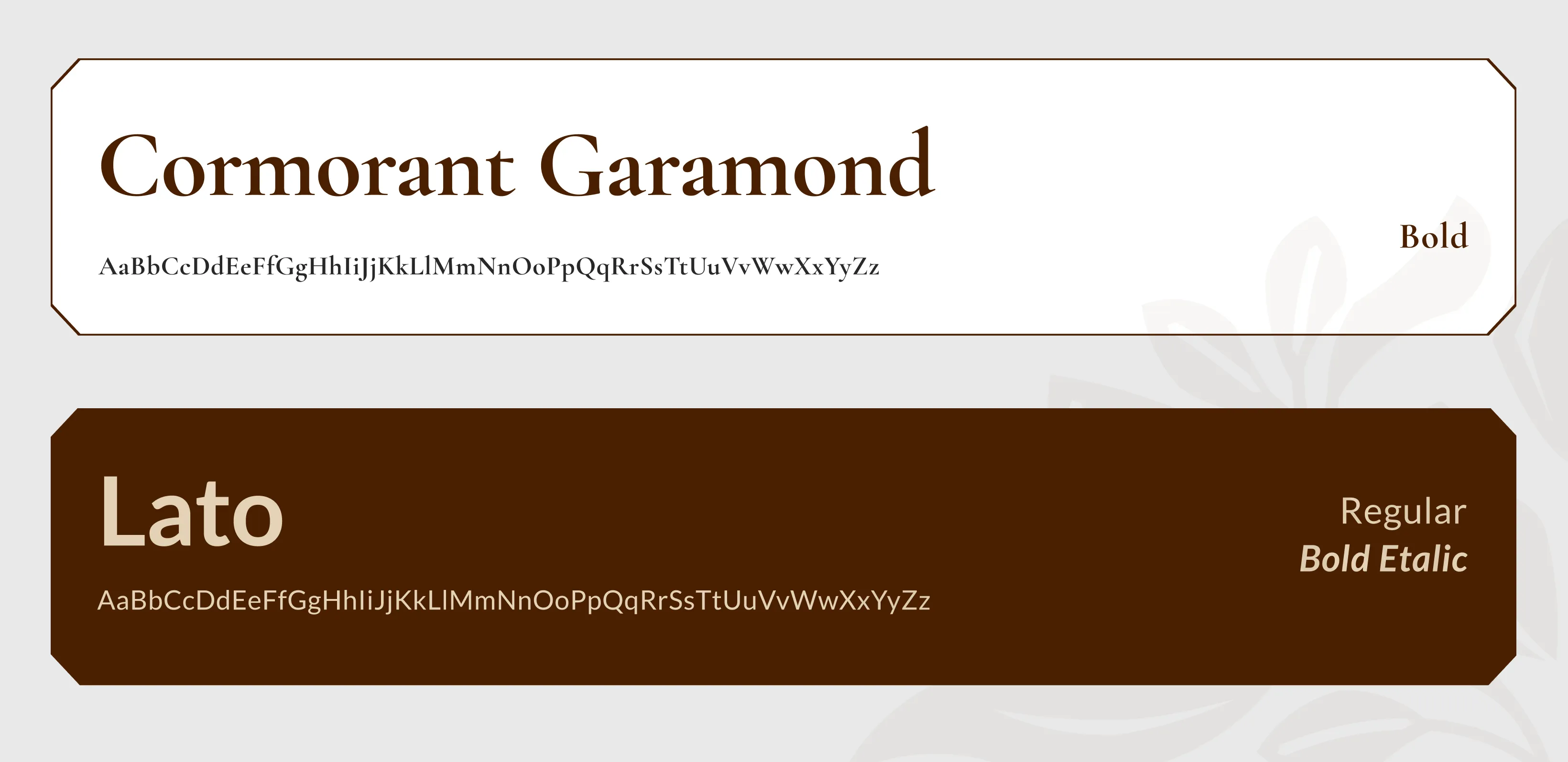
The Orivana Brand Guide is built around a heritage-inspired yet modern visual direction that communicates warmth, authenticity, and premium quality. The layout follows a clean grid structure with balanced spacing to maintain clarity and readability across spreads. Serif typography enhances the traditional and timeless character of the brand, while supporting text remains clean and minimal for functional clarity. The earthy brown and olive green palette reflects the richness of spices and nature, while subtle botanical corner motifs create consistency without overwhelming the design. Together, layout, hierarchy, imagery, and color form a cohesive system that feels refined, culturally rooted, and professionally structured.
Brand Guide Design
Graphic Design
Industry
Food, Beverage & Hospitality
Tools we used


Project Completion
2025
Key Market
Global
This brand guide represents the foundational identity system for Orivana, a spice-inspired food brand positioned at the intersection of heritage and modern sophistication. It defines how the logo, typography, colors, imagery, and layout should be consistently applied across packaging, print, and digital platforms. The primary purpose of this design is to establish a strong, recognizable, and trustworthy visual presence in a competitive food market. By maintaining clarity and consistency, the guide ensures that every brand touchpoint communicates authenticity, quality, and cultural depth.

Industry
Food, Beverage & HospitalityWhat we did
Brand Guide DesignGraphic DesignPlatform
-In the competitive food and spice industry, many brands struggle with inconsistent visual identity, unclear messaging, and weak differentiation on shelves and digital platforms. Overcomplicated packaging, improper logo usage, and inconsistent color application often reduce brand recall and customer trust. Without a structured system, the brand risks appearing fragmented and less premium. These challenges directly impact visibility, engagement, and long-term credibility within the market.
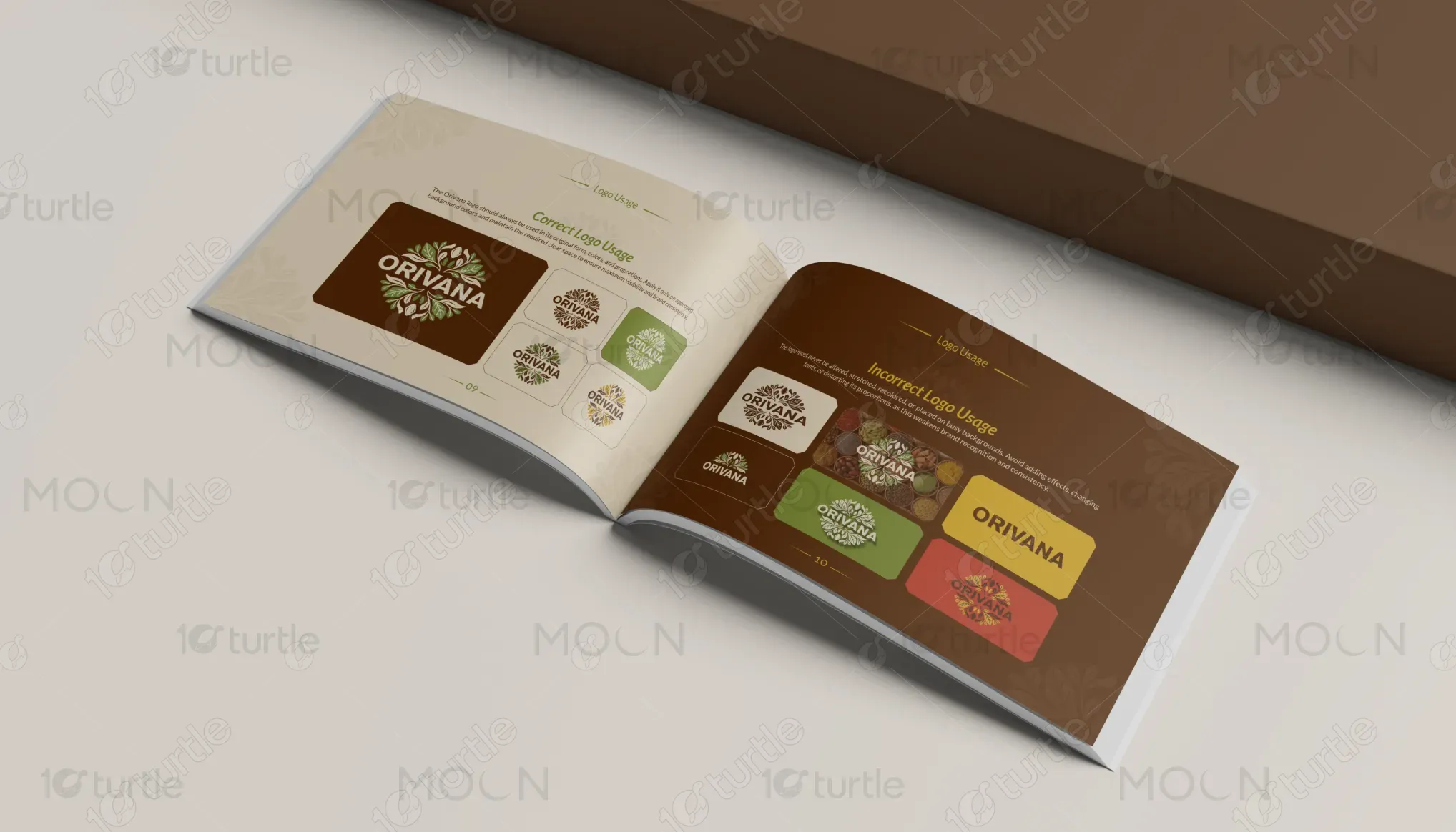
The Orivana Brand Guide addresses these challenges by introducing a structured and scalable identity framework. Clear logo usage guidelines prevent misapplication and ensure brand integrity. A defined color system enhances recognition while reinforcing natural authenticity. Thoughtful typography hierarchy improves readability and maintains elegance. The balanced layout system allows flexibility across different formats while preserving visual consistency. This approach ensures the brand communicates clearly, builds trust, and remains adaptable across packaging, marketing materials, and digital channels.
The Orivana Brand Guide design establishes a strong, culturally rooted identity with its earthy tones and refined typography. The clean grid structure and carefully chosen motifs enhance brand recognition and engagement. To further improve these metrics, emphasizing the premium nature of the product and leveraging the design across various digital touchpoints could drive higher conversion rates and investor interest.
The long-term vision behind the design is to position Orivana as a premium yet culturally rooted spice brand capable of expanding into broader food categories. The identity system is designed to evolve with new product lines, retail environments, and digital platforms without losing its core personality. By maintaining emotional warmth and visual consistency, the brand is positioned for sustainable growth, stronger market presence, and long-term audience connection.

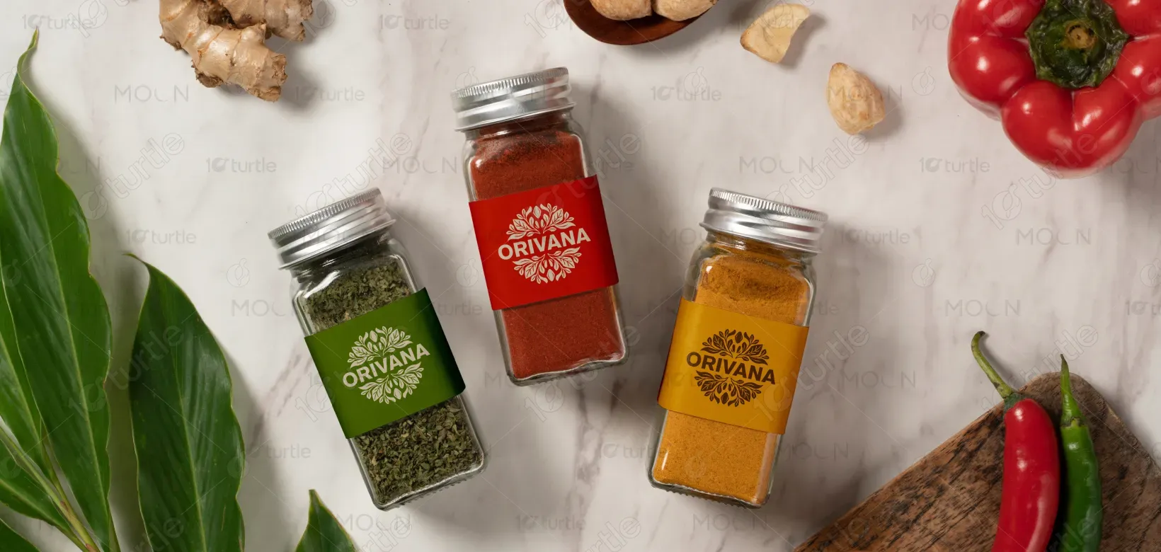
The color palette combines deep brown, olive green, warm beige, and subtle gold accents to reflect richness, authenticity, and natural origins. Brown conveys depth and spice heritage, green represents freshness and sustainability, and beige provides balance and readability. Gold accents introduce refinement without excess. The botanical corner patterns reinforce the organic identity while maintaining elegance and restraint. Together, the visual language communicates warmth, tradition, and premium quality across all formats.