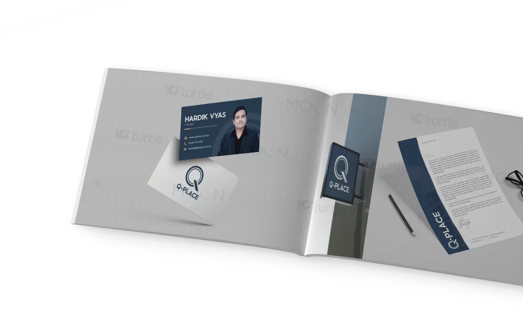
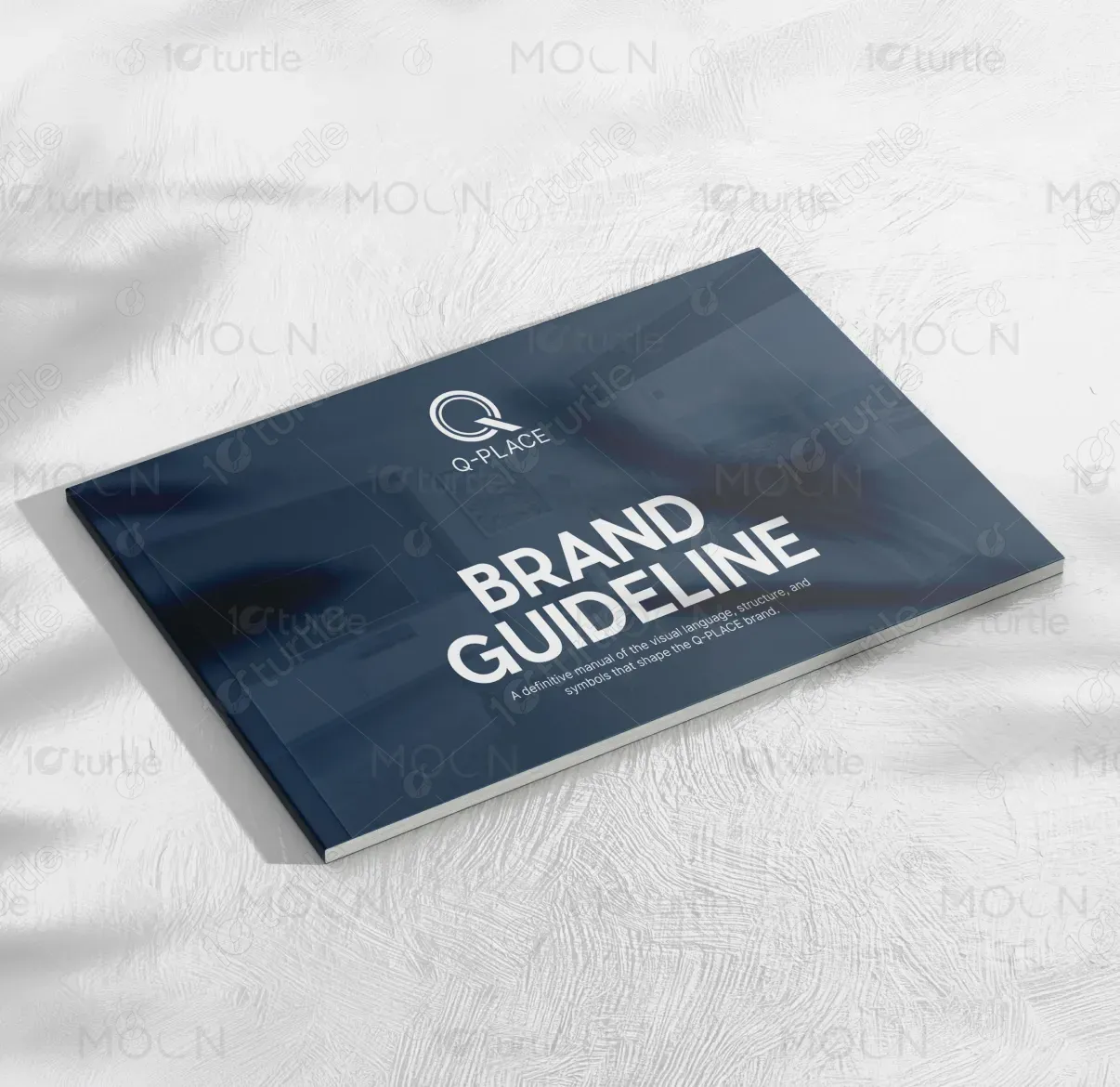
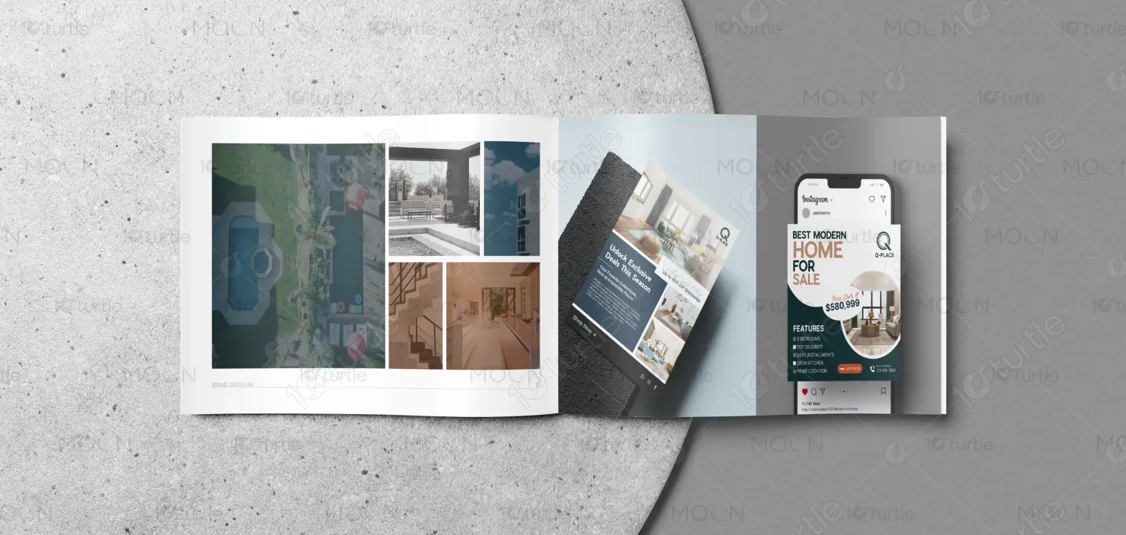
The design of Q-PLACE’s brand guideline reflects a blend of minimalism and precision, featuring clean lines and a modern aesthetic. The use of sleek typography and spacious layouts helps communicate the brand's focus on architectural excellence and innovative design. The visual elements are purposeful, with a strong emphasis on clarity and sophistication, ensuring that the brand feels contemporary, trustworthy, and professional. The overall design creates a strong, visually cohesive identity that speaks to high-end real estate and modern living.
Brand Guide Design
Graphic Design
Industry
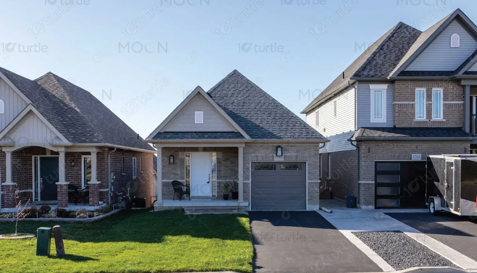
Property, Construction & Real Estate
Tools we used


Project Completion
2025
Key Market
Global
Q-PLACE is a modern real estate brand that emphasizes precision and architectural excellence. The brand aims to offer luxury and sustainable living spaces that cater to contemporary lifestyles. With a focus on high-end residential and commercial properties, Q-PLACE promises innovation and style. The design communicates trust and elegance through its sophisticated visual language, using clean lines and modern elements to highlight the quality and ambition behind the brand. Its market positioning focuses on modernity, luxury, and sustainability.

Industry
Property, Construction & Real EstateWhat we did
Brand Guide DesignGraphic DesignPlatform
-Many real estate brands lack a cohesive and modern visual identity that aligns with the evolving needs of urban living. Traditional design approaches often fail to convey the innovation and luxury that today's consumers seek. With a market flooded by generic, outdated branding, there is a significant gap in offering real estate brands that reflect both precision in architecture and a contemporary aesthetic. This disconnect affects the perception of quality and desirability.
Q-PLACE addresses this gap by combining minimalism with cutting-edge design elements to create a visually appealing and highly functional brand identity. The sleek design, sophisticated typography, and modern color palette reflect the precision, luxury, and innovation inherent in the properties Q-PLACE offers. This approach sets Q-PLACE apart in the competitive real estate market, making it stand out as a forward-thinking, high-quality brand.
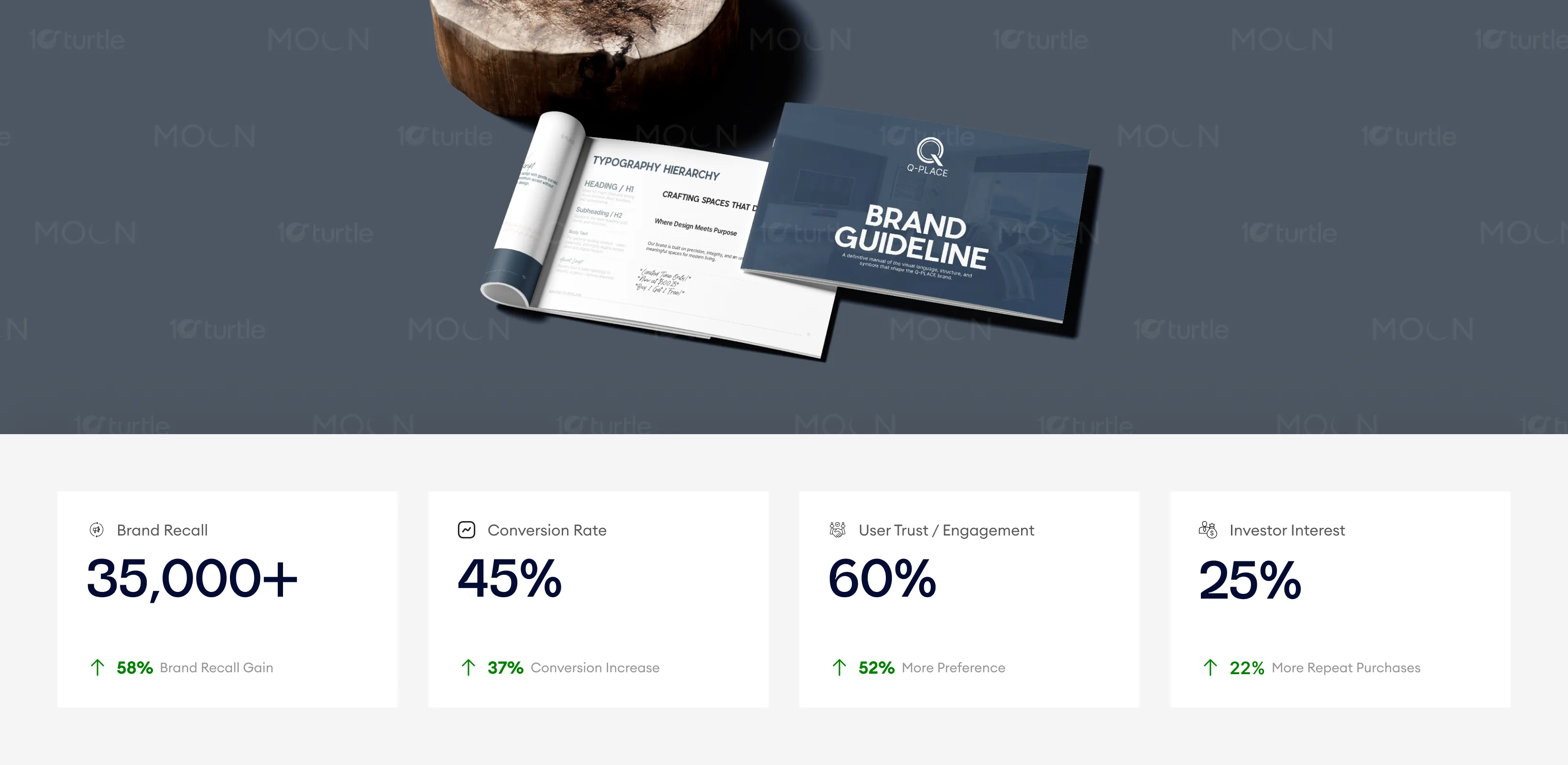
The refined and minimalist design of the brand guidelines positions Q-PLACE as a trusted, high-end real estate entity. The consistency and clarity of the guidelines improve brand recall, establish strong user engagement, and foster trust with potential clients and investors, leading to better business outcomes. Consistent visual elements across marketing and investor collateral are likely to increase investor interest and conversion rates.
The long-term vision for Q-PLACE is to become a leading symbol of luxury and innovative living in the real estate industry. The brand aims to expand its portfolio with sustainable, architecturally advanced properties while continuing to emphasize design excellence. Through its modern visual identity, Q-PLACE aspires to establish a strong, lasting impression on its customers, creating a brand that stands for sophistication, trust, and forward-thinking design.
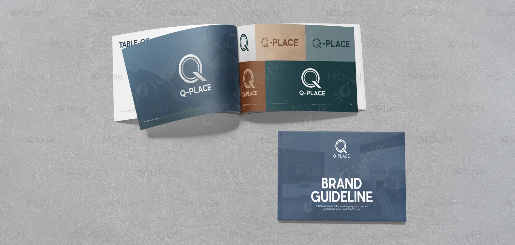
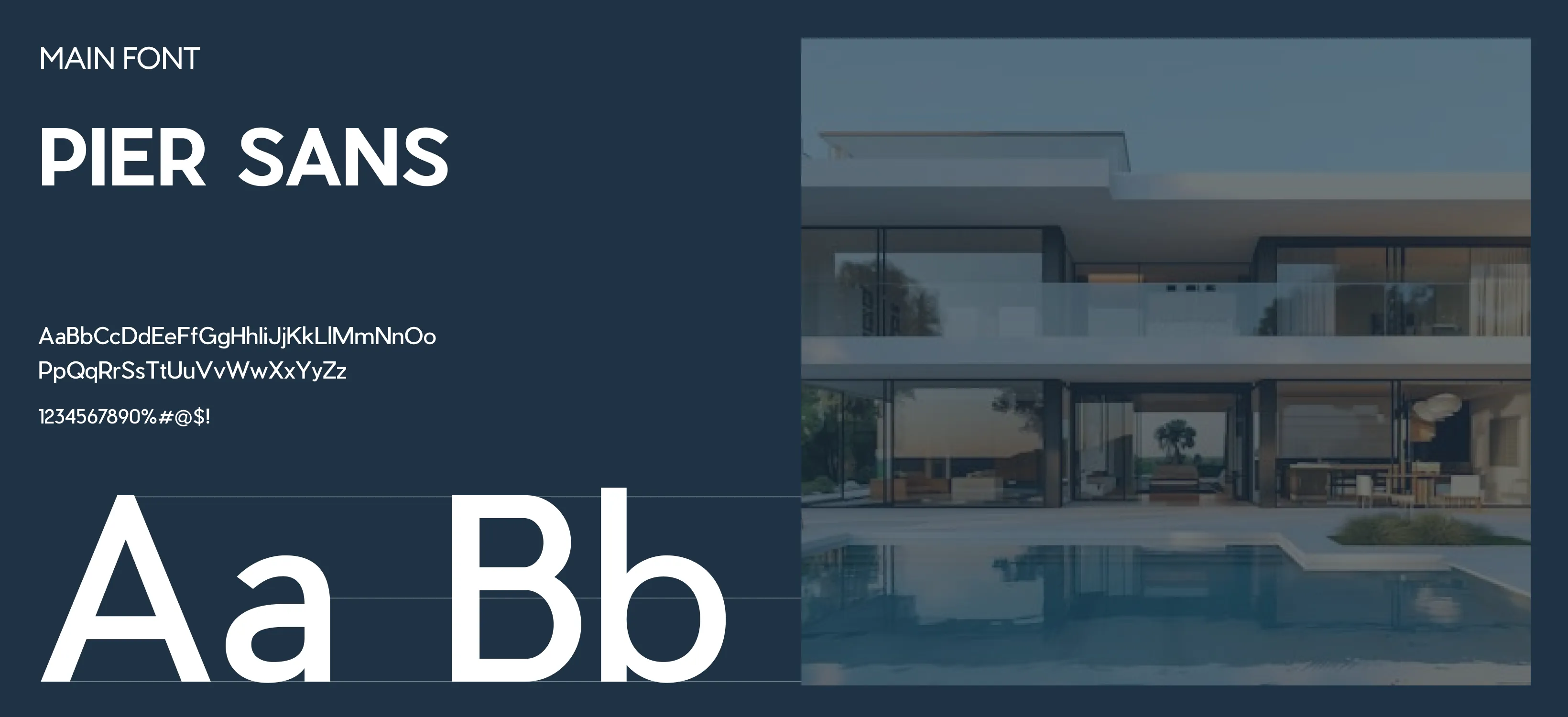
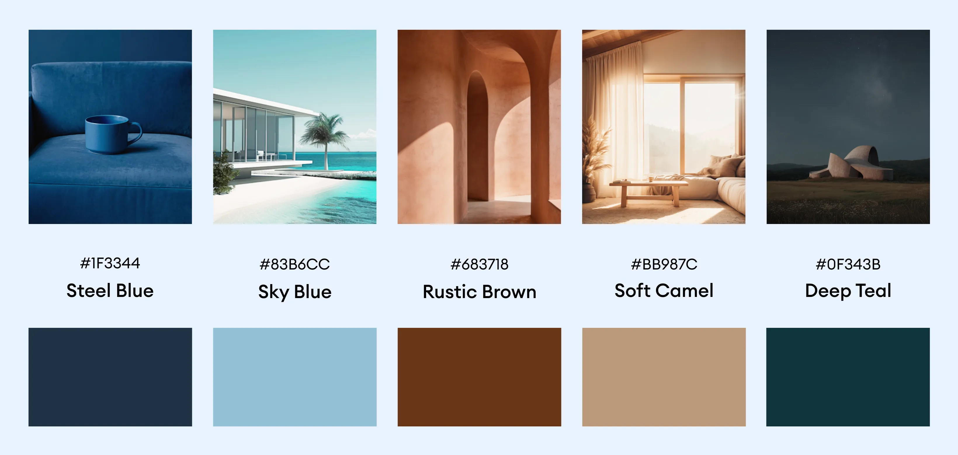
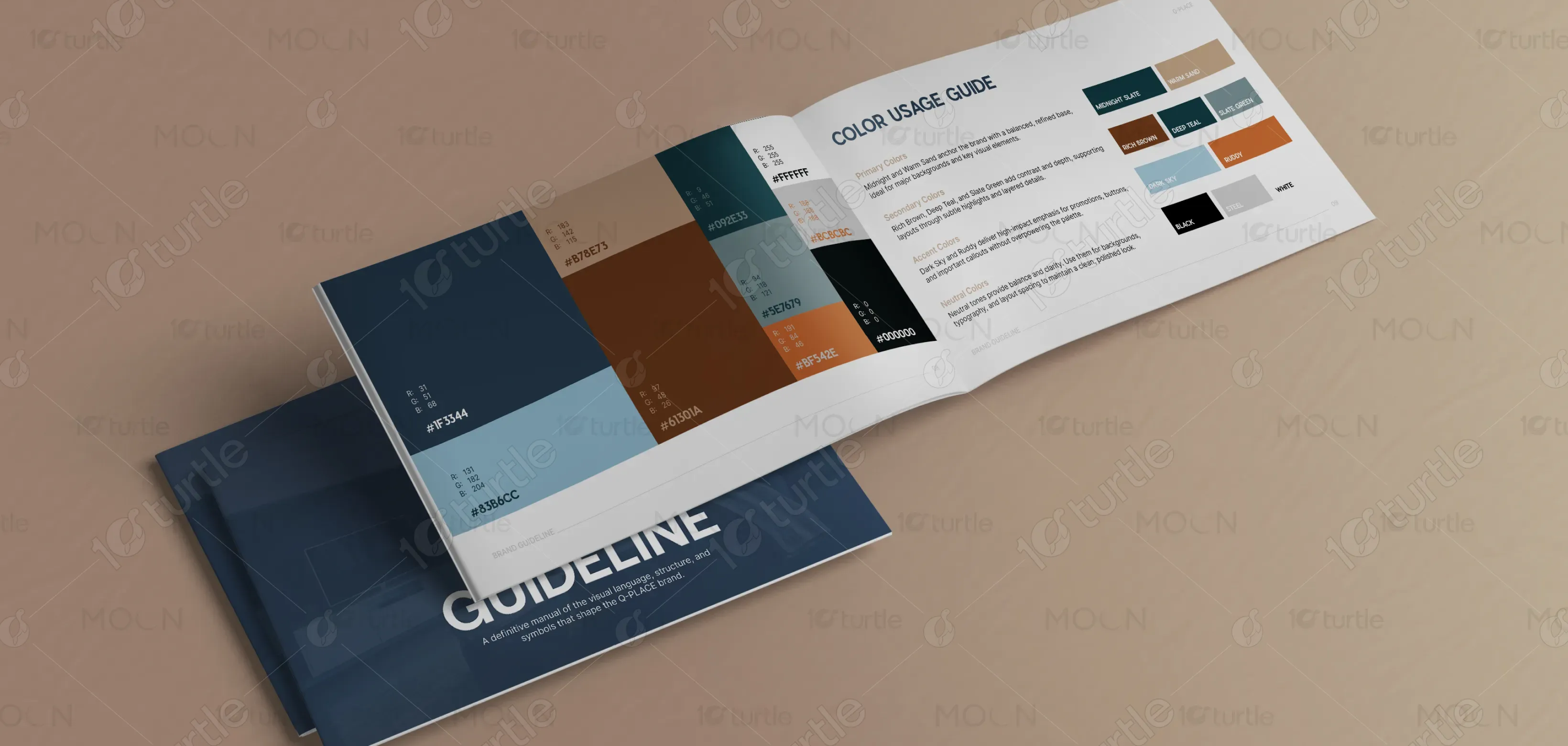
The color palette for Q-PLACE consists of deep blues, whites, and subtle grays. These colors evoke feelings of trust, professionalism, and sophistication. The darker tones of blue signify precision and stability, while the whites and grays balance the design with a sense of cleanliness and simplicity. This palette aligns with the brand’s focus on modern architecture and high-end living, creating a calm, reassuring visual experience that complements the brand's identity as a luxury real estate developer.