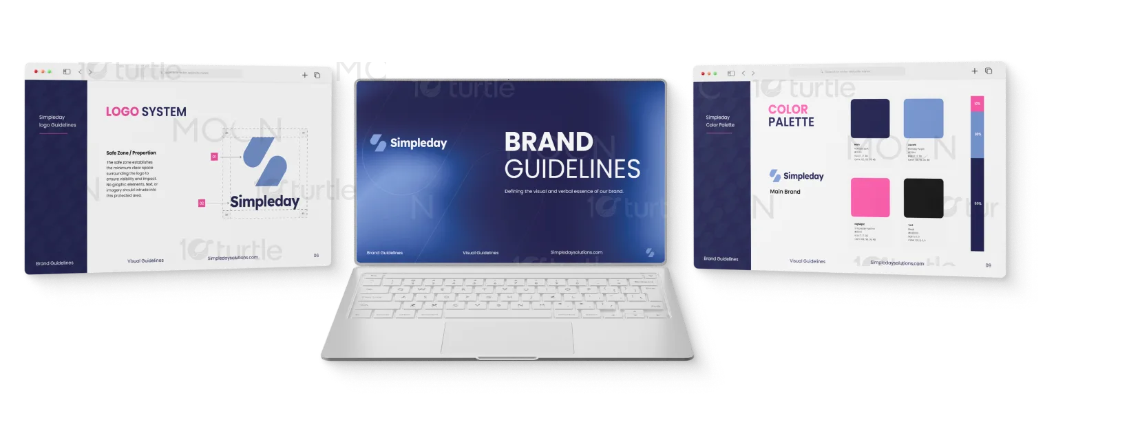
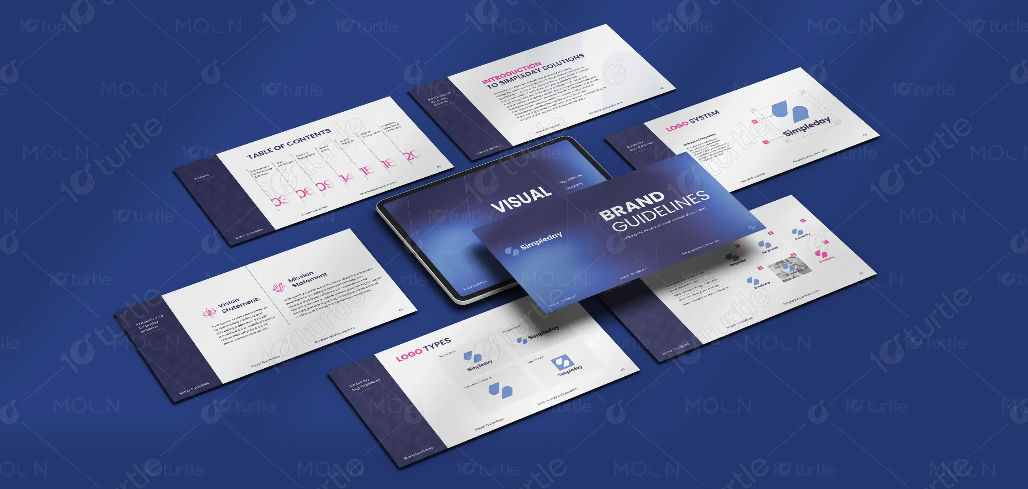
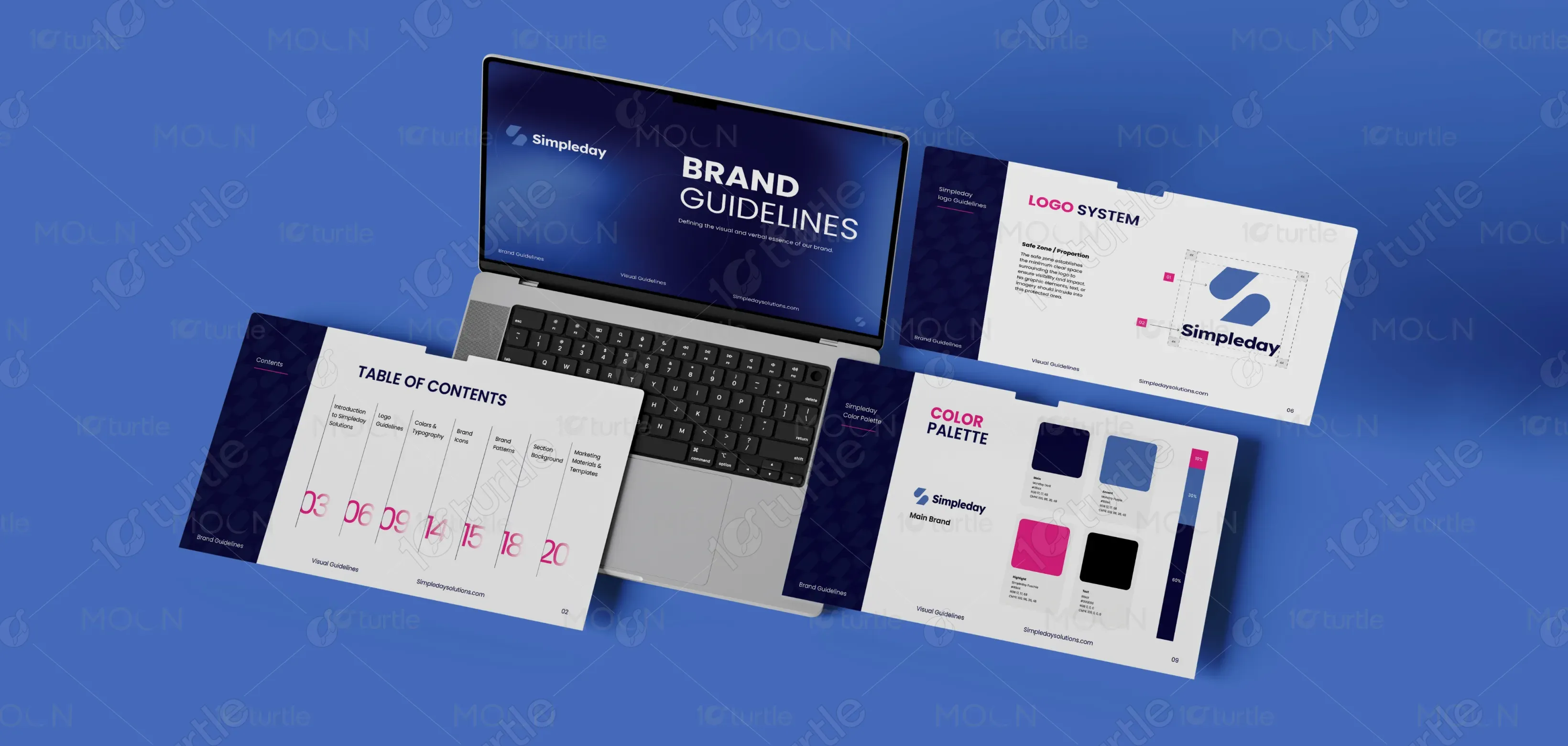
The design concept focuses on clarity, structure, and modern simplicity to reflect the core idea of the Simpleday brand. The layout uses clean grids, balanced spacing, and consistent alignment to create a professional and easy-to-follow visual system. A combination of modern sans-serif typography and structured information blocks establishes a clear hierarchy that guides readers naturally through the brand guidelines. The use of deep blue backgrounds, white surfaces, and subtle accent colors adds contrast while maintaining a calm and trustworthy aesthetic. Icons, logo examples, and visual demonstrations are carefully arranged to ensure each element of the brand system is presented clearly, allowing the document to function as both a visual reference and an instructional guide.
Brand Guide Design
Graphic Design
Industry
Technology, SaaS & Startups
Tools we used


Project Completion
2025
Key Market
Global
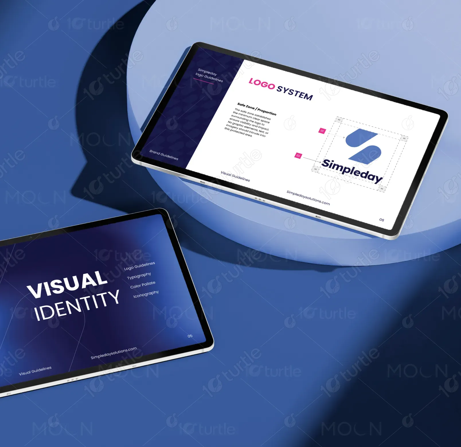
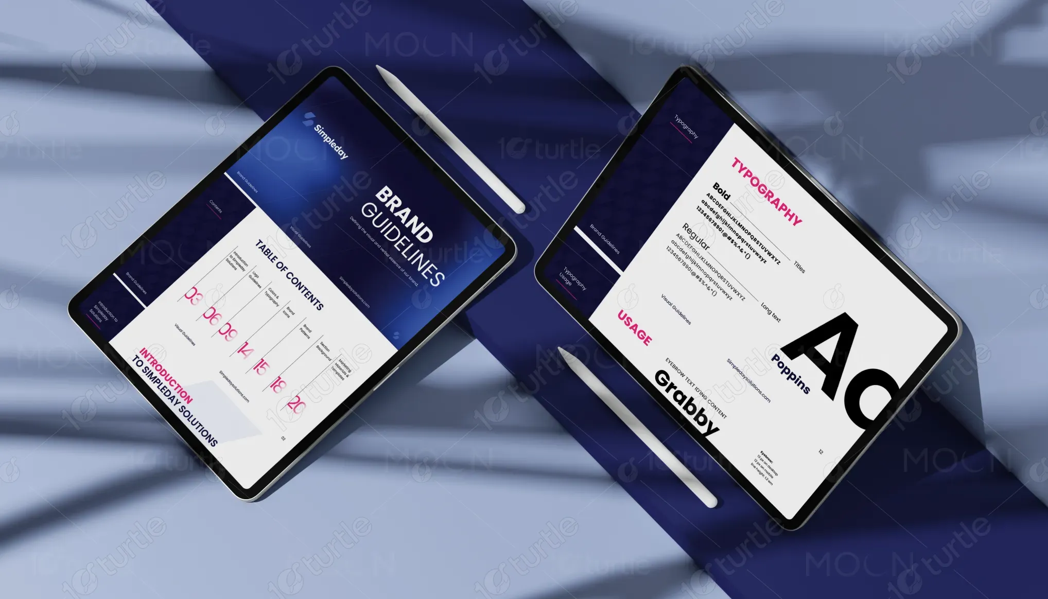
This brand guideline design represents the visual identity system for the brand Simpleday and serves as a comprehensive reference for maintaining consistency across all brand communications. The document outlines essential elements such as logo structure, typography usage, color applications, and visual principles that define the brand’s identity. Its primary purpose is to ensure that anyone working with the brand—from designers to marketing teams—can implement the visual language correctly and consistently across digital platforms, marketing materials, presentations, and product experiences. By presenting these elements in a structured and visually engaging format, the guide supports both strategic brand communication and practical application.

Industry
Technology, SaaS & StartupsWhat we did
Brand Guide DesignGraphic DesignPlatform
-Many brands struggle with inconsistent visual communication due to the absence of clear design standards or accessible documentation. Without defined guidelines, logos may be misused, colors applied inconsistently, and messaging presented without a cohesive visual identity, which weakens brand recognition and reduces audience trust. This lack of clarity can also create inefficiencies for design and marketing teams who need to interpret or recreate brand elements repeatedly. For a growing brand like Simpleday, maintaining visual consistency across multiple touchpoints becomes essential to ensure credibility, recognition, and a professional brand presence.
The brand guideline design solves these challenges by organizing all essential brand elements into a structured and visually intuitive system that clearly explains how each component should be used. A modular layout separates sections such as introduction, mission and vision, logo usage, and visual elements, allowing readers to navigate the document easily. Consistent typography, well-defined spacing, and clear visual examples demonstrate correct applications of the logo and brand assets, reducing ambiguity and improving usability. The design prioritizes readability and accessibility while remaining scalable for future updates, ensuring that the brand system can be implemented efficiently across various teams and platforms.

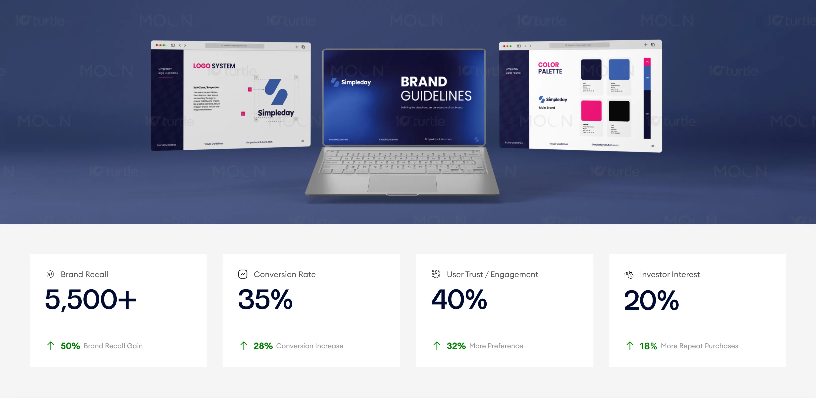
The sleek, structured layout and consistent design elements ensure a seamless understanding of the Simpleday brand system. This clarity not only enhances brand recall and trust but also boosts client conversions and investor interest, as the visual presentation communicates professionalism and transparency. The layout is optimized for both instructional and visual appeal, leading to stronger brand affinity and business growth.
The long-term vision behind the Simpleday brand guideline is to establish a strong and adaptable visual identity that can evolve with the brand while maintaining a recognizable and cohesive presence. By defining a clear design system early, the brand positions itself for growth across digital products, marketing campaigns, partnerships, and new service offerings. The guideline serves as a foundation that ensures all future visual communications align with the brand’s values of simplicity, clarity, and reliability, helping Simpleday build a lasting connection with its audience and strengthen its position within its industry.
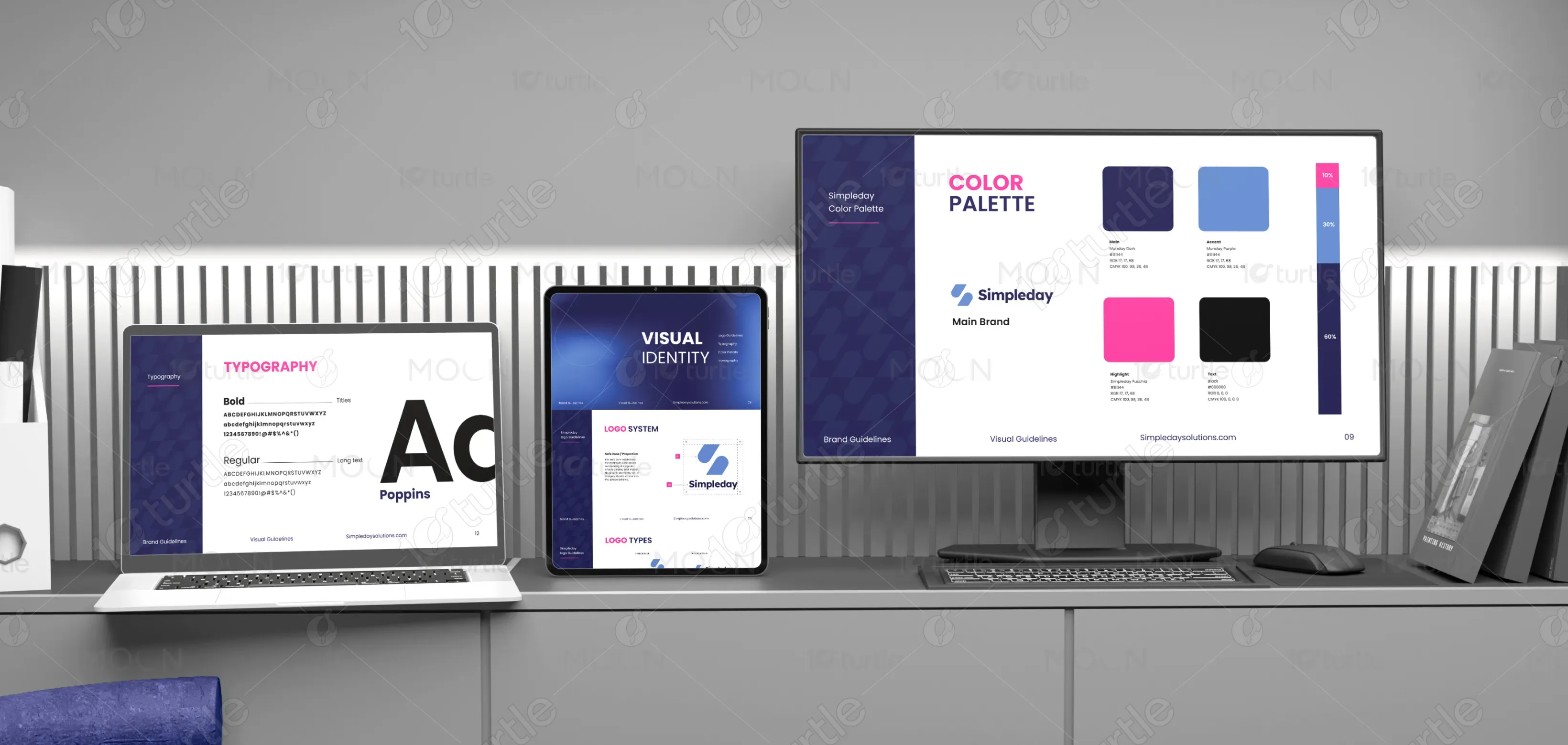
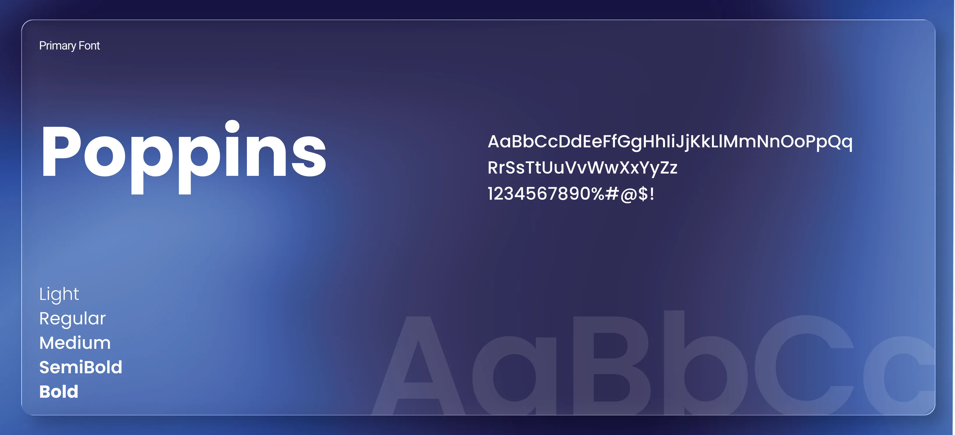
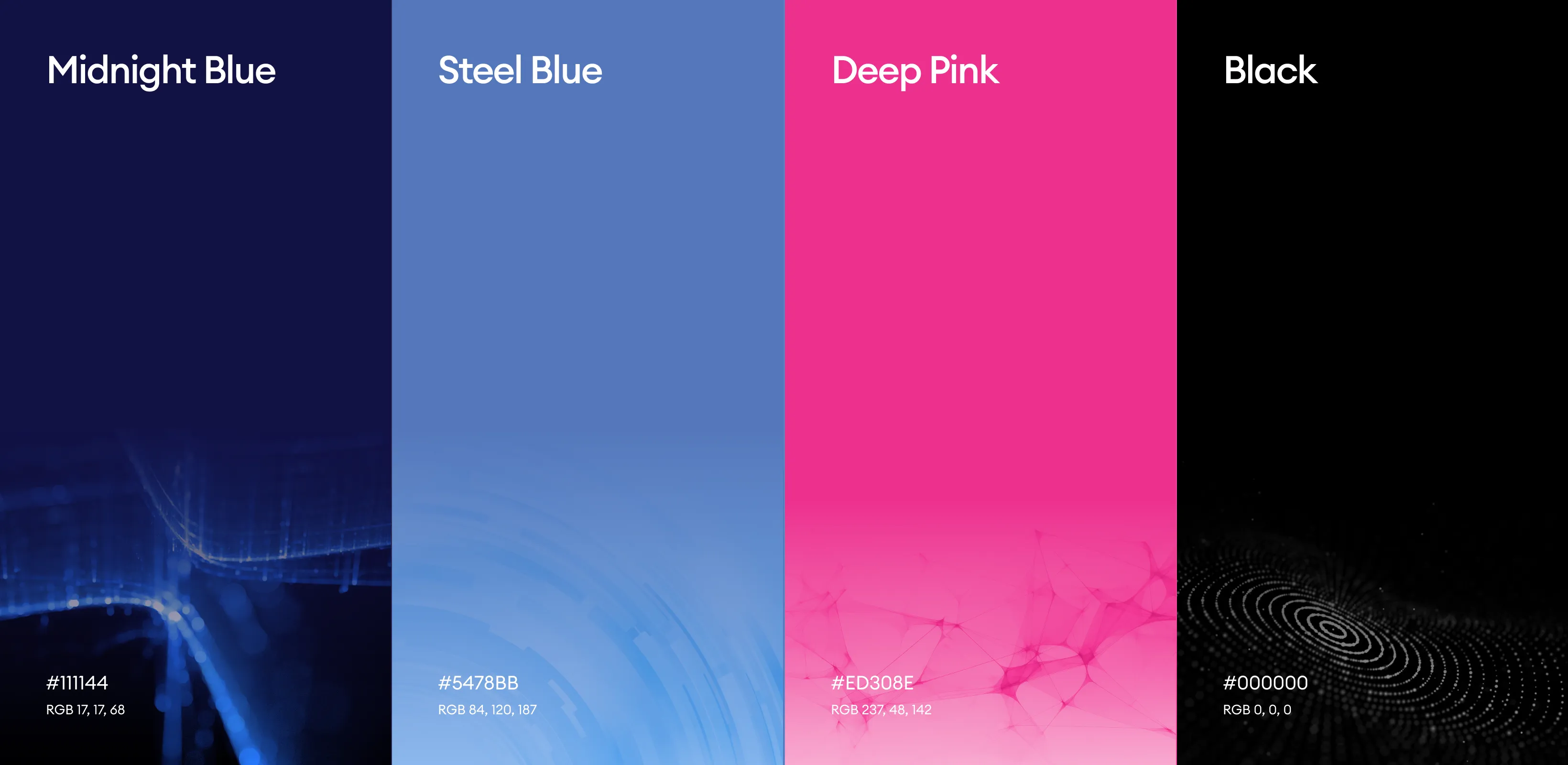
The color palette is built around deep blue tones paired with clean white surfaces and subtle accent colors, creating a visual identity that feels modern, professional, and approachable. The blue establishes trust, stability, and technological confidence, while white space enhances readability and keeps the layout clean and uncluttered. Supporting visual elements such as geometric icons, structured layouts, and minimal graphic patterns reinforce the brand’s emphasis on simplicity and clarity. Together, these elements create a cohesive visual language that remains recognizable across presentations, digital products, and marketing materials while maintaining a refined and contemporary aesthetic.