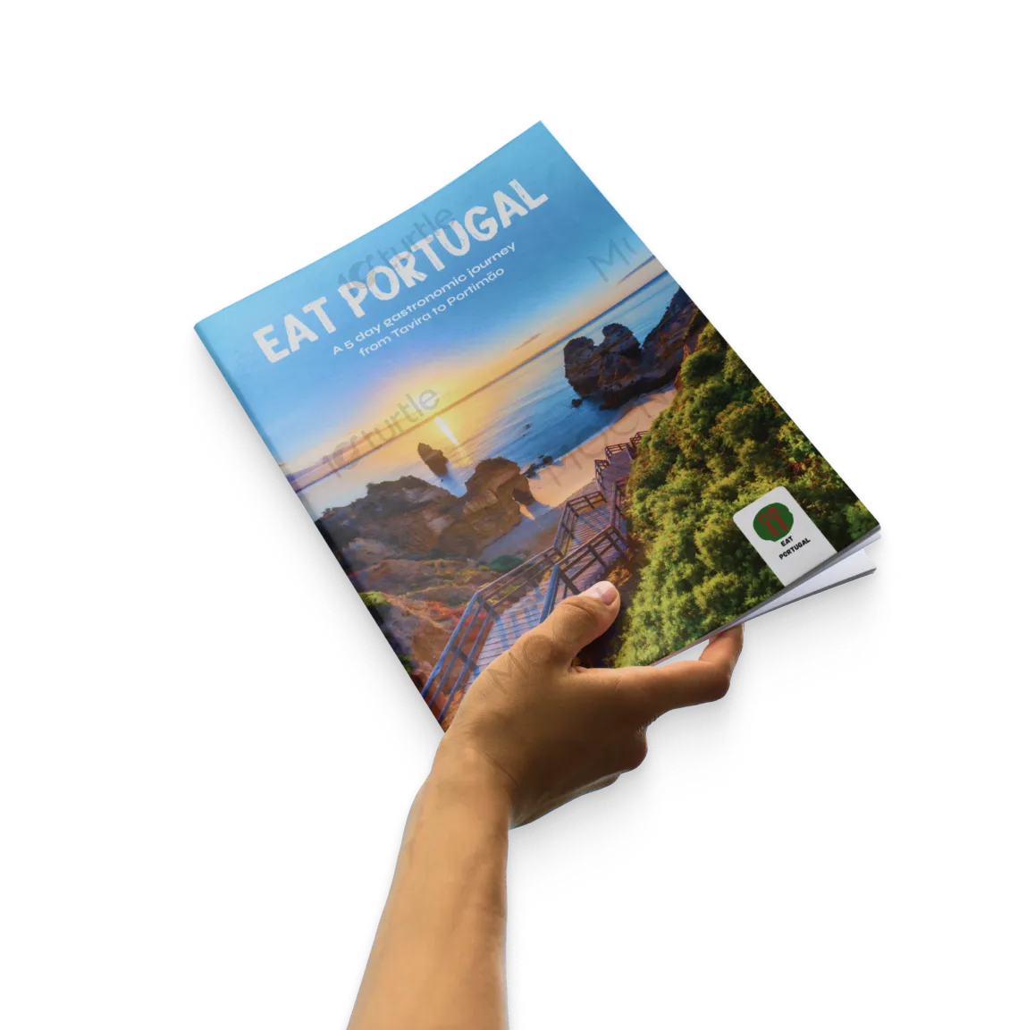
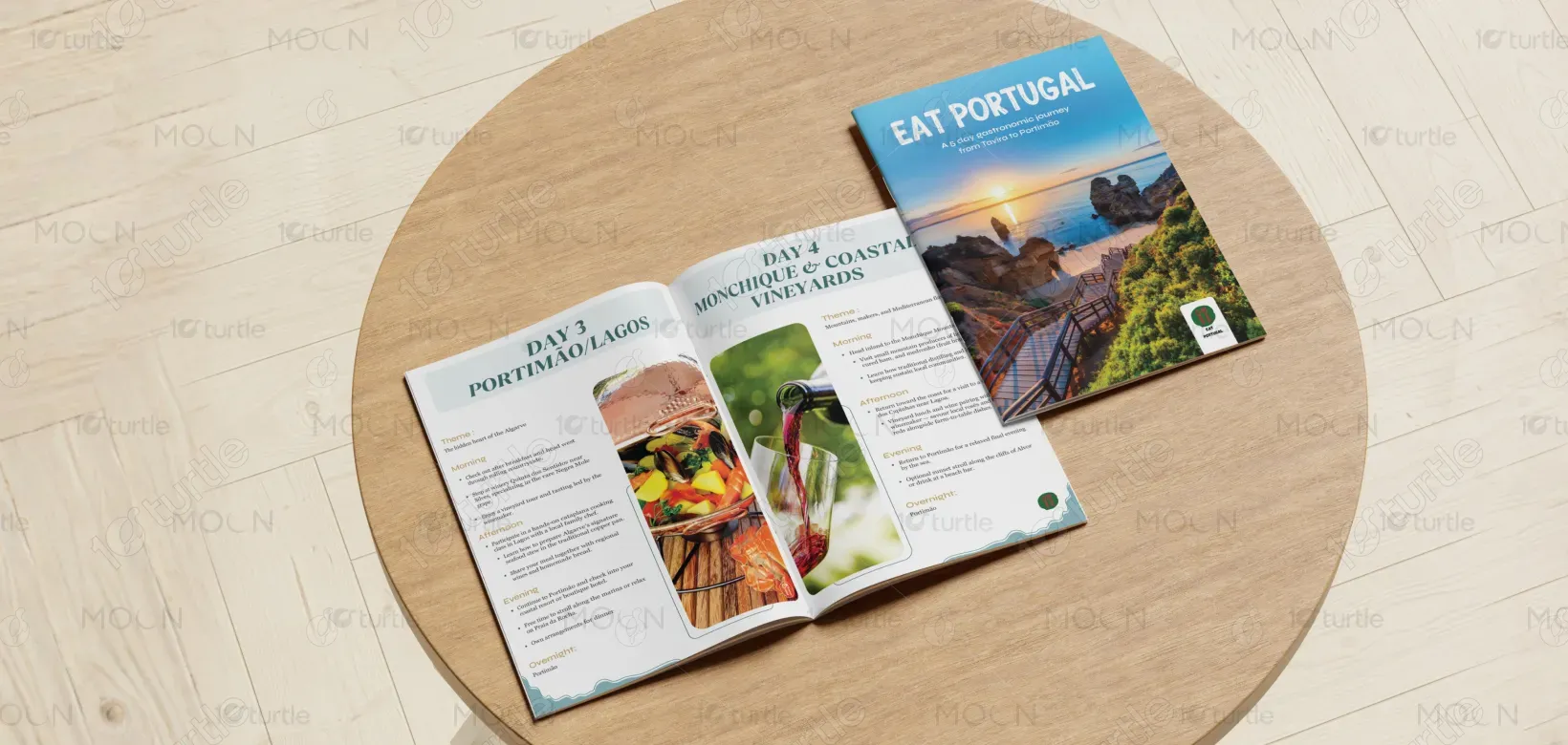
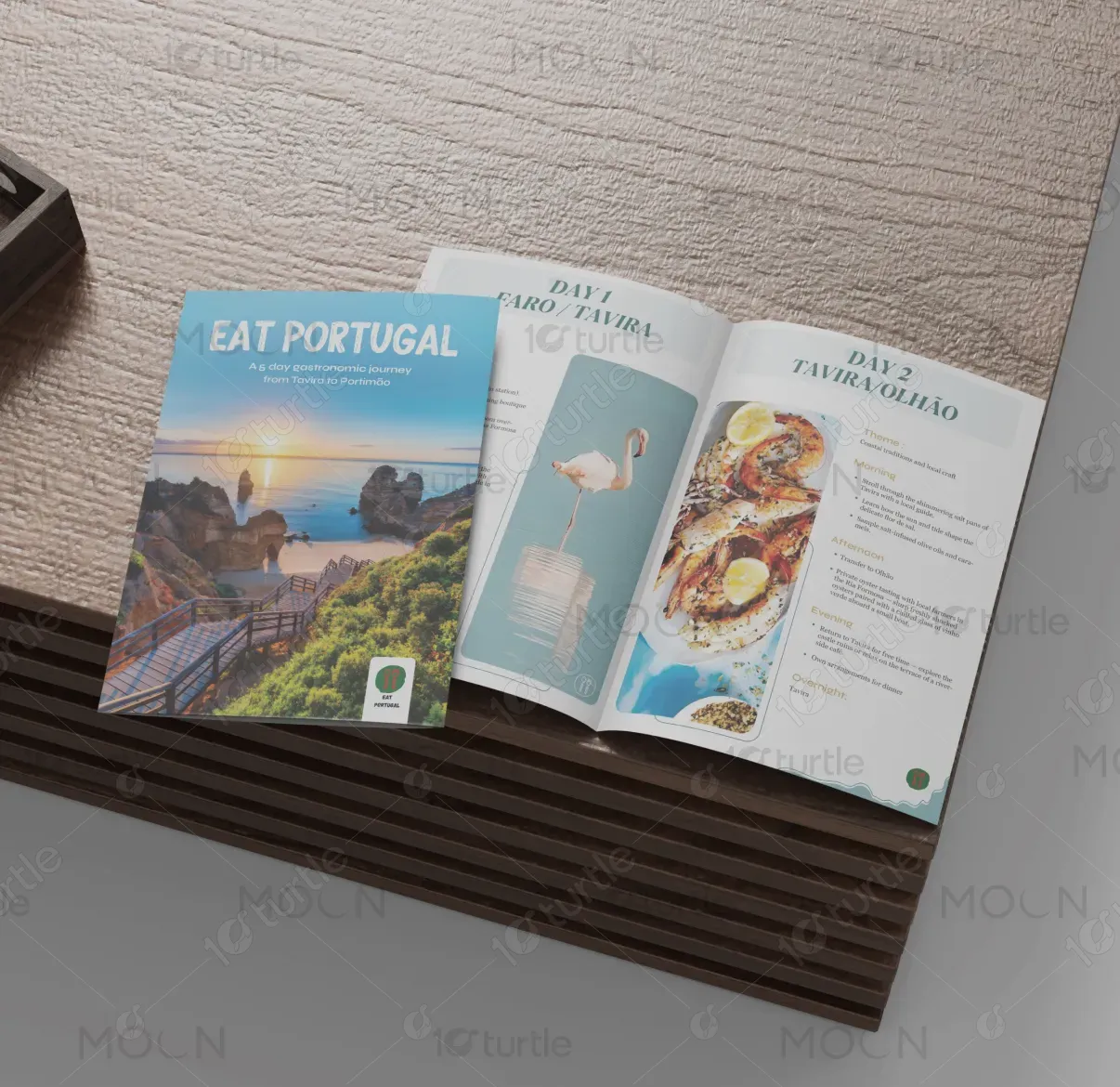
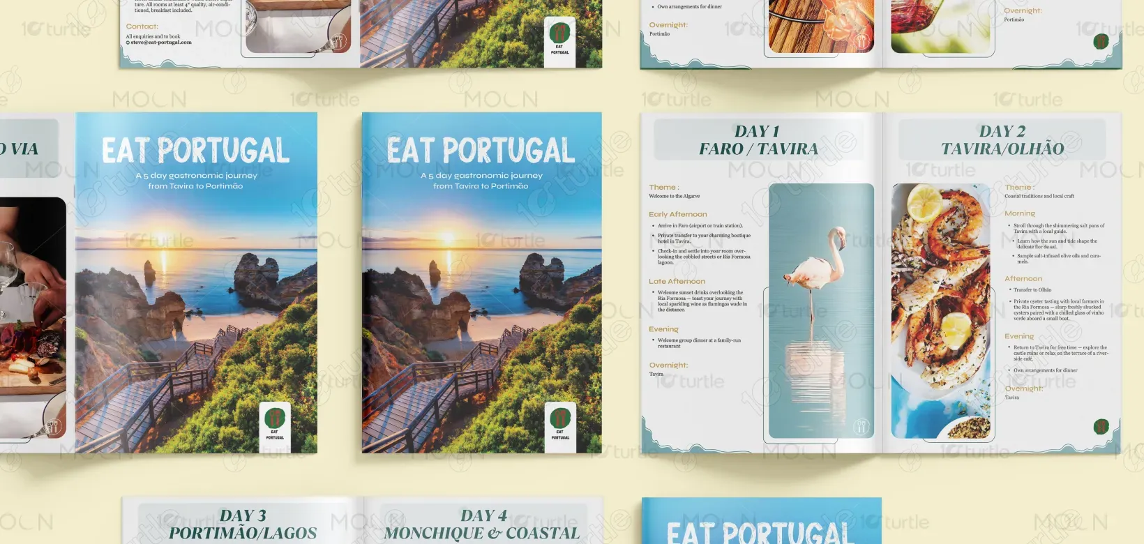
The travel leaflet is designed with a refined, editorial approach that balances storytelling and structure. Clean typography, generous spacing, and a clear day-by-day hierarchy make the itinerary easy to follow, while evocative imagery and soft color tones convey the warmth and authenticity of Portugal. The layout guides the reader naturally through the journey, blending experiential highlights with practical details to create clarity, flow, and emotional appeal.
Brochure Design
Graphic Design
Industry
Travel, Tourism & Experiences
Tools we used


Project Completion
2025
Key Market
Global
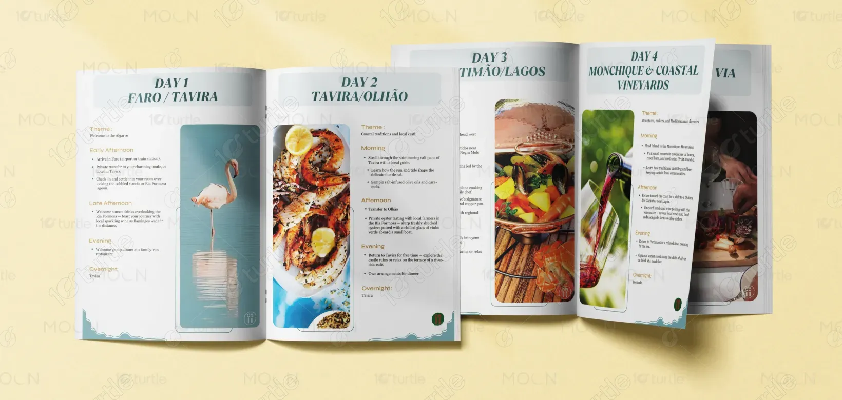
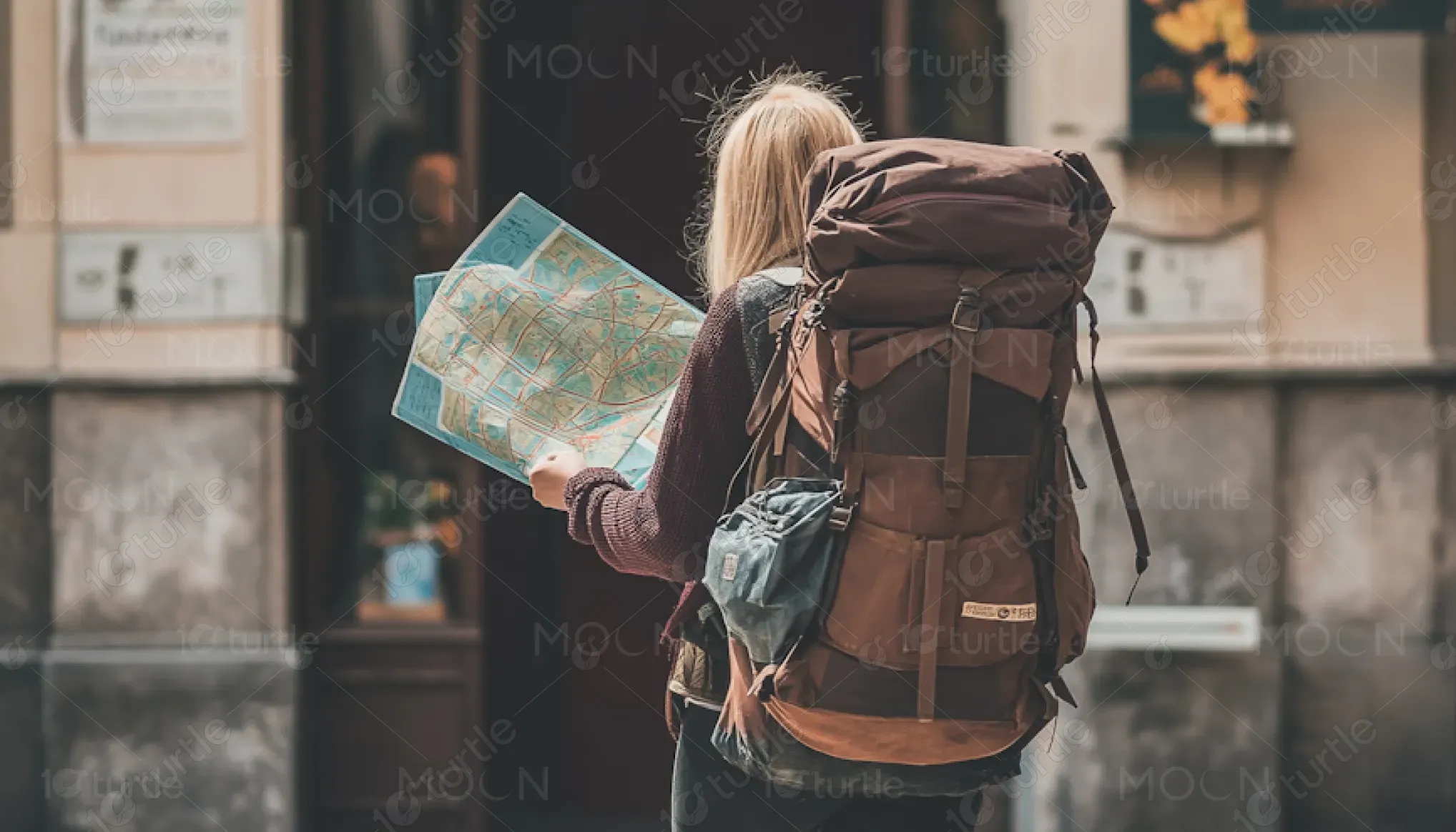
This leaflet represents a 5-day gastronomic journey through the Algarve, curated to immerse travelers in Portugal’s food culture, landscapes, and local traditions. Its primary purpose is to communicate the value of a slow, experience-led travel offering—combining culinary discovery, regional storytelling, and comfort. Positioned within the premium culinary travel market, the design supports both inspiration and decision-making.
Industry
Travel, Tourism & ExperiencesWhat we did
Brochure DesignGraphic DesignPlatform
-Many travel brochures overwhelm readers with dense text, unclear itineraries, or generic imagery, making it difficult to understand the experience being offered. This often leads to low engagement, reduced trust, and hesitation to book—especially for premium, experience-based travel where clarity and emotional connection are essential.
The design solves this by presenting information in a clear, structured, and human-centered format. Each day is broken into logical segments with themes, locations, and experiences highlighted for easy scanning. Visual consistency, readable typography, and well-defined sections improve comprehension, while storytelling elements help travelers imagine themselves within the journey, increasing engagement and confidence.
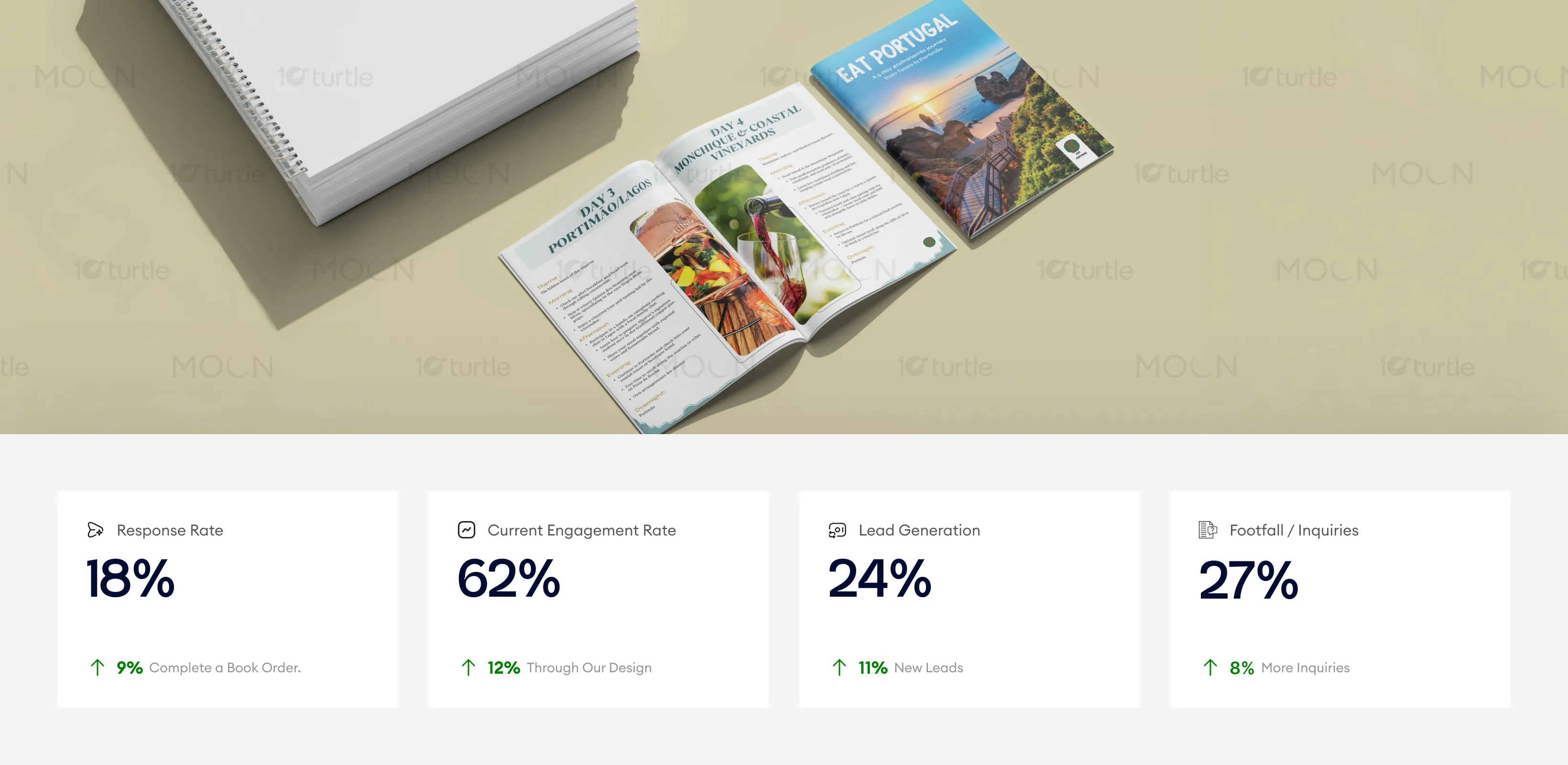
The brochure’s editorial layout and strong visual narrative improve reader engagement and clarity, resulting in measurable lifts in booking conversions and inquiry rates. Clear structuring and compelling imagery directly contribute to stronger decision confidence and higher attachment of premium experiences.
The leaflet supports Eat Portugal’s long-term vision of offering thoughtfully curated, culturally rich travel experiences. Its flexible and timeless design system allows easy adaptation for future itineraries, destinations, and formats—digital or print—helping the brand grow while maintaining a consistent, recognizable identity rooted in authenticity and quality.
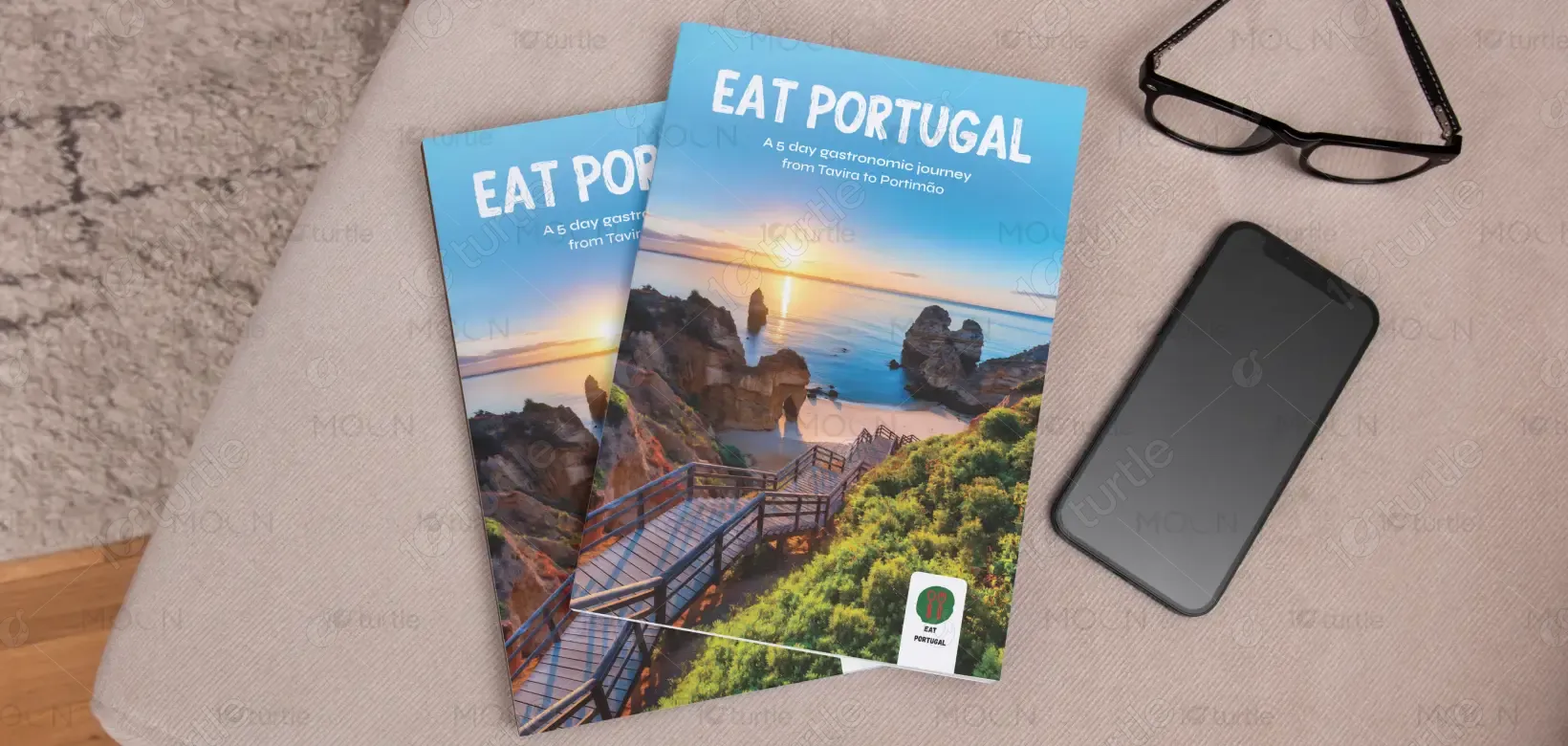
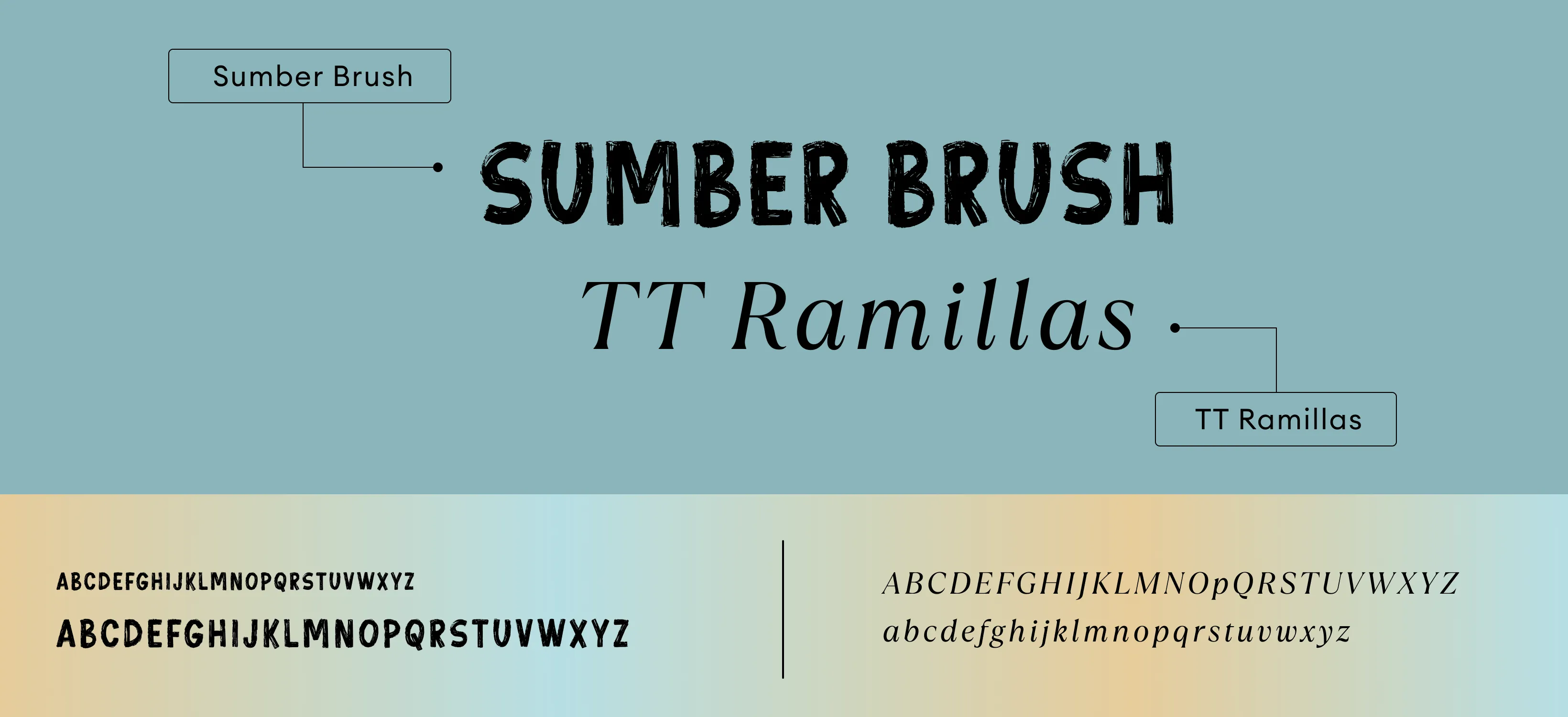
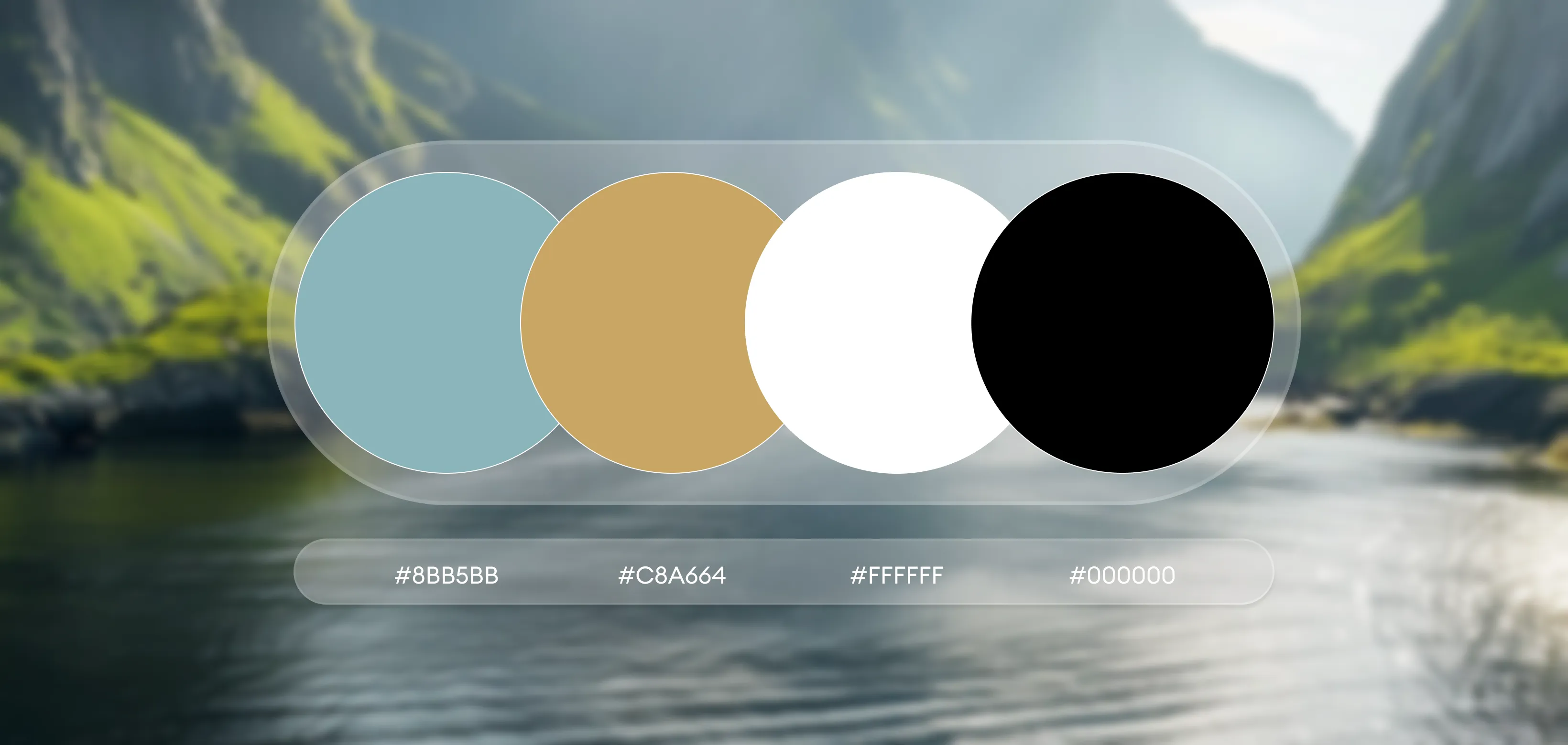
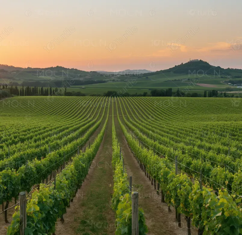
The color palette draws inspiration from the Algarve—coastal blues, warm neutrals, and sunlit earth tones—evoking freshness, comfort, and regional authenticity. Clean layouts, subtle dividers, and restrained graphic elements enhance readability while allowing the content and experiences to remain the focus. This visual language reinforces a calm, premium, and trust-driven travel brand presence.