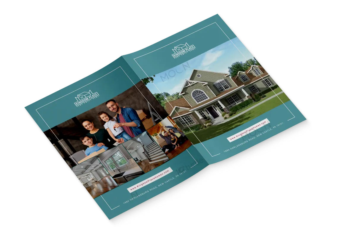
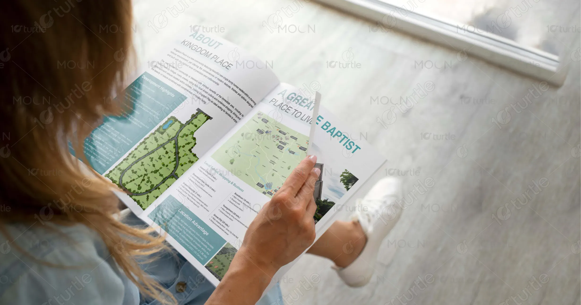
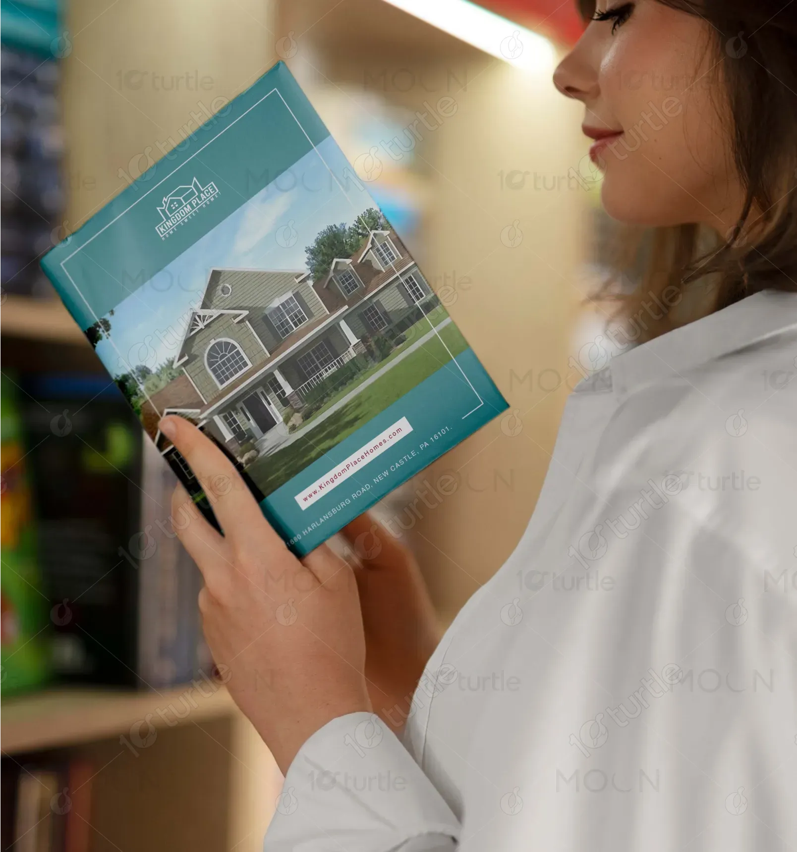
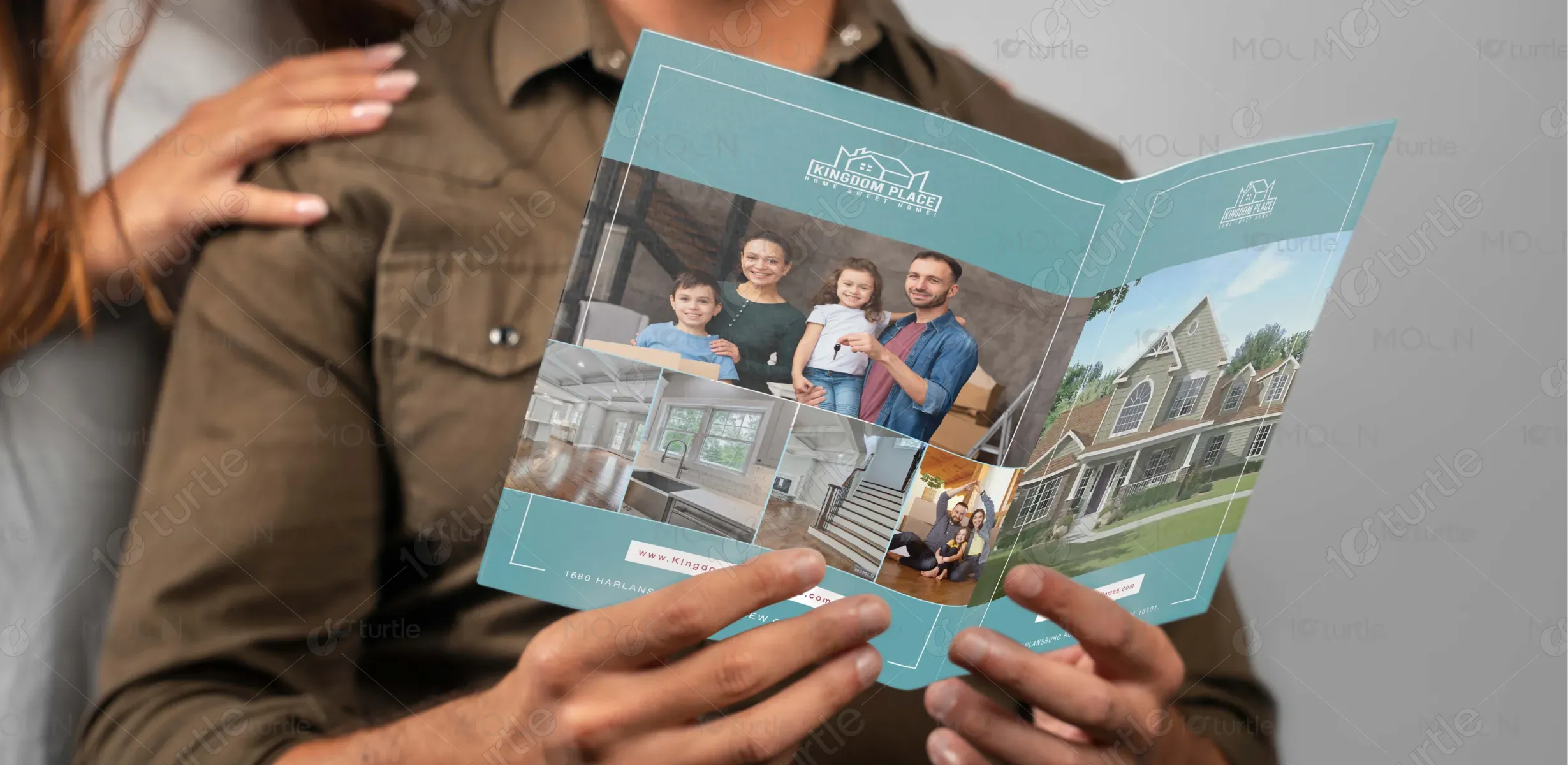
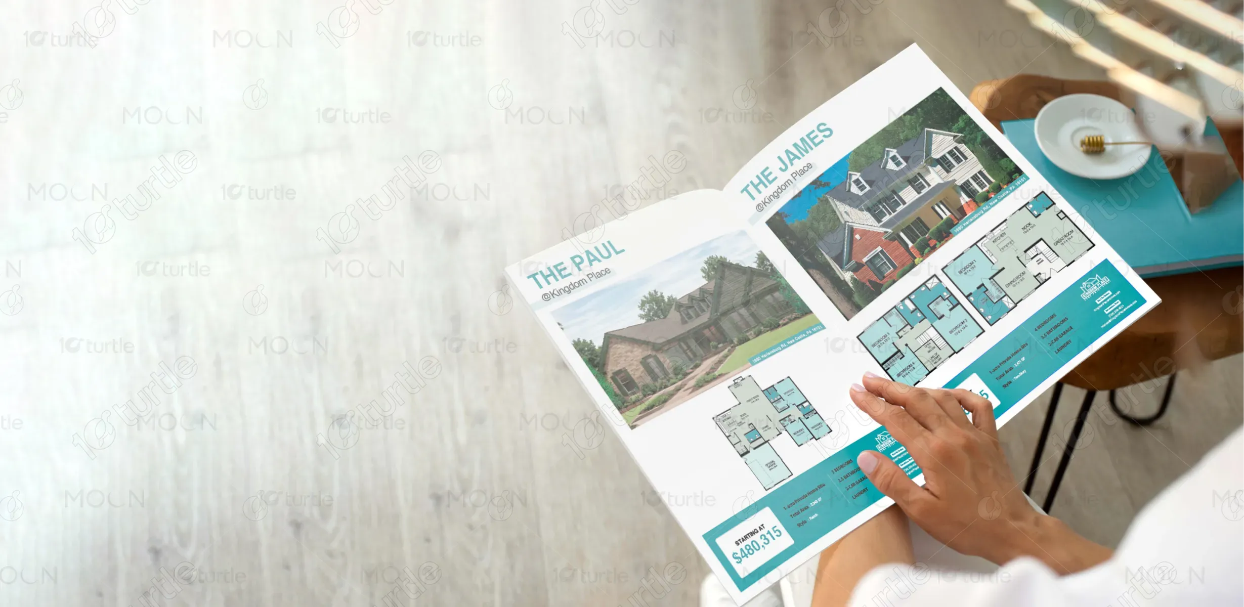
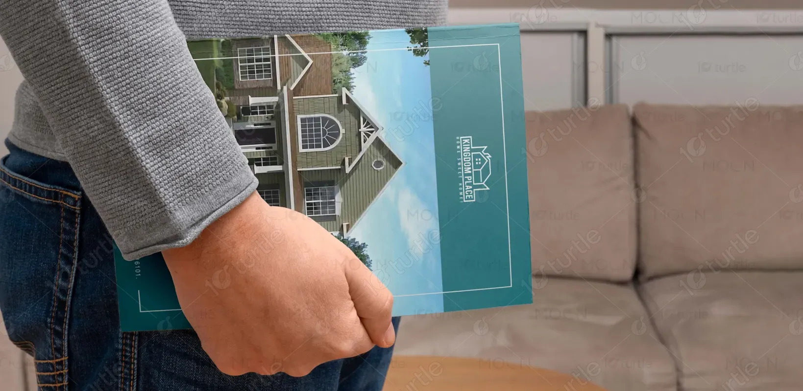
The Kingdom Place Homes brochure employs a clean, modern design that highlights clarity, space, and professionalism. The turquoise and white color palette evokes trust and freshness, while large, high-resolution images offer visual immersion. Layouts are thoughtfully organized to balance visuals and content, making key information easy to navigate. Typography is crisp and legible, and the use of maps and floor plans enhances user engagement. Overall, the aesthetic aligns with a premium, trustworthy real estate experience aimed at family-focused buyers.
Brochure Design
Graphic Design
Industry
Property, Construction & Real Estate
Tools we used


Project Completion
2025
Key Market
Global
This brochure promotes Kingdom Place, a residential community offering custom-designed homes in a peaceful, family-friendly setting. Each home design is tailored to modern lifestyles, with spacious layouts and high-end finishes. The brochure showcases home models, pricing, location advantages, and development highlights. It’s crafted for prospective homeowners who value smart investment, comfort, and long-term living. Its appeal lies in clear presentation, elegant design, and user-focused content, setting it apart in the competitive real estate marketing space.

Industry
Property, Construction & Real EstateWhat we did
Brochure DesignGraphic DesignPlatform
-Home buyers often struggle with overwhelming brochures that are cluttered, unclear, or overly technical. Many real estate materials fail to communicate the lifestyle benefits, focusing only on specs without telling a compelling story. Additionally, buyers want transparency—easy-to-understand layouts, honest pricing, and community insights—yet these are often buried or missing in traditional brochures. This disconnect leads to buyer confusion, mistrust, and lost leads, especially in competitive markets where clarity can make or break a sale.
The Kingdom Place brochure solves this with an intuitive, lifestyle-driven design. It offers a clean visual journey, starting with aspirational home imagery, followed by logical content flow: about the community, development map, nearby amenities, and detailed home plans with pricing. Clear sectioning, infographic-style maps, and visual hierarchy ensure easy comprehension. The brochure speaks directly to the buyer's needs—space, transparency, and trust—making it both a marketing tool and a buyer guide that builds confidence and clarity.
The long-term vision of Kingdom Place Homes is to become a benchmark for modern, sustainable living communities across suburban America. The brand aims to consistently deliver not just homes, but thriving neighborhoods rooted in family values, security, and lifestyle enrichment. Through thoughtful design, innovation, and a transparent sales approach, Kingdom Place seeks to inspire trust, attract long-term residents, and grow its footprint—ultimately becoming synonymous with quality living and generational value.
The color palette for Kingdom Place Homes combines turquoise blue and white for a fresh, trustworthy, and clean aesthetic. Charcoal grey ensures clear readability, while muted teal and cool light grey provide subtle sectioning and balance. Accent colors like fresh green highlight eco-friendly features, and sky blue adds a sense of openness and community. Together, these colors create a modern, welcoming, and easy-to-navigate brochure that reflects the brand’s values and lifestyle appeal.