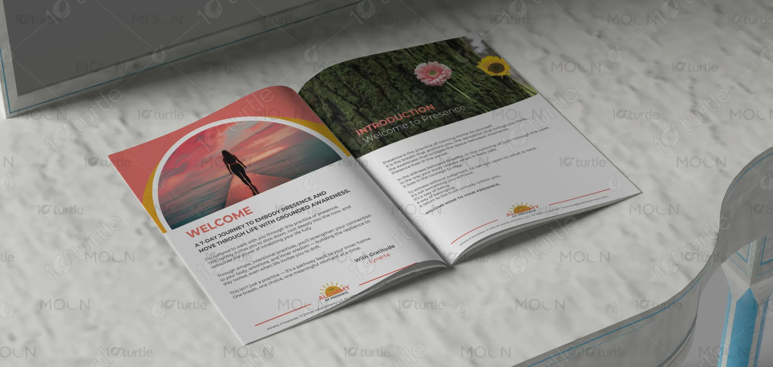
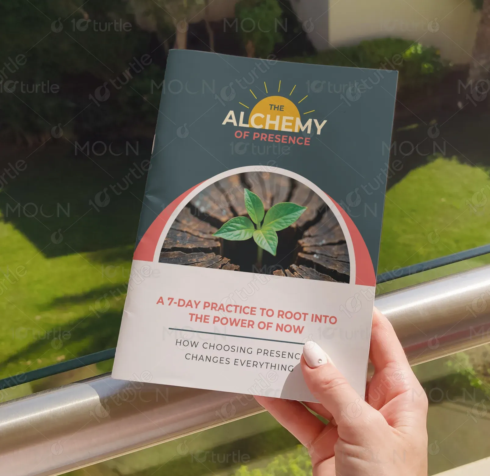
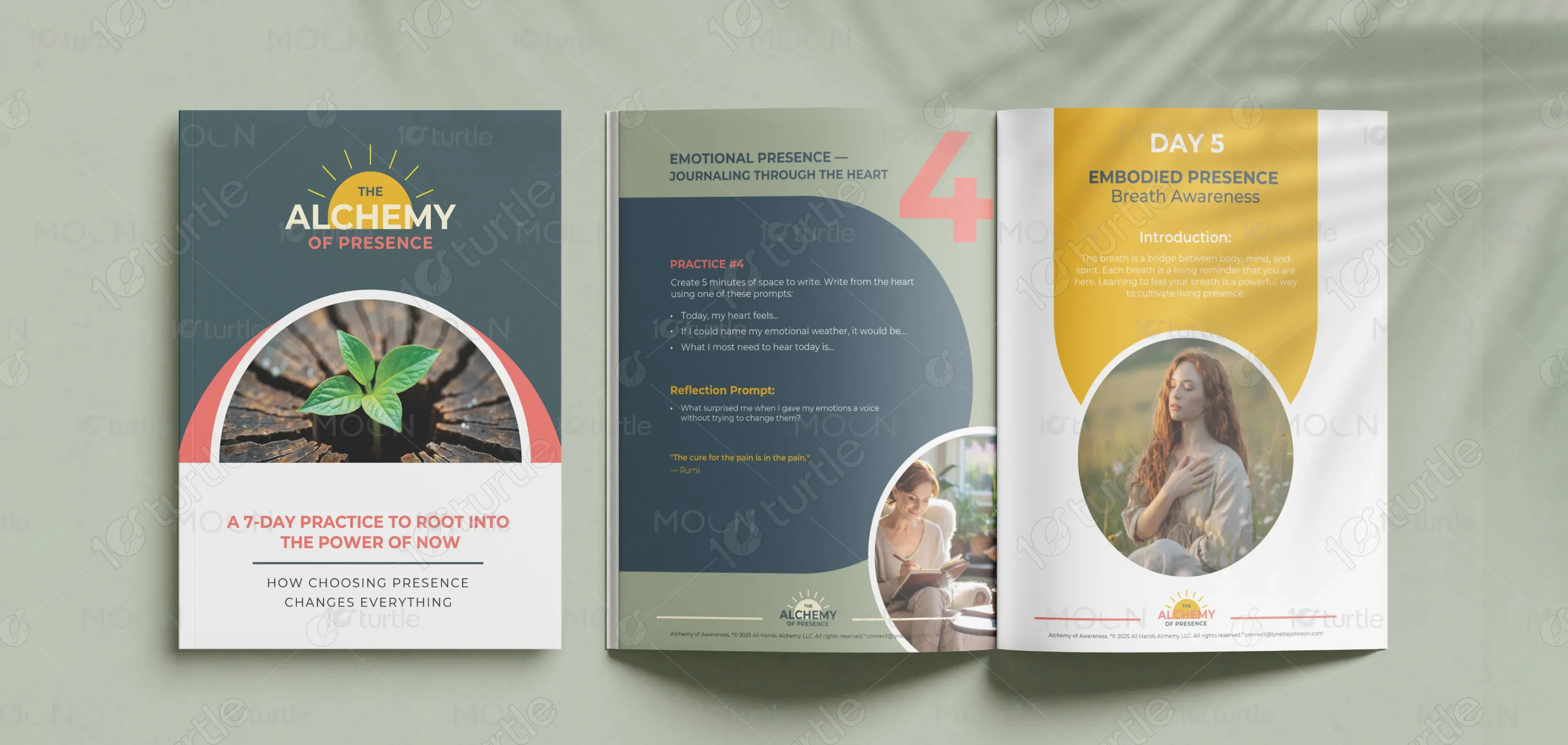
The design of The Alchemy of Presence combines vibrant, grounding colors and organic textures to evoke a sense of harmony, presence, and connection. The circular motifs symbolize unity and completeness, while the use of natural imagery, such as plants and landscapes, enhances the theme of growth and transformation. The typography is clean and modern, offering a balance between clarity and elegance. The overall creative direction focuses on creating an inviting, serene, and empowering experience for the user.
Brochure Design
Graphic Design
Industry
Healthcare & Wellness
Tools we used


Project Completion
2025
Key Market
Global
The Alchemy of Presence is a 7-day practice designed to guide individuals in reconnecting with the present moment. This program encourages mindfulness through simple, daily exercises focused on sensory awareness, emotional balance, and embodied presence. The product is geared towards individuals looking for a way to live more consciously and grounded in their daily lives. With its transformative approach and easy-to-follow framework, it stands out in the wellness and personal growth market, offering an effective yet accessible practice for anyone seeking to live in the moment.

Industry
Healthcare & WellnessWhat we did
Brochure DesignGraphic DesignPlatform
-Many personal growth programs today fail to address the fundamental issue of true mindfulness—living in the present. While numerous resources exist on meditation or mindfulness techniques, they often focus on abstract concepts rather than providing a tangible, practical, daily guide to incorporate these teachings into life. As a result, users may struggle with consistency or feel disconnected from the practice, unable to fully engage with the core principles of being present.
The Alchemy of Presence solves this problem by offering a structured 7-day program that combines practical, sensory-based exercises with emotional and embodied awareness practices. The easy-to-follow format ensures that users remain engaged and grounded, while the integration of nature-inspired imagery and mindful language creates a holistic, immersive experience. By focusing on daily, actionable steps, this product empowers users to cultivate presence and mindfulness in a way that feels natural, grounded, and sustainable.

The vision for The Alchemy of Presence is to create a transformative tool that helps individuals reconnect with themselves and the present moment. In the long-term, the brand seeks to become a trusted resource in the wellness and mindfulness industry, offering a variety of tools and programs that support personal growth and well-being. The goal is to inspire lasting positive change, allowing users to feel more fulfilled and connected in their everyday lives, and to create a lasting impact on mindfulness practices across the globe.

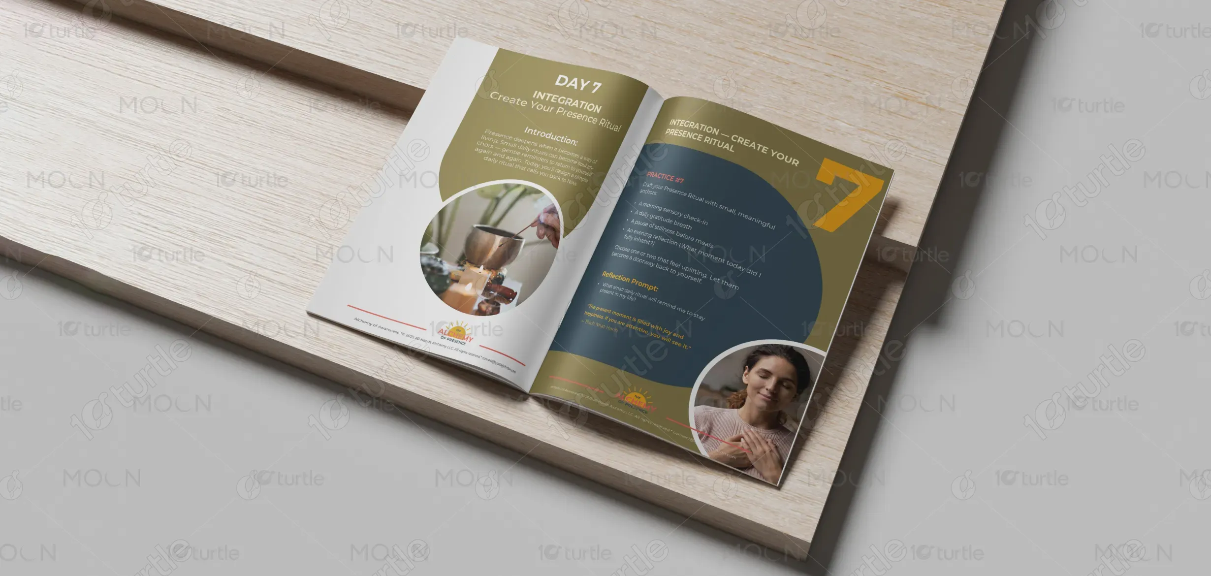
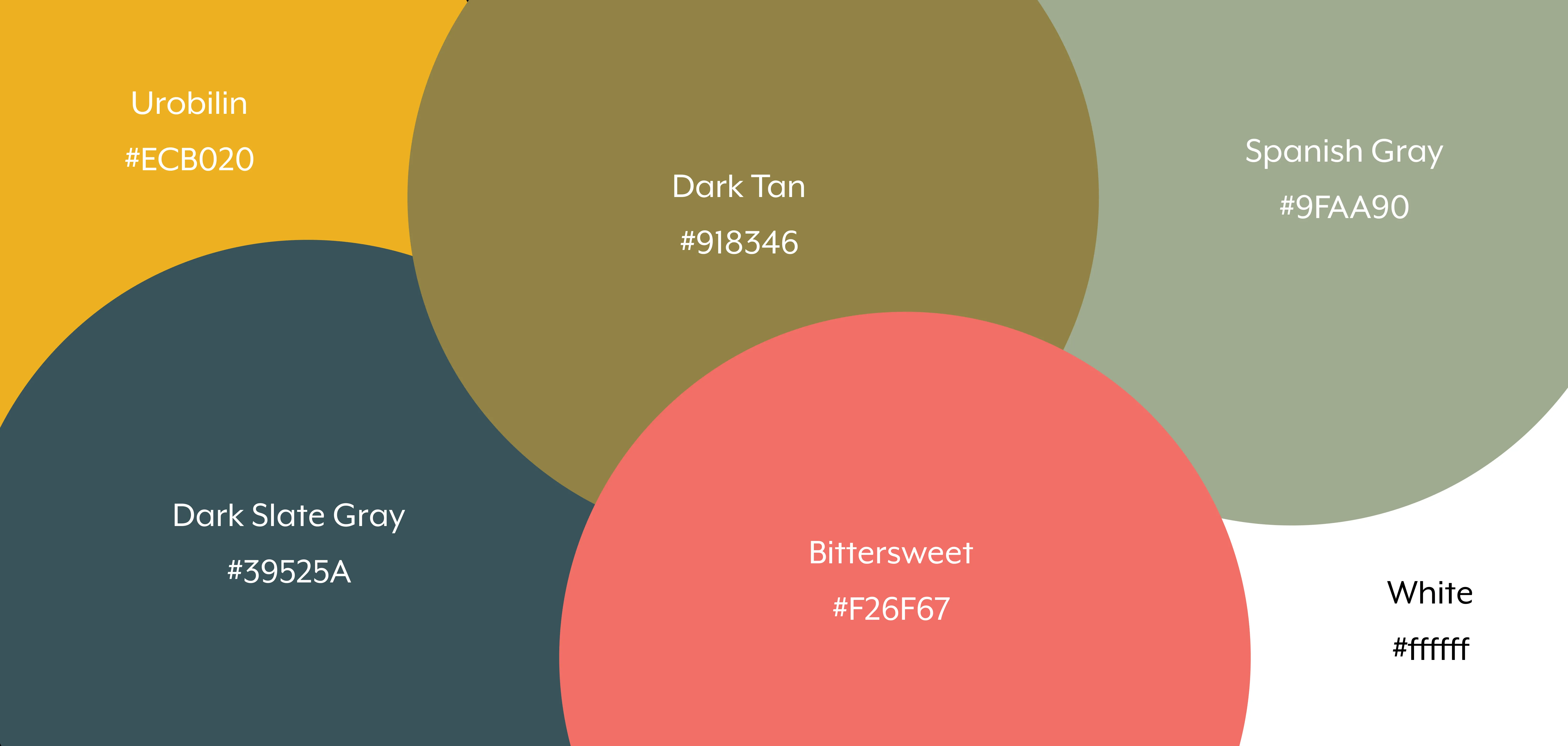
The color palette blends earthy tones of deep greens, warm oranges, and soothing neutrals to evoke feelings of tranquility, renewal, and vitality. The soft, yet vibrant hues represent growth and transformation, while the warm, earthy tones are meant to ground the user in the present moment. The subtle use of gold accents symbolizes illumination and clarity, reinforcing the theme of awakening and enlightenment that the program aims to achieve. These colors align with the brand’s commitment to mindfulness, nature, and personal evolution.