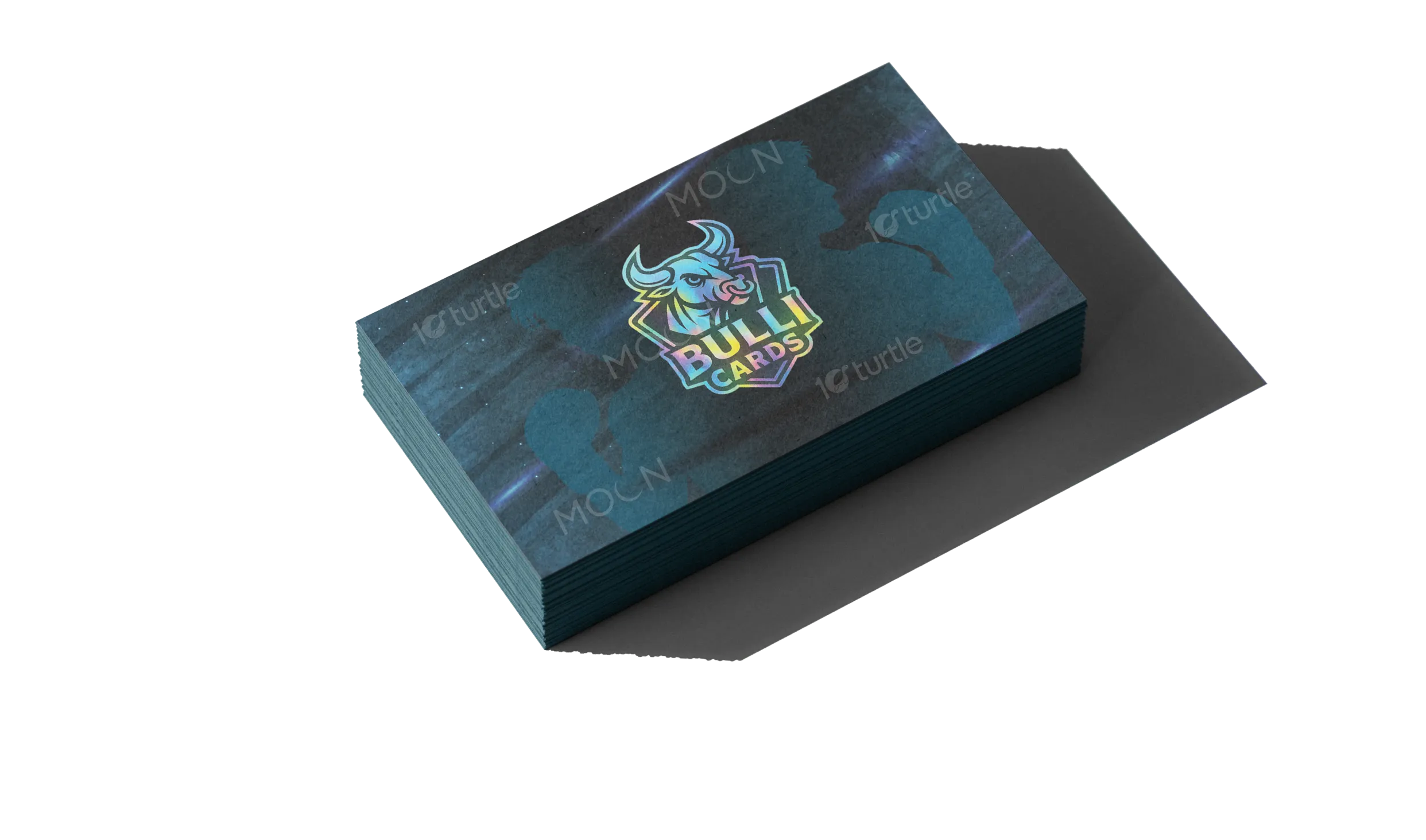
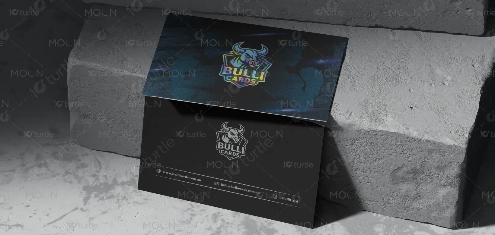
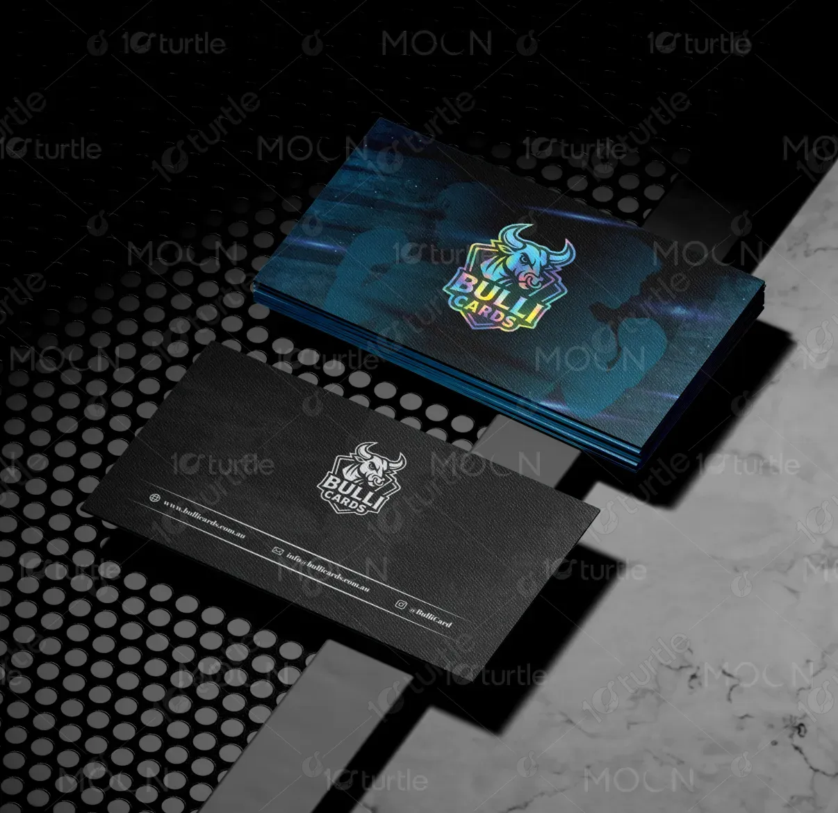
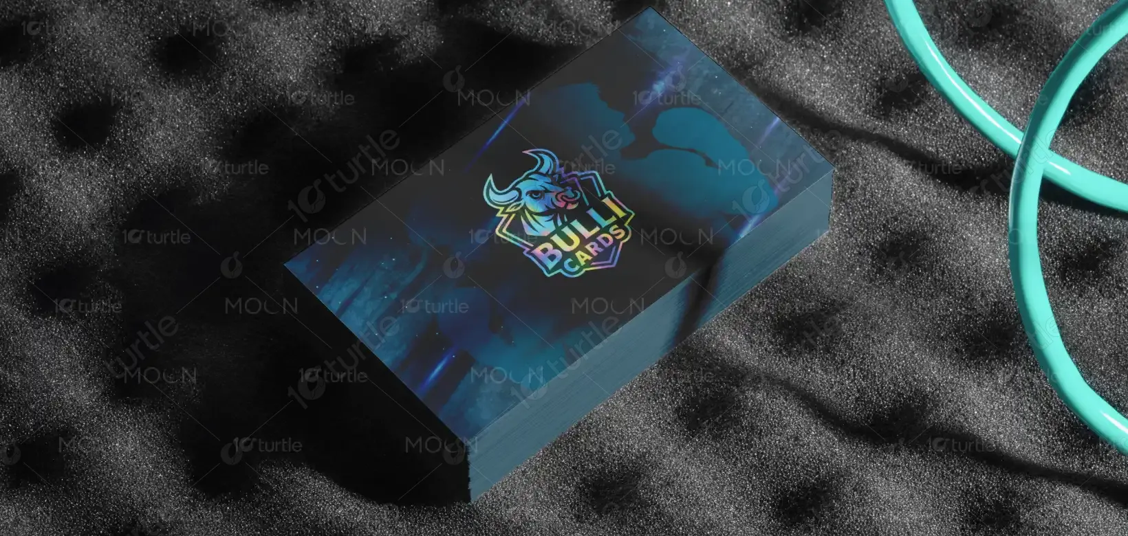
The business card design focuses on delivering a modern, minimalistic aesthetic that balances professionalism with creativity. Clean typography, well-structured spacing, and a strategic color palette ensure clarity and visual impact. The overall direction emphasizes functionality while maintaining brand elegance, ensuring the card leaves a lasting impression. With sharp alignment and subtle design elements, the card avoids clutter, highlighting only essential information.
Business Card Design
Graphic Design
Industry
Arts, Culture & Entertainment
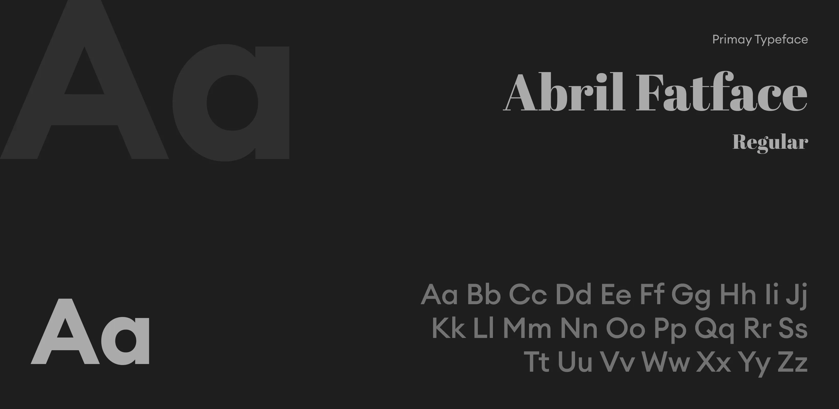
Tools we used


Project Completion
2025
Key Market
Global
This business card design is more than just a contact tool—it is a tangible representation of the brand’s essence. It communicates professionalism, credibility, and attention to detail, while making it easy for clients to recall and connect. Its uniqueness lies in its refined layout, balanced typography, and color harmony, which together create a distinct identity in a competitive market. Compact yet powerful, the card strengthens brand presence and adds value to every interaction.

Industry
Arts, Culture & EntertainmentWhat we did
Business Card DesignGraphic DesignPlatform
-Traditional business cards often fail to stand out due to cluttered layouts, inconsistent typography, or outdated aesthetics. Many cards lack a clear hierarchy, making it difficult for recipients to quickly identify key details. In competitive industries, a forgettable card can result in missed opportunities, as clients are overwhelmed with similar-looking designs. The challenge lies in creating a card that is not only functional but also distinctive enough to leave a professional and memorable impression.
This design resolves the issue by using a minimalist, brand-focused approach. Key information is highlighted with strong typography and logical placement, ensuring immediate readability. The use of negative space eliminates clutter, allowing the brand to breathe visually. A refined color scheme enhances brand recall while maintaining sophistication. By blending modern aesthetics with practical functionality, the card becomes both a networking tool and a subtle statement of professionalism, setting the brand apart in a crowded marketplace.
The long-term vision for this design is to establish the brand as a symbol of professionalism, trust, and innovation. As the brand grows, the business card becomes part of a cohesive identity system, aligning with other brand assets such as brochures, websites, and packaging. The goal is to create a lasting impression that elevates client relationships, reinforces brand credibility, and positions the brand as a forward-thinking leader in its field.
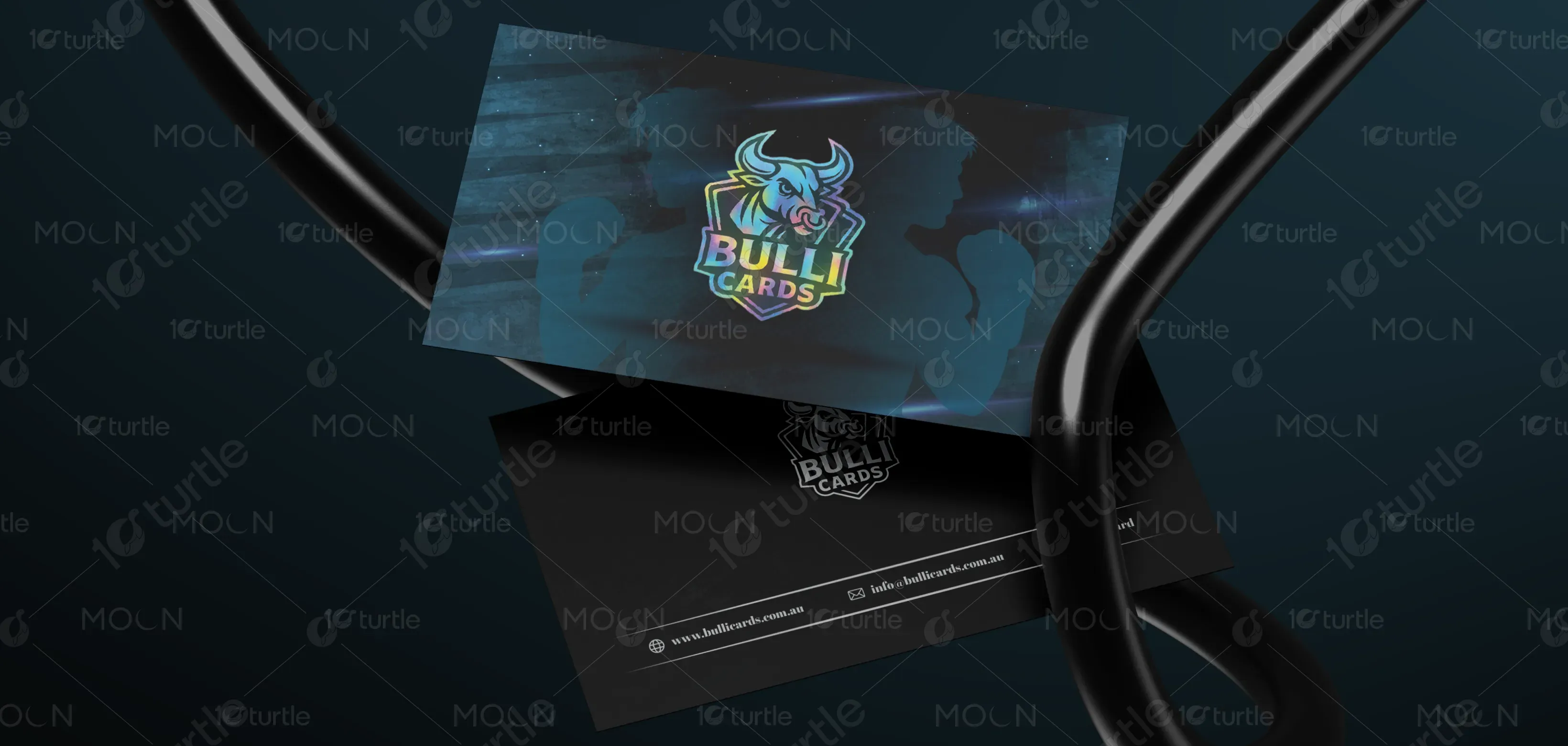
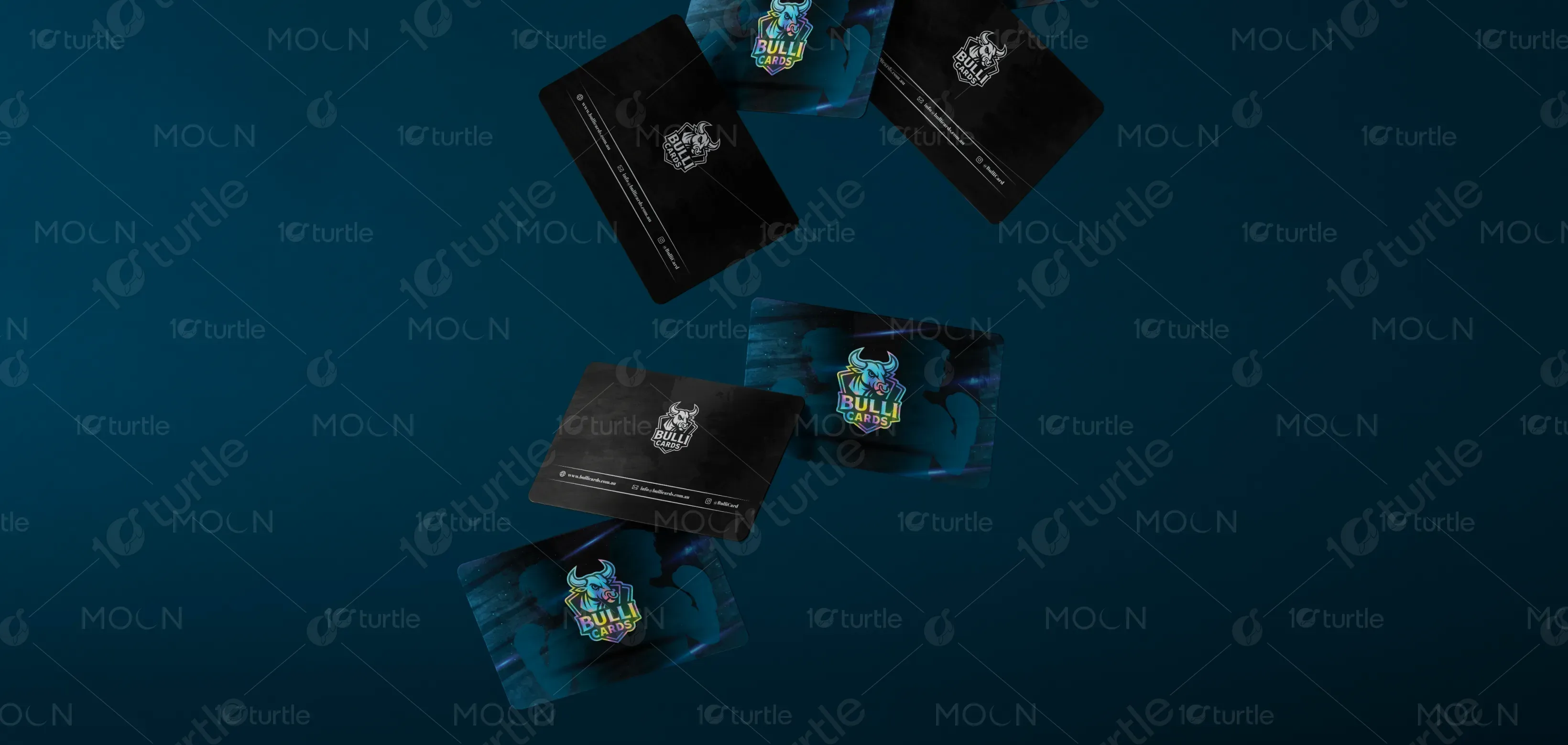
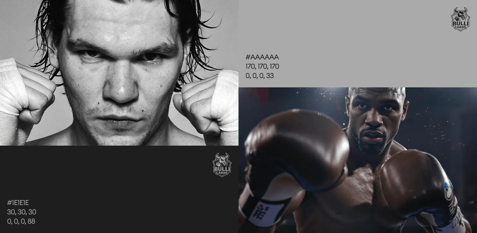
The chosen color palette combines professionalism with subtle vibrancy. Neutral tones like white and black provide clarity and balance, while accent hues add personality and highlight brand distinctiveness. These colors evoke trust, modernity, and sophistication, ensuring the design appeals to both corporate and creative audiences. By aligning with the brand’s identity, the palette not only enhances visual impact but also reinforces emotional resonance, making the card both functional and memorable.