
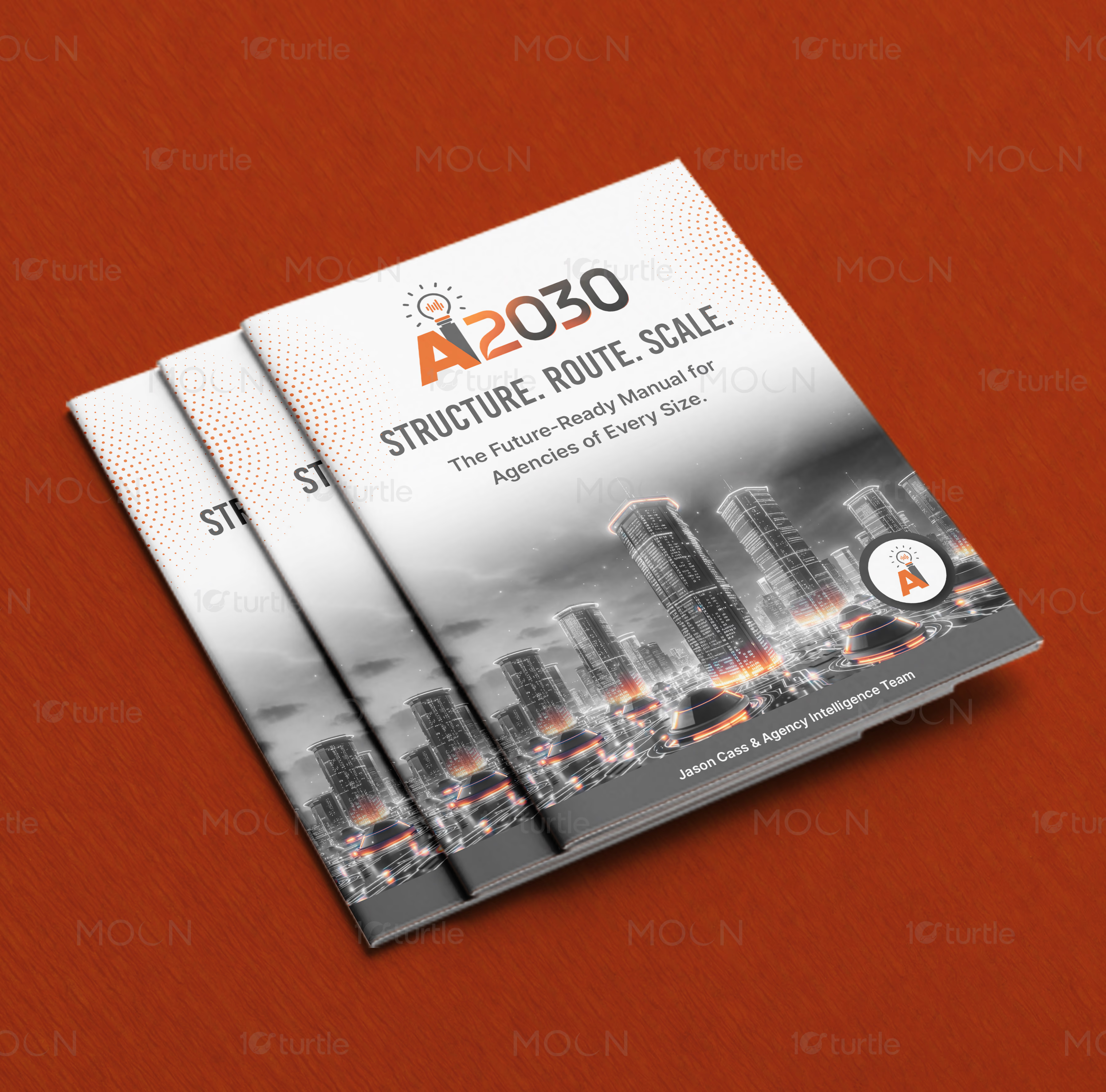
Designing a structured and highly technical corporate report for strategic professional services
Designing a structured and highly technical corporate report for strategic professional servicesarrow

Every grid and technical chart engineered to present dense professional data clearly

Editorial Design

Typography System

Overview

We designed a modern, future-ready corporate report layout system for the Ai2030 advisory platform, a strategic resource in the business services sector. Our team developed a structured visual framework with clear typographic hierarchy and bold accents to make complex industry insights readable and engaging. The resulting asset serves as a confident, easy-to-navigate guide for modern insurance professionals.

The Challenge

down-right

Modern business services publications often struggle to present highly technical data and strategic insights without overwhelming the reader. For this resource, complex insurance industry projections and operational guide rails were buried in dense, unformatted text layouts. We needed to design a structural grid and page system that could balance intense technical data with intuitive reading flows.

The Solution

down-right

We engineered a clean editorial layout built on a robust grid system, pairing bold sans-serif typography with a modern palette of white, charcoal, grey, and strategic orange accents. By designing custom data visualizations, structured tables, and bold section dividers, we transformed complex professional resources into a highly readable, confident system. This flexible template functions flawlessly across digital and physical print distributions.

The Impact

down-right

The new publication design has transformed how complex insurance agency intelligence is consumed by its executive audience. Readability and engagement metrics improved as the structured data visualization allowed readers to quickly interpret key business insights. This elevated report layout positions the client as a premium, forward-thinking authority within the corporate advisory landscape.

Inside page layout of the Ai2030 business services report showing clean sans-serif typography and grey grid lines
Detailed bar chart infographic within a modern corporate document layout featuring clear legend and charcoal axes
Section divider page from a professional service handbook layout featuring clean white space and orange numbers
Process diagram in a business services brochure using flat geometric shapes and a modern charcoal color scheme
Printed brand report showcasing textured grey cover stock with minimalist embossed typography details
Close-up of a structured data table inside a professional report design with clear vertical text alignment
Spread of a tech-inspired corporate guide with bold quote layout on contrasting orange background
Open corporate report mockup showing side-by-side pages with dynamic grid and large charcoal numerals
Executive summary layout with clean side margins, charcoal main body text, and prominent section headers
Quarterly corporate publication spread showing clean text block alignments and minimalist line icons
High-contrast digital brochure layout with data visualization cards highlighted with orange accents
Ai2030 - Project Image
Business Services Corporate Report Design - Complete Layout System

A professional corporate report design serves as a critical strategic asset for any business services firm looking to present complex information clearly. The physical layout and digital structure of a report directly dictate how an audience perceives the credibility, depth, and intelligence of the research inside. When technical guides, industry forecasts, or consulting reports are packaged in standard Word documents or unstyled templates, valuable information is lost in a sea of monochrome text. Our goal with this project was to establish a high-end publication system that elevates raw business guidelines into an intuitive visual narrative.

At the heart of any successful document layout is a deeply considered grid system. A modular page layout provides the blueprint for consistency across dozens of pages, ensuring that elements like headers, footers, body text, and sidebars always sit in predictable, harmonized positions. This mathematical structure allows the design team to introduce asymmetric layouts that keep the reader engaged. For this specific corporate report, we developed a flexible multi-column grid that cleanly separates deep research copy from secondary callouts. By creating a dedicated margin column for meta-information and quick definitions, we successfully kept the main text columns uncluttered.

Typography plays an equally vital role in high-quality editorial layout design. For a strategic guide, the chosen typefaces must balance contemporary aesthetic appeal with absolute readability under various conditions. We selected a bold geometric sans-serif typeface to anchor section headings, titles, and major pull quotes. This bold styling provides high visual contrast against a clean, open sans-serif body face. By maintaining a strict typographical hierarchy across every page, we ensured that readers can scan the document quickly to pull out high-level themes, while still enjoying a comfortable reading experience when diving into detailed paragraphs.

Color systems within corporate report design must be functional rather than purely decorative. Instead of relying on a typical corporate blue palette, we employed a modern visual identity based on charcoal, light grey, white, and vibrant orange accents. The deep charcoal acts as a premium grounding color, perfect for title pages and section dividers that create natural pauses in the text. Light grey and white backgrounds maintain clean readability for body text, while the hot orange is used sparingly as a functional high-lighting tool. This selective application of accent color draws the eye to crucial metrics, active page markers, and key performance indicators without overwhelming the overall composition.

Visualizing data is one of the most demanding aspects of corporate editorial design. Business services reports are often dense with numbers, metrics, and complex operational processes. Rather than relying on generic spreadsheet charts, we engineered custom data visualizations and infographics that speak the same visual language as the rest of the report. Through clean line weights, flat geometric shapes, and custom legend structures, we turned abstract statistics into understandable visuals. Tables were designed with generous horizontal padding and light grey row fills to help readers navigate multiple points of data without losing their place.

A comprehensive publication design must perform flawlessly across both physical and digital touchpoints. For digital distribution, we optimized the document layout as an interactive PDF with clickable navigation elements, optimized file sizes, and high-resolution rendering for screens of all sizes. For physical print production, we developed strict print specification sheets, including cover stock weight guidelines and color profile alignments, to ensure the charcoal depths and orange accents print beautifully. The result is a highly polished document that establishes an immediate sense of quality the moment a stakeholder holds it or views it on a screen.

Creating chapter markers and section dividers is another important design strategy we integrated into this layout. These full-bleed layouts provide clean visual breaks that divide dense corporate material into digestible modules. By utilizing massive numerical indicators, bold title placements, and strong background color contrast, these dividers signal a shift in topic while giving the reader a brief moment of visual rest. This thoughtful pacing prevents cognitive fatigue and ensures a much higher completion rate for multi-chapter strategic documents.

Ultimately, professional report layout design is about respect for the reader's time. Executive audiences are constantly bombarded with reading materials, white papers, and industry guides. A document that respects its audience is one that organizes its arguments clearly, highlights its key lessons visually, and delivers a comfortable reading journey from cover to cover. Through systematic layout grid alignment, robust typographic hierarchy, custom data visualizations, and modern color applications, we transformed technical guidelines into a compelling business services asset. This project proves that strategic editorial design is a powerful tool for building corporate authority and elevating brand value.

corporate report design

business services report design

report layout services

data visualization layout

professional report design

editorial design services

Next Project

arrow

Jules Cook

LOGO DESIGN • BRANDING • BRAND IDENTITY

Jules Cook