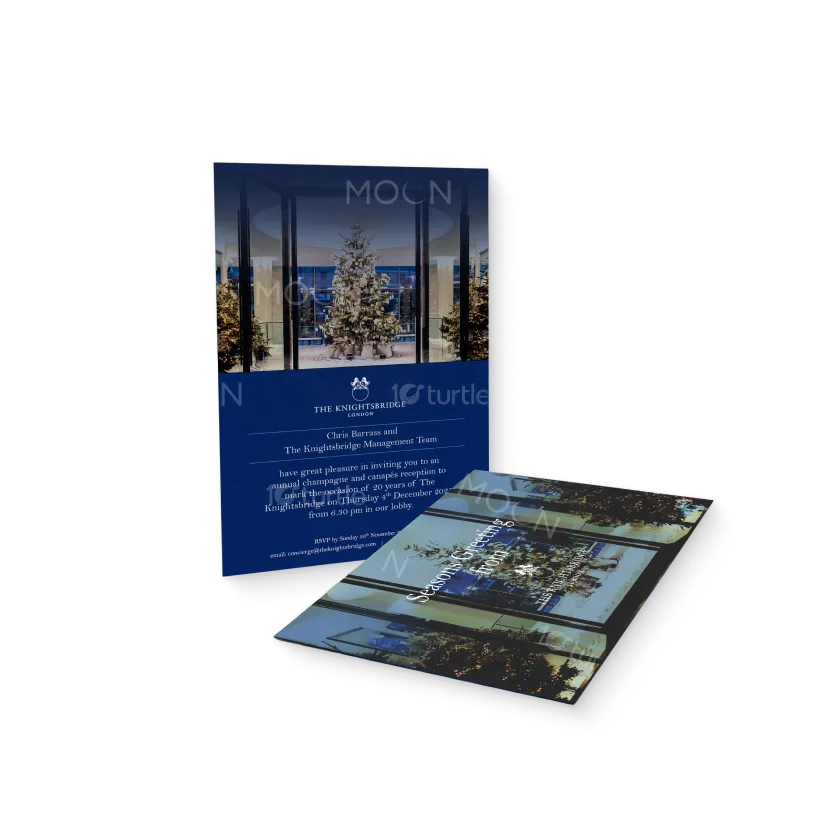
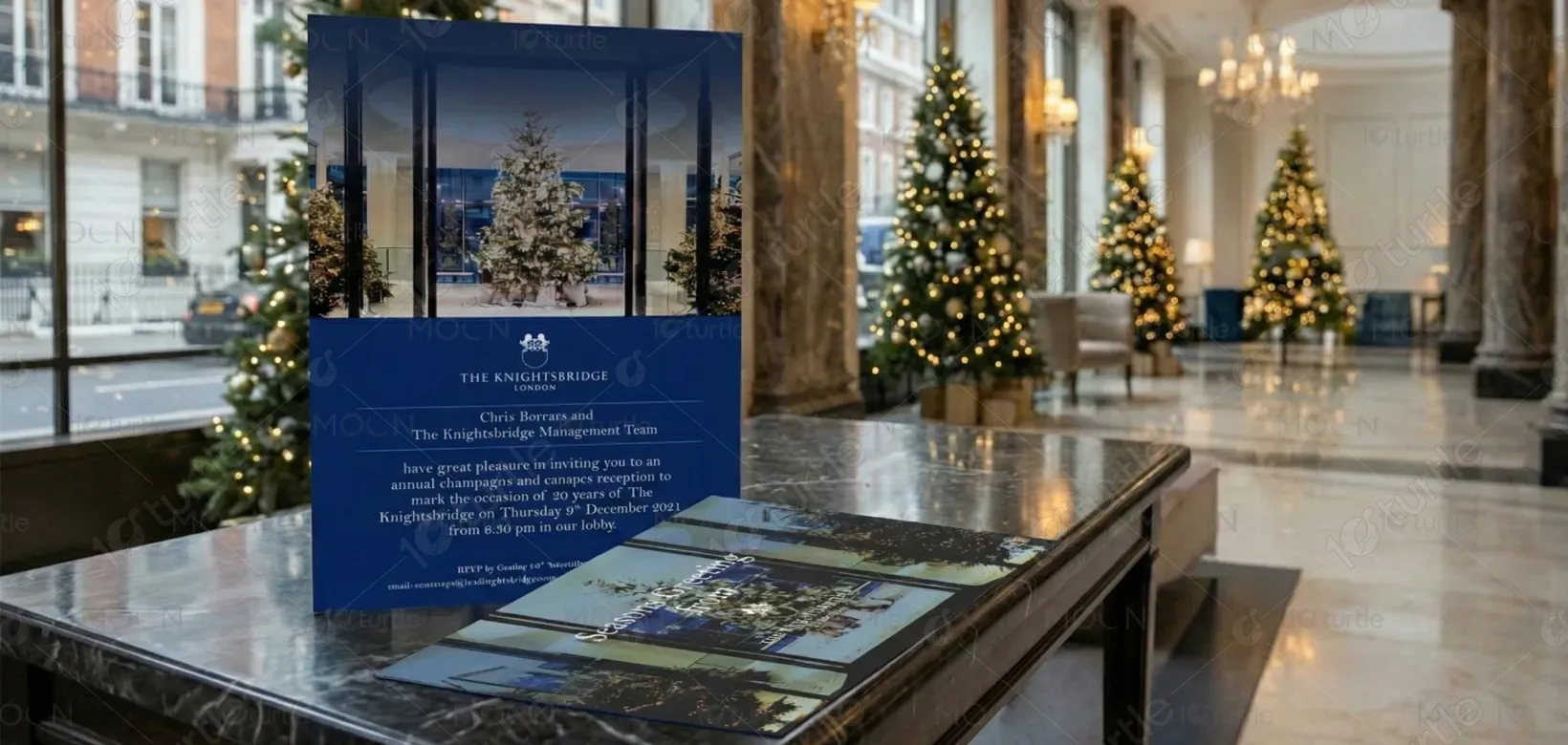
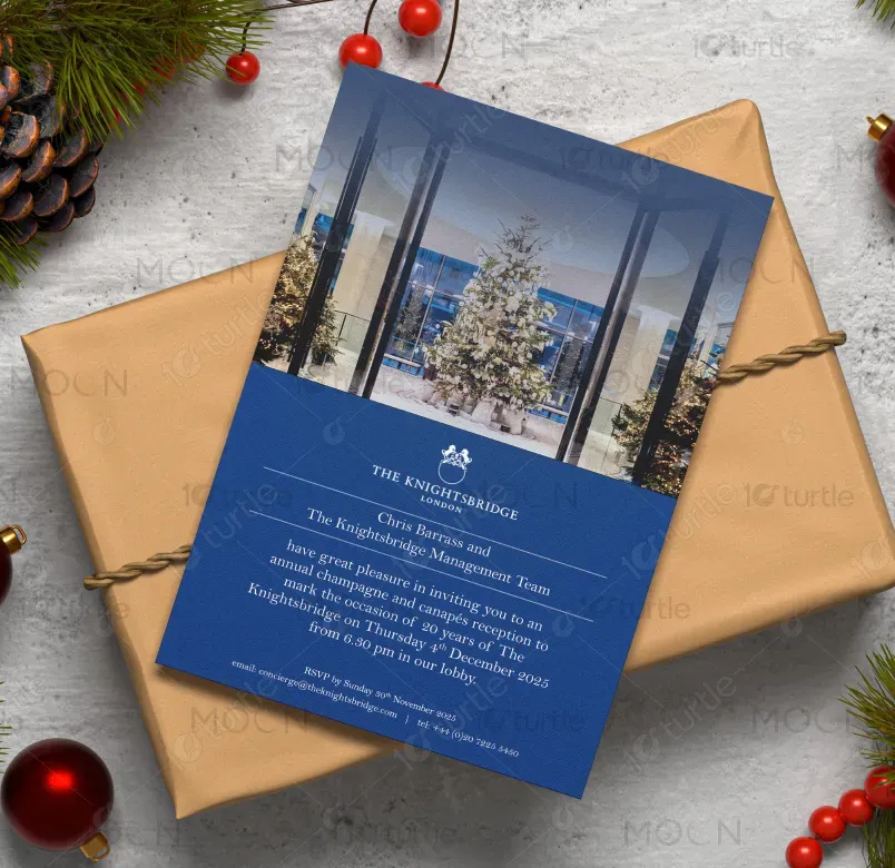
The design embraces understated luxury through a refined, symmetrical layout inspired by classic British hospitality. A rich royal blue base establishes elegance and trust, while the central festive imagery adds warmth and seasonal charm. Clean typography, generous spacing, and minimal decorative lines ensure clarity without distraction. The balance between imagery and text creates a timeless invitation that feels exclusive, celebratory, and aligned with The Knightsbridge London’s premium brand identity.
Card Design
Graphic Design
Industry
Arts, Culture & Entertainment
Tools we used


Project Completion
2025
Key Market
Global
This design is a formal invitation card created to commemorate 20 years of The Knightsbridge London. Its purpose is to invite guests to an exclusive champagne and canapés reception while reinforcing the hotel’s prestigious image. Positioned within the luxury hospitality market, the design stands out through its minimal elegance, refined typography, and sophisticated color palette, delivering a premium visual experience that reflects heritage, celebration, and exclusivity.
Industry
Arts, Culture & EntertainmentWhat we did
Card DesignGraphic DesignPlatform
-The key challenge was creating a festive invitation that felt celebratory without compromising the hotel’s refined luxury positioning. Many event invitations risk appearing overly decorative or casual during seasonal themes. For a premium hospitality brand like The Knightsbridge London, maintaining elegance while marking a milestone anniversary required careful balance to avoid visual clutter and ensure the design remained timeless and brand-appropriate.
The solution lies in a restrained design approach—using a single strong festive image, a classic color palette, and minimal graphic elements. Clear typographic hierarchy guides the reader naturally through the content, while subtle dividers enhance structure. This approach preserves sophistication, communicates essential information clearly, and elevates the invitation into a refined brand touchpoint rather than just an event announcement.

The long-term vision is to establish a reusable invitation design language for The Knightsbridge London—one that can evolve for future events while maintaining brand consistency. This design aims to strengthen brand recognition, convey timeless luxury, and leave guests with a lasting impression of elegance, exclusivity, and attention to detail synonymous with the hotel’s identity.
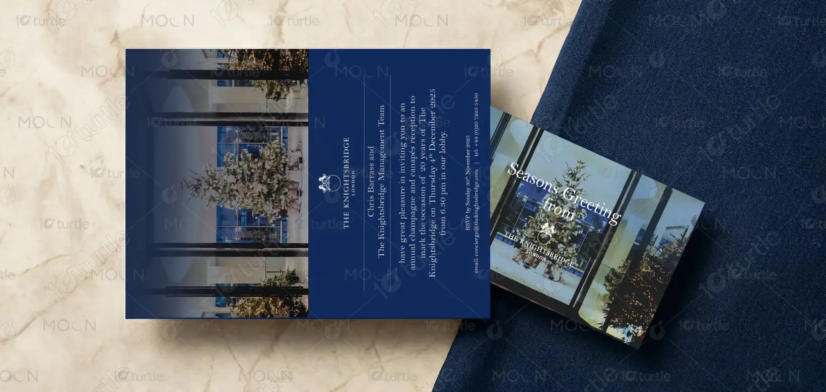

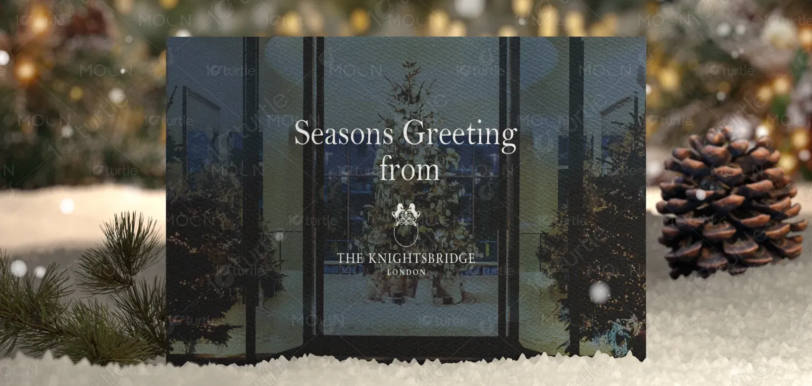
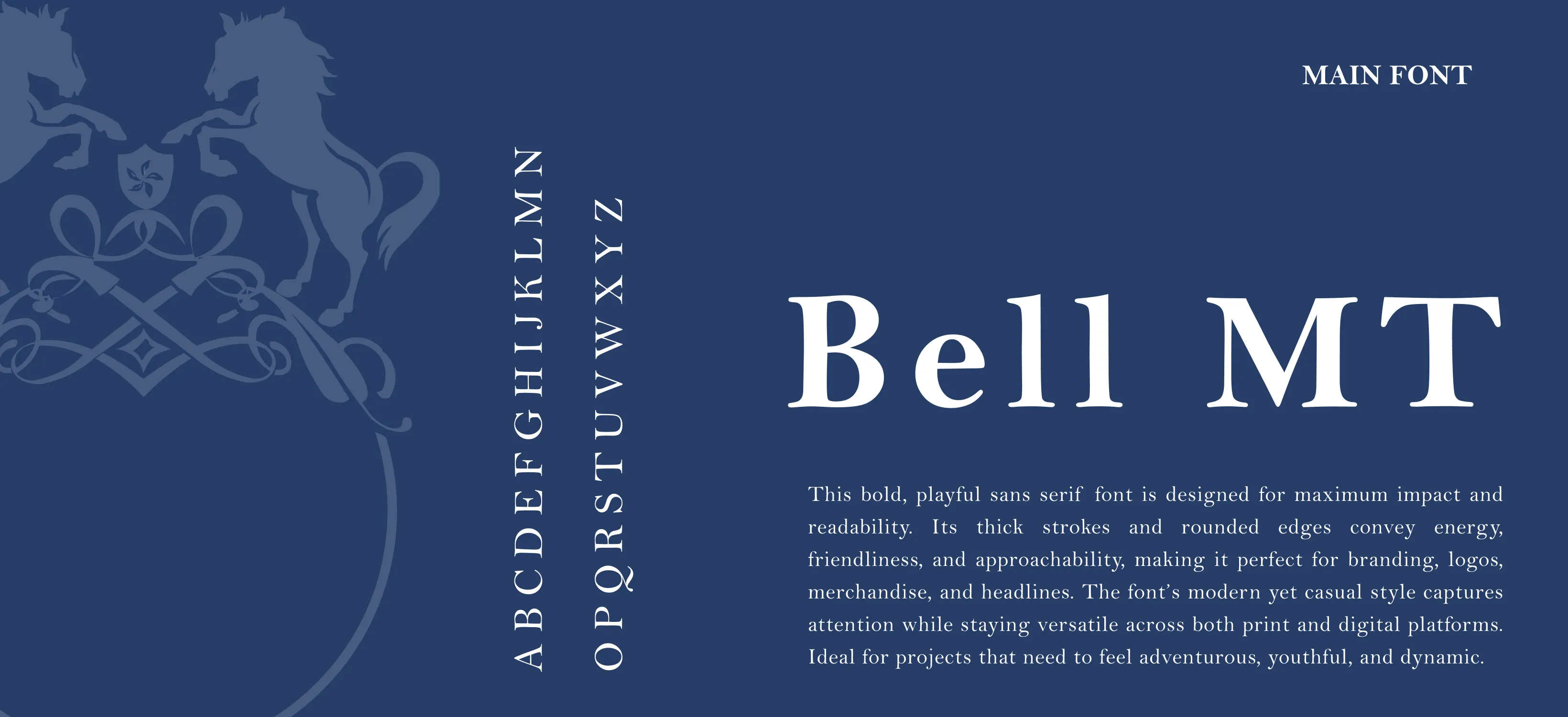
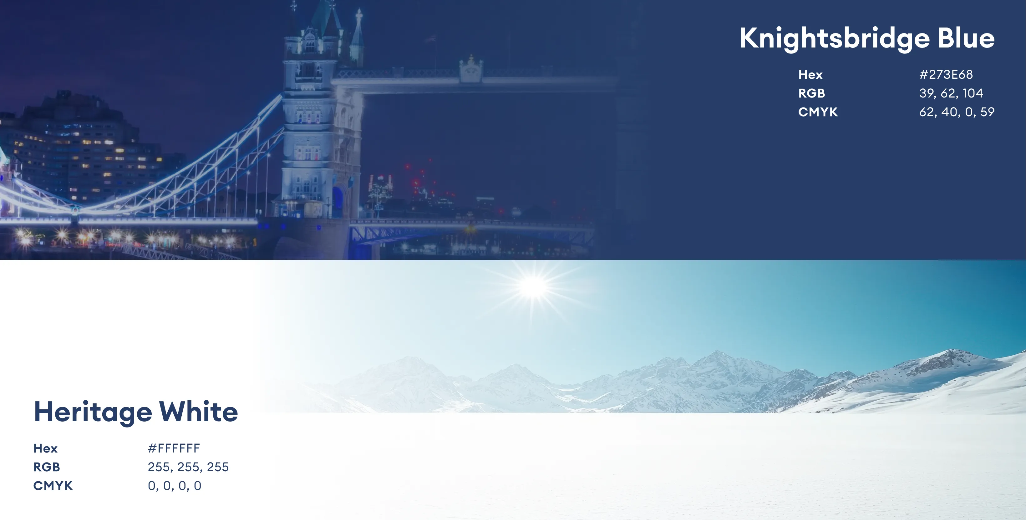
The palette is centered around deep royal blue, symbolizing trust, luxury, and heritage—core values of The Knightsbridge London. White typography ensures clarity and contrast, while soft warm tones in the imagery introduce a festive, welcoming atmosphere. Together, the colors evoke sophistication, calmness, and celebration, reinforcing the brand’s premium positioning and creating a visually balanced, elegant composition.