
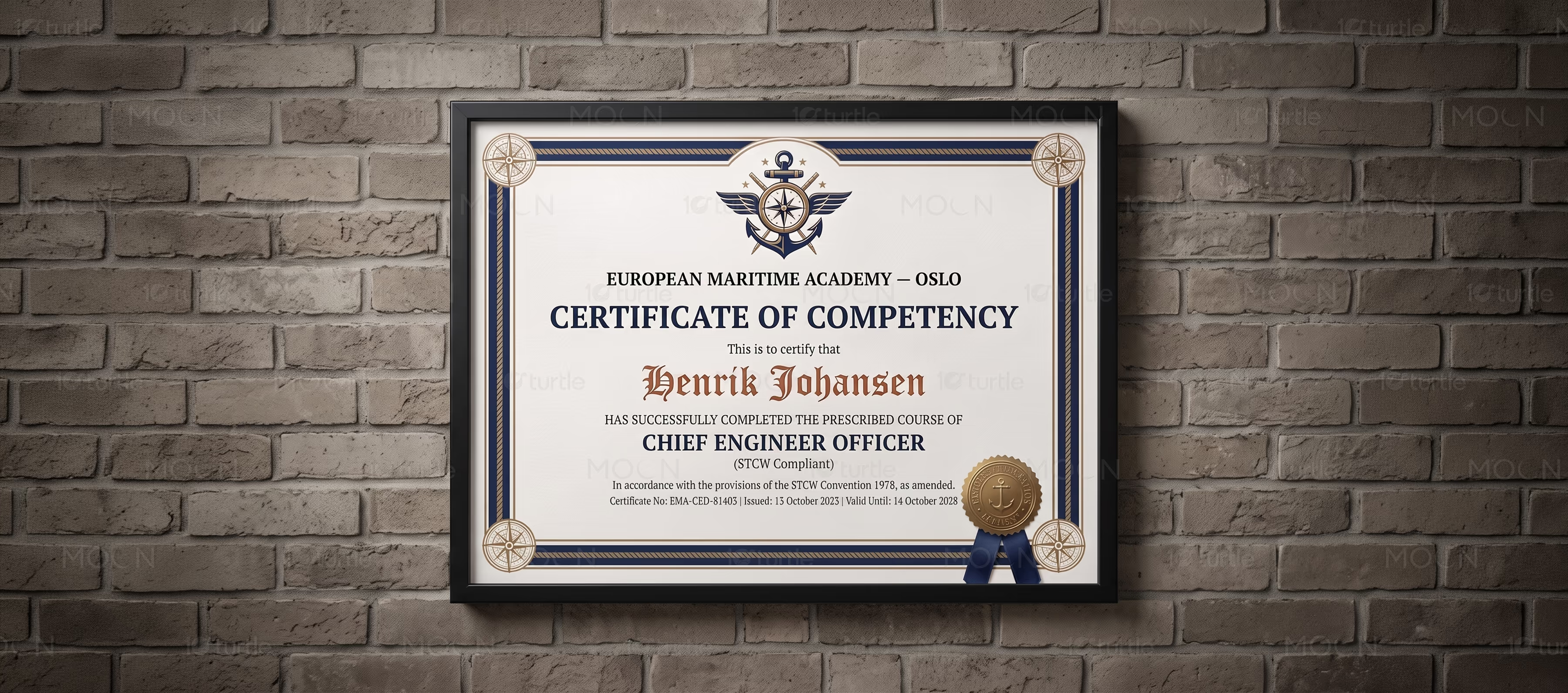
Certificate and Award Design Case Study
Certificate and Award Design Case Studyarrow

Elegant award systems for milestones, honors, and professional credibility.

Certificate Design • Award Design • Recognition Branding • Brand Collateral

Overview

This certificate and award design case study presents a flexible recognition system for professional, educational, creative, and event-based achievements. The collection includes premium, minimal, multilingual, and expressive certificate directions, helping organizations present milestones with clarity, authority, and emotional value while creating designs recipients feel proud to display.

The Challenge

down-right

Certificates and awards often look generic when they rely on basic templates, weak typography, or overcrowded layouts. This can reduce the perceived value of the achievement and make the issuing organization look less polished. Recognition materials also need to work across different industries, languages, events, training programs, and brand tones. The challenge was to create certificate and award designs that feel official, premium, readable, and emotionally meaningful.

The Solution

down-right

The design approach focuses on strong hierarchy, clean alignment, refined spacing, and intentional visual detailing. Minimal certificates use generous white space and elegant type pairings, while more creative designs use decorative borders, seals, color accents, and expressive layouts for stronger personality. Multilingual versions are structured carefully so different scripts remain balanced, readable, and visually consistent. Every design keeps key information such as names, titles, dates, signatures, and credentials clear.

The Impact

down-right

This certificate and award design system helps organizations elevate the way they recognize people. A polished certificate creates stronger trust, improves perceived program value, and gives recipients something worth sharing or framing. The design variety allows the collection to support corporate recognition, education, training, events, creative awards, and professional certifications. Long term, it strengthens brand credibility and turns formal recognition into a memorable branded experience.

02.avif
03.avif04.avif
05.avif
06.avif07.avif
08.avif
09.avif
10.avif11.avif
12.avif
13.avif
14.avif15.avif
16.avif
17.avif
18.avif
19.avif
20.avif21.avif
22.avif
23.avif
24.avif
25.avif
26.avif27.avif
31.avif32.avif
Achievement, Beautifully Framed

Certificate and award design is an important part of how organizations celebrate achievement, recognize effort, and build credibility around their programs. A certificate may seem like a simple document, but for the recipient it often becomes proof of growth, participation, skill, or professional progress. Because of that, the design must feel official, polished, and worthy of the milestone it represents. This case study focuses on a broad certificate and award design collection created for professional recognition, training, education, events, creative programs, and branded achievement systems.

The challenge with many certificate layouts is that they often look too templated. Standard borders, weak hierarchy, poor spacing, and generic typography can make the final piece feel less valuable. For corporate programs, educational institutions, wellness certifications, creative awards, and event recognition, that lack of polish can affect trust. A strong certificate design should not only look attractive; it should make the achievement feel respected.

The creative direction for this collection focused on designing recognition assets with structure, elegance, and flexibility. Minimal certificates use clean spacing, refined typography, and simple composition to create a premium professional tone. More decorative award layouts introduce formal borders, seals, subtle ornaments, and stronger visual accents to create a ceremonial feeling. This balance allows the collection to work across both serious professional settings and more expressive creative recognition moments.

Typography plays a central role throughout the system. Names, award titles, completion details, issuing bodies, dates, and signatures are arranged with clear hierarchy so the recipient’s achievement remains the visual focus. The layouts are built to feel balanced and readable, whether the certificate is printed, framed, shared digitally, or used during an event presentation. Multilingual certificate formats are also treated with care, making sure different language structures and scripts remain visually aligned and professional.

As a recognition design project, the goal is to make every certificate feel intentional rather than ordinary. Strong award design helps organizations create a better presentation experience and gives recipients something they are proud to keep. It also strengthens the brand behind the certificate by showing attention to detail, quality, and respect for achievement. In competitive education, training, corporate, and event industries, these small presentation details can make a lasting difference.

Overall, this certificate and award design case study demonstrates how thoughtful print certificate design can transform formal recognition into a premium branded asset. By combining elegant layouts, multilingual flexibility, strong hierarchy, and polished visual systems, the collection supports organizations that want their achievements to feel credible, memorable, and professionally presented.

#certificatedesign

#awarddesign

#recognitiondesign

#premiumcertificate

#corporatedesign

#eventdesign

Next Project

arrow

Glow Surgical Arts

BUSINESS CARD DESIGN • POSITIONING • BRAND IDENTITY

Glow Surgical Arts