
Brochure Education Case Study
Playful brochures for child-focused education brands
The Challenge
Education brands for children need to communicate value to both parents and young learners. Poor brochure design can feel too childish for parents, too text-heavy for kids, or too unclear for schools and caregivers. Learning programs, apps, and child development resources must explain benefits quickly while still feeling warm, safe, and trustworthy. The challenge is to balance playful visual language with organized educational messaging.
The Solution
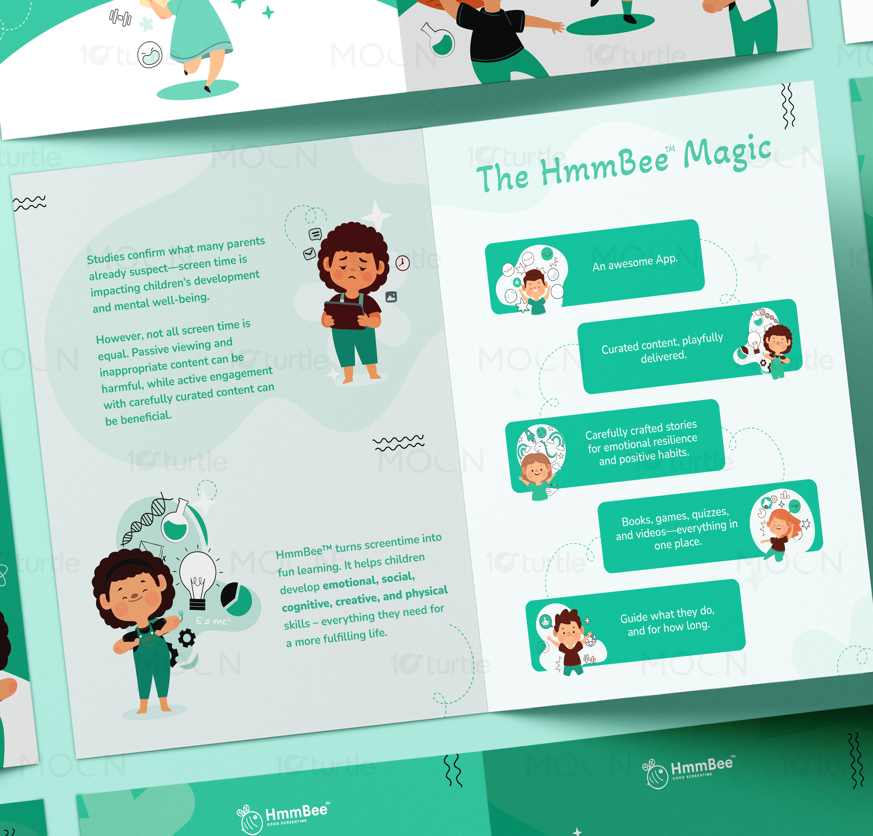
This collection solves that by using bright but controlled visual systems tailored to child education. The Borcelle Project brochure uses soft mint panels, rounded shapes, hand-drawn accents, and cute character illustrations to present activities and games. The HmmBee brochure uses green tones, app-style content cards, child illustrations, and curved dotted paths to explain positive screen-time learning. The Heroic Habits brochure uses bold blue panels, simple line art, and structured sections to make daily habits feel clear and motivating.
/ Project Information
This education brochure collection brings together three child-focused print designs across bi-fold and tri-fold formats. The visuals cover activity programs, screen-time learning, and habit-building education for kids. Each brochure uses playful illustration, simple content blocks, friendly colors, and clear fold-based storytelling to guide parents, schools, and learning communities.