
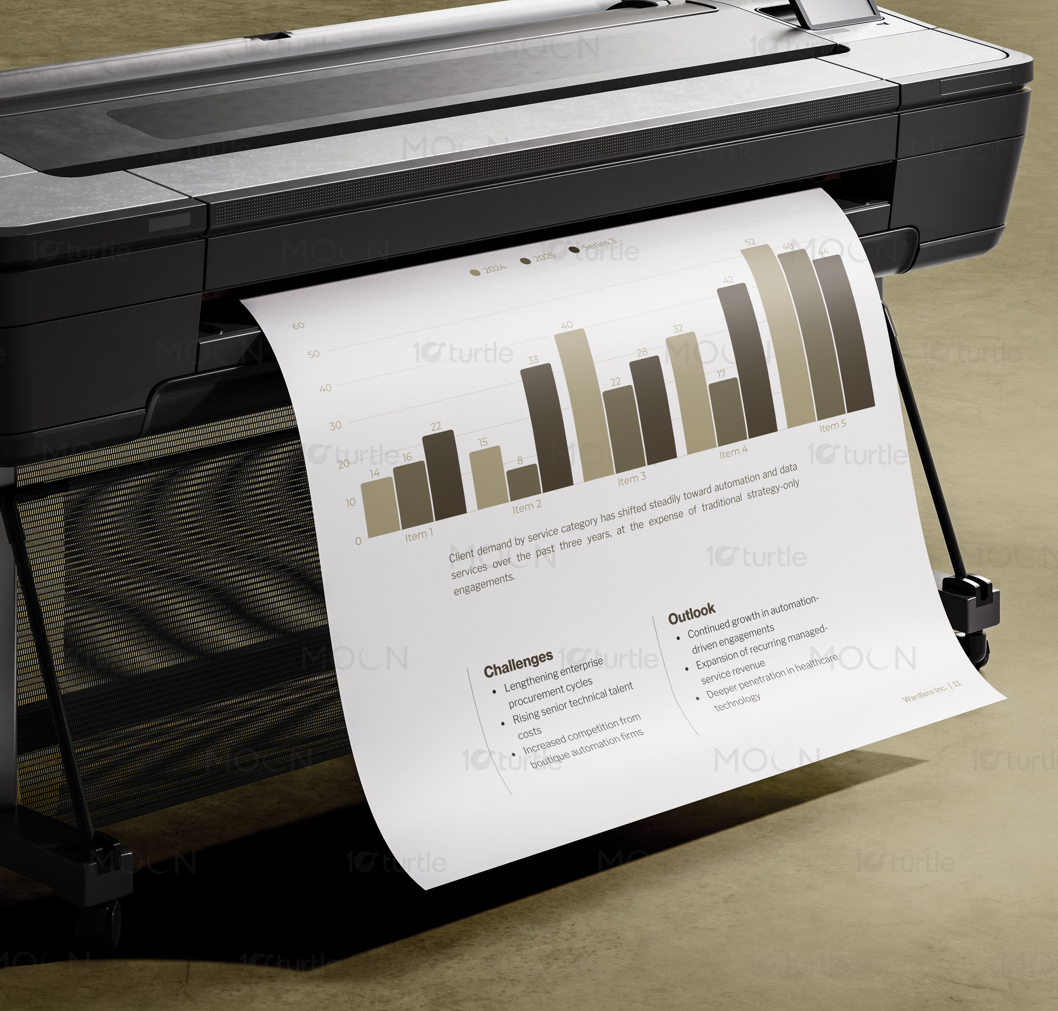
Transforming complex financial data into a compelling visual narrative for corporate stakeholders
Transforming complex financial data into a compelling visual narrative for corporate stakeholdersarrow

An editorial design engineered to command stakeholder attention and clarity

Editorial Design

Print Design

Overview

We designed a sophisticated dark-mode annual report that transforms complex financial and performance metrics into a visually stunning editorial narrative. Our objective was to elevate corporate reporting through minimalist layouts, deliberate negative space, and premium visual hierarchy. This project delivers an engaging, highly readable document that commands authority and communicates strategic progress.

The Challenge

down-right

Traditional annual reports are often dense, visually exhausting, and struggle to keep modern stakeholders engaged. With complex financial structures, long operational summaries, and uninspiring layouts, critical milestones are easily lost in a wall of numbers. Our challenge was to design a clean grid system that organizes intensive data without sacrificing aesthetic elegance or readability.

The Solution

down-right

We developed a minimalist editorial system anchored by an asymmetric multi-column grid, a refined dark-mode aesthetic, and custom data visualizations. By combining crisp, high-contrast typography with spacious layouts, we turned dense corporate charts into intuitive visual narratives. Every page spread was engineered to guide the reader through strategic data with effortless balance.

The Impact

down-right

The finished annual report design established a new benchmark for corporate transparency and aesthetic sophistication. Stakeholders experienced a dramatic improvement in document navigation, with visual hierarchy directing attention to key growth indicators instantly. The strategic blend of physical print luxury and digital precision reinforced the brand's position as a forward-thinking industry leader.

Minimalist corporate brochure layout showing financial data visualizations and modern sans-serif typography
Editorial design for Vantage Dynamics annual report featuring clean grid alignment and high-contrast tables
Close-up of minimalist annual report cover page printed on matte black stock with subtle gold foil lettering
Asymmetric grid layout in corporate annual report showcasing executive letters and sophisticated serif typefaces
Custom designed data visualization graphics in a dark mode corporate booklet highlighting year-on-year growth
Open double-page spread of Vantage Dynamics annual report illustrating the strategic roadmap timeline layout
Corporate document typography system overview displaying hierarchy from heavy headings to compact numbers
Sleek dark background financial table layout within a premium corporate report mockup
Modern editorial design layout for a business document with clean columns and structured sidebar callouts
Hardcover binding mockup of the Vantage Dynamics annual report highlighting executive finish and clean paper edges
Structured grid alignment page template showing the balance of empty space and dense corporate data columns
Sleek dark mode bar chart and pie diagram layouts matching the overall minimalist annual report style
Vantage Dynamics Annual Report - Project Image
Corporate Annual Report Design - Editorial Layout and Data System

Visual storytelling in corporate communications rests heavily on the execution of the annual report design. Far from a mere legal obligation, this high-stakes business document serves as a direct reflection of a company's commitment to precision, transparency, and forward-looking growth. Historically, corporate brochures and annual reviews have suffered from visual fatigue, characterized by dense paragraphs, uninspired grid alignments, and flat data representations. In redesigning this critical asset, our primary focus was to craft an editorial layout system that treats financial data and corporate governance with the aesthetic respect of a premium art publication. By pivoting to a striking dark-mode framework, we created an immediate sense of gravity and premium execution that sets this annual review apart from typical industry documents.

The foundation of any successful publication design lies in its structural framework, specifically the design grid. For this particular project, we abandoned standard symmetric templates in favor of a sophisticated asymmetric multi-column grid system. This layout logic allowed us to negotiate the placement of wide financial statements, executive summaries, and key performance charts in a way that feels organic yet disciplined. The deliberate inclusion of generous negative space ensures that the dense financial datasets do not overwhelm the reader, offering a natural visual breathing room that guides the eye through complex sections. Every column, margin, and gutters width was meticulously calculated to ensure absolute structural balance across both physical printed page spreads and digital screens.

Editorial layout design is nothing without a highly structured and sophisticated typography system. In this corporate brochure, we implemented a typographic hierarchy that pairs a contemporary, high-contrast sans-serif typeface for quantitative figures and headers with an elegant, highly readable serif typeface for running narrative text. This intentional contrast serves a vital structural purpose: the serif face provides a classic, warm, and highly legible experience for long letters from the leadership team, while the crisp sans-serif typeface ensures that complex financial figures, table headers, and numerical callouts are legible at small sizes. Leading, kerning, and line-length restrictions were strictly enforced to prevent reader fatigue and to maximize information retention.

Choosing a dark-mode palette for a corporate annual report was a deliberate strategic choice to evoke modern sophistication and focus. The design employs a deep, dark charcoal base color that eliminates the harsh glare associated with traditional white-background PDFs, enhancing readability over prolonged digital viewing sessions. This dark background is paired with off-white typography and subtle warm-grey tones for secondary structural elements. To highlight milestones and call attention to critical financial totals, we integrated a refined accent system featuring gold and silver tones. These accent hues are applied sparingly, acting as visual anchors that draw immediate focus to key performance indicators, strategic milestones, and major financial totals without cluttering the layout.

Transforming raw spreadsheet data into refined, elegant, and highly legible visual graphics was another major pillar of this graphic design project. Rather than using generic, automated charts, we hand-crafted every bar graph, line chart, and infographic to match the dark-mode aesthetic of the publication design. We aligned every chart line, coordinate label, and legend block to the dominant document grid, ensuring that data visuals look like integral design components rather than superficial additions. Important financial tables and balance sheets were stripped of heavy borders and reconstructed using clean horizontal lines and precise alignment, allowing numbers to breathe and making structural comparisons intuitive for corporate stakeholders.

Designing for a dual-medium delivery, where the report must perform flawlessly as both a downloadable digital PDF and a premium physical artifact, required deep print production expertise. For the physical execution of this publication, we developed comprehensive print specifications detailing paper weight, cover finishes, and binding methods. We specified a thick, matte black soft-touch cover stock to establish a tactile sense of luxury before the book is even opened. Inside pages were planned on high-weight matte paper to minimize light reflection and support the deep ink saturation required for the dark-mode pages. Subtle design features, such as minimal spot gloss on key graphics and metallic foil details on the cover title, provide a tangible sense of refinement that digital screens cannot replicate.

A crucial aspect of this editorial layout was the structural organization of content sections, which was handled through custom section divider pages. These divider layouts utilize dramatic, full-bleed dark backdrops and oversized typography, creating natural mental breaks between distinct operational and financial segments. Within the narrative sections, we integrated strategically placed pull-quotes and large metric callouts that interrupt long paragraphs, offering quick-scan entry points for busy investors. This structural rhythm prevents the document from feeling monotonous, keeping stakeholders engaged as they progress through the operational reports.

Ultimately, this editorial redesign for Vantage Dynamics elevates the standard of modern corporate documentation. By prioritizing grid alignment, visual hierarchy, sophisticated color palettes, and bespoke financial graphics, we transformed a dense set of regulatory disclosures into a highly persuasive brand asset. The final publication design does not just report on past performance, it projects a visual identity of modern sophistication, operational precision, and strategic vision. This project exemplifies how professional graphic design and editorial structure can turn raw numbers into a clear, compelling story of growth and capability.

Achieving this level of balance in corporate layout design requires a deep understanding of editorial mechanics and stakeholder expectations. Every alignment choice, font size variation, and line chart curve was evaluated against the goal of clarity and professional elegance. The result is a publication that performs seamlessly across digital devices and in physical boardroom meetings. This case study demonstrates how a highly disciplined, minimalist graphic system can solve the age-old problem of corporate document clutter, delivering a sleek, functional, and visually magnificent annual report that leaves an enduring, positive impression.

corporate annual report design

annual report layout design

editorial design for corporate

business document typography

minimalist annual report layout

data visualization layout design

Next Project

arrow

QUICK GUIDE

BOOK DESIGN • POSITIONING • BRAND IDENTITY

QUICK GUIDE