
Pouch Packaging Design • Food Packaging Design • Product Branding • FMCG Packaging
Overview
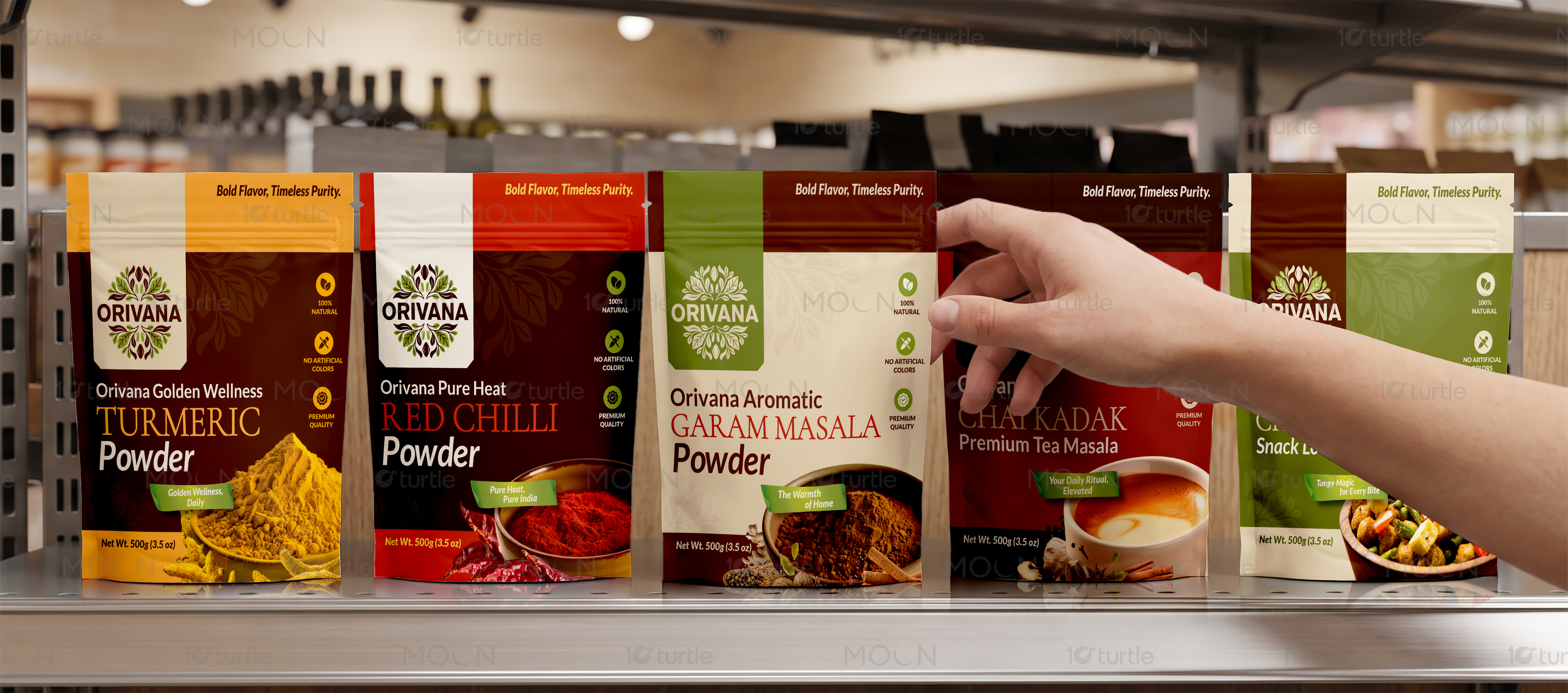
This packaging collection was developed to establish Orivana as a recognizable spice brand while showcasing ten unique flavors within one unified visual identity. Every pouch maintains consistent branding, premium shelf presence, and organized product information while using color, food imagery, and flavor-specific details to create immediate recognition across the complete product range.
The Challenge

Food brands often struggle to maintain consistency while expanding into multiple product variants. Packaging that looks too similar creates confusion, while completely different designs weaken overall brand recognition. In a competitive retail environment, shoppers make purchase decisions within seconds, making visual clarity and flavor differentiation essential. Poor packaging can reduce shelf impact, limit customer trust, and make premium products appear ordinary.
The Solution

This packaging system creates one recognizable Orivana identity while giving each flavor its own visual personality. Consistent logo placement, typography, layout structure, and information hierarchy strengthen brand recall across every pouch. Carefully selected color palettes and appetizing food photography allow customers to identify products instantly without sacrificing consistency. The result is a scalable packaging system suitable for both existing and future product launches.
The Impact

The complete packaging collection strengthens Orivana's presence across supermarkets, grocery stores, and online marketplaces. Clear flavor differentiation improves shopping convenience while reinforcing overall brand familiarity. Premium presentation helps communicate product quality before purchase, encouraging customer confidence and repeat buying. The scalable visual system also supports future product expansion without requiring a complete packaging redesign.


Creating packaging for an expanding food brand requires more than attractive graphics. Every product must feel like part of the same family while remaining easy to distinguish on crowded retail shelves. That balance becomes even more important when a brand offers multiple flavors across the same product category. For the Orivana pouch packaging design project, our objective was to develop a complete packaging system for ten different flavors that strengthened brand recognition while giving every product its own memorable identity. Rather than designing individual packs independently, we created one unified visual language that could grow alongside the brand.
The foundation of this pouch packaging design is consistency. Each package follows a structured layout with standardized logo placement, typography, nutritional information, quality icons, and product hierarchy. This familiar framework allows customers to instantly recognize the Orivana brand regardless of which flavor they choose. At the same time, every product receives a carefully selected color palette, authentic food photography, and unique visual cues that communicate its individual taste profile. This combination improves shelf navigation while reinforcing a premium shopping experience.
In the competitive Food & Beverage industry, packaging often becomes the first interaction customers have with a product. Strong visual presentation communicates quality before the package is ever opened. For this collection, warm earthy tones, ingredient-inspired graphics, and high-quality serving imagery were used to create appetite appeal and authenticity. Every pouch highlights the finished dish to help customers immediately understand the product's purpose while maintaining a clean and organized information hierarchy that supports confident purchasing decisions.
Beyond aesthetics, the packaging system was designed for long-term flexibility. As Orivana introduces new spice blends, seasoning mixes, or specialty products, additional variants can be integrated into the same visual framework without disrupting the overall food branding strategy. This scalable approach reduces future design inconsistencies while strengthening customer familiarity with the complete product range.
The project also prioritizes retail performance. Strong contrast, premium typography, consistent iconography, and organized content ensure that important information remains accessible without overwhelming the design. Whether displayed individually, grouped together on supermarket shelves, or featured in digital marketplaces, the collection delivers a polished and professional presentation. This spice packaging system enhances product visibility, supports premium positioning, and reinforces trust among both first-time buyers and returning customers.
Ultimately, this project demonstrates how thoughtful product packaging design extends beyond decoration. It creates a recognizable identity, improves the shopping experience, strengthens brand recall, and provides a scalable foundation for future growth. By combining cohesive branding with clear flavor differentiation, the Orivana packaging collection delivers a unified visual system that supports long-term success across retail and e-commerce environments.
#pouch packaging design
#food packaging design
#masala packaging design
#premium food packaging
#retail packaging