
Label Design • Packaging Design • Supplement Packaging • Product Label System • Retail Packaging
Overview
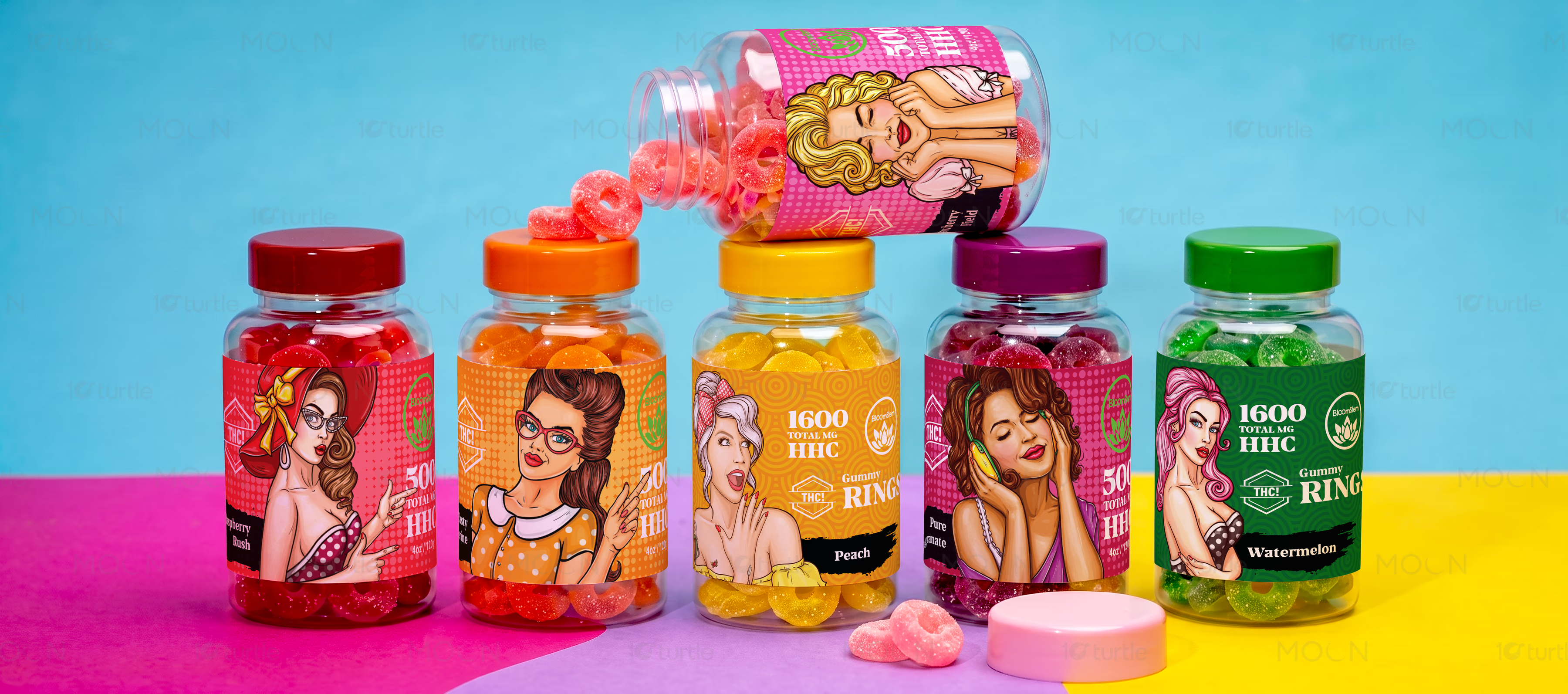
This label design case study presents six Bloomstem hemp gummy variants created as one recognizable product family. Each flavor uses a distinct color world, character illustration, and nutritional layout while maintaining consistent brand architecture. The result is a retail-ready packaging system that feels fun, flavorful, and easy to navigate at shelf level.
The Challenge

Hemp gummy and supplement brands need to feel exciting without losing trust, especially when product labels must carry dosage, flavor, ingredients, nutrition facts, and brand identity in limited space. Poor label design can make variants look disconnected, confuse the buyer, or make the product feel less credible. In a crowded lifestyle supplement market, unclear hierarchy also weakens shelf visibility and makes flavors harder to recognize quickly. The challenge was to make Bloomstem feel bold, collectible, and energetic while still keeping the label system organized.
The Solution

The collection solves this through a strong color-coded label system where each flavor has its own visual identity while staying connected through consistent brand placement, circular seal graphics, and structured information zones. Pop-art inspired character illustrations add personality, making the bottles feel lifestyle-driven rather than clinical. Transparent packaging and vivid gummy colors were used as part of the visual experience, allowing the product itself to support the design. The layout balances playful illustration with practical label clarity, creating a packaging family that works across multiple flavors.
The Impact

This work helps Bloomstem build stronger shelf recognition by making each bottle visually distinct but clearly part of the same brand family. The colorful system improves flavor navigation, supports repeat purchase behavior, and gives the product stronger appeal for retail, ecommerce, and social media presentation. By combining expressive illustration with organized supplement label design, Bloomstem can stand out in a competitive wellness and lifestyle category. Long-term, the system is flexible enough to expand into new flavors without losing brand consistency.


Bloomstem’s hemp gummy label design was created for a product category where first impressions matter instantly. In the health and lifestyle supplement market, packaging has to do more than look attractive. It needs to separate flavors, communicate product strength, make important information accessible, and still create enough visual desire for shoppers to pick up the bottle. For gummy-based supplements, that challenge becomes even more specific because the product already has a playful, candy-like quality, while the brand still needs to maintain structure, trust, and retail credibility.
The creative direction for this packaging case study focused on turning Bloomstem’s flavor range into a vibrant and recognizable product family. Instead of creating one static label repeated across every bottle, the system uses flavor-led color blocking, expressive illustrations, and consistent label architecture to give every variant its own personality. Pink, green, yellow, orange, and blue tones create strong visual separation across the shelf, while the repeated Bloomstem seal, dosage hierarchy, and circular graphic language keep the collection unified. This approach makes the hemp gummy label design feel both energetic and organized.
A key part of the visual strategy was the use of pop-art inspired character artwork. The illustrated figures give the labels a bold lifestyle presence, helping the product feel fun, expressive, and memorable. This is especially useful for lifestyle packaging design, where emotional recall and shelf personality often influence buyer attention. At the same time, the labels avoid becoming visually chaotic by keeping important supplement details in structured areas, including dosage, flavor naming, nutritional facts, quantity, and supporting brand information.
The bottle format also plays an important role in the final presentation. Because the packaging is transparent, the gummies become part of the design system. The label colors and cap colors are coordinated with the visible product inside, creating a layered retail experience that feels bright, tactile, and flavor-focused. This makes the product label system stronger across both physical shelves and digital product mockups, where color recognition and visual consistency help customers compare variants quickly.
For Bloomstem, the long-term value of this supplement label design is its flexibility. The system can support new flavors, seasonal variations, or future product lines without needing to rebuild the brand language from scratch. Each new SKU can follow the same structure while introducing a fresh color, character, or flavor cue. That gives the brand a scalable packaging foundation and a stronger presence across retail packaging, ecommerce listings, promotional visuals, and social media campaigns.
#labeldesign #packagingdesign #supplementpackaging #hempgummies #gummypackaging #wellnesspackaging #productlabel #retailpackaging #brandpackaging #fmcgdesign