
Infographic Business Communication Case Study
Infographic Business Communication Case Studyarrow

Complex reports transformed into accessible visual stories.

Infographic Design • Data Visualization Design • Report Design

Overview

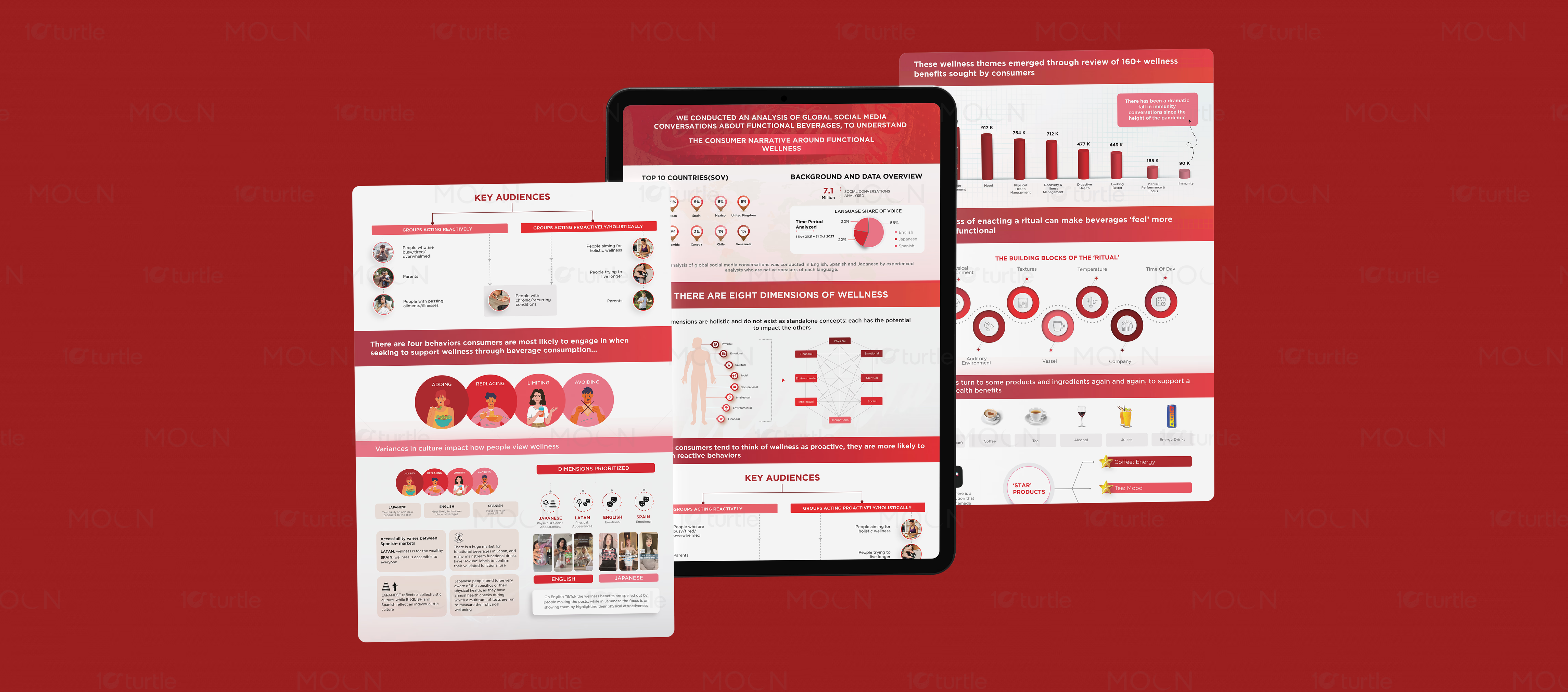
This infographic collection presents two research-heavy communication pieces designed to simplify complex information for professional audiences. The layouts combine charts, icons, segmented content blocks, and strong color systems to explain global functional wellness conversations and WhatsApp Business Account benefits. Both designs balance visual appeal with structured information flow, making reports easier to read, present, and share.

The Challenge

down-right

Infographic design must turn heavy data into information that feels quick, useful, and easy to follow. Research reports, consumer insights, and business service explanations often become difficult to read when they rely only on long paragraphs or unstructured data. Poor hierarchy can cause users to miss key findings, percentages, comparisons, and benefits. For professional communication, the biggest challenge is making complex content look credible without making it visually overwhelming.

The Solution

down-right

The collection uses strong section-based layouts, bold headings, charts, icons, and circular callouts to guide the viewer through each information layer. The functional wellness infographic uses a red and white system with bar charts, pie charts, audience segments, and behavioral diagrams to organize research findings clearly. The Lithos WhatsApp Business Account infographic uses a dark navy, cream, and gold palette with numbered benefit points arranged around a central WhatsApp icon. Both designs create visual order through spacing, contrast, iconography, and structured content grouping.

The Impact

down-right

These infographics help brands communicate research and business value more confidently across print and digital formats. The designs make complex data easier for clients, stakeholders, and viewers to understand at a glance. Strong visual systems improve report readability, presentation quality, and professional brand perception. Long term, this approach helps businesses turn information into persuasive communication assets.

02.avif
03.avif05
04.avif
06.avif07.avif
08.avif
09.avif10.avif
11.avif
12.avif
13.avif
Data Visualization Report for Business Insights

Infographic design plays an important role when brands need to explain complex information quickly and clearly. In this case study, the project brings together two different but connected infographic communication styles: one focused on global functional wellness research and the other focused on business communication benefits for a WhatsApp Business Account. Both designs show how dense information can be transformed into structured visual storytelling without losing clarity, credibility, or professional appeal.

The first infographic uses a strong red and white visual system to present research around functional beverages, wellness conversations, consumer behavior, and global data insights. The design includes country-based percentages, language share of voice, wellness dimensions, key audience groups, behavioral categories, bar charts, and diagram-led explanations. Instead of placing all findings in a flat report format, the layout breaks the content into readable sections with bold headers and visual separators. This makes the report infographic easier to scan while still carrying the detail needed for business and research presentations.

The second infographic shifts into a darker corporate communication style for Lithos, using navy, cream, gold, and circular icon panels. The central WhatsApp icon becomes the main visual anchor, while numbered benefit points explain customer trust, multimedia communication, ordering, live chat, direct access, and faster communication. This business infographic design uses radial balance and icon-based storytelling to make service benefits easier to understand. The result is a print-ready and display-ready infographic that feels premium, organized, and suitable for professional presentation.

Across both designs, the main creative goal was to improve information design. Each layout uses clear hierarchy, bold labels, graphic rhythm, and consistent spacing to help viewers move from headline to insight without confusion. Charts and icons are not used as decoration; they support understanding and make the content more memorable. This is especially important for corporate communication design, where the audience needs to absorb complex data or service information quickly.

As a full data visualization design project, the work shows how infographics can support reports, sales presentations, digital screens, printed posters, and stakeholder documents. The collection turns research and business information into visual assets that feel clean, persuasive, and easy to share. For brands that need to communicate insights, explain services, or present data professionally, infographic design becomes more than layout work. It becomes a strategic communication tool that helps information feel accessible, credible, and action-ready.

#infographicdesign

#datavisualization

#informationdesign

#reportdesign

#businessinfographic

#corporatedesign

#visualstorytelling

#presentationdesign

#researchdesign

#printdesign

#digitaldesign

Next Project

arrow

Pete Evans

BROCHURE DESIGN • POSITIONING • BRAND IDENTITY

Pete Evans