Tammy Fender is a premium holistic skincare brand focused on offering luxurious, plant-based skincare solutions rooted in ancient healing traditions. With a mission to promote radiant skin through clean, high-quality formulations, the brand elevates wellness from the inside out. The website serves as an educational and shopping platform where visitors can explore products, read about wellness practices, and immerse themselves in the world of clean beauty.
UX Design
Websites Design
UI Design
Community Engagement
Industry
Healthcare & Wellness
Tools we used

Project Completion
2024
Key Market
Skincare
The client aimed to revamp their online store and storytelling strategy. They wanted the website to embody the calm, nurturing, and effective nature of their skincare philosophy while improving the shopping flow, emphasizing top picks, community engagement, and lifestyle content.
Industry
Healthcare & WellnessWhat we did
User ResearchUI UX DesigningPlatform
WebsiteThe previous website lacked emotional warmth, aesthetic consistency, and user-friendly navigation. Tammy Fender needed a platform that could seamlessly present the brand story, promote products, and build deeper customer engagement—all while communicating its premium and spiritual identity.
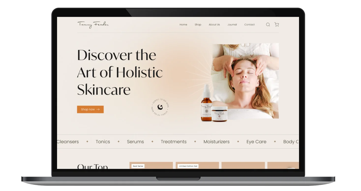
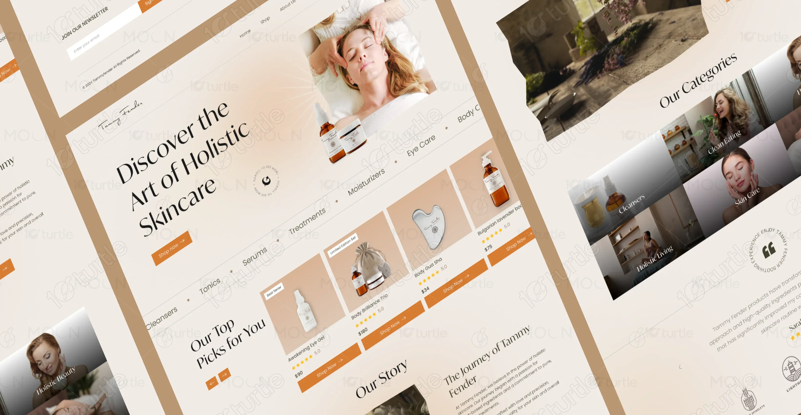
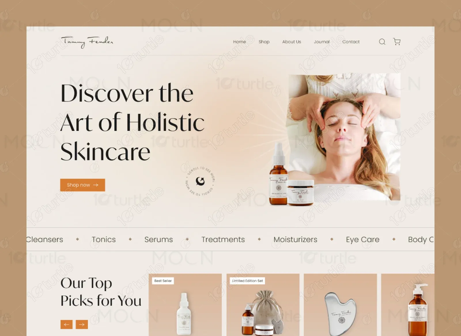
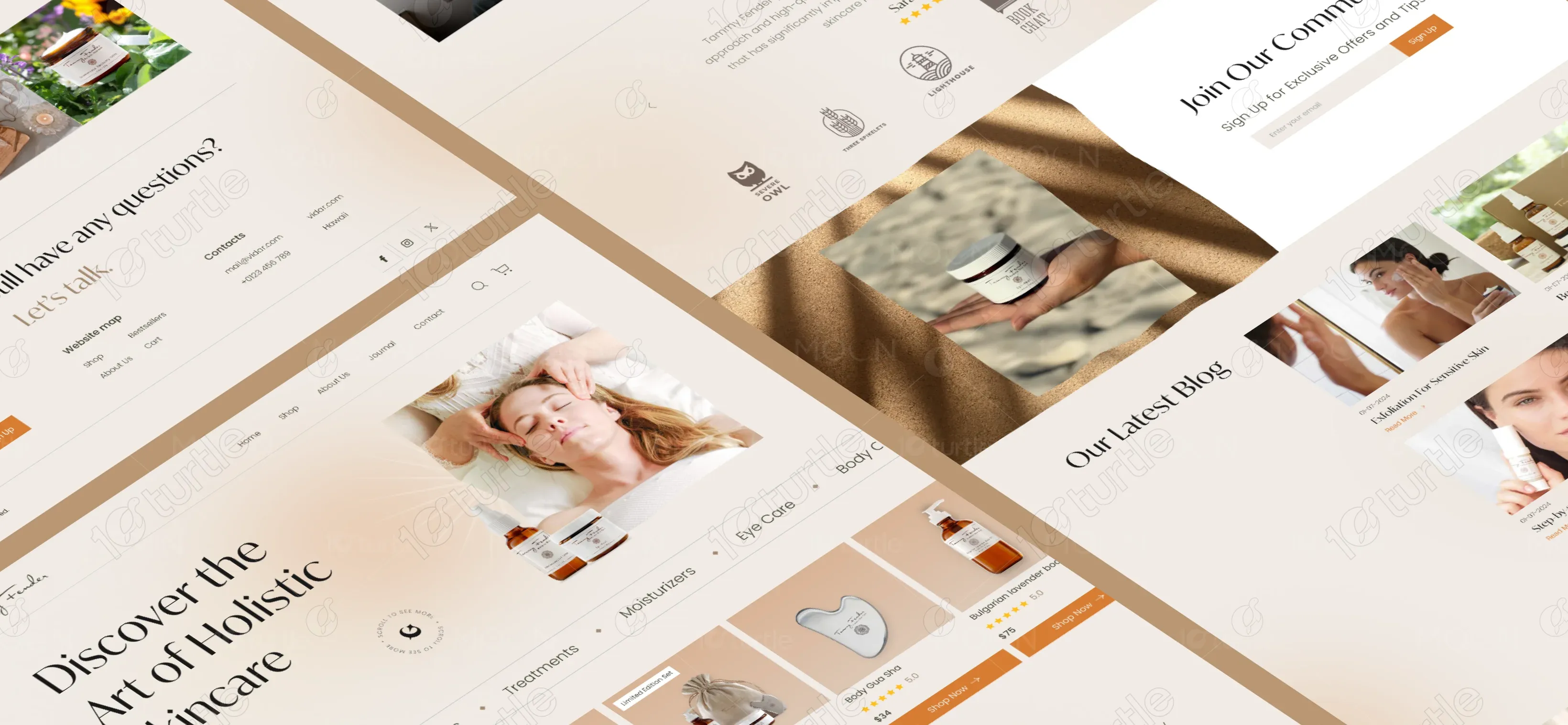
The redesigned website integrates thoughtful storytelling, luxurious visuals, and an intuitive eCommerce layout. From the homepage to the blog and journal sections, every element supports a holistic wellness journey. Clean UI, soft textures, and fluid transitions guide users through skincare education, product discovery, and easy purchasing.
The client wanted to communicate not just the benefits of their products, but the peaceful lifestyle they advocate. Their design vision called for earthy tones, light gradients, curated photography, and poetic typography.
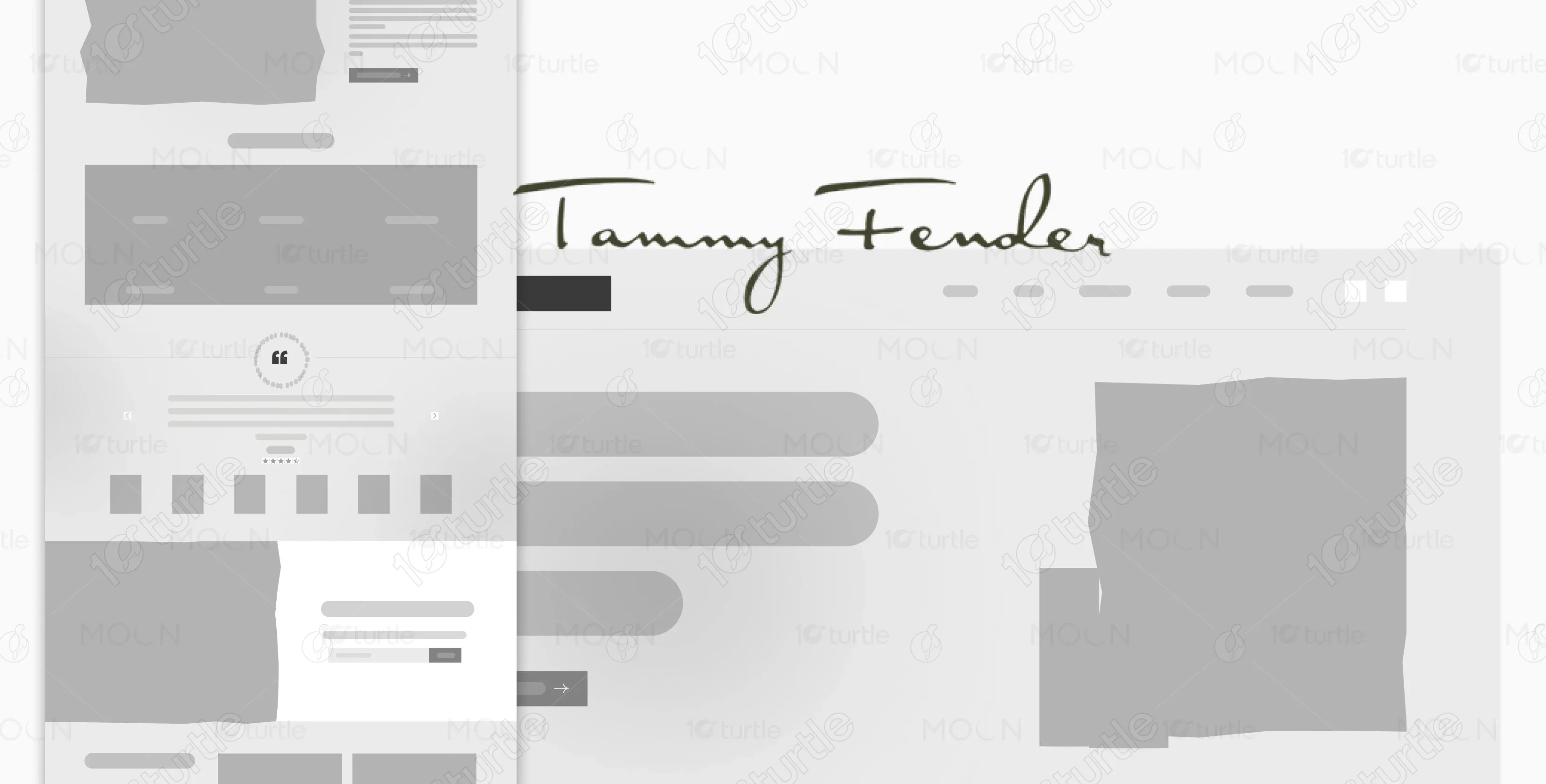
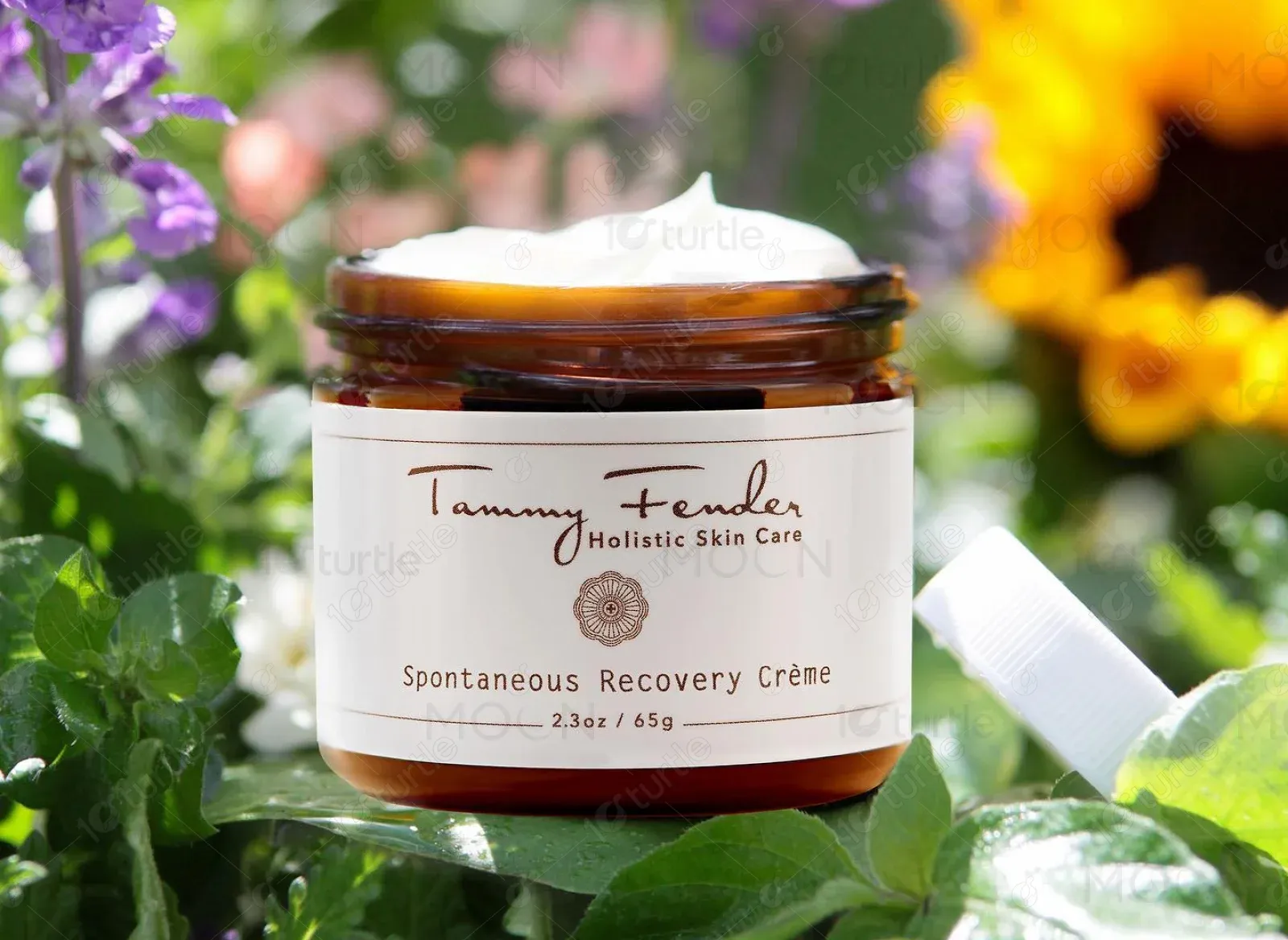
The Tammy Fender logo features an elegant handwritten script, symbolizing authenticity and intimacy. It is paired with a refined serif subtext, reinforcing trust and expertise in skincare. The minimal approach keeps the brand feeling both personal and premium.
The website uses a warm, elegant color palette designed to reflect earthiness and grace. The primary color is a soft cream-beige gradient that provides warmth and calm. Secondary tones include muted browns and sandy peaches. Accent colors such as burnt orange (#E57E38) are used sparingly for CTAs and highlights, creating visual balance without overwhelming the senses. The overall palette enhances the sense of purity, natural luxury, and tranquility.

The wireframes prioritized a clean product discovery flow, clear navigation, and storytelling integration. Sections were modular, emphasizing flexibility to showcase seasonal offers, featured categories, and educational journal content. The mobile-first layout ensured users could browse and shop with ease across all devices.