
Overview
This unified menu design case study presents two service-focused print systems: a hotel and restaurant menu in a portrait layout, and a spa and salon menu in a square booklet format. Each design responds to its setting through distinct typography, page flow, and pricing structure, while helping customers browse categories quickly and confidently.
The Challenge

Menus often fail when they overload guests with information or present prices and categories without a clear path. In hospitality, a cluttered menu slows decisions and weakens the dining experience. In beauty and wellness, unclear service menus can confuse clients about treatment lengths, member pricing, and service options. The challenge was to create two very different menu formats that remained easy to scan, visually appropriate, and functional in real use.
The Solution

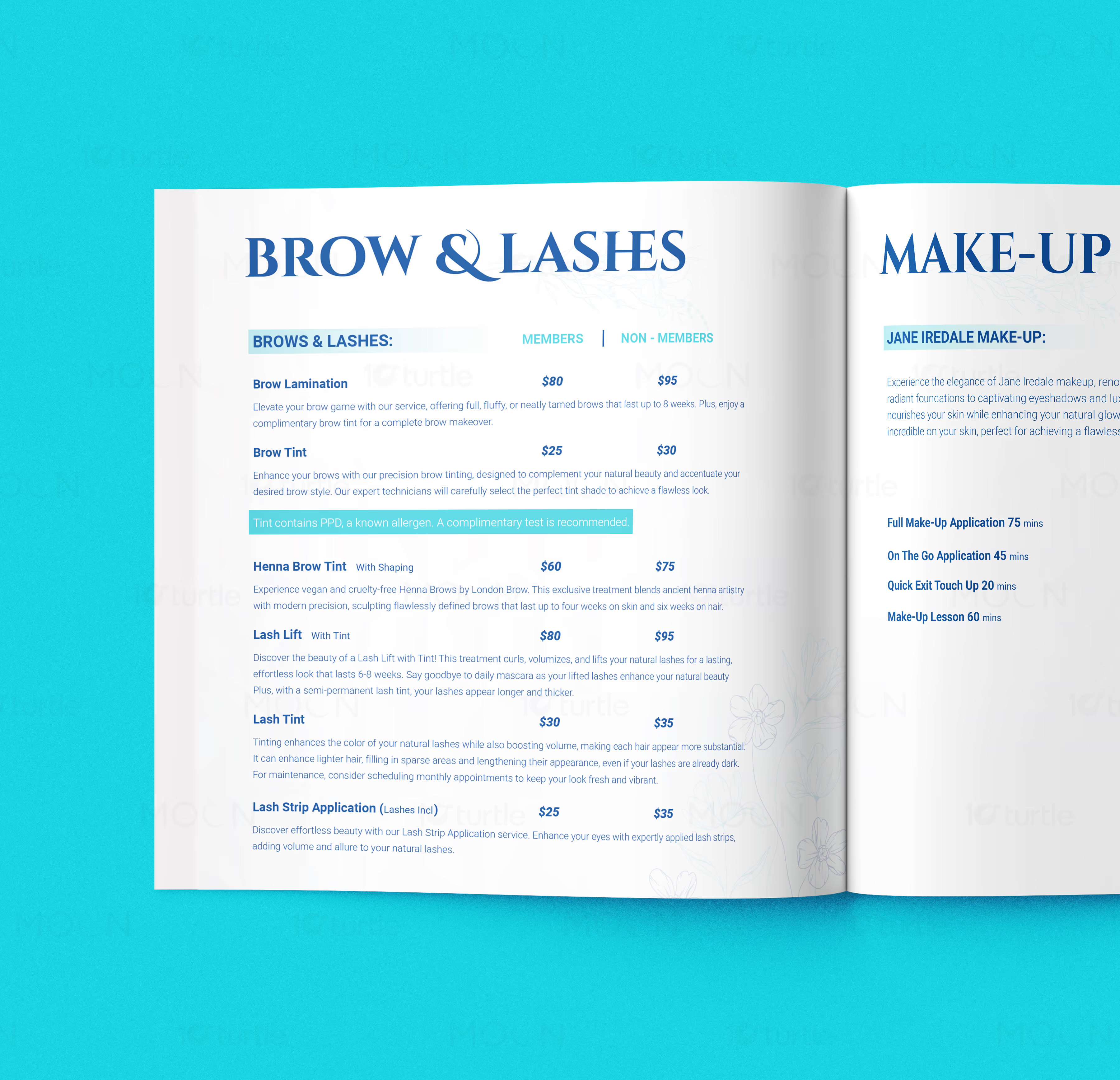
The collection solves this by giving each menu its own tailored visual language while keeping usability central. The food menu uses a restrained grey palette, elegant serif headings, and clean vertical sections to organize opening hours, drinks, pizzas, cocktails, and desserts in a straightforward portrait format. The salon menu adopts a fresh white-and-blue identity with floral line art, spacious square spreads, and clearly divided sections for nails, hair, and spa information. Across both, typography, alignment, and category spacing do the heavy lifting.
The Impact

This work helps each business communicate professionalism before a single order or booking is placed. The food menu feels calm, legible, and suited to a hotel or restaurant environment, while the salon menu feels polished, welcoming, and premium. Together, the collection shows how thoughtful menu design can improve customer confidence and support faster, smoother decision-making. Long term, these systems strengthen brand presentation and make service communication more memorable.


Menu design is one of the most practical forms of brand communication because it needs to inform, guide, and sell at the same time. In this case study, we approached two very different menu experiences as one cohesive body of work: a portrait food menu created for a hospitality setting, and a square salon booklet designed for Blue Door Spa + Salon. Although the industries differ, both projects share the same fundamental goal—making services easier to understand while reflecting the tone of the business.
The challenge in any menu design project is balancing structure with atmosphere. A menu has to carry pricing, categories, service names, and supporting information without feeling crowded or visually tiring. In the restaurant space, that means guests should be able to move naturally through drinks, cider, wine, spirits, cocktails, pizzas, and desserts. In the beauty and wellness space, clients need to compare service lengths, member and non-member pricing, and treatment options without friction. When that structure is weak, menus become hard to use, and the overall brand experience feels less polished.
The solution in this collection was to build two distinct systems with separate visual personalities. The food menu uses a restrained monochrome style with grey backgrounds, black serif headlines, and neatly divided content blocks. It feels classic, functional, and calm. Several mockups show the pages clipped to a wooden board, which adds a tactile hospitality feel while keeping the content editorial and easy to scan. The page categories are clearly sectioned, allowing the viewer to move through operating hours, beverages, and food items in a linear way.
The salon menu takes a different route. Blue Door Spa + Salon is presented in a square booklet format with a crisp white base, bright aqua backdrop, and a blue brand identity built around the “Blue Door” icon. Inside, floral line art softens the layout while large headings such as Nails, Hair, and Experience create strong navigation points. Member and non-member pricing is clearly separated, and the spreads maintain generous spacing to make long service lists feel approachable. The result is a menu booklet that feels fresh, feminine, and premium without becoming decorative at the expense of clarity.
Together, these two projects show how menu design can adapt to different environments while still following the same strategic principles. Good menu design improves customer confidence, speeds up decision-making, and supports stronger brand perception. Whether the goal is helping diners choose a cocktail or guiding salon clients through treatments and pricing, a thoughtful layout turns information into experience. This collection demonstrates how print menu design can be both highly functional and visually aligned with the mood of the business.
#menudesign
#restaurantmenu
#salonmenu
#spamenu
#printdesign
#hospitalitydesign
#beautybranding
#foodmenu
#brochuredesign
#editorialdesign
#servicemenu
#brandingdesign