graphicdesign
branding
techidentity
Overview
Espresso Roots entered the technology space with a unique proposition: bringing the precision of data-driven systems to the world of artisanal craft. As a brand that operates at the intersection of traditional supply chains and modern software solutions, they required a visual identity that felt both authoritative and approachable. 10turtle was commissioned to translate this duality into a cohesive graphic design language. The project scope encompassed the development of a core brand mark, a custom iconography set, and a suite of digital marketing assets. Our objective was to move away from the cold, sterile tropes often associated with tech startups, instead opting for a 'Modern-Organic' aesthetic that reflects the brand's name and mission. We focused on creating a design system that could scale from mobile application icons to large-scale physical environmental graphics.
The Challenge

The primary challenge lay in the inherent tension between the words 'Espresso' (representing heat, speed, and tradition) and 'Roots' (representing stability, nature, and growth), all while operating within a 'Technology' industry context. Existing tech brands in this niche often lean too far into generic SaaS aesthetics, losing the 'soul' of the product they serve. Espresso Roots needed to differentiate itself in a crowded market where many competitors use similar 'tech blue' palettes and minimalist sans-serif fonts. The visual identity had to communicate high-level technical reliability without alienating the craft-focused users who form the backbone of their ecosystem. We needed to solve the problem of visual coldness by introducing warmth and texture without sacrificing the clean, professional look expected of a tech innovator.
The Solution
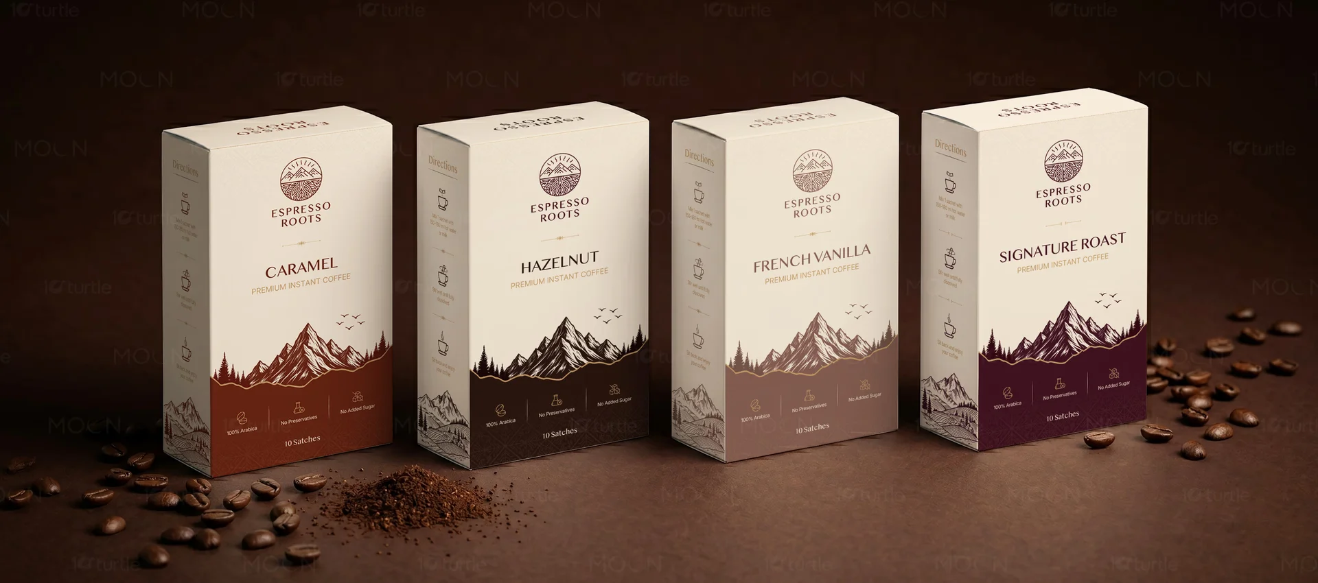
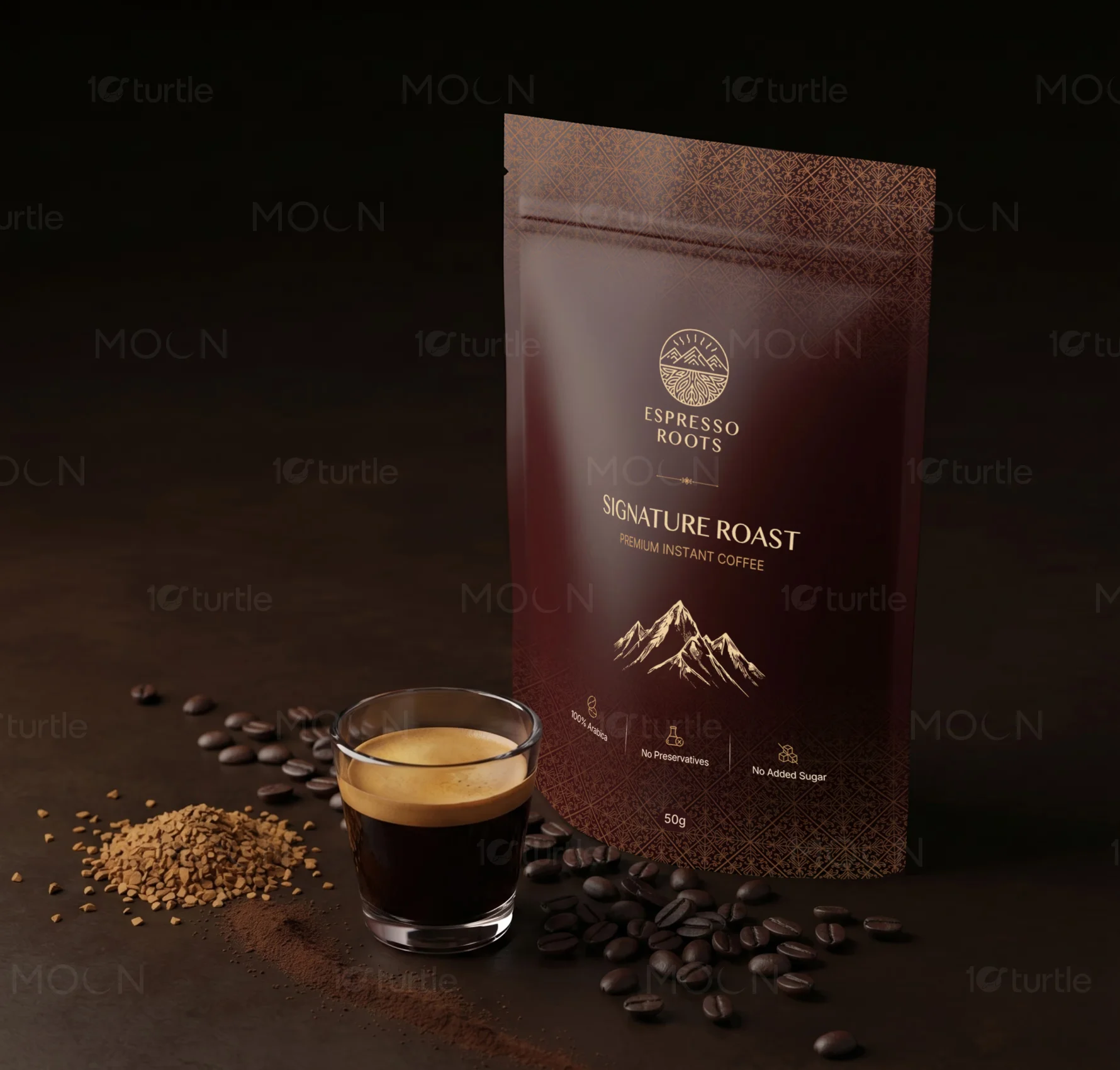
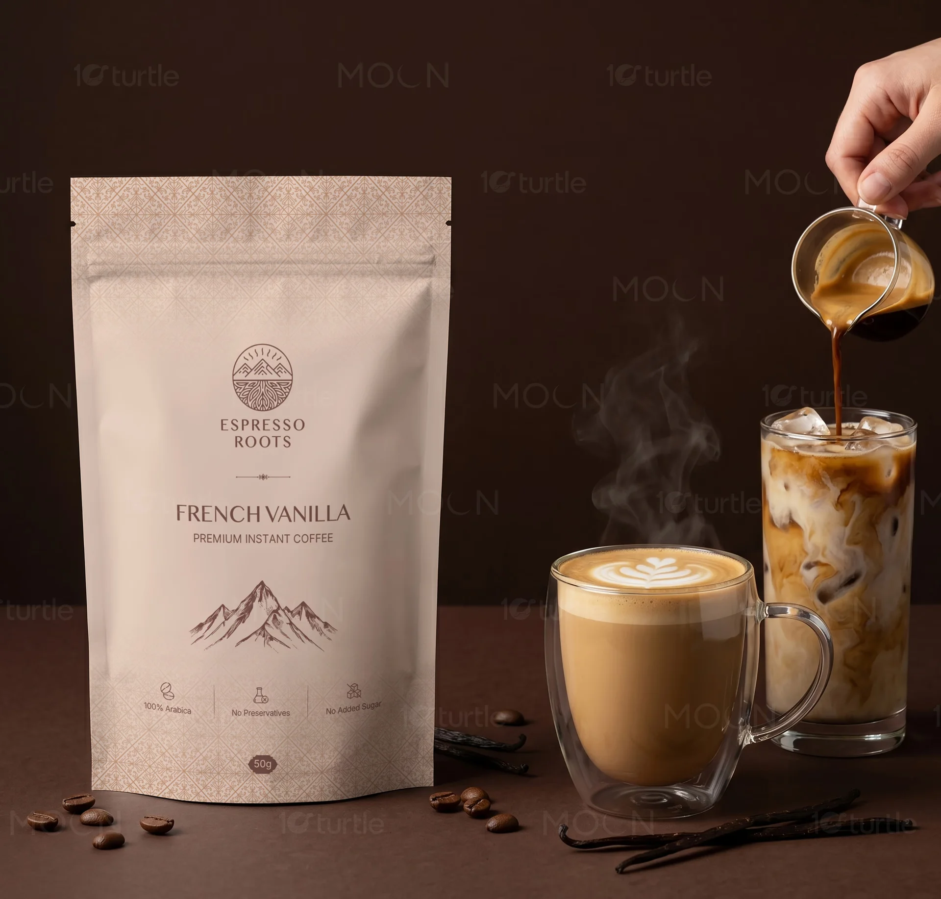
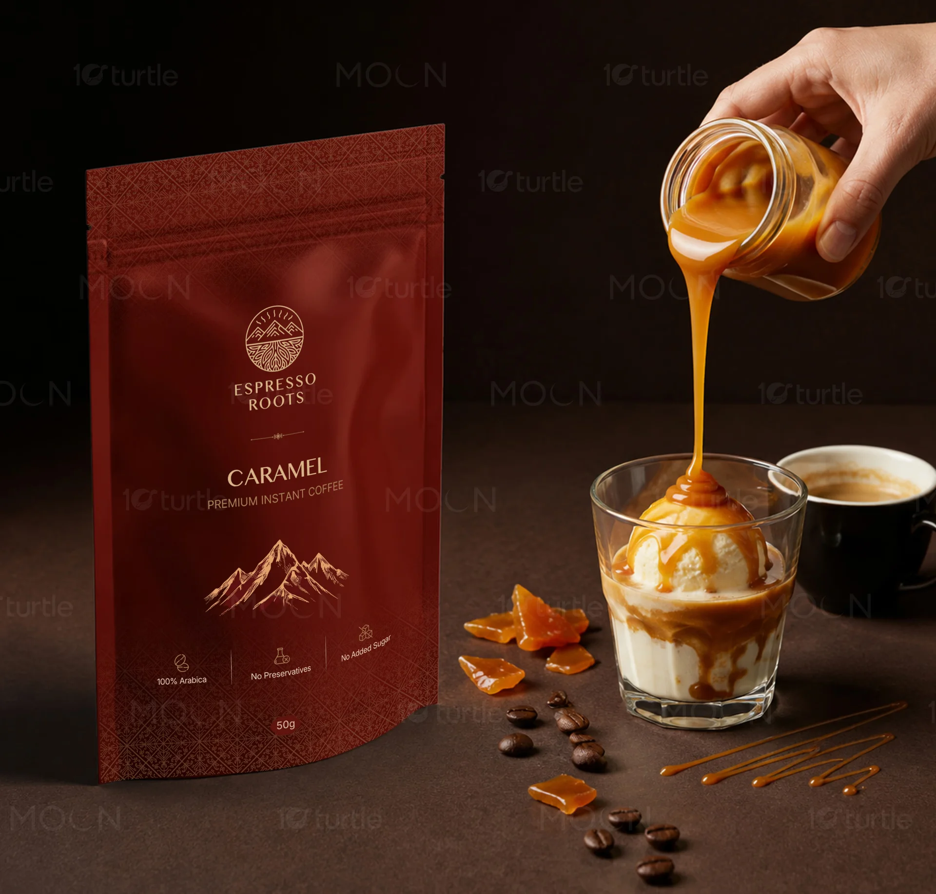
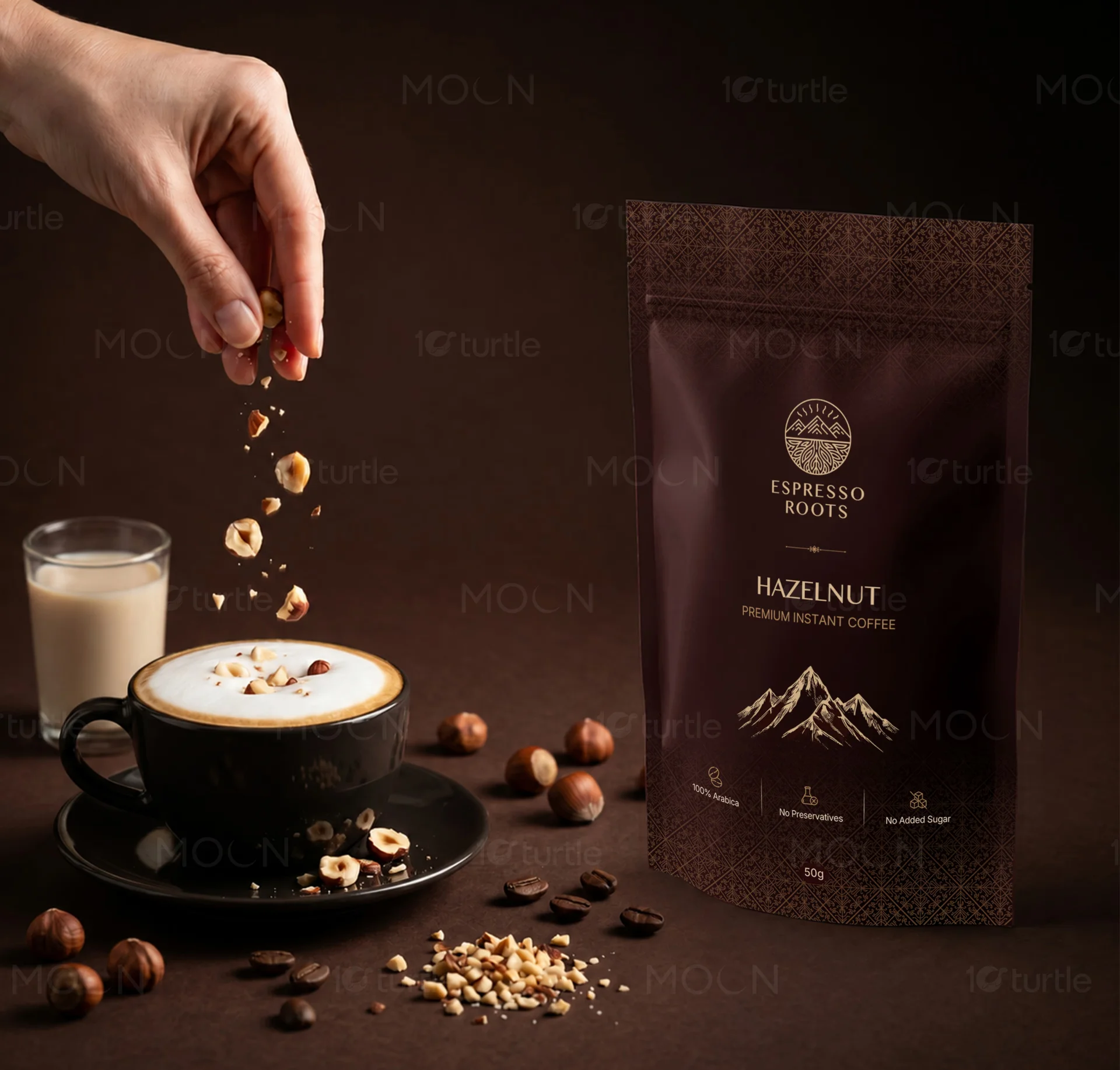
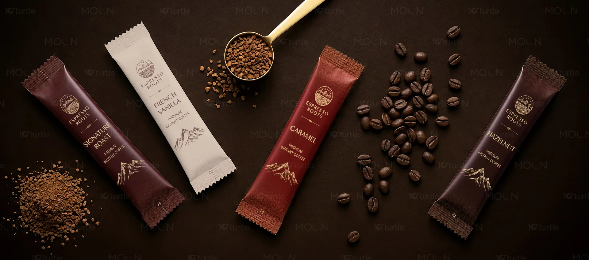
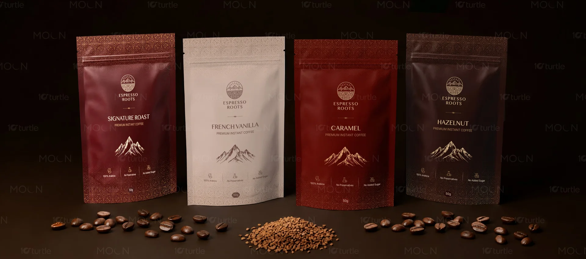
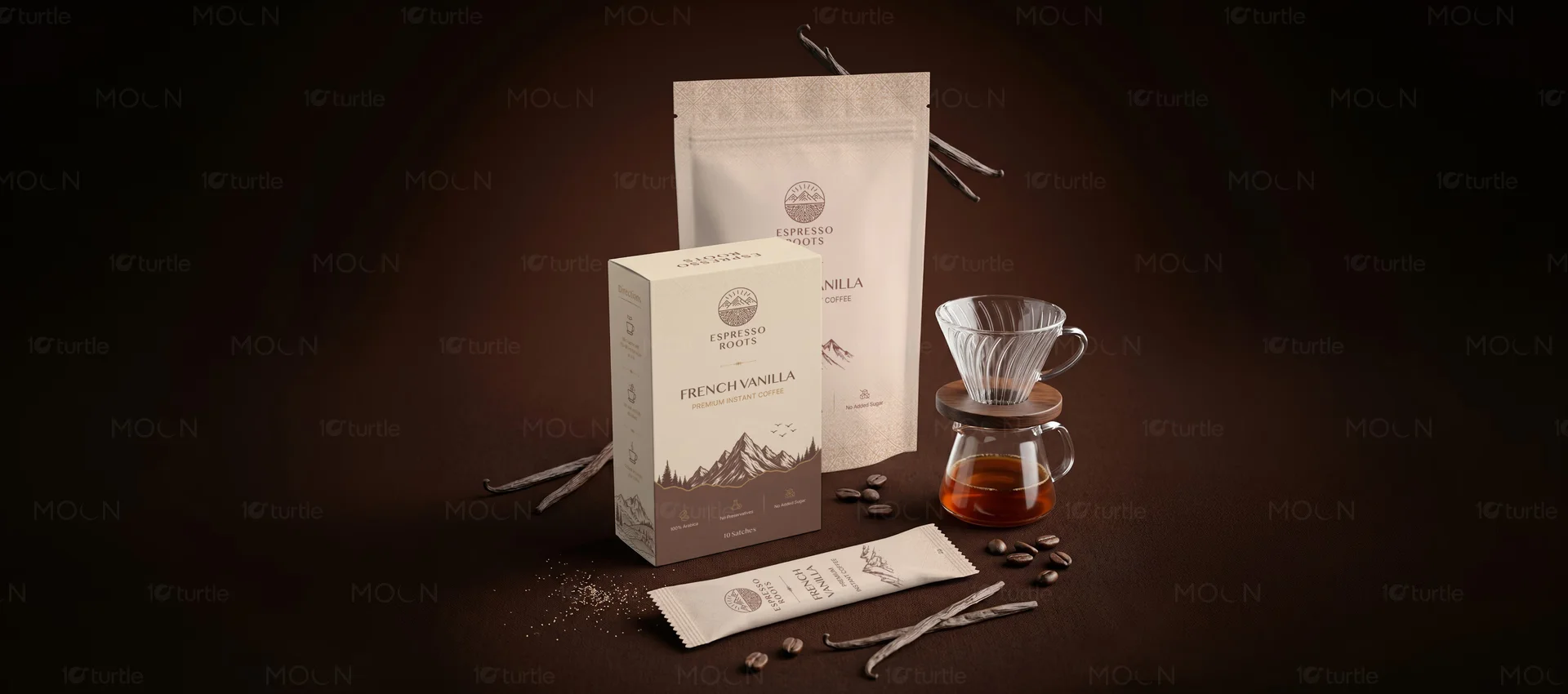
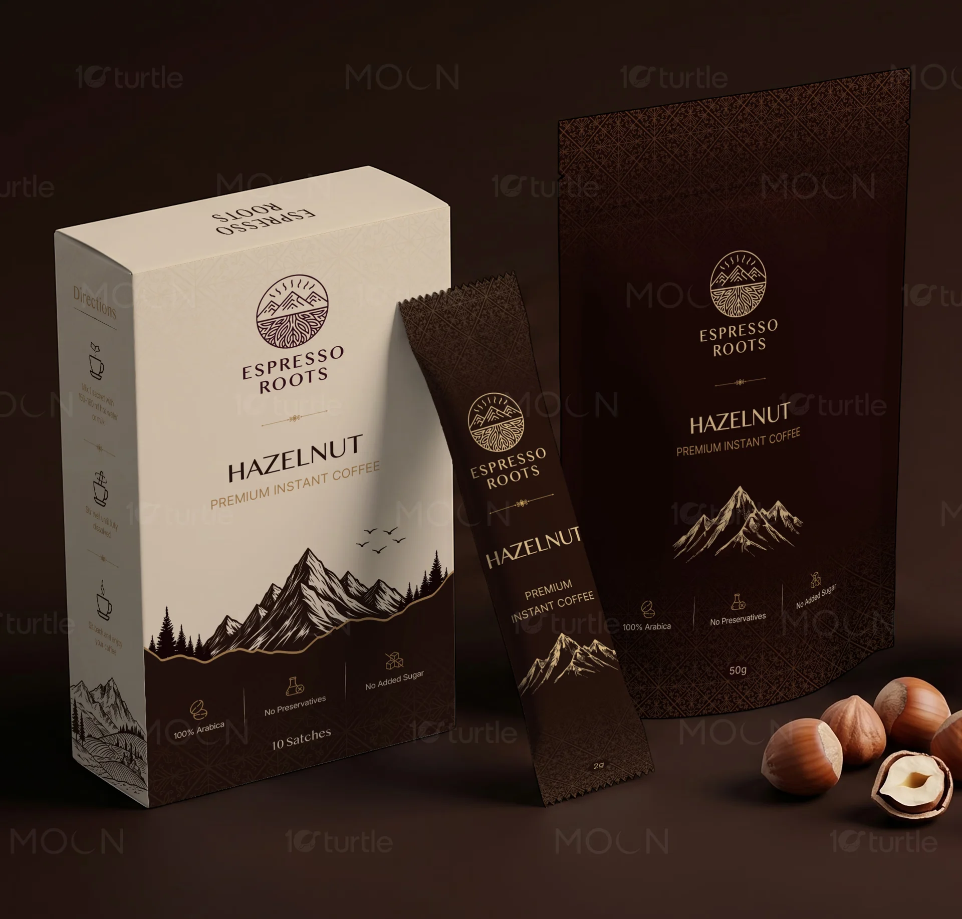
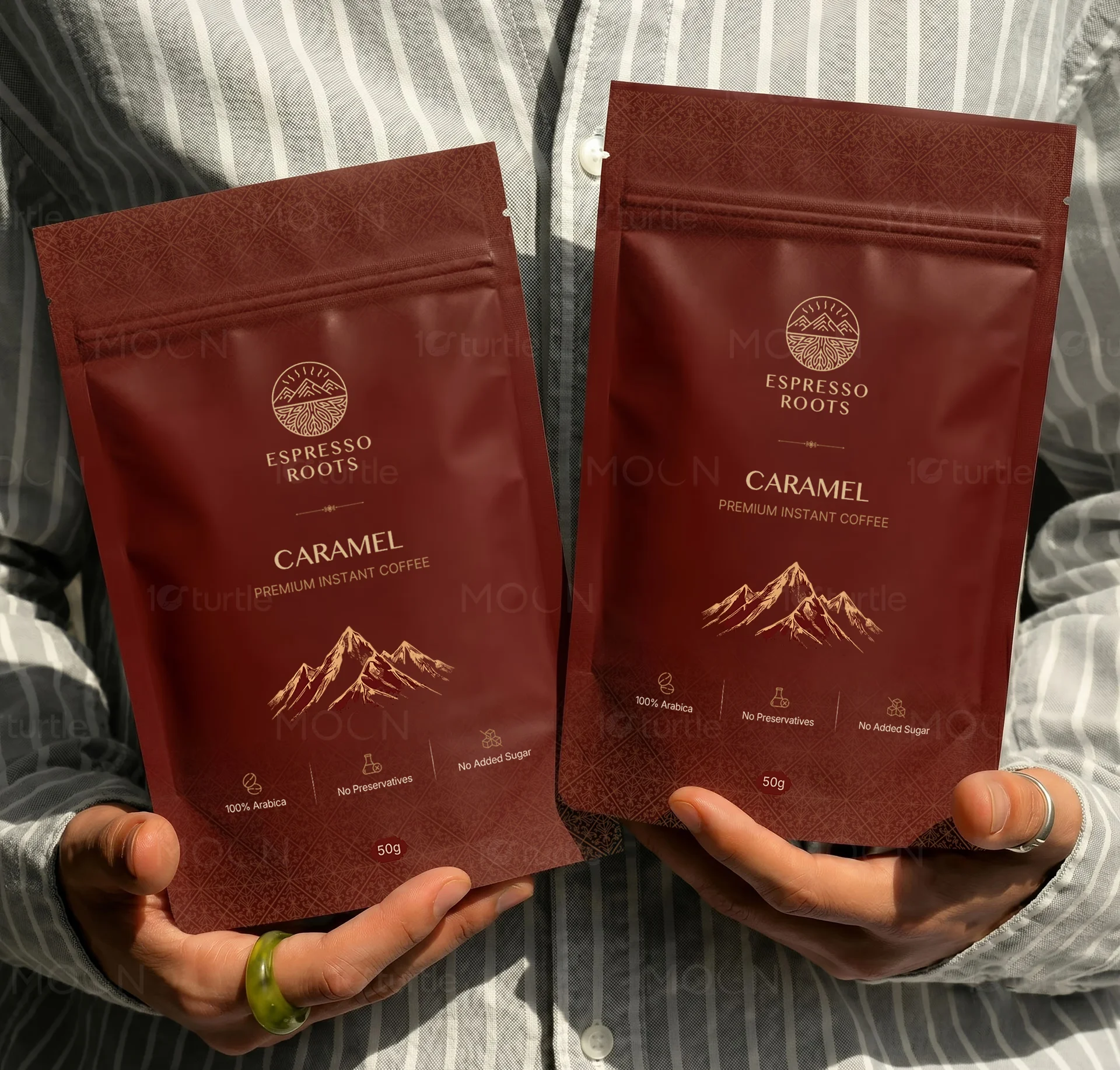
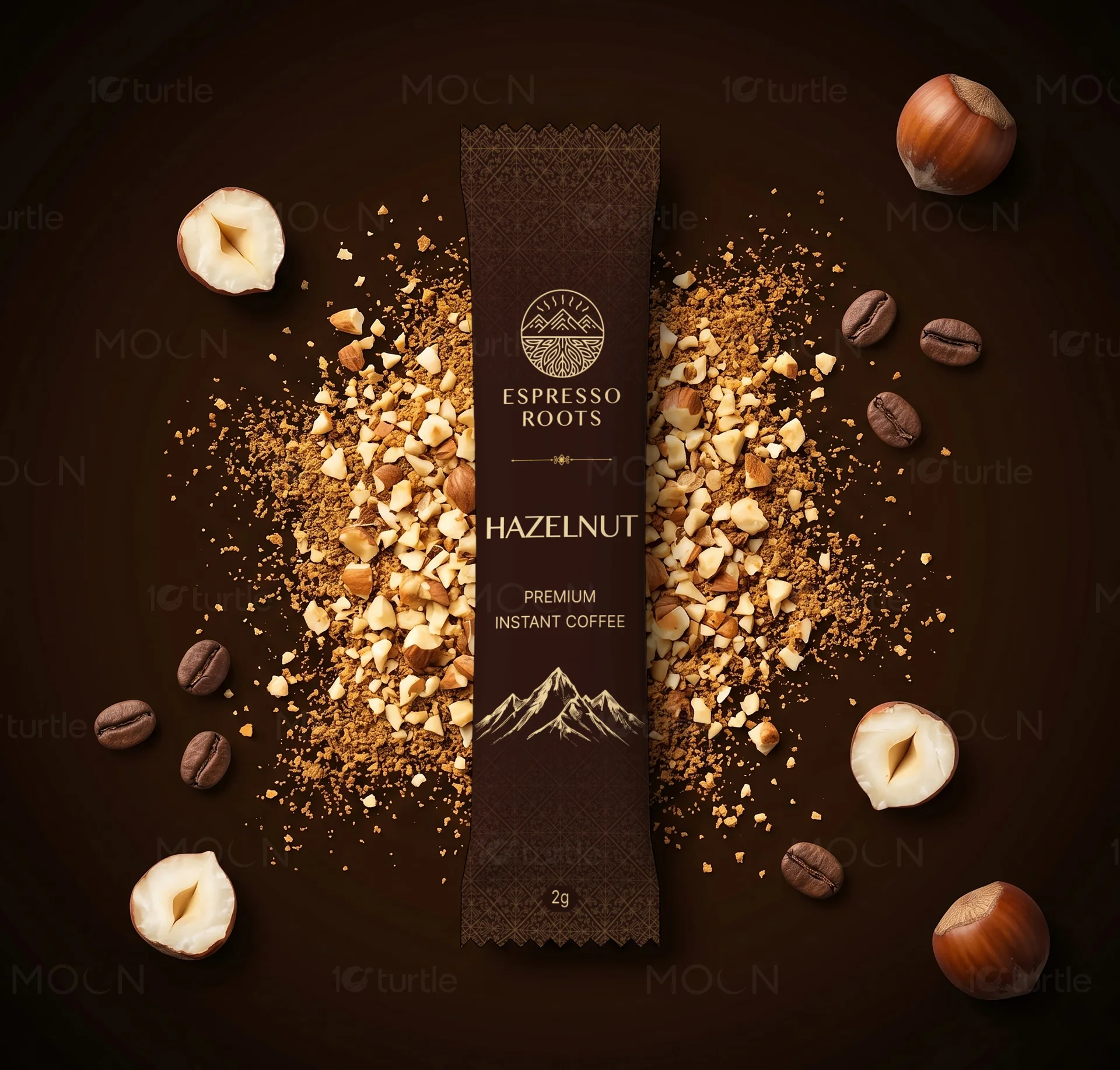
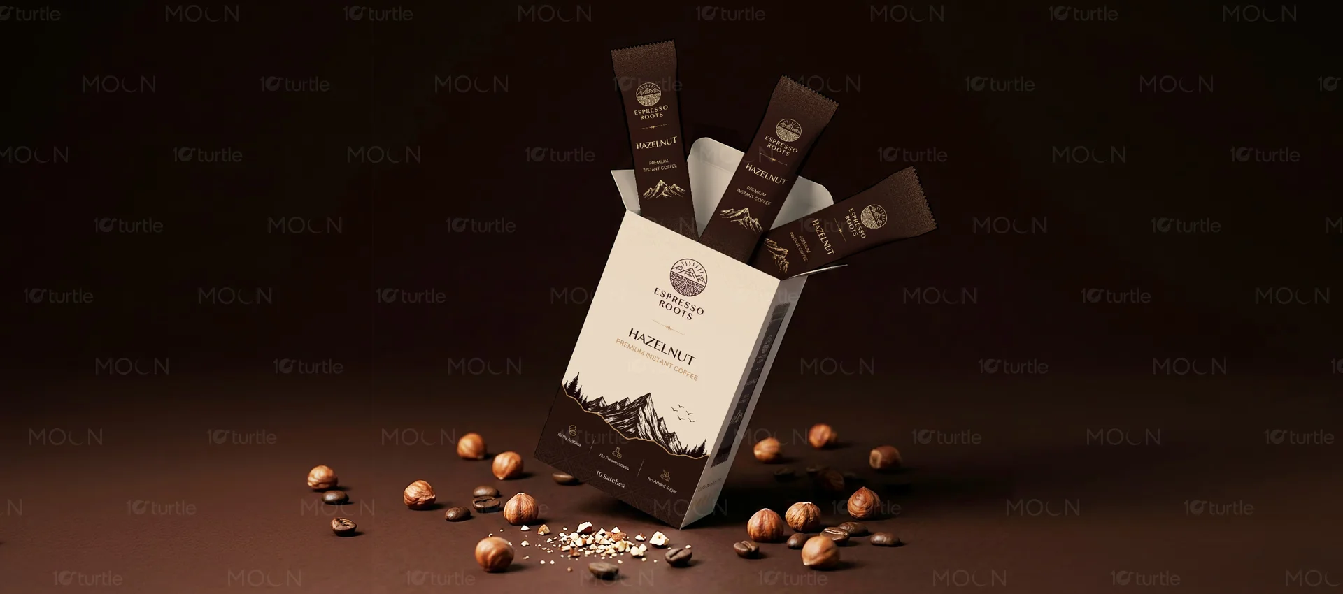
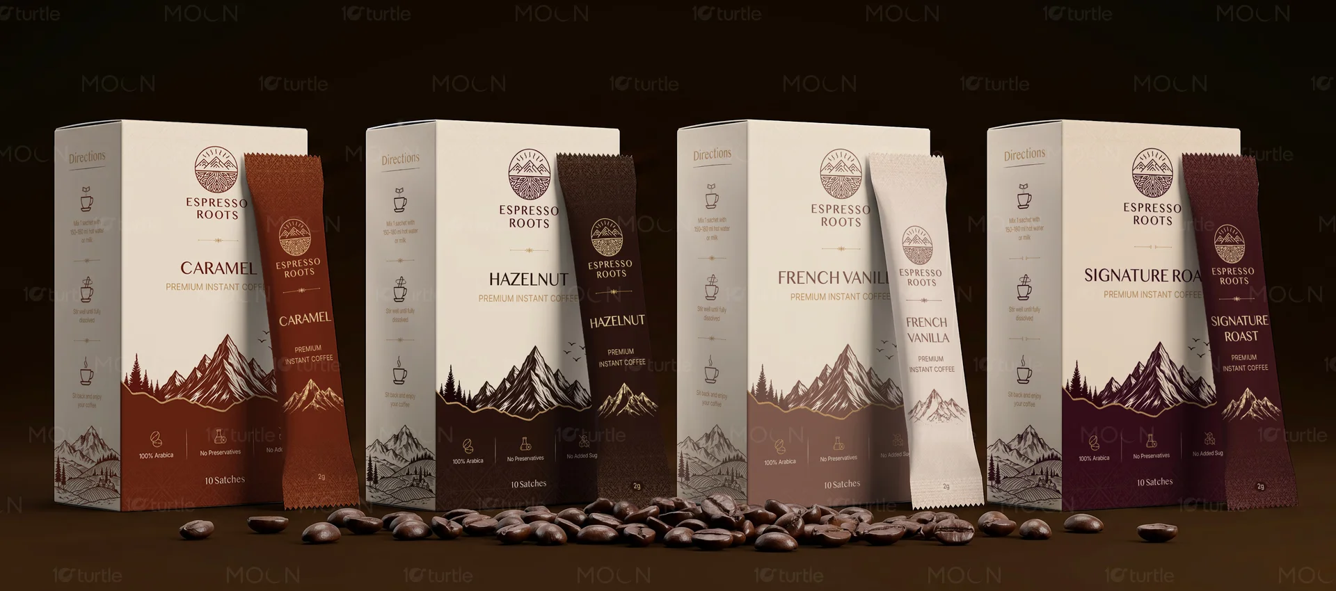
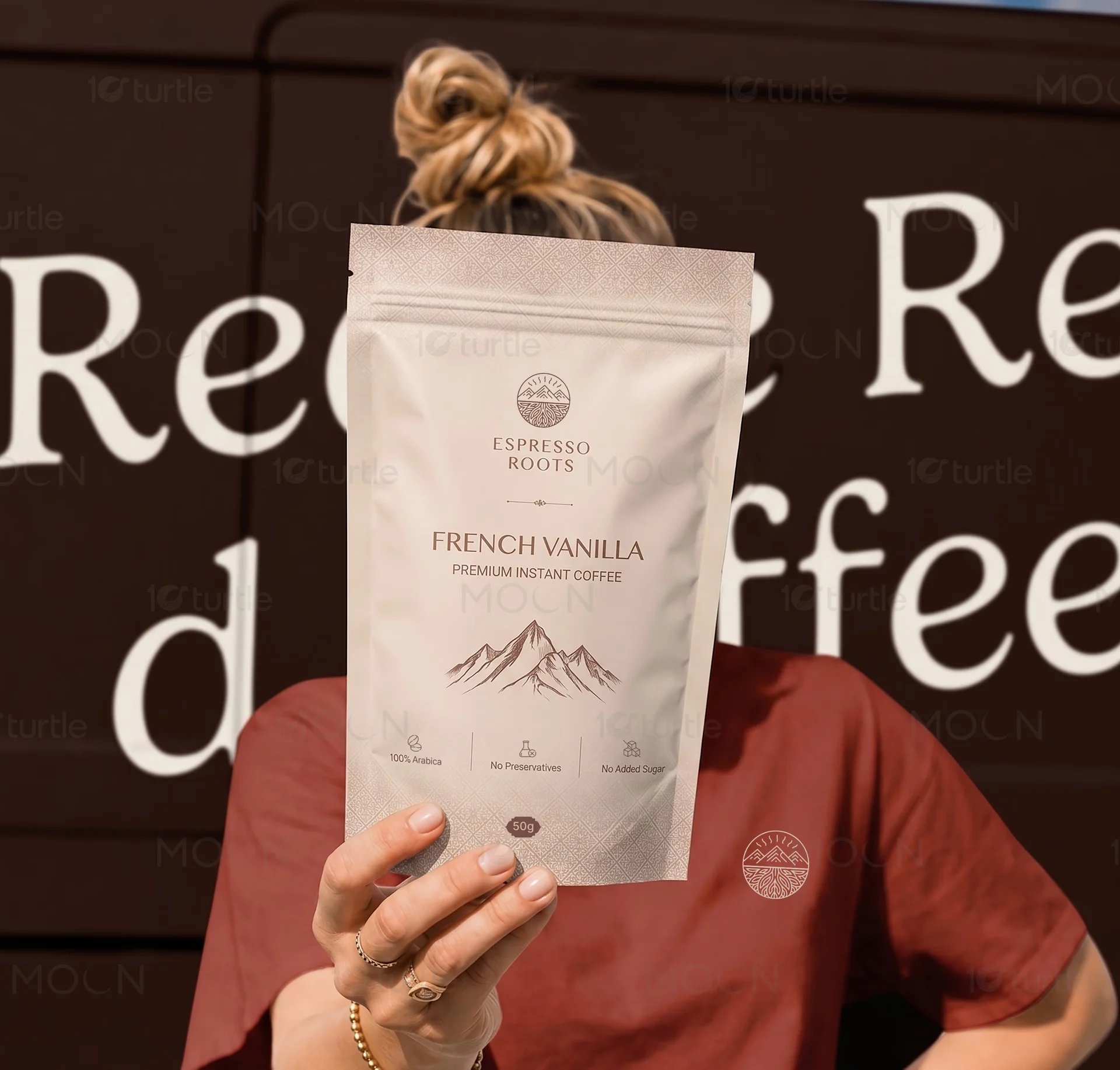
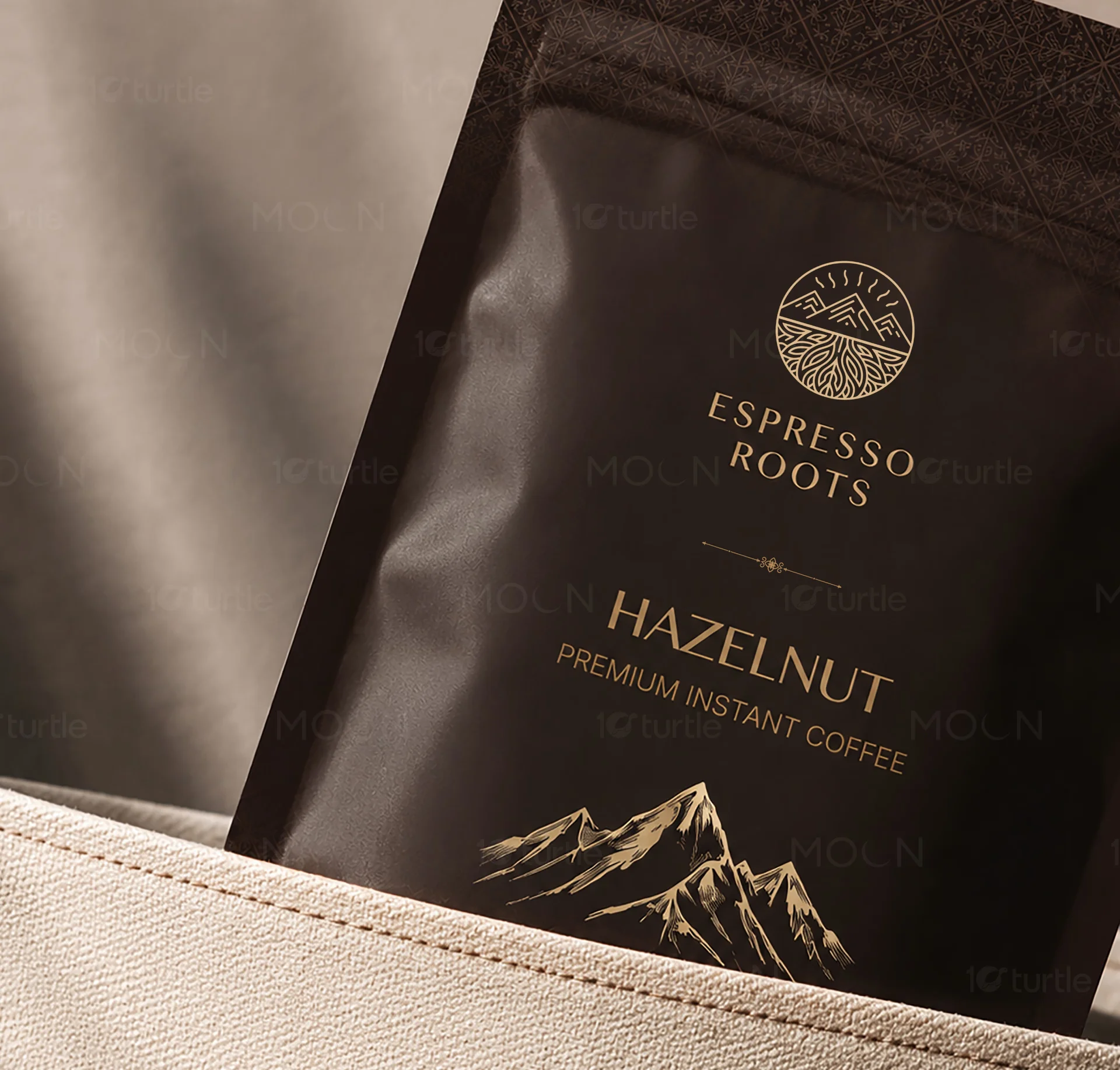
10turtle's strategy centered on 'Geometric Organicism.' We developed a logo that utilizes mathematical precision to form shapes inspired by natural coffee botany and interconnected data networks. The color palette was a critical component of the solution; we moved away from standard tech blues in favor of deep earth tones accented by high-contrast 'electronic' highlights. This created a visual bridge between the 'roots' of the industry and the digital 'vibrancy' of the platform. Deliverables included a comprehensive brand style guide, modular social media templates, and a custom set of line-art icons that simplify complex technical features for the end-user. We prioritized versatility, ensuring the graphics remained legible and impactful across various digital touchpoints. By layering modern typography with structured grid systems, we provided Espresso Roots with a toolkit that allows for consistent brand expression across all future technological expansions.
The Impact
The new graphic identity for Espresso Roots successfully positioned the company as a leader in the tech-enabled craft space. The cohesive visual language provided the internal team with the confidence to scale their marketing efforts, resulting in a more unified presence across their digital platforms. By humanizing their technical offerings through design, the brand reported increased engagement and a more distinct market recognition compared to competitors. The visual framework established by 10turtle has allowed Espresso Roots to maintain a premium feel while expanding their software features. The 'Modern-Organic' design system proved to be highly adaptable, facilitating a seamless transition of brand elements from web interfaces to physical product packaging and event booths. This project stands as a testament to how strategic graphic design can transform a tech brand's perception from a utility to a lifestyle authority.

In the fast-paced world of technology, standing out requires more than just functional code; it requires a visual narrative that resonates with the target audience. The Espresso Roots project by 10turtle is a prime example of how graphics design can bridge the gap between traditional values and modern innovation. As a technology-focused brand, Espresso Roots needed to communicate efficiency and reliability. However, their roots in the artisanal coffee industry demanded a level of warmth and authenticity that typical tech branding lacks.
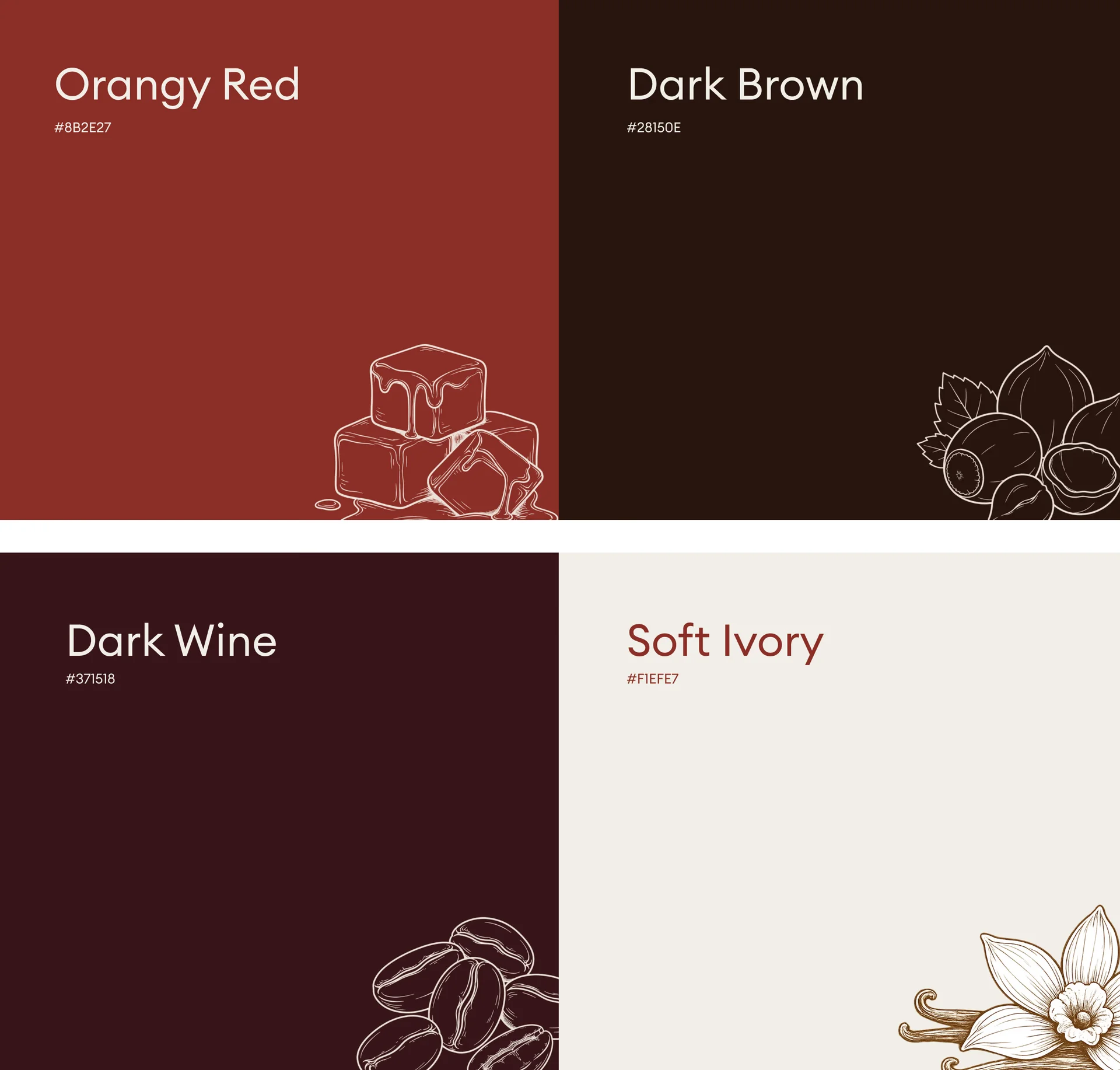
Our design process began with deep market research into the intersection of SaaS (Software as a Service) and the global coffee supply chain. We discovered that while the industry is rapidly digitizing, the users value the 'human' element of their craft. This insight led us to develop a graphic identity that uses structured, grid-based layouts to represent technological stability, paired with a color palette inspired by natural elements. The use of deep browns, forest greens, and vibrant sunset oranges provided a sophisticated alternative to the overused blue-and-white schemes of the tech world.
Key to the project's success was the creation of a custom iconography system. In technology design, icons serve as the shorthand for user interaction. For Espresso Roots, we crafted icons that were sleek and modern, yet possessed subtle curves that echoed the brand's organic origins. These assets were optimized for high-performance digital use, ensuring that whether they were viewed on a mobile screen or a desktop dashboard, the brand's visual integrity remained intact.
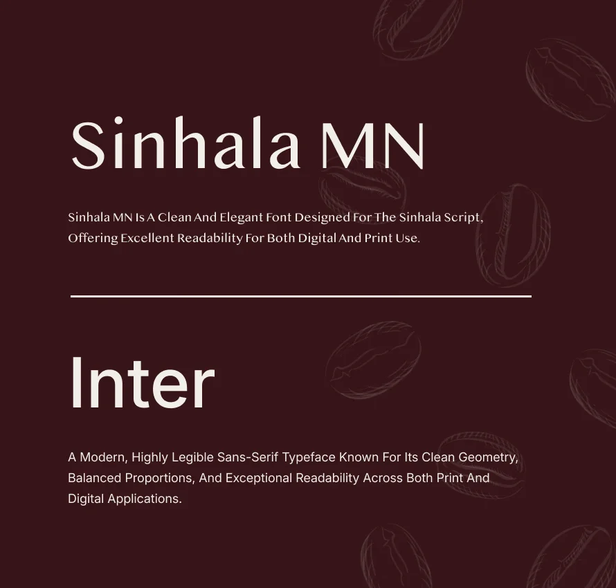
Beyond the logo and icons, 10turtle focused on creating a 'visual language' rather than just a set of assets. This included defining the way photography is treated, the rhythm of typography, and the use of white space to create a premium, uncluttered experience. By establishing these design principles early on, we ensured that Espresso Roots would have a scalable framework for all future growth. This case study highlights the importance of strategic graphic design in the tech industry, showing how a well-crafted visual identity can drive brand loyalty and market differentiation in an increasingly digital world.
tech graphic design
branding for technology startups
modern visual identity
Espresso Roots design
10turtle case study
SaaS branding
graphic design trends 2024
custom iconography tech